A Website about Corporate Identity.
November 7, 2007 12:16 PM Subscribe
A Website about Corporate Identity. A large archive of corporation logos with design credits, typeface identification (or, at least the typographic roots of the ID's.) and Pantone color information. Not at all complete, but it's a very nice start. Hopefully it will continue to expand.
via: Grain Edit (design blog)
Metafilter - the colors are blue (Pantone 7462) and 1970s leisure-suit yellow (Pantone 397). Metafilter uses the typeface Trade Gothic Bold Oblique.
posted by tepidmonkey at 12:50 PM on November 7, 2007 [1 favorite]
posted by tepidmonkey at 12:50 PM on November 7, 2007 [1 favorite]
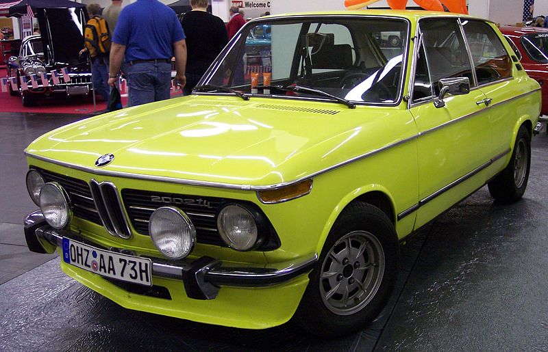
1970s leisure-suit yellow
Reminds me more of my first car, a yellow 1970s BMW. (They call it neon yellow here, but it was labeled "golf green" on a sticker under the hood.)
posted by StickyCarpet at 1:20 PM on November 7, 2007
Reminds me more of my first car, a yellow 1970s BMW. (They call it neon yellow here, but it was labeled "golf green" on a sticker under the hood.)
posted by StickyCarpet at 1:20 PM on November 7, 2007
This is essentially totally useless to me, but I really like it.
posted by cortex at 1:34 PM on November 7, 2007
posted by cortex at 1:34 PM on November 7, 2007
This is essential to me, but I don't really like it.
Gotta get out of MarCom.
posted by Ambrosia Voyeur at 2:30 PM on November 7, 2007 [2 favorites]
Gotta get out of MarCom.
posted by Ambrosia Voyeur at 2:30 PM on November 7, 2007 [2 favorites]
Damn it, it doesn't have Halliburton. And I really wanted to know what the pantone of evil was.
Ooh, but it does have AT&T, I guess I can console my self with that...
posted by quin at 3:13 PM on November 7, 2007
Ooh, but it does have AT&T, I guess I can console my self with that...
posted by quin at 3:13 PM on November 7, 2007
the corp ID stuff is really useful, but the Grain Edit blog is absolutely fantastic - thanks.
posted by the_very_hungry_caterpillar at 3:53 PM on November 7, 2007
posted by the_very_hungry_caterpillar at 3:53 PM on November 7, 2007
On the topic of corporate identity, don't forget the recently linked blog "Brand New," which makes before and after critiques of corporate re-branding.
posted by SmileyChewtrain at 6:32 PM on November 7, 2007
posted by SmileyChewtrain at 6:32 PM on November 7, 2007
Also check out Brands of the World, which offers downloadable vector files of nearly any logo you can think of.
posted by endquote at 9:25 PM on November 7, 2007
posted by endquote at 9:25 PM on November 7, 2007
I'm thinking of rebranding from "the quidnunc kid" to either "the quidnunc kid (Bermuda) holding corporation limited" or "zOwEE!".
The first option clearly sets out my precise legal status in the quidnunc kid group of companies, reducing confusion for potential investors and putting other stakeholders on notice both as to liability issues and to the co-ordination role I play within said corporate group. The second option is some fucking bullshit I just pulled out of a bull's asshole.
My question to the focus group is: what colour typeface would make you give "zOwEE!" all of your personal banking details? Write down those details in your favourite colour font and email them to me and I guarantee that you'll be "zOwEEd!" within four to six days.
posted by the quidnunc kid at 1:53 AM on November 8, 2007
Learn the colors of your future corporate master now. Before it's too late.
Great resource, though. I had no idea Victor Vasarely designed the Renault logo. I can see that, now.
posted by Thorzdad at 5:02 AM on November 8, 2007
Great resource, though. I had no idea Victor Vasarely designed the Renault logo. I can see that, now.
posted by Thorzdad at 5:02 AM on November 8, 2007
« Older Harold and Kumar go home for the holidays | If I'm not pure, at least my jewels are! Newer »
This thread has been archived and is closed to new comments
posted by isopraxis at 12:43 PM on November 7, 2007