The Wikimedia Commons Picture of the Year 2007
February 9, 2008 6:42 PM Subscribe
Wait'll the guys at Something Awful get done with that picture!
posted by Steven C. Den Beste at 6:57 PM on February 9, 2008
posted by Steven C. Den Beste at 6:57 PM on February 9, 2008
Can this one be real? It looks like a Klimt painting, just incredible.
posted by nasreddin at 7:00 PM on February 9, 2008
posted by nasreddin at 7:00 PM on February 9, 2008
Can this one be real? It looks like a Klimt painting, just incredible.
I was there not more than three weeks ago. Yes, it's real.
posted by claudius at 7:31 PM on February 9, 2008
I was there not more than three weeks ago. Yes, it's real.
posted by claudius at 7:31 PM on February 9, 2008
Am a huge fan of Wikipedia it's such an awesome concept, like the original Google. Enjoy the images that go along with the entries but not especially those ones. Well, I do like the rice paddies a la Klimt (good call claudius). Just odd ones, like this goose. What's not to totally love there? Not especially shocking or anything but cool anyway, like this Japanese Wikipedia one of a mixed ingredient soup called chanpon, that can also mean Japanglish, Maeda Toshinaga, "turbulence".
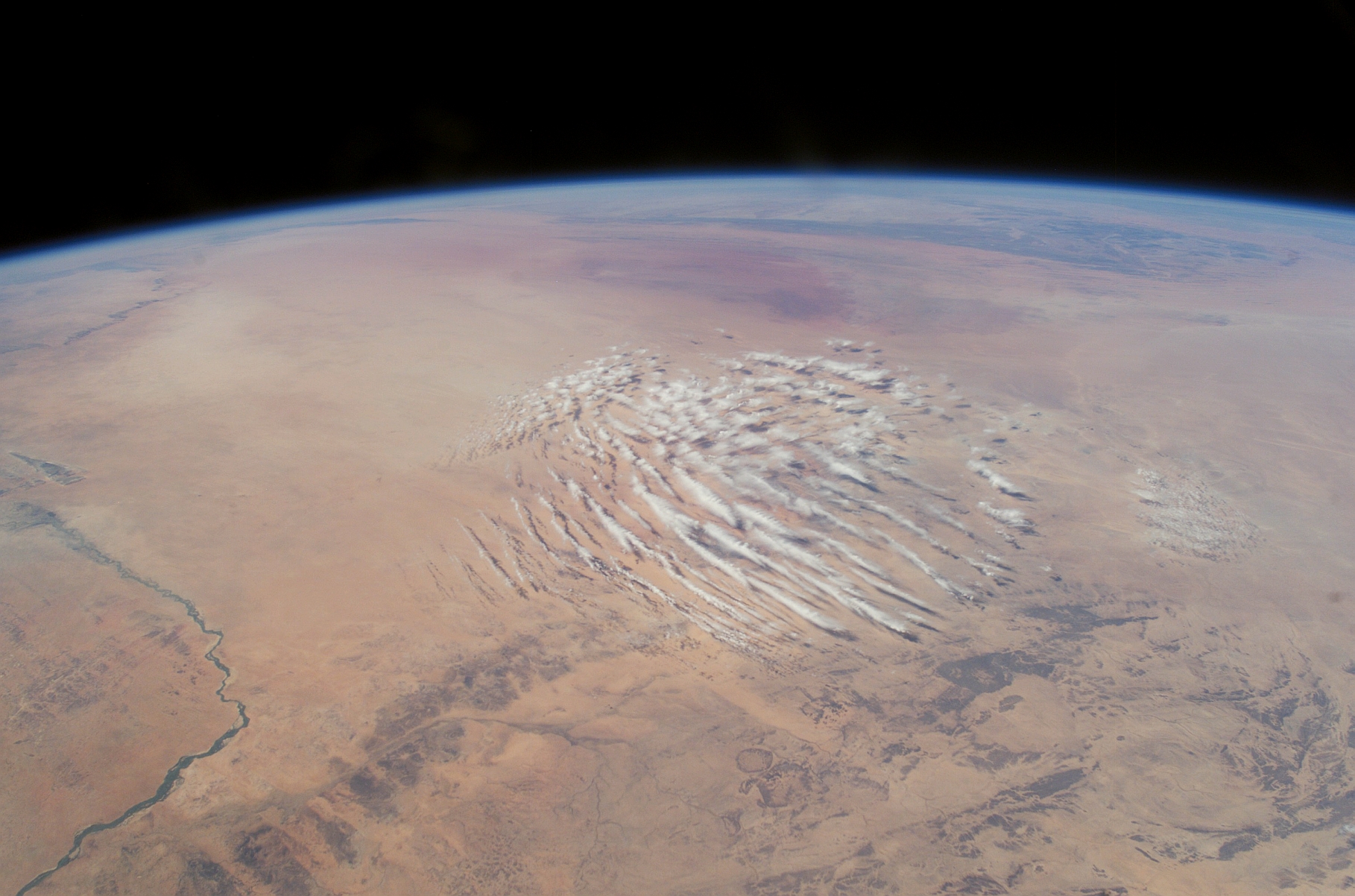
I just found this one, not on Wikipedia and had to pop it in here, it's clouds over the Sahara.
posted by nickyskye at 7:44 PM on February 9, 2008
I just found this one, not on Wikipedia and had to pop it in here, it's clouds over the Sahara.
posted by nickyskye at 7:44 PM on February 9, 2008
Nice. The NYC at night is a great example of how to do HDR right. Just beautiful detail.
posted by ijoshua at 7:46 PM on February 9, 2008
posted by ijoshua at 7:46 PM on February 9, 2008
Pretty pictures.
That's not a complement.
As a group, it's short on surprises.
I guess the wisdom of the collective runs a bit to the closer to the Kincade and Hallmark than I'd have hoped for.
posted by cccorlew at 7:57 PM on February 9, 2008 [2 favorites]
That's not a complement.
As a group, it's short on surprises.
I guess the wisdom of the collective runs a bit to the closer to the Kincade and Hallmark than I'd have hoped for.
posted by cccorlew at 7:57 PM on February 9, 2008 [2 favorites]
Yes, it's wonderful to see someone doing HDR that doesn't scream "HDR!!!!!".
Some great images here. I like the cow.
posted by echo target at 7:58 PM on February 9, 2008
Some great images here. I like the cow.
posted by echo target at 7:58 PM on February 9, 2008
I second cccorlew's assessment of this collection.
posted by blaneyphoto at 8:02 PM on February 9, 2008
posted by blaneyphoto at 8:02 PM on February 9, 2008
As a group, it's short on surprises.
Fair cop, but it's an encyclopedia. Encyclopedia pictures are supposed to get the concept across and be eye candy. If you want hard-hitting, raw photojournalism, you don't look in reference material.
posted by echo target at 8:03 PM on February 9, 2008 [2 favorites]
Fair cop, but it's an encyclopedia. Encyclopedia pictures are supposed to get the concept across and be eye candy. If you want hard-hitting, raw photojournalism, you don't look in reference material.
posted by echo target at 8:03 PM on February 9, 2008 [2 favorites]
For a moment, pretend I'm a photo n00b who gets my wallpapers off Digg front pages. Why does making a picture not scream HDR matter? Or for that matter, what is HDR?
And I like pretty pictures. People at work are always, "Ohhh, where did you get [insert pretty pictured from one of those websites with 10k pretty background]." Why shouldn't it be a compliment?
posted by jmd82 at 8:12 PM on February 9, 2008
And I like pretty pictures. People at work are always, "Ohhh, where did you get [insert pretty pictured from one of those websites with 10k pretty background]." Why shouldn't it be a compliment?
posted by jmd82 at 8:12 PM on February 9, 2008
Sure they're pretty. But as all travelers know, it is very easy to take crap pictures of beautiful things. These represent excellent craftsmanship on the part of the photographers. Getting the most evocative images possible of a given subject is worth celebrating.
posted by Miko at 8:20 PM on February 9, 2008
posted by Miko at 8:20 PM on February 9, 2008
The books picture is my favorite. I'm really digging all the "best photo of ______" threads today. Great post.
posted by mikeo2 at 8:30 PM on February 9, 2008
posted by mikeo2 at 8:30 PM on February 9, 2008
but it's an encyclopedia
Actually it's Wikimeda Commons - "common" with two meanings: common to all Wikimedia projects (not just the encyclopedia) - and common for all to use (must be GNU/CC copyleft license).
posted by stbalbach at 9:01 PM on February 9, 2008
Actually it's Wikimeda Commons - "common" with two meanings: common to all Wikimedia projects (not just the encyclopedia) - and common for all to use (must be GNU/CC copyleft license).
posted by stbalbach at 9:01 PM on February 9, 2008
Well, by the comments, it looks as though one of the judging criteria was that the photos be "encyclopedic."
posted by Miko at 9:05 PM on February 9, 2008
posted by Miko at 9:05 PM on February 9, 2008
Meant to credit you for the Klimt reference nasreddin.
One thing I learned from this post is that Wikipedia has a Featured picture candidates page. and one can go from there to a page of years and months, like February 2008. Lots of eye candy.
posted by nickyskye at 9:14 PM on February 9, 2008 [1 favorite]
One thing I learned from this post is that Wikipedia has a Featured picture candidates page. and one can go from there to a page of years and months, like February 2008. Lots of eye candy.
posted by nickyskye at 9:14 PM on February 9, 2008 [1 favorite]
I guess the wisdom of the collective runs a bit to the closer to the Kincade and Hallmark than I'd have hoped for.
May you be bludgeoned to death with a very expensive, very rare bottle of the finest wine.
posted by Cool Papa Bell at 9:16 PM on February 9, 2008 [8 favorites]
May you be bludgeoned to death with a very expensive, very rare bottle of the finest wine.
posted by Cool Papa Bell at 9:16 PM on February 9, 2008 [8 favorites]
Rad. Download .zip archives of the 2006 and 2007 POTY here.
posted by omarr at 9:38 PM on February 9, 2008
posted by omarr at 9:38 PM on February 9, 2008
Cool Papa Bell, would you be content to look at the same 50 "OMG AWESOME" pictures until the end of time, or would you prefer a little originality and variety?
posted by tehloki at 10:23 PM on February 9, 2008
posted by tehloki at 10:23 PM on February 9, 2008
For a moment, pretend I'm a photo n00b who gets my wallpapers off Digg front pages. Why does making a picture not scream HDR matter? Or for that matter, what is HDR?
erm....
HDR = "High Dynamic Range" and it means pictures that compress the dynamic range of scene into the dynamic range of a photograph. For example the sky might be 100,000 times brighter then the inside of a room, but on a computer screen it can only appear so many times brighter.
Anyway, when the first HDR pics came out, everyone oohed and ahed. but after a while it got annoying. Often, they would have much higher saturation then they should, and a lot of people used what appears to be a lowpass filter on the brightness of an image, which makes it look kind of ridiculous.
posted by delmoi at 10:45 PM on February 9, 2008
No.s 2 and 4 look out of this world. I wish I could shoot like that.
posted by hadjiboy at 12:34 AM on February 10, 2008
posted by hadjiboy at 12:34 AM on February 10, 2008
Pictures #1 and #4 really are exceptional, and the picture of the Great Pyramids is one of the best I have seen. Must confess that I really don't get the one with the cow.
posted by blue shadows at 1:18 AM on February 10, 2008
posted by blue shadows at 1:18 AM on February 10, 2008
What do you mean 'get'? It's a cow!
posted by Catfry at 3:01 AM on February 10, 2008 [2 favorites]
posted by Catfry at 3:01 AM on February 10, 2008 [2 favorites]
I propose a new Rule #34 but for art instead of porn: For every piece of art ever created, no matter how popular or obscure, someone somewhere hates it and would like to tell you why.
posted by LeeJay at 6:51 AM on February 10, 2008
posted by LeeJay at 6:51 AM on February 10, 2008
To get why people like the cow, take a look at the mountains in the distance beyond the cow's shoulders. Lenses have a flattening effect on the light that enters them. It's hard to adjust your lens perfectly so that you get such a good representation of great distance, with degrees of sharpness fading backward, just as you get with real human vision. The picture, though totally flat, is as close to 3D as a 2D picture can get. That's what the other photogs are praising as "great depth of field" and it is a good achievement (think Ansel Adams, who was great at it).
The picture has a lot to offer on the technical perfection scale, too. The colors are rich, the composition very balanced, and the animal's presence is captured well. So yeah, it's just a cow, but photographers find a lot to admire in the way the image was made.
posted by Miko at 8:09 AM on February 10, 2008
I did not see greatness in the cow picture, precisely because of the technical "perfection." It's far to slick by half. Look, even when Ansel Adams photos are the most heavily manipulated, they don't look so overtly studio-intensive or technologically enhanced. Or there's something more natural and sensuous about them all the same, rather.
posted by raysmj at 9:33 AM on February 10, 2008
posted by raysmj at 9:33 AM on February 10, 2008
Some very nice photos there. A few look good for an encyclopedia and some of them look artistic. I would have voted against #6 and #12 - they just scream manipulation and don't look real. It's the same reason I don't care for Peter Jackson's LoTR films. I don't care for any photo whose colors are saturated beyond anything I could see in real life.
posted by yath at 10:08 AM on February 10, 2008
posted by yath at 10:08 AM on February 10, 2008
Tiger's eye.
posted by
nickyskye
triple-time,
metred-rhyme,
eponym-
esterical.
posted by unregistered_animagus at 10:36 AM on February 10, 2008 [2 favorites]
posted by
nickyskye
triple-time,
metred-rhyme,
eponym-
esterical.
posted by unregistered_animagus at 10:36 AM on February 10, 2008 [2 favorites]
Peter Jackson's LOTR films are based on fantasy books, however, so at least there the completely unnatural cinematography is appropriate. My problem, however, isn't with over-saturation or any lack of naturalistic qualities with the cow photo as such, but a lack of soul or sensuousness. Upon giving these a second look, I only like the NYC photo, but ... would you really put that in an encyclopedia? Under what, a "Gotham City in Popular Culture" section of the Wikipedia Batman entry?
posted by raysmj at 11:20 AM on February 10, 2008
posted by raysmj at 11:20 AM on February 10, 2008
Nice post, thanks! Amazing what people will find to complain about. "If it's not ugly, I refuse to appreciate it!"
posted by languagehat at 12:59 PM on February 10, 2008
posted by languagehat at 12:59 PM on February 10, 2008
Who said anything about photos having to be ugly? No one. These are posted as a "best of" and thus can be rightly held up for criticism.
posted by raysmj at 2:11 PM on February 10, 2008
posted by raysmj at 2:11 PM on February 10, 2008
Nobody literally said they had to be ugly. I think my comment was a fair response to comments like:
Pretty pictures.
That's not a complement.
posted by languagehat at 2:36 PM on February 10, 2008
Pretty pictures.
That's not a complement.
posted by languagehat at 2:36 PM on February 10, 2008
You posted that comment right after my criticism, however, and I said nothing to that effect, either outright or implied.
posted by raysmj at 4:55 PM on February 10, 2008
posted by raysmj at 4:55 PM on February 10, 2008
Encyclopedia pictures are supposed to get the concept across and be eye candy.
one of the judging criteria was that the photos be "encyclopedic."
Exactly. These are illustrations. There are lots of pretty or artistic photos people upload that just aren't, well, useful for illustrating an article. They might look neat, or somebody's doing something fun, but they have a major flaw. Technical flaws like dropouts or poor framing are nomination-killers. An historical image can have some technical flaws if what it illustrates is important and rare, but copyleft stuff from contributors really needs to be of the highest quality and show the subject well.
Another aspect that isn't clear at this level of presentation is that there is a certain amount and type of photoshopping that is acceptable and even encouraged. For instance, the Egeskov Slot (#13) had some tourists on the grounds and a sign edited out. There is color correction, highlighting, and other things that help present a subject, without intruding on the encyclopedicity and ideally helping it.
I think that the Wikipedia/Wikimedia criteria (which are slightly different) are similar in a lot of ways to news feature photography. You want the subject to pop out at you. It certainly isn't an artistic competition and there isn't a scorched-earth fight over whether a photo is authentic or processed. But it does have to be processed in the right way, and being attractive certainly helps.
I've participated in a number of EN Wikipedia Featured Picture discussions, but a lot of the technical stuff goes right over my head (and I honestly ignore practically every creature shot). My preference is for historical photography and scans. But these are great desktops, and because they're on Commons, they're completely free. A lot of stuff of this quality on Flickr etc. is no longer available in such high resolution.
only like the NYC photo, but ... would you really put that in an encyclopedia?
I'm not a huge fan of them, but there's a clear trend toward eventually having a nighttime shot of each major city or skyline. It may not be in an article, though -- it may just be part of a Commons gallery. It's up to the article editors to select the best and most illustrative photos for the article.
posted by dhartung at 4:56 PM on February 10, 2008
You posted that comment right after my criticism, however, and I said nothing to that effect, either outright or implied.
Um, then maybe you should deduce that it had nothing whatever to do with your comment? Which it didn't. Jesus.
posted by languagehat at 5:26 PM on February 10, 2008
Um, then maybe you should deduce that it had nothing whatever to do with your comment? Which it didn't. Jesus.
posted by languagehat at 5:26 PM on February 10, 2008
It is incorrect to assume that viewers are unable to appreciate both cutting-edge avant-garde photography and those which are merely "pretty pictures." Appreciating the former does not require one to hate the latter.
posted by DevilsAdvocate at 7:55 AM on February 11, 2008
posted by DevilsAdvocate at 7:55 AM on February 11, 2008
Well said.
I suppose everything is open for criticism. I think perhaps a better way to frame the argument is like this: there are pictures of happiness which are a dime a dozen from smiley faces to roadside billboards; and then there are pictures that make you happy, which are much harder to do. To apply this to the Wikicommons picture set, there are pictures of castles everywhere, but how many pictures make you feel something? Not sure if the happy analogy makes sense with castles, but the picture has to go beyond just documenting an object. Ok, so maybe it doesn't make one feel angst, blood lust and other titillations like one might find in more "edgy" artwork, but it's just another side of the same emotion coin. Of course, once an image becomes over-done and seen a million times (like the bear snatching a jumping salmon in its jaws) then it looses its impact, some of the Wikicommons pictures have that problem.
posted by stbalbach at 8:48 AM on February 11, 2008
...would you really put that in an encyclopedia? Under what, a "Gotham City in Popular Culture" section of the Wikipedia Batman entry?
Gotham City skyline: 1 2 3
Nowhere near as spectacular as the real thing, though.
posted by ryanrs at 9:06 PM on February 11, 2008
Gotham City skyline: 1 2 3
Nowhere near as spectacular as the real thing, though.
posted by ryanrs at 9:06 PM on February 11, 2008
Um, then maybe you should deduce that it had nothing whatever to do with your comment?
No, when you put a comment like that directly under criticism, it comes off as belittling. You should always note the target of your comments. If you meant the comment to be general, the belittling comment still stands.
Meanwhile (not to you), as for nighttime pictures of a city, I still don't see how this one would be good for NYC at night. Is that supposed to be representative of NYC at night? I did say it was the one shot I liked, in hindsight, but it wouldn't be good for that sort of purpose. The people here are just into heavily processed photos and near technical perfection. But how many of you like, say, over-engineered pop music, with not a single mistake in it?
posted by raysmj at 5:17 AM on February 12, 2008
« Older Test your national pride | Do the loco-motion with me. Newer »
This thread has been archived and is closed to new comments
posted by Riverine at 6:52 PM on February 9, 2008