Olympic logos from 1896 to present
August 21, 2008 4:24 AM Subscribe
Olympic logos from 1896 to present. Tons of trivia too.
Yeah, I love Munich's design and typography, but Montreal's was beautiful too.
London 2012 is sooo bad. I'm never going to be able to look at that logo without seeing Lisa Simpson...
posted by Flashman at 4:53 AM on August 21, 2008
London 2012 is sooo bad. I'm never going to be able to look at that logo without seeing Lisa Simpson...
posted by Flashman at 4:53 AM on August 21, 2008
Montreal's was spectacular. Simple and clean. Ditto Athens 2004; lovely.
I will never understand what committee of morons selected the London logo. It is so hideous it hurts.
posted by dirtynumbangelboy at 5:04 AM on August 21, 2008 [1 favorite]
I will never understand what committee of morons selected the London logo. It is so hideous it hurts.
posted by dirtynumbangelboy at 5:04 AM on August 21, 2008 [1 favorite]
London 1012's made worse by the fact that none of the previous years have had a genuinely bad design, and yet it's almost comically, outrageously horrible, how-did-that-happen-no-really-I'm-curious disgusting.
posted by Tomorrowful at 5:11 AM on August 21, 2008 [1 favorite]
posted by Tomorrowful at 5:11 AM on August 21, 2008 [1 favorite]
Someone (probably on Mefi) said the London logo looks like Lisa Simpson giving a blowjob. Now that's all I can think of during the 200 times per day I have to look at that monstrosity. It's going to be a long four years.
posted by Optamystic at 5:13 AM on August 21, 2008
posted by Optamystic at 5:13 AM on August 21, 2008
Hey, you know what that 2012 logo looks like?
posted by yhbc at 5:19 AM on August 21, 2008 [2 favorites]
posted by yhbc at 5:19 AM on August 21, 2008 [2 favorites]
On the Sweden 1912 one...is that ribbon wrapped around the guy's wang?
posted by DU at 5:20 AM on August 21, 2008
posted by DU at 5:20 AM on August 21, 2008
Yeah no kidding - Sweden 1912 looks like it was drawn by Tom of Finland.
posted by Flashman at 5:22 AM on August 21, 2008
posted by Flashman at 5:22 AM on August 21, 2008
I prefer to see the 2012 logo as a man punching himself in the face, and take it as a metaphor for the games as a whole.
posted by Hogshead at 5:54 AM on August 21, 2008
posted by Hogshead at 5:54 AM on August 21, 2008
Eyyeeaargh, the 2012 literally hurts my eyes and makes me ashamed (as a Londoner). And, yup, it is not possible for me not to see Lisa Simpson there. Ye gods...
I do like a lot of the rest of the pictures, though. The five rings is a really nice, clean, simple, effective piece of branding.
posted by Drexen at 5:55 AM on August 21, 2008
I do like a lot of the rest of the pictures, though. The five rings is a really nice, clean, simple, effective piece of branding.
posted by Drexen at 5:55 AM on August 21, 2008
My favorites are Atlanta's, for its use of bold, flat color and negative space and Athens 2004 for its simplicity. Berlin (1936) also looks good.
Londa 2012 is bad. Atrociously bad. It's like the designers were on special variant ofcrack and then passed that crack off to committee and are still supplying the IOC with that special, special stuff and yet that still doesn't explain why that logo was made public and allowed to stay.
posted by Brandon Blatcher at 6:00 AM on August 21, 2008
Mexico City '68 is a reassurance that bad graphic design is not peculiar to London. It transcends time and place.
posted by echo target at 6:03 AM on August 21, 2008
posted by echo target at 6:03 AM on August 21, 2008
Also go to this page: http://www.colourlovers.com/lympic-games/
It's an bad link, but you're rewarded with a cute 404 page.
posted by Brandon Blatcher at 6:06 AM on August 21, 2008
It's an bad link, but you're rewarded with a cute 404 page.
posted by Brandon Blatcher at 6:06 AM on August 21, 2008
Mexico City '68 is a reassurance that bad graphic design is not peculiar to London. It transcends time and place.
Interestingly, if you cross your eyes then straighten them out again while looking at the '68 poster, you can see a sailboat in 3-D.
posted by billysumday at 6:06 AM on August 21, 2008
Interestingly, if you cross your eyes then straighten them out again while looking at the '68 poster, you can see a sailboat in 3-D.
posted by billysumday at 6:06 AM on August 21, 2008
I liked the Mexico city one. Certainly more then the more then the London logo.
posted by delmoi at 6:10 AM on August 21, 2008
posted by delmoi at 6:10 AM on August 21, 2008
Mexico '68 is a design classic & very much of it's time. Designed by American Lance Wyman who went on to design the wayfinding for the DF Metro & the US National Zoo amongst many other things. IIRC, Mexico 68 was the first time a logo design was used as the basis for the entire Olympics 'branding' and is considered a key point in the development of signage/visual identification.
[Wyman is a design hero of mine.]
London went a long way to beat the crap that LA managed to put out (twice!) but they've done well. Meaning not well at all.
posted by i_cola at 6:16 AM on August 21, 2008 [3 favorites]
[Wyman is a design hero of mine.]
London went a long way to beat the crap that LA managed to put out (twice!) but they've done well. Meaning not well at all.
posted by i_cola at 6:16 AM on August 21, 2008 [3 favorites]
Yeah, Otl Aicher, who did the Munchen icons is great. Here are a lot of pictures of tickets, posters, etc from the 72 olympics.
posted by bjrn at 6:18 AM on August 21, 2008
posted by bjrn at 6:18 AM on August 21, 2008
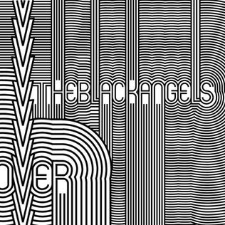
That Mexico City design is easily one of my favorites. The Black Angels stole the motif for the cover of their album Passover. I'm also intrigued by the Japan and Moscow games logos, which subvert the Olympic Rings with their own imposing branding.
The LA games logo looks like a cheap, mass-mailing inspired design. Luckily we have Atlanta to make up for it a little.
posted by Grundlebug at 6:23 AM on August 21, 2008
The LA games logo looks like a cheap, mass-mailing inspired design. Luckily we have Atlanta to make up for it a little.
posted by Grundlebug at 6:23 AM on August 21, 2008
Okay, 'of its time', 'key point in the development of signage,' sure. I'm not prepared to argue with that. But it gives me a headache. I suppose in 30 years you'll be saying that London's logo was actually a work of staggering genius.
posted by echo target at 6:28 AM on August 21, 2008
posted by echo target at 6:28 AM on August 21, 2008
Nobody's commented on the fact that the 1900 France one has the Eiffel Tower about to penetrate the woman on the coin?
posted by inigo2 at 6:41 AM on August 21, 2008
posted by inigo2 at 6:41 AM on August 21, 2008
The 2012 logo is a national disgrace. Coe was being interviewed the other day and he was saying things like 'of course the next Olympics cannot match this' and 'it's all about the legacy'. I really hope it ends up more London Eye than Dome but I can't say I'm that hopeful.
posted by fearfulsymmetry at 6:43 AM on August 21, 2008
posted by fearfulsymmetry at 6:43 AM on August 21, 2008
Interestingly, if you cross your eyes then straighten them out again while looking at the '68 poster, you can see a sailboat in 3-D.
IT'S A SCHOONER!
posted by inigo2 at 6:45 AM on August 21, 2008 [2 favorites]
IT'S A SCHOONER!
posted by inigo2 at 6:45 AM on August 21, 2008 [2 favorites]
I love the London logo. It shows the ingenuity of the designers who, using only post-it notes and hair gel wizzed up a logo in the cab ride over to the organising committee's offices- and sat straight faced while the £400000 bill was handed over.
posted by mattoxic at 6:51 AM on August 21, 2008 [2 favorites]
posted by mattoxic at 6:51 AM on August 21, 2008 [2 favorites]
I have a soft spot for Art-Nouveau/Arts-and-Crafts-movement style, so I'm digging the 1904 St. Louis one to the point that I"m thinking, "wow, can I download the image and make a poster of it?"
posted by EmpressCallipygos at 6:51 AM on August 21, 2008
posted by EmpressCallipygos at 6:51 AM on August 21, 2008
I like the 1980 logo, but points off for making all the rings red. The 1984 LA logo is pure pablum - red, white and blue stars. How long did that take to think up? And, while I can appreciate the distinctiveness of the '68 logo - it literally hurts to look at.
Waldi is still the best Olympic mascot.
posted by thewittyname at 6:55 AM on August 21, 2008 [1 favorite]
Waldi is still the best Olympic mascot.
posted by thewittyname at 6:55 AM on August 21, 2008 [1 favorite]
Waldi is still the best Olympic mascot.
Fatso begs to differ. He was much better than Syd, Ollie and Dickhead anyhow.
posted by Serial Killer Slumber Party at 7:13 AM on August 21, 2008 [2 favorites]
Fatso begs to differ. He was much better than Syd, Ollie and Dickhead anyhow.
posted by Serial Killer Slumber Party at 7:13 AM on August 21, 2008 [2 favorites]
Wow, great find, I've never seen them all gathered together in one place. In my opinion it went to shit after 1952. Italy succeeded in reviving the classical in 1960 but with the 1964, Tokyo it was all downhill (with a tip of the hat to the 1980, Moscow - classic).
posted by tellurian at 7:20 AM on August 21, 2008
posted by tellurian at 7:20 AM on August 21, 2008
London 2012 looks like a broken window, but if I understand correctly Vandalism is scheduled to be a demonstration sport that year so it makes sense.
posted by stupidsexyFlanders at 7:28 AM on August 21, 2008 [2 favorites]
posted by stupidsexyFlanders at 7:28 AM on August 21, 2008 [2 favorites]
London's is such an abomination, for comparison here is Chicago's attempt for 2016, Vancouver's winter logo for 2010, and what London could have had.
posted by Hypocrites at 7:40 AM on August 21, 2008 [1 favorite]
posted by Hypocrites at 7:40 AM on August 21, 2008 [1 favorite]
Wow, no love for Romulus and Remus nursing on a she-wolf in the Rome 1960 poster? Seriously, that's the only one of the bunch that makes me want to watch whatever it's advertising.
posted by [NOT HERMITOSIS-IST] at 7:41 AM on August 21, 2008 [1 favorite]
posted by [NOT HERMITOSIS-IST] at 7:41 AM on August 21, 2008 [1 favorite]
London 1012's made worse by the fact that none of the previous years have had a genuinely bad design
London 2012 is still the worst, but LA 1984 is bad. It looks like a decal from the side of a prototype missile. This was a better logo for those games.
posted by ROU_Xenophobe at 7:42 AM on August 21, 2008
London 2012 is still the worst, but LA 1984 is bad. It looks like a decal from the side of a prototype missile. This was a better logo for those games.
posted by ROU_Xenophobe at 7:42 AM on August 21, 2008
Wow, Hypocrites, that other London logo is so much amazingly better I can't believe it. I also love the Chicago one. (And I like the Mexico City one, but that's because it looks exactly like the doodles I make when I'm bored in meetings.)
posted by dpx.mfx at 7:46 AM on August 21, 2008
posted by dpx.mfx at 7:46 AM on August 21, 2008
Great link. I thought this was an interesting bit of trivia about Jesse Owens at the Berlin '36 games (that seems to have been more or less omitted from the official US version of the legend):
Jesse Owens’s participation in the Olympics was controversial due to his race, at a time when segregation and discrimination against blacks were the norm in much of the United States. However, once in Berlin, Owens was able to freely use public transportation and enter bars and other public facilities without the difficulty he would face as a black man in the United States.
posted by Atom Eyes at 8:01 AM on August 21, 2008
Oh wow, the 1980 one really nails the depressing, weirdo minimalism, and stark qualities of the Soviet experience. Its like an Orwellian punch in the eye. All the rings are red too. It must have been designed between gulag beatings during the Siberian eighty days of night.
posted by damn dirty ape at 8:07 AM on August 21, 2008 [1 favorite]
posted by damn dirty ape at 8:07 AM on August 21, 2008 [1 favorite]
The London 2012 candidate city logo was also classy, simple and effective, and had the advantage of not making people physically sick. Why they didn't at leats persist with the smart use of the shape of the Thames as a ribbon is just baffling, and painful.
posted by flashboy at 8:07 AM on August 21, 2008
posted by flashboy at 8:07 AM on August 21, 2008
Look at 2012 again. That's Maggie Simpson, not Lisa. Totally.
posted by spinturtle at 8:11 AM on August 21, 2008 [1 favorite]
posted by spinturtle at 8:11 AM on August 21, 2008 [1 favorite]
Wow. London's also-ran was spectacular. Bold, clean (though would be better if they simplified the Parliament clock tower), unmistakeably Britiish. Rule Britannia!
Chicago's was excellent, too. Simple, evokes the city, clean, spare.
And I <3 the inukshuk that VANOC chose.
posted by dirtynumbangelboy at 8:29 AM on August 21, 2008
Chicago's was excellent, too. Simple, evokes the city, clean, spare.
And I <3 the inukshuk that VANOC chose.
posted by dirtynumbangelboy at 8:29 AM on August 21, 2008
had the advantage of not making people physically sick.
I disagree. It resembles a tapeworm making its way through a gut.
posted by tellurian at 8:32 AM on August 21, 2008
I disagree. It resembles a tapeworm making its way through a gut.
posted by tellurian at 8:32 AM on August 21, 2008
London 2012 Hideousness Partially Explained, maybe:
The logo is the first in Olympic history to be able to use a variety of colours. The standard colours included green, magenta and blue, however the logo has incorporated a variety of colours, including the Union Flag to promote the handover ceremony. Sponsors have also incorporated their company colours in the logo, notable examples include Lloyds TSB and Adidas.
Emphasis mine.
Blechh.
posted by ZakDaddy at 8:34 AM on August 21, 2008
It's too bad they left out all the winter games. Now I can't complain about the smiling, erroneous 2010 inukshuk!
posted by Sys Rq at 8:34 AM on August 21, 2008
posted by Sys Rq at 8:34 AM on August 21, 2008
Chicago's is quite nice. Modern without looking like it'll be obviously dated in 15 years. Several layers of interpretation in the graphics used. Nice clean, distinctive color palette. I want Chicago to get the nod just so we can see some more.
posted by echo target at 8:35 AM on August 21, 2008
posted by echo target at 8:35 AM on August 21, 2008
That London also-ran probably got the axe for being entirely too "looming cruciform."
posted by Sys Rq at 8:36 AM on August 21, 2008
posted by Sys Rq at 8:36 AM on August 21, 2008
Top 3:
1) 1986 Mexico City - Geometric awesomeness
2) 1972 Munich - Iconic, quite literally
3) 1980 Moscow - Simple but effective
.. and a special mention to 1936. Totalitarianism breeds nice posters.
Bottom 3
n-2) 1984 LA - Simple but not effective
n-1) 1952 Helsinki - Learn to draw a human
n) 2012 London - How do you even get to this point?
posted by Harry at 8:37 AM on August 21, 2008
To be nitpicky, many of the examples aren't logos, per-se. They're more traditional, illustrative posters representing the games. An actual logo (i.e. a unique, repeated graphic symbol intended to identify the individual olympiad across various applications) don't seem to appear until '68 or so.
The Olympic symbol/logo itself (the 5 rings) seem to appear for the first time on the '32 poster.
And, yeah, that London 2012 logo is wretched. I would've failed my freshman design students if any of them had offered-up that solution. Unless the folks in the UK are foreseeing a huge '80s new-wave revival to be sweeping the globe in 2012, this thing is doomed.
posted by Thorzdad at 8:39 AM on August 21, 2008
The trivia is great. I hadn't heard this story before:
Japanese gymnast Shun Fujimoto performed on a broken right knee, and helped the Japanese team win the gold medal for the team championship. Fujimoto broke his leg on the floor exercise, and due to the closeness in the overall standings with the USSR, he hid the extent of the injury. With a broken knee, Fujimoto was able to complete his event on the rings, performing a perfect triple somersault dismount, maintaining perfect posture. He scored a 9.7 thus securing gold for Japan. Years later, when asked if he would do it again, he stated bluntly “No, I would not.posted by chunking express at 8:41 AM on August 21, 2008 [2 favorites]
what London could have had.
posted by Hypocrites at 7:40 AM on August 21
That is awful; it's even worse than the official logo. The type treatment is all wrong: it just abuts the mark instead of either being fully integrated or fully separated, and the tower-to-cross graphic looks like it was done in eight seconds with MS Paint by a blind, syphilitic gopher.
posted by Optimus Chyme at 8:44 AM on August 21, 2008
You know what's missing here? The designers (who were they and how was the work commissioned and what have they produced before and after). I just did some basic searches and couldn't find much information.
posted by tellurian at 8:46 AM on August 21, 2008
posted by tellurian at 8:46 AM on August 21, 2008
It is not New Wave but New Rave that is the culprit here.
posted by ninebelow at 8:47 AM on August 21, 2008
posted by ninebelow at 8:47 AM on August 21, 2008
"You know what's missing here? The designers (who were they and how was the work commissioned and what have they produced before and after)"
"what London could have had."
"it was done in eight seconds with MS Paint by a blind, syphilitic gopher"
Okay, that one is sorted. Next.
posted by tellurian at 8:54 AM on August 21, 2008
"what London could have had."
"it was done in eight seconds with MS Paint by a blind, syphilitic gopher"
Okay, that one is sorted. Next.
posted by tellurian at 8:54 AM on August 21, 2008
Your favorite Olympics logo sucks.
Amirite?
posted by cazoo at 9:03 AM on August 21, 2008 [1 favorite]
Amirite?
posted by cazoo at 9:03 AM on August 21, 2008 [1 favorite]
That is awful; it's even worse than the official logo. The type treatment is all wrong: it just abuts the mark instead of either being fully integrated or fully separated, and the tower-to-cross graphic looks like it was done in eight seconds with MS Paint by a blind, syphilitic gopher.
Well it would have to be refined. That logo was from BBC's user-submitted attempts and was likely done in MS Paint, it just happened to be my favorite.
posted by Hypocrites at 9:12 AM on August 21, 2008
Well it would have to be refined. That logo was from BBC's user-submitted attempts and was likely done in MS Paint, it just happened to be my favorite.
posted by Hypocrites at 9:12 AM on August 21, 2008
The Olympic symbol/logo itself (the 5 rings) seem to appear for the first time on the '32 poster.
No.. the rings date from much earlier than that. 1908 or thereabouts. The first use of them on the flag was in Antwerp 1920; that same flag was used until the games in Seoul, I believe.
posted by dirtynumbangelboy at 9:19 AM on August 21, 2008
No.. the rings date from much earlier than that. 1908 or thereabouts. The first use of them on the flag was in Antwerp 1920; that same flag was used until the games in Seoul, I believe.
posted by dirtynumbangelboy at 9:19 AM on August 21, 2008
Chicago's is quite nice. Modern without looking like it'll be obviously dated in 15 years. Several layers of interpretation in the graphics used. Nice clean, distinctive color palette. I want Chicago to get the nod just so we can see some more.
Actually, that logo has been replaced with this one — apparently you don't get to use a torch.
I really hope we don't actually get the Olympics. But it seems like Daley actually listened when it was the selection committee (instead of, e.g., Chicagoans) telling him our public transportation is a bad joke, so maybe it won't hurt if they string us along for a while longer.
posted by enn at 9:29 AM on August 21, 2008
What, no love for Tokyo '64? I think it's beautifully minimal. (Of course, I may be prejudiced because I was there.)
Another vote for London 2012 as the most hideous excrescence ever spewed at the public by a supposedly responsible organization. If I lived in London, I'd think seriously about moving rather than look at that for four years.
posted by languagehat at 9:29 AM on August 21, 2008
Another vote for London 2012 as the most hideous excrescence ever spewed at the public by a supposedly responsible organization. If I lived in London, I'd think seriously about moving rather than look at that for four years.
posted by languagehat at 9:29 AM on August 21, 2008
Nice demonstration of the evolution of design. But it's weird how the Olympics float in a design / artistic space all of their own, a synthetic pancontinental aspiration. It'd be interesting to compare design trends in commercial advertising art to the Olympics. Did Coca-Cola ever have such an awesome op-art thing like '68 in Mexico City? What did BMW's logos look like during the faux-classicism of '36 Berlin?
The logo that strikes me as most fresh today is Tokyo 1964. Maybe I've been watching too much Mad Men.
posted by Nelson at 9:38 AM on August 21, 2008
The logo that strikes me as most fresh today is Tokyo 1964. Maybe I've been watching too much Mad Men.
posted by Nelson at 9:38 AM on August 21, 2008
1980 Moscow looks like a big erection. I approve (of course), though the whole five-balls thing is a bit intimidating.
posted by troybob at 9:43 AM on August 21, 2008
posted by troybob at 9:43 AM on August 21, 2008
No.. the rings date from much earlier than that. 1908 or thereabouts.
Odd the rings don't appear on the early posters, then. Assuming, of course, these are typical examples of the official posters for the early Olympiads.
posted by Thorzdad at 9:50 AM on August 21, 2008
Odd the rings don't appear on the early posters, then. Assuming, of course, these are typical examples of the official posters for the early Olympiads.
posted by Thorzdad at 9:50 AM on August 21, 2008
Ya know what would be cool? A WINTER Olympics, with skiing and hockey and stuff.
posted by ethnomethodologist at 10:22 AM on August 21, 2008
posted by ethnomethodologist at 10:22 AM on August 21, 2008
To be honest, even though London's 2012 is ghastly, I can't say I'm a big fan of anything from 2000 and onward.
I find Stockholm's 1912 poster quite interesting, how the bands somehow have been caught in a vortex around his penis (and a guy standing behind him, obviously checking him out).
posted by bjrn at 10:34 AM on August 21, 2008
I find Stockholm's 1912 poster quite interesting, how the bands somehow have been caught in a vortex around his penis (and a guy standing behind him, obviously checking him out).
posted by bjrn at 10:34 AM on August 21, 2008
Careful examination of the 2010 Vancouver logo has finally revealed to me the location of the Village. And this whole time I thought it was in Wales.
posted by leapfrog at 10:39 AM on August 21, 2008
posted by leapfrog at 10:39 AM on August 21, 2008
It's like you can see the exact moment that people stopped studying art and started studying graphic design.
posted by troybob at 10:49 AM on August 21, 2008 [4 favorites]
posted by troybob at 10:49 AM on August 21, 2008 [4 favorites]
dnab: And I <3>it's been met with some consternation over here as not being representative of the native people of the area - BC, even the northern bits, isn't home to Inuit folk.
Something more influenced by, or coming from the Haida (as with a lot of the famous art around here) or other Coast Salish people would be more appropriate for the area, and so I still find it slightly weird that the logo welcoming the world to is based on a pathmarker belonging to a people roughly 2,000 miles north of the place they're being welcomed to.
posted by heeeraldo at 11:12 AM on August 21, 2008
I have no idea what just ate DNAB's quote; it should say "And I <3 the inukshuk that VANOC chose."
posted by heeeraldo at 11:12 AM on August 21, 2008
posted by heeeraldo at 11:12 AM on August 21, 2008
Adam Cadre (Olympic emblem connoisseur) on the 1980 Moscow and 1984 L.A. symbols:
Welcome to the Cold War. Doesn't this kind of sum up communism vs. capitalism in the 1980s? The Soviet emblem looks like something out of the early 1960s, much like the USSR's civilian technology at the time. "Comrade, you must design emblem that connotes reaching higher, and also building! For your service to the Motherland you will be given three extra ration cards and loaf of stale bread!" Meanwhile, the American emblem could only have come from a bloated advertising firm, and could not be more firmly rooted in the '80s without wearing an argyle sweater vest.
posted by Iridic at 11:20 AM on August 21, 2008
One of the most remarkable athletes was the American gymnast George Eyser, who won six medals even though his left leg was made of wood. - from 1904 St Louis, MO
Awesome.
posted by captainsohler at 12:04 PM on August 21, 2008
Awesome.
posted by captainsohler at 12:04 PM on August 21, 2008
the inukshuk that VANOC chose
...looks like a fat zombie that wants to give you a big hug as it eats your brains.
posted by ROU_Xenophobe at 12:11 PM on August 21, 2008
...looks like a fat zombie that wants to give you a big hug as it eats your brains.
posted by ROU_Xenophobe at 12:11 PM on August 21, 2008
Something more influenced by, or coming from the Haida (as with a lot of the famous art around here) or other Coast Salish people would be more appropriate for the area, and so I still find it slightly weird that the logo welcoming the world to is based on a pathmarker belonging to a people roughly 2,000 miles north of the place they're being welcomed to.
Exactly. And what's really odd is that Haida art is perfectly suited for logo design. The only reasons I can think of for the Inukshuk are a) pure ignorance, or b) mindful avoidance of Haida symbols. Maybe folks in BC see Haida art as kind of lame and cliché since it's on just about every available surface west of the Rockies, but, hey Vancouver, there's a reason for that ubiquity: Haida art looks good and is representative of the area. Sometimes the obvious choice is the best choice.
posted by Sys Rq at 12:26 PM on August 21, 2008
Wow, this is amazing. Up there ^ I mentioned that I went to the Tokyo Olympics; just now, going through some of my father's effects, I found a note he'd made of the prices for the tickets:
Op. day 16.80
T & Field 89.60
Bskbl - 11.20
_____
117.60
That's four tickets for each event (maybe fewer for some, but certainly not for the opening ceremony; there were obviously a number of t&f events). I can only imagine how much the equivalent would cost today.
posted by languagehat at 12:33 PM on August 21, 2008
Mexico City is the worst, with London 2012 trying hard to catch up. At least it doesn't cause dizziness & nausea.
posted by mike3k at 1:08 PM on August 21, 2008
posted by mike3k at 1:08 PM on August 21, 2008
The Vancouver 2010 logo needs the wedge of a mouth to go all the way across the head and a slightly skinnier torso with a T on it.
posted by clearly at 1:35 PM on August 21, 2008 [2 favorites]
posted by clearly at 1:35 PM on August 21, 2008 [2 favorites]
Best pre-war poster: Amsterdam, 1928.
Best post-war: Tokyo, 1964. Simple & elegant.
Why do so many of the post-2000 logos incorporate wee humanoid shapes? They're all dreadful (including the Vancouver Inukshuk, for all the reasons Sys Rq gives).
Love the Chicago ones. Dear lord, stay AWAY from dancing/racing/welcoming/bjing humans.
posted by jrochest at 2:53 PM on August 21, 2008
The early Paris is one is quite interesting too, in a classical gladiator kind of way.
Everyone is forgetting that the 2012 logo is pretty awesome, though.
posted by Harry at 2:58 PM on August 21, 2008
Everyone is forgetting that the 2012 logo is pretty awesome, though.
posted by Harry at 2:58 PM on August 21, 2008
However, for sheer uglitude, you need to check out the mascots.
posted by jrochest at 3:08 PM on August 21, 2008 [1 favorite]
posted by jrochest at 3:08 PM on August 21, 2008 [1 favorite]
you need to check out the mascots.
Quatchie? Really? Quatchie? They have a mascot named the sound of particularly unpleasant diarrhea?
posted by ROU_Xenophobe at 3:50 PM on August 21, 2008
Quatchie? Really? Quatchie? They have a mascot named the sound of particularly unpleasant diarrhea?
posted by ROU_Xenophobe at 3:50 PM on August 21, 2008
At least the Vancouver 2010 mascots are cute. The Atlanta thing looks just like you would expect from sticking a group of designers in the Big Brother house for six months. Even a two-toothed hillbilly would have been more elegant.
posted by troybob at 4:36 PM on August 21, 2008
posted by troybob at 4:36 PM on August 21, 2008
I think Mexico's cool, but not a good symbol. As mentioned in Iridic's link, the concept of the "Logo" for the Olympics has evolved, from posters to clip art. Especially looking at the symbols used by cities that lost the bid, it doesn't even come close to Berlin or Munich. Its unfair to compare art and logos.
posted by Suparnova at 5:09 PM on August 21, 2008
posted by Suparnova at 5:09 PM on August 21, 2008
Many of these aren't really logos, they're posters. The Montreal logo was the red thing in the upper left corner, not the "wooshing rings" in the center.
(When I was a kid, we had glasses with the Montreal logo on them. We got them for free: underneath the logo, there was an inscription. "Montréal 1975")
posted by Monday, stony Monday at 5:33 PM on August 21, 2008
(When I was a kid, we had glasses with the Montreal logo on them. We got them for free: underneath the logo, there was an inscription. "Montréal 1975")
posted by Monday, stony Monday at 5:33 PM on August 21, 2008
Ugh. I enjoyed the thread from work but couldn't check out the post itself until I got home. I think I was repressing just how bad 2012 is and being reminded was like a punch in the face.
Munich is beautiful. Berlin and Montreal also great. Tokyo and Mexico City both doing their thing. Atlanta pretty cool while L.A. shit sandwich. So, yeah, what everyone else said.
Also, those fucking Athens mascots actually enrage me for some reason.
posted by Durn Bronzefist at 5:37 PM on August 21, 2008
Hmm. I have yet to visit Mexico City or Atlanta, but so far, that's pretty much my opinion of those cities, too.
posted by Durn Bronzefist at 5:42 PM on August 21, 2008
posted by Durn Bronzefist at 5:42 PM on August 21, 2008
Oh come on, now. The London 2012 mark isn't that bad -- at least it's not generic, bland crap like Barcelona 1992.
And yes, troybob, it looks like that moment occurred around 1961.
posted by sportbucket at 5:45 PM on August 21, 2008
And yes, troybob, it looks like that moment occurred around 1961.
posted by sportbucket at 5:45 PM on August 21, 2008
Oh come on, now. The London 2012 mark isn't that bad
Are you serious? 2012 is proof that cocaine is still the drug of choice among ad men.
posted by Durn Bronzefist at 5:50 PM on August 21, 2008
Are you serious? 2012 is proof that cocaine is still the drug of choice among ad men.
posted by Durn Bronzefist at 5:50 PM on August 21, 2008
...if not simply proof of their animated fantasies...we might be lucky it doesn't look like something out of 'heavy metal'...
posted by troybob at 6:17 PM on August 21, 2008
posted by troybob at 6:17 PM on August 21, 2008
There's been a lot of anti-2010 Olympics graffiti here in Vancouver, and this version of the Olympic rings is original. The poorly-done "Riot 2010" stuff is basically an eyesore though.
posted by Zack_Replica at 8:29 PM on August 21, 2008
posted by Zack_Replica at 8:29 PM on August 21, 2008
Durn: Are you serious? 2012 is proof that cocaine is still the drug of choice among ad men.
Cocaine is a hell of a drug.
The 2012 logo is arguably on the edge of good taste, but Olympic logos recently are so bland and self-consciously inclusive that a mark like this, which makes people react strongly, even if it's negatively, is a welcome change, if I do say so my damned self.
posted by sportbucket at 9:46 PM on August 21, 2008
Haida art looks good and is representative of the area.
As I recall, the aboriginal groups whose traditional territory actually encompasses Vancouver/Whistler weren't crazy about the "ancient enemy" Haida idea. (BC is very diverse, with about aboriginal 30 languages spoken and 1/3 of all First Nations in Canada.
posted by Rumple at 11:59 PM on August 21, 2008
Am I the only one who feels waves of deep pyschic pain looking at the 2000 Sydney posters? It's like my soul is being disemboweled.
Perhaps it's just the juxtaposition with 1996 Atlanta, which is so much classier than what we came up with for a mascot. I remember that blue blobby thing in all of its awfulness - I had no idea that the actual *posters* didn't suck that hard.
posted by grapefruitmoon at 7:25 AM on August 22, 2008
Perhaps it's just the juxtaposition with 1996 Atlanta, which is so much classier than what we came up with for a mascot. I remember that blue blobby thing in all of its awfulness - I had no idea that the actual *posters* didn't suck that hard.
posted by grapefruitmoon at 7:25 AM on August 22, 2008
I... actually really like the London 2012 logo. The one used for the bid was so incredibly bland. I really like that it doesn't use Big Ben or the Thames, and the colours are ace.
posted by pocketfluff at 7:48 AM on August 22, 2008
posted by pocketfluff at 7:48 AM on August 22, 2008
As I recall, the aboriginal groups whose traditional territory actually encompasses Vancouver/Whistler weren't crazy about the "ancient enemy" Haida idea.
Well, there's that, yeah: Haida are up around the Queen Charlottes. Whoops. Replace all above instances of "Haida" with "Salish" and I think my point still stands.
posted by Sys Rq at 7:56 AM on August 22, 2008
Well, there's that, yeah: Haida are up around the Queen Charlottes. Whoops. Replace all above instances of "Haida" with "Salish" and I think my point still stands.
posted by Sys Rq at 7:56 AM on August 22, 2008
Well, they were pissed about the the use of the Inuit thing as well.
Then consider the Inuit perspective that the logo was IIRC designed by some white women from Kitsilano and the story is still a bubbling resentment across Canadian FN.
posted by Rumple at 11:48 AM on August 22, 2008
Then consider the Inuit perspective that the logo was IIRC designed by some white women from Kitsilano and the story is still a bubbling resentment across Canadian FN.
posted by Rumple at 11:48 AM on August 22, 2008
I... actually really like the London 2012 logo. The one used for the bid was so incredibly bland. I really like that it doesn't use Big Ben or the Thames, and the colours are ace.
'Fess up. You designed the 2012 logo, didn't you?
posted by mazola at 9:23 PM on August 22, 2008
'Fess up. You designed the 2012 logo, didn't you?
posted by mazola at 9:23 PM on August 22, 2008
"the logo was IIRC designed by some white women from Kitsilano"
suddenly I am surprised that the logo isn't a dog, in yoga pants, leaping out of a handbag or out from some arugula or organic heirloom tomatoes in each of the colors of the rings.
posted by heeeraldo at 12:48 AM on August 23, 2008
suddenly I am surprised that the logo isn't a dog, in yoga pants, leaping out of a handbag or out from some arugula or organic heirloom tomatoes in each of the colors of the rings.
posted by heeeraldo at 12:48 AM on August 23, 2008
heeraldo: That's pretty much what my friends and I thought about the logo. Lululemon sweats, TNA shoulderbag, a grande half mocha double-shot ultra-low-fat milk in one hand, and taking up most of the sidewalk with one of those 3-wheeled strollers that you can jog with I'm so not even going to notice you expression someone get me a small tactical nuke already.
The logo: Ok, snark aside, for anyone who isn't familiar with the First Nations in British Columbia, there are a great many FN bands in BC, with different languages, and different ways of representing their cultures, beliefs, stories, histories, etc. through art and symbolism. Some really great examples can be found at the following sites...
U'mista Cultural Society
Roy Henry Vickers, Tsimshian tribe
and of course Bill Reid (it's possible you may be familiar with this image from this place).
The inuksuk that was chosen is used by the peoples who live above the Arctic Circle, and has no bearing or relationship with the peoples living in the south. BC and indeed all of Canada has been/is in talks with many FN bands to repair damages done through exploitation through the early settlers by giving rightful recognition and recompense to the individual bands that were, in the past, lumped together as being "Indians," and the racialism that went along with that. In choosing this symbol, it's seen as a belittling and dismissive gesture to local FN peoples by the BC government which really doesn't impress people, as you may have gathered.
My tangent aside, thanks for the post. All the posters are very representative of the times that they were created in, for better or for worse, but always interesting.
posted by Zack_Replica at 10:11 PM on August 23, 2008
and of course Bill Reid (it's possible you may be familiar with this image from this place).
also this sculpture, of which the original resides in Washington DC, a replica can be found in Vancouver International Airport, and an image of which is on the Canadian $20 bill.
posted by heeeraldo at 12:47 PM on August 24, 2008
also this sculpture, of which the original resides in Washington DC, a replica can be found in Vancouver International Airport, and an image of which is on the Canadian $20 bill.
posted by heeeraldo at 12:47 PM on August 24, 2008
« Older Listen Explore Discover Create | Ten French soldiers killed in afghanistan Newer »
This thread has been archived and is closed to new comments
posted by Jofus at 4:46 AM on August 21, 2008