Book Design
March 4, 2010 10:00 PM Subscribe
In the United States, “we tend to want to use every inch, to fill; up with color, and to get it to do as much as it can do. Everything here is bigger, more commercial, more targeted to sell and to advertise. In Europe, the covers are geared to look more like the way they dress: very simple. Their use of negative space goes along with the theory of less is more."
What do book cover designs and designers tell us about our reading culture? And what will the future of book design be in the digital future?
Previ-ously
What do book cover designs and designers tell us about our reading culture? And what will the future of book design be in the digital future?
Previ-ously
Your "Everything" link would make a wonderful post all by itself. I'm not at all sure how it informs your thesis here, but it's the best thing I've seen all day: That link again.
posted by George_Spiggott at 10:17 PM on March 4, 2010 [1 favorite]
posted by George_Spiggott at 10:17 PM on March 4, 2010 [1 favorite]
These seem like very suspect just-so explanations.
posted by Solon and Thanks at 10:19 PM on March 4, 2010 [1 favorite]
posted by Solon and Thanks at 10:19 PM on March 4, 2010 [1 favorite]
(in the "less is more" link.)
posted by Solon and Thanks at 10:19 PM on March 4, 2010
posted by Solon and Thanks at 10:19 PM on March 4, 2010
So, we are all taught not to judge a book by it's cover (at least that's what I learned at my very first 'job', starting at around age 8 when a local children's bookstore as a favor to me and my parents let me come in and work organizing books, in exchange for books, which I coveted and read hungrily). But I wonder (and recently explored a bit) how a cover informs our interpretation of a book. I looked for then, and again now, some kind of studies maybe looking at how different types of covers might vary interpretations of the book. I never found anything that really satisfied my curiosity.
But, that said, covers can say a lot and do a lot for me, personally, in making me reach for a book I've never heard of. On the other hand, those covers they make when the movie comes out for a book drive me crazy - the ones that say "Now a major motion picture" and show a still of the actors. I'm always embarassed to be seen with them, if I miss the cut and end up with the damn movie version of a popular book. Long live the library for helping me avoid that.
posted by bunnycup at 10:20 PM on March 4, 2010 [2 favorites]
What do book cover designs and designers tell us about our reading culture?
Well this is not a question about reading culture as much as it is about corporate branding. Why the difference? Some ad departments think they are smarter than other ad departments.
I see this in films too. Some titles in Sweden are translated (some literally and some very poorly) and some are not translated at all. I remember the (completely forgettable) film "City Hall" which was marketed in Sweden as "Makt Spel" (Power Play) when "Stadhuset" (CIty Hall) would have worked just fine.
I have a friend who writes Swedish subtitles for English language films and she jokes about the "ad" department having knock-down drag-out fights over stuff like this.
And one thing you will see in Europe that you won't see in any American ad - profanity. Actual words used by actual adults where actual children can see them. Like the (awful) Swedish film "Fucking Åmal" which was re-branded in the US as "Show Me Love." You can blame American censorship and not branding for that one.
posted by three blind mice at 10:28 PM on March 4, 2010 [1 favorite]
I have a lot of occasion to see both the UK and US covers of various books and I do find I prefer the UK covers; they tend to be more abstract, with a stronger emphasis on design rather than literal realism. The Jordan covers and the accompanying text in the "less is more" link are pretty illustrative of what I've seen; I have a particular loathing of bad representational art on fiction covers as shown there, and these are a plague on US SF and Fantasy; they do nothing but rob from the imaginative experience. ...Not that I've ever been tempted to read Jordan anyway.
posted by George_Spiggott at 10:33 PM on March 4, 2010 [2 favorites]
posted by George_Spiggott at 10:33 PM on March 4, 2010 [2 favorites]
The Jordan covers and the accompanying text in the "less is more" link are pretty illustrative of what I've seen; I have a particular loathing of bad representational art on fiction covers as shown there
Ah yes, Darrell K. Sweet. The Thomas Kincaid of genre cover art. Except at least Kincaid can be kind of pleasant (if saccharine) to look at occasionally. Darrell K. Sweet covers are just ugly.
Darrell K. Sweet is a running joke among people who care about such things. Which, judging by sales figures, appears to be limited to you, me, and THATS THE LIST.
posted by Justinian at 10:49 PM on March 4, 2010 [2 favorites]
Americans dress like the rustic backwater hicks they are. Jeans and button-down shirt of some sort, polo or oxford, crew socks and sneakers. Take one look at the shoes... are they long and silly and =men's= shoes, on a man? Who's also wearing flat-front slacks or oddly tinted denim jeans, and an over-elaborate t-shirt print, or over-stuffed parka in June on the Mediterranean coast with nonsensical english-sort-of words on it?
Yeah.
American design gives value for dollar. Euro design screams, "Daddy didn't love me! Look here! Look here! Loooooook! At me!"
posted by Slap*Happy at 11:14 PM on March 4, 2010 [1 favorite]
Yeah.
American design gives value for dollar. Euro design screams, "Daddy didn't love me! Look here! Look here! Loooooook! At me!"
posted by Slap*Happy at 11:14 PM on March 4, 2010 [1 favorite]
Based on the samples linked here, I get the impression that it's not so much a systematic difference of philosophy; more that in the US the range of options for a cover includes something in a well-established tradition of covers which depict realistic scenes; a tradition which might be linked to the greater prominence of comic books in US culture (?). That kind of cover would not really be viable in the UK: in the British context a straight realistic picture of a scene from the story risks making it look like a kid's book.
posted by Phanx at 11:30 PM on March 4, 2010 [1 favorite]
posted by Phanx at 11:30 PM on March 4, 2010 [1 favorite]
Another reason for covers looking the way they do. Author Justine Larbalestier on the cover to her novel depicting a white girl when the book's main character isn't white. Luckily, the outcry produced a favorable solution.
posted by cmgonzalez at 11:42 PM on March 4, 2010 [1 favorite]
posted by cmgonzalez at 11:42 PM on March 4, 2010 [1 favorite]
I agree that the final link seems like just so explanations, especially in light of the fun UK vs US comparisons in earlier links.
Also, according to Amazon.co.uk, the black cover of Jonathan Strange seems to be just as prevalent in the UK as the white one, if not more so. I know that my three volume US edition has one black, one white, and one red cover.
posted by milestogo at 11:44 PM on March 4, 2010 [1 favorite]
Also, according to Amazon.co.uk, the black cover of Jonathan Strange seems to be just as prevalent in the UK as the white one, if not more so. I know that my three volume US edition has one black, one white, and one red cover.
posted by milestogo at 11:44 PM on March 4, 2010 [1 favorite]
I used to know a professor - pretty damned good one, actually, and he advised on my thesis when I was an undergraduate - who didn't leave the covers on most of his more treasured books. He'd unbind them, remove the front and back, put three hole punches in them, and put them in the appropriate sized binders. He'd always say that this made more sense mostly because he could add pages for notes, but also because it made it a lot more natural to lay the book down flat on a table.
And, he said, usually it was nice to get rid of the distracting cover.
posted by koeselitz at 12:20 AM on March 5, 2010 [1 favorite]
And, he said, usually it was nice to get rid of the distracting cover.
posted by koeselitz at 12:20 AM on March 5, 2010 [1 favorite]
Put me down as another American who can't stand that Jordan cover. I almost didn't read a couple of wonderful James Blaylock books because of their not so sweet Sweet covers. I'm going to have to go look for some good ones in the Chesley awards just to get that image out of my head. On second thought, best just to go to V&A.
posted by BrotherCaine at 12:32 AM on March 5, 2010
posted by BrotherCaine at 12:32 AM on March 5, 2010
Come one people, these links are only about book covers in the United Kingdom. This has nothing to do with "Europe", only with the UK.
Besides the fact one the UK is more culturally like the 51st state of the USA than a European country (ok, that's arguable, but bear with me), if this post wanted to go about European book covers, you'd want to link to the following as well:
- amazon france
- BOL (netherlands)
- Buchpark (germany)
etc.
posted by knz at 12:54 AM on March 5, 2010 [5 favorites]
stratastar: “What do book cover designs and designers tell us about our reading culture? And what will the future of book design be in the digital future?”
The biggest indicator of our 'reading culture' isn't what's on the book covers, but how many there are of them. We should be printing several orders of magnitude fewer books. Libraries are declining in usage gradually, and have been for the last twenty years; everybody's hung up on this being about 'digital culture' and 'ebooks' and all that, but that's bullshit, and the fact that this trend is two decades old proves it. The decline in the use of libraries has nothing to do with digitization of books; it has to do with western ownership culture and our growing disdain for public places and public things. We want to own the books we read, we want them to be our books, so that we don't have to afford them any reverence or give any effort toward their upkeep, and so that they can satisfy our craving for possession. That's why there is a fetish surrounding the attractiveness of book covers, and, in Europe as in the United States, books are carefully designed to satisfy the local norms about what is an attractive use of space and what makes a worthy commodity. We see everything in our lives as a potential product, something to be consumed; books are no different, and we really don't care how many trees we have to chop down to keep feeding our endless, hideously unsustainable habit.
My own philosophy regarding books may seem idiosyncratic, but I've spent enough time around them for it to make sense to me. Most of the publishers I really like are German ones; for some reason, German publishers seem to have a knack for producing beautiful volumes which are clearly intended to last a long, long time. I guess I should also say that I don't think I believe in paperbacks; paperbacks are almost invariably wasteful, because a book that's worth printing is worth printing so that it will last, and because people spend so little time actually reading books that we could probably make do nicely with one hardcover replacing every four paperback printings of any given book if we'd just learn to share them a bit more. People don't seem to think about how much paper we watch fly by our faces every day of our lives. I'm not saying everyone should be a hand-wringing, self-flagellating hippy or something, but trees are worth a hell of a lot more than this kind of treatment. Books can be a beautiful and nearly sacred thing, but for them to occupy that space in our lives we have to do justice to the sacrifice trees make in order for them to exist, and, in turn, we need to learn to be a little more restrained about our production of books, I think.
I hope I don't sound too much like a curmudgeon when I say so, but this obliviousness to the sources of things makes me sort of sick and annoyed when I think about "reading culture" as it is, at least in the US. In the past ten years, huge chain bookstores like Barnes & Noble and Borders have crept in and occupied the void left by the decline of the traditional library, and one only has to browse the aisles of one's local chain bookstore to see the "reading culture" this has encouraged. And I should say that it is indeed good that some public space devoted to books now exists, because I'd worried that that was really something we were losing. But there's something flat, something stale about them. I think what I feel flows from the fact that these chain bookstores encourage us to value books for their own sake, as simple objects; they do this, of course, because they want us to buy those books. And this lie of the value of books for their own sake is a pleasing and seductive lie, especially for those of us who've spent a big chunk of our lives engrossed within and enthralled by particular books; it seems well and good that we'd be surrounded by them, that we'd be enticed by the shinier ones, that we'd be encouraged to take them home and keep them forever for our very own.
But it's still a lie. Books are not good for their own sake. A book is not good because it's printed on paper and bound between two cardboard flaps. A book is good because it's a voice from the past, because it's a connection to another human being, because it's a work of art or a form of communication. Owning a book is merely a convenience. The essential benefit of books resides in reading them. That's why I feel like covers are more than a little ephemeral, and I might even say they're an annoying and cumbersome distraction from something vastly more important.
posted by koeselitz at 1:13 AM on March 5, 2010 [17 favorites]
you'd want to link to the following as well
L'adresse internet que vous avez entrée dans votre navigateur ne correspond à aucune page active de notre site.
posted by Phanx at 1:30 AM on March 5, 2010
L'adresse internet que vous avez entrée dans votre navigateur ne correspond à aucune page active de notre site.
posted by Phanx at 1:30 AM on March 5, 2010
I normally much prefer UK/european covers to their US equivalents. The one exception I know of personally is that I'm jealous that folks in the US get this cover for the Girl with the Dragon Tattoo wheras here in the UK we are stuck with this cover (not bad exactly, but not great either).
posted by jzed at 1:39 AM on March 5, 2010
posted by jzed at 1:39 AM on March 5, 2010
As a matter of fact, the UK book covers have pretty much followed the US bling fashion. Continental Europe remains far more restrained. Compare the US and UK covers for the Girl with the Dragon Tattoo with the French, Spanish, German, Swedish. (BTW, Stieg Larsson's success in France has been credited in no small measure to the cover art).
posted by Skeptic at 2:08 AM on March 5, 2010 [2 favorites]
posted by Skeptic at 2:08 AM on March 5, 2010 [2 favorites]
Also note how differently the title has been translated: the original Swedish title translates as "The men who hated women". In France and Spain, this has been translated almost literally as "The men who did not love women". The German editors, however, have gone on a complete tangent, and titled the book "Verblendung", which means the act of being blinded, or bedazzled.
posted by Skeptic at 3:02 AM on March 5, 2010
posted by Skeptic at 3:02 AM on March 5, 2010
Actually, "Män som hatar kvinnor" = "The men who hate women". The name is even stronger with present tense, as it puts a creepy suspicion over every male character in that book. I usually don't care about translation choices in titles, but that is such a great evocative title to waste in translation.
posted by Free word order! at 3:20 AM on March 5, 2010
posted by Free word order! at 3:20 AM on March 5, 2010
You know you can just take off the dust jacket and throw it away.
posted by Pollomacho at 4:51 AM on March 5, 2010
posted by Pollomacho at 4:51 AM on March 5, 2010
I don't know, in that first link the UK covers seem far more "advertisey" than the US ones. Hard to make these kinds of judgments from a dozen covers, though...
posted by r_nebblesworthII at 5:05 AM on March 5, 2010
posted by r_nebblesworthII at 5:05 AM on March 5, 2010
But I wonder (and recently explored a bit) how a cover informs our interpretation of a book.
Having recently read two of the books featured in the links, this is something that struck me too. The Gate at the Stairs--aside from unexpectedly zagging far from the narrative I'd expected about halfway through--has pretty much no connection to the imagery on the U.S. cover, leaving me vaguely befuddled whenever I'd pick it up. (Tarmac? Daybreak? What was I reading?)
Kafka on the Shore, on the other hand...one could probably put anything on the cover of that book (and, sure, make it Hebrew) and have it plausibly evince the same reaction.
posted by kittyprecious at 5:22 AM on March 5, 2010
The book's more important though, right?
Not in a discussion about design.
That Book Design Review link is great. But what do I see when I look for its latest posts: "After almost 5 years and 1,112 posts, I've decided to put The BDR on indefinite hiatus." Oh man, how come I only find out about cool stuff once its over?
I've linked it before but the Caustic Cover Critic blog is great too.
posted by ninebelow at 5:31 AM on March 5, 2010
I have a lot of occasion to see both the UK and US covers of various books and I do find I prefer the UK covers; they tend to be more abstract, with a stronger emphasis on design rather than literal realism.
A great example of this:
Use Of Weapons UK
Use Of Weapons US
posted by EndsOfInvention at 5:34 AM on March 5, 2010
A great example of this:
Use Of Weapons UK
Use Of Weapons US
posted by EndsOfInvention at 5:34 AM on March 5, 2010
Yeah, the UK isn't Europe. Continental bookcovers are so much more minimal, but I think part of it could be explained by the difference in book production by country. When you are producing 5x the number of books you need ways of distinguishing them for consumers. But is it really a bad thing that we write, read, and own so many books?
And what of the fact that many of the classics, don't even need to be owned anymore. They're online and we have easy ways of reading them for free, does that add to their essential value now that they are no longer physical objects for many people, or remove it?
Justinian - Oh how I hate Darrell K. Sweet as well... in one of the previous posts someone linked to Tor's ebook cover art of Jorden's books, including artist drafts.
posted by stratastar at 5:43 AM on March 5, 2010
What you have described as the US edition of Use Of Weapons is actually the original UK edition. Was it actually ever published in the US? Agreed that the newer UK edition - complete with wooden chair - is awful.
Justinian: a few more people than just you two. But yes, we do seem to be a minority.
There are good US covers and good UK covers but when it comes to science fiction and fantasy the US is in a league of its own in terms of bad covers. Look at Baen Books for instance. Now, they aren't entirely representative but they arent' anywhere near rare enough.
The big book cover controversy in fantasy at the moment is cliche of the hooded and cloaked figure. Fantasy novelist Mark Newton, an ex-bookseller who now works in the publishing industry, responds that it is just good business sense.
posted by ninebelow at 5:43 AM on March 5, 2010
The decline in the use of libraries has nothing to do with digitization of books; it has to do with western ownership culture and our growing disdain for public places and public things.
I agree with the disdain of public places and things, but I don't agree that it's about ownership per se. It's more a fetishization of the individual. I have no ties to society! I am an island! I share nothing, I require nothing! I stand alone and wave MY book!
One need only look at the political demographics of libraries (users, supporters, supressors, censors, etc) to see how true this is. And the fact that it is spreading to other cultures indicates that this peculiarly American obsession is being transmitted via our TV, movies and (ironically) books like so many of our other obsessions.
posted by DU at 5:46 AM on March 5, 2010 [1 favorite]
empath: That superman link is fantastic.
I much preferred the original to all of the new covers.
Also, British covers are much more similar to US covers than than European covers, which isn't weird since they're the same language market. European covers tend to be much, much more abstract and restrained than ones from Anglophone countries, especially French ones, many of which are still published essentially without a cover design (other examples 1, 2, 3).
posted by Kattullus at 5:50 AM on March 5, 2010
A great example of this:
Use Of Weapons UK
Use Of Weapons US
What you've got there are the current-minus-one Orbit edition, from the UK and US, and the first UK Orbit edition.
posted by ROU_Xenophobe at 5:58 AM on March 5, 2010
Use Of Weapons UK
Use Of Weapons US
What you've got there are the current-minus-one Orbit edition, from the UK and US, and the first UK Orbit edition.
posted by ROU_Xenophobe at 5:58 AM on March 5, 2010
Actually, the current UK cover of Use Of Weapons is probably better than either of those; less generic than the first one, less literal (and shit) than the second one, nice use of a single colour scheme. The redesign of the whole series is a very nice updating of the previous covers.
posted by ninebelow at 5:59 AM on March 5, 2010
posted by ninebelow at 5:59 AM on March 5, 2010
Huh, I was under the impression that was the US version. I stand corrected (by an OU of all things).
posted by EndsOfInvention at 5:59 AM on March 5, 2010 [1 favorite]
posted by EndsOfInvention at 5:59 AM on March 5, 2010 [1 favorite]
Kattullus I wouldn't call that as being "without a cover design". In fact those are classic cover designs (especially the minimalistic "Pléiade" covers, which have much influenced French cover design). The difference is rather than French, Spanish, Italian and, to a lesser extent, German publishers put a lot more emphasis in brand identity, organising "collections" of titles with very much the same look and feel. Ironically, the original model for this approach are the classic Penguin covers...
posted by Skeptic at 6:07 AM on March 5, 2010 [2 favorites]
posted by Skeptic at 6:07 AM on March 5, 2010 [2 favorites]
I was under the impression that was the US version.
I can go to the other room and check, but I have that edition and I'm pretty sure it's Orbit UK.
The best Banks covers were the old black-and-white Macmillan covers for the non-M's.
posted by ROU_Xenophobe at 6:11 AM on March 5, 2010
I can go to the other room and check, but I have that edition and I'm pretty sure it's Orbit UK.
The best Banks covers were the old black-and-white Macmillan covers for the non-M's.
posted by ROU_Xenophobe at 6:11 AM on March 5, 2010
Owning a book is merely a convenience. The essential benefit of books resides in reading them.
Right, agreed - which is why the pro-hardcover argument boggles my mind. I detest hardcovers, I will not buy any book in hardcover. My husband recently got a new book from the library in hardcover, and I tried to read it. It was so heavy to hold while laying in bed to read last night (and I read, in bed, every night, have done since I learned to read). After trying to prop the book up on a pillow, sit directly up to read, and other convoluted attempts, with a sore back/neck and wallowing in frustration, I asked him to return the hardcover to the library. I'll read the damn book when it comes out in a size I can hold.
My love of books has nothing to do with possession fetishes. I like to read. I try only to buy books I anticipate reading several times, and I do frequently re-read my books. I've probably been less picky about certain sexual partners than I am about whether to buy a book or borrow it. In addition to reading in bed, I like to carry them on planes, trains and automobiles. A hardcover simply satisfies none of my book-reading needs. Other than mandatory textbooks, I haven't purchased a hardcover in years. Hardcovers are great for "building a library" to last the ages and to impress the people who visit with your wide, eclectic reading tastes - but who wants to lug the thing around and get neck pain trying to read it? And for me, at the end of a day, books are for reading.
posted by bunnycup at 6:13 AM on March 5, 2010
Following up Justine Larbalestier's assertion that covers change how people read (nice link, cmgonzalez!), I love the covers for Lombardo's Iliad & Odyssey. Much more compelling than the typical Greek pottery.
posted by ahughey at 6:16 AM on March 5, 2010
posted by ahughey at 6:16 AM on March 5, 2010
I like how the links that compare US and UK book covers tell us which ones to like better.
posted by Uther Bentrazor at 6:20 AM on March 5, 2010
posted by Uther Bentrazor at 6:20 AM on March 5, 2010
Yeah, hardbacks are a fucking pain in the arse. As far as I can tell, the only point of them is to charge twice the price for the first 6 months after publication to squeeze more money out of people who are too eager to read a book to wait for the paperback.
posted by EndsOfInvention at 6:24 AM on March 5, 2010
posted by EndsOfInvention at 6:24 AM on March 5, 2010
I hate hardbacks too and I would love to live in a world where only paperback originals were published. That said:
a) Some (deluded) people prefer hardbacks so there is a market for them
b) Publishers can make the same profit by selling fewer books which is a good thing for writers given how small most of their sales figures
c) Publishers get two shots at the prize in terms of reviews, adverts and bookshop placement. Again, it is hard to begrudge this given how many books sink without a trace.
So I'm not that concerned about publishers trying to maximise profit for themselves and their authors, particularly when for every book I want to read now but can't because it is in hardback, there is is one published last year which has just been released in paperback.
posted by ninebelow at 6:38 AM on March 5, 2010
it has to do with western ownership culture and our growing disdain for public places and public things.
That's not true. I'm not spending any money buying fiction books I haven't already read and don't know if I'll read again. I'd go to the library more if the baby boomers weren't so loud about being angry about having a queue to use the dozen internet computers.
posted by anniecat at 6:41 AM on March 5, 2010
The knitting design world isn't exactly immune to bad cover decisions, either. When I worked for a UK knitmag, I learned that a [very popular UK designer] had chosen photos of my boss' (ADORABLE) mixed race child for the cover of her book there. The book was republished in the US, but the publisher here refused to put the kid on the cover and replaced her with a blonde white girl instead. Blech.
posted by bitter-girl.com at 6:53 AM on March 5, 2010
posted by bitter-girl.com at 6:53 AM on March 5, 2010
Wow, I universally preferred the UK cover art to the US art. Does that make me a bad American? Or is their theory that Americans want this stuff jacked?
posted by fusinski at 7:03 AM on March 5, 2010
posted by fusinski at 7:03 AM on March 5, 2010
I have precisely one hardcover fiction book. It's a collection of shorts from Faulkner, published by the Modern Library and is about the same size as a 250 page paperback. It's wonderful: not too large, somehow feels 'grown up', and has made me question my hatred of hardbacks.
posted by vbfg at 7:24 AM on March 5, 2010
posted by vbfg at 7:24 AM on March 5, 2010
Wow. The Jordan cover in that "less is more" link is like a parody of bad cover art. Or is it maybe just truth in advertising?
"This book contains poorly-drawn characters with really weird perspectives that stand around and talk a lot. Plus! Edge-of-your-seat map-reading action!"
posted by straight at 7:38 AM on March 5, 2010 [1 favorite]
"This book contains poorly-drawn characters with really weird perspectives that stand around and talk a lot. Plus! Edge-of-your-seat map-reading action!"
posted by straight at 7:38 AM on March 5, 2010 [1 favorite]
I can't help but think that a huge part of this supposed US/UK difference is confirmation bias. C. Max Magee (the Millions blogger) declares that there's a trend, then posts a string of cover comparisons which have as many simple, artsy UK covers and bold, colorful UK covers as the contrary. But then he just sweeps these away as exceptions to the rule.
Maybe there is a wider trend that's not very well showcased in these links, but I'm not convinced by what's here.
I will say that the disparity between US and UK adult sff book covers is pretty marked. And I also hate Darrell K. Sweet's work, but he got me interested in cover art (as an, er, negative example) which by extension led to my casual interest in book design, so thanks, Darrell.
posted by bettafish at 7:45 AM on March 5, 2010
We want to own the books we read, we want them to be our books, so that we don't have to afford them any reverence or give any effort toward their upkeep, and so that they can satisfy our craving for possession
The reason I want personal copies of my books is because I only want my bathroom germs on them. :)
posted by longdaysjourney at 7:47 AM on March 5, 2010
The reason I want personal copies of my books is because I only want my bathroom germs on them. :)
posted by longdaysjourney at 7:47 AM on March 5, 2010
Please, please, please don't let the Darrell K. Sweet cover keep you from reading A Talent for War.
Please.
posted by adamdschneider at 7:48 AM on March 5, 2010
Please.
posted by adamdschneider at 7:48 AM on March 5, 2010
But it's still a lie. Books are not good for their own sake.
posted by koeselitz at 4:13 AM on March 5 [-][-][-][-][-][-][-][-][-][-][-] Favorites added! [!]
Can't... Add... Any... More...Eeyyargh!
posted by fuq at 7:53 AM on March 5, 2010
posted by koeselitz at 4:13 AM on March 5 [-][-][-][-][-][-][-][-][-][-][-] Favorites added! [!]
Can't... Add... Any... More...Eeyyargh!
posted by fuq at 7:53 AM on March 5, 2010
We want to own the books we read, we want them to be our books, so that we don't have to afford them any reverence or give any effort toward their upkeep, and so that they can satisfy our craving for possession.
Couldn't it equally be that we want a large choice of books, the opportunity to get our hands on them immediately without any fuss and we can now afford to do so? Personally, once I've read a book and I know I'm not going to read it again I tend to give it away. Why does everything have to have some moral spin on it?
posted by Summer at 7:57 AM on March 5, 2010
I generally prefer the UK covers, but I gotta admit I often ask myself why publishers in the UK don't know how to publish titles I want to read. Rather, they don't publish books I want to read. Why is this?
A perfect example is This Book Will Save Your Life by AM Homes. It's one of my favorite books of the past twenty five years and one I buy often because, for some very strange reason, I lose it often. I think there are probably 8 copies in my home, work, or out in the wild that I've purchased.
The North American version is one of my favorite books to hold. It is the perfect weight and size. It has exactly the right amount of bend to it. The pages turn easily and the strong but flexible binding falls open beautifully as you turn the pages. The cover is exquisite and, to my eye, gets to the heart of the book. The spine is distinct, pleasing, easily identifiable from a distance. Sometimes, when I'm feeling down, it raises my spirits to just hold this book. To carry it around with me for a few minutes calms me. And I'm not even thinking about the content when I'm doing it.
Whereas the UK version, which I have a couple copies of, bought in desperation when none of my other copies could be found, is a dud. It's a lightweight brick. The cover, though a representation of some of the content, isn't inviting. The paper is stiff and scratchy. I'll grant that the font isn't as bad as many UK books I see but it's not like the North American one. The binding is ridiculous--it's so tight that the book warps in and of itself, just because of the glue. You lie it flat and it's not even, but skewed, and you have to hold the book open to read it, which takes too much effort--you have to concentrate on the act of using the book in order to use it. Everything about this book is wrong. If it weren't for the amazing writing, there's be absolutely no reason to own this book.
I find this is the case with many UK editions. Do europeans feel the opposite to the way I do? Do they wonder, Seriously, what's up with these people. Their books aren't right.
posted by dobbs at 8:10 AM on March 5, 2010
There's a big white strip of folio paperbacks in French on my bookshelf. Their covers are all different once you pull them out, but they're standardized in their spine and the way the author and title are printed on the front. They look nice together, and the cover art isn't quite as loud as a lot of American books' is.
It's odd and kind of sad that people use major corporate bookstores as some kind of public and social reading space. (I did as a teen). But really, there's nothing that comes close. No cafes where you're encouraged to spend hours and hours reading the same book without being bothered to buy more or leave. Libraries have always felt a wee too solemn for my liking, and older librarians I've met just seem so damn crotchety. There's some serious lack going on that might not ever be filled except by public transportation or park benches when the weather is nice.
posted by inkytea at 8:53 AM on March 5, 2010
As far as I can tell, the only point of them is to charge twice the price for the first 6 months after publication to squeeze more money out of people who are too eager to read a book to wait for the paperback.
Well, yeah.
Re continental books, I agree with Skeptic about the importance of brand identity. I'm living in France right now. You go into a bookshop and the shelves are lined with Folio editions, whose covers all have the same format as one another, and indeed, the same format they've had for the last 40 years. Author's name and book title on a white strip, then an image: stock photo, boring* or beautiful, or a detail from some sort of painting. I appreciate what they're doing, but honestly, faced with that wall of black and white spines and semi-identical covers, I find myself overwhelmed to the point of paralysis. (It doesn't help that I don't know anything about French literature after Moliere...) Even so, there are loads of French books with busy, colourful cover art. These two by Katherine Pancol, for instance, are everywhere.
Another difference I've observed between the format of French books and English-language ones has to do with children's literature. Often, when I pick up what looks like a picture book for very small children, I'm astonished at how many words there are. If it's a collection of stories, they're all very long. I can't tell if tiny French children actually attempt to read these (my experience with them in my job tells me they don't), or if it's just that older children are meant to lug around the kind of large, colourful hardcover books that I expect to find on a much younger person's bookshelf.
Other differences: Instead of a summary at the back of a book there's often a passage from the text, chosen apparently at random. And when the French do do summaries, for books, movies, or whatever, rather than provide vague information about the events and themes of the work as a whole, which is what I'm used to from English-language stuff, they tend to give a ridiculously detailed account of its first moments and then be like, OOH WHAT HAPPENS NEXT? I kind of love it.
* Compare the American edition.
posted by two or three cars parked under the stars at 8:58 AM on March 5, 2010
Yeah, hardbacks are a fucking pain in the arse. As far as I can tell, the only point of them is to charge twice the price for the first 6 months after publication to squeeze more money out of people who are too eager to read a book to wait for the paperback.
Seems like it's a lot longer than 6 months for a book that is selling well, and then it goes to a scarcely-less-expensive trade format and stays that way for years. Doesn't make it mass-market paperback until about the time a less popular book would have been remaindered. Neal Stephenson's books are handled this way, for example.
posted by George_Spiggott at 9:01 AM on March 5, 2010
And, um, now that I've actually clicked on all the links in the post, I think it's great. The distinction between American and UK design seems a bit made up, but it was lovely looking at all those gorgeous covers. God bless beautiful things.
posted by two or three cars parked under the stars at 9:34 AM on March 5, 2010
posted by two or three cars parked under the stars at 9:34 AM on March 5, 2010
What you have described as the US edition of Use Of Weapons is actually the original UK edition. Was it actually ever published in the US?
This cover matches my meory of the US edition of Use of Weapons. My favorite (M) Banks. Thanks be to Ken MacLeod.
The cover is shit.
Please, please, please don't let the Darrell K. Sweet cover keep you from reading A Talent for War.
But do yourself a favor and pretend there is no epilogue. What a brilliant book up until that point.
posted by Justinian at 9:48 AM on March 5, 2010
As a German, I really love the US/UK trend of making bold artistic decisions for book covers. I can still remember being visually shocked by the Safran-Foer-Type "scribbly" covers when they first came out. I couldn't help looking at them! That's a good thing, I think. It's one of the few places where we can see the work of brilliant graphical artists in our everyday lives, without going to a museum or gallery.
The cover designs for German (mainstream) publishers are much less likely to take artistic risks than UK or US covers. That goes in both directions - we have fewer "blingy" covers, but we also have fewer books with very restricted/clean graphics. Most covers are boring, dusty-looking "in betweens", which fail at being exciting in any way. E.g., this is the German cover for The Black Swan (this is the original). I can literally hear the marketing person explaining how "A black swan on a white cover is just too boring, we need something fresh." Behold: a pink origami thingy, which is ugly as well as having no discernible connection whatsoever to what the book is about...
posted by The Toad at 10:06 AM on March 5, 2010 [1 favorite]
If there is one thing I would love to be able to pressure publishers, particularly of literary or established works, to do, it would be to issue more anotated versions. I revel in footnotes, trivia, related factoids, etc. I must have read Pride and Prejudice a thousand times since being assigned it for a paper in 9th grade. I've been in the play, and still know much of Mrs Bennet's dialog by heart. I've seen every film, television and miniseries version. But when I got my Annotated Pride and Prejudice, it was heaven. Same with my annotated Lolita, one of three versions on my shelf (one, an old hardcover, found in a box of unwanted books sitting on a streetcorner in Brooklyn). I am always in search of annotated versions of books I adore.
posted by bunnycup at 10:09 AM on March 5, 2010
posted by bunnycup at 10:09 AM on March 5, 2010
Let me just say that the Peguin Red cover design for Bram Stoker's: Dracula looks like a dubstep EP, and that's sort of cool IMO.
posted by codacorolla at 10:56 AM on March 5, 2010
posted by codacorolla at 10:56 AM on March 5, 2010
I think I'm broken inside, because something like 85% of the time, the UK cover of a book looks fake or second rate to me. Even if they try to do something interesting and illustrative in a style that I technically like (like the UK cover of Unaccustomed Earth), they always seem like they took half the time to put together that the US copies did. I really don't know if I'm buying into a poison-the-well type fallacy where the US covers spoil me for the others, but these links lead me to believe that if we can truly point out such a stylistic distinction, then my bias is in some way legitimate.
Most of the time when I look at a UK version of a book, it feels the same as when I click on a link to a site where someone's "re-imagining" book covers. It's fun, and designy, but it's not the REAL cover, oh no. It's just an interpretation.
posted by redsparkler at 11:27 AM on March 5, 2010
Most of the time when I look at a UK version of a book, it feels the same as when I click on a link to a site where someone's "re-imagining" book covers. It's fun, and designy, but it's not the REAL cover, oh no. It's just an interpretation.
posted by redsparkler at 11:27 AM on March 5, 2010
I read a lot of fantasy and the only thing to prevent me from my wife's derision when we are sitting in bed reading is to remove the dust jacket. Jordan's covers might be among the worst offenders but Steven Erikson's Malazan series had some truly awful covers as well. George RR Martin must have gotten some serious mojo at his publisher to get them to switch to something simple.
posted by Ber at 11:29 AM on March 5, 2010
posted by Ber at 11:29 AM on March 5, 2010
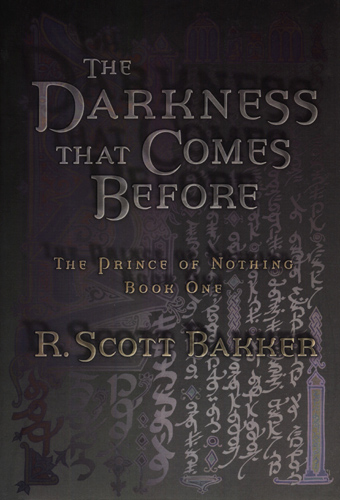
Yes, fantasy covers are generally execrable. The hardcovers for R. Scott Bakker's Prince of Nothing Trilogy had the best covers ever. The covers on the new trades aren't bad, either.
I was so disappointed with the cover of his latest, especially when I was promised this.
posted by adamdschneider at 12:30 PM on March 5, 2010
I was so disappointed with the cover of his latest, especially when I was promised this.
posted by adamdschneider at 12:30 PM on March 5, 2010
me: “Owning a book is merely a convenience. The essential benefit of books resides in reading them.”
bunnycup: “Right, agreed - which is why the pro-hardcover argument boggles my mind. I detest hardcovers, I will not buy any book in hardcover. My husband recently got a new book from the library in hardcover, and I tried to read it. It was so heavy to hold while laying in bed to read last night (and I read, in bed, every night, have done since I learned to read). After trying to prop the book up on a pillow, sit directly up to read, and other convoluted attempts, with a sore back/neck and wallowing in frustration, I asked him to return the hardcover to the library. I'll read the damn book when it comes out in a size I can hold... In addition to reading in bed, I like to carry them on planes, trains and automobiles. A hardcover simply satisfies none of my book-reading needs. Other than mandatory textbooks, I haven't purchased a hardcover in years. Hardcovers are great for "building a library" to last the ages and to impress the people who visit with your wide, eclectic reading tastes - but who wants to lug the thing around and get neck pain trying to read it? And for me, at the end of a day, books are for reading.”
ninebelow: “I hate hardbacks too and I would love to live in a world where only paperback originals were published. That said: ¶ a) Some (deluded) people prefer hardbacks so there is a market for them ¶ b) Publishers can make the same profit by selling fewer books which is a good thing for writers given how small most of their sales figures ¶ c) Publishers get two shots at the prize in terms of reviews, adverts and bookshop placement. Again, it is hard to begrudge this given how many books sink without a trace. ¶ So I'm not that concerned about publishers trying to maximise profit for themselves and their authors, particularly when for every book I want to read now but can't because it is in hardback, there is is one published last year which has just been released in paperback.”
See, this is evidence that I'm sort of coming from an entirely different world from most people here, I guess. Part of the problem in communication, I think, is that I haven't bought a new edition of a book in decades, and don't plan to any time soon. I don't begrudge people who do, but I do despise the publishing industry for mangling the public's conception of what a hardcover and what a paperback is.
Hardcover books should not be appreciably heavier than paperbacks. They should not be larger, and they should not be more unwieldy. For at least a hundred years human beings have been well capable of producing nice, handy, useful small hardcovers which function perfectly and are no less readable and convenient than paperbacks. But the hardcover books that are produced for most editions are several sizes larger, heavier, on ridiculously thick-stock paper, with an oversized cover so that the dust jacket can hold the author's name in a font large enough to be read from space. I don't blame any of you for feeling this way about hardcover books – often this is the only kind of hardcover available for a book. But it really doesn't need to be this way.
vbfg: I have precisely one hardcover fiction book. It's a collection of shorts from Faulkner, published by the Modern Library and is about the same size as a 250 page paperback. It's wonderful: not too large, somehow feels 'grown up', and has made me question my hatred of hardbacks.”
That's actually a very good example. The Modern Library is one publisher printing books well that don't cost entirely too much and that are a useful and practical size and format. The pages aren't as thick as slices of bread, the cover isn't ten miles high, and yes, you can read it in bed comfortably. That's how a hardcover book should be. Moreover it becomes obvious over a small amount of time, I think, that hardcovers are a good deal more durable because they're designed to actually withstand the process of reading; a paperback is unfortunately designed to have a tension by which pulling it open and reading it gradually destroys the spine. A well-built hardcover book can usually fall open flat and be read that way, and yet is still small enough to be held in the hand, too. I like that.
My experience is that the UK press, over the last few hundred years, has had pretty shoddy long-term standards on this; there have been a lot of rushed printings and populist techniques designed to produce a book quickly and cheaply. The US press has been geared toward marketing books, and that's why this fallacious "paperback/hardcover" dual-printing scam got started in the first place. The French seem to be all over the map, although their academic press sometimes seems to produce some nice volumes. But, as I mentioned above, the German publishing companies, of which there seem to be five or six really good ones, have a very, very good track record as far as producing beautiful and useful books. Lightweight, solid hardcovers, with fine stitching and tight bindings which are glued properly and in the right places - this is how books ought to be.
I'm really not saying that everyone should like books just like I do, but we're talking about design, right? And the design, the practical design, the engineering of books is something we categorically ignore nowadays. The flap of paper on the cover means much less to me than the way the thing's put together underneath.
me: “... it has to do with western ownership culture and our growing disdain for public places and public things.”
anniecat: “That's not true. I'm not spending any money buying fiction books I haven't already read and don't know if I'll read again. I'd go to the library more if the baby boomers weren't so loud about being angry about having a queue to use the dozen internet computers.”
Please notice, anniecat, that I didn't say a word about you – I was talking about the bookbuying public in general, and I have a feeling you're not exactly the common bookbuyer. Look at the people around you the next time you're in a large chain bookstore – are those people doing what you do, buying only books that they've read before and will read again, and avoiding those books they don't know if they'll ever touch? Maybe I'm selling them short, but I really don't think so.
Also, I know what you mean about public libraries being somewhat annoying nowadays. I have the same experience. I usually have to shop around a bit before I find one that I like. But I do think that, if you're not already doing this, it's a very good idea to mention this to a librarian; they tend to listen when people raise concerns like that, and taking some responsibility for the state of things is the whole point after all.
posted by koeselitz at 12:55 PM on March 5, 2010 [1 favorite]
koeselitz, that's a really interesting point in your follow up about hardcover books and, for example, cover print large enough to be read from space. It's a good point, as I will admit I do own some hardcover books that are not significantly larger or heavier than paperbacks.
posted by bunnycup at 1:00 PM on March 5, 2010
posted by bunnycup at 1:00 PM on March 5, 2010
EndsOfInvention: “Yeah, hardbacks are a fucking pain in the arse. As far as I can tell, the only point of them is to charge twice the price for the first 6 months after publication to squeeze more money out of people who are too eager to read a book to wait for the paperback.”
I can't remember ever buying a book that was first printed in the last fifty years, and I don't really intend to. I'm not saying that all of you should drop everything and read older books, but it's pretty interesting noticing how much the publishing industry has managed to change people's conception of hardcover and paperback books. It's a bit perverse, if you ask me. Heck, they're bound very cheaply, but some of the most comforting books in my own life have been hardcovers from the Loeb Classical Library, partially because they are more convenient and easier to carry and read than any paperback books I know of anywhere. Here's what they look like – and note that they are 11.5 cm x 16.5 cm (4.5 inches x 6.5 inches). Fantastic little books, those, in a pretty green cloth binding with a small embossed emblem on the cover.
posted by koeselitz at 1:19 PM on March 5, 2010
bunnycup: “koeselitz, that's a really interesting point in your follow up about hardcover books and, for example, cover print large enough to be read from space. It's a good point, as I will admit I do own some hardcover books that are not significantly larger or heavier than paperbacks.”
Thanks. I mean no disparagement, by the way - I just feel like publishers exploit the fetish people have for books by printing these huge, medieval volumes with faux-cut pages that you'd need a lectern to read properly, just so that they can charge double the paperback cover-price. Ugh. It's so refreshing to see a volume from the Springer-Verlag, for example - glance in the science section of a university library for these kinds of books - which is compact, bound neatly in cloth, and stitched so tightly and carefully that one can see that it'll last many decades. I like that.
posted by koeselitz at 1:23 PM on March 5, 2010
Even books that haven't been fashionable for decades are getting classy designs. My copy of The Glass Bead Game looks like an entire art department worked on it, and everything Vintage Publishing puts out (check Faulkner in your bookstore) looks gorgeous. Why are these books being dressed up? I'm the only person I know who reads these titles, and I'm paying $20 a book anyway.
I'm eagerly awaiting the Espresso machine's arrival in town. Even then, the cost of purdy covers is replaced by the cost of having a huge, expensive novelty machine in-house.
posted by spamguy at 2:31 PM on March 5, 2010
I'm eagerly awaiting the Espresso machine's arrival in town. Even then, the cost of purdy covers is replaced by the cost of having a huge, expensive novelty machine in-house.
posted by spamguy at 2:31 PM on March 5, 2010
Skeptic: Kattullus I wouldn't call that as being "without a cover design". In fact those are classic cover designs (especially the minimalistic "Pléiade" covers, which have much influenced French cover design).
I said it badly but what I meant was that the individual books don't have individually designed covers. As two or three cars parked under the stars describes very well, it can be totally disorienting when you're not used to it.
posted by Kattullus at 3:18 PM on March 5, 2010
I said it badly but what I meant was that the individual books don't have individually designed covers. As two or three cars parked under the stars describes very well, it can be totally disorienting when you're not used to it.
posted by Kattullus at 3:18 PM on March 5, 2010
We want to own the books we read, we want them to be our books, so that we don't have to afford them any reverence or give any effort toward their upkeep, and so that they can satisfy our craving for possession.
There's a large part of me that agrees with this thought, and I've ruthlessly culled my book collection on a number of occasions. The reason I have a harder time doing that these days is my daughter.
When I was growing up, one of my pleasures was scrounging through my parent's book collection looking for my next book. You could argue that I could do the same thing in a library, and you'd be right, but the upshot of reading from the books my parents deemed worthy to keep gave us something shared. It also usually meant I was reading something a bit more challenging than what I might select for myself in a public library. Whereas my natural inclinations might lead me to some luridly-covered, second-rate sci-fi novel*, I might instead pick up A Confederacy of Dunces.
So these days, when I'm going through the collection, I have to stop and think whether I might like my daughter to stumble upon this novel or that on a long, rainy afternoon. A lot of books don't make that cut, but some do, and it has little to do with the little voice that says, "Mine, mine mine!"
* I still loves 'em, but they're the literary equivalent of a Twinkie.
posted by lekvar at 4:16 PM on March 5, 2010 [2 favorites]
Here. Some dutch covers:
"The Most Beautiful Book Cover 2010"
posted by Sourisnoire at 2:15 AM on March 6, 2010 [1 favorite]
"The Most Beautiful Book Cover 2010"
posted by Sourisnoire at 2:15 AM on March 6, 2010 [1 favorite]
Sourisnoire, I just don't see how that can compete with the American edition of the same title.
posted by redsparkler at 11:18 AM on March 6, 2010
posted by redsparkler at 11:18 AM on March 6, 2010
« Older Civilization - I destroy it to feel like - I'm a... | We could see such people - no longer as mythical... Newer »
This thread has been archived and is closed to new comments
posted by philip-random at 10:10 PM on March 4, 2010 [3 favorites]