Paying the Kill Fee
April 24, 2010 4:12 AM Subscribe
Chris Ware was commissioned by Fortune to illustrate their May cover. His "hilarious, beautiful, meticulous" submission, which included "Guantanamo Bay prisoners, Mexican factory workers, and a few potshots at business execs and money-grubbing politicians," was rejected. Hi-res Flickr version here. Previously (1, 2)
At first I wondered what the Tea Pot Dome scandal had to do with anything. Then I realized that I'm one of those awful elitists that are ruining 'Merica.
posted by allen.spaulding at 4:25 AM on April 24, 2010 [15 favorites]
posted by allen.spaulding at 4:25 AM on April 24, 2010 [15 favorites]
I think the Milton Friedman Paycheck Advance was my favorite little detail.
posted by Toekneesan at 4:37 AM on April 24, 2010 [9 favorites]
posted by Toekneesan at 4:37 AM on April 24, 2010 [9 favorites]
I liked how he draws helicopters.
posted by clearly at 5:06 AM on April 24, 2010 [1 favorite]
posted by clearly at 5:06 AM on April 24, 2010 [1 favorite]
Thanks for this!
Just wondering, are they Guantanamo prisoners? Looking at the drawing, it looks like the whole island of Cuba is surrounded in barbed wire, which would suggest a slightly different interpretation.
posted by nangua at 5:16 AM on April 24, 2010
Just wondering, are they Guantanamo prisoners? Looking at the drawing, it looks like the whole island of Cuba is surrounded in barbed wire, which would suggest a slightly different interpretation.
posted by nangua at 5:16 AM on April 24, 2010
I love it! Fortune really missed an opportunity here. Had they run the cover with some indication that they were in on the joke, they've have come off as secure people with a good sense of humour.
posted by QIbHom at 5:23 AM on April 24, 2010 [4 favorites]
posted by QIbHom at 5:23 AM on April 24, 2010 [4 favorites]
At first I wondered what the Tea Pot Dome scandal had to do with anything. Then I realized that I'm one of those awful elitists that are ruining 'Merica.
Precisely my thought process as well. We should start a party or something.
posted by felix betachat at 5:23 AM on April 24, 2010 [1 favorite]
Precisely my thought process as well. We should start a party or something.
posted by felix betachat at 5:23 AM on April 24, 2010 [1 favorite]
I love it! Fortune really missed an opportunity here. Had they run the cover with some indication that they were in on the joke, they've have come off as secure people with a good sense of humour.
They might very well be both of those things. Their target demographic, however, is decidedly not particularly well-known for it's security or humor.
posted by Ryvar at 5:32 AM on April 24, 2010 [9 favorites]
They might very well be both of those things. Their target demographic, however, is decidedly not particularly well-known for it's security or humor.
posted by Ryvar at 5:32 AM on April 24, 2010 [9 favorites]
Yeah there's a lot to see here. I like the musicians rocking out on top of the building as they play for the one customer lounging in the piano bar, but why are the two guys throwing bricks off the roof? They've hit some poor slob below and they seem pretty jubilant about it. Significance? Just rich guys getting their kicks by maliciously harming the middle class?
posted by Secret Life of Gravy at 5:33 AM on April 24, 2010
posted by Secret Life of Gravy at 5:33 AM on April 24, 2010
It's almost as if he's trying to tell us something...but WHAT?
posted by briank at 5:33 AM on April 24, 2010 [22 favorites]
posted by briank at 5:33 AM on April 24, 2010 [22 favorites]
I thought the brick was something that fell out of the cash lift. The guys on top are not directly above the guy (unlike the lift), and they don't have anything in their hands
posted by delmoi at 5:41 AM on April 24, 2010
posted by delmoi at 5:41 AM on April 24, 2010
"Welcome to toxic asset acres" reads the sign in front of the housing development.
Only the tile is incorrect: It should read MisFortune.
posted by three blind mice at 5:42 AM on April 24, 2010 [2 favorites]
Only the tile is incorrect: It should read MisFortune.
posted by three blind mice at 5:42 AM on April 24, 2010 [2 favorites]
I wonder how much they paid him....
posted by DenOfSizer at 5:48 AM on April 24, 2010 [4 favorites]
posted by DenOfSizer at 5:48 AM on April 24, 2010 [4 favorites]
> Looking at the drawing, it looks like the whole island of Cuba is surrounded in barbed wire, which would suggest a slightly different interpretation.
The U.S. Treasury building is also the size of Maryland and there are three architecturally-questionable skyscrapers that extend into the ionosphere. I am sure that Chris Ware is using his artistic license to indicate that, clearly, only one third to one half of Cuba is a prison, not the entire island.
posted by ardgedee at 5:52 AM on April 24, 2010 [1 favorite]
I respect what he's done, but I've never been able to actually enjoy Chris Ware's work.
But this....is awesome.
posted by the bricabrac man at 6:06 AM on April 24, 2010
But this....is awesome.
posted by the bricabrac man at 6:06 AM on April 24, 2010
Whoever rejected this is an idiot. You think the people up top don't know they're dancing atop golden towers, while the rest of us slowly sink into the mud below? They not only know... they think that's how it should be. Meanwhile print media is in decline, and one more magazine is afraid to take a chance. So they've missed an opportunity to sell a few more magazines, protected a point of view that didn't need protecting, and the illustration is all over the web anyway. Smooth.
posted by billyfleetwood at 6:09 AM on April 24, 2010 [5 favorites]
posted by billyfleetwood at 6:09 AM on April 24, 2010 [5 favorites]
I love how rich people cry "CLASS WARFARE!" whenever a poor or middle class person dares to point out that rich people are engaging in class warfare as if the mere act of pointing out class warfare is more offensive and sinful than actively conducting class warfare.
posted by MegoSteve at 6:21 AM on April 24, 2010 [83 favorites]
posted by MegoSteve at 6:21 AM on April 24, 2010 [83 favorites]
Agreed, Billy. Think of all the college kids who would buy the magazine, just to tack the cover up to the wall!
posted by mccarty.tim at 6:28 AM on April 24, 2010 [1 favorite]
posted by mccarty.tim at 6:28 AM on April 24, 2010 [1 favorite]
Hmmm getting thrown off the job by a conservative organisation is the only way to survive - make something they like and you negate yourself.
posted by sgt.serenity at 6:37 AM on April 24, 2010 [3 favorites]
posted by sgt.serenity at 6:37 AM on April 24, 2010 [3 favorites]
Just wondering, are they Guantanamo prisoners? Looking at the drawing, it looks like the whole island of Cuba is surrounded in barbed wire, which would suggest a slightly different interpretation.
Considering they're all wearing Federal Prisoner Orange and turbans, I'd say Guantanamo is a safe bet, no?
Also, what's going on directly beneath the bottom loop of the 5? (Directly below where the one guy is peeking over the edge.) Is that guy pushing a terrarium or a greenish brain in a jar? IT IS THE ONLY THING I CAN'T FIGURE OUT FIX IT MEFI FIX IT.
posted by elizardbits at 6:48 AM on April 24, 2010 [1 favorite]
My guess is that's he's digging into Walt Disney's grave, just to find a well-preserved, still functioning brain. It's in the Hollywood region, after all.
posted by mccarty.tim at 6:50 AM on April 24, 2010
posted by mccarty.tim at 6:50 AM on April 24, 2010
I thought the brick was something that fell out of the cash lift. The guys on top are not directly above the guy (unlike the lift), and they don't have anything in their hands
Some sort of... brickle-down economics one might say?
posted by longbaugh at 6:54 AM on April 24, 2010 [6 favorites]
Some sort of... brickle-down economics one might say?
posted by longbaugh at 6:54 AM on April 24, 2010 [6 favorites]
In 100 years this image will be in history books
...of other countries.
posted by Mick at 6:59 AM on April 24, 2010 [11 favorites]
...of other countries.
posted by Mick at 6:59 AM on April 24, 2010 [11 favorites]
I wonder what it changes into when you fold on line a-a and b-b?
posted by Gungho at 7:00 AM on April 24, 2010 [17 favorites]
posted by Gungho at 7:00 AM on April 24, 2010 [17 favorites]
I'm with bricabrac man; I've always admired Ware's stuff without ever being tempted to read the little tiny captions. But this is great.
posted by acrasis at 7:00 AM on April 24, 2010
posted by acrasis at 7:00 AM on April 24, 2010
Also, what's going on directly beneath the bottom loop of the 5?
I took that to be the artist trying to get it all on his canvas.
posted by kuujjuarapik at 7:01 AM on April 24, 2010 [1 favorite]
I took that to be the artist trying to get it all on his canvas.
posted by kuujjuarapik at 7:01 AM on April 24, 2010 [1 favorite]
The thing I'm most curious about - what was the exact assignment? Covers are so important, with so many people involved in the decision, that it is inconceivable that Fortune would call up Chris Ware and say 'go nuts.' There had to have been direction. Something like: 'make us a detailed scene about capitalism.' Was it meant to be critical? Was it meant to be dark humor? They called Chris for a reason, to bring the art director's vision to life. Knowing that there was a risk that it wouldn't appeal to everyone.
Then, Chris took that direction and made a conscious decision to draw this cover. What was he thinking? I doubt that any artist would agree to an assignment simply to bite the hand that feeds. Did he make the cover in good faith, taking artistic license but still at least following the art direction in spirit? Or was it really a case of him submitting the image knowing that it would fail - knowing also that it would be great publicity?
From the perspective of a commercial artist, decisions like the one Chris made in creating the piece are so fascinating. And the meeting where his cover was unveiled to the Fortune editors - holy shit I would have paid good money to be a fly on that wall. Among the people who were actually there, I'm sure it will become legendary. Too bad those sissies didn't have the balls to run that cover. The thing about the great magazine die-off, people are afraid to take risks at the exact time when risks are the most important thing they could be doing. Chalk one up to a missed opportunity - the internets win again.
posted by infinitefloatingbrains at 7:05 AM on April 24, 2010 [14 favorites]
I liked how he draws helicopters.
The helicopter is "Helicopter Ben Bernanke"... you can see one hovering (hoovering) over Greece. It's a really nice touch that Helicopter Ben is depicted dumping the cash on Wall Street... an even nicer touch is the old timey colors and fonts, like say from 1929.
posted by ennui.bz at 7:10 AM on April 24, 2010 [6 favorites]
I'm curious to know Fortune's side as well. So what does May's cover look like? Did they reject this concept as "too much truth being spoken to power" but accept a less inflammatory work from Chris for their cover? Or did they go with someone else?
posted by zarq at 7:14 AM on April 24, 2010
posted by zarq at 7:14 AM on April 24, 2010
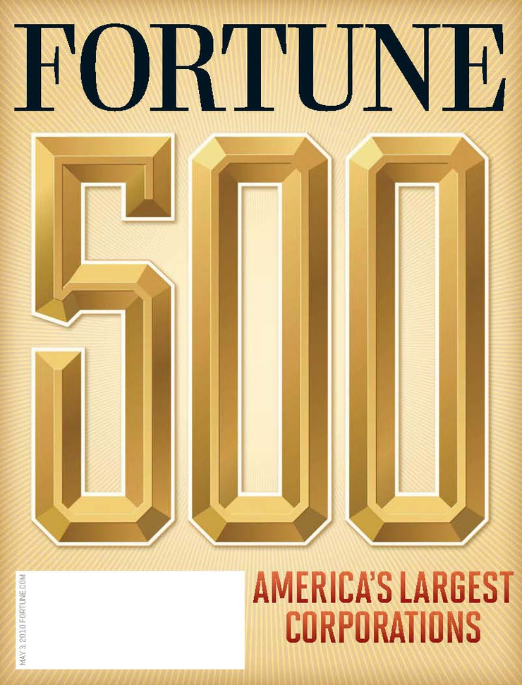
Here is the actual May 2010 Fortune cover. I couldn't have even imagined anything more boring.
posted by infinitefloatingbrains at 7:20 AM on April 24, 2010 [1 favorite]
posted by infinitefloatingbrains at 7:20 AM on April 24, 2010 [1 favorite]
He forgot to include tiny figures of magazine executives of a financial industry magazine rejecting an artist's detailed vision of their rapaciousness for the cover of said magazine.
posted by Ron Thanagar at 7:25 AM on April 24, 2010 [2 favorites]
posted by Ron Thanagar at 7:25 AM on April 24, 2010 [2 favorites]
I imagine they rejected the cover because it looked like something that an untalented High School student might have done for some "edgy" self-published crapzine, and Fortune has higher standards than that.
posted by Chasuk at 7:26 AM on April 24, 2010 [2 favorites]
posted by Chasuk at 7:26 AM on April 24, 2010 [2 favorites]
That's bloody lovely.
What did they think he was, some graphic designer?
posted by Artw at 7:34 AM on April 24, 2010
What did they think he was, some graphic designer?
posted by Artw at 7:34 AM on April 24, 2010
I imagine they rejected the cover because it looked like something that an untalented High School student might have done for some "edgy" self-published crapzine, and Fortune has higher standards than that.
That must be it. I'm sure they hired Ware without ever having glanced at his portfolio and therefore had no idea what to expect stylistically.
posted by FelliniBlank at 7:34 AM on April 24, 2010 [9 favorites]
That must be it. I'm sure they hired Ware without ever having glanced at his portfolio and therefore had no idea what to expect stylistically.
posted by FelliniBlank at 7:34 AM on April 24, 2010 [9 favorites]
I imagine they rejected the cover because by accepting this critique they would appear to be acknowledging, 'yeah this is corporate America, you got a problem with it, fuck you'.
posted by Flashman at 7:38 AM on April 24, 2010 [2 favorites]
posted by Flashman at 7:38 AM on April 24, 2010 [2 favorites]
Silly artist, they're not exploiting Mexican labor, they're "being competitive in today's tough business environment."
But seriously, did he think for even a microsecond they would run this?
posted by tommasz at 7:39 AM on April 24, 2010
But seriously, did he think for even a microsecond they would run this?
posted by tommasz at 7:39 AM on April 24, 2010
"Oi! Picasso! Don't draw it all wonky!"
posted by Artw at 7:40 AM on April 24, 2010 [15 favorites]
posted by Artw at 7:40 AM on April 24, 2010 [15 favorites]
From the blog of the artist who did the cover that they actually accepted, with a bit of discussion of the back-and-forth between the artist and Fortune.
posted by blucevalo at 7:51 AM on April 24, 2010 [3 favorites]
posted by blucevalo at 7:51 AM on April 24, 2010 [3 favorites]
I imagine they rejected the cover because it looked like something that an untalented High School student might have done for some "edgy" self-published crapzine, and Fortune has higher standards than that.
*Chortle*
posted by Alvy Ampersand at 8:01 AM on April 24, 2010 [4 favorites]
*Chortle*
posted by Alvy Ampersand at 8:01 AM on April 24, 2010 [4 favorites]
Looks like Historically speaking a big 500 with some styling is really what they are after, though sometimes a big 5 will do.
posted by Artw at 8:05 AM on April 24, 2010
posted by Artw at 8:05 AM on April 24, 2010
Chris Ware, meet Diego Rivera.
(Keep on stickin' it to The Man!)
posted by bitter-girl.com at 8:23 AM on April 24, 2010 [4 favorites]
(Keep on stickin' it to The Man!)
posted by bitter-girl.com at 8:23 AM on April 24, 2010 [4 favorites]
Also, what's going on directly beneath the bottom loop of the 5? (Directly below where the one guy is peeking over the edge.) Is that guy pushing a terrarium or a greenish brain in a jar? IT IS THE ONLY THING I CAN'T FIGURE OUT FIX IT MEFI FIX IT.I thought it looked like an artist drawing something, but I couldn't figure out why it was there either.
---
As far as the cover, they maintain a list of the "fortune 500", the biggest companies, although it seems kind of superfluous these days -- you can just go on google finance to see the 500 largest companies by market cap. Anyway. I imagine the art direction was just "Slap a bit 500 on it!"
Interestingly the artists who did get the cover Did a blog post about it, and says he had about a week and a half to do it. I bet he kind of feels like a, um... prat or something, with everyone seeing the "awesome" cover that was suppressed, and everyone claiming how crappy the actual cover was.
It looks like something they threw together over the weekend after discarding the Chris Ware cover.
posted by delmoi at 8:29 AM on April 24, 2010 [1 favorite]
The thing I'm most curious about - what was the exact assignment? Covers are so important, with so many people involved in the decision, that it is inconceivable that Fortune would call up Chris Ware and say 'go nuts.' There had to have been direction. [...] Did he make the cover in good faith, taking artistic license but still at least following the art direction in spirit? Or was it really a case of him submitting the image knowing that it would fail [...]?
Exactly. I seriously doubt this is Chris Ware striking a punk rock blow against the Judge Smails of the world and laughing as their monocles pop out at his provocative cover. That seems really unlikely to me, and an interpretation of events borne from an unfamiliarity with how magazine covers get made.
I'd say a more likely scenario is that the magazine probably DID ask him to do something a little cheeky, a little (ugh) edgy, but the cover was rejected more on artistic than content grounds. Look, I'm a HUGE fan of Ware's work, but--please insert a giant blinking IMHO here--I just don't think this is Ware's best work. I can totally seeing Fortune hiring Ware expecting the sort of intricate and iconographic diagram work he's known for, and being a bit put off by what they received: something that's much more simplistic and more reminiscent of Eboy than Ware. Frankly, I find it a bit ugly.
I wasn't at any of the meetings, so I have no more idea about what went down than anyone else, but I have a feeling the content would have been approved if the illustration had looked more like what we think of when we hear the name "Chris Ware." When you hire Ware, you're also hiring his--I'm sorry everyone--branding as well as what the Chris Ware brand can bring to your product. (I'll now pause so someone can run to YouTube and fetch that Bill Hicks routine about marketing for their response.) But this piece not only isn't consistent with Fortune's branding...it's inconsistent with Ware's branding.
I'm not saying this is even necessarily a bad thing...I'm just saying that it's more likely that "we don't care for it and it won't look good on the cover of our biggest issue of the year" is a more likely scenario than "We're morally offended that you would dare attack the fine upstanding tradition of American capitalism!"
posted by Ian A.T. at 8:30 AM on April 24, 2010 [6 favorites]
Did something happen at Fortune HQ circa 1984 that might account for the sudden abject boringness of their "500" covers?
posted by Sys Rq at 8:34 AM on April 24, 2010
posted by Sys Rq at 8:34 AM on April 24, 2010
Look, I'm a HUGE fan of Ware's work, but--please insert a giant blinking IMHO here--I just don't think this is Ware's best work. I can totally seeing Fortune hiring Ware expecting the sort of intricate and iconographic diagram work he's known for, and being a bit put off by what they received: something that's much more simplistic and more reminiscent of Eboy than Ware. Frankly, I find it a bit ugly.
I agree completely with this assessment. Still, I don't believe for a second that that was the motivating factor WRT the rejection.
posted by Sys Rq at 8:37 AM on April 24, 2010
I agree completely with this assessment. Still, I don't believe for a second that that was the motivating factor WRT the rejection.
posted by Sys Rq at 8:37 AM on April 24, 2010
(I mean, no matter how sub-par Ware's cover was relative to his usual output, it was still a good sight better than yet another big 500 on another plain background.)
posted by Sys Rq at 8:38 AM on April 24, 2010
posted by Sys Rq at 8:38 AM on April 24, 2010
I love how rich people cry "CLASS WARFARE!" whenever a poor or middle class person dares to point out that rich people are engaging in class warfare as if the mere act of pointing out class warfare is more offensive and sinful than actively conducting class warfare.
Class warfare is when the non-rich fight back.
posted by DU at 8:46 AM on April 24, 2010 [10 favorites]
Class warfare is when the non-rich fight back.
posted by DU at 8:46 AM on April 24, 2010 [10 favorites]
something that's much more simplistic and more reminiscent of Eboy than Ware. Frankly, I find it a bit ugly.
Actually it looks like eboy actually did a similar cover, and it looks like it was used on Fortune China
posted by delmoi at 8:55 AM on April 24, 2010
Actually it looks like eboy actually did a similar cover, and it looks like it was used on Fortune China
posted by delmoi at 8:55 AM on April 24, 2010
That's nice, but not nearly as clever. It probably IS more or less what they were after.
posted by Artw at 8:59 AM on April 24, 2010
posted by Artw at 8:59 AM on April 24, 2010
Ian A.T.: I can totally seeing Fortune hiring Ware expecting the sort of intricate and iconographic diagram work he's known for, and being a bit put off by what they received: something that's much more simplistic and more reminiscent of Eboy than Ware. Frankly, I find it a bit ugly.
Heh, unlike you and Sys Rq I had the exact opposite reaction. This is by far my favorite Chris Ware piece. Usually I find his work... how do I put it... antiseptic maybe? Lifeless? Sterile? Something like that, though none of these words really capture it. I just don't connect with him, but I really, really like this. It vibrates with vitality, emotion and power in a way that Ware's usual work doesn't.
In fact, Eboy's Fortune China cover strikes me as dull in the same way that Ware usually does. I can appreciate their craft, but emotionally they never resonate, except with that Fortune cover by Ware.
posted by Kattullus at 9:04 AM on April 24, 2010 [1 favorite]
Maybe he has a fan at the magazine who just wanted to throw some money his way.
posted by The Hamms Bear at 9:18 AM on April 24, 2010
posted by The Hamms Bear at 9:18 AM on April 24, 2010
Actually, my guess is that Fortune probably gets a bunch of artists to submit covers, then picks the one they like best.
posted by delmoi at 9:38 AM on April 24, 2010
posted by delmoi at 9:38 AM on April 24, 2010
"The 500 with the bevels or the one with the shadows? What about the one with the starburst thing behind it?"
posted by Artw at 9:43 AM on April 24, 2010 [1 favorite]
posted by Artw at 9:43 AM on April 24, 2010 [1 favorite]
I'm with kattullus on this one. I hardly ever enjoy Ware's work, but I thought this was pretty great. Also someone remind me, especially in light of that awful, crowded, pointless fortune china cover, why do people like eboy's art? Every piece I see looks like a cover from busytown except it's pixilated.
posted by cyphill at 9:46 AM on April 24, 2010
posted by cyphill at 9:46 AM on April 24, 2010
Ware's cover might have been rejected because it doesn't jive with the Fortune editors' world view, but it's also the visual equivalent of an anti-capitalist screed. I don't think it displays nearly the same wit or subtlety as his work for the New Yorker.
posted by boghead at 10:02 AM on April 24, 2010 [1 favorite]
posted by boghead at 10:02 AM on April 24, 2010 [1 favorite]
> I wonder what it changes into when you fold on line a-a and b-b?
Fone 50
posted by scope the lobe at 10:22 AM on April 24, 2010 [5 favorites]
Fone 50
posted by scope the lobe at 10:22 AM on April 24, 2010 [5 favorites]
I take the new, boring 500 cover as Fortune's way of letting us know that they do have a sense of humor and they get the joke. It's so boring it almost makes you wonder if there's something to it, you know? (I hope I'm right about this)
posted by iamkimiam at 10:22 AM on April 24, 2010
posted by iamkimiam at 10:22 AM on April 24, 2010
Some of Chris Ware's work for This American Life
posted by l33tpolicywonk at 10:26 AM on April 24, 2010 [1 favorite]
posted by l33tpolicywonk at 10:26 AM on April 24, 2010 [1 favorite]
Any ideas on how to buy a print, or print it with the copyright holder's permission?
posted by langedon at 11:12 AM on April 24, 2010 [1 favorite]
posted by langedon at 11:12 AM on April 24, 2010 [1 favorite]
I like Eboy's art because every piece I see looks like a cover from busytown except it's pixilated.
posted by everichon at 11:14 AM on April 24, 2010 [1 favorite]
posted by everichon at 11:14 AM on April 24, 2010 [1 favorite]
I imagine they rejected the cover because by accepting this critique they would appear to be acknowledging, 'yeah this is corporate America, you got a problem with it, fuck you.
There's plenty of crap going on in corporate America. There's plenty of crap going on in America period. Still, if you want to finger Fortune magazine as the figurehead of crappiness you would have to explain why Fortune broke the story of the Enron scandal.
Or why it was one of the first to warn of a coming collapse of the US housing bubble in a front page story in 2004?
posted by storybored at 11:17 AM on April 24, 2010 [3 favorites]
A good choice for MetaFilter post #91337...
posted by oneswellfoop at 11:32 AM on April 24, 2010
posted by oneswellfoop at 11:32 AM on April 24, 2010
How much for a Greenspan LubePro?
Twenty credit swaps and a collateralized debt obligation, same as in town.
posted by jonp72 at 11:49 AM on April 24, 2010 [2 favorites]
Twenty credit swaps and a collateralized debt obligation, same as in town.
posted by jonp72 at 11:49 AM on April 24, 2010 [2 favorites]
oooh I wondered what the glowing green tube thing was also but I think it might be nuclear waste getting buried at yucca mountain??
posted by supermedusa at 12:02 PM on April 24, 2010
posted by supermedusa at 12:02 PM on April 24, 2010
Cute, but nowhere near as good as his 2006 Thanksgiving cover for the New Yorker (self-link)
posted by shii at 12:37 PM on April 24, 2010
posted by shii at 12:37 PM on April 24, 2010
Maybe the Family Learning Channel can have him do some TV spots...
posted by stevil at 1:26 PM on April 24, 2010 [3 favorites]
posted by stevil at 1:26 PM on April 24, 2010 [3 favorites]
I liked how Ware's cover illustration for the New Yorker around Halloween of last year -- featuring parents staring at their smartphones while their kids trick-or-treat -- was actually the first panel of his fiction piece on the inside. Given that New Yorker covers are notoriously stand-alone, I wonder if that was the first time that happened?
posted by lisa g at 2:18 PM on April 24, 2010 [2 favorites]
posted by lisa g at 2:18 PM on April 24, 2010 [2 favorites]
I have to say, this cover looks really rushed. Ware's New Yorker covers appeal to my aesthetic sensibilities, but this one falls flat in that regard.
Part of me wonders if this was just a mockup for the concept that was then rejected.
posted by [expletive deleted] at 4:29 PM on April 24, 2010
Part of me wonders if this was just a mockup for the concept that was then rejected.
posted by [expletive deleted] at 4:29 PM on April 24, 2010
I wonder what it changes into when you fold on line a-a and b-b?
The face of Alan Greenspan, and the caption 'What, Me Worry?'
posted by PeterMcDermott at 5:11 PM on April 24, 2010
The face of Alan Greenspan, and the caption 'What, Me Worry?'
posted by PeterMcDermott at 5:11 PM on April 24, 2010
I love it! Fortune really missed an opportunity here. Had they run the cover with some indication that they were in on the joke, they've have come off as secure people with a good sense of humour.
I'm not sure they'd have come off as anything other than blind fools. I mean, something along the lines of the cover linked above from the Fortune China was probably what they were hoping for - a sort of edgy, modern feel, could be seen as negative if you were already inclined against the capitalist world, but could be seen as fun and energetic. But this one clearly paints corporate america as destroying the country, and not through fun and distraction, but just huge heavy structures...
Seeing some of his previous work, I don't know why they thought he'd be able to do something friendly, though, and I'm curious how or why he took the job to start with. All a bit mysterious.
posted by mdn at 9:11 PM on April 24, 2010
A good choice for MetaFilter post #91337...
Why, is it, uh, gleet? sleeting?
posted by kenko at 9:48 PM on April 24, 2010
Why, is it, uh, gleet? sleeting?
posted by kenko at 9:48 PM on April 24, 2010
I'd love to hear a bit more about the story behind this. What's the blog/who's the person/personality who broke this story? Is it true?
Also, it really boggles my mind that everybody loves this so hard (not here so much, but around the blogosphere). I mean, it's so clear to me that this is an inferior Chris Ware work. Totally lacking in composition, wit, subtley, humor - everything I love about the dude.
posted by boghead at 4:25 PM on April 26, 2010
« Older Wild frontier | art from recycled cassette tape and other stuff Newer »
This thread has been archived and is closed to new comments
posted by magstheaxe at 4:18 AM on April 24, 2010