Brandon Shaeffer's Movie Posters
July 23, 2010 5:59 AM Subscribe
Graphic designer Brandon Shaeffer blends conceptualism, block graphic, op-art and deco/streamline sensibilities. His movie poster re-designs are particularly fabulous. Much more can be found in his Flickr stream and tumblr blog.
“My views tend to align themselves with three old dead guys who, at one point in their lives, sported some utterly fantastic beards..."
?
“My views tend to align themselves with three old dead guys who, at one point in their lives, sported some utterly fantastic beards..."
?!
“My views tend to align themselves with three old dead guys who, at one point in their lives, sported some utterly fantastic beards..."
...
posted by Bathtub Bobsled at 6:53 AM on July 23, 2010
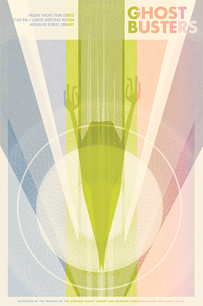
He's obviously talented and there's much to like about his style, but it doesn't always work for the movie posters. Like the one for Ghostbusters, it completely fails to telegraph the humor in the movie. On it's own, it's visually striking and wonderful, but it communicate the tone of the intended film at all, which is a major let down.
posted by new brand day at 7:22 AM on July 23, 2010
posted by new brand day at 7:22 AM on July 23, 2010
There's a lot of these sorts of posters floating around the web of varying quality, with Shaeffer definitely near the top. However, as an exercise in making a poster for a film, in the very pure sense, they fail. This isn't necessarily a bad thing. They're great as pieces of memorabilia or revival house releases (which is what they're originally made for, I believe) or maybe even DVD covers, but they all require a certain familiarity with a film that a "real" movie poster wouldn't.
posted by griphus at 7:40 AM on July 23, 2010
posted by griphus at 7:40 AM on July 23, 2010
Griphus, I think that's right--his posters presuppose and require familiarity with the film in question; he's offering a distillation rather than an introduction. And, at that, I think they're the best I've seen. But I agree that they can be far too clever by half if you don't know what he's referring to.
posted by Admiral Haddock at 7:46 AM on July 23, 2010
posted by Admiral Haddock at 7:46 AM on July 23, 2010
I think that's why these posters work--they're (supposedly) for the Ashland Public Library's "Friday Night Film" series, where I imagine most of the patrons have already seen these films. The posters don't need to appeal to a broad audience, just a group of film buffs. If nothing else, just for some discussion fodder during after-film tea time and monocle polishing. Well, that's what film buffs do, right?
posted by bhayes82 at 9:52 AM on July 23, 2010
posted by bhayes82 at 9:52 AM on July 23, 2010
It fails to communicate to the audience what the subject matter is, while nice art and an excellent composition study, its poor design and ultimately self-indulgent.
Even a hack can do a decent design for an imaginary client, about an imaginary widget for an imaginary audience. Its the constraints that make you truly excel.
posted by MiltonRandKalman at 11:49 AM on July 23, 2010
Even a hack can do a decent design for an imaginary client, about an imaginary widget for an imaginary audience. Its the constraints that make you truly excel.
posted by MiltonRandKalman at 11:49 AM on July 23, 2010
I like what he's doing - agreeing that they don't reflect the subjects transparently - the spaciousness and zoom of some remind me of 30s World's Fair posters. Acid Deco?
posted by Twang at 9:51 PM on July 23, 2010
posted by Twang at 9:51 PM on July 23, 2010
« Older Boing Boom Tschak | Free Geography Tools Newer »
This thread has been archived and is closed to new comments
posted by Admiral Haddock at 6:17 AM on July 23, 2010