Starbucks introduces a new logo
January 5, 2011 1:14 PM Subscribe
Starbucks unveils a new logo. They're taking a no-words branding approach.
Official statement from Starbucks says:
"Our new evolution liberates the Siren from the outer ring, making her the true, welcoming face of Starbucks. For people all over the globe, she is a signal of the world’s finest coffee — and much more. She stands unbound, sharing our stories, inviting all of us in to explore, to find something new and to connect with each other. And as always, she is urging all of us forward to the next thing. After all, who can resist her?"
Some have already deemed it a hot mess.
Others see the wordless logo as part of Starbucks' natural evolution into a world-recognized brand, with better potential for international expansion.
"In each coffee shop's door hangs the familiar Starbucks logo, slightly altered to present the familiar mermaid figure as a cyclopean mermaid whose all-seeing eye forms the apex of a world-spanning pyramid. "
posted by Paragon at 1:16 PM on January 5, 2011 [10 favorites]
posted by Paragon at 1:16 PM on January 5, 2011 [10 favorites]
I always thought the woman was supposed to be Melusina. Or, at least, I don't think the Sirens were mermaids.
posted by orrnyereg at 1:17 PM on January 5, 2011 [1 favorite]
posted by orrnyereg at 1:17 PM on January 5, 2011 [1 favorite]
Wow, that is some first-class primo corporate bullshit there.
posted by blucevalo at 1:17 PM on January 5, 2011 [51 favorites]
posted by blucevalo at 1:17 PM on January 5, 2011 [51 favorites]
I love how all the agency did for this "new" logo was remove the outer ring and change the siren to green—for which they will be paid approximately $8,345,228,002.99.
posted by pineapple at 1:18 PM on January 5, 2011 [6 favorites]
posted by pineapple at 1:18 PM on January 5, 2011 [6 favorites]
This is clearly the beginning of the long-anticipated second phase of Starbucks operations.
posted by enn at 1:18 PM on January 5, 2011 [4 favorites]
posted by enn at 1:18 PM on January 5, 2011 [4 favorites]
Bah. She's still missing her nipples.
posted by giraffe at 1:18 PM on January 5, 2011 [13 favorites]
posted by giraffe at 1:18 PM on January 5, 2011 [13 favorites]
Seems to be right in-line with the recent redesign of Starbucks' other brand.
posted by Thorzdad at 1:18 PM on January 5, 2011
posted by Thorzdad at 1:18 PM on January 5, 2011
Pretentious much? Not just the move to wordlessness, but the video.
posted by bearwife at 1:18 PM on January 5, 2011 [1 favorite]
posted by bearwife at 1:18 PM on January 5, 2011 [1 favorite]
Damn it.
posted by enn at 1:19 PM on January 5, 2011 [2 favorites]
posted by enn at 1:19 PM on January 5, 2011 [2 favorites]
I think the green and black color scheme was really not so crucial to their brand identity like the "hot mess" link claims. The green (like their straws!) is a much stronger brand signifier to a consumer like me.
posted by vespabelle at 1:19 PM on January 5, 2011 [2 favorites]
posted by vespabelle at 1:19 PM on January 5, 2011 [2 favorites]
I know what's going to happen. I'm going to be walking along the street, craving a cup of coffee (as is my way), and then I'm going to see this new logo and be momentarily fooled and think something's changed. I'll walk in, order some coffee, and be instantly reminded of why I don't like Starbucks: their coffee. I just don't like their coffee.
posted by ORthey at 1:21 PM on January 5, 2011 [3 favorites]
posted by ORthey at 1:21 PM on January 5, 2011 [3 favorites]
> The green (like their straws!) is a much stronger brand signifier to a consumer like me.
Do humans actually talk like this?
posted by theodolite at 1:21 PM on January 5, 2011 [20 favorites]
Do humans actually talk like this?
posted by theodolite at 1:21 PM on January 5, 2011 [20 favorites]
It looks exactly the same to me.
posted by roomthreeseventeen at 1:22 PM on January 5, 2011 [2 favorites]
posted by roomthreeseventeen at 1:22 PM on January 5, 2011 [2 favorites]
I like it. I wish it didn't make her look like she had fishhands, but that was the case before as well. I wish more logo design would move toward simplicity and clarity instead of towards gradients and bevels.
posted by Rock Steady at 1:22 PM on January 5, 2011
posted by Rock Steady at 1:22 PM on January 5, 2011
Marketing is never about results.
Marketing is about being able to tell your boss a cool story about how you spent money.
"You spent millions. What did you do?"
"We changed the logo."
"Did sales go up?"
"It's not my job to make sales go up. You can't logically tie changing the logo to increasing sales. We could have the greatest logo in the world but that would mean nothing if the coffee tastes like crap."
"Well then, what is your job?"
"It's my job to do things like changing the logo."
posted by Cool Papa Bell at 1:22 PM on January 5, 2011 [30 favorites]
I read his name as "Howard S. Starbucks". Now that's a fucking name...
posted by jontyjago at 1:23 PM on January 5, 2011
posted by jontyjago at 1:23 PM on January 5, 2011
They must think Coca Cola has been doing it wrong all these years.
posted by i_have_a_computer at 1:23 PM on January 5, 2011
posted by i_have_a_computer at 1:23 PM on January 5, 2011
The green (like their straws!) is a much stronger brand signifier to a consumer like me.
Do humans actually talk like this?
Hell, that's nothing. I once knew a woman in a marketing department who, when asked where she was going on her vacation would refer the place as a market. As in "We're taking the kids to the Orlando market this year"
I am not making this up.
posted by Thorzdad at 1:24 PM on January 5, 2011 [24 favorites]
The new logo expresses what Starbucks represents to our partners and customers.
Crazy mermaid ladies with robot arms.
posted by He Is Only The Imposter at 1:26 PM on January 5, 2011 [8 favorites]
I see a green and white crescent moon (with a woman in it) and a star.
Very Pakistani Flag.
posted by panaceanot at 1:27 PM on January 5, 2011 [3 favorites]
Very Pakistani Flag.
posted by panaceanot at 1:27 PM on January 5, 2011 [3 favorites]
Like doublehappy mentioned, the logo's "siren" from 1992 onward is kind of hard to notice, and I'm not sure why either since I have the same reaction. No one really inspected the middle since it's a bunch of vague shapes. The original 70's siren was distinct enough to where you actually knew what you were looking at. The 1992 one was really abstract to the point where I just ignored it and associated the brand with the circular text frame.
Of course now, their logo is this abstract circle shape with vauge shapes and you really don't know what you're looking at. I feel like the brand has been become a nameless, dystopian expression rather than a coffee shop.
TLDR: text was more iconic than the logo in the center, and now that they've gotten rid of that it's become unrecognizable.
posted by hellojed at 1:28 PM on January 5, 2011 [2 favorites]
change for the sake of change?
Also, I can't take anyone seriously if they use the phrase "hot mess".
posted by modernnomad at 1:28 PM on January 5, 2011
Also, I can't take anyone seriously if they use the phrase "hot mess".
posted by modernnomad at 1:28 PM on January 5, 2011
Dude you're making that up. She probably said "I'm taking them to the Orlando DMA."
posted by Mister_A at 1:28 PM on January 5, 2011 [4 favorites]
posted by Mister_A at 1:28 PM on January 5, 2011 [4 favorites]
Paragon beet me to my second favorite onion article.
posted by shothotbot at 1:29 PM on January 5, 2011
posted by shothotbot at 1:29 PM on January 5, 2011
I bet that the marketing department sent out an internal email to all employees announcing the new logo and saying how excited they were about it and how it was going to propel the company to a new level. Marketing people are always so excited about things like that.
posted by octothorpe at 1:29 PM on January 5, 2011 [6 favorites]
posted by octothorpe at 1:29 PM on January 5, 2011 [6 favorites]
nsfw
posted by chinston at 1:30 PM on January 5, 2011 [1 favorite]
posted by chinston at 1:30 PM on January 5, 2011 [1 favorite]
I liked the previous use of green, black and white, it gave contrast and depth. In comparison, the new logo looks flat and flaky, like it'll slide of something. I sorta understand taking the wording off, but it just seems blase without. The graphic needs to be visually stranger and interesting while still looking coherent.
posted by Brandon Blatcher at 1:30 PM on January 5, 2011 [1 favorite]
posted by Brandon Blatcher at 1:30 PM on January 5, 2011 [1 favorite]
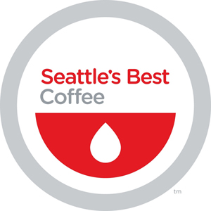
As far as rebrands / logo refreshes go, this one isn't bad. It emphasizes a core element of the old logo without changing it significantly. The update feels fresh but still has a strong traditional thread. This seems a whole lot better than the aforementioned Seattle's Best rebrand or other drastic / disastrous rebrands in recent history (UPS, Tropicana, Pepsi, etc.).
posted by scelerat at 1:31 PM on January 5, 2011
posted by scelerat at 1:31 PM on January 5, 2011
Once I worked at a B&N cafe, and we got a shipment of misprinted Starbucks cups with nothing in the center of the ring. Needless to say sharpies + bored, resentful baristas = many, many new logo candidates that day. The poison control logo was my fave.
posted by activitystory at 1:32 PM on January 5, 2011 [10 favorites]
posted by activitystory at 1:32 PM on January 5, 2011 [10 favorites]
Jesus that robot in the video is fucking creepy looking.
posted by Threeway Handshake at 1:33 PM on January 5, 2011
posted by Threeway Handshake at 1:33 PM on January 5, 2011
I never even noticed the black. In fact, at first glance I couldn't tell what was different. I'll still recognize it as Starbucks: Home of Shitty Overpriced Coffee, and I still won't drink it unless I'm desperate for a cuppa.
posted by Malice at 1:34 PM on January 5, 2011
posted by Malice at 1:34 PM on January 5, 2011
The green (like their straws!) is a much stronger brand signifier to a consumer like me.
Do humans actually talk like this?
I'm a regular-old-consumer (no background in marketing, for example) and I didn't blink at that sentence. It's a precise, if jargony, way of communicating a cluster of ideas. Can you think of a way to state that cluster of ideas as clearly and more succinctly? I can't.
And I see vespabelle's point: I was recently watching some TV show and absently noticed that the characters' coffee cup logos were obscured, but that the greens straws still tipped me off that they were apparently drinking Starbucks. (And I wondered if that counted as product placement or not; if I remembered which show, I'd have looked at the credits for "promotional consideration by [whatever."]) If I, who doesn't even go to Starbucks, can notice that so easily, then it's a pretty distinctive detail.
posted by Elsa at 1:35 PM on January 5, 2011 [3 favorites]
Mermaids are lactating fish, dammit!
I thought they were aquatic mammals - like the platypus.
posted by Joe Beese at 1:35 PM on January 5, 2011 [1 favorite]
I thought they were aquatic mammals - like the platypus.
posted by Joe Beese at 1:35 PM on January 5, 2011 [1 favorite]
Erm....she does have nipples. They're under her hair. Her breasts are too far apart due to a crappy boob job. Don't be so goddamn insensitive.
posted by iconomy at 1:36 PM on January 5, 2011 [2 favorites]
posted by iconomy at 1:36 PM on January 5, 2011 [2 favorites]
Along with Chile's and McDonalds, Starbucks is just getting ready for the illiterate masses as Idiocracy comes to pass.
posted by hippybear at 1:36 PM on January 5, 2011 [7 favorites]
posted by hippybear at 1:36 PM on January 5, 2011 [7 favorites]
Not much of an issue. Taking an already familiar visual image, removing the no-longer necessary identifying lettering and changing the color to that of the lettering while making no visible change in the illustration. Doesn't McDonald's already use the "golden arches M" without the name on its packaging? Yep. So let's come out and say it... Starbucks is copying McDonald's. *giggle*
What has always disturbed me about Starbucks was the original logo, a mermaid with a split tail holding both parts of the tail in her two hands, or, more accurately, a slut mermaid spreading her scaly legs. the first 'modern' version partially obscured the tacky imagery, but apparently when they went public, they had to reframe the image to make the 'tails' totally unidentifiable. A whole generation has grown up thinking she's holding up two bundles of seaweed, but seriously, why haven't womens groups come down on this sluttiest of modern logos?
posted by oneswellfoop at 1:44 PM on January 5, 2011 [1 favorite]
A lot of things weren't labeled beyond caracatures in Idiocracy too. Starbucks is just planning ahead.
Sorry folks that wanted StarTrek (or even BladeRunner) for their sci-fi future...
posted by Nanukthedog at 1:44 PM on January 5, 2011 [1 favorite]
Sorry folks that wanted StarTrek (or even BladeRunner) for their sci-fi future...
posted by Nanukthedog at 1:44 PM on January 5, 2011 [1 favorite]
The first two things people notice in a logo are shape, and then color. This logo keeps the same shape and color as the original logo and I don't think it's so different that it's unrecognizably Starbucks. The very fact that people haven't noticed the siren in the past kind of indicates a re-emphasis on the siren would be good for a rebranding.
That being said, I never really understood what a siren had to do with coffee or Starbucks' business model. They're attractive? Draw you in?
I love how all the agency did for this "new" logo was remove the outer ring and change the siren to green—for which they will be paid approximately $8,345,228,002.99.
Rebranding is hard, because you really can't completely change a recognizable identity. It needs to carry some part of the brand's legacy with it, especially if that brand is Everywhere. I don't envy the agencies that do large rebranding projects like this - no matter what change you make, there are going to be scores of people who dislike it or say things like this.
It reminds me of this Modern Art cliché.
posted by girih knot at 1:45 PM on January 5, 2011 [1 favorite]
giraffe: Bah. She's still missing her nipples
Artw: Still no tits or bellybuttonYou guys do know the original logo had both tits and apparently a bellybutton at the beginning, right?
posted by hincandenza at 1:50 PM on January 5, 2011
This is why it sucks that Wikipedia no-longer has a page for "the mermaid problem".
posted by Artw at 1:51 PM on January 5, 2011
posted by Artw at 1:51 PM on January 5, 2011
why haven't womens groups come down on this sluttiest of modern logos?
Who said it was modern? Images of twin-tailed mermaids date back centuries, and the one on the Starbucks logo has been identified with a melusine.
posted by Halloween Jack at 1:51 PM on January 5, 2011 [1 favorite]
Who said it was modern? Images of twin-tailed mermaids date back centuries, and the one on the Starbucks logo has been identified with a melusine.
posted by Halloween Jack at 1:51 PM on January 5, 2011 [1 favorite]
Makes sense. Now they can be global without having to localize "Starbucks" and "Coffee" into a hundred different languages.
Personally I liked the original logo. That one is still used in the market location in Seattle.
posted by jeffamaphone at 1:55 PM on January 5, 2011
Personally I liked the original logo. That one is still used in the market location in Seattle.
posted by jeffamaphone at 1:55 PM on January 5, 2011
I would like to see a cage match between the Starbuck's Mermaid and the Land o' Lakes Woman. Two shall enter. One shall leave.
posted by quadog at 1:57 PM on January 5, 2011 [3 favorites]
posted by quadog at 1:57 PM on January 5, 2011 [3 favorites]
Once the marketingspeak used the word 'unbound' all I could think about was Zalgo, whom I shall henceforth associate with Starbucks.
posted by jtron at 1:58 PM on January 5, 2011 [1 favorite]
posted by jtron at 1:58 PM on January 5, 2011 [1 favorite]
hincandenza: "You guys do know the original logo had both tits and apparently a bellybutton at the beginning, right?"
Yup! That's why it's so frustrating!
posted by giraffe at 2:02 PM on January 5, 2011 [1 favorite]
Yup! That's why it's so frustrating!
posted by giraffe at 2:02 PM on January 5, 2011 [1 favorite]
girih knot: That being said, I never really understood what a siren had to do with coffee or Starbucks' business model. They're attractive? Draw you in?Well, the chain was named after first mate Starbuck from Moby Dick. Presumably the siren is a continuation of the nautical theme.
posted by skymt at 2:05 PM on January 5, 2011
Bo-ring.
posted by dougrayrankin at 2:05 PM on January 5, 2011
posted by dougrayrankin at 2:05 PM on January 5, 2011
For people all over the globe, she is a signal of the world’s finest coffee
Not in Australia, where most of your stores closed down, you fucking hacks. Take your swill and go elsewhere.
posted by His thoughts were red thoughts at 2:08 PM on January 5, 2011 [3 favorites]
Not in Australia, where most of your stores closed down, you fucking hacks. Take your swill and go elsewhere.
posted by His thoughts were red thoughts at 2:08 PM on January 5, 2011 [3 favorites]
One–color print job x A bazillion coffee cups = $$$$$$$$$
posted by Kabanos at 2:12 PM on January 5, 2011 [22 favorites]
Seems to be right in-line with the recent redesign of Starbucks' other brand.
Wow, that's bad. The original says "mmm, good old-fashioned coffee. You know what I could use right now? A big cup of coffee".
The new one says BLOOD FOR THE BLOOD GOD.
posted by vorfeed at 2:13 PM on January 5, 2011 [13 favorites]
Wow, that's bad. The original says "mmm, good old-fashioned coffee. You know what I could use right now? A big cup of coffee".
The new one says BLOOD FOR THE BLOOD GOD.
posted by vorfeed at 2:13 PM on January 5, 2011 [13 favorites]
It simply means they have become such a large recognized company that everyone knows them by their logo alone. If they actually paid someone to figure this out then I question their business sense.
posted by Rashomon at 2:14 PM on January 5, 2011
posted by Rashomon at 2:14 PM on January 5, 2011
I have no words for this.
posted by azarbayejani at 2:15 PM on January 5, 2011
posted by azarbayejani at 2:15 PM on January 5, 2011
get it?
posted by azarbayejani at 2:15 PM on January 5, 2011 [1 favorite]
posted by azarbayejani at 2:15 PM on January 5, 2011 [1 favorite]
Presumably the siren is a continuation of the nautical theme.
Well, that and the fact that the current "original" location is directly across from a huge fish market and nearly on the sound, and the actual original location was within the same building as the fish market...
The nautical theme isn't surprising.
posted by hippybear at 2:16 PM on January 5, 2011
Well, that and the fact that the current "original" location is directly across from a huge fish market and nearly on the sound, and the actual original location was within the same building as the fish market...
The nautical theme isn't surprising.
posted by hippybear at 2:16 PM on January 5, 2011
Well, their fucking Web site crashed Flash. Thanks for nothing, Starbucks.
Bo-ring.
Seriously. This is awfully trivial.
posted by mrgrimm at 2:16 PM on January 5, 2011
Bo-ring.
Seriously. This is awfully trivial.
posted by mrgrimm at 2:16 PM on January 5, 2011
In the images of the new logo, I was kind of surprised to see the registered trademark symbol (®) next to all the previous iterations but the regular symbol (™) next to the new one. I wonder what that's about. Registration still pending? Different rules for text-free images? Or something else?
posted by The Winsome Parker Lewis at 2:20 PM on January 5, 2011 [1 favorite]
posted by The Winsome Parker Lewis at 2:20 PM on January 5, 2011 [1 favorite]
I don't envy the agencies that do large rebranding projects like this - no matter what change you make, there are going to be scores of people who dislike it or say things like this.
Yeah, I was being slightly tongue-in-cheek. Marketing is my occupation and I'm usually one of the few defending the excesses of capitalism around here.
posted by pineapple at 2:24 PM on January 5, 2011
Yeah, I was being slightly tongue-in-cheek. Marketing is my occupation and I'm usually one of the few defending the excesses of capitalism around here.
posted by pineapple at 2:24 PM on January 5, 2011
At least they were smart enough to know that a company shouldn't change it's logo. Unlike the Gap, KFC, Pizza Hut, etc etc etc.
posted by Liquidwolf at 2:25 PM on January 5, 2011
posted by Liquidwolf at 2:25 PM on January 5, 2011
If you ever feel like starting your own company, Pour Your Heart Into It: How Starbucks Built a Company One Cup at a Time is an amazingly good read.
posted by KokuRyu at 2:25 PM on January 5, 2011
posted by KokuRyu at 2:25 PM on January 5, 2011
This is awfully trivial.
Overthinking a cup of beans?
posted by We had a deal, Kyle at 2:27 PM on January 5, 2011 [2 favorites]
Overthinking a cup of beans?
posted by We had a deal, Kyle at 2:27 PM on January 5, 2011 [2 favorites]
Company I hate, whose product and business practices I hate, does some standard corporate self-masturbatory bullshit.
Okay. Thanks for that.
posted by Decani at 2:28 PM on January 5, 2011 [2 favorites]
Okay. Thanks for that.
posted by Decani at 2:28 PM on January 5, 2011 [2 favorites]
Well, the chain was named after first mate Starbuck from Moby Dick. Presumably the siren is a continuation of the nautical theme.
You're on the right track, but you need to delve deeper into ancient mythology to make the connection:
In Greek mythology, the Sirens were seductresses who lured sailors with enchanting music and voices to shipwreck on rocky coasts.
Today, the Siren(tm) lures urban dwellers to a muddy, putrid liquid-death with point-of-purchase music compilations featuring sultry voices and lush instrumentation that, when heard in passing, compel the rest of us to bash our heads against craggy rocks.
posted by prinado at 2:38 PM on January 5, 2011 [2 favorites]
How's this for a brand signifier; my internal dialog of the name of the business is always said in a lispy, bitchy, gay man's voice: Sztar-buksz
posted by wcfields at 2:41 PM on January 5, 2011 [1 favorite]
posted by wcfields at 2:41 PM on January 5, 2011 [1 favorite]
"We've allowed her to come out of the circle in a way that I think gives us the freedom and flexibility to think beyond coffee."
There's a 1:1 relationship between the amount of bullshit in this sentence and the shitty taste of their coffee. That is an achievement.
posted by ob at 2:45 PM on January 5, 2011 [1 favorite]
There's a 1:1 relationship between the amount of bullshit in this sentence and the shitty taste of their coffee. That is an achievement.
posted by ob at 2:45 PM on January 5, 2011 [1 favorite]
The new logo immediately reminded me of the Girl Scouts logo, although upon further inspection the only similarity is that they are both roundish and green. Nevertheless...
posted by pemberkins at 2:54 PM on January 5, 2011 [1 favorite]
posted by pemberkins at 2:54 PM on January 5, 2011 [1 favorite]
All I see in this logo are cheap 1-color stickers. Loads of stickers. The front of the building is going to look like a wall with a giant, 1-color sticker. And I bet the name badges will be round now too. Round pins...almost cheaper than stickers.
posted by iamkimiam at 2:56 PM on January 5, 2011 [1 favorite]
posted by iamkimiam at 2:56 PM on January 5, 2011 [1 favorite]
As a soon to be former employee of Starbucks, I am getting ready to divest myself of some stock options. I just have one question about this logo nonsense: Will this affect share prices?
posted by Gin and Comics at 3:04 PM on January 5, 2011
posted by Gin and Comics at 3:04 PM on January 5, 2011
And as always, she is urging all of us forward to the next thing.
Doom?
posted by nickmark at 3:13 PM on January 5, 2011
Doom?
posted by nickmark at 3:13 PM on January 5, 2011
huh. my best friend worked on this campaign (mostly internal design), which is going to be pretty multi-faceted I guess. I don't really have an opinion one way or another on the logo, except I also didn't notice the mermaid until a couple years ago. wild how we can see something a thousand times without it really registering. kind of like my husband and spelling.
posted by changeling at 3:24 PM on January 5, 2011
posted by changeling at 3:24 PM on January 5, 2011
I want to have a pool where I can bet when a company is going to go out of style.
posted by anniecat at 3:26 PM on January 5, 2011
posted by anniecat at 3:26 PM on January 5, 2011
A company is changing their logo and a bunch of design nerds hate it? Is my egg finished already?
posted by Legomancer at 3:31 PM on January 5, 2011 [4 favorites]
posted by Legomancer at 3:31 PM on January 5, 2011 [4 favorites]
A waging pool? Shallow.
posted by panaceanot at 3:32 PM on January 5, 2011
posted by panaceanot at 3:32 PM on January 5, 2011
I liked it better when you could see the mermaid's junk.
posted by clvrmnky at 3:33 PM on January 5, 2011
posted by clvrmnky at 3:33 PM on January 5, 2011
"a bunch of design nerds" - Legomancer
posted by panaceanot at 3:33 PM on January 5, 2011
posted by panaceanot at 3:33 PM on January 5, 2011
The camera keeps zooming in. Seven years from now, the Starbucks logo will be a green crescent which is all you can see of the mermaid's chin.
posted by straight at 3:42 PM on January 5, 2011 [3 favorites]
posted by straight at 3:42 PM on January 5, 2011 [3 favorites]
You guys do know the original logo had both tits and apparently a bellybutton at the beginning, right?
You thought that was the original logo? Oh, that's a pale shadow of how it looked before marketing got their hands on it. (NSFW@SBucks)(further discussion)
posted by sebastienbailard at 3:44 PM on January 5, 2011 [4 favorites]
You thought that was the original logo? Oh, that's a pale shadow of how it looked before marketing got their hands on it. (NSFW@SBucks)(further discussion)
posted by sebastienbailard at 3:44 PM on January 5, 2011 [4 favorites]
The preview link is dead, if that means anything.
Wonder if it has anything to do with the 2 million fish in Maryland?
posted by Twang at 3:56 PM on January 5, 2011
Wonder if it has anything to do with the 2 million fish in Maryland?
posted by Twang at 3:56 PM on January 5, 2011
theodolite : Do humans actually talk like this?
Nope. You can further test this by suggesting they need to add some Comic Sans to the logo, and watch the designdroids blow a CPU.
That, and I suspect someone, somewhere would literally break down and cry to learn that, before reading this thread, I couldn't have told you (without looking) that Starbucks had a black and green logo.
Tempest in a venti chai, and all that.
posted by pla at 4:00 PM on January 5, 2011
"This service is unavailable." Did we break Starbucks?
posted by kaspen at 4:13 PM on January 5, 2011
posted by kaspen at 4:13 PM on January 5, 2011
1.) When I first heard the news, I thought they were getting rid of the naked hippy chick. Nice head fake, Starbugs.
2.) Twin Tail?!?! Those are her legs ?!?! That's about 8 different types of funny.
posted by djrock3k at 4:17 PM on January 5, 2011
2.) Twin Tail?!?! Those are her legs ?!?! That's about 8 different types of funny.
posted by djrock3k at 4:17 PM on January 5, 2011
I liked it when it had boobies.
posted by punkfloyd at 4:26 PM on January 5, 2011 [1 favorite]
posted by punkfloyd at 4:26 PM on January 5, 2011 [1 favorite]
I'm really looking forward to the next 40 years of Starbucks.
posted by cthuljew at 4:29 PM on January 5, 2011
posted by cthuljew at 4:29 PM on January 5, 2011
Those are her legs ?!?!
"Why couldn’t she be the other type of mermaid, with the fish part on top and the lady part on the bottom?!"
posted by mendel at 4:36 PM on January 5, 2011 [3 favorites]
"Why couldn’t she be the other type of mermaid, with the fish part on top and the lady part on the bottom?!"
posted by mendel at 4:36 PM on January 5, 2011 [3 favorites]
"This service is unavailable."
I'm getting that too.
posted by John Cohen at 4:37 PM on January 5, 2011 [1 favorite]
I'm getting that too.
posted by John Cohen at 4:37 PM on January 5, 2011 [1 favorite]
Hooray, a giant corporation with three shops in my small town alone including two in the same shopping plaza is changing its ubiquitous logo!
posted by JHarris at 4:55 PM on January 5, 2011 [1 favorite]
posted by JHarris at 4:55 PM on January 5, 2011 [1 favorite]
I had no idea the things to either side of her were upturned fish legs. She's like an aquatic counterpart to Mithras.
I wonder if I can make a few grand selling a conspiracy theory book alleging that very thing.
posted by clarknova at 4:56 PM on January 5, 2011
I wonder if I can make a few grand selling a conspiracy theory book alleging that very thing.
posted by clarknova at 4:56 PM on January 5, 2011
> The green (like their straws!) is a much stronger brand signifier to a consumer like me.
Do humans actually talk like this?
posted by theodolite at 1:21 PM on 1/5
Normally, I don't talk like that but I guess reading about branding and re-branding and corporate image I'd something to my brain. (I still think black is pretty minor in terms of Starbucks' logo.)
posted by vespabelle at 5:11 PM on January 5, 2011
So ... now is the time to simultaneously destroy a piece of corporate art and a chain coffee outlet?
posted by bwg at 5:12 PM on January 5, 2011 [3 favorites]
posted by bwg at 5:12 PM on January 5, 2011 [3 favorites]
blucevalo: "Wow, that is some first-class primo corporate bullshit there"
Or you could have said: "Wow, that is some venti primo corporate bullshit there."
But then Starbucks would get wind of it and immediately invent a new, larger size:
Venti Primo.
posted by bwg at 5:16 PM on January 5, 2011
Or you could have said: "Wow, that is some venti primo corporate bullshit there."
But then Starbucks would get wind of it and immediately invent a new, larger size:
Venti Primo.
posted by bwg at 5:16 PM on January 5, 2011
wild how we can see something a thousand times without it really registering.
Like the arrow in the FedEx logo. I can still remember the moment I suddenly saw it, after years of not seeing it. Hit me like a dope-slap upside of my head. It suddenly jumped toward the top of my "Wish I'd designed that one" list.
posted by Thorzdad at 5:19 PM on January 5, 2011 [1 favorite]
Like the arrow in the FedEx logo. I can still remember the moment I suddenly saw it, after years of not seeing it. Hit me like a dope-slap upside of my head. It suddenly jumped toward the top of my "Wish I'd designed that one" list.
posted by Thorzdad at 5:19 PM on January 5, 2011 [1 favorite]
i like their logo as far as those things go. but i don't drink their coffee. i live in portland, why in the hell would i not go to any of the countless shops in town that brew with far tastier coffee? i wouldn't.
posted by rainperimeter at 5:22 PM on January 5, 2011
posted by rainperimeter at 5:22 PM on January 5, 2011
Only slightly relevant link to the best thing Starbucks has ever done. Ever, ever, ever.
Previously.
posted by Muttoneer at 5:57 PM on January 5, 2011
Previously.
posted by Muttoneer at 5:57 PM on January 5, 2011
Had to stop on my way to the shitter to get a pair of scissors and cut off my huge cluster of ideas. So, where were we?
posted by mr.marx at 6:16 PM on January 5, 2011 [1 favorite]
posted by mr.marx at 6:16 PM on January 5, 2011 [1 favorite]
Hmmm. I feel...nothing about this logo change. As someone who loves crapping on Starbucks as much as anyone else, it seems like I should be interested or have something to say about it, but I don't care at all. Is that good or bad, from Starbucks' point of view?
The linked Seattle's Best logo redesign made me think, though, about a weird current trend in corporate logos. Seattle's Best. Giant Food. Gap.
I appreciate the trend toward simplicity, but all the linked examples look so cheap and unfinished, like something in the header of a content farm site or maybe something a student would draw for a fictional company for an Econ report. Like they're trying to be sleek and vaguely European, but it's not quite gelling. What's with that? What's that style called? Blech.
posted by peachfuzz at 6:25 PM on January 5, 2011
Starbucks is going to damage brand awareness with this change. The mermaid is probably the least noticeable element of the current logo.
The part of the logo that's always jumped off the cup for me has been the brand name itself. The lettering is big and bold. The mermaid's just sort of in the background and easy to overlook.
Plus, Starbucks is such a great name: why de-emphasize it?
posted by jeremy b at 6:43 PM on January 5, 2011 [1 favorite]
Echoing peachfuzz's concerns about the trend towrads minimalism in logos. It is on the verge of (if not already) a "thing" in that talentless hacks are starting to get wind id=f it and come up with charmless logos that are really nothing more than prelimanary sketeches. But this this is not what concerns me.
What concerns me is the inevitable backlash against the rising wave of crappy minimalist logos. Soon every other BoingBoing/Gizmodo post is going to be how AWESOME this overly onamented, unintelligble, Victorian style logo is. This too, will be come a "thing" perpretared by the same talentless hacks who gave us tghe crappy minimalist logos. I weep for the future, a future in which it will look like every Dover Press Clip Art book has spilled forth onto all available white space,
posted by KingEdRa at 6:51 PM on January 5, 2011
Yeah, this seems like a poor choice in my opinion. The mermaid has nothing to do with the brand, and hasn't for a long time. The logo, to me, was a black circle with green and white inside. Not a mermaid. As jeremy said, the lettering on the outer circle was strong and noticeable. I think this change sucks.
posted by sophist at 7:43 PM on January 5, 2011
posted by sophist at 7:43 PM on January 5, 2011
I like how it embraces and respects their heritage while evolving to be suitable for the future.
posted by mazola at 8:21 PM on January 5, 2011 [4 favorites]
posted by mazola at 8:21 PM on January 5, 2011 [4 favorites]
A Mermaid is like two demigods removed from a Gorgon Stare.
posted by ovvl at 9:06 PM on January 5, 2011
posted by ovvl at 9:06 PM on January 5, 2011
I like how it evolves and makes suitable their embrace while their future is heritable and respectful.
posted by maxwelton at 9:09 PM on January 5, 2011 [1 favorite]
posted by maxwelton at 9:09 PM on January 5, 2011 [1 favorite]
Looks like the two-headed snake thing from the Conan movies. "Our coffee bites"?
posted by buzzman at 9:22 PM on January 5, 2011
posted by buzzman at 9:22 PM on January 5, 2011
I don't mind this.
It's waay better than the new Comedy Central logo
posted by The Esteemed Doctor Bunsen Honeydew at 9:44 PM on January 5, 2011
It's waay better than the new Comedy Central logo
posted by The Esteemed Doctor Bunsen Honeydew at 9:44 PM on January 5, 2011
Somebody always deems it a hot mess.
posted by chundo at 10:15 PM on January 5, 2011 [1 favorite]
posted by chundo at 10:15 PM on January 5, 2011 [1 favorite]
The mermaid might not have anything to do with coffee, but it's been part of their branding for a long time, and it still works. When you're scanning the mini mall for a Starbucks location, and you're not too cool to admit it, what do you look for? Not the word "Starbucks." If you're anything like me, you look for a green circle. And when you find a green circle, you do a second check to make sure it's not somebody else's green circle. Mermaid? Ah, okay. Now I know it's Starbucks. The name is the last thing I scan for. This is also exactly why their new Seattle's Best branding sucks. There's nothing left of the branding but the name, and it now looks generic. Granted, SE doesn't have the cachet that SB does. If you're drinking Seattle's best outside your home, you probably just happen to be at a place that serves it. And now the logo looks like that.
posted by katillathehun at 10:15 PM on January 5, 2011
posted by katillathehun at 10:15 PM on January 5, 2011
Uh, that's SE as in Seattle. See what I mean? I can't even remember the acronym. GREEN. MERMAID.
posted by katillathehun at 10:17 PM on January 5, 2011
posted by katillathehun at 10:17 PM on January 5, 2011
Reminds me of this. Which reminds me of this. Which makes me laugh.
Like Starbucks' coffee.
Also, this readies them for international expansion? Does that mean there will be more?!
With more than 5,500 coffeehouses in over 50 countries....
posted by chavenet at 10:20 PM on January 5, 2011
Like Starbucks' coffee.
Also, this readies them for international expansion? Does that mean there will be more?!
With more than 5,500 coffeehouses in over 50 countries....
posted by chavenet at 10:20 PM on January 5, 2011
STARBUCKS COFFEE is an anagram of BET FOR CAFE SUCKS
posted by twoleftfeet at 10:48 PM on January 5, 2011
posted by twoleftfeet at 10:48 PM on January 5, 2011
Those are tails? I thought she had cloven-hoof hands or something.
posted by Raunchy 60s Humour at 10:58 PM on January 5, 2011
posted by Raunchy 60s Humour at 10:58 PM on January 5, 2011
What's with the science-class soundtrack in the video?
posted by threeants at 11:02 PM on January 5, 2011
posted by threeants at 11:02 PM on January 5, 2011
Add a black ring around it and I'm in. Not into it sans black.
posted by wemayfreeze at 11:14 PM on January 5, 2011
posted by wemayfreeze at 11:14 PM on January 5, 2011
This is awfully trivial.
Ho ho ho! To you, maybe! But did you read this, by Steve M. senior writer???
"As a writer, though, I can tell you that there is a lot more to her than just the design and how she looks. This is what she means to me, and to us.
She is a storyteller, carrying the lore of Starbucks ahead, and remembering our past. In a lot of ways, she’s a muse –always there, inspiring us and pushing us ahead.
And she’s a promise too, inviting all of us to find what we’re looking for, even if it’s something we haven’t even imagined yet.
Shh!! Stop laughing! How dare you? He's not done yet!!
She means something different to every one who sees her, who knows her. For me she’s kind of the final say on the spirit of everything I write and everything we do. Even as I’m writing this, I wonder what she thinks. (She likes it, by the way.)
Here we are today. Our new evolution liberates the Siren from the outer ring, making her the true, welcoming face of Starbucks. For people all over the globe, she is a signal of the world’s finest coffee – and much more. She stands unbound, sharing our stories, inviting all of us in to explore, to find something new and to connect with each other. And as always, she is urging all of us forward to the next thing. After all, who can resist her?"
---
THERE. Important enough for you? This logo is obviously the eminent symbol of our time! To me she's an end to all communicable disease, and a vision of society where every human soul shines like a star in the night sky. Blasphemers will say that she is the same logo that's been around since 1992--only a half-assed minimalist effort worth a solid B- in any first-year design class--but someday their own children will call them liars and spit at their memory. Mark me now, armies will mass under her banner, and the world will be purged of sin by her righteous green hand. Accept her today and rule in paradise tomorrow; deny her and oblivion is yours.
I'm getting my tattoos right away--across my back, on each forearm, and over my entire face. On your knees, fools. PRAY to it.
posted by millions at 11:58 PM on January 5, 2011 [2 favorites]
One colour now? All this to cut printing costs?
posted by londonmark at 12:35 AM on January 6, 2011
posted by londonmark at 12:35 AM on January 6, 2011
The linked Seattle's Best logo redesign made me think, though, about a weird current trend in corporate logos.
It made me think about uvulas. And the Awesome smiley. But mostly uvulas.
posted by Lazlo at 12:50 AM on January 6, 2011 [1 favorite]
It made me think about uvulas. And the Awesome smiley. But mostly uvulas.
posted by Lazlo at 12:50 AM on January 6, 2011 [1 favorite]
I just have to say, the Starbucks in Pike Place Market, which isn't the original location but just around the corner, totally has the comfiest damn chairs and most pleasant lighting of any Starbucks I've ever been in. And, it's slightly less pretentious and more personable than you might think, at least in terms of decor and the people who are obviously hand-picked to work there on the basis of barista attitude. I still get my cappuccino from Seattle Coffee Works, though.
posted by Mizu at 3:13 AM on January 6, 2011
posted by Mizu at 3:13 AM on January 6, 2011
Oh, and, er, logo thoughts:
I like the new version. It places more emphasis on the linear curves and the symmetry of the symbol. If they're trying to represent "coffee", they're not doing a bad job of it. Look - the undulating lines of her hair evoke steam rising or liquid pouring into a hot cup. The gradated curving lines along her fishtails form impressions of the sea - historically relevant to the SB brand and a reminder of coffee's trade-sourced origins. If you didn't know she was a siren or a mermaid, you could also see the fishtail shapes like two large pitchers that she's holding out towards the viewer, which reminds me of images like the Temperance tarot card, or the symbol of Aquarius. The spiky negative shape on the top of the logo formed by the crown, star, and tail fins speak to the idea of wakefulness and action - again, that coffee thing coming back at you, while the circular echo in the lower portion of the image simultaneously helps ground it and provides a feeling of calm.
Removing the outer ring gets rid of a lot of unbalanced noise that was fighting with the symmetry of the logo. It also removes the extraneous stars - if, perhaps, they were stars that represented the ones used to navigate early coffee trade routes, I could dig it, but they weren't and they didn't need to be there, except to help nail down the big, blocky, poorly kerned STARBUCKS COFFEE letters. Making the whole thing green, yes, cuts it down to a single color printing process, but also points both to the oceanic motif and Starbucks' vocal insistence on healthier, cleaner business practices (the veracity of which you are free to question.) All in all, some smart choices were made in each iteration of the new logo.
I still like the one with the boobs best, of course.
posted by Mizu at 3:27 AM on January 6, 2011 [1 favorite]
Starbucks is not doing very well in the UK. They have been closing stores.
They tried to blame it on the UK economy but that would fail to explain why their biggest rival, Costa coffee, has been continuing to expand.
posted by vacapinta at 4:04 AM on January 6, 2011
They tried to blame it on the UK economy but that would fail to explain why their biggest rival, Costa coffee, has been continuing to expand.
posted by vacapinta at 4:04 AM on January 6, 2011
DO NOT turn down the volume and instead listen to Sarah by the Starship, while watching this..One Man And His Cup, you'll have an anxiety attack.
posted by Flex1970 at 4:12 AM on January 6, 2011
posted by Flex1970 at 4:12 AM on January 6, 2011
On their hopes for international expansion: why Starbucks failed in Australia. A brand was never going to save them here. There was a huge amount of hype when they first opened - as there was for Krispy Kreme - but it wore off pretty fast once people realised that the product, for Australian tastes, wasn't actually very good.
posted by une_heure_pleine at 7:14 AM on January 6, 2011
posted by une_heure_pleine at 7:14 AM on January 6, 2011
The older versions of the logo made me think of vintage gas pumps, fishing tackle boxes full of hand-tyed flies, artisan beers, shaving brushes, and L.L. Bean duck boots. In other words, carefully crafted quality. Doing something the right way, rather than the fastest way.
The new one makes me think of a dollar store. Cheap, loud, annoying.
posted by MexicanYenta at 7:25 AM on January 6, 2011
The new one makes me think of a dollar store. Cheap, loud, annoying.
posted by MexicanYenta at 7:25 AM on January 6, 2011
Wow. I just checked the new rebranded website for Seattle's Best and it's horrible... they've basically gone from an overbearing flash based site with a badly thought out interface to an overbearing JavaScript based website with a badly thought out interface. I'm sure the words "HTML 5" were used many times in meetings for this.
Also, yeah, new SB brand is bland and a weird departure.
posted by Artw at 10:54 AM on January 6, 2011
Also, yeah, new SB brand is bland and a weird departure.
posted by Artw at 10:54 AM on January 6, 2011
Aw, this means the Starbucks Parody Logo that May Not be Printed, Linked to from the Artists Website, or Otherwise Distributed will have to be updated!
posted by anthill at 7:40 PM on January 6, 2011 [1 favorite]
posted by anthill at 7:40 PM on January 6, 2011 [1 favorite]
Make the mermaid BIG!
Make the mermaid BIGGAHHHhhaHH!!!
posted by Ambrosia Voyeur at 10:12 PM on January 6, 2011 [1 favorite]
Make the mermaid BIGGAHHHhhaHH!!!
posted by Ambrosia Voyeur at 10:12 PM on January 6, 2011 [1 favorite]
When you're scanning the mini mall for a Starbucks location, and you're not too cool to admit it, what do you look for? Not the word "Starbucks." If you're anything like me, you look for a green circle.
So true—I was recently driving around my old hometown with a sweetheart who NEEDED CHAI and was able to spot the green circle amidst a boggling amalgam of suburbia from a good 500 yards out.
posted by carsonb at 5:28 PM on January 7, 2011
So true—I was recently driving around my old hometown with a sweetheart who NEEDED CHAI and was able to spot the green circle amidst a boggling amalgam of suburbia from a good 500 yards out.
posted by carsonb at 5:28 PM on January 7, 2011
Holy crap
Makes sense. The profit margin on coffee is huge. They can give you a bunch more for not too much money and make lots more money.
posted by mrgrimm at 9:01 AM on January 18, 2011
Makes sense. The profit margin on coffee is huge. They can give you a bunch more for not too much money and make lots more money.
posted by mrgrimm at 9:01 AM on January 18, 2011
« Older Down and Out on $250,000 a Year | Court: No Warrant Needed To Search Cell Phone Newer »
This thread has been archived and is closed to new comments
posted by empath at 1:14 PM on January 5, 2011