“But once you hear ‘swastika made of dicks’ it's kind of over."
February 5, 2019 9:36 AM Subscribe
Slack, the office messaging app company, unveiled a new logo. Five minutes later, Twitter got at it.
Outrage over logo design or transforming it into something unintended is not new.
But particularly over the past five years, designers have started strategizing about how their imagery will travel on troll-infested platforms. A big part of the design thinking process has become How will people twist our idea into something hideous or hateful?
[logo debacles previously: ■ © V 🍆 2012]
in fairness if you throw something random into a fourfold symmetry there's a 90% chance you'll end up with something swastika-adjacent
posted by BungaDunga at 9:41 AM on February 5, 2019 [49 favorites]
posted by BungaDunga at 9:41 AM on February 5, 2019 [49 favorites]
Yeah, the whole "swastika in the negative space" thing seems like a stretch to me. But that's what will get all the twitter action today.
posted by JoeZydeco at 9:44 AM on February 5, 2019 [3 favorites]
posted by JoeZydeco at 9:44 AM on February 5, 2019 [3 favorites]
The dicks thing is a lot harder to unsee. Specifically the idea of them as fun factory-esque dildoes with the teardrop part being the fake balls.
posted by dinty_moore at 9:46 AM on February 5, 2019 [15 favorites]
posted by dinty_moore at 9:46 AM on February 5, 2019 [15 favorites]
FWIW, the negative space makes a backwards swastika (Zs instead of Ss) ...but to me it just looks like a rainbow squirting butthole.
posted by sexyrobot at 9:50 AM on February 5, 2019 [1 favorite]
posted by sexyrobot at 9:50 AM on February 5, 2019 [1 favorite]
Marketing Puke: "So here are the 3 finalists for our new logo design, which we just spent $500,000 on. Should we market test them before we pick one and go live with it?"
Marketing VP: "Nah, that costs money. These are great designs because we spent $500,000 on them; what could possibly go wrong?"
posted by ZenMasterThis at 9:50 AM on February 5, 2019 [10 favorites]
Marketing VP: "Nah, that costs money. These are great designs because we spent $500,000 on them; what could possibly go wrong?"
posted by ZenMasterThis at 9:50 AM on February 5, 2019 [10 favorites]
Is there nothing that Nazis can't ruin? I mean, all these pinwheel fourfold symmetry designs ought to be cool looking. This is why we can't have nice things.
posted by elizilla at 9:51 AM on February 5, 2019 [5 favorites]
posted by elizilla at 9:51 AM on February 5, 2019 [5 favorites]
hello from 2019 and ARE YOU ON TEAM DICKS OR TEAM SWASTIKA
posted by prize bull octorok at 9:54 AM on February 5, 2019 [70 favorites]
posted by prize bull octorok at 9:54 AM on February 5, 2019 [70 favorites]
Something something sun microsystems, something 4chan logo, something creamaster cycle.
posted by poe at 9:55 AM on February 5, 2019 [10 favorites]
posted by poe at 9:55 AM on February 5, 2019 [10 favorites]
Yeah, the whole "swastika in the negative space" thing seems like a stretch to me.
Why? There is a swastika in the negative space. The negative space is part of the logo. If the designers didn’t intend it, they suck at their job.
(You too, Columbia.)
posted by Sys Rq at 9:55 AM on February 5, 2019 [4 favorites]
Why? There is a swastika in the negative space. The negative space is part of the logo. If the designers didn’t intend it, they suck at their job.
(You too, Columbia.)
posted by Sys Rq at 9:55 AM on February 5, 2019 [4 favorites]
in fairness if you throw something random into a fourfold symmetry there's a 90% chance you'll end up with something swastika-adjacent
here's the thing, 2-fold can be construed as female or male sexy bits, conspiracy theorists will accuse 3-fold of being a pedophilia symbol, 5-fold of being a pentagram, 6-fold of being a stand in for the Star of David...
posted by 445supermag at 9:56 AM on February 5, 2019 [13 favorites]
here's the thing, 2-fold can be construed as female or male sexy bits, conspiracy theorists will accuse 3-fold of being a pedophilia symbol, 5-fold of being a pentagram, 6-fold of being a stand in for the Star of David...
posted by 445supermag at 9:56 AM on February 5, 2019 [13 favorites]
Nothing a good IPO can't fix.
posted by ZeusHumms at 9:56 AM on February 5, 2019 [3 favorites]
posted by ZeusHumms at 9:56 AM on February 5, 2019 [3 favorites]
You have to do a bit of hunting to find the swastika in the negative space , but when the icon is monocolor and small, like the favicon is on a browser taskbar, the logo looks exactly like a swastika to me. I can't not see it. It's awful. I tucked it away in a folder that contains nothing else just so it's not constantly on my screen.
posted by painquale at 9:57 AM on February 5, 2019 [5 favorites]
posted by painquale at 9:57 AM on February 5, 2019 [5 favorites]
I mean, all these pinwheel fourfold symmetry designs ought to be cool looking.
What could possibly be even remotely cool about the 10,000,000th oblongs-in-a-square design that’s virtually indistinguishable from the previous 9,999,999?
posted by Sys Rq at 9:58 AM on February 5, 2019 [5 favorites]
What could possibly be even remotely cool about the 10,000,000th oblongs-in-a-square design that’s virtually indistinguishable from the previous 9,999,999?
posted by Sys Rq at 9:58 AM on February 5, 2019 [5 favorites]
My favorite outcome of this round of new logo mockery.
posted by zekesonxx
i'm truly at a loss
posted by dismas at 9:59 AM on February 5, 2019 [27 favorites]
posted by zekesonxx
i'm truly at a loss
posted by dismas at 9:59 AM on February 5, 2019 [27 favorites]
If you think the logo is bad, the favicon rendering of it (at least in Chrome) is worse. Fuckin' inscrutably awful -- it really, really amps up the "backwards swastika" look.
posted by tocts at 10:00 AM on February 5, 2019
posted by tocts at 10:00 AM on February 5, 2019
a cockstika if u will
posted by boo_radley at 10:03 AM on February 5, 2019 [19 favorites]
posted by boo_radley at 10:03 AM on February 5, 2019 [19 favorites]
Metafilter: The dicks thing is a lot harder to unsee.
posted by mandolin conspiracy at 10:03 AM on February 5, 2019 [9 favorites]
posted by mandolin conspiracy at 10:03 AM on February 5, 2019 [9 favorites]
I am on Team Dicks! I love dicks and unintentional dick-adjacent design!
posted by fluttering hellfire at 10:04 AM on February 5, 2019 [6 favorites]
posted by fluttering hellfire at 10:04 AM on February 5, 2019 [6 favorites]
This isn't a commentary on this post but just to say that with the new "everything is moving too fast" I feel like this news broke about 5 years ago and it was only 2 weeks.
posted by bleep at 10:05 AM on February 5, 2019 [19 favorites]
posted by bleep at 10:05 AM on February 5, 2019 [19 favorites]
My favorite outcome of this round of new logo mockery.
I....don't.....I don't get it. What is that re-spun into?
posted by EmpressCallipygos at 10:08 AM on February 5, 2019 [45 favorites]
I....don't.....I don't get it. What is that re-spun into?
posted by EmpressCallipygos at 10:08 AM on February 5, 2019 [45 favorites]
Would it have been too hard to pass it around on, oh I don't know, Slack and asked their own people for opinions? If nothing else it would be way less embarrassing.
posted by tommasz at 10:08 AM on February 5, 2019 [1 favorite]
posted by tommasz at 10:08 AM on February 5, 2019 [1 favorite]
It should be mentioned that there's a handy tool to help you design penis-free logos. (chrome only for me)
posted by Ansible at 10:09 AM on February 5, 2019 [9 favorites]
posted by Ansible at 10:09 AM on February 5, 2019 [9 favorites]
There is a swastika in the negative space.
Only if you ignore a bunch of the negative space as well though?
... And our brain is pretty good at that when it's favicon size, as it turns out.
"The swastika is already complete within the logo, before I start my work. It is already there, I just have to chisel away the superfluous material."
posted by ODiV at 10:10 AM on February 5, 2019 [7 favorites]
I'm not really seeing the swastika even in the favicon, but I believe some people do. Mostly it either looks like a flower or four duckies swimming in a circle, which are both fine, except for having precisely nothing to do with a chat program, It's not as though their "plaid? Why is this plaid?" logo was much better. There must have been some option that still actually looked like an octothorpe they could have gone with.
posted by Karmakaze at 10:10 AM on February 5, 2019 [1 favorite]
posted by Karmakaze at 10:10 AM on February 5, 2019 [1 favorite]
When they first rolled it out, I thought "Wet swastika." When I saw the white version in my system tray, I thought, "Oh, actually, it's a butthole." Now when I have a pending message, the tray icon gets a little red dot on the upper right, and every time I go, "gotta check the hemmorrhoid."
Like, I get their old logo was overly complicated, but this one is hideous.
posted by skullhead at 10:10 AM on February 5, 2019 [6 favorites]
Like, I get their old logo was overly complicated, but this one is hideous.
posted by skullhead at 10:10 AM on February 5, 2019 [6 favorites]
My favorite outcome of this round of new logo mockery.
I....don't.....I don't get it. What is that re-spun into?
It's the Loss meme.
posted by Etrigan at 10:11 AM on February 5, 2019 [12 favorites]
I....don't.....I don't get it. What is that re-spun into?
It's the Loss meme.
posted by Etrigan at 10:11 AM on February 5, 2019 [12 favorites]
What could possibly be even remotely cool about the 10,000,000th oblongs-in-a-square design that’s virtually indistinguishable from the previous 9,999,999?
You could make one out of penises with testicles hanging off. That would be cool.
posted by Tell Me No Lies at 10:16 AM on February 5, 2019 [2 favorites]
You could make one out of penises with testicles hanging off. That would be cool.
posted by Tell Me No Lies at 10:16 AM on February 5, 2019 [2 favorites]
a cockstika if u will
I was thinking swasdicka, but I think yours is better.
I guess you could say Slack blurs the line between Gemeinschaft and Gesellschaft.
posted by The Underpants Monster at 10:16 AM on February 5, 2019 [7 favorites]
I was thinking swasdicka, but I think yours is better.
I guess you could say Slack blurs the line between Gemeinschaft and Gesellschaft.
posted by The Underpants Monster at 10:16 AM on February 5, 2019 [7 favorites]
I still don't know what was so bad about the old logo.
posted by rhizome at 10:17 AM on February 5, 2019 [11 favorites]
posted by rhizome at 10:17 AM on February 5, 2019 [11 favorites]
hello from 2019 and ARE YOU ON TEAM DICKS OR TEAM SWASTIKA
Finally we're talking about the mouthfeel.
posted by octobersurprise at 10:18 AM on February 5, 2019 [29 favorites]
Finally we're talking about the mouthfeel.
posted by octobersurprise at 10:18 AM on February 5, 2019 [29 favorites]
I still don't know what was so bad about the old logo.
Nothing was wrong with it! But for some reason all companies think you have to have to change your logo very so often and it always SUCKS worse than the last one.
posted by Liquidwolf at 10:20 AM on February 5, 2019 [4 favorites]
Nothing was wrong with it! But for some reason all companies think you have to have to change your logo very so often and it always SUCKS worse than the last one.
posted by Liquidwolf at 10:20 AM on February 5, 2019 [4 favorites]
I find that the negative spaces created by the logo's testicles impede my ability to perceive the swastika
posted by prize bull octorok at 10:22 AM on February 5, 2019 [13 favorites]
posted by prize bull octorok at 10:22 AM on February 5, 2019 [13 favorites]
When it comes to logos with C4 symmetry, my favorite is still the old Sun logo.
posted by traveler_ at 10:23 AM on February 5, 2019 [20 favorites]
posted by traveler_ at 10:23 AM on February 5, 2019 [20 favorites]
a variation on an internet favorite from yesteryear
posted by ryanrs at 10:24 AM on February 5, 2019 [9 favorites]
posted by ryanrs at 10:24 AM on February 5, 2019 [9 favorites]
I still don't know what was so bad about the old logo.
They sort of explained it - too many colors, too many different versions of a logo, not enough cohesiveness, but they could have just taken one of the more simplified logo versions and kept that for everything. Also, it doesn't seem super cohesive now - there's still the full version, no no-color version, and the slackbot login version, and all of them look worse.
posted by dinty_moore at 10:25 AM on February 5, 2019 [5 favorites]
I still don't know what was so bad about the old logo.
Nothing was wrong with it! But for soem reason all companies think you have to have a new logo very so often and it always SUCKS worse than the last one.
The nonprofit I used to work for was looking into hiring a firm to build a new website and a logo redesign at the same time, and the reps who came out to talk to us said that a logo is only effective for about 3 years in today's market. I don't know how much of that is true and how much is salesmanship, but it definitely is a line of thinking that is alive out there.
posted by The Underpants Monster at 10:26 AM on February 5, 2019 [1 favorite]
The negative space is part of the logo. If the designers didn’t intend it, they suck at their job.
See also: the FedEx arrow.
posted by tobascodagama at 10:27 AM on February 5, 2019 [3 favorites]
See also: the FedEx arrow.
posted by tobascodagama at 10:27 AM on February 5, 2019 [3 favorites]
somebody is making millions of dollars per year as a logometrics consultant with nothing more than a bit of surveymonkey data and some theories they pulled out of their derriere and here you are doing actual work at a real job
posted by prize bull octorok at 10:28 AM on February 5, 2019 [12 favorites]
posted by prize bull octorok at 10:28 AM on February 5, 2019 [12 favorites]
The nonprofit I used to work for was looking into hiring a firm to build a new website and a logo redesign at the same time, and the reps who came out to talk to us said that a logo is only effective for about 3 years in today's market. I don't know how much of that is true and how much is salesmanship, but it definitely is a line of thinking that is alive out there.
Yep. Sounds like totally broken thinking. It's the opposite of the smart strategy which would be to never change your logo and let it become iconic.
posted by Liquidwolf at 10:29 AM on February 5, 2019 [19 favorites]
somebody is making millions of dollars per year as a logometrics consultant with nothing more than a bit of surveymonkey data and some theories they pulled out of their derriere and here you are doing actual work at a real job
Excuse you why do you think I'm posting here right now.
posted by dinty_moore at 10:34 AM on February 5, 2019 [5 favorites]
Excuse you why do you think I'm posting here right now.
posted by dinty_moore at 10:34 AM on February 5, 2019 [5 favorites]
But for some reason all companies think you have to have to change your logo every so often
There are two types of marketing.
The first type is measurable. Did a numerical metric go up? Sales up, user acquisition costs down, etc.
The second type recognizes that there are types of marketing activity that are wholly subjective and/or pummeled by external factors. You could have marketed the shit out of something, but it's just a bad product, period. Is that the marketer's fault? Not really.
Therefore, the measurement of success isn't an actual result in the marketplace. It's the story you can tell about how you spent the money. You're being measured only by the subjective impact of the story you can tell your boss. Is it a good story that shows you're being creative and energetic?
"What did you do with the marketing budget we gave you?"
"We did a lot of Very Important Research and we changed the logo to really Express Our Brand. It's new and hot and fresh. The millennials will love it."
"Great to hear. OK, next item..."
posted by Cool Papa Bell at 10:35 AM on February 5, 2019 [3 favorites]
"Great to hear. OK, next item..."
"...whoever is drawing rainbow swastikas of dicks all over the place needs to cut it out."
posted by Etrigan at 10:40 AM on February 5, 2019 [22 favorites]
"...whoever is drawing rainbow swastikas of dicks all over the place needs to cut it out."
posted by Etrigan at 10:40 AM on February 5, 2019 [22 favorites]
Sometimes logo redesigns come off great. I really love the 70's era Bell System logo; the previous one, though also iconic, was antiquated. The death star was a mistake, I think, but all in all it was ok. Not an improvement, but ok.
Anyway, this discussion would not be complete without the Pepsi Logo design document.
posted by sjswitzer at 10:40 AM on February 5, 2019 [7 favorites]
Anyway, this discussion would not be complete without the Pepsi Logo design document.
posted by sjswitzer at 10:40 AM on February 5, 2019 [7 favorites]
My company starting using Slack 2-3 months ago. I noticed the recent logo change. Something about it kind of tickled at the back of my mind in a vague unconscious way, but it wasn't until the very moment I read "swastika made of dicks" in the title that I thought "That's it!" - before I even saw it was referring to Slack.
posted by Greg_Ace at 10:41 AM on February 5, 2019
posted by Greg_Ace at 10:41 AM on February 5, 2019
It's the opposite of the smart strategy which would be to never change your logo and let it become iconic.
See, for example, the work Saul Bass
posted by exogenous at 10:42 AM on February 5, 2019 [4 favorites]
See, for example, the work Saul Bass
posted by exogenous at 10:42 AM on February 5, 2019 [4 favorites]
"a giant stepped on the Rainbow Goblins mid-circlejerk" -- My Take
posted by prize bull octorok at 10:42 AM on February 5, 2019
posted by prize bull octorok at 10:42 AM on February 5, 2019
Sometimes logo redesigns come off great. I really love the 70's era Bell System logo
True, but it's worth digging into why that redesign worked. IMO, it's because it kept the distinctive part of the old logo, while removing the excess stuff. This made it feel "modern" at the time, because that was the in thing to do, but it wasn't like they just threw away the name recognition they'd built up. It was a good evolutionary move.
posted by Kadin2048 at 10:45 AM on February 5, 2019 [3 favorites]
a logo is only effective for about 3 years in today's market.
I have no idea what that sentence could possibly mean.
The closest thing I can think of is "On average, most corporations burn all goodwill with their customers and potential customers every three years and need to rebrand everything to purge the negative associations people have with their current logo," which seems unlikely but at least sorta makes sense.
posted by straight at 10:46 AM on February 5, 2019 [30 favorites]
I still don't know what was so bad about the old logo.
The monochrome white-on-black with a slight tilt was fine. The color version was, as noted, too many colors. Each bar was a color, and then each point of overlap was yet another color, and a "muddy" color by current design standards at that. Print (and screen) tech has gotten to the point where design standards don't limit logos to one color (two at a stretch), but even Google's relatively garish branding stopped at four.
Adding on to the too many colors problem, slack branding flipped between the multi-color octothorpe and a close-up of the center that , out of context, just looked like plaid. There was no consistency about whether the # or the plaid logo was used, which is not great branding. Ideally a logo should be consistent, render well in greyscale (or have a good monchrome version), and be identifiable at both large and favicon sizes. The close-up/plaid failed at greyscale and the octothorpe failed at small.
The new logo isn't the worst ever. They dialed up the saturation, simplified the shapes, and took it down to a manageable four colors. The mistakes are mostly (a) abstracting the shapes into droplets and rounded corners, which is a recipe for accidental phallic effect and (b) forgetting why so many 4-fold logos are done at an angle.
Note also that the new logo came out two weeks before an IPO. They likely felt that they needed something that fit corporate branding guidelines better (especially the too many colors problem) in order to sell better.
posted by Karmakaze at 10:50 AM on February 5, 2019 [7 favorites]
I really love the 70's era Bell System logo; That was the awesome Saul Bass.
posted by Liquidwolf at 10:51 AM on February 5, 2019 [3 favorites]
posted by Liquidwolf at 10:51 AM on February 5, 2019 [3 favorites]
The only company who has actually improved their logo by changing it (that I can recall) is Google. Their current clean sans serif font logo is way better than that lame 90s looking serif logo they had before, which looked bland and outdated from the start.
posted by Liquidwolf at 10:57 AM on February 5, 2019 [2 favorites]
posted by Liquidwolf at 10:57 AM on February 5, 2019 [2 favorites]
looking into hiring a firm to build a new website and a logo redesign at the same time, and the reps who came out to talk to us said that a logo is only effective for about 3 years in today's market. I don't know how much of that is true and how much is salesmanship
0% and 100%, respectively.
posted by Sys Rq at 11:12 AM on February 5, 2019 [7 favorites]
0% and 100%, respectively.
posted by Sys Rq at 11:12 AM on February 5, 2019 [7 favorites]
Who would've guessed a logo bearing an image with a lot of unfortunate baggage could be produced by an agency called Pentagram?
posted by DrAstroZoom at 11:13 AM on February 5, 2019 [2 favorites]
posted by DrAstroZoom at 11:13 AM on February 5, 2019 [2 favorites]
First, I don't see what's weird about the link in the first comment, unless "meaningless thing" is what you were going at.
Second, holy CHRIST "branding and logo consultants" are just charlatans 99% of the time, aren't they? It's like people thought marketing was too wholesome and fact-based, so they moved into something MORE filled with woo.
posted by uberchet at 11:16 AM on February 5, 2019 [1 favorite]
Second, holy CHRIST "branding and logo consultants" are just charlatans 99% of the time, aren't they? It's like people thought marketing was too wholesome and fact-based, so they moved into something MORE filled with woo.
posted by uberchet at 11:16 AM on February 5, 2019 [1 favorite]
Boo_radley: a cockstika if u will
Schwantztika?
posted by dr_dank at 11:16 AM on February 5, 2019 [22 favorites]
Schwantztika?
posted by dr_dank at 11:16 AM on February 5, 2019 [22 favorites]
Is this where I come to complain about the eBay logo? I still think it looks crappy and boring.
get off my lawn
posted by littlesq at 11:23 AM on February 5, 2019 [3 favorites]
get off my lawn
posted by littlesq at 11:23 AM on February 5, 2019 [3 favorites]
Who would've guessed a logo bearing an image with a lot of unfortunate baggage could be produced by an agency called Pentagram?
Pentagram did this logo? They're a famous high end agency, and they usually produce good visual things. What happened?
posted by Liquidwolf at 11:24 AM on February 5, 2019
Pentagram did this logo? They're a famous high end agency, and they usually produce good visual things. What happened?
posted by Liquidwolf at 11:24 AM on February 5, 2019
"On average, most corporations burn all goodwill with their customers and potential customers every three years and need to rebrand everything to purge the negative associations people have with their current logo,"
Yep. That seems about right to me.
posted by rbellon at 11:24 AM on February 5, 2019 [1 favorite]
Yep. That seems about right to me.
posted by rbellon at 11:24 AM on February 5, 2019 [1 favorite]
Would it have been too hard to pass it around on, oh I don't know, Slack and asked their own people for opinions?
The logo design committee has spent the past six months going back and forth with the design agency, getting the colors just right, perfecting the border radii, crafting precisely the correct level of phallic evocation of the shapes; the marketing team, the CEO, all the department heads have signed off on it; it's been so much work that they're just barely done in time for the IPO ... and you think their employees were going to stop it by having opinions? Like most of us, for the most part they all just shrugged at the inevitability of it and went back to work.
I don't really see the dicks, but it might take a while to go back to not seeing the swastika.
posted by sfenders at 11:25 AM on February 5, 2019 [1 favorite]
"branding and logo consultants" are just charlatans 99% of the time, aren't the
After "Oath:" was announced we all just assumed execs and consultants had been locked in a room for so long that it ran out of air or something.
posted by flaterik at 11:25 AM on February 5, 2019 [6 favorites]
After "Oath:" was announced we all just assumed execs and consultants had been locked in a room for so long that it ran out of air or something.
posted by flaterik at 11:25 AM on February 5, 2019 [6 favorites]
I used to walk over a manhole cover with the old Saul Bass Bell logo on it every morning on my way to the office. It always made me smile.
I also loved Norm Inouye's original EPCOT Center logistics, which were in a very Bassian style.
posted by The Underpants Monster at 11:37 AM on February 5, 2019 [1 favorite]
I also loved Norm Inouye's original EPCOT Center logistics, which were in a very Bassian style.
posted by The Underpants Monster at 11:37 AM on February 5, 2019 [1 favorite]
Sometimes logo redesigns come off great. I really love the 70's era Bell System logo; the previous one, though also iconic, was antiquated. The death star was a mistake, I think, but all in all it was ok. Not an improvement, but ok.
But those were both Saul Bass logos, and both of them great, I'd say. At least AT&T had the excuse of needing a new logo for their new name when Bell got busted up.
Anyway, this discussion would not be complete without the Pepsi Logo design document.
Bass was a great logo designer, but even he wasn't immune from the urge to make a 30-minute eye-roll-inducing sales-pitch video extolling the magnificent virtues of adopting a new logo.
posted by straight at 11:39 AM on February 5, 2019 [1 favorite]
Pentagram did this logo? They're a famous high end agency, and they usually produce good visual things. What happened?
Pentagram has had mixed results in logo design in recent years if you follow the "trades" at all.
Mostly panned: Mostly applauded: posted by jeremias at 11:42 AM on February 5, 2019 [6 favorites]
Pentagram has had mixed results in logo design in recent years if you follow the "trades" at all.
Mostly panned: Mostly applauded: posted by jeremias at 11:42 AM on February 5, 2019 [6 favorites]
I dunno why they didn't just go with the obvious image. Simplify it down to a pipe with some wavy lines coming out of it or something.
posted by egypturnash at 11:42 AM on February 5, 2019 [8 favorites]
posted by egypturnash at 11:42 AM on February 5, 2019 [8 favorites]
Mr. Urnash just pulled out his copy of The Book Of The SubGenius and flipped through it. And this potent image leapt out at me. A wingéd clock, with a dagger stabbed through it. What could be more perfect for that chat program you kill time on at work? It's a fiddly rendering but you could simplify that into something pretty strong. Maybe lose the wings, maybe use them for the extra-ornate version.
But nah, let's have some vague blobs that look like something out of a template file that you bought off of fiverr.com. That's trendy.
posted by egypturnash at 12:10 PM on February 5, 2019 [3 favorites]
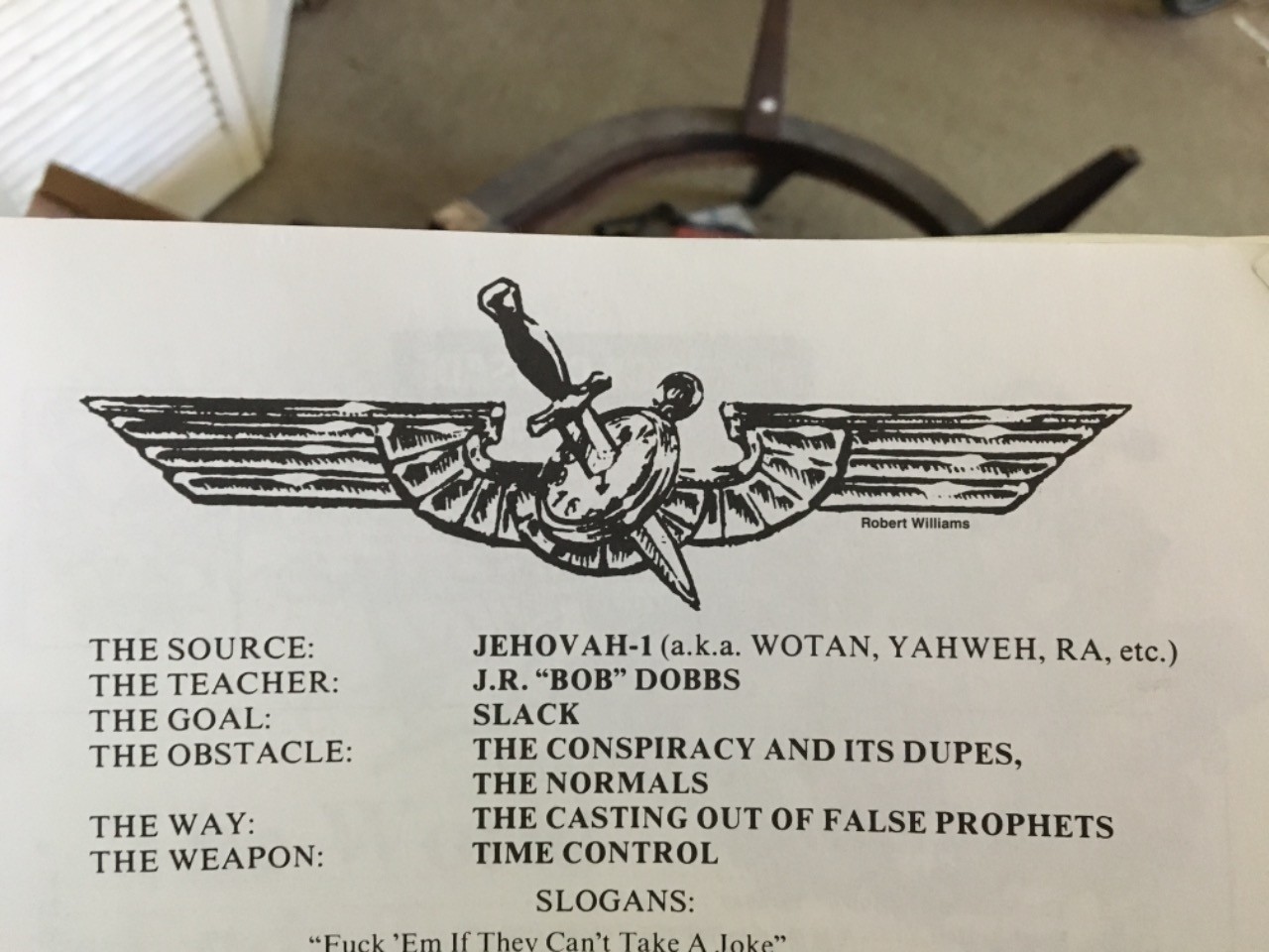
But nah, let's have some vague blobs that look like something out of a template file that you bought off of fiverr.com. That's trendy.
posted by egypturnash at 12:10 PM on February 5, 2019 [3 favorites]
John Gruber had a scathing post about the range of options Pentagram came up with for the Slack rebranding. ("What Pentagram has revealed indicates a total disregard for what Slack is and was — a brand which users have genuine affection for ...")
posted by RedOrGreen at 12:10 PM on February 5, 2019 [4 favorites]
posted by RedOrGreen at 12:10 PM on February 5, 2019 [4 favorites]
you should be able to doodle a good corporate logo from memory and have it be recognizable
just a sample of the solid, bespoke (as in I made it up within the last 30 seconds) consulting advice you'll get when you hire fuckpbo, my disruptive digital marketing agency
our scrums are extremely agile and we guarantee that twitter will need to spend at least 25 minutes or more photoshopping our designs before they'll look like racist hate symbols
(we make no promises about dicks)
posted by prize bull octorok at 12:20 PM on February 5, 2019 [11 favorites]
Exactly. The "number of colors" complaint seemed to be the one that the Slack explanation post is oriented around, which is the simplest fix (as the link at the end of Gruber's post illustrates). I have to (HAVE TO) think that Slack execs completely ignored their own designers, which is a bummer because while I don't know alot about him, Stewart seems like a good guy. Probably chapter 98257 in the book of "apparently that's not enough."
posted by rhizome at 12:23 PM on February 5, 2019
posted by rhizome at 12:23 PM on February 5, 2019
I mean, what if Slack decided it needed a big boost in public awareness of its existence right before its IPO and came up with a plan where it would roll out a new logo that looks like a dickstika to get a ton of free publicity,
Well for starters they significantly overpaid for free publicity...
posted by Tell Me No Lies at 12:26 PM on February 5, 2019
Well for starters they significantly overpaid for free publicity...
posted by Tell Me No Lies at 12:26 PM on February 5, 2019
Weren't they originally based in Vancouver? They should have done some variation of the statue from Dude Chilling Park. That dude is slack.
posted by Ashwagandha at 12:31 PM on February 5, 2019 [5 favorites]
posted by Ashwagandha at 12:31 PM on February 5, 2019 [5 favorites]
Symmetry in logo design is overrated.
posted by Western Infidels at 12:33 PM on February 5, 2019 [3 favorites]
posted by Western Infidels at 12:33 PM on February 5, 2019 [3 favorites]
I basically cannot take the "number of colors" argument against the old logo as being anything but the thinnest veneer over "we wanted to re-do it and so we backed into whatever would justify it". I'm not even saying it wasn't a problem -- just, it's precisely the kind of bullshit that happens (often in tech shops) where someone's like, "well, this existing thing has a flaw that we could address without making a huge change, but I think actually the only solution is to start again from the ground up [unspoken: because it'd be cooler to build it from scratch]".
posted by tocts at 12:39 PM on February 5, 2019 [2 favorites]
posted by tocts at 12:39 PM on February 5, 2019 [2 favorites]
That's true, if the designer wants to just make a small change then the business person will say ah let's do the opposite of that. If the designer recommends starting over the business person will say ah let's do the opposite of that.
posted by bleep at 12:51 PM on February 5, 2019
posted by bleep at 12:51 PM on February 5, 2019
The "accidentally making a swastika" thing is a real pitfall. I've done it a few times, myself. You just get so into the work that you don't see what's happening until you take a few steps back. Hopefully, you see it before you present options to the client, because the client will always pick the worst/most problematic option.
posted by Thorzdad at 1:04 PM on February 5, 2019 [5 favorites]
posted by Thorzdad at 1:04 PM on February 5, 2019 [5 favorites]
Metafilter: I am on Team Dicks! I love dicks and unintentional dick-adjacent design!
posted by saysthis at 1:08 PM on February 5, 2019 [6 favorites]
posted by saysthis at 1:08 PM on February 5, 2019 [6 favorites]
The new logo is just far too... moist for my liking.
The day that it changed over, this was what I, er, slacked to my boss: It looks like the logo of a company that just rebranded to be a meaningless nonsense word that ends in -ex
posted by soren_lorensen at 1:09 PM on February 5, 2019 [1 favorite]
The day that it changed over, this was what I, er, slacked to my boss: It looks like the logo of a company that just rebranded to be a meaningless nonsense word that ends in -ex
posted by soren_lorensen at 1:09 PM on February 5, 2019 [1 favorite]
The dicks thing is a lot harder to unsee. Specifically the idea of them as fun factory-esque dildoes with the teardrop part being the fake balls.
Wait isn't Mathowie working for slack now? (He has a history with dildos)
posted by srboisvert at 1:23 PM on February 5, 2019 [5 favorites]
Wait isn't Mathowie working for slack now? (He has a history with dildos)
posted by srboisvert at 1:23 PM on February 5, 2019 [5 favorites]
Mr. Urnash just pulled out his copy of The Book Of The SubGenius and flipped through it. And this potent image leapt out at me.
Yeah, that does look familiar.
on preview, yeah
posted by MikeKD at 1:24 PM on February 5, 2019
Yeah, that does look familiar.
on preview, yeah
posted by MikeKD at 1:24 PM on February 5, 2019
Swastikocks
posted by kirkaracha at 1:26 PM on February 5, 2019 [5 favorites]
posted by kirkaracha at 1:26 PM on February 5, 2019 [5 favorites]
The "accidentally making a swastika" thing is a real pitfall. I've done it a few times, myself. You just get so into the work that you don't see what's happening until you take a few steps back. Hopefully, you see it before you present options to the client, because the client will always pick the worst/most problematic option.
I once had to explain to an IT exec why I was going to do everything in my power to prevent them from including a phrase like "...we will be implementing the final solution to [issue X] by the end of the month" in a message that was destined to reach a couple of thousand employees. I had to specifically cite the Wannsee conference to prove my point, or at least prove that I knew what the fuck I was talking about.
posted by mandolin conspiracy at 1:38 PM on February 5, 2019 [14 favorites]
See, for example, the work Saul Bass
I always like to give a shout out to the people who "redesigned" the Saul Bass Girl Scouts logo...by doing almost nothing.
I always like to give a shout out to the people who "redesigned" the Saul Bass Girl Scouts logo...by doing almost nothing.
One thing we also all know is that you don’t mess with a Saul Bass logo. I mean, yes you can change it or get rid of it as there is no written law about it, but doing so will not win you any friends in this industry. The first smart move by OCD was to not mess with a Saul Bass logo, the second was to try to technically improve it. Working with Joe Finocchiaro and Jasper Goodall, OCD made some subtle updates to the three girl profiles.posted by Nonsteroidal Anti-Inflammatory Drug at 1:48 PM on February 5, 2019 [3 favorites]
It’s obviously a swasdicka.
posted by jenkinsEar at 2:00 PM on February 5, 2019 [7 favorites]
posted by jenkinsEar at 2:00 PM on February 5, 2019 [7 favorites]
After "Oath:" was announced we all just assumed execs and consultants had been locked in a room for so long that it ran out of air or something.
You misspelled tronc.
posted by tclark at 2:13 PM on February 5, 2019 [7 favorites]
You misspelled tronc.
posted by tclark at 2:13 PM on February 5, 2019 [7 favorites]
Honestly, I can see the four-ducks-having-an-orgy thing way more than a can see the swastika. And the four ducks thing is kind of sweet, actually.
posted by holborne at 2:16 PM on February 5, 2019 [2 favorites]
posted by holborne at 2:16 PM on February 5, 2019 [2 favorites]
It is amazing how often I see things where I ask myself "why didn't they show this to a focus group of teenage boys to see whether they started snorting uncontrollably?"
posted by Gilgamesh's Chauffeur at 2:42 PM on February 5, 2019 [8 favorites]
posted by Gilgamesh's Chauffeur at 2:42 PM on February 5, 2019 [8 favorites]
"why didn't they show this to a focus group of teenage boys to see whether they started snorting uncontrollably?"
That was an item on the Evil Overlord Checklist. "One of my advisors will be an average five-year-old child. Any flaws in my plan that he is able to spot will be corrected before implementation."
posted by justsomebodythatyouusedtoknow at 3:20 PM on February 5, 2019 [12 favorites]
That was an item on the Evil Overlord Checklist. "One of my advisors will be an average five-year-old child. Any flaws in my plan that he is able to spot will be corrected before implementation."
posted by justsomebodythatyouusedtoknow at 3:20 PM on February 5, 2019 [12 favorites]
Mr. Urnash just pulled out his copy of The Book Of The SubGenius and flipped through it. And this potent image leapt out at me.
Yeah, that does look familiar.
I mean... not really? Not at all? Maybe your link got messed up and you meant to point to something that looks more like the kind of flight wings you see pilots of all stripes wearing, rather than an eagle.
posted by Hal Mumkin at 5:28 PM on February 5, 2019 [3 favorites]
And the four ducks thing is kind of sweet, actually.
Shows what you know about ducks.
posted by sjswitzer at 5:40 PM on February 5, 2019 [6 favorites]
Shows what you know about ducks.
posted by sjswitzer at 5:40 PM on February 5, 2019 [6 favorites]
I'll say this for ducks: at least they're not geese.
posted by The Underpants Monster at 6:28 PM on February 5, 2019 [4 favorites]
posted by The Underpants Monster at 6:28 PM on February 5, 2019 [4 favorites]
a logo is only effective for about 3 years in today's market.
cough *Nike* cough
posted by nnethercote at 6:42 PM on February 5, 2019 [1 favorite]
cough *Nike* cough
posted by nnethercote at 6:42 PM on February 5, 2019 [1 favorite]
I write code for a living. I have impostor syndrome for days. Some days I make mistakes. Some days, I do things I later come to regret. Sometimes I feel like I'm bad at my job.
I can state with great confidence and without fear of contradiction that I have never gone to work and made a swastika out of dicks.
posted by sourcequench at 7:03 PM on February 5, 2019 [19 favorites]
I can state with great confidence and without fear of contradiction that I have never gone to work and made a swastika out of dicks.
posted by sourcequench at 7:03 PM on February 5, 2019 [19 favorites]
the reps who came out to talk to us said that a logo is only effective for about 3 years in today's market.
I feel like they misheard or intentionally twisted something at some point, and it was originally "a logo is only effective after about 3 years in today's market" -- that is, when you change the logo it won't be immediately iconic; it will take about 3 years for people to recognize the logo on its own.
posted by Bugbread at 7:56 PM on February 5, 2019 [6 favorites]
I own a pair of Slack socks from a few years ago, and they’re perfect: simple plaid design with the old logo colors makes them great-looking socks and every so often someone makes the connection and compliments them. I think off-kilter angle and white base is what made it work so well with a light touch in new contexts.
posted by migurski at 8:26 PM on February 5, 2019
posted by migurski at 8:26 PM on February 5, 2019
I remember a kid who used to stencil swastikas made of dicks. They weren't particularly good, and obviously were also quite horrid in a different way, but at least they were exactly what they appeared to be. And I never confused them with a corporate logo.
posted by aspersioncast at 9:19 PM on February 5, 2019 [2 favorites]
posted by aspersioncast at 9:19 PM on February 5, 2019 [2 favorites]
This is a much better solution. It still brightened and reduced the number of colors while still being recognizable. And even the "weave" effect is good for the idea of a service that helps teams interact. I know they didn't like the 13% angle, because they wanted to bind to grids, but... the grid is not king. Let it go.
posted by Karmakaze at 8:11 AM on February 6, 2019 [1 favorite]
posted by Karmakaze at 8:11 AM on February 6, 2019 [1 favorite]
So one upside of this thread is that it reminded me to do an
So there's that. I probably should have snagged a copy of the old icon beforehand, though.
posted by suetanvil at 8:38 AM on February 6, 2019 [2 favorites]
apt update; apt dist-upgrade So there's that. I probably should have snagged a copy of the old icon beforehand, though.
posted by suetanvil at 8:38 AM on February 6, 2019 [2 favorites]
the grid is not king
Except for King Grid the Grate.
posted by Greg_Ace at 9:12 AM on February 6, 2019 [4 favorites]
Except for King Grid the Grate.
posted by Greg_Ace at 9:12 AM on February 6, 2019 [4 favorites]
I think the logo is fine, and is pretty obviously a pinwheel. This kerfuffle seems like maximum twitter tryhard edginess to me.
posted by monju_bosatsu at 10:46 AM on February 6, 2019 [2 favorites]
posted by monju_bosatsu at 10:46 AM on February 6, 2019 [2 favorites]
I think the logo is fine, and is pretty obviously a pinwheel.
It's supposed to still be an octothorpe/hashtag:
It's supposed to still be an octothorpe/hashtag:
Ultimately, the team decided to retain the equity of Slack’s familiar octothorpe, retooling it to eliminate reproduction challenges and increase consistency across applications.posted by Etrigan at 10:53 AM on February 6, 2019
Ahem: In "Nothing Left to Lose", Jack is shocked to find out that Pete's only ambition is to remain in his current job. Jack attempts to help Pete by having him make adjustments to his lifestyle, including shaving off what remains of his hair. Unfortunately, it is revealed that his ring of hair was hiding an obscene birthmark that Jack describes as "a swastika made of penises", leading him to be beaten in the street and forced to wear another wig.
posted by Sys Rq at 11:40 AM on February 6, 2019 [1 favorite]
posted by Sys Rq at 11:40 AM on February 6, 2019 [1 favorite]
Oop I wasn't really seeing the swastika thing until the Deck just served me a Slack ad, and now I see that everyone is in fact correct.
[on double-checking I guess it's Carbon, now?]
posted by aspersioncast at 11:48 AM on February 6, 2019
[on double-checking I guess it's Carbon, now?]
posted by aspersioncast at 11:48 AM on February 6, 2019
I think the most important objection to the new logo is: it's rather hideous. Dicks and swastikas aside, it's just ugly to me.
posted by stillnocturnal at 11:51 AM on February 6, 2019 [1 favorite]
posted by stillnocturnal at 11:51 AM on February 6, 2019 [1 favorite]
you'll get when you hire fuckpbo, my disruptive digital marketing agency
I hope you've got some good documentation of the name being registered, I'm pretty sure this is the name of an IKEA sex pillow
posted by Jon Mitchell at 8:26 PM on February 6, 2019
I hope you've got some good documentation of the name being registered, I'm pretty sure this is the name of an IKEA sex pillow
posted by Jon Mitchell at 8:26 PM on February 6, 2019
Incidentally, "IKEA Sex Pillow" is the name of my new band; we release the master tapes of our studio recordings, and listeners have to assemble them into an erotic song.
posted by Greg_Ace at 9:51 PM on February 6, 2019 [2 favorites]
posted by Greg_Ace at 9:51 PM on February 6, 2019 [2 favorites]
Also, there's usually a track or two left over that didn't seem to fit anywhere.
posted by Greg_Ace at 9:53 PM on February 6, 2019 [1 favorite]
posted by Greg_Ace at 9:53 PM on February 6, 2019 [1 favorite]
These sex pillows, do they come in colors ...?
posted by Chitownfats at 5:00 AM on February 7, 2019
posted by Chitownfats at 5:00 AM on February 7, 2019
I once had to explain to an IT exec why I was going to do everything in my power to prevent them from including a phrase like "...we will be implementing the final solution to [issue X] by the end of the month" in a message that was destined to reach a couple of thousand employees. I had to specifically cite the Wannsee conference to prove my point, or at least prove that I knew what the fuck I was talking about.
Late post but I am so glad I'm not the only person who catches this. Usually, though, it's because I'm about to use the phrase myself and there's a speed bump where I'm like "actually no you definitely can't say that under any circumstances, find another phrase."
posted by chrominance at 8:02 AM on February 7, 2019
Even before the historical reference, since when does IT even ever have a literal final solution, a last fix/upgrade?
posted by rhizome at 9:03 AM on February 7, 2019 [3 favorites]
posted by rhizome at 9:03 AM on February 7, 2019 [3 favorites]
What if your company just didn't have a logo?
posted by The corpse in the library at 4:14 PM on February 7, 2019 [3 favorites]
posted by The corpse in the library at 4:14 PM on February 7, 2019 [3 favorites]
If you've only seen one arrow in the FedEx logo, look again. The second one isn't as overt.
posted by dws at 11:12 AM on February 9, 2019 [1 favorite]
posted by dws at 11:12 AM on February 9, 2019 [1 favorite]
(ok dws I can't see the second one. Is there one or are you trolling me? :) )
posted by freethefeet at 4:03 AM on February 12, 2019 [1 favorite]
posted by freethefeet at 4:03 AM on February 12, 2019 [1 favorite]
« Older Just swingin' on by... | New tools against (old) data breaches Newer »
This thread has been archived and is closed to new comments
posted by zekesonxx at 9:38 AM on February 5, 2019 [25 favorites]