75 sci-fi illustrations
January 4, 2011 11:17 AM Subscribe
75 Sensational Examples Of Sci-Fi Illustration at Designer's Terminal. If you click on an image there are details of each artist.
I find it orange and teal to be very comforting. It reminds me that I don't need to think anymore.
posted by blue_beetle at 11:22 AM on January 4, 2011
posted by blue_beetle at 11:22 AM on January 4, 2011
Looking at the click-through URLs, it seems to be a "best of deviantart SF" collection. The thing it brings home to me is that people at home now have sufficient computer power to do the kinds of digital illustration that used to be reserved for the pros. When the amateurs are moderately talented and the pros (as they often are) are uninspired, it's almost impossible to tell the difference.
posted by immlass at 11:32 AM on January 4, 2011 [1 favorite]
posted by immlass at 11:32 AM on January 4, 2011 [1 favorite]
Snerk. Trojan Llama, anyone? But seriously, these are lovely and cool and I thank you for the post.
posted by Gator at 11:36 AM on January 4, 2011
posted by Gator at 11:36 AM on January 4, 2011
I FRIGGIN LOVE ORANGE AND TEAL
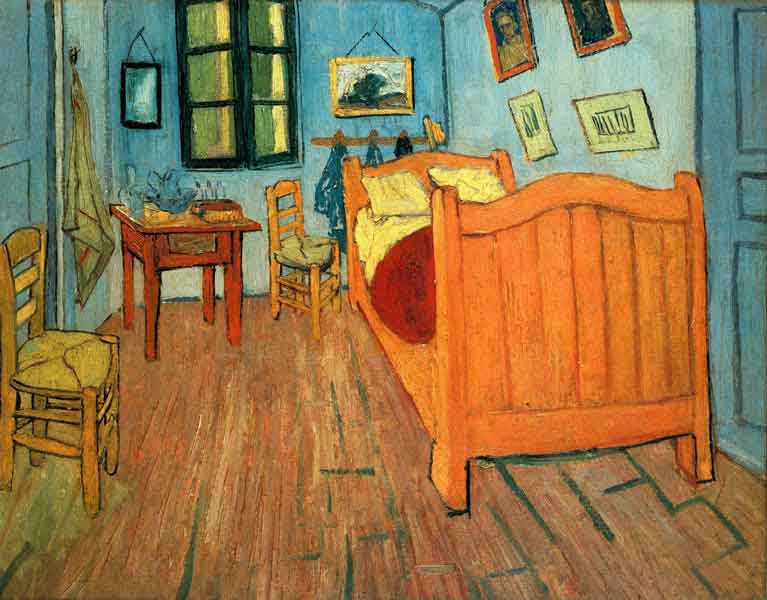
Although it's sickeningly exaggerated in films (and elsewhere) these days, the orange and teal thing isn't really all that new.
posted by CitrusFreak12 at 11:43 AM on January 4, 2011
Although it's sickeningly exaggerated in films (and elsewhere) these days, the orange and teal thing isn't really all that new.
posted by CitrusFreak12 at 11:43 AM on January 4, 2011
I FRIGGIN LOVE SPACE MARINES
which is good, because there are a lot of pictures of space marines
posted by 7segment at 11:51 AM on January 4, 2011
which is good, because there are a lot of pictures of space marines
posted by 7segment at 11:51 AM on January 4, 2011
All them Space Marines are dressed like astronauts .
posted by Mister_A at 11:52 AM on January 4, 2011
posted by Mister_A at 11:52 AM on January 4, 2011
people at home now have sufficient computer power
Which should be liberating, and yet these all feel somehow constrained.
posted by Trochanter at 12:04 PM on January 4, 2011 [3 favorites]
Which should be liberating, and yet these all feel somehow constrained.
posted by Trochanter at 12:04 PM on January 4, 2011 [3 favorites]
Also maybe they don't highlight their center of interest enough, somehow?
posted by Trochanter at 12:07 PM on January 4, 2011
posted by Trochanter at 12:07 PM on January 4, 2011
In the future, buildings will be slightly taller than they are now, and more things will fly around! Men will carry guns! And there might be gears, or a giant monster, or something! Realize my vision, science!
posted by IjonTichy at 12:09 PM on January 4, 2011 [7 favorites]
posted by IjonTichy at 12:09 PM on January 4, 2011 [7 favorites]
these all feel somehow constrained.
Market forces, man. Ain't nobody going to buy a science fiction book with an ugly, weak man or a black woman on the cover. No, it's all armored lumbering warriors and eldritch, bare-legged white chicks.
posted by infinitewindow at 12:10 PM on January 4, 2011
Market forces, man. Ain't nobody going to buy a science fiction book with an ugly, weak man or a black woman on the cover. No, it's all armored lumbering warriors and eldritch, bare-legged white chicks.
posted by infinitewindow at 12:10 PM on January 4, 2011
IF you look at these as student exercises or portfolio-builders, etc., they are fine. Most of these artists would benefit from a little professional direction, for sure.
posted by Mister_A at 12:10 PM on January 4, 2011 [1 favorite]
posted by Mister_A at 12:10 PM on January 4, 2011 [1 favorite]
In the future, buildings will be slightly taller than they are now, and more things will fly around! Men will carry guns! And there might be gears, or a giant monster, or something! Realize my vision, science!
posted by IjonTichy at 2:09 PM on January 4 [+] [!]
I've got some really great news for you. Tell you all about it next week in Costa Rica.
posted by cog_nate at 12:15 PM on January 4, 2011 [1 favorite]
posted by IjonTichy at 2:09 PM on January 4 [+] [!]
I've got some really great news for you. Tell you all about it next week in Costa Rica.
posted by cog_nate at 12:15 PM on January 4, 2011 [1 favorite]
fav this as fitting
this is nice spacial climax
this is personal fav
nice post. Great sythnesis of sci-fi genres. not cutting edge but thats not the point IMO.
related(:)
Why does Stephen Hawking think science has overtaken philosophy?
posted by clavdivs at 12:15 PM on January 4, 2011
this is nice spacial climax
this is personal fav
nice post. Great sythnesis of sci-fi genres. not cutting edge but thats not the point IMO.
related(:)
Why does Stephen Hawking think science has overtaken philosophy?
posted by clavdivs at 12:15 PM on January 4, 2011
Science fiction part of fiction, which deals with the futuristic impact of science on our society. Most of the times it opposes the known reality, but some people believe that it can happen in future. In this genre of fiction, we see what a designer expect to happen in future or have been happened in historical past, that contradicts known facts of history. Majority of Sci-Fi artwork involves outer space creations taking over this world. People believe it is against the known laws of nature but scientists are working as hard as they can to make science fiction a reality.
I'm sure this reads better in whatever language it was auto-translated out of.
posted by Horace Rumpole at 12:17 PM on January 4, 2011 [1 favorite]
I'm sure this reads better in whatever language it was auto-translated out of.
posted by Horace Rumpole at 12:17 PM on January 4, 2011 [1 favorite]
With futuristic concept art, I like to play a variation on that New Yorker cartoon caption game, except where each piece should read, "This is where assholes used to live".
posted by hanoixan at 12:30 PM on January 4, 2011
posted by hanoixan at 12:30 PM on January 4, 2011
I agree that there are way too many "bad-ass" space marines. And there's also a repeated motif of a white woman with a child threatened by some kind of baddie. Easy short hand for innocence, I guess?
This one is my favorite--especially the red-orange cloud dragons, which in my opinion make it feel more like slipstream than pure science fiction. This one is also interesting. And there's a few nifty cityscapes.
posted by overglow at 12:42 PM on January 4, 2011
This one is my favorite--especially the red-orange cloud dragons, which in my opinion make it feel more like slipstream than pure science fiction. This one is also interesting. And there's a few nifty cityscapes.
posted by overglow at 12:42 PM on January 4, 2011
I really want to read a story about the Shepherds Friend RX-902.
posted by Shohn at 12:43 PM on January 4, 2011
posted by Shohn at 12:43 PM on January 4, 2011
Maybe he gets robo-rabies from a robo-wolf and the shepherd has to freeze him in carbonite.
posted by Gator at 12:48 PM on January 4, 2011 [1 favorite]
posted by Gator at 12:48 PM on January 4, 2011 [1 favorite]
Robo-rabies is one of those diseases that people worry about disproportionately to their risk of being affected, like ague.
posted by Mister_A at 12:53 PM on January 4, 2011
posted by Mister_A at 12:53 PM on January 4, 2011
One common graphic style in this list looks like Craig Mullins' excellent artwork for Bungie's Marathon... circa 1994.
For 1994, that digital artwork was pretty mind-blowing.
posted by anthill at 12:55 PM on January 4, 2011 [3 favorites]
For 1994, that digital artwork was pretty mind-blowing.
posted by anthill at 12:55 PM on January 4, 2011 [3 favorites]
These kinds of illustrations put me off buying and reading a lot of sci-fi books. These images are so samey, and devoid of simplicity and boldness. Against the common wisdom, I would tend to judge books by these, as covers. Although Kurt Vonnegut and Margaret Atwood might in some senses be called Science Fiction, it would be horrible to see their books illustrated anything like this. Or Asimov - much better cover art linked above. I once was browsing in the Horror section of a bookshop - full of similarly homogenised cover art - and was dismayed to see H P Lovecraft books packaged a bit like this. Not good.
posted by iotic at 12:56 PM on January 4, 2011 [1 favorite]
posted by iotic at 12:56 PM on January 4, 2011 [1 favorite]
All of these are more technically proficient than I'll probably ever be so I feel sort of bad hating on them, but they're all somehow so flat and uninspiring in their attempts at epicness. Even (maybe even especially) the ones that use the "stuff in the distance is lighter" technique.
The only elements in the few of the that actually stand out and draw focus appear to be photos that have been composited into illustration.
I'll take Wayne Barlow, Michael Whelan, Frank Kelly Freas, or Michael Uhlenkott any day.
posted by usonian at 1:00 PM on January 4, 2011 [3 favorites]
The only elements in the few of the that actually stand out and draw focus appear to be photos that have been composited into illustration.
I'll take Wayne Barlow, Michael Whelan, Frank Kelly Freas, or Michael Uhlenkott any day.
posted by usonian at 1:00 PM on January 4, 2011 [3 favorites]
They've been mentioned before, but the blogs Concept Ships and Concept Art World are great if you have a trace of imagination left in your withered soul like imaginary spaceships.
posted by TheophileEscargot at 1:01 PM on January 4, 2011 [5 favorites]
posted by TheophileEscargot at 1:01 PM on January 4, 2011 [5 favorites]
All of these are more technically proficient than I'll probably ever be so I feel sort of bad hating on them, but they're all somehow so flat and uninspiring in their attempts at epicness.
I agree completely. I can't draw for shit but I can recognize pedestrian, uninspiring illustration. These are not sensational. In terms of great SF illustration, I mean. If your kid just whipped one up after school they'd be pretty sensational. They're like really good karaoke. It's better than most of us can sing but it isn't "sensational singing" in an absolute sense.
Is there where I admit I am ambivalent about Whelan? And I mean ambivalent in the actual meaning of the word, not in the watered down "I don't know what ambivalent means" sense.
posted by Justinian at 1:29 PM on January 4, 2011
I remember leafing through the heavy metal LP bins in the Plymouth Virgin Megastore, back in those heady days when the 70s were morphing into the 80s, not because I liked heavy metal but because I liked science fiction and thought that with all that SF imagery, there must be something which would snag me. Same feeling of "it's not very... this is a genre of ideas, right? What am I missing?".
(I sorta got the hang of SF vs fantasy shortly thereafter, partially as a result of that sort of experience and partially through twigging that the Thomas Dolby and Tubeway Army stuff was closer to the mark. That and an interview with Gary Numan in Smash Hits where he namechecked Burroughs, Philip Dick and JG Ballard... ooh, I thought, wonder what they're like. Kept me going until I discovered that cheeky little indole group.)
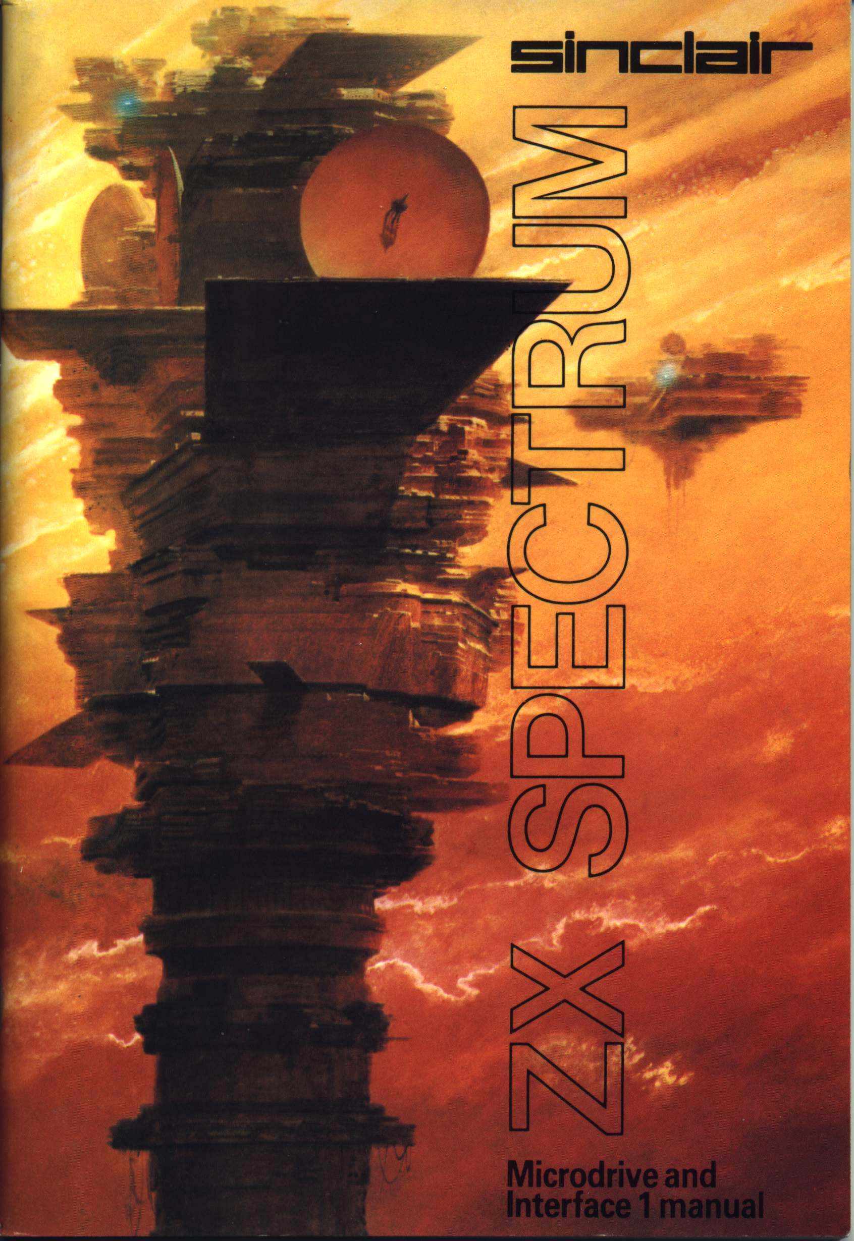
On a related subject, there are many things to be said for and against the Sinclair Research 8-bit microcomputers, but I think it's undeniable that the cover art for the ZX81, the ZX Spectrum and the Interface 1/Microdrive (especially) were the best evah.
posted by Devonian at 1:34 PM on January 4, 2011 [1 favorite]
(I sorta got the hang of SF vs fantasy shortly thereafter, partially as a result of that sort of experience and partially through twigging that the Thomas Dolby and Tubeway Army stuff was closer to the mark. That and an interview with Gary Numan in Smash Hits where he namechecked Burroughs, Philip Dick and JG Ballard... ooh, I thought, wonder what they're like. Kept me going until I discovered that cheeky little indole group.)
On a related subject, there are many things to be said for and against the Sinclair Research 8-bit microcomputers, but I think it's undeniable that the cover art for the ZX81, the ZX Spectrum and the Interface 1/Microdrive (especially) were the best evah.
posted by Devonian at 1:34 PM on January 4, 2011 [1 favorite]
This (hi-res) maybe falls under "3d rendering" but I clicked the link in the post with high hopes of finding more of this type of sci-fi imagery. But I was disappointed... Too much drama and action! The closest one was the theistic dawn but I want more detail.
posted by mnsc at 1:41 PM on January 4, 2011
posted by mnsc at 1:41 PM on January 4, 2011
I really want to read a story about the Shepherds Friend RX-902.
While not perfectly analogous, the concept of a weaponized cybernetic dog that is the Rat-thing from Snow Crash has a lot of the same basic awesome built into it.
posted by quin at 1:54 PM on January 4, 2011
While not perfectly analogous, the concept of a weaponized cybernetic dog that is the Rat-thing from Snow Crash has a lot of the same basic awesome built into it.
posted by quin at 1:54 PM on January 4, 2011
That Teal and Orange link should be a FPP.
posted by longdaysjourney at 1:57 PM on January 4, 2011
posted by longdaysjourney at 1:57 PM on January 4, 2011
That Teal and Orange link should be a FPP
It has been
posted by iotic at 2:12 PM on January 4, 2011 [1 favorite]
It has been
posted by iotic at 2:12 PM on January 4, 2011 [1 favorite]
The Emperor protects.
A lot of people see WH40K Space Marines and think they're entirely derivative - but the thing of it is, they were - I mean, they were first. They were the Space Marines that made space marines.
posted by kbanas at 2:26 PM on January 4, 2011
A lot of people see WH40K Space Marines and think they're entirely derivative - but the thing of it is, they were - I mean, they were first. They were the Space Marines that made space marines.
posted by kbanas at 2:26 PM on January 4, 2011
In fact, I'm not sure why Starcraft doesn't take more flack for blatantly copying the WH40K "template" - Human, Eldar, Tyranid - how about we call them... Human, Protoss, Zerg?! Genius!
posted by kbanas at 2:27 PM on January 4, 2011
posted by kbanas at 2:27 PM on January 4, 2011
I thought some of these were great, and some less than great. 75 is a lot of sensation, really. I think maybe 20 would have been more achievable.
posted by smoke at 2:41 PM on January 4, 2011
posted by smoke at 2:41 PM on January 4, 2011
A lot of people see WH40K Space Marines and think they're entirely derivative - but the thing of it is, they were - I mean, they were first. They were the Space Marines that made space marines.
Eh, what? Starship Troopers? John Steakley's Armor? I can't recall offhand if they wore battle armor in The Forever War too.
posted by Justinian at 2:41 PM on January 4, 2011
Eh, what? Starship Troopers? John Steakley's Armor? I can't recall offhand if they wore battle armor in The Forever War too.
posted by Justinian at 2:41 PM on January 4, 2011
I liked a lot few of those than I thought I would when I clicked that link.
But then when I think of Science Fiction, I'm not usually thinking of stories that would make good levels in Mass Effect or Warhammer 40,000.
posted by straight at 2:42 PM on January 4, 2011
But then when I think of Science Fiction, I'm not usually thinking of stories that would make good levels in Mass Effect or Warhammer 40,000.
posted by straight at 2:42 PM on January 4, 2011
I think it's a horrid trend that's been gaining steam the past few years. All of these "75 amazing things of all time!" SEO linkbait articles. The hyperbole falls flat and only really works on an audience of teenagers.
What makes this collection, these particular works of art, so sensational? Are these sorts of things going to be allowed on Mefi from now on?
Seriously. This linked page looks like someone went in and typed "sci-fi" in google image search and then made a page with the results. It's ...nice that they linked to the artists' sites, but... wait, these are all deviantart links?
Blogspam.
posted by Catblack at 2:46 PM on January 4, 2011 [3 favorites]
I can't recall offhand if they wore battle armor in The Forever War too.
They did.
posted by His thoughts were red thoughts at 2:46 PM on January 4, 2011
They did.
posted by His thoughts were red thoughts at 2:46 PM on January 4, 2011
Human, Eldar, Tyranid - how about we call them... Human, Protoss, Zerg?! Genius!
Related.
posted by A Thousand Baited Hooks at 2:47 PM on January 4, 2011 [1 favorite]
Related.
posted by A Thousand Baited Hooks at 2:47 PM on January 4, 2011 [1 favorite]
A lot of people see WH40K Space Marines and think they're entirely derivative.
Yes. Because they are.
posted by His thoughts were red thoughts at 2:47 PM on January 4, 2011
Yes. Because they are.
posted by His thoughts were red thoughts at 2:47 PM on January 4, 2011
When I first started scrolling through, I thought this was a setup and that all the works were from the same artist who wanted to work everything to a bloodless sheen. There are a few that are a little rougher and looser (13, 14, 67) and 12 is described as unfinished by the artist here. I think it looks great just as it is and that she never succumbs to the suggestion to add some neon green to it.
posted by maudlin at 2:56 PM on January 4, 2011
posted by maudlin at 2:56 PM on January 4, 2011
Holy crap, it's the 2nd post on a new blog. Wow, compiling this must have taken an entire HOUR!
This is the sort of crap that is ruining the internet. At least when you see a superlative-rich cracked.com headline, you know there's going to be a fun, snarky article attached.
posted by Catblack at 3:03 PM on January 4, 2011
This is the sort of crap that is ruining the internet. At least when you see a superlative-rich cracked.com headline, you know there's going to be a fun, snarky article attached.
posted by Catblack at 3:03 PM on January 4, 2011
Eh, I'll take this over Yet Another Buzzfeed/Tumblr Page Full of Unattributed Photos.
posted by Gator at 3:08 PM on January 4, 2011
posted by Gator at 3:08 PM on January 4, 2011
They did.
I figured they did but I didn't want to undermine my point if I was wrong. Thanks. I wonder if a decent FPP could somehow be constructed around the dialogue within SF between books like Troopers, Armor, TFW, and so on. Although I guess that'd be about it... stuff like Scalzi's Old Man's War, are more of a homage than something engaged in the dialogue. Maybe Gerrold but I'm not sure where he fits into the conversation and, frankly, at this point I'm pretty sure he doesn't know either.
posted by Justinian at 3:17 PM on January 4, 2011 [1 favorite]
I'm pretty sure Gerrold was eaten by a giant red worm.
I'm fairly certain that worm is going to eat GRRM soon too.
posted by flaterik at 3:36 PM on January 4, 2011 [1 favorite]
I'm fairly certain that worm is going to eat GRRM soon too.
posted by flaterik at 3:36 PM on January 4, 2011 [1 favorite]
I once was browsing in the Horror section of a bookshop - full of similarly homogenized cover art - and was dismayed to see H P Lovecraft books packaged a bit like this.
Tangential, but I really loved the cover of the anthology I got from the science fiction book club several years ago. Up close it has a lot of great pen detail.
I think what ends up being uninspired and homogenized about the kind of art in the post is that they try too hard to be realistic. Exploration in a lack of realism (of form, not subject matter) can say a lot more on a symbolic level.
posted by girih knot at 3:57 PM on January 4, 2011
I guess my phone takes higher resolution photos than I realized. That second image is showing more of the four color process than pen detail.
posted by girih knot at 4:00 PM on January 4, 2011
posted by girih knot at 4:00 PM on January 4, 2011
And yet still, I cannot find decent renditions of any of the Culture books' ships, tech, etc no matter how I tweak the GIS.
Grrrrrrr.
posted by digitalprimate at 4:33 PM on January 4, 2011
Grrrrrrr.
posted by digitalprimate at 4:33 PM on January 4, 2011
Tangential, but I really loved the cover of the anthology I got from the science fiction book club several years ago. Up close it has a lot of great pen detail
Is that by Ian Miller? Its very similar to the cover he did for the greatest book ever written.
He's a brilliant artist. The graphic novel he did with M. John Harrison, The Luck In The Head, contains some wonderful and terrifying images.
posted by dng at 4:46 PM on January 4, 2011 [1 favorite]
Is that by Ian Miller? Its very similar to the cover he did for the greatest book ever written.
He's a brilliant artist. The graphic novel he did with M. John Harrison, The Luck In The Head, contains some wonderful and terrifying images.
posted by dng at 4:46 PM on January 4, 2011 [1 favorite]
Slightly better than "fantasy art." Worse than "art" art.
And..."Theistic Dawn"? Worst title ever.
posted by kozad at 4:49 PM on January 4, 2011
And..."Theistic Dawn"? Worst title ever.
posted by kozad at 4:49 PM on January 4, 2011
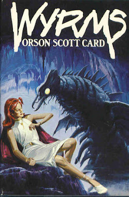
This is my favourite cover ever. 'Cause of Wyrm willies. Yeah!
posted by Trochanter at 5:23 PM on January 4, 2011
posted by Trochanter at 5:23 PM on January 4, 2011
dng: It is! Thank you for the links!
posted by girih knot at 6:00 PM on January 4, 2011
posted by girih knot at 6:00 PM on January 4, 2011
Hey! Isn't this one the Book Tower in Detroit? God, first Snooty French Photographers (previously on Metafilter), now cutting edge science fiction illustrators.
Can we stop beating up on HockeyTown?
posted by helmutdog at 8:11 PM on January 4, 2011
Can we stop beating up on HockeyTown?
posted by helmutdog at 8:11 PM on January 4, 2011
I love science fiction. I love the ideas of space travel, sentient AIs, distant planets, alternative universes, alien races, and so on. But I really don't enjoy most of this art. I particularly don't enjoy space marines or post-apocalyptic fantasy waifs. I especially don't enjoy space marines meeting post-apocalyptic fantasy waifs with a backdrop of a futuristic city torn apart by war.
posted by Joh at 10:10 PM on January 4, 2011
posted by Joh at 10:10 PM on January 4, 2011
Mostly very meh, but the girl waiting to blast herself and the tank to kingdom come gave me the shivers.
posted by rodgerd at 10:41 PM on January 4, 2011
posted by rodgerd at 10:41 PM on January 4, 2011
The art was there, for the most part. Some of them were pretty. But after about five of them I just started assigning which roleplaying setting they belonged to because it was more interesting that way (aside from all the obvious WH40k stuff, that is). And after that I realized, not for the first time, that 1). I am a huge dork, and 2). I am really jonesing to play Shadowrun again. Sigh.
posted by daikaisho at 1:21 AM on January 5, 2011
posted by daikaisho at 1:21 AM on January 5, 2011
Is there where I admit I am ambivalent about Whelan?
I have a soft spot for Whelan from his covers for Asimov's Robots and Foundation novels, which I read voraciously in high school. I think his style has been imitated so much and for so long that it makes his own work stand out less than it used to.
(And on rereading my comment, that's Barlowe.)
posted by usonian at 5:54 AM on January 5, 2011
so great!
posted by eyeheartyou at 6:28 AM on January 6, 2011
posted by eyeheartyou at 6:28 AM on January 6, 2011
« Older "We are already experts at lying to ourselves" | A House in California Newer »
This thread has been archived and is closed to new comments
posted by theodolite at 11:18 AM on January 4, 2011 [2 favorites]