Andreas Cellarius and his Harmonia Macrocosmica
April 23, 2011 2:46 PM Subscribe
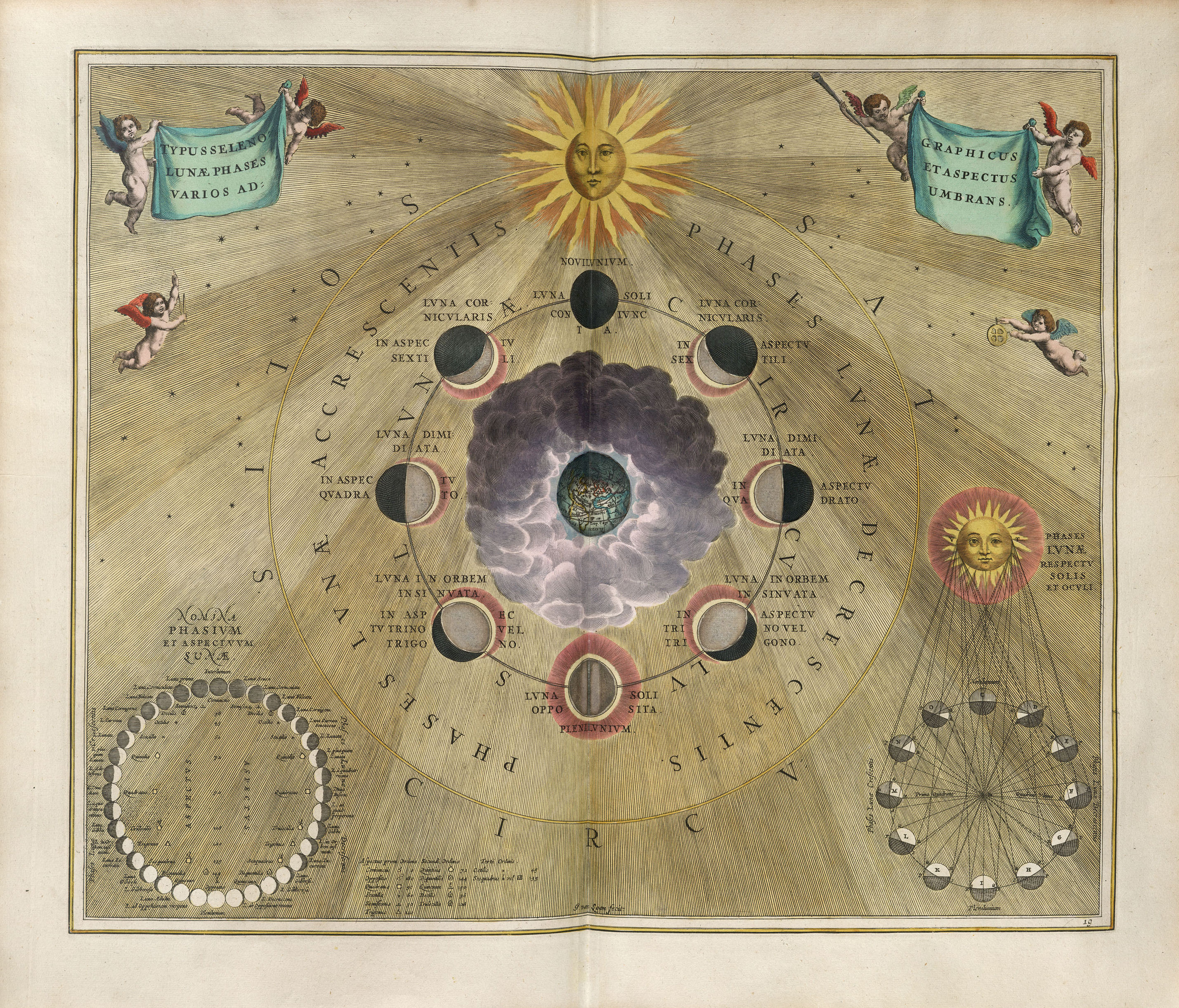
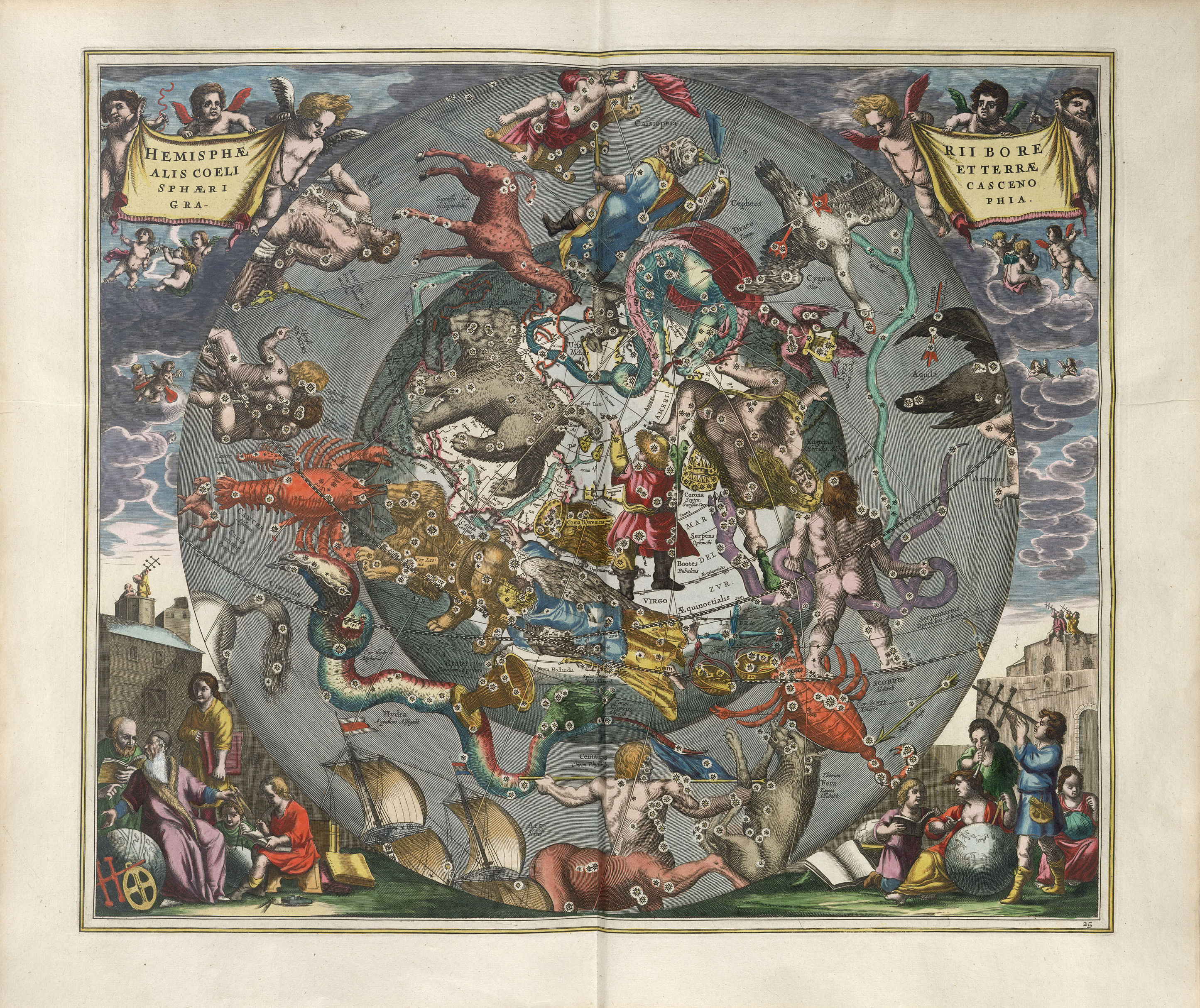
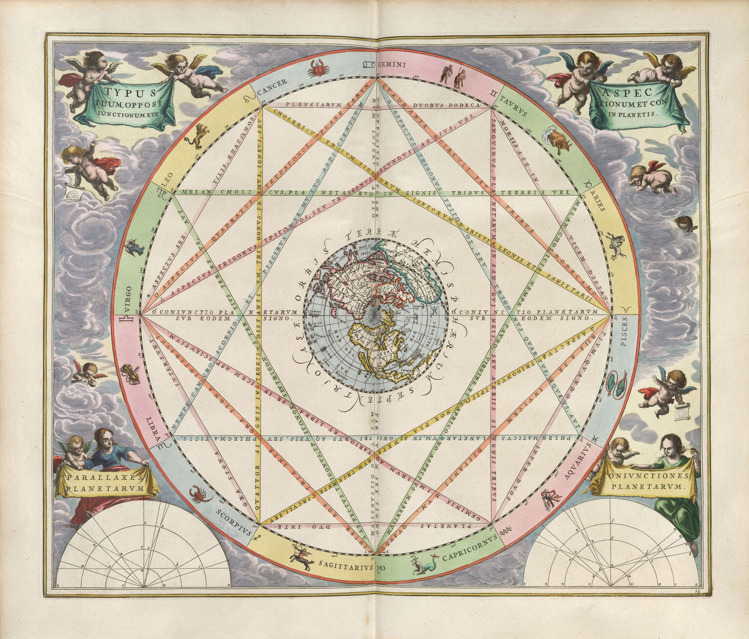
Andreas Cellarius was a scholar of the 17th Century who produced one of the most famous cosmological atlases of all time, Harmonia Macrocosmica, featuring 29 beautiful plates (large, high-quality scans), illustrating various aspects of the Universe as understood by the Western science of his time. It's impossible to pick favorites among them, but here are three examples: Phases of the Moon, Sizes of the Celestial Bodies and Stars and Constellations of the Northern Sky.
Scenography of the Copernican world system is a great image. And a good name for a band.
posted by GenjiandProust at 3:08 PM on April 23, 2011 [1 favorite]
posted by GenjiandProust at 3:08 PM on April 23, 2011 [1 favorite]
I liked the ones that seemed more raw geometry, and especially coupled with that Latin text, it made a lot of them look like ceremonial magick sigils. This one I especially liked.
posted by Marisa Stole the Precious Thing at 4:37 PM on April 23, 2011
posted by Marisa Stole the Precious Thing at 4:37 PM on April 23, 2011
Wow, these are great! I love stuff like this! Thanks!
posted by Ron Thanagar at 4:50 PM on April 23, 2011
posted by Ron Thanagar at 4:50 PM on April 23, 2011
New Scientist needs more cherubs
posted by the noob at 4:57 PM on April 23, 2011 [2 favorites]
posted by the noob at 4:57 PM on April 23, 2011 [2 favorites]
Which one, Marisa?
posted by ottereroticist at 5:01 PM on April 23, 2011
posted by ottereroticist at 5:01 PM on April 23, 2011
These are beautiful, thanks! They're like scientific mandalas.
posted by dialetheia at 5:09 PM on April 23, 2011 [1 favorite]
posted by dialetheia at 5:09 PM on April 23, 2011 [1 favorite]
Down Them All!
posted by benito.strauss at 6:07 PM on April 23, 2011
posted by benito.strauss at 6:07 PM on April 23, 2011
Magnificent work. Thanks for the post. You can see higher resolution scans here http://www.rarebookroom.org/Control/gelmcs/index.html
posted by ThenCameNow at 12:03 AM on April 24, 2011
posted by ThenCameNow at 12:03 AM on April 24, 2011
These are beautiful and intriguing, thanks. It's interesting to see how the state of knowledge has changed since the 1600s (the relative sizes of celestial bodies are comically wrong), but it's also interesting to see how the unwritten rules of scientific credibility have changed.
17th Century: cherubim, elegant typography and ornament for the sake of ornament = state-of-the-art science.
20th Century: whitespace, stripped-down graphics, and minimalist esthetics = the cutting edge.
21st Century: huge datasets require more cluttered-looking graphics, not always amenable to static display. Links to websites showing dynamic data analysis = the new hotness?
It seems like scientific graphics are getting more "busy", cluttered and hard to parse, but the ratio of data to ink (or pixels) is still high. Despite regrettable instances of chartjunk, the overall style is still "less ornament = more credible".
Anybody have some historical insight into the shift?
posted by Quietgal at 11:07 AM on April 24, 2011 [1 favorite]
Neat! Here's the whole book: Harmonia Macrocosmica and Harmonia Macrocosmica () - 1661 - Cellarius, Andreas (author) - Amsterdam - The Warnock Library
and the WP article.
posted by psyche7 at 11:31 AM on April 24, 2011
and the WP article.
posted by psyche7 at 11:31 AM on April 24, 2011
codacorolla: "I would love to have these poster-sized for my room. I also have to say that I always appreciate when someone is willing to put up rare material like this in high resolution and not bind it to some crappy flash-based image viewing software."
Here you go:
Allposters: Atlas Coelestis Seu Harmonia Macrocosmica, 18th Century
posted by psyche7 at 11:33 AM on April 24, 2011 [1 favorite]
Here you go:
Allposters: Atlas Coelestis Seu Harmonia Macrocosmica, 18th Century
posted by psyche7 at 11:33 AM on April 24, 2011 [1 favorite]
What I find striking about these is how easy it is to simply look and immediately understand what these diagrams are supposed to be illustrating, in spite of having no special expertise in astronomy and not being able to read Latin.
I get the sense that these were intended more as references--a 16th-century equivalent to a star catalogue or astronomy textbook, rather than original research. Still, I agree with Quietgal's point: the current unspoken convention seems to be that it's more "rigorous" (virtuous?) to treat graphics as slightly-different text, rather than as a complement to words.
posted by kagredon at 10:02 PM on April 24, 2011
The beautiful colors makes one note that there are no colors in the sky. Our night skies are in black and white.
posted by Socratess at 3:41 AM on April 25, 2011
posted by Socratess at 3:41 AM on April 25, 2011
Thanks psyche!
posted by codacorolla at 7:23 AM on April 25, 2011
posted by codacorolla at 7:23 AM on April 25, 2011
« Older May your remains one day be discovered by someone... | The Mark of Cain Newer »
This thread has been archived and is closed to new comments
posted by codacorolla at 2:56 PM on April 23, 2011 [1 favorite]