Alright, so for our happy little desert, we're going to want to start with some "blue of the ibad" on our brush...
September 1, 2011 1:44 PM Subscribe
The many covers of the Dune series. / Dune fan art found on deviantart, and other, different fan art, and some even more fan art. (Dune art previously)
Oh sorry, I probably have something blocking the sound. Thanks for the heads up, griphus.
posted by curious nu at 1:49 PM on September 1, 2011
posted by curious nu at 1:49 PM on September 1, 2011
The David Lynch movie totally stomped my mind's eye. Now I can't even watch Desparate Housewives.
posted by RobotVoodooPower at 1:53 PM on September 1, 2011 [1 favorite]
posted by RobotVoodooPower at 1:53 PM on September 1, 2011 [1 favorite]
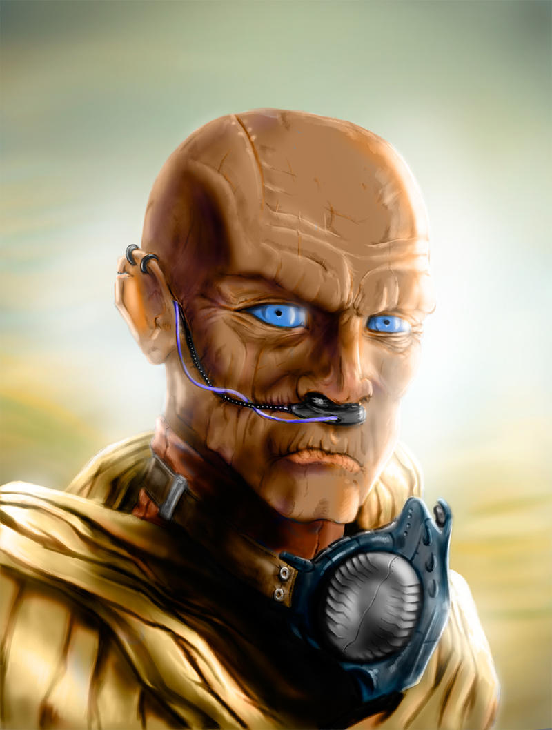
griphus: "Also, this take on Leto II makes him look like he's wearing an oversize sandworm costume. I think it came out considerably more adorable than the artist intended."
I think that's an artistic representation of a long-lost chapter of God Emperor of Dune, considered apocryphal by the Herbert estate but embraced by the fan community. In it, a group of Bene Genesserit come to the newly transformed Leto II, and rigorously test his mental discipline by reciting the ritual Arakeen taunt:
"Who's a cute wittle sandworm? Who's a cute wittle sandworm? YOU ARE!"
posted by mkultra at 1:53 PM on September 1, 2011 [17 favorites]
Now I can't even watch Desparate Housewives.
"The sleeper must awaken!!!"
"Geez, Orson, I just wanted to snooze for another few minutes, no need to shout."
posted by kmz at 1:54 PM on September 1, 2011 [1 favorite]
"The sleeper must awaken!!!"
"Geez, Orson, I just wanted to snooze for another few minutes, no need to shout."
posted by kmz at 1:54 PM on September 1, 2011 [1 favorite]
I've always considered this Bruce Pennington cover for Children of Dune my favourite.
posted by PenDevil at 1:58 PM on September 1, 2011 [1 favorite]
posted by PenDevil at 1:58 PM on September 1, 2011 [1 favorite]
This dude has terrible water discipline. (Just like everybody in that Sci-Fi Channel miniseries. Ugh.)
posted by kmz at 2:02 PM on September 1, 2011 [1 favorite]
posted by kmz at 2:02 PM on September 1, 2011 [1 favorite]
The covers website doesn't seem to mention that the first five books on the NEL imprint all fit together into one panarama. You can see them here.
posted by permafrost at 2:04 PM on September 1, 2011 [3 favorites]
posted by permafrost at 2:04 PM on September 1, 2011 [3 favorites]
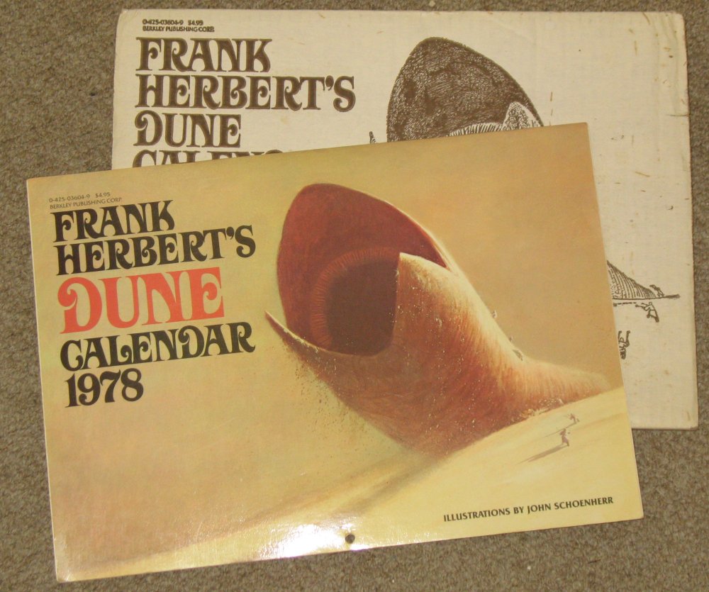
My brother had this calendar, which colored my perception of the Dune universe before I read any of the books. To this day, everything else looks clunky and overstated to me.
posted by Xoebe at 2:09 PM on September 1, 2011 [3 favorites]
posted by Xoebe at 2:09 PM on September 1, 2011 [3 favorites]
Now I can't even watch Desparate Housewives.
Ha, every time I watch Dune all I can think is "wow, Agent Cooper had a really weird time growing up."
posted by griphus at 2:19 PM on September 1, 2011
Ha, every time I watch Dune all I can think is "wow, Agent Cooper had a really weird time growing up."
posted by griphus at 2:19 PM on September 1, 2011
The linked Flickr set is wonderful. I want this person to do more.
posted by everichon at 2:19 PM on September 1, 2011 [4 favorites]
posted by everichon at 2:19 PM on September 1, 2011 [4 favorites]
I actually enjoyed both SciFi miniseries very much. If nothing else, I became acquainted with half-naked most of the time mmm hmmm James McAvoy's work.
In fact, I think the worst thing about those two series was William Hurt (wooden as Pinocchio) and Susan Sarandon (hammy as Virginia).
posted by PapaLobo at 2:21 PM on September 1, 2011 [3 favorites]
In fact, I think the worst thing about those two series was William Hurt (wooden as Pinocchio) and Susan Sarandon (hammy as Virginia).
posted by PapaLobo at 2:21 PM on September 1, 2011 [3 favorites]
Someone did this for the Glen Cook Black Company books at one point. What screws with my mind on these type of things is that the cover art is not only inconsistent country to country, but that sometimes the artwork for one book might end up as the artwork for another book in some other country.
posted by cjorgensen at 2:28 PM on September 1, 2011
posted by cjorgensen at 2:28 PM on September 1, 2011
Really, I think the art is remarkably consistent across the entire range. Not entirely, of course, but the general sense and themes are pretty stable. Maybe it's just that the desert setting lends itself to lots and lots of brown and tan...
posted by GenjiandProust at 2:34 PM on September 1, 2011
posted by GenjiandProust at 2:34 PM on September 1, 2011
I take taht back. This stands out as the cutest sandworm/human hybrid of them all. Apparently failing in his attempt to give a flower you a very rigid young lady on account of his poor motor control. Which makes it all the more poignant.
posted by GenjiandProust at 2:37 PM on September 1, 2011 [1 favorite]
posted by GenjiandProust at 2:37 PM on September 1, 2011 [1 favorite]
Oh god Poser art.
posted by griphus at 2:48 PM on September 1, 2011 [3 favorites]
posted by griphus at 2:48 PM on September 1, 2011 [3 favorites]
The 13-year-old in me is still snickering at the Danish titles, but the rest of me is in awe at the variety in artwork this series has had over the years.
griphus, that's exactly what I think when I watch Blue Velvet.
posted by mysterpigg at 3:05 PM on September 1, 2011
griphus, that's exactly what I think when I watch Blue Velvet.
posted by mysterpigg at 3:05 PM on September 1, 2011
I kind of like the anime style covers of the Japanese editions. Never really pictured Dune as an anime.
posted by smoothvirus at 3:14 PM on September 1, 2011
posted by smoothvirus at 3:14 PM on September 1, 2011
Someone did this for the Glen Cook Black Company books at one point.
Ooo! Link, link!
posted by The Tensor at 3:29 PM on September 1, 2011
Ooo! Link, link!
posted by The Tensor at 3:29 PM on September 1, 2011
Most subliminal cover.
Hehe. I'm pretty sure that was Herbert's intention for the sandworms.
posted by P.o.B. at 4:00 PM on September 1, 2011
Hehe. I'm pretty sure that was Herbert's intention for the sandworms.
posted by P.o.B. at 4:00 PM on September 1, 2011
I loved the Dune books as a teen sci-fi addict. I read my paperback copies over and over until the covers fell off. I certainly wasnt the only one who found the David Lynch movie disappointing at best. However in later years I grew to appreciate David Lynch and now I find Lynch's look at the Dune universe quite interesting.
Listen to David Lynch and Frank Herbert pat each other on the back about the film project.
posted by Abinadab at 4:37 PM on September 1, 2011
Listen to David Lynch and Frank Herbert pat each other on the back about the film project.
posted by Abinadab at 4:37 PM on September 1, 2011
I like the Grim Adventures Of Billy & Mandy version of God Emperor
posted by Lovecraft In Brooklyn at 4:50 PM on September 1, 2011 [1 favorite]
posted by Lovecraft In Brooklyn at 4:50 PM on September 1, 2011 [1 favorite]
Absolutely unreal things and vast sweeping worlds often do better if left to the reader's imagination to visualize. The covers of the books were fine, just enough to give an idea of how big the worms were and how desolate the landscape. But take that flickr set (and burn it) among others, with all due respect, its like that animated cartoon of The Lord of the Rings that was released in the 1980s - weeping over because they snatched away your own vision of what was and how it could be.
Otoh, Sting looked good in the movie (which I didn't see but purchased a copy of "The making of...")
posted by infini at 9:46 PM on September 1, 2011
Otoh, Sting looked good in the movie (which I didn't see but purchased a copy of "The making of...")
posted by infini at 9:46 PM on September 1, 2011
The NEL covers that permafrost links to are the only true Dune cover for me. Whenever I see a Dune book at a store I usually wonder why they have the wrong covers on them.
posted by schwa at 12:22 AM on September 2, 2011
posted by schwa at 12:22 AM on September 2, 2011
My brother had this calendar, which colored my perception of the Dune universe before I read any of the books. To this day, everything else looks clunky and overstated to me.
Me too. Those are the "correct" sandworms.
posted by Meatbomb at 7:38 AM on September 2, 2011
Me too. Those are the "correct" sandworms.
posted by Meatbomb at 7:38 AM on September 2, 2011
Emily Carroll wins again!
posted by infinitewindow at 2:49 PM on September 2, 2011
posted by infinitewindow at 2:49 PM on September 2, 2011
I used to look at this Dune cover art site before buying copies of the novels. I'd find the best old covers then seek them out. I need good cover art on my books. I makes the story better. That being said, all the 1990s-2000s era covers suck hard.
posted by Liquidwolf at 4:36 PM on September 2, 2011
posted by Liquidwolf at 4:36 PM on September 2, 2011
« Older Morphabet | New Gay Military Magazine Headed for Base... Newer »
This thread has been archived and is closed to new comments
Also, this take on Leto II makes him look like he's wearing an oversize sandworm costume. I think it came out considerably more adorable than the artist intended.
posted by griphus at 1:47 PM on September 1, 2011