"I have now attained the true art of letter-writing..."
February 24, 2013 8:08 AM Subscribe
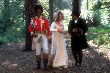
Post & Prejudice: [guardian.co.uk] "The Royal Mail is joining in the celebrations to mark the 200th anniversary of Pride and Prejudice with the release of a series of stamps featuring all six of Jane Austen's novels. Royal Mail commissioned the artwork by Angela Barrett." [Slideshow]
I'm an idiot American that likes to do idiot things. I wrote the Queen a letter and when I got a reply many months later, from Mrs. Sonia Bonici her Senior Correspondence Officer, it came stamped "Royal Mail" and I got excited because I thought the Queen had her own private mail, and how cool is that? My girlfriend pointed out that I was not only an idiot, but stupid too.
posted by cjorgensen at 8:50 AM on February 24, 2013 [4 favorites]
posted by cjorgensen at 8:50 AM on February 24, 2013 [4 favorites]
It's a shame Edward Gorey is dead. He would have done a great job with these.
posted by TheWhiteSkull at 8:51 AM on February 24, 2013
posted by TheWhiteSkull at 8:51 AM on February 24, 2013
I was thinking of something more like this.
Did I mention, dinner is served?
posted by charlie don't surf at 8:59 AM on February 24, 2013
Did I mention, dinner is served?
posted by charlie don't surf at 8:59 AM on February 24, 2013
My irrepressible inner 14-year-old unfortunately sees the Pride and Prejudice stamp image as a porn film box. Yes, she is standing in front of and slightly below him; yes he is leering down at her.
“It is a truth universally acknowledged, that a single man in possession of a good fortune, must be in want of a grilled cheese sandwich.”
posted by chavenet at 9:11 AM on February 24, 2013
“It is a truth universally acknowledged, that a single man in possession of a good fortune, must be in want of a grilled cheese sandwich.”
posted by chavenet at 9:11 AM on February 24, 2013
I wonder if someone who knew the novels a lot better than I do could distinguish them by these illustrations without the titles on them. To me one scene of drab Regency souls in lush Regency settings is very like another.
posted by George_Spiggott at 9:20 AM on February 24, 2013
posted by George_Spiggott at 9:20 AM on February 24, 2013
The one of Northanger Abbey's anti-heroine Catherine snooping in the wardrobe I would have known. I am not sure about the others.
posted by orange swan at 9:26 AM on February 24, 2013
posted by orange swan at 9:26 AM on February 24, 2013
These are great! Yes, I was able to guess which novel was which by the images alone (except for Northanger Abbey, which I haven't read). Each one depicts an emotionally charged and foreboding moment in the book, though not necessarily the most dramatic or memorable moment.
I love that the emphasis in the illustrations, as in Austen's books, is on the women's experiences, their feelings and inner lives, and the external drama serves to showcase that, rather than being an end in itself. My only quibble with these is that I wish Emma looked a little more lively.
posted by milk white peacock at 9:53 AM on February 24, 2013
My only quibble with these is that I wish Emma looked a little more lively.
Well, that was one of Emma's lowest moments (getting dressed down after the picnic), so I suppose she wasn't feeling so lively. :)
But I agree about the emphasis in these illustrations. Nice moments chosen. The one for P&P is a really great idea in that regard, though it comes off a little weird in the execution.
posted by torticat at 10:37 AM on February 24, 2013
These bland, inoffensive and boring images make me nostalgic for the era of David Gentleman when British stamps were designed properly. With Gentleman you can always tell that the designer has thought carefully about the relationship between the image and the Queen's head. With these stamps you can tell that the image has come first and the Queen's head has been stuck on afterwards.
British stamp design is in a bad way at the moment (Christmas 2011 being a particular low), which probably has something to do with the fact that hardly anybody buys these stamps to stick on envelopes any more, they buy them as 'collectibles'. Form and function have been completely severed.
posted by verstegan at 11:08 AM on February 24, 2013
Off topic question: I'm on a mac using Google Chrome and Guardian slideshows never work. Why?
Anyway, I like the style of the pictures, it kind of seems like something a young, accomplished gentlewoman might draw, but they really fail to capture the spirit of the novels.
posted by Partario at 11:52 AM on February 24, 2013
Anyway, I like the style of the pictures, it kind of seems like something a young, accomplished gentlewoman might draw, but they really fail to capture the spirit of the novels.
posted by Partario at 11:52 AM on February 24, 2013
Holy hell, you guys are a tough crowd. I've always thought that Angela Barrett is one of the most talented illustrators working in childrens' books today; her take on Beauty and the Beast is haunting and gorgeous. But instead it's said here that her work is "inoffensive and boring"... or (and this is almost worse) her work is not that of a consummate industry professional but like that of a "young, accomplished gentlewoman"? Talk about damning with faint praise.
Feh.
posted by suburbanbeatnik at 10:08 PM on February 24, 2013 [1 favorite]
Feh.
posted by suburbanbeatnik at 10:08 PM on February 24, 2013 [1 favorite]
« Older Dad! Dad! My little sister's been kidnapped! What... | Don't Forget Your Past Newer »
This thread has been archived and is closed to new comments
posted by Foci for Analysis at 8:41 AM on February 24, 2013 [1 favorite]