book covers tell women what they want by surmising who they want to be
July 9, 2016 10:08 AM Subscribe
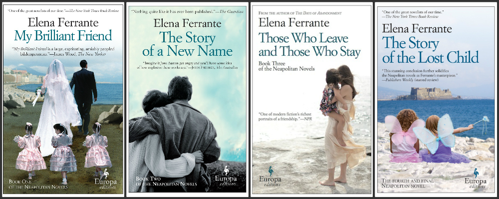
The Subtle Genius of Elena Ferrante’s Bad Book Covers by Emily Harnett [The Atlantic] With their sandy beaches and windswept women, the U.S. editions of Elena Ferrante’s novels look familiar even if you’ve never seen them. That’s because they look like virtually every other book authored by a woman these days—not to mention like bridal magazines, beach-resort brochures, and even “Viagra ads.” On Twitter and beyond, readers have described Ferrante’s covers as “horrible,” “atrocious,” “utterly hideous,” and as a “disservice” to her novels. At Slate, one commenter approvingly mentions a local bookstore’s decision to display one of Ferrante’s books in plain brown paper, reviving a practice used for Playboy and the infamous issue of Vanity Fair with a pregnant Demi Moore on the cover. The implication, of course, isn’t that Ferrante’s covers are obscene in the traditional sense—just obscenely bad. Previously.
I never felt like the covers were going for a 'chicklit' vibe. I just attributed their design to a more European sensibility. The design is also in keeping with the way other Europa Editions are marketed.
posted by Fizz at 10:34 AM on July 9, 2016 [3 favorites]
posted by Fizz at 10:34 AM on July 9, 2016 [3 favorites]
The book contains a bride and a beach, so the cover shows a bride and a beach. Not deceptive in the least.
Tbh, they should've gone with a pair of shoes on the cover.
posted by betweenthebars at 10:38 AM on July 9, 2016
Tbh, they should've gone with a pair of shoes on the cover.
posted by betweenthebars at 10:38 AM on July 9, 2016
This article would have been helped by contrasting her covers with the kind most people think of as "literary." Which I would say tend to feature fewer straightforward photographic portrayals of human bodies and more drawings/etchings/collages/creative typography/embossing/cutouts/etc.
I'll admit that I like the second kind better. If only because I'm tired of looking at white people's faces on everything, especially in the format of a Ralph Lauren ad gone awry.
I am really not sure what point the writer is making. Is Ms. Harnett saying that this type of cover is most appropriate for women's writing and therefore we should stop being snobby and sexist about it? Maybe?
Honestly I just find these covers badly designed and boring. I think women writers do tend to get the badly designed/cheesy/boring types of covers because of sexism, and that the fact that the writing inside is perfectly good doesn't redeem the crap art. I wouldn't want to see this art on something written by a man, either.
The interesting bit that gets kind of buried is that Ms. Ferrante likes these covers. And if she does, then she should have them. And if it is some sort of sly joke on the lit-crit establishment, well that is hilarious and I salute her, but most people are not going to be able to tell it's a joke when walking down the bookstore aisles, so that's a risky position to take.
posted by emjaybee at 10:42 AM on July 9, 2016 [11 favorites]
I would like to see some covers of books about women where the women are not all chosen and then photographed for their ability to appear like catalog models - thin, young, normatively beautiful, usually white, etc. I would like to see some covers of books about women where the women get to be non-feminine, or where the women get to exist in groups, or doing something that does not involve being beautifully pensive. One can photograph women looking a variety of women and doing a variety of things.
Actually, my favorite book covers are the ones for Timmi DuChamp's Marq'ssan series - they are an assemblage of photos of women and situations and the same photos are arranged and emphasized differently for each book. The rhythm and emphasis expresses something about the series and the variety of pictures expresses something about the women, while being portraits of none. The narrators of all the books are women and the major characters are all women, including the scariest villain. (The most evil villain is a man, but we get a half-book of the scariest villain's viewpoint.)
I love these because they show something about the situation of women, the meaning of the book, and because they have some ambition more than just showing an artistic picture of a pretty young woman that relates slightly to the story.
Here they are:
Alanya to Alanta
Renegade
Tsunami
Blood in the Fruit
Stretto
I feel like we're in a cultural moment where no one can imagine an outside, so everything is either pop-generic or "let's make a clever riff on what is pop and generic". I am a child of the nineties - the indie label nineties, the thrift store nineties, the fanzine nineties - and it gets me right down.
posted by Frowner at 10:46 AM on July 9, 2016 [16 favorites]
I am really not sure what point the writer is making. Is Ms. Harnett saying that this type of cover is most appropriate for women's writing and therefore we should stop being snobby and sexist about it? Maybe?
This gets at one of the really difficult aspects of this kind of analysis. If people dismiss typically feminine covers as non-literary, should we then try to market books by or about women in non-feminine covers in order to demonstrate that fiction by and about women can be literary? Or should we be more focused on pointing out to the world that feminine things are not bad, and that things can be both feminine and literary at the same time, and that if they dismiss books because they have feminine covers, the problem lies with them and not with the femininity?
posted by jacquilynne at 10:51 AM on July 9, 2016 [14 favorites]
This interview with the art director of the covers is pretty illuminating. The photos on the covers are intentionally kitsch and "low-class."
posted by (Over) Thinking at 10:52 AM on July 9, 2016 [8 favorites]
posted by (Over) Thinking at 10:52 AM on July 9, 2016 [8 favorites]
I keep reading about how terrible the Ferrante covers are, and it sort of pisses me off. These books take seriously the lives and concerns of women, and we're used to dismissing books that take women seriously. Usually, books about women's lives are garbage chick lit, but it's ok to like Ferrante's books, because although they are about women, they're European and highbrow. But these books about women need covers that differentiate them from other books about women, or people might get the mistaken impression that we normally read books about something as silly and insignificant as women's lives.
I read books about women. I even sometimes read books about women that get categorized as chick lit. I am not embarrassed about that fact, and I don't need there to be special covers that hide that I think people like me can be interesting.
posted by ArbitraryAndCapricious at 10:53 AM on July 9, 2016 [17 favorites]
The Atlantic is always an interesting place to learn how class anxiety sounds when the word "class" itself is taboo.
posted by RogerB at 10:59 AM on July 9, 2016 [13 favorites]
posted by RogerB at 10:59 AM on July 9, 2016 [13 favorites]
Is there anything on how cheap these covers look? My first impression isn't "chick-lit" but "self published"
posted by The Whelk at 11:00 AM on July 9, 2016 [28 favorites]
posted by The Whelk at 11:00 AM on July 9, 2016 [28 favorites]
Did that thing with only womens' legs on the cover blow over yet?
posted by thelonius at 11:07 AM on July 9, 2016 [1 favorite]
posted by thelonius at 11:07 AM on July 9, 2016 [1 favorite]
It would sort of interest me, just out of curiosity, to see what readers would choose or design as better covers; that would help me see what audience expectations aren't being fulfilled. When it comes down to it, as long as Ferrante's OK with her covers, all I really care about is the text -- I'm not a very visual person (more audio and text), so I tend not to react strongly one way or another to most book covers unless there's something extremely engaging, unappealing, or otherwise noticeable about them.
I find Ferrante's Neapolitan novel covers -- the American photo ones -- appealing because a) all four share the same color scheme/format*, which appeases my Type-A brain, b) each is like a snapshot of an event or moment in the narrative, and c) you can't see any character faces, which seems to be a way of saying, "You can only really know these people and what's going on here by reading the book."
*I get really actively annoyed and unhappy when different books in a multi-volume series are different sizes or don't share consistent design across the series.
posted by FelliniBlank at 11:13 AM on July 9, 2016 [5 favorites]
I feel like there's some stuff in tension here:
1. Representation - like, is it the job of the book cover to represent the characters? if so, how? Is mere representation the biggest concern - like, if the choice is a generic chic lit cover with irony, an experimental/independent cover or a justice-oriented representation (so you might have an older woman who looks like the [for example based on an imaginary book] biracial plain main character rather than a cover model who looks generically pretty) which does one go with?
2. Blankness. What seems cool about the covers in the OP is that if all women's fiction looks the same, then you can hide anything under the blankness. There's too much individual identification in culture right now, too much targeting. If it's all windblown beaches, etc, you escape that - it could be anything in there. it's like a visual alias.
3. Grouping the novels with all "women's novels" rather than grouping the novels with "literature" - redrawing the venn diagram so that, like, the Neapolitan novels and Virginia Woolf and romance novels and urban fantasy are all in one circle, stronger together.
4. But how does race work with this? I feel like the generic/blank women's novel cover is coded white.
posted by Frowner at 11:13 AM on July 9, 2016 [2 favorites]
Put me in the "Hate The Covers" column. I don't necessarily think it was a bad idea to have the covers reflect domesticity or femininity. But why are the covers devoid of any hint of the utter despair, anger, violence, pain, and heartache that permeate the story? I think the covers are misleading and to find out that was intentional doesn't make me hate them any less.
posted by pjsky at 11:16 AM on July 9, 2016 [4 favorites]
posted by pjsky at 11:16 AM on July 9, 2016 [4 favorites]
Where are the examples of the bad covers? I'm missing something. The article makes it sound like the covers are some hideous, insulting monstrosities, unfit for public display. These may be modest and vague, but I can't see what's wrong with them. Are the covers for male-written highbrow literature so vastly superior?
Male readers generally aren’t enticed by chick-lit covers, and many female readers are also turned off by them, with good reason.
Umm... if this were true, the books wouldn't sell as well as they do. Marketers don't randomly throw crap on the covers, and to suggest they would design covers that actively repels readers is insulting.
posted by GhostintheMachine at 11:20 AM on July 9, 2016 [2 favorites]
If I were designing the cover for "My Brilliant Friend" it would be a B/W photo of a stylish middle aged woman sitting at a typewriter, the features of her face lost in shadows. In the background a bookcase crowded with memorabilia, including a small framed photo of 2 young girls laughing and clinging to each other.
posted by pjsky at 11:21 AM on July 9, 2016 [2 favorites]
posted by pjsky at 11:21 AM on July 9, 2016 [2 favorites]
Here's the French trade paperback cover for "Mon amie prodigieuse" ("My Brilliant Friend"). Then there's "Le nouveau nom" ("The Story of a New Name") and "Les jours de mon abandon" ("Those Who Leave and Those Who Stay"). It does look like her Italian paperback covers are the same as the US ones.
Of course you can always go for the classic Gallimard covers: Les jours de mon abandon.
posted by fraula at 11:39 AM on July 9, 2016 [1 favorite]
Of course you can always go for the classic Gallimard covers: Les jours de mon abandon.
posted by fraula at 11:39 AM on July 9, 2016 [1 favorite]
So if you go to a place that collects "great" book covers like Book Cover Archive, you get a feel for what kinds of covers a "serious" "literary" book gets.
A striking image + custom typography. Often plays with image orientation, color values. Combines photographic and drawn elements. Almost always obscures faces (it would be interesting to compare/contrast the ways "chicklit" covers do this with the way standard-lit covers do it).
But to me the biggest difference is the typography. Right now, it's almos the most important element in a lot of book design, but on Ferrante's books, and the generic women's-lit books they imitate, it's generic, swirly, forgettable.
Making books that are designed that way look completely out of step with modern book cover design.
(I'm using lots of quotation marks in recognition that opinions on those terms/rankings will differ).
posted by emjaybee at 11:45 AM on July 9, 2016 [7 favorites]
Living in Europe, in a lit-happy country where major bookstore chains still carry works in languages from other European countries as well as from the US and UK, it's interesting to see how US-centric that style of "great" book cover is, though. You just don't see it here. The Gallimard cover I linked to is the same style they've published for decades, as are the Folio (trade paperback) covers. Same font, same photo style.
The US covers come across as, well, garish in comparison. I seem to have left the States at a time when things changed on that level, too – I still recall more "classic" covers, and seeing the garish new ones, well, I hadn't realized they were viewed as those of "great books" until reading this thread. I thought they were flash-in-the-pan marketing ploys and that the bookstore chains here were ordering those editions because of their flash.
posted by fraula at 12:10 PM on July 9, 2016 [6 favorites]
That's a good, thoughtful article; thanks for posting it. Both these sentences are well written and inarguably true:
> I am really not sure what point the writer is making.
Well, for one thing, she made all the points you made, so maybe you got something out of it without noticing? In particular, she points out the bit that you say "gets kind of buried," that Ms. Ferrante likes these covers. In fact, she apparently chose them.
> The article makes it sound like the covers are some hideous, insulting monstrosities, unfit for public display.
No it doesn't. Did you actually RTFA? She specifically says the style "isn’t exactly 'hideous,' as some readers claim." Are you perhaps remembering outraged reader quotes and attibuting them to the writer who quoted them?
posted by languagehat at 12:11 PM on July 9, 2016 [5 favorites]
Weiner has more in common with Ferrante than covers alone, and there’s a whiff of hypochondria to the reader backlash—a fear that Ferrante’s high-minded fiction might be contaminated by mere resemblance to more commercial fare. That anxiety forgets just how commercial Ferrante really is, right down to her soapy, page-turning plots and seven-figure book sales.I started reading the series thinking "I'm sure this is actually Serious Fiction and not that commercial stuff," and soon I realized 1) yup, it's Serious, but 2) it's damn sure commercial as well, which is why it's selling like hotcakes and I'm turning the pages so feverishly, and 3) there's nothing wrong with that! there's no reason Serious Fiction has to be like cod-liver oil! I also liked this:
In interviews, Ferrante has said that the ambition of her writing is to make “the facts of ordinary life […] extraordinarily gripping when read,” which well captures the genius of her fiction.Yes indeed.
> I am really not sure what point the writer is making.
Well, for one thing, she made all the points you made, so maybe you got something out of it without noticing? In particular, she points out the bit that you say "gets kind of buried," that Ms. Ferrante likes these covers. In fact, she apparently chose them.
> The article makes it sound like the covers are some hideous, insulting monstrosities, unfit for public display.
No it doesn't. Did you actually RTFA? She specifically says the style "isn’t exactly 'hideous,' as some readers claim." Are you perhaps remembering outraged reader quotes and attibuting them to the writer who quoted them?
posted by languagehat at 12:11 PM on July 9, 2016 [5 favorites]
The late writer Edmund Wilson was the only author I knew of who had full control over the shape, design, formatting of his books. I tend to buy a book because I want to read a specific work and care little for the book cover itself.
posted by Postroad at 12:32 PM on July 9, 2016
posted by Postroad at 12:32 PM on July 9, 2016
I also don't get why these covers are "bad." They're boring, but not like, super hideous. Not like oh, this. I have to give the artist props for actually drawing the characters as is (Rish in particular with the lapis skin is a whopping challenge), but why the hell is she doing a random jete in the back while Tej is straight up backwards falling off the couch about to lose her top? Ughhhhhh. The worst.
posted by jenfullmoon at 12:43 PM on July 9, 2016 [2 favorites]
posted by jenfullmoon at 12:43 PM on July 9, 2016 [2 favorites]
Fizz: I never felt like the covers were going for a 'chicklit' vibe. I just attributed their design to a more European sensibility.
This is one thing that irks me about marketing - how much seems to be done for certain "sensibilities," but has anyone really studied how people in different markets really react to different covers and styles, or is it more of "we've always done it this way, and women keep buying the books, so let's keep doing this"? Because I feel like it's the latter.
posted by filthy light thief at 12:53 PM on July 9, 2016 [2 favorites]
Huh. Am I the only one who thinks these covers are (a) excellent and (b) VERY distinct from the usual "chick lit" covers? Granted, I probably think that partly because the covers have the distinctive Europa Editions "look" (they use that typeface a LOT) and Europa Editions is a prestige brand. But also, the partial colorization, the image-collagey look, the clashing pastel and dull colors, all strike me as both intentionally kitschy and intentionally "off." If I'd never heard of the books, I'd probably look at the covers and think "literary novels about disturbing things happening in 1950s households," which is not far off.
posted by ostro at 1:12 PM on July 9, 2016 [5 favorites]
posted by ostro at 1:12 PM on July 9, 2016 [5 favorites]
The Atlantic is always an interesting place to learn how class anxiety sounds when the word "class" itself is taboo.
Hmm, I don't know. From my personal experience, very comfortable upper-middle-class women read lots of books with pastel photographic covers. Design for books marketed to working-class women suggests romance novels with a woman sultrily half-wearing a satiny 1860s dress on a bare 1980s body, or inspirational books with blazes of Photoshopped sunlight and small children looking heavenward. Whether I think such covers are tacky because of socioeconomic constraints or not, I will never be honestly able to know.
Since I haven't yet read the books, I can't say whether Ferrante's covers are really fitting or not, but just because she chose the images doesn't make them the right choice. An author doesn't necessarily have an artist's eye.
posted by Countess Elena at 1:13 PM on July 9, 2016 [3 favorites]
but not like, super hideous. Not like oh, this.
That's not fair. Baen covers are a punchline in the industry.
FWIW, those American Ferrante covers look incredibly nondescript, but I'm not enamoured of the Spanish covers, either. The Catalan ones with the orange on black color scheme look better IMO.
posted by sukeban at 1:16 PM on July 9, 2016 [2 favorites]
I am really not sure what point the writer is making
I think the article makes some good points, and the second half makes those points a lot more clearly than the first. The second half is the meat of the essay where Harnett makes her positive case, and things get much clearer. My summary:
Purely as a matter of writing/presentation technique, this is something I'm really interested in, so I went through and drew out the switchbacking assertions in the first half. I'm blockquoting my summary, for ease of reading or skipping. The points are coded very roughly as anti-covers and pro-covers.
"-" = covers are a problem, and "+" = covers are ok
posted by LobsterMitten at 1:51 PM on July 9, 2016 [21 favorites]
I think the article makes some good points, and the second half makes those points a lot more clearly than the first. The second half is the meat of the essay where Harnett makes her positive case, and things get much clearer. My summary:
The covers are causing this reaction (mainly?) because they're images of women doing things, which strikes men and women as unliterary, and that's what's bad. Books by and about women should be able to be marketed as being about humanity even when they're focused on women specifically and have a womanish cover, just as similarly male-centric novels have been for years.But back to the first half of her essay just to address the point about unclarity, allow me to nerd out about writing structure for a minute. The first half suffers from a logical/structural problem that I call logical "switchbacking." It uses the "x, but y" or "but while y, also x" construction a bunch of times in a row, which can make it hard for the reader to grasp the through-line of the author's thesis, or which points the author is merely reporting vs which she's endorsing.
Purely as a matter of writing/presentation technique, this is something I'm really interested in, so I went through and drew out the switchbacking assertions in the first half. I'm blockquoting my summary, for ease of reading or skipping. The points are coded very roughly as anti-covers and pro-covers.
"-" = covers are a problem, and "+" = covers are ok
The books are great...It's interesting because of course, the first half presents a complicated set of considerations, positive and negative... maybe presenting those will always be a little confusing. When I'm revising an essay like this, if I find too much switchbacking, I'll (roughly) try to see if I can simplify and collect all the negative points in one paragraph and the positive points in another -- sometimes it makes it easier for the reader to follow. (For teaching writing and editing, I love getting new good examples of this in action, too, so thanks for posting this.)
- But people think the covers are bad (bunch of specific quotes)
+ But the publisher made the covers like this on purpose for reasons
- But the mere fact that it's intentionally corny doesn't mean people need to like it
+ But disliking them for not being serious looking buys into destructive stigma
- But the stigma still exists; the chick-lit genre has "cast a shadow" over Ferrante and her readers, and the covers are putting the work into a less-seriously-regarded category for sexist reasons
+ But the visual formula of oceans and pastels isn't hideous
- But it is tired and silly
+ But the reader backlash is "hypochondriac", a fear of perceived association with the less-seriously-regarded "commercial" category
+ But Ferrante's work is commercial, so it's correct to associate it with commercial work (i.e. the fear is unjustified, the covers are ok)
- But the fear is also justified because of the sexist reality in the publishing world that books by women automatically get this kind of cover even if it's unsuitable to the material. (i.e. the fear is justified, the covers are a problem)
+ But the fear is also probably partly a fear of "unsophisticated readers" (and in that sense unjustified)
- But that's really a fear that publishers are "underselling the ambition" of their novels (and our writer agrees this is a justified fear)
- Both men and many women are turned off by this kind of cover (so the fear of underselling-in-terms-of-sales is justified)
- Women are turned off "with good reason" because the covers are skinny white women etc and it's "bankrolling your own belittlement" (so again the backlash against the covers is justified)
+ But we accept that we're bankrollng our belittlement when we watch/listen to other pop culture
- But novels are supposed to be better than that
+ But Ferrante's covers aren't actually patronizing
- But they are trite
posted by LobsterMitten at 1:51 PM on July 9, 2016 [21 favorites]
When I was studying commercial art once upon a time for about five minutes, we had a section on book covers, which was pretty explicit about the semiotics of genre and markets in book marketing. And generic type stock photos like that were a clear marker for a specific type of 'supermarket books' (displayed near the checkout, intended as impulse purchases) targeted toward women. Just like die-cuts were common for similarly marketed genre novels marketed for men (although I don't think I've seen that in a while).
And their backs are probably turned so that the putative reader can more easily imagine herself in the role of the protagonist. Some romance novels, from what I've heard, leave the female characters fairly nondescript for the same reason.
You could take any one of those pictures, and put a bland little inspirational phrase like "Live Love Laugh" on it and sell it as a poster at Target or use it as a placeholder for a picture frame. The imagery just reads as treacly, and based solely on the cover, it's not unreasonable to assume that the story inside is a sort of 'beach read.' Just something sort of unchallenging that you can read piecemeal that won't suffer too much from distractions and interruptions, and won't defy too many expectations of the formula.
And there is absolutely nothing wrong with that, but I can understand why some women might not want to be seen reading books with covers like that because of stereotype threat.
There are no doubt tons of great, non-formulaic stories hiding behind covers like that, for no reason other than that they were written by women. But the design language is not an accident, and readers are not necessarily being sexist just for recognizing the style.
It is a really interesting choice.
posted by ernielundquist at 1:58 PM on July 9, 2016 [12 favorites]
That's not fair. Baen covers are a punchline in the industry.
Some combination of spaceships, boobs, and badly composed Poser 4 models. But at least they're consistent.
Of course if you piss off your publisher you could get the opposite problem and end up with a generically composed wall of text which is likely to torpedo any chance of actually selling books.
The covers in the OP just seem... bland to me. Not good, certainly, but not remotely something I'd include in my "worst covers" mental file. Maybe I've simply seen too many cheesy and bad covers.
posted by Justinian at 3:02 PM on July 9, 2016
I mean, "generic" isn't good but memorable isn't always a good thing either. Those teeth! No!
posted by Justinian at 3:03 PM on July 9, 2016 [1 favorite]
posted by Justinian at 3:03 PM on July 9, 2016 [1 favorite]
No it doesn't. Did you actually RTFA?
Yes, I did. Where I read:
"Their visual formula isn’t exactly “hideous,” as some readers claim, but it’s certainly tired, and not a little silly..."
"Ferrante’s terrible covers and brilliant fiction suggest..."
"It also captures the genius of her bad covers. "
The article's author certainly isn't celebrating the covers so much as tolerating them.
posted by GhostintheMachine at 3:37 PM on July 9, 2016 [2 favorites]
To me, those covers say This. Is. Serious. Literary. Fiction.
And to me, what's inside the covers says the same thing.
(I hope there's nobody left who thinks "interested in the reality of women's lives, including their domestic lives" is in any way in tension with Serious. Literary. Fiction.)
posted by escabeche at 3:58 PM on July 9, 2016 [1 favorite]
And to me, what's inside the covers says the same thing.
(I hope there's nobody left who thinks "interested in the reality of women's lives, including their domestic lives" is in any way in tension with Serious. Literary. Fiction.)
posted by escabeche at 3:58 PM on July 9, 2016 [1 favorite]
I ran into a book designer friend of mine today, and I was praising to him the cover of the Finnish version of Nora Webster by Colm Tóibín. Funnily enough, it turned out that my friend had designed that particular cover, so he was quite happy to hear that. I much prefer it to other editions even though they all happen to have the same motif of a woman by the sea. What struck me about the Finnish version was the hand-tinted look it had, as well as the fact that the woman's face could be seen. It gave the figure specificity and gravity, lacking in all the other images of women with their faces obscured in some way.
As for the Ferrante covers, they don't particularly bug me, nor do they appeal to me. I think they could be more interesting, but I understand the decision to package them in a fairly neutral way. I'm glad they're not in Chip-Kidd-a-like jacket, because there are already too many of those.
posted by Kattullus at 4:21 PM on July 9, 2016
intentionally kitschy: I don't know if it's my lack of education, my lack of class, or being on the spectrum that means any deliberate or subtle parodying or re-use of a cover style (that I associate with books that turned out to have an unexpectedly Christian theme within chic lit) just went right over my head. I feel kept out of a loop, maybe even stupid, because of an obvious -to them - in-joke (between author, publisher and some commenters in this thread). Just so you know, i didn't know Thomas Kincaid was a hack until well into my 30s, and I'm not sure about Norman Rockwell anymore. I've heard of high and low art (my daughter is PhD student and lecturer in fine arts) but I dont really get the difference. This is a language that has to be learned, and in a lot of cases taught, because there simply isn't enough background examples for it to filter through (you don't learn French by accident unless you hear it every day).
I'm tired that most literary/ media characters seem to be young and slim and beautiful and from that cover, i would assume this about these books. The potential cover described above by pjsky would have me picking up the book to see if there was an interesting story. The other cover type - backs of privileged slim women on the beach - these stories are often as alien to me as stories written by men about men.
posted by b33j at 4:27 PM on July 9, 2016 [2 favorites]
That's interesting. I don't think I would have picked up My Brilliant Friend if it hadn't been recommended to me, and I knew at the outset that it was a book about working-class girls in post-war Italy. But knowing that, and knowing that people I trusted thought it was brilliant, I didn't find the cover off-putting. I also didn't really read it as kitsch.
posted by ArbitraryAndCapricious at 4:56 PM on July 9, 2016 [1 favorite]
posted by ArbitraryAndCapricious at 4:56 PM on July 9, 2016 [1 favorite]
> The article's author certainly isn't celebrating the covers so much as tolerating them.
No, of course not—I wouldn't celebrate them either. But not celebrating them isn't the same as calling them "hideous, insulting monstrosities, unfit for public display," which was your wording. Me, I'm happy for whatever covers make Ferrante the most money.
posted by languagehat at 5:48 PM on July 9, 2016 [2 favorites]
Whatever happened to not judging a book by its cover?
posted by Ideefixe at 8:10 PM on July 9, 2016 [2 favorites]
posted by Ideefixe at 8:10 PM on July 9, 2016 [2 favorites]
> I don't think I would have picked up My Brilliant Friend if it hadn't been recommended to me, and I knew at the outset that it was a book about working-class girls in post-war Italy. But knowing that, and knowing that people I trusted thought it was brilliant, I didn't find the cover off-putting. I also didn't really read it as kitsch.
I admit, I absolutely was put off by the cover, after seeing My Brilliant Friend in some discussion, possibly here, of great recent fiction. All I used to judge it a "pass" were the quick mention, the title, the cover and synopsis. The cover looked like Christian fiction or self-help from the early 90s to me and my stomach turned at the memories of being taken to buy "anything I wanted" from the Christian bookstore and coming up empty. Maybe it's the epitome of shallowness, judging a book by its cover, but I don't have a dependable way to find fiction I enjoy, and so I depend on context clues about literature and I just hate finding out a book isn't what I'd hoped, because I'll always finish it anyway.
posted by Ambrosia Voyeur at 10:15 PM on July 9, 2016 [2 favorites]
So, judging a cover by its book doesn't work either, huh?
posted by progosk at 12:12 AM on July 10, 2016
posted by progosk at 12:12 AM on July 10, 2016
Ideefixe: "Whatever happened to not judging a book by its cover?"
Eponysterical!
posted by chavenet at 2:40 AM on July 10, 2016
Eponysterical!
posted by chavenet at 2:40 AM on July 10, 2016
I think a lot of book cover agonizing is because of what it signals about you, the buyer/reader, to those in your immediate environs (on the subway, on an airplane, at the office, &c.) , a problem essentially solved by e-readers (or even a nice slip-on book protector). I get that the marketing aspects are important at the various points of sale & that there is a need to both cut through the "noise" to stand out while simultaneously signalling or "this is a book that will be like that other book you liked," but once you've bought it it says something about you, which is why those Harry Potter books had "adult" editions, just as one example.
posted by chavenet at 2:48 AM on July 10, 2016 [2 favorites]
posted by chavenet at 2:48 AM on July 10, 2016 [2 favorites]
My girlfriend is a book designer (and I work in digital design). We've talked a lot about these covers. She gulped down all 4 novels earlier this year, I've only read the first one so far. I think what the article doesn't really address (nor most of the comments I've read about the covers), is not that the content or style of the covers is strange, but that the actual implementation is really off. With the exception of the third book, the images are really odd collages that feel almost deliberately awkwardly stitched together. The shadows are bizarre, the colours and tones feel very unnatural, mismatched, even within the one image. The typography is kind of unapologetically inelegant.
There are some really great comments above about the intractable weirdness around women's literature, "chick-lit" and the overlap between them. But to me, what's producing a gut reaction against these covers is not the general style, but the implementation of that style. It's existing in some uncanny valley of aesthetic, where you can feel the designer deliberately doing something bad, rather than simply doing some iffy work because that's what they're capable of. They feel intentional. I think that if these covers were more "normal" renditions of the exact same motifs then they would be generating far, far less discussion. People can feel weird design, even if they can't pick out what exactly is off-putting about it.
So yeah, they're really interesting.
posted by distorte at 2:57 AM on July 10, 2016 [8 favorites]
I'm glad they're not in Chip-Kidd-a-like jacket, because there are already too many of those.
From Chip Kidd's wiki:
From Chip Kidd's wiki:
Kidd has often downplayed the importance of cover designs, stating, "I'm very much against the idea that the cover will sell the book. Marketing departments of publishing houses tend to latch onto this concept and they can't let go. But it's about whether the book itself really connects with the public, and the cover is only a small part of that." He is also known to be humorously self-deprecating about his work with statements such as "I piggy-backed my career on the backs of authors, not the other way around. The latest example of that is The Road, by Cormac McCarthy. I'm lucky to be attached to that. Cormac McCarthy is not lucky to have me doing his cover."posted by Fizz at 5:32 AM on July 10, 2016
People can feel weird design, even if they can't pick out what exactly is off-putting about it.
Yes, and I think that speaks directly to Lila's sense of dissolving margins, the split between the expectation of the way things should be and the sudden perception that they are not at all as they appear, that there's an increasing chasm between appearances/expectations and the gross material realities of things, of lives. The creation of art by attacking paper with scissors and exposing the bizarre shadows and unnatural colors is revelatory; these covers are a deadly serious joke.
posted by MonkeyToes at 6:30 AM on July 10, 2016 [4 favorites]
distorte, thanks so much for your comment. I couldn't really tell that "offness" from looking at these on-screen, now I'll probably see if I can find one in a bookstore and see if it stands out to me too.
posted by emjaybee at 10:14 PM on July 10, 2016 [1 favorite]
posted by emjaybee at 10:14 PM on July 10, 2016 [1 favorite]
The Norwegian editions of the first two books had covers that were meant to appeal to those who buy Jojo Moyes, Victoria Hislop, Katherine Webb - but without being offputting to others. They succeeded, in my view from behind the counter in an Oslo bookstore.
L'amica geniale
Storia del nuovo cognome
posted by magnusbe at 3:04 PM on July 11, 2016 [1 favorite]
L'amica geniale
Storia del nuovo cognome
posted by magnusbe at 3:04 PM on July 11, 2016 [1 favorite]
« Older Why Do Animals Like Capybaras So Much? | Endymion Newer »
This thread has been archived and is closed to new comments
posted by filthy light thief at 10:21 AM on July 9, 2016 [1 favorite]