Obama Presidential Portraits unveiled
February 12, 2018 8:34 AM Subscribe
The official portraits of Barack and Michelle Obama have just been unveiled at the Smithsonian's National Portrait Gallery.
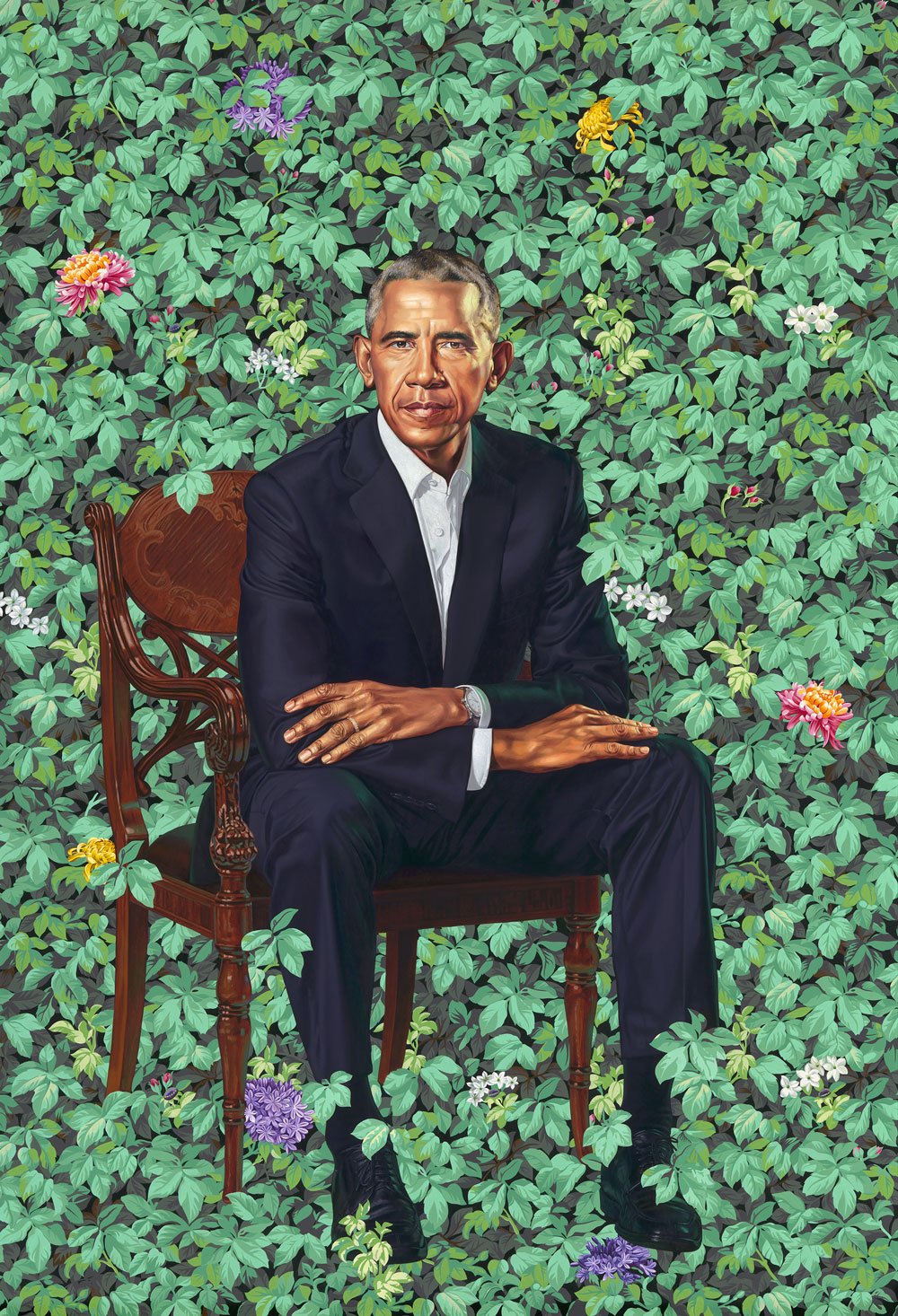
The two portraits were painted by Kehinde Wiley and Amy Sherald. Wiley is known for blending contemporary portraiture with the poses and regal backdrops of Old Master paintings. His backgrounds are generally a riot of stylized foliage, or bold ornamental patterns. His first subjects were African American men, but in 2012 he has been working on female portraits, An Economy of Grace.
"Without shying away from the complicated socio-political histories relevant to the world, Wiley's figurative paintings and sculptures "quote historical sources and position young black men within the field of power." His heroic paintings evoke a modern style instilling a unique and contemporary manner, awakening complex issues that many would prefer remain mute."
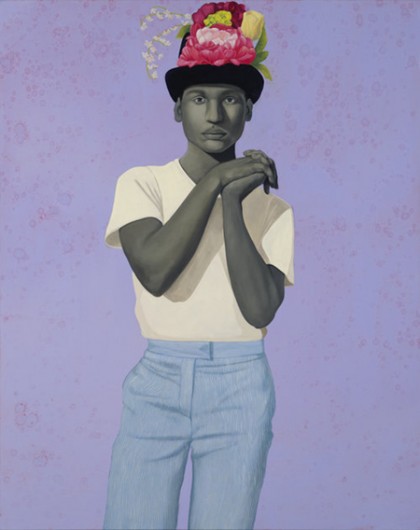
Sherald, also a portraitist, has only been painting in earnest since 2012, and in 2017 was included in an exhibition of emerging artists at the Studio Museum of Harlem titled Fictions. Her work focuses exclusively on African American subjects wearing vivid but timeless clothing against a monochromatic background and gazing directly out at the viewer.
"While Sherald is often compared to Barkley Hendricks, the late painter known for his “cool” portraits of stylish African-Americans, another useful precedent is Hans Holbein, the 16th-century Northern Renaissance artist who portrayed the grand figures of his day against similar arresting monochrome colors, from deep blue to minty green. In fact, Sherald was trained in the classical Northern tradition by the Swedish painter Odd Nerdrum, who taught her the old technique of beginning a portrait by modeling the figure in grisaille—now a signature element of Sherald’s style, since she paints all of her subjects with grey skin as a way of “evening the playing field,” Meloche explains."
The two portraits were painted by Kehinde Wiley and Amy Sherald. Wiley is known for blending contemporary portraiture with the poses and regal backdrops of Old Master paintings. His backgrounds are generally a riot of stylized foliage, or bold ornamental patterns. His first subjects were African American men, but in 2012 he has been working on female portraits, An Economy of Grace.
"Without shying away from the complicated socio-political histories relevant to the world, Wiley's figurative paintings and sculptures "quote historical sources and position young black men within the field of power." His heroic paintings evoke a modern style instilling a unique and contemporary manner, awakening complex issues that many would prefer remain mute."
Sherald, also a portraitist, has only been painting in earnest since 2012, and in 2017 was included in an exhibition of emerging artists at the Studio Museum of Harlem titled Fictions. Her work focuses exclusively on African American subjects wearing vivid but timeless clothing against a monochromatic background and gazing directly out at the viewer.
"While Sherald is often compared to Barkley Hendricks, the late painter known for his “cool” portraits of stylish African-Americans, another useful precedent is Hans Holbein, the 16th-century Northern Renaissance artist who portrayed the grand figures of his day against similar arresting monochrome colors, from deep blue to minty green. In fact, Sherald was trained in the classical Northern tradition by the Swedish painter Odd Nerdrum, who taught her the old technique of beginning a portrait by modeling the figure in grisaille—now a signature element of Sherald’s style, since she paints all of her subjects with grey skin as a way of “evening the playing field,” Meloche explains."
(Collection of Presidential and First Lady portraits, I mean.)
posted by Capt. Renault at 8:43 AM on February 12, 2018
posted by Capt. Renault at 8:43 AM on February 12, 2018
He looks like he’s floating, I like the surreal effect. Michelle is great too, though hers seems like less of a bold move to my eye.
posted by SaltySalticid at 8:44 AM on February 12, 2018
posted by SaltySalticid at 8:44 AM on February 12, 2018
holy shit his hands are huge
posted by Halloween Jack at 8:46 AM on February 12, 2018 [32 favorites]
posted by Halloween Jack at 8:46 AM on February 12, 2018 [32 favorites]
The background of Barack's is a bit weird. I never really associated him with nature motifs. Maybe it'd grow on me with some time to appreciate it in person.
Michelle's is simply amazing through and through, though.
posted by tobascodagama at 8:54 AM on February 12, 2018 [7 favorites]
Michelle's is simply amazing through and through, though.
posted by tobascodagama at 8:54 AM on February 12, 2018 [7 favorites]
I just watched the PBS video of the unveiling and I think I'm going to cry.
posted by photoslob at 8:54 AM on February 12, 2018 [5 favorites]
posted by photoslob at 8:54 AM on February 12, 2018 [5 favorites]
I don’t know much about art but I think these are amazing. I’m tearing up remembering the days when our president was a human being and not just a gibbering void stuffed into an ill-fitting man suit.
posted by skycrashesdown at 8:56 AM on February 12, 2018 [21 favorites]
posted by skycrashesdown at 8:56 AM on February 12, 2018 [21 favorites]
The background of Barack's is a bit weird. I never really associated him with nature motifs.
that's kind of what Kehinde Wiley does. There are a few of his works at the Brooklyn Musuem I visit when I go and yeah, they're very impressive in person.
posted by EmpressCallipygos at 8:58 AM on February 12, 2018 [3 favorites]
that's kind of what Kehinde Wiley does. There are a few of his works at the Brooklyn Musuem I visit when I go and yeah, they're very impressive in person.
posted by EmpressCallipygos at 8:58 AM on February 12, 2018 [3 favorites]
While I like the style of the Michelle Obama portrait, I don't know that I'm that impressed with the likeness. The face doesn't seem that much like her, even accounting for the necessary stylization in this kind of thing.
posted by DirtyOldTown at 8:59 AM on February 12, 2018 [36 favorites]
posted by DirtyOldTown at 8:59 AM on February 12, 2018 [36 favorites]
the thing republicans have to get mad about today is obama looking like he just got his own Vertigo title.
posted by MartinWisse at 9:02 AM on February 12, 2018 [15 favorites]
posted by MartinWisse at 9:02 AM on February 12, 2018 [15 favorites]
As someone who knows nothing - but nothing - about art, I thought Barack's portrait was WHOA. The big hands. The ivy growing all around and then your eye moves lower to where it's taking over his ankles, goddamn. The portrait screams "legacy." Nice!
Michelle's portrait was offputting. Why is there nothing in the background? I'm on board with the grey skin and all but the lack of anything else going on reduced Michelle to her "fashion icon" avatar. There's more to the lady than that. Come on.
posted by MiraK at 9:04 AM on February 12, 2018 [2 favorites]
I had a kneejerk "ummm" reaction to the Michelle Obama portrait and I'm really coming around to appreciating it and understanding what Sherald is after after reading more about the work that she does. Barack Obama's hit me immediately because I thought "Oh, Hawai'i" It's been interesting seeing people responding and I appreciate the hell out of the Obamas insisting on African American artists for this. Just a way their legacy continues to do good works.
posted by jessamyn at 9:04 AM on February 12, 2018 [10 favorites]
posted by jessamyn at 9:04 AM on February 12, 2018 [10 favorites]
I’m very into the symbolism of the president’s portrait. The garden is not the site of power that you’d usually associate with a president. And then there are the gender and racial stereotypes that are upset by placing a black man in a feminized setting. This is definitely a portrait of Nobel Peace Prize Obama.
Although I think the background is more distracting than in Wiley’s other work. It pulls attention from Obama more than other subjects. Maybe that’s intentional for Obama in particular. I’m not sure what would have motivated that decision, though.
posted by Banknote of the year at 9:04 AM on February 12, 2018 [9 favorites]
Here's an additional link to a NY Times article Obama Portraits Blend Paint and Politics, and Fact and Fiction. The flowers in the background of the presidential portrait were specifically chosen: "African blue lilies represent Kenya, his father’s birthplace; jasmine stands for Hawaii, where Mr. Obama himself was born; chrysanthemums, the official flower of Chicago, reference the city where his political career began, and where he met his wife."
posted by PussKillian at 9:05 AM on February 12, 2018 [12 favorites]
posted by PussKillian at 9:05 AM on February 12, 2018 [12 favorites]
I'm also wondering about the likeness of Michelle Obama. The painting is beautiful and I'm fine with artistic interpretation, but something about the facial structure just doesn't look like her. But then maybe it's just that I'm used to seeing her with more of a straight bob haircut and with a giant camera-pleasing smile, the role she played as first lady.
Does anyone know of photos of Michelle that look more like this portrait? This one is the best I've found after some casual searching. I haven't found a single photo of her with that thoughtful / pondering look on her face; she seems to always have so much twinkle in her eye in published photos.
posted by Nelson at 9:05 AM on February 12, 2018 [4 favorites]
I’m very into the symbolism of the president’s portrait.
I read it more as the ivy being the populace and the natural forces of the office. Are they overtaking Obama? Or does he simply belong to those? He seems distinct, but is he really just another part of that garden?
posted by Capt. Renault at 9:19 AM on February 12, 2018 [5 favorites]
I read it more as the ivy being the populace and the natural forces of the office. Are they overtaking Obama? Or does he simply belong to those? He seems distinct, but is he really just another part of that garden?
posted by Capt. Renault at 9:19 AM on February 12, 2018 [5 favorites]
I appreciate that they both look very thoughtful.
posted by Nancy Lebovitz at 9:21 AM on February 12, 2018
posted by Nancy Lebovitz at 9:21 AM on February 12, 2018
I really want to go and see Michelle's portrait in person. Like Jessamyn, I was a little "eh" when I first saw it, but now I think it's the sort of portrait that I could sit in front and stare at, just picking apart the elements of it.
I love how excited and a little shell shocked Sherald was at the the unveiling!
And I haven't seen the full Barack paining, but from the half I saw, I thought the ivy seemed a little menacing, like the republicans trying to pull him back.
posted by Hermeowne Grangepurr at 9:28 AM on February 12, 2018
How do you only see half a painting?
posted by Atom Eyes at 9:34 AM on February 12, 2018 [1 favorite]
posted by Atom Eyes at 9:34 AM on February 12, 2018 [1 favorite]
If you want to fill your next hour or so with people speaking about each other with dignity, respect and humor, you could do worse than stream the unveiling ceremony in that first link. Kind of makes you want to go out and be your best self possible.
Also, there's this from the president about 26 minutes in: "Amy, I want to thank you for so spectacularly capturing the grace, and beauty, and intelligence, and charm ... and hotness ... of the woman that I love."
posted by vverse23 at 9:35 AM on February 12, 2018 [9 favorites]
Also, there's this from the president about 26 minutes in: "Amy, I want to thank you for so spectacularly capturing the grace, and beauty, and intelligence, and charm ... and hotness ... of the woman that I love."
posted by vverse23 at 9:35 AM on February 12, 2018 [9 favorites]
I kind of hope someone commissions Barack's for some wallpaper. I would totally do up my house in that man.
posted by Think_Long at 9:36 AM on February 12, 2018 [6 favorites]
posted by Think_Long at 9:36 AM on February 12, 2018 [6 favorites]
I appreciate the hell out of the Obamas insisting on African American artists for this.
Me too - and they are the first ever African American artists to have Presidential portraits in the National Gallery.
posted by Miko at 9:39 AM on February 12, 2018 [6 favorites]
Me too - and they are the first ever African American artists to have Presidential portraits in the National Gallery.
posted by Miko at 9:39 AM on February 12, 2018 [6 favorites]
Should Trump ever manage to have an official portrait he'll insist on hands the size of frying pans...
posted by jim in austin at 9:45 AM on February 12, 2018 [1 favorite]
posted by jim in austin at 9:45 AM on February 12, 2018 [1 favorite]
I think both are amazing pieces, wow. I too had a 'meh' reaction on first seeing Michelle's portrait, but reading about Sherald's work and its tradition of origin helped me better understand what's going on there. But I still feel like I need an in-person viewing to really be persuaded (and it's a painting, so of course it needs that).
Barack's portrait left me a little confused at first, and then kind of knocked out as I looked at it for a bit, and now I'm really floored after reading about Wiley's work and understanding its context better.
I appreciate the hell out of the Obamas insisting on African American artists for this.
Me three. (Though I doubt they had to insist--probably more like they just chose these two artists? I'm assuming that former presidents/first ladies have that prerogative for their official portraits...)
posted by LooseFilter at 9:46 AM on February 12, 2018 [1 favorite]
I love Wiley's work, but I've always felt that he excelled when he put black subjects in the poses and (updated) trappings of aristocrats. When his subject is himself already at the top of the heap, I'm not sure it has the same effect. Still love the style though.
And I have to agree with many others about the portrait of Michelle Obama; the proportions just seem out of whack to me.
posted by dbx at 9:50 AM on February 12, 2018
And I have to agree with many others about the portrait of Michelle Obama; the proportions just seem out of whack to me.
posted by dbx at 9:50 AM on February 12, 2018
Michelle's portrait was offputting. Why is there nothing in the background? I'm on board with the grey skin and all but the lack of anything else going on reduced Michelle to her "fashion icon" avatar. There's more to the lady than that. Come on.
You're right, there is. For instance, you're missing the symbolism of her dress, which evokes quilts made by the African-American women of Gee's Bend.
posted by palomar at 9:51 AM on February 12, 2018 [11 favorites]
You're right, there is. For instance, you're missing the symbolism of her dress, which evokes quilts made by the African-American women of Gee's Bend.
posted by palomar at 9:51 AM on February 12, 2018 [11 favorites]
Kehinde Wiley, in his comments from the unveiling: "There are botanicals going on there that nod toward his personal story. There's the chrysanthemum which is the state flower of Chicago, there are flowers that point toward Kenya, there are flowers that point toward Hawaii. In a very symbolic way what I'm doing is charting his path on Earth through those plants. There's a fight going on between him in the foreground and those plants that are trying announce themselves through his feet. Who gets to be the star of the show, the story, or the man who inhabits that story?"
posted by vverse23 at 9:56 AM on February 12, 2018 [14 favorites]
posted by vverse23 at 9:56 AM on February 12, 2018 [14 favorites]
You're right, there is. For instance, you're missing the symbolism of her dress, which evokes quilts made by the African-American women of Gee's Bend.
Yes, that's the first thing that I thought when I saw the dress. The portrait was simple, but not simplistic. I would expect that both portraits would have their own symbolism, and they did. I think that in a selfie era, an appreciation of studying a painting to appreciate its nuances is somewhat wanting, but neither painting disappoints.
posted by Alexandra Kitty at 10:00 AM on February 12, 2018 [3 favorites]
I love that these portraits are different from the usual boring fare served up by previous inhabitants of the White House. I love that they actually require people to THINK about the symbolism contained in each work.
posted by palomar at 10:01 AM on February 12, 2018 [3 favorites]
posted by palomar at 10:01 AM on February 12, 2018 [3 favorites]
Fantastic. My first reaction was mixed and surprised, but they really reward contemplation.
For example, I had the first initial thoughts about Michelle's being uncanny but the more I look at it, the more I appreciate it and see it as an excellent likeliness.
I read it as a portrait of a conflicted/burdened woman who carries it well. The dress comes close to overwhelming the viewer, but doesn't: you can't help but be drawn to her face, even though she is painted in more muted tones. (Her arms in particular do the work of drawing your gaze upwards). This seems like a story about what it means for her to be an "icon". The dress almost overwhelms the real woman, but doesn't. It also isn't just "a dress": it feels like she is wearing a garment with historical, purposeful, and symbolic weight and meaning. To me, her expression looks contemplative but also ambivalent or even conflicted. I also appreciate that her strength clearly shines through.
posted by Emily's Fist at 10:05 AM on February 12, 2018 [4 favorites]
holy shit his hands are huge
Wait until you see Trump's official portrait.
posted by It's Never Lurgi at 10:09 AM on February 12, 2018 [6 favorites]
Wait until you see Trump's official portrait.
posted by It's Never Lurgi at 10:09 AM on February 12, 2018 [6 favorites]
they are the first ever African American artists to have Presidential portraits in the National Gallery.
Also, facts like this still have the power to horrify (which is...good, I guess). I mean: WTF. Vast and deep parts of American (global) creative culture either would not exist, our would be nothing like the current forms and kinds we enjoy, if not for African-American people.
This was one of the things I most loved and appreciated about the Obamas' cultural contributions and representation as President & First Lady: the events they had, the artists of all kinds (especially the musicians!) that they would bring to the White House and different events--and not just honoring already-accomplished-but-under-recognized folks, but always having their finger on the pulse of upcoming great talent, too. (My favorite along those lines. I hope to see another U.S. president who will host poetry jams--'An Evening of Poetry, Music & the Spoken Word'--in my lifetime, but I only have a few decades left, if lucky, so I'm not sure that I will. Sigh.)
posted by LooseFilter at 10:10 AM on February 12, 2018 [11 favorites]
The Washington Post has a thoughtful art criticism article about the portraits. It has a bit about Michelle Obama's dress
posted by Nelson at 10:49 AM on February 12, 2018 [4 favorites]
Sherald has depicted Michelle Obama in a dress by Michelle Smith’s Milly label, tasteful but not extravagant department-store fashion that recalls the first lady’s mix of couture and comfortable pragmatism. Sherald was attracted by the large, geometric patterns of the fabric, which recalls the style of Mondrian.(Oddly he does not discuss the design connection to African American quilting; that was sure my first thought too, not Mondrian.)
posted by Nelson at 10:49 AM on February 12, 2018 [4 favorites]
I can't be the only one who immediately pictured this.
posted by leotrotsky at 10:53 AM on February 12, 2018 [5 favorites]
posted by leotrotsky at 10:53 AM on February 12, 2018 [5 favorites]
I also appreciate that her strength clearly shines through.
The arms pull the viewer upwards. The whole triangle composition pulls you up to the face. It's an arrangement of power, but it's contrasted by her expression and by the half-hidden heart motif on her dress.
posted by Capt. Renault at 11:07 AM on February 12, 2018 [5 favorites]
The arms pull the viewer upwards. The whole triangle composition pulls you up to the face. It's an arrangement of power, but it's contrasted by her expression and by the half-hidden heart motif on her dress.
posted by Capt. Renault at 11:07 AM on February 12, 2018 [5 favorites]
I've been a huge fan on Wiley's ever since his Judith and Holofernes took my breath away at the NCMA. Keep in mind that it is 10 feet tall, and quite striking. I was so excited to see this after I heard he had been chosen for the official portrait, and the result does not disappoint.
I wasn't familiar with Sherald, but Michelle's portrait is indeed striking, and I look forward to seeing more from her in the future. It's true the resemblance isn't quite as strong as in Barack's portrait, but I think that is less important than it used to be, now that we are in a time of constant photographic surveillance, and she certainly captured what I see as Michelle's character.
posted by Rock Steady at 11:17 AM on February 12, 2018 [6 favorites]
I like how the Barack portrait is striking and simple. His wedding band features prominently. His watch, which I think I read is not his style (?) but he wore because it was a gift from his Secret Service detail, peeks out from his sleeve. He appears to be sitting suspended on a wall of what looks to me like Virginia creeper, which is a hardy native perennial. The flowers in the background, per the Chicago Tribune, are "chrysanthemums referencing the official flower of Chicago, jasmine evoking his native Hawaii and African blue lilies in memory of his late father."
He is leaning forward, like he's listening to you intently. I wonder if the chair style has some kind of meaning?
posted by zennie at 11:25 AM on February 12, 2018 [1 favorite]
He is leaning forward, like he's listening to you intently. I wonder if the chair style has some kind of meaning?
posted by zennie at 11:25 AM on February 12, 2018 [1 favorite]
Everyone's going for the Simpson's comparison, but I am constantly remembering the good old days of this.
posted by twooster at 11:37 AM on February 12, 2018
posted by twooster at 11:37 AM on February 12, 2018
It's Never Lurgi: "holy shit his hands are huge
Wait until you see Trump's official portrait."
Does it look like this?
posted by caution live frogs at 11:41 AM on February 12, 2018 [1 favorite]
Wait until you see Trump's official portrait."
Does it look like this?
posted by caution live frogs at 11:41 AM on February 12, 2018 [1 favorite]
Not really my cup of tea. Both Obamas have a natural radiance and dignity that I just don't see reflected in the portraits. The composition is interesting enough, I guess, but Wiley's background overshadows his subject, and the portrait of Mrs. Obama reminds me of a sketch for a magazine ad.
posted by The Underpants Monster at 11:41 AM on February 12, 2018 [1 favorite]
posted by The Underpants Monster at 11:41 AM on February 12, 2018 [1 favorite]
I think Michelle's portrait looks a lot like Malia.
posted by ThePinkSuperhero at 11:42 AM on February 12, 2018
posted by ThePinkSuperhero at 11:42 AM on February 12, 2018
Jerry Saltz weighs in: The Obamas’ Official Portraits Rise to the Occasion
posted by Capt. Renault at 12:18 PM on February 12, 2018
posted by Capt. Renault at 12:18 PM on February 12, 2018
I'm art-blind perhaps but I don't think any justice was done to Michelle in the portrait. Nothing about it is impressive or captures anything about her magnificent presence in the WH. There isn't any likeness either but that's probably not the intent. Barack's a bit 'meh' too
posted by savitarka at 12:18 PM on February 12, 2018 [3 favorites]
posted by savitarka at 12:18 PM on February 12, 2018 [3 favorites]
My husband just texted me to ask if we can get prints. Anyone know if prints will be made available?
posted by rabbitrabbit at 12:37 PM on February 12, 2018 [2 favorites]
posted by rabbitrabbit at 12:37 PM on February 12, 2018 [2 favorites]
I keep going back to them. Personally, I think I could stare at them for hours, picking up little bits of info and nuance here and there. I also suspect that Michelle's portrait might look better in person. She does look much younger in it with her hair down, but my eye keeps moving back up to her face.
I love how different the styles are, how much meaning is packed in, and how they're going to pop in the gallery.
posted by Hermeowne Grangepurr at 12:38 PM on February 12, 2018 [3 favorites]
I love how different the styles are, how much meaning is packed in, and how they're going to pop in the gallery.
posted by Hermeowne Grangepurr at 12:38 PM on February 12, 2018 [3 favorites]
I don't think any justice was done to Michelle in the portrait
This isn't aimed specifically at you, you just posted the shortest of this critique..
Which First Lady portraits set the standard for doing justice to their subject? In what ways is this justice lacking in Michelle Obama's? If I was going to be pointed, I'd ask if there might be some subtleties to be mentioned about a lack of "justice" in a portrait of a black woman.
posted by rhizome at 12:45 PM on February 12, 2018 [2 favorites]
Here’s where I reveal my utter lack of respect for and/or deep understanding of art, because literally my first thought was ‘this would make a great shower curtain’.
seriously though, it would
posted by The Toad at 12:52 PM on February 12, 2018
seriously though, it would
posted by The Toad at 12:52 PM on February 12, 2018
Michelle's official photo by Chuck Kennedy from your link looks great. She looks warm, kind and radiant to me in that picture. None of her vibes leap out in the Smithsonian portrait. I'm admittedly not qualified to be any sort of art critic but maybe these official portraits of national figures should appeal to a broader audience instead of select people..
All this is criticism is of course immaterial since the subjects themselves seem happy with their representation..
posted by savitarka at 1:06 PM on February 12, 2018 [1 favorite]
All this is criticism is of course immaterial since the subjects themselves seem happy with their representation..
posted by savitarka at 1:06 PM on February 12, 2018 [1 favorite]
Looking through the First Lady portraits link, Eleanor Roosevelt has an awesome one with an amazing amount of character to it.
posted by vibratory manner of working at 1:44 PM on February 12, 2018 [2 favorites]
posted by vibratory manner of working at 1:44 PM on February 12, 2018 [2 favorites]
Eleanor Roosevelt portrait direct link
posted by vibratory manner of working at 1:46 PM on February 12, 2018 [3 favorites]
posted by vibratory manner of working at 1:46 PM on February 12, 2018 [3 favorites]
@caution live frogs
Does it look like this?
Nope. Like this.
posted by ReginaHart at 1:53 PM on February 12, 2018 [1 favorite]
Does it look like this?
Nope. Like this.
posted by ReginaHart at 1:53 PM on February 12, 2018 [1 favorite]
Comparing official portraits to photos is not a response I was prepared for.
posted by rhizome at 2:00 PM on February 12, 2018 [5 favorites]
posted by rhizome at 2:00 PM on February 12, 2018 [5 favorites]
I think the Michelle portrait is pretty bad. No offense to the artist. Obama looks good.
posted by Liquidwolf at 2:34 PM on February 12, 2018
posted by Liquidwolf at 2:34 PM on February 12, 2018
rhizome.. I wasn't comparing a photo to a portrait. I listed the attributes of a beloved personality that I could readily see in the photo and how the portrait was completely bland and conveyed nothing to me. It's not for me for sure. Maybe that's the USP of the portrait.
posted by savitarka at 2:39 PM on February 12, 2018
posted by savitarka at 2:39 PM on February 12, 2018
Wait until you see Trump's official portrait."
Does it look like this?
Dammit, I was going to make a Marcel Duchamp joke for Trump's official portrait.
posted by TheWhiteSkull at 2:50 PM on February 12, 2018
Does it look like this?
Dammit, I was going to make a Marcel Duchamp joke for Trump's official portrait.
posted by TheWhiteSkull at 2:50 PM on February 12, 2018
IMO, these look like shit. I'm kinda shocked.
I think Obama's looks decent, though be should be surrounded by marijuana leaves. The Michelle one is indeed shockingly bad.
posted by Liquidwolf at 2:53 PM on February 12, 2018
I think Obama's looks decent, though be should be surrounded by marijuana leaves. The Michelle one is indeed shockingly bad.
posted by Liquidwolf at 2:53 PM on February 12, 2018
Here's an interesting article on the history of presidential portraits. [Warning: there is some autoplay video on the page.]
posted by Westringia F. at 2:55 PM on February 12, 2018
posted by Westringia F. at 2:55 PM on February 12, 2018
Those of you who do not care for the portraits -- is it that you don't like the style of Kehinde Wiley or Amy Sherald's art generally, or that within the context of their work you feel the portraits are lacking?
posted by Westringia F. at 3:03 PM on February 12, 2018 [6 favorites]
posted by Westringia F. at 3:03 PM on February 12, 2018 [6 favorites]
I think, conceptually, I don't have a problem with Michelle's portrait--I understand what Sherald does and is trying to do. I just don't think it works quite as well as say, this painting. It's possible to paint grey skin that's vibrant and looks alive, and she does it exceedingly well in the aforementioned painting! But I find the Michelle painting much more flat, and my initial reaction was... well, I've been practicing painting grey skin lately and it looks a lot like my attempts at it, which I haven't been personally happy with. I like the composition the more I look at it, but I keep getting hung up on the depth. Of course, this might be a function of the scale of the image + it might look better in person + maybe that's what the artist was going for, who knows!
That said, looking at the previous First Lady's portraits, they're... not nearly as good as I guess I would have expected, IMHO. I really like Martha Jefferson's, Frances Cleveland's, Edith Roosevelt's, Grace Coolidge's, and the aforementioned Eleanor Roosevelt's. There's also some decent standard portraiture in there. But some of it is... not bad, I guess, but has some uncanny valley stuff going on that I wouldn't expect for an art piece this important. Looking at Presidential Portraits it seems like there's a little less of that, but something sure is going on with Bill Clinton...
So in that context actually I can't really complain. And good on the Obamas for doing something new.
posted by brook horse at 3:07 PM on February 12, 2018 [1 favorite]
The more I look at both, the more I like them. They are both very different, but share the same spirit: enigmatic, cerebral, and say far more than what a photograph would about them. When I heard the word "disaster" before I got to see them, I was imagining something stilted, cringeworthy, and tacky, like an Olan Mills picture from the 1980s.
What a relief when I got to see them for myself.
These portraits are elegant, but dreamlike. Michelle Obama's is almost a softer and more sophisticated version of the "Hope" poster that captured imaginations back in the day.
In an age where rage and disapproval is the first response, these portraits deserve more respect than that.
posted by Alexandra Kitty at 3:11 PM on February 12, 2018 [14 favorites]
Those of you who do not care for the portraits -- is it that you don't like the style of Kehinde Wiley or Amy Sherald's art generally, or that within the context of their work you feel the portraits are lacking?
I think some of Sherald's work is really nice now that I see other pieces, I just don't think is one up to the caliber of what I'd expect for a portrait of the first lady. But I do like her style in some other works.
posted by Liquidwolf at 3:11 PM on February 12, 2018 [1 favorite]
I think some of Sherald's work is really nice now that I see other pieces, I just don't think is one up to the caliber of what I'd expect for a portrait of the first lady. But I do like her style in some other works.
posted by Liquidwolf at 3:11 PM on February 12, 2018 [1 favorite]
The likeness in the Michelle portrait was recogniseable but somehow not one I had expected. It very much reminds me of old folk art - the sitter seems like a woman with a great deal yet to accomplish.
posted by bonobothegreat at 3:11 PM on February 12, 2018 [1 favorite]
posted by bonobothegreat at 3:11 PM on February 12, 2018 [1 favorite]
A portrait is a partnership between the artist, the subject and the viewer. In some, the artist tries to get out of the way and let the viewer imagine he or she is viewing the subject directly. These artists don't do that. When you view these works you see not only the subject, you also see how the artist feels about the subject.
Michelle sits, pensive, at the top of a mountain of fashion and elegance. Barack finally has the time to relax on his verandah and listen to us.
I, too, would like prints. Especially the Michelle one.
posted by irisclara at 3:13 PM on February 12, 2018 [6 favorites]
Michelle sits, pensive, at the top of a mountain of fashion and elegance. Barack finally has the time to relax on his verandah and listen to us.
I, too, would like prints. Especially the Michelle one.
posted by irisclara at 3:13 PM on February 12, 2018 [6 favorites]
> looking at the previous First Lady's portraits, they're... not nearly as good as I guess I would have expected, IMHO. [...] There's also some decent standard portraiture in there. But some of it is... not bad, I guess, but has some uncanny valley stuff going on that I wouldn't expect for an art piece this important.
It seems that official portraits of the First Lady are a fairly recent thing. That history article I posted above says:
It seems that official portraits of the First Lady are a fairly recent thing. That history article I posted above says:
As for First Ladies, though elite women would certainly have had their portraits painted before the 20th century, it wasn’t until around 1902, when Theodore Roosevelt’s First Lady Edith Roosevelt oversaw a renovation of the White House, that portraits of the First Ladies would start to be hung in the Vermeil Room on the ground floor of the White House. [...] Funding for First Ladies’ portraits wouldn’t exist until the 1960s, when First Lady Jacqueline Kennedy founded the White House Historical Association. Before that, First Ladies may have arranged to have their own portraits done, or like-minded interest groups would pay for them. [...] The commissioning process set up for George H.W. Bush’s portrait has applied to First Ladies too, beginning with Hillary Clinton.posted by Westringia F. at 3:19 PM on February 12, 2018
Who gets to be the star of the show, the story, or the man who inhabits that story?"
Let me tell you what I wish I’d known / When I was young and dreamed of glory
You have no control / Who lives, who dies, who tells your story
posted by tzikeh at 3:23 PM on February 12, 2018 [5 favorites]
Let me tell you what I wish I’d known / When I was young and dreamed of glory
You have no control / Who lives, who dies, who tells your story
posted by tzikeh at 3:23 PM on February 12, 2018 [5 favorites]
I like these both quite a bit, probably his better but I'd really have to see them in person to say for sure. My first reaction though was just to sigh out loud. I miss them so.
posted by octothorpe at 3:31 PM on February 12, 2018 [4 favorites]
posted by octothorpe at 3:31 PM on February 12, 2018 [4 favorites]
> I just don't think it works quite as well as say, this painting.
Wow, yeah, I love that one! And I see what you're saying about depth; the oblique light really emphasizes the contours of the subject in a way that pops off the canvas.
That said, I'm not sure that a similar treatment would have worked with Michelle's portrait, insofar as casting her face half into shadow could have given the impression of broodiness or timidity. Personally, I like the way she's lit head on and regarding the viewer directly; it seems very challenging and confident to me.
posted by Westringia F. at 3:33 PM on February 12, 2018 [1 favorite]
I don't mind the style. But Michelle's face only barely resembles her and a selfish part of me wants everyone to see the portrait and immediately say "Michelle!" without having to read the plaque. I'm not an art person, though.
I also realized that these aren't the ones that'll hang in the White House ("A second and different set of portraits of the former first couple will eventually hang in the White House.").
And upon further research (the site is understandably crashing a lot at the moment) I think these are a fine addition to that collection.
posted by kimberussell at 3:34 PM on February 12, 2018
It seems that official portraits of the First Lady are a fairly recent thing.
I figured that was probably the case, just didn't have the energy to go look it up. I also stand by my comment that Bill Clinton's portrait (and Hillary's, TBH), have the same uncanny valley issue going on.
That said, I'm not sure that a similar treatment would have worked with Michelle's portrait, insofar as casting her face half into shadow could have given the impression of broodiness or timidity.
True, but I don't think it's solely a function of casting the face half in shadow--it's the arms and hands in particular that look very fleshed out and real to me (which is impacted by the angle of the light, but I don't feel like that's a significant portion of what gives it depth--it's a more direct light, I guess, instead of a very soft and diffused light?), whereas not so much in the Michelle painting. I think she could have kept the same lighting angle but went for bolder shadows and a bit of that very subtle highlighting (see in particular the highlight in contrast to the sharp shadow on the wrist, and the very soft highlights that follow the muscle/fat deposits on the arm rather than just leaving it smooth) which is what really gives it its life, to me. But again, maybe that's there in the actual painting and just doesn't show up well in this photo. Or maybe the very diffused look is part of her message. Unfortunately I just can't get out of my head the resemblance to my own poor attempts at depth and shadow, where I'm not going for that and yet that's all I get.
posted by brook horse at 3:46 PM on February 12, 2018 [1 favorite]
The likeness in the Michelle portrait was recogniseable but somehow not one I had expected. It very much reminds me of old folk art - the sitter seems like a woman with a great deal yet to accomplish.
posted by bonobothegreat at 6:11 PM on February 12 [+] [!]
Well, god willing.
posted by ZaphodB at 3:55 PM on February 12, 2018 [5 favorites]
posted by bonobothegreat at 6:11 PM on February 12 [+] [!]
Well, god willing.
posted by ZaphodB at 3:55 PM on February 12, 2018 [5 favorites]
I tend to look at these sorts of things through two lenses: how do they work as art and how do they work as a portrait of a human being, which can either be literally or spiritually representational (or both)?
As art, I think both are very successful. Both painters are quite accomplished and have done some wonderful work here.
As portraits, I think that the President's is a bit more successful than the First Lady's because it is representational on both axes. Mr. Obama's portrait looks like him and has characteristics that define his Presidency and him as a person. He was a vibrant, commanding personality as President, but he floats in the space of the canvas, adrift, unanchored, alone, unsupported by anything but his roots and his family. None of the typical trappings of American power are visible in this portrait, appropriately so.
Mrs. Obama's portrait is not a good physical likeness, but I still think it works as a representation of her presence in the White House. She's thoughtful, elegant, lovely, backed by a beautiful blue ground that reminds me of sunnier times. In 100 years no one looking at this portrait will know what she literally looked like based on it, but we have photos for that. I can still feel her in this work.
posted by xyzzy at 4:10 PM on February 12, 2018 [5 favorites]
I like what Constance Grady said of the portraits:
Paired together, the two portraits are immensely striking: Not only are they both unusually active for this kind of portrait, but they give off a palpable sense of intelligence, directness, and — perhaps more than anything else — cool. They’re portraits whose subjects care about aesthetics, who are thoughtful about the history of portraiture, and who have the personal charisma to carry the weight of that history on themselves.
These paintings are brilliant because of how they make our expectations of this type of portrait into an alien and questionable notion.
posted by crush at 6:11 PM on February 12, 2018 [2 favorites]
Here are a couple of direct links to images of the two portraits, on artnet.com. These are reasonably detailed images (1000px short side) that were reduced in the artnet article that used them. I think if we're all gonna judge large paintings, we should at least circulate the best images available.
Barack — Michelle
posted by sylvanshine at 6:31 PM on February 12, 2018 [15 favorites]
Barack — Michelle
posted by sylvanshine at 6:31 PM on February 12, 2018 [15 favorites]
I like his, it's interesting, different, and still captures him.
Hers I'm not crazy about. I don't hate it as a painting, but it doesn't particularly create an emotional response or likeness that I associate with her. And I can't say why, but that big blank blue background seems really odd. It's a great painting of a dress.
I don't believe in explanations of why you should like art. Explanations are for enhancing your appreciation of art that you like on a visceral level.
posted by bongo_x at 6:35 PM on February 12, 2018 [1 favorite]
Disappointed to come back to so much negativity. Particularly the people who feel it appropriate to just say "this is crap" and disappear. It's not only disrespectful, it's dumb. If you don't like the portrait that's fine, but at least try to add to the conversation. Also do have some respect for what it means to have our first African American presidential family depicted by African American artists. Specifically if you don't understand some of the cultural connections and the history of the artists, you might want to learn something before forming a final opinion.
BTW if you're looking for something in this genre widely considered a disaster, Jerry Brown's governor portrait is a good place to start. I've come around to liking it but it's definitely, um, an aggressive style. It looks really out of place hung with the other California governor portraits, too. The Chuck Close painting of Bill Clinton is also often complained about but there AFAICT you're either in to Close's style thing or you're not.
posted by Nelson at 6:41 PM on February 12, 2018 [16 favorites]
I've really loved Kehinde Wiley's work for a long time now, so I was well-primed to adore his Obama portrait, but oh my God, Amy Sherald. I am literally ashamed that I haven't come across her work before. I love it completely. I can't wait to be able to see it in person, because if I'm staring, rapt, on my computer screen, it's going to be better in real life.
I adore that she sits alone, calm, looking out of a flat, silent space. It means she explodes into the field of vision so much more. And yeah, there's the Gee's Bend Quilt of a dress, but also she takes up space. She takes up so much space! She's undeniable. I like that it's slightly flat; it's enrapturing -- her gaze is the most important part of the whole painting. For some reason, it's really reminding me of Euan Uglow's works, even though his style and his models are completely different. But they're just as physically there as Michelle is.
I really do like Barack's portrait too, but if I had to pick, I'd rather have a print of Michelle's painting. They're both such gorgeous paens to the art of portraiture, though, really.
posted by kalimac at 6:59 PM on February 12, 2018 [12 favorites]
Sherald's portraits make use of a technique called grisaille, in which grey tones are used to evoke classical scuipture. The first use of grisaille is considered to be Giotto's Seven Vices and Seven Virtues on the walls of the Scrovegni Chapel. Grisaille is used quite often in medieval manuscripts. She pairs this with flat, richly colored backgrounds similar to those in works by Hans Holbein the Younger. It's very interesting to see what a modern, personal style she develops using centuries old portraiture techniques. It's a shame that many images of her painting showing up online are poor grabs from the video. The high res images are clearly of a work that really looks like Michele Obama. I bet the painting looks amazing in person.
posted by oneirodynia at 8:00 PM on February 12, 2018 [8 favorites]
posted by oneirodynia at 8:00 PM on February 12, 2018 [8 favorites]
John F Kennedy by Elaine de Kooning in the National Portrait Gallery.
posted by oneirodynia at 8:06 PM on February 12, 2018 [4 favorites]
posted by oneirodynia at 8:06 PM on February 12, 2018 [4 favorites]
> IMO, these look like shit. I'm kinda shocked.
>I think Obama's looks decent, though be should be surrounded by marijuana leaves. The Michelle one is indeed shockingly bad.
They may not be to your taste, they may not be what you expected as portraits, you may dislike them, that's fine. But they are not bad. They are, in fact, objectively good; they are skillfully rendered works by accomplished painters.
posted by desuetude at 8:36 PM on February 12, 2018 [10 favorites]
Wow, you are not kidding about the difference high resolution makes to the painting of Michelle. My opinion just flipped 180 in the positive direction.
posted by postel's law at 8:39 PM on February 12, 2018 [3 favorites]
posted by postel's law at 8:39 PM on February 12, 2018 [3 favorites]
I think both pieces are fantastic. The more I look at them, the more I like them. So happy for and proud of Kehinde and Amy. And I love that they're blackity, black, black, black.
posted by shoesietart at 8:40 PM on February 12, 2018 [4 favorites]
posted by shoesietart at 8:40 PM on February 12, 2018 [4 favorites]
I like both of these a lot and have really been enjoying learning about the artists. I'm so impressed by the facial expression in Michelle's. It so complex! I see patience, anger, challenge, tiredness, curiosity, wisdom... it's so good!
posted by aka burlap at 8:52 PM on February 12, 2018 [4 favorites]
posted by aka burlap at 8:52 PM on February 12, 2018 [4 favorites]
Wow! So true about the difference in the Michelle portrait with the hi-res version. That’s remarkable.
posted by Miko at 8:58 PM on February 12, 2018
posted by Miko at 8:58 PM on February 12, 2018
I saw an exhibition of Wiley's work in Columbus in 2007. I really loved it, genuinely original, fresh, skilled, beautiful. They were quite large canvasses. I love the portrait of President Obama.
I love the style and composition of the portrait of Michelle Obama, though it is not as distinctive a likeness. It does captures some of her strength and dignity, her physical presence. The dress in the portrait is gorgeous.
Both portraits are very contemporary and Black. The choices of artists were audacious and they will add a great deal to the National Portrait Gallery. There's no shortage of pictures of the Obamas; my grandchildren will not have to wonder if that's exactly what they looked like, but they will understand something of who they are from the portraits.
posted by theora55 at 9:11 PM on February 12, 2018 [3 favorites]
I think they're gorgeous, evocative, really marvelous pieces of art ( and highly unusual for political portraits, which are usually somewhere between ugly, staid and just godawful). I love them.
posted by thivaia at 9:20 PM on February 12, 2018 [4 favorites]
posted by thivaia at 9:20 PM on February 12, 2018 [4 favorites]
So, my hot take is on first glance: Barack's is busy, which suits a president. So many conflicting things. So many priorities. So much going on. And he's in the middle of it all. It surrounds him and threatens to overwhelm him, but he's in the center of it all, just sitting amidst it.
Michelle's is very focused, very quiet, and very centered. And that sort of speaks to her. She always made it very clear she did not want this, right? Sort of a running joke between them that she wasn't super thrilled with this whole presidency thing. I think she doesn't much care for being the center of attention, or at the very least she doesn't care for the noise and clamor that comes with politics.
I love them both for being artful, and for being true to what I consider the Obama aesthetic. In a hundred years school children will study these paintings and get a sense of what these two people were like. That gives me hope and happiness.
Then they'll look at the painting of the president that follows and be all, "WTF is that? Why did they paint gold-on-gold? And why are his hands the size of Mons Olympus?"
posted by offalark at 10:33 PM on February 12, 2018 [8 favorites]
I don't know what's up with y'all. Look at them danged arms and shoulders -- exquisite.
posted by xigxag at 10:53 PM on February 12, 2018 [4 favorites]
posted by xigxag at 10:53 PM on February 12, 2018 [4 favorites]
To elaborate slightly, not only is the shading, composition, coloring well done but more importantly to my eyes the projection of power and inner strength is tremendous. Look at the position of the fingers. The way the triangle of the dress simultaneously hides and focuses attention on her striking gaze and torso. In deemphasizing the body the artist consciously eliminates the stereotype of the (black) woman as sexual creature. Instead, notice how that, as you're regarding her, she's regarding you right back, and she's not necessarily pleased with what she sees.
It's just a bit off putting the comments about "that doesn't really look like her" or whatever. I mean, first I disagree that it doesn't look like Ms. Obama, but that aside, it's never been the case in the entire history of art that paintings had to physically resemble their subjects photographically to be deemed worthy, so why are we judging this piece on so banal a quality? That's not to say one is obligated to view the work as successful, but it should be judged on aspects of portraiture that go beyond mere verisimilitude, imo.
posted by xigxag at 11:20 PM on February 12, 2018 [4 favorites]
The more I look at it I can't help but feel that the background in Michelle's picture does it a disservice. The whites and the greys over the pale blue background...
Looking at individual elements of it I find them really pleasing and intriguing, but the overall effect is bland and washed out. Not how I think of her.
Looking at the artist's other work I think this is my least favorite. Much of it is strong and bold, and I wish this was.
But, it's fine. It's not bad at all, I just wish it was more than fine.
posted by bongo_x at 12:05 AM on February 13, 2018
I don't know what's up with y'all. Look at them danged arms and shoulders -- exquisite.
Yes, beautifully rendered. But they're not the part many people are having trouble with.
The solemnity of expression seems so out of character. Would love to see the painting in person to understand it better.
posted by artdrectr at 12:46 AM on February 13, 2018 [1 favorite]
Yes, beautifully rendered. But they're not the part many people are having trouble with.
The solemnity of expression seems so out of character. Would love to see the painting in person to understand it better.
posted by artdrectr at 12:46 AM on February 13, 2018 [1 favorite]
I love them both. The Michelle one in particular does not look as good in the video as it does in a higher-quality image.
From the Antipodes, this 1975 Louis Kahan portrait of Australian union leader and later PM Bob Hawke is a favourite of mine.
posted by michaelhoney at 1:32 AM on February 13, 2018 [3 favorites]
From the Antipodes, this 1975 Louis Kahan portrait of Australian union leader and later PM Bob Hawke is a favourite of mine.
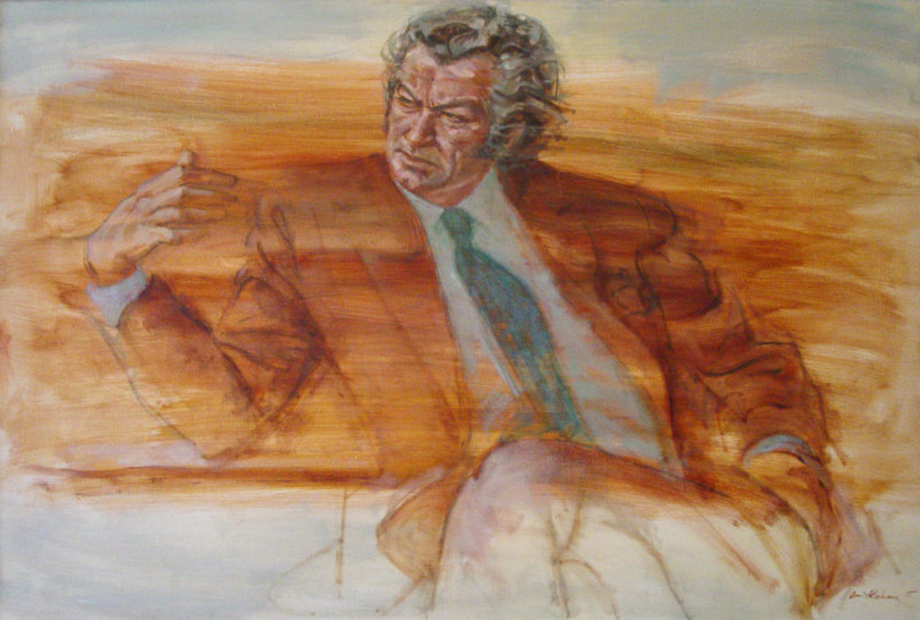
posted by michaelhoney at 1:32 AM on February 13, 2018 [3 favorites]
My first reaction when I saw these were negative and disappointed. But I remembered something my husband has said to me before. "If you like a new song immediately, it's probably shit." I think it's because I have some weird idea of what a presidential portrait should look like and these feel unfamiliar compared to that.
But a couple of things to personally note:
- I haven't stopped thinking about them since yesterday. It hasn't been constant, but randomly popped into my head. That's some impact.
- Looking now at the high res version, I really really like the Obama portrait. It's so vibrant and alive and there he is in the center of it all, exuding grace and presence.
- The Michelle Obama one still challenges me, but I am much more amenable to the high res version. I love the little detail of her fingernails painted lavender and the shadows in her dress create surprising depth and realness when the overall image originally felt kind of flat. I like that she's not smiling, just looking straight at you, unwavering, calm, powerful but not intimidating. Yes, this one is not my favorite but I think it's gonna continue to grow on me.
posted by like_neon at 2:02 AM on February 13, 2018 [6 favorites]
>"If you like a new song immediately, it's probably shit."
Why does it seem like with things related to art (in the broadest terms, including for example food) that we're supposed to perform skepticism of our first instincts?
posted by laptolain at 2:25 AM on February 13, 2018 [1 favorite]
Why does it seem like with things related to art (in the broadest terms, including for example food) that we're supposed to perform skepticism of our first instincts?
posted by laptolain at 2:25 AM on February 13, 2018 [1 favorite]
I can only speak for my own interpretation. It's not so much scepticism but acknowledging that I am being exposed to something unfamiliar with the possibility of broadening the mind to new ideas and experiences.
I also value the comfort in the familiar, but I find it's the stuff that makes me go 'hmmmm' that makes me grow (even if I decide I don't like it after all).
posted by like_neon at 2:35 AM on February 13, 2018 [4 favorites]
I also value the comfort in the familiar, but I find it's the stuff that makes me go 'hmmmm' that makes me grow (even if I decide I don't like it after all).
posted by like_neon at 2:35 AM on February 13, 2018 [4 favorites]
I saw someone online refer to the portrait of Barack as "unmanly" and II'm still flabbergasted at that reaction.
posted by agregoli at 5:22 AM on February 13, 2018 [1 favorite]
posted by agregoli at 5:22 AM on February 13, 2018 [1 favorite]
I quite like Barack's, but when I look at Michelle's I find it hard to focus on her. It might be different in person, but all I can see is the dress.
Maybe if there was more visual interest up top it'd make it easier to take it in as a whole?
posted by Trifling at 5:46 AM on February 13, 2018 [2 favorites]
Maybe if there was more visual interest up top it'd make it easier to take it in as a whole?
posted by Trifling at 5:46 AM on February 13, 2018 [2 favorites]
I like both portraits for attempting to stay true to their times, although the faces feel a bit off, (but perhaps that is how art works these days). However, I particularly like the Nixon portrait by Norman Rockwell.
posted by Laotic at 6:20 AM on February 13, 2018 [1 favorite]
posted by Laotic at 6:20 AM on February 13, 2018 [1 favorite]
erm, by which I mean Rockewell knew how to flatter a person.
posted by Laotic at 6:46 AM on February 13, 2018 [2 favorites]
posted by Laotic at 6:46 AM on February 13, 2018 [2 favorites]
I have mixed views.
I really like parts of Obama's portrait, and other parts I definitely don't like.
Pros: His face, hands and torso are quite good. I really like how he is looking straight onward, directly into the viewer. It's a very strong pose. I love the vibrancy and the verdure of the backdrop, which is a bold step and pays off. I especiallly like that various symbolic flowers are incorporated, which I think pays homage well to his background, and introducing a stereotypically "feminizing" touch which is also a very powerful statement. I love the way the chair is rendered - finely detailed with a glossy finish.
Cons: Obama's somewhat hunched, edge-of-the-seat, manspreading posture. The leaves engulfing his ankles. The large size of the backdrop with respect to the subject of the portrait, that distracts from the President. The large amount of the chair that is seen, which again distracts from the subject. I understand the arguments that have been made for these elements, but I don't think they are ultimately strong enough arguments to override the aesthetic problems they introduce.
Conclusion: It feels to me like an excellent photo that has been poorly cropped. To test this, I cropped the portrait to eliminate his body just below his hands, most of the chair, and much of the background (while leaving enough around him that it's still a significant element). The result is, in my opinion, a beautiful, beautiful Presidential portrait - dignified while still being a bold new artistic statement.
As for Michelle's portrait, I am really rather crestfallen about it. The arguments about the artist's style and the symbolism are understandable, but I just don't find them persuasive. The gray-scale motif with the subject's ashen skin, combined with the slightly off facial features, really have done the First Lady a disservice. She's an extraordinary woman, and the portrait fades her away in what seems to be an exercise in symbolism and artistic license.
posted by darkstar at 7:26 AM on February 13, 2018 [2 favorites]
Why does it seem like with things related to art (in the broadest terms, including for example food) that we're supposed to perform skepticism of our first instincts?
I kind of think about art the way I think about falling in love. My favorite things--books, music, food, alcohol, places, boys (and girls) I have loved--often rubbed me the wrong way at first blush. There's something to the struggle, the complication of feelings, the slow, growing insistence that maybe, just maybe, there's something more beneath the surface and that exquisite, sort of shivery feeling when you suddenly just sort of get it and it's sublime. I love a dawning realization, the fuck me, I understand now enough that sometimes leaves you gorgeously shattered and rather shameless in admitting you were so very wrong the first time out the gate.
posted by thivaia at 8:57 AM on February 13, 2018 [4 favorites]
I love a dawning realization, the fuck me, I understand now enough that sometimes leaves you gorgeously shattered and rather shameless in admitting you were so very wrong the first time out the gate
This is exactly how I fell in love with Bjork.
posted by like_neon at 9:05 AM on February 13, 2018 [2 favorites]
This is exactly how I fell in love with Bjork.
posted by like_neon at 9:05 AM on February 13, 2018 [2 favorites]
Instead, notice how that, as you're regarding her, she's regarding you right back, and she's not necessarily pleased with what she sees.
The solemnity of expression seems so out of character.
It interests me in that it is such an intentional choice not to smile after years of mandatory smiling. Not that Michelle Obama doesn't inherently experience joy, but the pressures on First Lady - particularly a black first lady - may often have meant prioritizing the warm, bright smile over more complex inner feelings. She spent eight plus years mastering the art of public poise, including its required smiles. It seems significant to me that in her portrait she chose a serious expression. It's also masterful in that the longer I look at it, the more potential moods and expressions I see. Is she thoughtful? Calm? Angry? Disapproving? Reproachful? Reflective? At peace? In sorrow? Puzzled? All of the above and more seem to pass over her face as though it is a living face. In that sense she appears as both a complex depiction of an individual, and a projection of whatever the viewer happens to perceive in that expression and bearing. Just as she was when within the public eye.
posted by Miko at 9:18 AM on February 13, 2018 [8 favorites]
I was talking about Michelle's face with Eyebrows McGee, and said it seems to me like the (viewer's) right side looks like her but the left side doesn't. EM had a really good idea about that and what it might mean, which maybe she'll comment here.
posted by LobsterMitten at 10:17 AM on February 13, 2018
posted by LobsterMitten at 10:17 AM on February 13, 2018
The more I look at her portrait, the more I like it.
This is not a portrait of highly educated, dynamic and driven Michelle from Chicago. This is a portrait of the First Lady of the United States, Wife of the 44th President of the United States, 2009-2016. She operated on sheer determination and grit.
posted by zennie at 10:29 AM on February 13, 2018
This is not a portrait of highly educated, dynamic and driven Michelle from Chicago. This is a portrait of the First Lady of the United States, Wife of the 44th President of the United States, 2009-2016. She operated on sheer determination and grit.
posted by zennie at 10:29 AM on February 13, 2018
I was just talking with LobsterMitten, who mentioned Michelle's face appearing uneven, as if in two halves, and that put me in mind of a tradition in Christian art wherein the face of a religious figure is depicted with two halves, to show a duality of ideas -- anger/mercy, hope/despair, or, as in the most famous example, human/divine. In Christ Pantocrator, from the 6th century, Jesus's face is notably uneven -- not from the curved wooden panel or decay over the centuries or bad ancient art technique, as people often suppose, but because the icon shows Jesus in his human form and divine form. If you hold up a piece of paper (or your thumb, in a pinch) and cover each half of the picture in turn, you see two distinctly different portraits in one portrait.
It became a much less common technique after the realism of the Renaissance came in, but you do still see it occasionally, even today, in religious portraiture (especially in large-scale works intended for use in liturgical buildings).
I don't know enough about the artist to know if that's part of her influences or a theme she's ever used before in her work, but to me it looks like each half of Michelle's face looks more like Michelle than the whole face does, and it's possible that was a deliberate choice to show two expressions/attitudes in a single portrait, to give us duality and tension and unfamiliarity to grapple with, and to symbolically express a more complete and dynamic depiction of a person than a single static image can, using a very old technique.
posted by Eyebrows McGee at 10:29 AM on February 13, 2018 [9 favorites]
I would like to congratulate everyone here on the blue for having more sense about the portrait than Sean Hannity apparently had.
Not that that's all that high a bar, but.
posted by EmpressCallipygos at 10:33 AM on February 13, 2018
Not that that's all that high a bar, but.
posted by EmpressCallipygos at 10:33 AM on February 13, 2018
These are proper works of art and the best presidential portraits since Aaron Shikler's Kennedy
posted by fearfulsymmetry at 11:25 AM on February 13, 2018 [1 favorite]
posted by fearfulsymmetry at 11:25 AM on February 13, 2018 [1 favorite]
The large amount of the chair that is seen, which again distracts from the subject.
I think the amount of visible chair is not out of the ordinary. See this portrait of Lincoln. It's the grounding, state element of the portrait. To me it's an interesting meditation on his dimensionality. He's surrounded by flora representing his past, and that mass of greenery growing around and beyond him represents the future of his careful cultivation. He's set things in motion that now have their own life and purpose.
I am a horticulturalist though, so I may be reading into it.
posted by oneirodynia at 11:42 AM on February 13, 2018 [1 favorite]
New Yorker: The Mystery of Amy Sherald’s Portrait of Michelle Obama by Doreen St. Félix.
The painting is shocking because Sherald has somehow conjured a vision of Michelle Obama, one of the most photographed women in history, that we have not yet seen.posted by Nelson at 11:43 AM on February 13, 2018 [8 favorites]
I kind of hope someone commissions Barack's for some wallpaper. I would totally do up my house in that man.
Here's some wallpaper for your desktop.
posted by Kabanos at 12:37 PM on February 13, 2018 [1 favorite]
Here's some wallpaper for your desktop.
posted by Kabanos at 12:37 PM on February 13, 2018 [1 favorite]
I really disliked them yesterday. But today after looking at high resolution pictures I‘m reasonably sure I‘d actually love the paintings in person. Not that my opinion matters, just saying. Reminds me a bit of my reaction to classical singing - can‘t stand listening to a reproduction from a cd or mp3, but live, it‘s a different thing altogether.
Maybe they are just not very photogenic paintings?
His painting has an obvious charm and charisma, hers is a bit more layered. Good stuff.
posted by The Toad at 2:30 PM on February 13, 2018
Maybe they are just not very photogenic paintings?
His painting has an obvious charm and charisma, hers is a bit more layered. Good stuff.
posted by The Toad at 2:30 PM on February 13, 2018
Here's a black art historian's contextual take. (warning: Facebook)
Here's Ijeoma Oluo's take. (warning: Facebook video)
I feel like people who don't like them maybe need to take a step back and listen to these two black women.
posted by rabbitrabbit at 3:50 PM on February 13, 2018 [3 favorites]
Here's Ijeoma Oluo's take. (warning: Facebook video)
I feel like people who don't like them maybe need to take a step back and listen to these two black women.
posted by rabbitrabbit at 3:50 PM on February 13, 2018 [3 favorites]
Thanks for posting those, rabbitrabbit. Ijeoma Oluo's discussion is succinct and incisive - appreciated hearing it.
posted by Miko at 4:34 PM on February 13, 2018
posted by Miko at 4:34 PM on February 13, 2018
I feel like people who don't like them maybe need to take a step back and listen to these two black women.
I feel like thinking people in good faith can honestly come to different conclusions about works of art.
posted by The Underpants Monster at 4:38 PM on February 13, 2018 [3 favorites]
I feel like thinking people in good faith can honestly come to different conclusions about works of art.
posted by The Underpants Monster at 4:38 PM on February 13, 2018 [3 favorites]
This feels a little silly and impertinent, but can we talk about Barack Obama's shirt for just a second? Is it buttoned? Like, at all?
posted by Westringia F. at 4:47 PM on February 13, 2018 [2 favorites]
posted by Westringia F. at 4:47 PM on February 13, 2018 [2 favorites]
I follow Wiley on FB, and -- the comments? I'm embarrassed to be part of humanity.
Good on Kehinde and Barack for being brave enough to present this artistic vision, knowing what would inevitably follow. It was an even bolder choice than I'd realized.
posted by Capt. Renault at 6:42 AM on February 14, 2018
Good on Kehinde and Barack for being brave enough to present this artistic vision, knowing what would inevitably follow. It was an even bolder choice than I'd realized.
posted by Capt. Renault at 6:42 AM on February 14, 2018
I feel like thinking people in good faith can honestly come to different conclusions about works of art.
Maybe I didn't express myself well... of course any work of art is something that people feel A Way about, but what I'm reacting to is my sense that some people in this thread are expressing opinions about this Black art in a way which indicates that there might be some unexamined expectations that the portraits should conform to the dominant (white) cultural norms.
If that's the case it might not be a bad idea to look at the wider context: the artists, their work, and what it means to commission works like this as the first Black President and First Lady. If nothing else, regardless of how you feel about the portraits themselves, it's worth appreciating.
posted by rabbitrabbit at 6:59 AM on February 14, 2018 [4 favorites]
I think you can come to different conclusions regarding personal taste, but not necessarily to the facts surrounding the context for interpretation that experts can offer.
posted by Miko at 8:06 AM on February 14, 2018 [1 favorite]
posted by Miko at 8:06 AM on February 14, 2018 [1 favorite]
Maybe I didn't express myself well... of course any work of art is something that people feel A Way about, but what I'm reacting to is my sense that some people in this thread are expressing opinions about this Black art in a way which indicates that there might be some unexamined expectations that the portraits should conform to the dominant (white) cultural norms.
What it sounded like to me was, "If you don't love these portraits, the only explanation is that you must be too dumb and ignorant to understand them."
I've studied art history, art in small-scale societies, and women's art at the college level. When I worked at a museum, I was lucky enough to hear a whole series of lectures on art of the diaspora by Africana Studies experts from around the world during our major exhibit on the subject, which I toured many times. "People of Color in European Art History" is one of the first Tumblrs I followed.
And I still don't care too much for the Obama portraits, and I don't feel that I need to.
posted by The Underpants Monster at 9:41 AM on February 14, 2018 [1 favorite]
I really want to see these in person to capture the full weight of them. The First Lady’s struck me immediately - the stark bare ness of color with a few brights is very reminiscent of the best of Mondrian but the shapes reminded me of “African” prints and I’m not at all surprised to learn they come from Alabama black diaspora culture. I’m struck by the use of grey instead of color in Sherald’s work in general as well - somehow my brain supplied Obama’s skin color so it took me a long moment to be able to see it accurately. That moment of suspension between what my brain expected and Sherald created is... evocative.
I want copies of both of these. I hope they make prints.
posted by Deoridhe at 10:06 AM on February 14, 2018 [2 favorites]
I want copies of both of these. I hope they make prints.
posted by Deoridhe at 10:06 AM on February 14, 2018 [2 favorites]
OK folks my quest to find the 🔥BIGGEST IMAGES🔥 has resulted in improvements from my previous image links in this thread.
Barack is up to 2047 x 3000 [thisiscolossal.com, epony-something].
Michelle is up to 2501 x 3000 [vice.com] and you can finally see intricate facial detail.
(Both appear slightly more saturated than average.)
posted by sylvanshine at 7:25 PM on February 14, 2018 [6 favorites]
Barack is up to 2047 x 3000 [thisiscolossal.com, epony-something].
Michelle is up to 2501 x 3000 [vice.com] and you can finally see intricate facial detail.
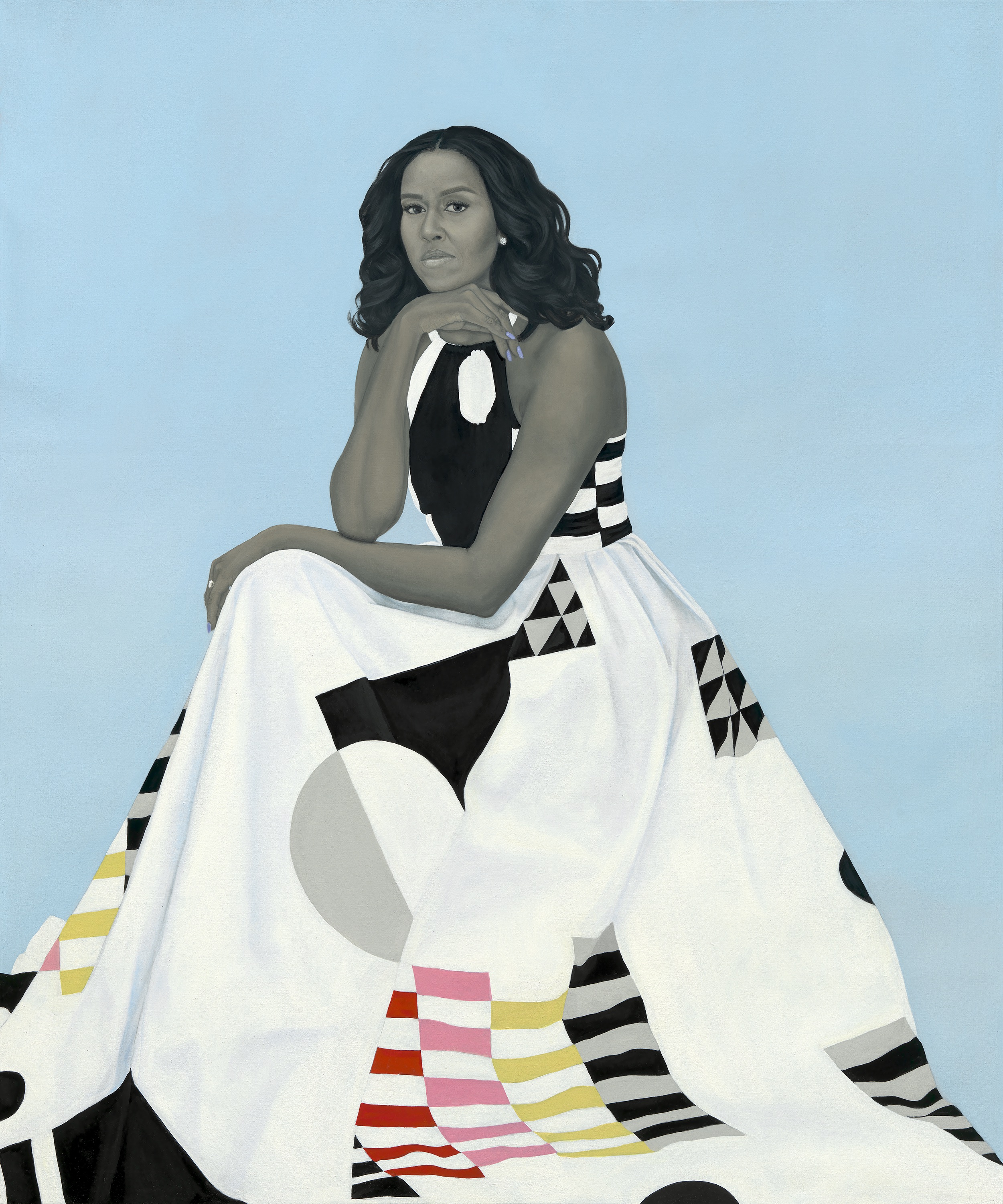
(Both appear slightly more saturated than average.)
posted by sylvanshine at 7:25 PM on February 14, 2018 [6 favorites]
« Older wheee!What Was Your Favorite Moment Of This Week’s... | You give me fever Newer »
This thread has been archived and is closed to new comments
I'm not nearly as familiar with Amy Sherald, but I quite like this portrait. For its simplicity, there's a lot going on.
Well done! And thank goodness they've added something a bit innovative to that collection. That's been all too rare.
posted by Capt. Renault at 8:41 AM on February 12, 2018 [3 favorites]