The Graphical Underground
July 24, 2007 7:32 PM Subscribe
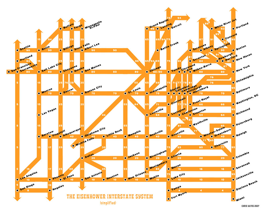
The maps of the London Underground and the Washington Metro are iconic in their cities and a favorite of experts on information graphics. They share a similar philosophy: sacrifice geographical accuracy in order to clearly illustrate the system. What if the New York Subway map were drawn the same way? What about the Interstate system?
What if the New York Subway map were drawn the same way?
the g train would still suck.
posted by vrakatar at 7:39 PM on July 24, 2007 [2 favorites]
the g train would still suck.
posted by vrakatar at 7:39 PM on July 24, 2007 [2 favorites]
Wow, that Interstate one is ludicrously bad. Who thought thick lines = simplified?
posted by smackfu at 7:40 PM on July 24, 2007
posted by smackfu at 7:40 PM on July 24, 2007
And what about finding your way on the Web 2.0 'tube' map?
posted by ericb at 7:40 PM on July 24, 2007
posted by ericb at 7:40 PM on July 24, 2007
Recently on MeFi - a classic rendition of the geography vs. usability debate as pertaining to the NY subway.
posted by Miko at 7:43 PM on July 24, 2007
posted by Miko at 7:43 PM on July 24, 2007
The New York City map is not at all difficult to use. There are many lines, but it's as simple as tracing your finger along a line and seeing where it goes. It's very easy to read and includes transfer points.
Geographic accuracy is important, as it gives you a better idea of your surroundings.
posted by cmgonzalez at 7:47 PM on July 24, 2007
Geographic accuracy is important, as it gives you a better idea of your surroundings.
posted by cmgonzalez at 7:47 PM on July 24, 2007
Admission: I was born and raised here and have used the system regularly since childhood. But I have had to use other cities' subways, including those of Madrid, London, Paris, Rome, and Washington D.C. They were mostly wonky in comparison and it was often difficult to tell the distance between stations. As someone that likes to walk and wander around, geographic accuracy helps immensely.
posted by cmgonzalez at 7:51 PM on July 24, 2007
posted by cmgonzalez at 7:51 PM on July 24, 2007
I rather like the Interstate redesign, and would have liked to have had it on my transcontinental road trip. I've done my share of subway sampling and geographical accuracy has never helped nor hindered me in my wanderings, but piss-poor information graphics have turned me wrong-way-about on more occasions than I care to think of.
posted by lekvar at 7:58 PM on July 24, 2007
posted by lekvar at 7:58 PM on July 24, 2007
The map of the TTC (Toronto Transit Commission) subways is very, very simple to read. And since the city is on a grid system, it's even easier--each station is (approximately) 1km apart.
posted by dirtynumbangelboy at 7:59 PM on July 24, 2007
posted by dirtynumbangelboy at 7:59 PM on July 24, 2007
cmgonzalez: you should read the thread I just linked to. It's full of commentary on the ease of use of the NY subway map.
They were mostly wonky in comparison
Of course; after your first comment I figured you were a native or a resident of NYC. You grew up in a city with the most Byzantine of all subway maps in all the world. Simplicity is confusing thereafter. People who use maps the most - visitors - really prefer a simple organization over a geographically accurate map. They've got the guidebook for the accurate map; the transportation can be reduced to a schematic showing what you really need: What order the stations come in, and which line to take to get to the stop you need.
I'm sympathetic; I grew up on the NY system too, and I resist change, but there's no denying that the simpler map is easier to use to get where you need to go when you're not familiar with the system and don't want to stand in a station tracing a long line on greasy plexiglas while some guy wails away on a saxophone next to your ear.
I love the interstate highway map, too. It's maybe not as useful to boil interstates down that way, because there are many many more exits than subway stations, but the schematic works perfectly well for planning a road trip that hits several major cities. All the easiest options are really easy to identify.
posted by Miko at 7:59 PM on July 24, 2007
The interstate isn't just ugly and hard to read, it's incomplete as well -- most of 94 is missing, plus 39 and 43, and that's just in Wisconsin.
posted by aaronetc at 7:59 PM on July 24, 2007
posted by aaronetc at 7:59 PM on July 24, 2007
What if the New York Subway map were drawn the same way? What about the Interstate system?
I would theorize that the world had been taken over by Cory Doctorow and I'd have to start planning a coup.
posted by spiderwire at 8:03 PM on July 24, 2007 [3 favorites]
I would theorize that the world had been taken over by Cory Doctorow and I'd have to start planning a coup.
posted by spiderwire at 8:03 PM on July 24, 2007 [3 favorites]
The interstate one also has at least one mis-spelling.
That aside, yuck.
The New York subway one though is nice.
posted by idb at 8:09 PM on July 24, 2007
That aside, yuck.
The New York subway one though is nice.
posted by idb at 8:09 PM on July 24, 2007
Hey, dnab, don't show how tiny our subway system is... it's embarrassing.
posted by anthill at 8:12 PM on July 24, 2007
posted by anthill at 8:12 PM on July 24, 2007
One great difference between New York and, say, London is that the physical layout of the city is much more straight forward. A city that grew organically around a twisting river incorporating nearby towns and hamlets as it grew is not simple to map, either on paper or in your head. Overlaying a train map on that is likely to be very confusing for everybody who actually needs the map. A schematic representation actually helps give order to what's going on, obviously at the expense of great simplification.
Also, though it is distorted, the relationship between stations on the underground map is not entirely wrong -- I've used it to find my way to somewhere I sort of know how to get to, but where I needed a gentle reminder of the relationship of where it is to my current location.
posted by Quinbus Flestrin at 8:14 PM on July 24, 2007
The classic MBTA map of the Boston subway is also graphical instead of geographical.
Of course, ours is smaller than NYC. Not that size matters, of course! It just means we have to try harder.
posted by yhbc at 8:15 PM on July 24, 2007
Of course, ours is smaller than NYC. Not that size matters, of course! It just means we have to try harder.
posted by yhbc at 8:15 PM on July 24, 2007
That NYC subway map is such a huge improvement over the existing one, words fail me.
I'm bookmarking it for the next time I have to go to NYC.
I don't consider myself a stupid person, but I have never had an experience involving the NYC subway that didn't end with me begging strangers for some sort of assistance. I've avoided it and just taken cabs whenever I've been sent there for business travel for years.
posted by Kadin2048 at 8:17 PM on July 24, 2007
ne great difference between New York and, say, London is that the physical layout of the city is much more straight forward.
Agreed if you're talking about Manhattan, particularly midtown, but not if you include the boroughs.
posted by Miko at 8:18 PM on July 24, 2007
Agreed if you're talking about Manhattan, particularly midtown, but not if you include the boroughs.
posted by Miko at 8:18 PM on July 24, 2007
Geographic accuracy is important, as it gives you a better idea of your surroundings.
Tufte would tell you that, when it comes to subway maps, "your surroundings" are mostly irrelevant (chartjunk), and therefore shouldn't be on the map. When you enter a subway station, you've essentially left "world geography" behind in favor of "subway geography" and you're only interested in going from point A to point B, so the map with the least surplus information is the one that's going to be most useful to the most number of people.
posted by Cool Papa Bell at 8:25 PM on July 24, 2007
but there's no denying that the simpler map is easier to use to get where you need to go when you're not familiar with the system and don't want to stand in a station tracing a long line on greasy plexiglas while some guy wails away on a saxophone next to your ear.
I added my experience with other systems to support my point though. I still find the NYC map design superior (and easier) to those laid out in a distorted structure. I've lived abroad and patronized a different system very frequently. I've also been a tourist, and it's often easier to get lost when geography is distorted. Maybe it would save some folks two minutes but cost them five or ten later.
A bit of patience mapping out your route in advance or tracing that line goes a long way later.
Also, I read that other thread when it was posted.
posted by cmgonzalez at 8:31 PM on July 24, 2007
A city that grew organically around a twisting river incorporating nearby towns and hamlets as it grew is not simple to map, either on paper or in your head.
Ha! This description could apply to both NY and London.
posted by smackfu at 8:34 PM on July 24, 2007
Ha! This description could apply to both NY and London.
posted by smackfu at 8:34 PM on July 24, 2007
I added my experience with other systems to support my point though.
I don't think it says anything about the other systems, though. You started with a different schema, so it became harder for you to understand other ways of representing information.
posted by Miko at 8:35 PM on July 24, 2007
I don't think it says anything about the other systems, though. You started with a different schema, so it became harder for you to understand other ways of representing information.
posted by Miko at 8:35 PM on July 24, 2007
Tufte would tell you that, when it comes to subway maps, "your surroundings" are mostly irrelevant (chartjunk), and therefore shouldn't be on the map.
But the real world doesn't exactly disappear just because you're on transport. The route map doesn't exist in a vacuum. This isn't useless or irrelevant information. It is in fact, highly relevant and useful information.
posted by cmgonzalez at 8:36 PM on July 24, 2007
But the real world doesn't exactly disappear just because you're on transport. The route map doesn't exist in a vacuum. This isn't useless or irrelevant information. It is in fact, highly relevant and useful information.
posted by cmgonzalez at 8:36 PM on July 24, 2007
I don't think it says anything about the other systems, though. You started with a different schema, so it became harder for you to understand other ways of representing information.
Not at all. I can grasp pie charts and bar graphs each just fine. Same with maps.
posted by cmgonzalez at 8:36 PM on July 24, 2007
Not at all. I can grasp pie charts and bar graphs each just fine. Same with maps.
posted by cmgonzalez at 8:36 PM on July 24, 2007
not if you include the boroughs.
No, you're quite right, I was thinking mostly of Manhattan, but London doesn't even have a one area of noticeable size that any ordered layout.
posted by Quinbus Flestrin at 8:39 PM on July 24, 2007
No, you're quite right, I was thinking mostly of Manhattan, but London doesn't even have a one area of noticeable size that any ordered layout.
posted by Quinbus Flestrin at 8:39 PM on July 24, 2007
For graphical design fun, I created my own map of Seattle in this way.
Most people in a city spend the vast majority of their time in the same twenty or so locations, or travelling between those locations. So I made a map of those locations for me, and the routes between them, and pretty much threw out the rest of Seattle :-)
posted by -harlequin- at 8:39 PM on July 24, 2007
But the real world doesn't exactly disappear just because you're on transport
Think like a tourist. You don't really care how points on the surface are related with one another if you are merely trying to get between them, and must go underground to do so. AZ typical traveler is working with a list of destinations: a museum here, a monument there, a ferry dock here, and a restaurant there. You've printed information about each off the web, and knowing you are traveling by subway, you've made sure to get the directions to each from the nearest subway station.
Does it matter now how they are related to each other geographically? Not in the least; all that matters is how you transfer from one line to the other to get to the station you need to begin following your directions from.
The points are more important than the pathways. You need only to know how to get from your point to the next point.
I think the NY subway maps work, sure. I've used them all my life, and yes, they get you around. But they are based on an assumption that underground rail works like surface transport, and it doesn't. What use is a geographic map in an underground world where there is no visible geographic information? The current maps are adequate, but not ideal.
I think the utility of the maps could easily be put to a test. I think it would make a great NYT article or web stunt to challenge two independently operating groups of travelers, all of whom have no experience of NYC subways, to complete a course of travel involving several destinations and a time schedule, and equip only one group with the updated map.
posted by Miko at 8:44 PM on July 24, 2007
Not at all. I can grasp pie charts and bar graphs each just fine. Same with maps.
Then why should a different method bother you?
posted by Miko at 8:45 PM on July 24, 2007
Then why should a different method bother you?
posted by Miko at 8:45 PM on July 24, 2007
I called it "Seattle - minus the sucky bits" :-)
posted by -harlequin- at 8:45 PM on July 24, 2007
posted by -harlequin- at 8:45 PM on July 24, 2007
For further consideration:
Tokyo
Philadelphia
Paris
Chicago
posted by silby at 8:52 PM on July 24, 2007
Tokyo
Philadelphia
Paris
Chicago
posted by silby at 8:52 PM on July 24, 2007
The Washington Metro's tactile/low-vision map is beautiful - it's this huge colorful poster-thing with raised edges that you can trace. I've been trying to get a copy for a while to hang on my wall, but since I'm no longer in the area, it's been hard to find one. (And it turns out the Boston MBTA's 'tactile map' is actually just a Braille schedule - not very visually appealing. Bugger.) Seriously, I'd spend a few bucks for a poster version of either town's metro map if they had one.
Or heck, even a high-res or vector image that I could get printed ...
posted by spaceman_spiff at 8:59 PM on July 24, 2007
Or heck, even a high-res or vector image that I could get printed ...
posted by spaceman_spiff at 8:59 PM on July 24, 2007
@spaceman_spiff: The pdf version of the DC Metro Map should be able to print up big...at least, I can zoom way in on it w/o loss of detail. Bring it to Kinko's and see if they can print it at 200%.
posted by silby at 9:08 PM on July 24, 2007
posted by silby at 9:08 PM on July 24, 2007
Silby: Squee! Words alone cannot express my thanks. I can't believe I missed that.
posted by spaceman_spiff at 9:17 PM on July 24, 2007
posted by spaceman_spiff at 9:17 PM on July 24, 2007
I have a print of the Interstate map up in my cube. Yates is aware that Wisconsin is missing - he had to simplify things somewhere to match the dimensions he wanted.
Here's the source of that image, which you probably should have linked instead of just the .jpg.
posted by beaucoupkevin at 9:34 PM on July 24, 2007
Here's the source of that image, which you probably should have linked instead of just the .jpg.
posted by beaucoupkevin at 9:34 PM on July 24, 2007
great thing about the nyc subway map: you can estimate how many blocks, and therefore how long a walk, to your destination from a given stop.
lame thing: if you're going somewhere you've never been before (a party in Ditmas park, for example) it can be difficult to plot out where trains link to other trains without having to walk underground a good ways and smell all...that...piss...
posted by vrakatar at 9:39 PM on July 24, 2007
lame thing: if you're going somewhere you've never been before (a party in Ditmas park, for example) it can be difficult to plot out where trains link to other trains without having to walk underground a good ways and smell all...that...piss...
posted by vrakatar at 9:39 PM on July 24, 2007
Things I learned on the Metro:
There is no eating on the Metro. THERE IS NO EATING ON THE METRO. You will go to jail and the Chief Justice of the Supreme Court will show you no mercy.
Tourists, while annoying, are to be pitied.
In the summer, take the elevator.
If we have enough faith in the Purple Line, it will one day save us all.
posted by PostIronyIsNotaMyth at 11:06 PM on July 24, 2007
You've printed information about each off the web, and knowing you are traveling by subway, you've made sure to get the directions to each from the nearest subway station.
So in order to know how to get somewhere you have to do all this research before hand? How does that make it any easier? If you need to walk somewhere you have never been before geographic maps are much better. The best is a compromise where for smaller maps are graphically compressed, and then somewhere in the station they have one big geographically accurate map.
Yates is aware that Wisconsin is missing - he had to simplify things somewhere to match the dimensions he wanted.
As a Wisconsinite, Fuck Yates. What a crappy map.
posted by afu at 11:12 PM on July 24, 2007 [1 favorite]
I lived in London for ten years, and I still find the NYC subway map easier to use. Either works well, but if I want to know how long it will take me to get somewhere, the NYC map gives me an idea, and the London one doesn't.
posted by alloneword at 11:16 PM on July 24, 2007
posted by alloneword at 11:16 PM on July 24, 2007
vrakatar - so I'd summarise your points like this:
great thing about the nyc subway map: Functions well as a mpa of the city.
lame thing: Does not actually function as subway map.
Which is basically why I think people who clamour for geographical accuracy in subway maps don't actually want subway maps.
posted by Artw at 11:22 PM on July 24, 2007 [1 favorite]
All well and fine, plenty room for either version of a subway map. When I saw the London geographical version, it made some things clear which had bothered me. I don't live in the Underground, and I also use real street maps. So having the geographical version was helpful.
What is needed, are signs at the entrance/exits of such stations indicating direction! How many times have I come up up to the street, only to start walking the opposite direction I needed? At least in Manhattan, you can usually spot something to help you.
posted by Goofyy at 11:41 PM on July 24, 2007
Another two cents - I really don't like the NYC subway map. It's nice that you can see where you're going, but it was not at all clear to me that there were different trains working on the same line, stopping at different places. As someone who's used the London Underground for a few years, I find its map far superior. Agreed that London needs better signage.
A good rule of thumb about how long it takes to get places is that within Zone 1, stations are on average 2 minutes apart. Outside of Zone 1, stations are 3 minutes apart. This breaks down if you're going all the way out to Zone 6 though.
posted by adrianhon at 1:17 AM on July 25, 2007
A good rule of thumb about how long it takes to get places is that within Zone 1, stations are on average 2 minutes apart. Outside of Zone 1, stations are 3 minutes apart. This breaks down if you're going all the way out to Zone 6 though.
posted by adrianhon at 1:17 AM on July 25, 2007
What is needed, are signs at the entrance/exits of such stations indicating direction!
Most LU stations have these along with little maps that tell you where you are by the station exits. Even the annoying ones like bank that have a dozen exits.
posted by rhymer at 2:13 AM on July 25, 2007
Most LU stations have these along with little maps that tell you where you are by the station exits. Even the annoying ones like bank that have a dozen exits.
posted by rhymer at 2:13 AM on July 25, 2007
Does London have the concept of express trains? That alone adds complexity to the NYC one.
posted by smackfu at 5:44 AM on July 25, 2007
posted by smackfu at 5:44 AM on July 25, 2007
I don't understand the peculiar animus aimed at the current NYC subway map.
I also don't understand why we should change a map that works very well for millions of people who actually live here and who pay the taxes that make any kind of map possible. Why should we change the map to make life easier for people who are just going to wander around in circles and gawk at The Tall Buildings in Times Square anyway?
If the grease is an issue, you can always get yourself a clean paper copy from the token booth clerk.
posted by jason's_planet at 8:05 AM on July 25, 2007
token booth clerk.
Bwahahahah! Now that was a joke for locals. Token booth clerk! That's rich.
Part of my preference for the schematic map is that the people who need a map are the ones consulting it. That is: tourists and people traveling to unfamiliar neighborhoods. NEw Yorkers who are already familiar with the city's layout do not need to use it as much, so I don't think their opinion should determine which map it is. Most people travel on their usual snail trails and get to know one or two or three lines quite well. Put them onto a foreign line in a new borough and they're just as helpless with the geographic map.
I believe that maps should be designed for the people who need them, not the people who don't need them.
Having seen the New York economy both when it did not have tourism and now that it does, I feel somewhat assured in saying that the presence of tourists who need maps is in large part responsible for there being any kind of tax base which might support map updating and printing, as well. That being said, I'm not sure how the transit system is funded - direct user fees must make up a large part of the budget for things like mapping.
posted by Miko at 8:56 AM on July 25, 2007
It occurred to me that London does indeed have anatomically correct transport maps. Just take a look at the Transport for London bus maps. It takes five multi-megabyte pdfs to convey the needed information. Central London isn't too bad, but the four quadrant maps make it tricky to work out which bus goes where, even if it's easy enough to find which buses pass a given point. Try planning a bus trip from, say, Croydon to Hendon by bus only using the bus maps and you'd go crazy (I know in practice that it's unlikely that anyone would actually do such a journey entirely by bus).
It's a quarter of a century since I've lived in London, so my experience is a little dated, but in my day most tourists avoided busses, and even natives didn't try to use the bus map unless they already had a vague idea of which buses went to the general area of their destination. A complicated transport system overlaid on confusing geography makes for truly confounding graphics, and I think they actually do a great job under difficult circumstances of trying to explain what's going on.
After trying to use the bus maps it's easy to see why Londoners are so fond of the schematic Tube map.
posted by Quinbus Flestrin at 9:09 AM on July 25, 2007
NEw Yorkers who are already familiar with the city's layout do not need to use it as much, so I don't think their opinion should determine which map it is. Most people travel on their usual snail trails and get to know one or two or three lines quite well. Put them onto a foreign line in a new borough and they're just as helpless with the geographic map.
I know. Fuck them. They just live there.
I think that the opinions of people who use the system day in and day out, paying for the system directly in the form of fares, and indirectly through state and local taxes and through levies on our Con Ed bills, should have a greater bearing on this matter than the opinions of people who get the willies at the idea that they might encounter grime or grease or -- GOD FORBID -- a loud subway musician in the course of their travels.
It's our system. Not theirs.
posted by jason's_planet at 12:17 PM on July 25, 2007
It's not really any individual's system. Besides, I wasn't suggesting that ownership had anything to do with it - need for a map has to do with it. After a short time as a resident anywhere, you understand and know your own local system and will hardly ever consult the map again. Most New Yorkers never need to look at the map; the only time you need to consult a map is when you are not familiar with your destination area. Therefore, a map should be designed for those not familiar with the destination area - in other words, those people who are most likely to use and need it. Not the people who use it every day. They don't need the map to get to work every day.
I'd personally consider it a waste of public funds to design a map for people who don't need a map.
I'm from the NY area myself. Though locals put up with it and try to put a fun, tough face on it, the truth is that the New York ridership experience is one of the worst in the U.S. Though it is speedy and has great saturation to all points of the city and surround, the subway is honestly not all that well maintained or user-friendly as compared with other systems. It's far, far better than it was twenty years ago, but it is still not a well-run system. There are many ways it could be improved.
posted by Miko at 12:41 PM on July 25, 2007
There are no express trains on the London Underground. There's one line which branches in the middle to make it a bit trickier, but it's not disastrous if you end up on the wrong one.
Having lived in London for a year and recently visited NY, I find the London map to be incredibly easy to use for getting around to the station I want, but it's also easy to do a needlessly complex journey when the stations you need are within walking distance of each other. The NY map was pretty useful for me to see when it was worth getting a train and when I should walk, but that's also due to Manhattan's block layout and useful street numbering making it much harder to get completely lost in NY than in London. The express trains caught me out a couple of times, but it didn't take that long to get the hang of it.
posted by penguinliz at 1:06 PM on July 25, 2007
I'd personally consider it a waste of public funds to design a map for people who don't need a map.
I'd consider it a waste of public funds to redesign a map that works perfectly well when I have a hard time getting subway service out of my area of Queens on the weekend.
The subway system used a map that sacrificed geograhical accuracy almost thirty years ago. People didn't like it very much at all. It was more or less unusable for just about everyone, locals and non-locals alike.
So why should we repeat the mistakes of thirty years ago?
posted by jason's_planet at 1:27 PM on July 25, 2007
Something cool but only marginally related.
Who-pays arguments get complicated. The MTA's funding sources are pretty diversified. Its operating budget revenue comes from 41% ridership (some local, some outof-town, some far out of town), and about 35% property taxes. The remaining funds are drawn variously from state and local subsidies (ie, taxes being paid by people from outside New York City to support the convenience of transit and reduce road congestion for people living upstate, in NJ and CT, and on Long Island) and federal monies such as highway and infrastructure grants and growth funding. The federal money is, of course, coming out of every taxpayer's pocket.
I don't claim to know what the right solution is. I'd just don't agree that we can necessarily assume the old map is superior for navigational purposes without testing it in a fair study. (Besides which, the kickmap is really still highly geographically based, not terribly abstracted, and the colors and fonts make it just plain easier to read). I agree that staying with an old, imperfect map might be better for overall budget reasons, because throwing money to pay for a lot of arty discussions on map redesign over lunch isn't the best use of funds, either. But I'd be interested to see someone stage a fair test.
posted by Miko at 2:01 PM on July 25, 2007
Um, that proposed new NYC Subway map isn't just "not geographically accurate" - it doesn't show many streets at all! Any street that doesn't have a subway stop on it, no matter how important or arterial, is invisible.
Look at, for instance, the Brooklyn maps; now use the proposed map to get to Union and Henry. There are no stops on 5th Ave., so it doesn't exist.
In Manhattan, Madison Avenue is gone. Greenwich Avenue, gone. Amsterdam and Columbus? I'll bet they're gone too.
This map might help you get around the subway system... but the city? Not much.
posted by nicwolff at 6:23 PM on July 25, 2007
don't worry miko, according to today's news the mta is considering (gee, wonder how that will turn out) an increase in fares AND tolls so they'll have money for arty redesigns, catered lunches, and junkets galore!
i miss tokens.
posted by vrakatar at 6:31 PM on July 25, 2007
i miss tokens.
posted by vrakatar at 6:31 PM on July 25, 2007
This map might help you get around the subway system... but the city? Not much.
I like a street map for getting around the city. A subway map is for using the trains, IMO. It's interesting that NY has tried to make its subway map a single-use city map.
posted by Miko at 8:41 PM on July 25, 2007
I like a street map for getting around the city. A subway map is for using the trains, IMO. It's interesting that NY has tried to make its subway map a single-use city map.
posted by Miko at 8:41 PM on July 25, 2007
I like a street map for getting around the city. A subway map is for using the trains
Well, in NYC we generally use the trains for getting around the city. If you just want to visit the stations, I guess this map would be fine...
posted by nicwolff at 8:56 PM on July 25, 2007
Well, in NYC we generally use the trains for getting around the city. If you just want to visit the stations, I guess this map would be fine...
posted by nicwolff at 8:56 PM on July 25, 2007
Yates is aware that Wisconsin is missing - he had to simplify things somewhere to match the dimensions he wanted.
That's ridiculous -- the space where Wisconsin's interstates should be is just empty space between Michigan and Minnesota.
posted by aaronetc at 6:27 AM on July 26, 2007
That's ridiculous -- the space where Wisconsin's interstates should be is just empty space between Michigan and Minnesota.
posted by aaronetc at 6:27 AM on July 26, 2007
Oy nicwolff...literal as a fifth grader. Getting around the surface of the city at ground level. Is that better?
posted by Miko at 9:31 AM on July 26, 2007
posted by Miko at 9:31 AM on July 26, 2007
Better? Not a bit. Your destination's "at ground level", somewhere, and you're not likely to find it with that map, unless you've already been told what station is nearest. 41 years a New Yorker, and I wouldn't be able to walk into a subway station, look at that map, and get anywhere I didn't already know how to go. I guess once I have an iPhone, I could run upstairs, Google Maps my destination and find the nearest subway stop and what lines it's on, then use this map to... oh, right, then I wouldn't need this map.
posted by nicwolff at 10:54 AM on July 26, 2007
posted by nicwolff at 10:54 AM on July 26, 2007
I understand everything you say, but you're asking to depend on a subway map to help you find your way around the surface. Like I said, I'm familiar with NY too, but people there are used to the expectation that the transit map is also your navigation map for everything - a one-stop go-to map with streets, alleys, museums, neighborhoods, public buildings, and everything on it. It doesn't necessarily have to be that way - a transit map doesn't have to be a life-size picture of the city itself - that's a lot of responsiblity for a transit map to take on. Just about anywhere else you travel, you use the surface map to identify your destination, then locate the station stop on the nearest point to your destination, and use the transit map to get from where you are to that station stop. It's just as good a system. As soon as you're familiar with an area, you no longer need either map, just as you don't in New York. I don't know about you, but when I'm headed to a restauarant in a new neighborhood and I've never been there before, I look up the street address and then use the street map to figure out which station stop it's nearest. I start with the surface and end up on the surface. The subway points, being less specific, don't have to give me a picture of the journey.
Like I said, it doesn't have to be just a matter of preference, though. It should be a matter of usability. Anyone who's interested enough should test it out - get some out-of-town friends to play guinea pig, arm each with a different map, and give them each the same multipoint itinerary requiring them to check in at 3 different surface destinations on different lines (require transfers) starting at the same time of day. Time their trips, and debrief afterward. If the MTA map works the best, by all means let us know. If the other map works the best, that's a strong indication that it's well designed.
But I think what I'm hearing is that people like the New York system because it's essentially one-stop shopping. You don't have to look much of anything up, make any phone calls, carry a guidebook, or plan ahead. The difficulty is that the density of information people like is precisely what makes it so hard for newbies to use.
posted by Miko at 12:54 PM on July 26, 2007
You can't, or won't, live in or visit New York for long if you can't comfortably parse and integrate multiple dense layers of communication. The MTA map does an excellent job of layering information to tell you how to actually get around the city.
This simplified map doesn't show streets; it doesn't show bus transfers; it doesn't show bridges; it doesn't show the LIRR or the PATH or Metro-North or Amtrak, except where they meet the subway; it doesn't show the commuter ferries. Real people getting around New York - not idealized "subway users" - need all that information, in the same place, to decide not just how to get somewhere on the subway, but if the subway's the best way to get there.
It's a nice simplified map that could be sold to tourists at newsstands, but by no means should it replace the MTA's subway map.
posted by nicwolff at 4:17 PM on July 26, 2007
You can't, or won't, live in or visit New York for long if you can't comfortably parse and integrate multiple dense layers of communication.
And yet people do it all the time, and have for a century.
My only point: just because something works all right doesn't mean it couldn't work better.
posted by Miko at 7:35 PM on July 26, 2007
And yet people do it all the time, and have for a century.
My only point: just because something works all right doesn't mean it couldn't work better.
posted by Miko at 7:35 PM on July 26, 2007
I'm sure the MTA map could be improved on. But this proposed map doesn't come close. Any amateur could make a "clearer" subway map by throwing out most of the other information and reusing the recovered space; actual designers work to real-world requirements and constraints, and the current MTA map is a pretty elegant compromise.
posted by nicwolff at 9:55 PM on July 26, 2007
posted by nicwolff at 9:55 PM on July 26, 2007
My only point: just because something works all right doesn't mean it couldn't work better.
My points:
Why try to reinvent the wheel?
The imagined best is the enemy of the actual good.
posted by jason's_planet at 7:41 AM on July 27, 2007
My points:
Why try to reinvent the wheel?
The imagined best is the enemy of the actual good.
posted by jason's_planet at 7:41 AM on July 27, 2007
Personally, I'm very glad the wheel was reinvented. The caveman version was good, but my bike's are better.
Nicwolff's right, though - it was decided long ago that the MTA map was going to be all things to all transport users, and once that expectation is set, anything else is a compromise.
This thing is just so ripe for a "Talk of the Town" piece on a timed trial, though.
posted by Miko at 2:19 PM on July 27, 2007
Your destination's "at ground level", somewhere, and you're not likely to find it with that map, unless you've already been told what station is nearest.
Well, duh.
posted by Artw at 3:26 PM on July 27, 2007
Well, duh.
posted by Artw at 3:26 PM on July 27, 2007
all things to all transport users
It's telling that even while reaching snidely for this idiom you can't bring yourself to use the word "people" - you're still fantasizing about some kind of idealized "transport user". The current MTA map was designed to help people get where they're going - not just to "use transport".
A counter-example: a couple of months ago I had to get from Boston's Logan Airport to a friend's house at Beacon and Dartmouth St., a few blocks from the Common. I got off the plane and found a bus to the Airport station on the Blue line, where I looked at the only map available - which doesn't show the Common or any other geographical hints at all - and, forced to guess which station was nearest his house, ended up about a mile away and late for dinner. The Boston subway map, which like this proposed NYC map shows very clearly which lines will take a "transport user" from any station from any other, doesn't tell a real person how to get anywhere.
posted by nicwolff at 4:32 PM on July 28, 2007
reaching snidely for this idiom
I chose to say "transport users" for accuracy, because not all people use public transport. Not even all New Yorkers or visitors to New York. If it will help you focus on my point, I'd be happy to split the hair: I hereby officially change it to "people who use public transport," though I don't think it really has any impact at all upon my point. I used a word more specific than "people" because people who don't use public transport can't be expected to care how the map looks or functions.
In fact, throughout this thread, I have been arguing to test the maps against one another by giving them to actual people who intend to use public transport. You seem to be saying that we can dismiss alternate suggestions out of hand. I'd like the argument to find its way into the real world and leave the realm of personal preference, longstanding habit, and semantics.
forced to guess which station was nearest his house,
See, this is exactly the mindset that makes this a difficult problem for people used to the present system. Only a New Yorker could find himself in this situation, because only a New Yorker could expect to travel without directions to his destination. It's not safe to carry that expectation into the broader world - it isn't standard by any means.
When traveling by public transportation in any other US city with a specific destination point in mind, it's a good idea to have identified the station closest to your destination point before you embark on the trip. Travel takes preparation. After growing up using the New York system, and then traveling extensively in the US, using systems from Boston's to Philly's to DC's to Pittsburgh's to Atlanta's to Chicago's, (very detailed - but still not every street!) I can say with confidence that before you go somewhere in those cities, you generally need to know how to get there before you leave. The fact that you think this suggestion is somehow insane is New York parochialism at its strongest.
posted by Miko at 6:10 PM on July 28, 2007
I have been arguing to test the maps against one another by giving them to actual people who intend to use public transport
No, you've been arguing to test the maps by giving them to imaginary people who intend to use the subway and only the subway, never considering taking for any part of their trip a bus or commuter train or a ferry, which are all public transport too.
Only a New Yorker could find himself in this situation
The fact that people in NYC can get places using just our subway map, and people in other cities can't, isn't a very strong argument for making our map less useful. The idea that, knowing the address of my destination, I should have to find a map that shows the city streets and the location of the subway stations, but that this map should not be the subway map and should not indicate which lines stop at which stations, and that I should then have to find a subway map which will have only that information, is, if not insane, then at least awfully stupid.
I see why you were nervous about mentioning Chicago's map, by the way - it's excellent supporting evidence for my position, showing subway, bus, and commuter trains, and all major streets, over very accurate geography. Quite nice really.
posted by nicwolff at 11:43 PM on July 28, 2007 [1 favorite]
I think Chicago's map supported my point. I was just there, and you can't use it to find street addresses.
you've been arguing to test the maps by giving them to imaginary people
That's an incorrect reading. Why would I want to test the map on imaginary people?
Sorry I continue to disagree with you.
posted by Miko at 11:53 AM on July 29, 2007
you've been arguing to test the maps by giving them to imaginary people
That's an incorrect reading. Why would I want to test the map on imaginary people?
Sorry I continue to disagree with you.
posted by Miko at 11:53 AM on July 29, 2007
you can't use it to find street addresses.
To clarify: because for each street noted, 4 or 5 in between are completely absent. from the map. You still have to know the directions, including the information that something is between Street A and Street B. Otherwise you're SOL.
posted by Miko at 11:56 AM on July 29, 2007
To clarify: because for each street noted, 4 or 5 in between are completely absent. from the map. You still have to know the directions, including the information that something is between Street A and Street B. Otherwise you're SOL.
posted by Miko at 11:56 AM on July 29, 2007
Why would I want to test the map on imaginary people
Because it's the only way you could get the result you insist on. You propose to test maps on "people who intend to use public transport", by which you mean "people who are committed to using only the subway to get around the city" and there are no such people.
Let's say we give the Kick map to your imaginary guy, and the MTA map to an actual person - let's say, me - and we tell them to get from the far Lower East Side to the Williamsburg shore. Your guy walks back to Essex and takes the F train to Marcy Ave, then walks back to the river. My map shows the Williamsburg Bridge, which since it's a beautiful day I walk across, or maybe bike. Who's happier now?
Otherwise you're SOL.
That's just not true; all you need is a general idea of where your destination is relative to the major thoroughfares, landmarks, or coastlines, and the NYC or Chicago transit maps suffice to identify the nearest station and the subway lines or alternative routes to it. I didn't have the street address of my friend's house in Boston, but I knew that it's on that street that runs W from the NW corner of the Common, a few blocks from the Prudential building; if those had been on the map, I'd have been right on target.
posted by nicwolff at 2:41 PM on July 29, 2007
I can say with confidence that before you go somewhere in those cities, you generally need to know how to get there before you leave. The fact that you think this suggestion is somehow insane is New York parochialism at its strongest.
Good for them. If they want to do things that way in their cities, that's their business.
We want to do things another way in our city and we are totally within our rights to do so because this is ours. It belongs to us. We, as the citizens, have the final say. It's not parochialism. It's simply how we prefer to do things here. New York is not everywhere else. We are most emphatically not standard. And that's what people love about the place.
Miko, if you're so intent on making New York fit some kind of standard, I propose that we do the following:
All pizza here has to suck, because our incredible pizza leads people to have unrealistic standards. You leave New York and think that the pizza will be good, and it won't. So from here on out, all NYC pizza has to suck.
All bars and clubs must have a last call at 12:45 a.m. because that's pretty much how it's done in every other city, so why should New York be any different?
Likewise, we should just shut down the trains at midnight. Because that's how it's done everywhere else.
posted by jason's_planet at 3:44 PM on July 29, 2007
This:
We want to do things another way in our city and we are totally within our rights to do so because this is ours. It belongs to us. We, as the citizens, have the final say.
And this:
It's not parochialism.
OK, now it's not parochialism. Now it's cognitive dissonance.
posted by Cool Papa Bell at 6:15 PM on July 29, 2007
y which you mean "people who are committed to using only the subway to get around the city" and there are no such people.
Mind reading again. You're leaping to assumptions by suggesting an interpretation of "what I mean" rather than "what I said."
If I were designing the study, I'd aim it at people with little or no knowledge of the system, because prior knowledge would skew the results. So I might suggest intercepting people who plan to use the MTA before they have begun using the system; say, people at a suburban rail station, or business travelers who have taken a cab from the airport to their hotel. Once they had indentified their day's destination(s), I'd issue them a map, randomly assigned, and then record their travels all day to see where they encountered trouble. This would yield some interesting case study evidence.
Because there's no control there, though, I'd want to set up a trial where the two maps could go head to head. For that, I'd suggest taking a similarly unfamiliar population - say, college freshmen during the first day of orientation at a NY university - and divide them into several paired groups. Each group would receive an itinerary - Amazing Race style - and for each itinerary one group could use the MTA map while the other would use the new map plus a street map (NY street maps show bus routes and subway stations, and the bus route maps are also posted at stops). I would time the trips of each competing group, but would also follow them to see at what points they encountered trouble, confusion, or disagreement about the route to take.
What I would expect to find is that newbies will encounter confusion with either map system (they certainly do with the present MTA map). The question would be how much, where, and for how long.
Jason etc: I'm not suggesting that New York needs to fit a standard. I do contest the idea that "citizens" (which citizens? New York City's? New York state's? NJ, CT? American? All of these people are paying for the system. My link to MTA funding earlier was meant to demonstrate that a much larger group than citizens of NY has a stake in and is paying for the system).
Instead, what I'm suggesting is that the central criterion for what makes a good map is its usability for the people who most need it: those who are least familiar with the city. That criterion should trump all others. If indeed, as Nicwolff is arguing, a geographic map is the most usable, then wonderful, However, it hasn't been deeply examined. Most objections to it are not pragmatic but cultural, like your own: "That's just the way we like it and how it's always been." Whether or not it is the most useful conceivable format, there are many inherent flaws with the geographic map in such an extensive and interlinked multimodal system - especially at nodes where multiple forms of transport meet.
The idea that all the information is on the map isn't even accurate. The map might indicate that there is a bus stop nearby to a subway stop. However, you've still got to go parse the sidebar to figure out how frequent the bus is, what the Sunday and holiday schedule is, and what the differences are between express and regular service. So it's not as though the current map adequately provides all the information needed to get around the city; you still need additional references.
posted by Miko at 7:48 PM on July 29, 2007
NY Times: The Great Subway Map Wars
NY Times: Can He Get There From Here?
NY Subway Historical Maps
37Signals: Helpful Distortion at NYC & London Subway Maps :
Gothamist: Kick Map Finds its Way to MTA. From that article:
I also wrote a note to the Talk of the Town editor and suggested that they stage some map trials. Who knows?
posted by Miko at 8:37 PM on July 29, 2007
NY Times: Can He Get There From Here?
NY Subway Historical Maps
37Signals: Helpful Distortion at NYC & London Subway Maps :
Gothamist: Kick Map Finds its Way to MTA. From that article:
We like the KickMap design. The New York City subway was the first system to run both local and express trains on the same lines, and continues to be the only system with that design. This can make the system baffling to those unfamiliar with the subway, as confused riders stare at single lines populated with multiple letters and numbers signifying where a train may or may not stop and let them off. We'll admit to having the same trouble when riding an unfamiliar subway line. Criticisms that Jabbour's map is geographically inaccurate and won't let riders know exactly where they are when leaving a station seem misplaced, as a lot of people have trouble figuring out which direction they're facing when leaving a station and generally use street-level signage for that type of orientation.There's some interesting commentary on all those sites. Looks as though designers, New Yorkers, and transport geeks are, you know, all over the map on this one. Both the advantages and the concerns mentioned here are being discussed by people on the platforms and the streets as well as at the design and planning level. What's safe to say is that we probably haven't heard the last of a graphical redesign: Jabbour has vowed to continually refine his map until its usability so exceeds the MTA's that it will become the official design. So it'll be interesting.
I also wrote a note to the Talk of the Town editor and suggested that they stage some map trials. Who knows?
posted by Miko at 8:37 PM on July 29, 2007
Thank you for the first link, Miko. I was actually going to use that earlier.
Here's another quote from that very same article, only this one describes the MTA's opinion, not Gothamist's opinion:
Here's another quote from that very same article, only this one describes the MTA's opinion, not Gothamist's opinion:
But when he showed up at the agency’s Midtown offices with copies of his work, they were quick to find fault with it. According to Christopher Boylan, the transportation authority’s executive director of corporate and community affairs, who recalled the meeting, the main criticism was that Mr. Jabbour’s map, like Mr. Vignelli’s, was artistic but geographically inaccurate.posted by jason's_planet at 9:14 PM on July 29, 2007
“He’s a good designer and it’s an interesting map,” Mr. Boylan said. “The design is important, but the thing we’re concerned with is the best directional guidance. We design a map for use, not solely to look good, and we think it looks good.”
A little bit about Mr. Vignelli's map, which I mentioned earlier, from your first link:
In 1972, Mr. Vignelli designed a completely new schematic map for the M.T.A., one that showed New York’s subway routes as rich, contrasting stripes of color, marching in lock step across a white background, and turning only at 45- or 90-degree angles. In contrast to the brilliance of the subway routes, aboveground New York was almost invisible: the outlines of the boroughs were stubby and squared-off; the parks were gray boxes; and the water was tan.posted by jason's_planet at 9:18 PM on July 29, 2007
The map defiantly ignored the city’s geography: the Broadway line was shown crossing the Eighth Avenue line at 42nd Street (they actually cross at Columbus Circle); Bowling Green appeared above Rector Street (it’s below); and Central Park was a small square rather than a tall rectangle.
“Of course I know Central Park is rectangular and not square,” Mr. Vignelli said the other day, sitting at a green marble table in his studio on East 67th Street. “Of course I know the park is green, and not gray. Who cares? You want to go from Point A to Point B, period. The only thing you are interested in is the spaghetti.”
As it turned out, New Yorkers were interested in more than the spaghetti. Almost as soon as Mr. Vignelli’s map arrived at stations, people started complaining about its failure to describe the city’s geography. Tourists were getting off the subway at the bottom of Central Park and trying to stroll to the top, for example, expecting a 30-minute walk.
So, let me get this right, Miko: your "controlled" study is going to involve giving one group the MTA map, and another group the Kick map plus a street map? That's what you call going "head to head"?
What if that group gets around better than those with just the MTA map? Are you going to recommend that the MTA switch to the Kick map, but also start handing out street maps? Because that's all you'd have learned.
Please tell me nothing important depends on your ability to design an experiment.
posted by nicwolff at 10:57 PM on July 29, 2007
Looks as though designers, New Yorkers, and transport geeks are, you know, all over the map on this one.
Uh, no, as jason's_planet points out, it looks as though New Yorkers, tourists, and the MTA have repeatedly and resoundingly rejected geographically inaccurate maps, whether they come from renowned Italian designers or obsessed amateur cranks.
posted by nicwolff at 11:01 PM on July 29, 2007
Uh, no, as jason's_planet points out, it looks as though New Yorkers, tourists, and the MTA have repeatedly and resoundingly rejected geographically inaccurate maps, whether they come from renowned Italian designers or obsessed amateur cranks.
posted by nicwolff at 11:01 PM on July 29, 2007
That's what you call going "head to head"?
Yes, because this entire time I've been saying that depending on a single map is what has given us a confusing system. The MTA map is, at present, trying to be a total transportation and street map, which is an unusual choice and probably too much job for one map. As I have said over and over and over, trying to combine too many map functions on one page makes maps less usable. Since the MTA map is already more than one map, the other group should also get complete information. Just as, when you go to London (or Chicago, or Boston), you will most definitely need a street map as well as a subway map. This, in fact, was Jabbour's motivation in designing the map - as this design blogger, who is critical of the map, says: "In the eyes of Mr. Jabbour, the New York system is too complicated to layer on information like commuter rail and bus routes, as the current map does. He would like to see a map that is singularly devoted to the subway. "
it looks as though New Yorkers, tourists, and the MTA have repeatedly and resoundingly rejected geographically inaccurate maps
No, not really. The 1972 redesign aside, you've conveniently ignored the many quotes and comments in those links indicating current support for an alternative map. The Gothamist's very article says:
As I said, opinions differ. I wished the Gothamist article had gone into some detail about what the MTA believes the kick map's flaws to be; only the snarky comment was quoted. But Jabbour is certainly collecting information and feedback, and I find it interesting that the NYC tourism bure
It's an interesting process to watch. However, it is an evolutionary process, not an either-or debate. There are many ways to solve a problem, not just one. Or two. Obviously, the story continues to unfold. One day, someone will design a better NYC subway map; it would be folly to think it will remain unchanged for another 20 years. The new designer may or may not be Jabbour and may or may not be influenced by Jabbour or by other map designers in other cities. It may or may not be welcome to you. But, given your passion, I hope that you both plan to be at the public fora when discussion of new maps takes place, to defend the completely perfect map which you already believe you have.
In closing, I forgot this link to a nice analysis of NYC subway map design constraints and how the Kick Map handles some of them, on Cartoblog, and you'll also be interested in the discussion at Visual Complexity< ?a> (note range of comments).
posted by Miko at 8:17 AM on July 30, 2007
Yes, because this entire time I've been saying that depending on a single map is what has given us a confusing system. The MTA map is, at present, trying to be a total transportation and street map, which is an unusual choice and probably too much job for one map. As I have said over and over and over, trying to combine too many map functions on one page makes maps less usable. Since the MTA map is already more than one map, the other group should also get complete information. Just as, when you go to London (or Chicago, or Boston), you will most definitely need a street map as well as a subway map. This, in fact, was Jabbour's motivation in designing the map - as this design blogger, who is critical of the map, says: "In the eyes of Mr. Jabbour, the New York system is too complicated to layer on information like commuter rail and bus routes, as the current map does. He would like to see a map that is singularly devoted to the subway. "
it looks as though New Yorkers, tourists, and the MTA have repeatedly and resoundingly rejected geographically inaccurate maps
No, not really. The 1972 redesign aside, you've conveniently ignored the many quotes and comments in those links indicating current support for an alternative map. The Gothamist's very article says:
We like the KickMap design. The New York City subway was the first system to run both local and express trains on the same lines, and continues to be the only system with that design. This can make the system baffling to those unfamiliar with the subway, as confused riders stare at single lines populated with multiple letters and numbers signifying where a train may or may not stop and let them off. We'll admit to having the same trouble when riding an unfamiliar subway line. Criticisms that Jabbour's map is geographically inaccurate and won't let riders know exactly where they are when leaving a station seem misplaced, as a lot of people have trouble figuring out which direction they're facing when leaving a station and generally use street-level signage for that type of orientation.Their poll indicates support among Gothamist readers: 64% in favor, vs. 13% who say "leave it -- the current map is fine."
As I said, opinions differ. I wished the Gothamist article had gone into some detail about what the MTA believes the kick map's flaws to be; only the snarky comment was quoted. But Jabbour is certainly collecting information and feedback, and I find it interesting that the NYC tourism bure
It's an interesting process to watch. However, it is an evolutionary process, not an either-or debate. There are many ways to solve a problem, not just one. Or two. Obviously, the story continues to unfold. One day, someone will design a better NYC subway map; it would be folly to think it will remain unchanged for another 20 years. The new designer may or may not be Jabbour and may or may not be influenced by Jabbour or by other map designers in other cities. It may or may not be welcome to you. But, given your passion, I hope that you both plan to be at the public fora when discussion of new maps takes place, to defend the completely perfect map which you already believe you have.
In closing, I forgot this link to a nice analysis of NYC subway map design constraints and how the Kick Map handles some of them, on Cartoblog, and you'll also be interested in the discussion at Visual Complexity< ?a> (note range of comments).
posted by Miko at 8:17 AM on July 30, 2007
The MTA distributes a single map, and must compromise between usability and usefulness. The Kick map is certainly more usable, for the little it's useful for; the MTA's current map is less usable but much more useful. You'd like to have a more usable map, but you don't seem to care how useful it is; your answer is "buy and carry another map". New York's answer, for 28 years, has been "no thanks".
Gothamist and its readers are hardly a representative sample of New Yorkers.
And your link to a "nice analysis" on Cartoblog is in fact a link to an article by the Kick map's designer! Getting a little desperate?
posted by nicwolff at 1:16 PM on July 30, 2007
Gothamist and its readers are hardly a representative sample of New Yorkers.
And your link to a "nice analysis" on Cartoblog is in fact a link to an article by the Kick map's designer! Getting a little desperate?
posted by nicwolff at 1:16 PM on July 30, 2007
Oh, that's funny. I totally didn't look at the author's name, I just RTFA.
Getting a little desperate?
No, I'm not desperate. On the contrary, you seem to be a whole lot more excited about this discussion than I am, though I prefer to consider more points of view than you do. Quite simply, I was looking around for responses to/reviews of the map. In fact it's discussed elsewhere on Cartoblog, though not as well. Still worth reading, though, to see how the designer thinks.
Anyway, some people agree with me, some with you. I just can't muster the degree of outrage you seem to feel about this and I don't think it merits a lot of hot, sarcastic rhetoric; practice that somewhere else. I think ideas about a map redesign are well worth exploring, and since a future iteration of the MTA design is inevitable, why not experiment with and refine this one and learn what can be learned?
posted by Miko at 2:13 PM on July 30, 2007
At this point, six days into this discussion, with neither side giving an inch, I think that you and I are just going to have to agree to disagree on this matter.
Best of luck to your friend Jabbour.
Take care.
posted by jason's_planet at 6:58 AM on July 31, 2007
Best of luck to your friend Jabbour.
Take care.
posted by jason's_planet at 6:58 AM on July 31, 2007
FWIW, the MBTA does have an interactive subway/street map on its website.
posted by brujita at 9:28 PM on August 14, 2007
« Older Kinder Surprise | Welcome To The Top of Europe Newer »
This thread has been archived and is closed to new comments
posted by ZachsMind at 7:36 PM on July 24, 2007