The (Mostly) True Story of Helvetica and the New York City Subway
November 19, 2008 10:27 AM Subscribe
The (Mostly) True Story of Helvetica and the New York City Subway. Why is Helvetica used now, and when did the changeover occur? To answer those questions this essay explores several important histories: of the New York City subway system, transportation signage in the 1960s, Unimark International and, of course, Helvetica.
As any New Yorker—or visitor to the city—knows, the subway system is a labyrinth.
I always thought of it as a web. Not the best constructed web (especially when you get out to or want to travel between the Bronx, Queens or Brooklyn), but a web none the less. Labyrinth sounds way too ominous.
This article was fascinating, thank you. I also like that there are still remainders of different fints and signs in each station. It give each a unique feel. Uniformity is stylistic choice I prefer to see in movies, visual inconsistencies and chaos are better for real life.
posted by piratebowling at 10:44 AM on November 19, 2008
Nine pages?! Internet, why won't you let me work today?
posted by roll truck roll at 10:52 AM on November 19, 2008
posted by roll truck roll at 10:52 AM on November 19, 2008
Oh typography nerds, I'm simultaneously attracted and repelled by you.posted by blue_beetle at 11:33 AM on November 19, 2008 [2 favorites]
Michael Bierut on Vignelli and the New York City subway
posted by needled at 11:41 AM on November 19, 2008
posted by needled at 11:41 AM on November 19, 2008
Usually font stuff makes my eyes glaze over, but my New Yorker self-obsession wins out in this case. Plus it's actually pretty interesting. Nice post.
posted by Damn That Television at 11:45 AM on November 19, 2008
posted by Damn That Television at 11:45 AM on November 19, 2008
It's un-American, these goddamn Swiss with their fancy little knives and their fancy little typefaces.
posted by rokusan at 11:54 AM on November 19, 2008
posted by rokusan at 11:54 AM on November 19, 2008
there was a documentary on the font made the other year
posted by sponge at 12:20 PM on November 19, 2008
posted by sponge at 12:20 PM on November 19, 2008
You had me at "signage typeface."
posted by kirkaracha at 12:22 PM on November 19, 2008 [1 favorite]
posted by kirkaracha at 12:22 PM on November 19, 2008 [1 favorite]
This is wonderful, thank you.
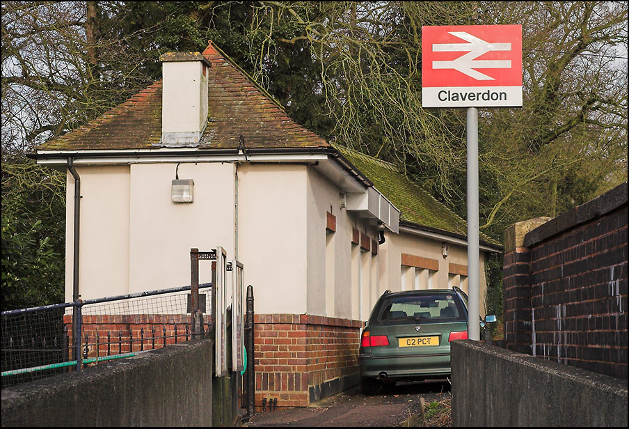
As a Brit, I enjoyed the linked-to article on the British Rail signage redesign in the 1960s (which also used a Helvetica-like font). Although the BR double arrow symbol is still used as the symbol for train stations, that old font has pretty much disappeared. I remember thinking the old font looked so bureaucratic and boring compared to the elegant Gill Sans which was used on signage before. Now I think it's a great example of modern design. Perhaps I'm just a bit nostalgic for it.
posted by athenian at 12:57 PM on November 19, 2008
Helvetica is still the perfume of the city.
posted by porn in the woods at 1:08 PM on November 19, 2008
posted by porn in the woods at 1:08 PM on November 19, 2008
They also have an article by Momus, where you can learn even more things that you'd never thought you'd ever know about him...
posted by You Can't Tip a Buick at 2:01 PM on November 19, 2008
posted by You Can't Tip a Buick at 2:01 PM on November 19, 2008
Exogenous, thanks for the mention. I like Shaw’s piece way more than my own. So: +1.
posted by joeclark at 6:47 PM on November 20, 2008
posted by joeclark at 6:47 PM on November 20, 2008
« Older Polaroids are not dead! | Put that organ in a plastic bag! Newer »
This thread has been archived and is closed to new comments
I get the "you're pathetic" look from her every time I wear my Helvetica t-shirt.
posted by Slack-a-gogo at 10:43 AM on November 19, 2008 [2 favorites]