I thought I was the only one
November 15, 2009 6:02 PM Subscribe
“I think sometimes that being overly type-sensitive is like an allergy,” : The New York Times on the perils of being a font nerd.
Nice dweeb tag.
posted by Balisong at 6:14 PM on November 15, 2009 [1 favorite]
posted by Balisong at 6:14 PM on November 15, 2009 [1 favorite]
(unpacks invisible knapsack full of dumb quotes, Comic Sans, Hobo, and Zaph Chancery)
posted by porn in the woods at 6:21 PM on November 15, 2009
posted by porn in the woods at 6:21 PM on November 15, 2009
I was hardly halfway through the article when the stench of douchebaggery became so overwhelming that I threw up a little in my throat.
posted by aheckler at 6:24 PM on November 15, 2009 [7 favorites]
posted by aheckler at 6:24 PM on November 15, 2009 [7 favorites]
If you get upset enough to write for the NY Times every time you see some janky kerning in a major city, you are not a type nerd, you are poorly adjusted and I am concerned for your blood pressure/overall well being.
posted by voronoi at 6:34 PM on November 15, 2009 [8 favorites]
posted by voronoi at 6:34 PM on November 15, 2009 [8 favorites]
Y'know what I hate? How the squiggly bit at the top of my 'a' in Verdana doesn't extend an extra pixel longer! And the genocide in Darfur!
posted by bunnytricks at 6:35 PM on November 15, 2009 [3 favorites]
posted by bunnytricks at 6:35 PM on November 15, 2009 [3 favorites]
I'm sorry. This is not aesthetic sensitivity the writer is expressing, it's either OCD or utter, nauseating pretension.
posted by es_de_bah at 6:37 PM on November 15, 2009 [10 favorites]
posted by es_de_bah at 6:37 PM on November 15, 2009 [10 favorites]
There's only one use of the tag dweeb on all of metafilter? I feel like I should make a post to remedy this. Or find contacts' posts and tag them all with dweeb.
posted by that girl at 6:43 PM on November 15, 2009
posted by that girl at 6:43 PM on November 15, 2009
See the typographic art at the Herb Lubalin Center in the Cooper Gallery, NYC.
There are also several new type releases at HypeforType each month.
posted by netbros at 6:51 PM on November 15, 2009 [1 favorite]
There are also several new type releases at HypeforType each month.
posted by netbros at 6:51 PM on November 15, 2009 [1 favorite]
Sadly, I feel the same way when I see someone riding a poorly fitting bike. What I do is just knock them to the ground and adjust their saddle real quick.
posted by fixedgear at 7:00 PM on November 15, 2009 [3 favorites]
posted by fixedgear at 7:00 PM on November 15, 2009 [3 favorites]
> I'm sorry. This is not aesthetic sensitivity the writer is expressing, it's either OCD or utter, nauseating pretension.
Sometimes I fantasize about a world in which all the underlying code being executed in the computers, wristwatches, cellphones, clock radios, and gas station pumps around us were immediately visible and readable by programmers; that the framework underlying everything were visible to engineers, industrial designers and architects, and see if they could spend a week without being driven mad by the constant, inescapable reminders of how poorly built and poorly executed most of the properties of their world are. And then see if they resort to snarking against people with perfect pitch suffering dissonance, or those who inwardly cringe at bad design.
posted by ardgedee at 7:00 PM on November 15, 2009 [35 favorites]
tl;dr: "Hey, you know whatever that thing is that's really important to you, personally? Caring about it means you're a jerk."
posted by ardgedee at 7:03 PM on November 15, 2009 [4 favorites]
posted by ardgedee at 7:03 PM on November 15, 2009 [4 favorites]
You know you die a little every time you pass one of those new highway signs.
posted by RobotVoodooPower at 7:14 PM on November 15, 2009 [2 favorites]
posted by RobotVoodooPower at 7:14 PM on November 15, 2009 [2 favorites]
As the first to admit it - I like Comic Sans. I wouldn't use it in something that needed to look "professional" (which I translate to "as boring as possible"), but for anything else... It flows, goes easy on the eyes, has a nice warm fuzzy feel to it. Generally stands out as a font that doesn't try to "say" anything other than my intended message.
And I can't tell the difference (or care that one exists) between Arial and Helvetica. Don't even get me started on that particular battle... Like they say, "winning an argument on the Internet is like winning the special olympics - Either way, you're still a retard".
But hey, what do I know. I don't make any money off designing fonts (of course, I don't spend any to get "just the right font", either, which seems like some sort of prerequisite for the vast number of font-snobs out there viciously defending their favorite squiggle on the tail of "a").
posted by pla at 7:18 PM on November 15, 2009 [2 favorites]
Here are some typeface names I thought of, in case you're working on one. I offer these freely.
Schmoopy. Tantamount. Excoria. Trans-Cranston. New Grover.
posted by longsleeves at 7:22 PM on November 15, 2009 [36 favorites]
Schmoopy. Tantamount. Excoria. Trans-Cranston. New Grover.
posted by longsleeves at 7:22 PM on November 15, 2009 [36 favorites]
I have tried, very hard, to give a damn about typography, but it just doesn't seem to ever hold my interest so long as the things I have to read are legible.
Is there some sort of gateway drug or secret initiation for caring about font? I watched bits and pieces of Helvetica, but it wasn't really a life-changing experience. All I really learned was that if you want to type something that will be displayed publically, you should do it in Helvetica so that you don't freak out the anal retentive typographers who will KILL, yes, KILL, if you use Papyrus or Comic MS Sans.
posted by mccarty.tim at 7:25 PM on November 15, 2009 [2 favorites]
pla admits liking Comic Sans. Get out the rope.
(or...get over fontomania)
posted by kozad at 7:28 PM on November 15, 2009
(or...get over fontomania)
posted by kozad at 7:28 PM on November 15, 2009
There's no font in the world that could make this article less hateful. Unless it was turned into Wingdings and sent to Microsoft as an Excel crash report.
posted by turgid dahlia at 7:29 PM on November 15, 2009 [2 favorites]
posted by turgid dahlia at 7:29 PM on November 15, 2009 [2 favorites]
I can sympathize simply on the basis that having worked in a Retirement Services division of a bank, I will never hear any more wrong phrase than "Rollover IRA," which is a made up thing. You can execute a rollover. Your IRA is a Traditional or a Roth. ARUGH.
So, type nerds: I can understand your pain.
And I like to take photos of what we call "Papyrus in the Wild."
posted by Medieval Maven at 7:32 PM on November 15, 2009 [2 favorites]
So, type nerds: I can understand your pain.
And I like to take photos of what we call "Papyrus in the Wild."
posted by Medieval Maven at 7:32 PM on November 15, 2009 [2 favorites]
Whenever I see men on the street who have arm, back or neck tattooes of the name of their motorcycle club in faux-blackletter gothic script I always make a point of telling them that it's historically inacurate for the script to be written exclusively in all-caps and that it shows a terrible understanding of the role of illuminated manuscript in pre-modern Europe.
posted by Fiasco da Gama at 7:33 PM on November 15, 2009 [62 favorites]
posted by Fiasco da Gama at 7:33 PM on November 15, 2009 [62 favorites]
that the framework underlying everything were visible to engineers, industrial designers and architects, and see if they could spend a week without being driven mad by the constant, inescapable reminders of how poorly built and poorly executed most of the properties of their world are.
Speaking as a planner, for me most of it actually is. I basically have to consider everything when designing a subdivision, and there isn't a lot that isn't carefully mapped. I do a lot of graphic layouts and though I do like a well-placed, carefully-considered font the hatred of the purely aesthetic pales in comparison to things that don't work well - things we planners/urban designers/engineers see all the time, every day. A poorly-designed merge lane makes my blood boil, on a small scale; the amount of attention we give to cars and single-family houses and highways makes me want to cry on a regular basis.
It's maddening to look at constrains I'm forced to design within for the sake of money, client direction, spoiled and entitled populations and spineless politicians. Things really could be so much better if our society was able to make a sea change in terms of an agreed-upon or market-driven set of minimum design standards.
posted by jimmythefish at 7:35 PM on November 15, 2009 [1 favorite]
Yeah, listening to people freak out about Areal vs. Helvetica, when only a few characters are different, gets old.
posted by delmoi at 7:35 PM on November 15, 2009
posted by delmoi at 7:35 PM on November 15, 2009
Is there some sort of gateway drug or secret initiation for caring about font?
In my experience, casual conversations about fonts inevitably lead to testimonies regarding the superiority of macs.
posted by Morrigan at 7:39 PM on November 15, 2009 [5 favorites]
In my experience, casual conversations about fonts inevitably lead to testimonies regarding the superiority of macs.
posted by Morrigan at 7:39 PM on November 15, 2009 [5 favorites]
TRY ARE NEW "CHECKEN" WINGS
posted by boo_radley at 7:41 PM on November 15, 2009 [5 favorites]
posted by boo_radley at 7:41 PM on November 15, 2009 [5 favorites]
A Christmas or two ago we got our young daughter a mermaid toy (or her Grams did, I can't remember). I do remember it wasn't an official 'Little Mermaid' brand. It was just a mermaid. I told my daughter this mermaid's name was Helvetica.
And that it was better.
posted by mazola at 7:43 PM on November 15, 2009 [24 favorites]
And that it was better.
posted by mazola at 7:43 PM on November 15, 2009 [24 favorites]
pla: "As the first to admit it - I like Comic Sans."
*POINTS WHILE SCREECHING*
posted by brundlefly at 7:43 PM on November 15, 2009 [20 favorites]
*POINTS WHILE SCREECHING*
posted by brundlefly at 7:43 PM on November 15, 2009 [20 favorites]
I couldn't make it past the first part. WTF was wrong with the a and the e?? Why is there not even a picture showing it? Also IMO the NYC subway signs ARE ABSOLUTELY BEAUTIFUL SO STFU
posted by The Biggest Dreamer at 7:44 PM on November 15, 2009
posted by The Biggest Dreamer at 7:44 PM on November 15, 2009
"Generally stands out as a font that doesn't try to "say" anything other than my intended message."
If your message is "The content of this publication has the same credibility as a poorly lettered comic strip for children", then sure.
posted by i_am_joe's_spleen at 7:46 PM on November 15, 2009 [5 favorites]
If your message is "The content of this publication has the same credibility as a poorly lettered comic strip for children", then sure.
posted by i_am_joe's_spleen at 7:46 PM on November 15, 2009 [5 favorites]
As the first to admit it - I like Comic Sans.
When you leave tomorrow I'm taking your mouse as it's better than mine. Fred over there wants your stapler.
posted by jimmythefish at 7:50 PM on November 15, 2009
When you leave tomorrow I'm taking your mouse as it's better than mine. Fred over there wants your stapler.
posted by jimmythefish at 7:50 PM on November 15, 2009
I like Papyrus. Haters gonna hate.
posted by Pope Guilty at 8:00 PM on November 15, 2009
posted by Pope Guilty at 8:00 PM on November 15, 2009
You can like Comics Sans if you like, just don't ever use it in a comic.
posted by Artw at 8:08 PM on November 15, 2009
posted by Artw at 8:08 PM on November 15, 2009
That's what the 'sans' means. Without comic.
posted by mazola at 8:14 PM on November 15, 2009 [9 favorites]
posted by mazola at 8:14 PM on November 15, 2009 [9 favorites]
There are people who will stab you with a knife if you try it. Honest.
posted by Artw at 8:21 PM on November 15, 2009
posted by Artw at 8:21 PM on November 15, 2009
I remember there being something weird about the "Do not lean" sign when I'd see it on a daily basis, kinda glad someone wrote about it.
Here's a pic of it. It was the o's that bothered me the most.
posted by piratebowling at 8:25 PM on November 15, 2009 [1 favorite]
Here's a pic of it. It was the o's that bothered me the most.
posted by piratebowling at 8:25 PM on November 15, 2009 [1 favorite]
As the first to admit it - I like Comic Sans. I wouldn't use it in something that needed to look "professional" (which I translate to "as boring as possible"), but for anything else...
... for anything else, it says almost as much as the actual words themselves. It's like wearing a Daffy Duck tie to a wedding. You can't defend it by saying "well, I wouldn't wear it to anything professional, but hey, it's easy on the eyes, fits well and has a warm, fuzzy feel".
You're still the dude standing there in the Daffy Duck tie.
posted by bonaldi at 8:28 PM on November 15, 2009 [6 favorites]
Yeah, what all the previous MeFite commenters all said.
Just don't ask any of them about Ariel. Trust me.
posted by ZenMasterThis at 8:51 PM on November 15, 2009
Just don't ask any of them about Ariel. Trust me.
posted by ZenMasterThis at 8:51 PM on November 15, 2009
What's wrong with Daffy Duck ties?
posted by brundlefly at 9:06 PM on November 15, 2009
posted by brundlefly at 9:06 PM on November 15, 2009
MeFites have historically been hostile to any display of typographic expertise. Too many of you are proud of your ignorance, and your Windows-style neutral quotation marks. Yet without the tools you use to express your derision of those tools, all you’d be left with is shouting.
posted by joeclark at 9:23 PM on November 15, 2009 [1 favorite]
posted by joeclark at 9:23 PM on November 15, 2009 [1 favorite]
Does anyone remember the Commodore Amiga's brash attempt to create a world in which fonts were named for gemstones instead of cities and monks?
posted by johngoren at 9:32 PM on November 15, 2009 [1 favorite]
posted by johngoren at 9:32 PM on November 15, 2009 [1 favorite]
When is the right time to use Papyrus? When you run a yoga studio? When else?
Seems like a link to typewar is warranted in this post. Although I mostly don't care about fonts, that game has really made me appreciate some of the more subtle differences between very similar fonts.
posted by BuddhaInABucket at 9:33 PM on November 15, 2009 [2 favorites]
Seems like a link to typewar is warranted in this post. Although I mostly don't care about fonts, that game has really made me appreciate some of the more subtle differences between very similar fonts.
posted by BuddhaInABucket at 9:33 PM on November 15, 2009 [2 favorites]
I'm a type freak. I admit it. And I went to read the article with an expectation of type douchebaggery, probably enhanced by the comments here.
Honestly, we're talking about Michael Bierut, partner in Penta-Fucking-Gram, one of the leading design firms worldwide. It's his job to be like this. The same goes for Paul Barnes.
It's the designer's eye. We catch it at a young age, and there's no way out. Typographic blunders in movies, etc. are amusing pieces of trivia for the initiated, it's a niche of a niche, but I'm pretty sure theoretical physicists have their in-jokes, too.
Lastly, there is a difference between Helvetica and Arial, and a significant one at that. We know it, so you don't have to, leave us at least the right to grumble about bad design and bad type.
I know where you're coming from, anyway, Mefi. It's the dime-a-dozen artsy hipster kids fresh out of design school you can't stand, isn't it?
posted by _dario at 9:35 PM on November 15, 2009 [6 favorites]
Which is -precisely- why I publish my blog in Steambot ... the 'pickies' run away screaming.
posted by Twang at 9:40 PM on November 15, 2009
posted by Twang at 9:40 PM on November 15, 2009
I'm surprised Impact doesn't come in for more hate.
posted by johngoren at 9:41 PM on November 15, 2009
posted by johngoren at 9:41 PM on November 15, 2009
Hm.
When the guy in the 5-year-old-looks-like-it's-20-years-old Volvo slams hard into your carefully cared for-car in a parking lot and gives a shrug--"it's only a car, man!"...
When someone picks up your carefully set up vintage Strat and starts flailing on the strings while pretending to be "a rock star"...
When someone picks up the salt and ketchup and liberally douses their beautifully cooked meal before they even taste it...
When someone uses the precision-ground surface of your favorite machine tool as an anvil...
When someone sets down their wet glass on your antique table which has been in your family for hundreds of years...
When someone looks at a virgin forest and can only see a future subdivision...
You get the idea. Everyone has something they care passionately about (I hope) and when they see what amounts to abuse and a "who gives a shit, I don't" attitude from others, it grates. I would be willing to be quite a number of people who profess to not give a crap about typography do care profoundly about other aethetic issues, like what color their neighbors can paint their house or what is appropriate wear in the office.
posted by maxwelton at 9:52 PM on November 15, 2009 [16 favorites]
and see if they could spend a week without being driven mad by the constant, inescapable reminders of how poorly built and poorly executed most of the properties of their world are.
You have no goddamn idea how engineers work. Because we build shit that way on purpose. Otherwise it would still be flint, stones and the odd fire.
posted by GuyZero at 9:53 PM on November 15, 2009 [1 favorite]
You have no goddamn idea how engineers work. Because we build shit that way on purpose. Otherwise it would still be flint, stones and the odd fire.
posted by GuyZero at 9:53 PM on November 15, 2009 [1 favorite]
I've been working as a professional designer for almost 20 years, and there's nothing more insufferable than someone who's "sensitive" about type. Because it's not just noticing that something is done wrong, it's the need to let others know that you know. I don't care how refined your aesthetic sense is, you're just as annoying as someone who leaves blog comments pointing out typos and spelling errors.
My father worked for 30 years as an electrician. After he retired he spent the next 10 years as an electrical inspector for the city. It's his job to know if it's done right or not. Ask him if he's personally offended by shoddy electrical work, and he'll probably reply with a laugh and a comment I've heard him say on many occasions. "Hey, Firemen have families to feed too"
posted by billyfleetwood at 10:19 PM on November 15, 2009 [13 favorites]
And using Arial instead of Helvetica is somewhat more forgivable than shoddy electrical work.
If font designers got their noses bent out of shape, fine. But the people who just do the digital equivalent of putting stickers on photos? Please.
I'll truncate billyfleetwood's comment slightly:
I don't care how refined your aesthetic sense is, you're annoying.
posted by GuyZero at 10:30 PM on November 15, 2009
This post makes me want to wear Crocs.
posted by Seamus at 10:55 PM on November 15, 2009 [2 favorites]
posted by Seamus at 10:55 PM on November 15, 2009 [2 favorites]
When is the right time to use Papyrus? When you run a yoga studio? When else?
Before there were yoga studios, there were seventh-grade social studies reports.
posted by threeants at 12:32 AM on November 16, 2009
Before there were yoga studios, there were seventh-grade social studies reports.
posted by threeants at 12:32 AM on November 16, 2009
So what IS the difference between Arial and Helvetica? I mean, I can see differences when I look at them side-by-side, but what makes one better than the other to a designer's eye?
posted by meadowlark lime at 12:33 AM on November 16, 2009
posted by meadowlark lime at 12:33 AM on November 16, 2009
Yeah, openly criticising every bit of bad design is going to make someone irritating pretty fast, but it's sometimes hard to ignore if you can see it. If someone walked past wearing flashing lights and yodelling then most people would notice and comment; seeing a supposedly-swanky restaurant using Comic Sans for its signs and menus (as I once encountered in the Lake District) is similarly attention-grabbing for a graphic designer.
posted by malevolent at 12:45 AM on November 16, 2009
posted by malevolent at 12:45 AM on November 16, 2009
I regularly drive past this church and can't help but admire the audacity of the big red Comic Sans sign outside. They carry the branding through to their website too.
They sacrifice a type designer there every St. Serif's Day.
posted by le morte de bea arthur at 1:34 AM on November 16, 2009
They sacrifice a type designer there every St. Serif's Day.
posted by le morte de bea arthur at 1:34 AM on November 16, 2009
But we're all big fans of Microsoft's move to Calibri, right?
posted by Cantdosleepy at 1:48 AM on November 16, 2009 [5 favorites]
posted by Cantdosleepy at 1:48 AM on November 16, 2009 [5 favorites]
Back when I was younger, my company landed the gig for moving our country's telco's (Telstra) annual report online. This had never been done, and we were breaking new ground. We received the word documents of the report, and I diligently set about hand coding it into HTML- opting for Arial. We FTP'd it up to the server and waited for the response- which was... "We don't like the 'j' you've used".
And so begun a long career in dealing with fuckheads.
posted by mattoxic at 2:18 AM on November 16, 2009 [3 favorites]
And so begun a long career in dealing with fuckheads.
posted by mattoxic at 2:18 AM on November 16, 2009 [3 favorites]
So what IS the difference between Arial and Helvetica? I mean, I can see differences when I look at them side-by-side, but what makes one better than the other to a designer's eye?
Typography's all about black and white. Contrast. The shapes of the characters aren't the most important thing, it's how they all fit together on the page.
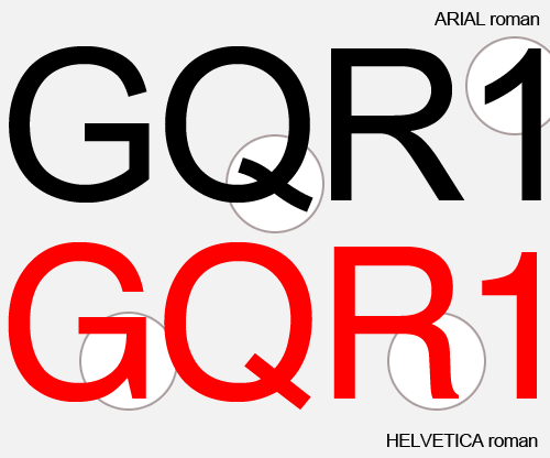
Arial is a passable typeface, but Helvetica is perfection. Arial's key flaw is that it's a knockoff: instead of cloning Helvetica directly, they copied 95% of it and improvised the remainder. This is an unnatural design process that lends itself to inconsistency and awkwardness: inconsistency and awkwardness that you can see with just a quick look at some differences. The Helvetica in that link shows clean lines, exact parallel strokes, straight up modernism. The Arial is schizophrenic: the ungraceful curves of R and 1, the unfinished G.
When you look at a paragraph of Arial dishonesty and confusion stares at you from within. You might not notice it, without having been shown, but it's objectively there nonetheless.
posted by stepheno at 2:59 AM on November 16, 2009 [10 favorites]
Typography's all about black and white. Contrast. The shapes of the characters aren't the most important thing, it's how they all fit together on the page.
Arial is a passable typeface, but Helvetica is perfection. Arial's key flaw is that it's a knockoff: instead of cloning Helvetica directly, they copied 95% of it and improvised the remainder. This is an unnatural design process that lends itself to inconsistency and awkwardness: inconsistency and awkwardness that you can see with just a quick look at some differences. The Helvetica in that link shows clean lines, exact parallel strokes, straight up modernism. The Arial is schizophrenic: the ungraceful curves of R and 1, the unfinished G.
When you look at a paragraph of Arial dishonesty and confusion stares at you from within. You might not notice it, without having been shown, but it's objectively there nonetheless.
posted by stepheno at 2:59 AM on November 16, 2009 [10 favorites]
I'm semi-obsessed with type (although probably more obsessed than I'd care to admit given I got FPPed for writing about once). Indeed, myself and several other semi-obsessives (all of whom work in the publishing industry in some way) actually have an ongoing competition. The objective is to keep an eye out for the most unexpected or inappropriate instance of Comic Sans. Whenever one of us sees it used in a way we feel seta a new low, we grab some evidence (either photo or copy of whatever pamphlet or suchlike it was in).
Every month or so, we then decide who has spotted the most unexpected and/or inappropriate usage since we'd last judged it and they're declared the current "King of Comic Sans" - complete with a certificate and free booze for the evening (yes, unsurprisingly, this competition is generally carried out in a pub).
Anyway, about three months ago now my mother passed away. She'd been battling cancer for about two years but it finally won. Mercifully, she lived a relatively full life until virtually the very end - it was only in the final month, after the cancer spread to her brain, that she detoriated seriously. Then, after a couple of days of serious pain, she slipped into a sleep from which she never regained consciousness and died about three weeks later.
As it happened, I was the only family member with her when she died - it was very early in the morning and we'd been operating a "shift" system during the nights to ensure there was always someone with her.
I took a a minute to compose myself (okay, maybe more than a minute) and then went and woke my dad and the rest of the family. Whilst they were having their own moments, I went to look for the little booklet that said what you had to do next. Towards the end, when it had become clear that she didn't have much time left, the charity people had given her this - it said who to ring, what to ask for etc.
She wouldn't show it to us at the time (said it was "too morbid") but told us it was in the top draw of her bedside cabinet.
Now, as the others had their own moments, I remembered about the booklet and opened the draw. It was there, just like she said it would be.
It was a little A5 booklet with a Lily on the cover. I opened it up and inside it listed in great detail and in formal yet understanding language, who needed to be called and what could be done when.
It was also written entirely in Comic Sans.
Of course I wasn't really thinking entirely clearly at the time and this completely passed me by. At least it did until the very last page. There, scrawled in the corner in my mother's shaky handwriting, complete with an arrow pointing at the printed text below, were the words:
"Comic Sans!!!!"
My mother had known about the competition - I'd told a story about it last year during Christmas Dinner. She also knew that I tend to deal with grief by just getting on with things, and so probably guessed I'd be the person who read the booklet.
We don't give out a certificate to the "King of Comic Sans" anymore. By unanimous decision we have a little plastic silver cup called "The Garius' Mum Memorial Trophy."
I think she'd like that.
posted by garius at 3:42 AM on November 16, 2009 [669 favorites]
"What's wrong with Arial?" is not the right question to ask a font nerd. A better question is this: "If Helvetica didn't exist, but Arial did, would anyone think there was anything wrong with it?"
Arial is hated mostly because it isn't Helvetica. Without the touchstone to compare it with, the knock-off would probably not be disliked by the vast majority of people who hate it. It might not be the designer's favorite choice, but it wouldn't be heaped with the scorn it currently receives.
Comic Sans on the other hand sucks no matter what.
posted by caution live frogs at 5:17 AM on November 16, 2009 [2 favorites]
Dammit garius, your story made me tear up a little.
posted by Uther Bentrazor at 6:25 AM on November 16, 2009 [1 favorite]
posted by Uther Bentrazor at 6:25 AM on November 16, 2009 [1 favorite]
Garius you rule. I read metafilter in Courier. Most of my font optional applications I have the Courier option toggled; fixed space font is easier on your old fogey brain when you learned how to use a computer back in the Paleolithic. I thought the "sans" in comic sans meant it didn't have serifs, not that it didn't have any pictures.
posted by bukvich at 6:52 AM on November 16, 2009
posted by bukvich at 6:52 AM on November 16, 2009
I'm 100% confident that I'll never read a more touching story involving fonts than the one that garius posted.
posted by diogenes at 6:52 AM on November 16, 2009
posted by diogenes at 6:52 AM on November 16, 2009
I'm 100% confident that I'll never read a more touching story involving fonts than the one that garius posted.
Heh. You sure?
Paul Renner (creator of Futura) was persecuted mercilessly by the Nazis. If I remember, the fact that Futura wasn't "German" enough was one of the things that counted very firmly against him.
okay admittedly that's heartbreaking rather than touching I s'pose.
posted by garius at 7:29 AM on November 16, 2009 [5 favorites]
I never thought a post about Comic Sans would kick up enough dust to get some into my eyes.
Thanks for that.
posted by mistersquid at 7:30 AM on November 16, 2009
Thanks for that.
posted by mistersquid at 7:30 AM on November 16, 2009
When you look at a paragraph of Arial dishonesty and confusion stares at you from within. You might not notice it, without having been shown, but it's objectively there nonetheless.
posted by stepheno
Metaphors are by their very nature not objective. There is every possibility that certain people find an unfinished G extra trustworthy or an ungracefully curved R to be clear and unconfusing. I'm not one of those people, but the word "objective" doesn't mean what you seem to think it means.
posted by haveanicesummer at 7:38 AM on November 16, 2009 [1 favorite]
Uther Bentrazor - Dammit garius, your story made me tear up a little.
Me too. My eyes just welled up. Excellent addition garius. Your mom sounds like an awesome lady.
When I saw this headline last night I immediately thought of Cayce Pollard from William Gibson's Pattern Recognition who had an allergic reaction to logos. She couldn't wear or carry anything that showed a logo. Times square would drive her to anaphylactic shock. Surprised that no else mentioned that.
posted by Babblesort at 7:54 AM on November 16, 2009 [1 favorite]
piratebowling's link to the Do Not Lean sign
That's a seriously bad job of typosetting, and I'm not even vaguely anal about typographic quality.
posted by sciurus at 8:16 AM on November 16, 2009
That's a seriously bad job of typosetting, and I'm not even vaguely anal about typographic quality.
posted by sciurus at 8:16 AM on November 16, 2009
I love Comic Sans because it's completely guileless. There's something about it that makes my heart glow and I immediately trust the entity behind the site. I've been surfing a lot of vacation rental sites lately and it's funny how you can use web design and font choice to type someone. (And I totally did *not* spend 10 minutes mousing over the navigation bar here or anything.)
posted by jenh at 8:24 AM on November 16, 2009 [10 favorites]
posted by jenh at 8:24 AM on November 16, 2009 [10 favorites]
I like reading about other people's extreme aesthetic allergies, because it makes me feel better about my own. Reading about some fontwonk having a conniption over kerning makes me feel less insane when I can't stop my self from scowling or sneering when someone walks into the room wearing warm-up pants. or Crocs, or *gasp* both. So loud, such bad texture and hideous hideous design.
Or that taking an active dislike to a stranger because they can't seem to keep their bike chain greased and they just make terrible noises as they schlump down the street with their seat too low and the rear brake caliper rubbing on the godawful nobby off-road tire that came standard with the Magna or whatever cheapass walmart bike they thought would be good enough for a year or so, but will be left abandoned on a pole the first time the rear tire goes totally flat. Left there to rust and decay and serve as monument to the total lack of moral fiber and goodness of the person who decided to buy it in the first place.
flames... flames on the side of my face...
heaving... heavy breaths...
posted by Cold Lurkey at 8:25 AM on November 16, 2009 [1 favorite]
And I totally did *not* spend 10 minutes mousing over the navigation bar here or anything
That's the greatest navigation bar I've ever seen.
posted by garius at 8:38 AM on November 16, 2009
That's the greatest navigation bar I've ever seen.
posted by garius at 8:38 AM on November 16, 2009
> Not caring about it ardgedee, whining about it
The subject of the article was how designers view public typography, some key figures were asked to discuss their relationship with typography, and they provided interesting responses. The article provides no evidence that Beirut, Simonson, et al are inclined to whinge on at the drop of a hat about typography as some horrible stereotypes of fluttering effetes confined to their cork-lined rooms on bad font days.
posted by ardgedee at 8:42 AM on November 16, 2009
My family knows me as a font nerd; I'm not as bad as many, but when something shows up in the news about NBC being sued for misusing fonts, everybody has to tell me about it.
I try to downplay it, but then I see the fake website for Farewell Atlantis, the imaginary in-movie book from 2012, of which they have the covers and a sample chapter for download. When I get to the sample chapter, see the lack of ligatures, missing em-dashes (double dashes in a book?!?), ragged right justification, the wrong kind of barcode on the cover, and I find that, yes, I am just as annoying about typography as everyone says I am.
/sidenote: I have a cousin who is, in fact, named Cooper Black.
posted by AzraelBrown at 8:52 AM on November 16, 2009
A better question is this: "If Helvetica didn't exist, but Arial did, would anyone think there was anything wrong with it?"
If Helvetica had never existed, could Arial have come about? How likely is it that someone would have designed a typeface that looks like Arial without having Helvetica to refer to? While Helvetica was quite idealistic in its modernist lines, Arial makes more compromises (the slanted ends of strokes, for example), and would look rather odd to a world where Helvetica wasn't as plentiful as oxygen.
posted by acb at 9:21 AM on November 16, 2009
I love Comic Sans because it's completely guileless. There's something about it that makes my heart glow and I immediately trust the entity behind the site.
Really? To me it looks like the sort of thing a clueless, passive-aggressive office worker would use to soften an angry memo or notice, along with a good helping of smilies.
posted by acb at 9:24 AM on November 16, 2009 [7 favorites]
Really? To me it looks like the sort of thing a clueless, passive-aggressive office worker would use to soften an angry memo or notice, along with a good helping of smilies.
posted by acb at 9:24 AM on November 16, 2009 [7 favorites]
I'm not one of those people, but the word "objective" doesn't mean what you seem to think it means.
A=A (but only in the right typeface)
posted by acb at 9:25 AM on November 16, 2009
A=A (but only in the right typeface)
posted by acb at 9:25 AM on November 16, 2009
for font nerds everywhere: Typewar
previously
posted by cubby at 9:29 AM on November 16, 2009 [1 favorite]
previously
posted by cubby at 9:29 AM on November 16, 2009 [1 favorite]
It looks like they accidentally printed "Do not loon on dear" and tried to fix it later.
posted by rlk at 9:33 AM on November 16, 2009 [1 favorite]
posted by rlk at 9:33 AM on November 16, 2009 [1 favorite]
I try to downplay it, but...
The thing is, if you know how something is "supposed" to work, yes, it can be offensive to your sensibilities when you see it poorly executed. But in my opinion, as a designer, it's your job to have that relationship with the entire world. I think many focus on type because it's an obscure knowledge with ubiquitous application. Perfect recipe for a bit of snobbery. But that's just knowing about something. Which is not the same as caring about something.
If you love type, then your mind doesn't have room for bad type. And if you live in NYC and love type, then you don't need gps coordinates to know that this is on the corner of 25th and 6th, and the Lubalin Archives are at the Cooper Union, and why worry about the bad, when there's so much good?
posted by billyfleetwood at 10:23 AM on November 16, 2009
When you look at a paragraph of Arial dishonesty and confusion stares at you from within. You might not notice it, without having been shown, but it's objectively there nonetheless.
Okay, I was totally with you and even beginning to appreciate some of the finer points of "font" people until you said that...
posted by Pantengliopoli at 11:42 AM on November 16, 2009
Okay, I was totally with you and even beginning to appreciate some of the finer points of "font" people until you said that...
posted by Pantengliopoli at 11:42 AM on November 16, 2009
When you get right down to it, fonts are an aesthetic issue. Someone can enumerate all the ways in which Comic Sans is wrong, but it's not a science. Comic Sans is just wrong, ugly, stupid, and over-used.
I was going to call Comic Sans the Precious Moments figurine of fonts, but the Crocs analogy is apt. Comic Sans is the Crocs of fonts. Just accept it.
But going back to statuary, Helvetica is the "Michelangelo's David" of fonts. Whereas Arial is the "plaster miniature of Rodin's The Thinker sitting on the toilet, on sale at Spencer Gifts" of fonts.
posted by ErikaB at 12:12 PM on November 16, 2009 [2 favorites]
If I could favorite garius' comment 100,000,000 times, I would.
By the way, for those who prefer it the other way, it already has over 115 favorites.
posted by omegar at 12:43 PM on November 16, 2009
By the way, for those who prefer it the other way, it already has over 115 favorites.
posted by omegar at 12:43 PM on November 16, 2009
For what it's worth, I feel this way about theatrical lighting.
I was at a rock show the other night, and the band on stage was Mucca Pazza--a twenty-person punk marching band with five cheerleaders. There was one bit where the full band was grouped pretty close together in the center of the stage, and brightly lit, but the cheerleaders were standing off the the sides in the dark. I mean, the venue had moving lights, and even had someone at the board, why did they let those folks dance in the darkness?
I didn't mention it to anyone at the time.
posted by Squid Voltaire at 12:47 PM on November 16, 2009 [2 favorites]
Punk cheerleaders left in the dark! Now that is an outrage I can really get behind.
posted by Babblesort at 1:50 PM on November 16, 2009
posted by Babblesort at 1:50 PM on November 16, 2009
I would never hire a graphic designer who wasn't a bit crazy about type, because it's all about attention to detail. If you are going to make something once that many people will see many times, why not spend an extra few seconds getting the kerning correct? If you have a excuse for that, it may be fine in your profession, but you won't be that successful in graphic design unless all you want to do is publish pamphlets for the local charity bake sale. So yes, all this craziness is a justifiable side-effect of someone's profession.
posted by Soupisgoodfood at 2:12 PM on November 16, 2009 [2 favorites]
posted by Soupisgoodfood at 2:12 PM on November 16, 2009 [2 favorites]
Okay, I was totally with you and even beginning to appreciate some of the finer points of "font" people until you said that...
&
Metaphors are by their very nature not objective. There is every possibility that certain people find an unfinished G extra trustworthy or an ungracefully curved R to be clear and unconfusing. I'm not one of those people, but the word "objective" doesn't mean what you seem to think it means.
I think I need to clear it up. My point sounds more pretentious that it is. I'm not using any metaphors, though.
Arial is 'dishonest': it's pretending to be original work. The very process of its own creation—plagiarism—was dishonest. It's 'confused' because it has forced differences from the true original, and loses the overall aesthetic (i.e. parallel lines). This is not subjective, the proof is in the history.
And I'm not a font person! I'm an engineer. See, I even used dumb quotes above.
posted by stepheno at 2:16 PM on November 16, 2009
Mediocre designers obsess over fonts. Good designers obsess over typography.
posted by Mcable at 2:18 PM on November 16, 2009
posted by Mcable at 2:18 PM on November 16, 2009
You know you die a little every time you pass one of those new highway signs.
Anybody else really, really hate the new Clearview-fonted highway signs? It's true that I'm sentimental and love the old highway sign font, but I don't find the new signs easier to read at all, and the kerning just seems goofy on most of the updated signs I've seen.
posted by jenh at 4:17 PM on November 16, 2009 [1 favorite]
Really? To me it looks like the sort of thing a clueless, passive-aggressive office worker would use to soften an angry memo or notice, along with a good helping of smilies."
Yes!
posted by radioamy at 8:01 PM on November 16, 2009
Yes!
posted by radioamy at 8:01 PM on November 16, 2009
Can someone explain the Gap sign? How did someone manage to switch F for S? Or did I not read that paragraph correctly?
posted by radioamy at 8:02 PM on November 16, 2009
posted by radioamy at 8:02 PM on November 16, 2009
Can someone explain the Gap sign? How did someone manage to switch F for S? Or did I not read that paragraph correctly?
The Long s -- you know, the one that looks like an f.
posted by Methylviolet at 9:26 PM on November 16, 2009
The Long s -- you know, the one that looks like an f.
posted by Methylviolet at 9:26 PM on November 16, 2009
I hate Clearview road signs as well. I don't want my tax dollars going to a crappy new committee-designed font.
posted by scrowdid at 5:50 AM on November 17, 2009
posted by scrowdid at 5:50 AM on November 17, 2009
If Helvetica didn't exist, but Arial did, would anyone think there was anything wrong with it?Yes, we would, because its characters mix humanist and grotesk forms. (The R, for example.) It is true that some other features of Arial, like angled stem of t, are found in other grotesks. It’s just that Arial is inconsistent with itself and its siblings.
posted by joeclark at 10:42 AM on November 17, 2009
One of the advantages of being a typeface designer, I'm told, is that you have the right to name the font you design. I heard this in the context of a story about a chap who designed an exclusive in-house font for a large company to use, and they were a bunch of schmucks. The name he chose for their font? "Foreskin."
This may be an apocryphal story.
posted by lapsangsouchong at 7:06 PM on November 17, 2009
This may be an apocryphal story.
posted by lapsangsouchong at 7:06 PM on November 17, 2009
> One of the advantages of being a typeface designer, I'm told, is that you have the right to name the font you design.
Chank Diesel had no problem giving his fonts name like Dutch Oven, Eatpoo, Chunder and Fucker. Even in the world o' type Foreskin barely registers on the offense-o-meter.
posted by ardgedee at 9:09 PM on November 17, 2009 [2 favorites]
Chank Diesel had no problem giving his fonts name like Dutch Oven, Eatpoo, Chunder and Fucker. Even in the world o' type Foreskin barely registers on the offense-o-meter.
posted by ardgedee at 9:09 PM on November 17, 2009 [2 favorites]
« Older Sin Sisamouth | Su d'oh ku! Newer »
This thread has been archived and is closed to new comments
posted by Balisong at 6:13 PM on November 15, 2009 [2 favorites]