Johnson vs. Johnston
February 13, 2010 3:45 PM Subscribe
London's transport system has a visual identity instantly recognised (and often imitated) around the world, of which a key part is Edward Johnston's typeface, originally designed for the London Underground.
(Previously.) However, this may not be the case for much longer; the Mayor of London, Boris Johnson, has revealed plans to give all official London bodies a unified identity, based on that of the Visit London tourism campaign. There is already a Facebook group protesting the proposal.
It's this kind of "let's unify everything" thinking that led to the awful NYC Taxi Logo. Let's hope London doesn't make similar mistakes.
posted by TrialByMedia at 4:08 PM on February 13, 2010
posted by TrialByMedia at 4:08 PM on February 13, 2010
I wonder what Boris would do with a fucking clue if he ever got his hands on one. Eat it, probably.
posted by Grangousier at 4:10 PM on February 13, 2010 [12 favorites]
posted by Grangousier at 4:10 PM on February 13, 2010 [12 favorites]
If only someone would propose a TV show called "Self-Important, Power-Crazed Old Etonians Nailed to Trees and Burned Alive". That would be good for a laugh. I'd watch that show, even if it was on E4.
posted by Grangousier at 4:14 PM on February 13, 2010 [8 favorites]
posted by Grangousier at 4:14 PM on February 13, 2010 [8 favorites]
What is the point in visually unifying things?
So that we can all agree on things all the time.
Right?
posted by Elmore at 4:20 PM on February 13, 2010
So that we can all agree on things all the time.
Right?
posted by Elmore at 4:20 PM on February 13, 2010
LEAVE JOHNSTON ALONE!!
posted by teferi at 4:28 PM on February 13, 2010 [1 favorite]
posted by teferi at 4:28 PM on February 13, 2010 [1 favorite]
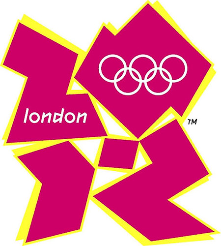
Look at the bright side; at least he didn't choose the font from the 2012 Olympics Logo.
posted by ZenMasterThis at 4:31 PM on February 13, 2010 [1 favorite]
posted by ZenMasterThis at 4:31 PM on February 13, 2010 [1 favorite]
Never going to happen. If this is executed and lasts for a year, I will go to the Black Horse on Rathbone St. in London in a bunny suit and buy every attending Metafilter member a pint. You can hold me to this.
I'm confident that this is bullshit and you have short memories, but feel free to hold me to this.
posted by Mayor Curley at 4:53 PM on February 13, 2010 [15 favorites]
I'm confident that this is bullshit and you have short memories, but feel free to hold me to this.
posted by Mayor Curley at 4:53 PM on February 13, 2010 [15 favorites]
If it does happen, it probably won't stick; a generic, nondescript sans-serif, whose only raison d'etre seems to be that, in today's age, Helvetica has too much baggage, wouldn't fill Johnston's shoes, and within the decade, the vultures (in the form of politicians/bureaucrats/marketeers seeking to score some points by having a go at redesigning it themselves) would start circling. After a few iterations, London would probably end up much like Toronto, an uninspiring mess of Helvetica knockoffs or whatever was considered the fashionably modern thing to do at the time.
Common sense says that it won't happen, though common sense also said that Londoners wouldn't vote for someone as inexperienced as Boris Johnson.
posted by acb at 5:07 PM on February 13, 2010
Common sense says that it won't happen, though common sense also said that Londoners wouldn't vote for someone as inexperienced as Boris Johnson.
posted by acb at 5:07 PM on February 13, 2010
Look at the bright side; at least he didn't choose the font from the 2012 Olympics Logo.
Holy shit, is that the actual logo? Who came up with that, Logos Galore?
posted by Crane Shot at 5:26 PM on February 13, 2010
Holy shit, is that the actual logo? Who came up with that, Logos Galore?
posted by Crane Shot at 5:26 PM on February 13, 2010
Well, this is what happens when you let the Worshipful Company of Management Consultants have a say in picking the mayor but not the voters!
Er, wait.
posted by delmoi at 6:15 PM on February 13, 2010
Er, wait.
posted by delmoi at 6:15 PM on February 13, 2010
Holy shit, is that the actual logo? Who came up with that, Logos Galore ?
We had a thread on that.
posted by delmoi at 6:16 PM on February 13, 2010
We had a thread on that.
posted by delmoi at 6:16 PM on February 13, 2010
This is, incidentally, the same mayor scrapping a perfectly good bus fleet on entirely sentimental grounds (he preferred the charming but horribly outdated buses that preceded the new ones), and the same mayor who threw a public tantrum over TFL's removal of the Thames from the Tube map (the river was removed to clarify the design; Johnson demanded its restoration).
So it seems sweeping away an iconic bit of London is a horrible injustice that must be righted at grotesque public expense when it's someone else doing the sweeping, unless it's Johnson doing the sweeping, in which case it's modernisation.
Delmoi, you have confused the Lord Mayor of the City of London - a ceremonial role applying only to the Square Mile - with the actual mayor of London who was actually directly elected by the populace, god help us all.
posted by WPW at 7:09 PM on February 13, 2010 [1 favorite]
Incredibly fucking stupid idea, if you ask me. If it's not broken, don't fix it. And this comes from one that eats logos and craps corporate image for a living, with a side of actively battling the "we have a new director/CEO/boss/owner, we must redesign EVERYTHING NOW so it looks like we're taking care of something" attitude, even if there's good money to be made there for a designer.
Now, to the TL;DR irrelevant anecdote: on 7/7/2005, when the London bombings happened, I was emotionally involved (or, "quite pissed") for a series of reasons, including that at that time I had some work with a publisher located steps away from one of the tube stations where it happened, my SO has lived for some time in London, and, last but not least, I always admired the design of the underground signage.
Out of that I mindlessly scrawled a few doodads on the side of an artwork I was working on, and posted them on flickr; a few variations on the roundel, with defiant statements on them, in the "bugger off" London attitude I learned to love through the years. They took off quite rapidly (now you'd say they went 'viral') and people started asking for tshirts. So I set up a blog and a shop and started selling them at cost, with a reasonable overhead going to the relief fund set up by then mayor Livingstone and the Red Cross. It took off even more, and the US and UK branches of the printing company offered to match the total overhead I would have made with an equivalent donation (which was pretty nice of them).
A word of advice: don't do that when the object of the design is derivative work from the logo system of a very established company or institution: I received a C&D email from TfL (Transport for London, the public transport company) about a week later. They are very, very careful of their image and intellectual property, and with good reason. I picked up the phone, we talked about our respective motives, and I offered to pull everything down. The lawyer I spoke to said that as long as I hadn't personal gain from the sales they'd be fine with that, and that he'd have to consult with the IP supervisor to confirm everything; we hung up amicably. A few hours later, I received a fax in which they granted me usage of their logo for derivative work until a certain date. I was screaming and jumping up and down my studio. In the end, a nice number of tshirts were sold, then my 'license' expired, I replaced the 'infringing' designs with originals, sold a few more, and then finally called it a day, sending a nice check to the relief fund.
Which is why I love the London Underground logo and I think it should stay that way.
posted by _dario at 7:53 PM on February 13, 2010 [12 favorites]
Look, this just makes sense, folks. After all, what is it tourists are after when they visit a thriving city with a tradition of messy multiculturalism dating back to ancient times? Exactly: they want total homogeneity, preferably in a trendy style that will date very quickly, imposed by above by some no-chin schmucks fresh out of an MBA mill. It just makes sense.
posted by No-sword at 8:30 PM on February 13, 2010 [5 favorites]
posted by No-sword at 8:30 PM on February 13, 2010 [5 favorites]
Cameron Booth did a lovely interpretation of the US Federal Highway System using the Tube style fonts and colors.
posted by a womble is an active kind of sloth at 8:42 PM on February 13, 2010 [3 favorites]
posted by a womble is an active kind of sloth at 8:42 PM on February 13, 2010 [3 favorites]
Completely pointless. Boris was meant to be a common sense sort of guy...
posted by DanCall at 2:18 AM on February 14, 2010
posted by DanCall at 2:18 AM on February 14, 2010
Common sense? Are you having a joke? I resent my fellow Londoners who voted this imbecile into office.
posted by Lleyam at 2:28 AM on February 14, 2010
posted by Lleyam at 2:28 AM on February 14, 2010
If only someone would propose a TV show called "Self-Important, Power-Crazed Old Etonians Nailed to Trees and Burned Alive". That would be good for a laugh. I'd watch that show, even if it was on E4.
Since they're removing Friends from their line-up next year, E4 are going to have to milk Boris for a lot longer than that if they want to fill the schedule.
Hmm. Milking Boris. Hmm. Get me the commissioning editor of E4 and a pump!
posted by ArmyOfKittens at 3:22 AM on February 14, 2010
Since they're removing Friends from their line-up next year, E4 are going to have to milk Boris for a lot longer than that if they want to fill the schedule.
Hmm. Milking Boris. Hmm. Get me the commissioning editor of E4 and a pump!
posted by ArmyOfKittens at 3:22 AM on February 14, 2010
_dario that's an awesome story.
posted by dabitch at 3:25 AM on February 14, 2010 [1 favorite]
posted by dabitch at 3:25 AM on February 14, 2010 [1 favorite]
Holy shit, is that the actual logo? Who came up with that, Logos Galore ?
Funnily enough the marketing firm that has won the rebranding job is Saffron - chaired by Wally Olins, of Wolff Olins, the people responsible for that very logo. Small world.
posted by ntrifle at 3:37 AM on February 14, 2010
Funnily enough the marketing firm that has won the rebranding job is Saffron - chaired by Wally Olins, of Wolff Olins, the people responsible for that very logo. Small world.
posted by ntrifle at 3:37 AM on February 14, 2010
Before everyone starts getting ranty, there's bugger-all to substantiate Marketing's story. I've been trying to chase this down ever since it popped up on the marketing site.
My findings so far:
1) there's nothing in the original tender about the typeface replacing Johnston (as far as I've been able to ascertain).
2) TfL knew bugger all about it when I emailed their press office (and I've got a pretty good relationship with them so their normally very honest with me). All my unofficial sources within the organisation came up blank as well. After doing some serious digging this week the most I've been able to find is that it looks like there's some vague talk from the Mayor's office about looking at whether the new serif might feature on some TfL products if its successful, which TfL have politely chosen not to simply laugh off. They have absolutely no intention of making any typographical changes on the transport infrastructure.
3) When I spoke to the mayor's office they also denied that there was any intention to replace Johnston either on the Underground or as TfL's official typeface.
At the end of the week, TfL also gave me the following:
"The Mayor's office is seeking to develop a new brand for London which could be extended to the GLA family including TfL. This work is at an early stage but no changes are planned to the London Underground and TfL family of roundels or the New Johnston typeface used on station signage."
Was hoping to have to avoid doing a post on this on the London Reconnections because everything about the Marketing piece screamed "unsubstiantiated generalisation" when I read it, but looks like its probably worth me putting something up.
posted by garius at 4:41 AM on February 14, 2010 [8 favorites]
Right. My findings (or rather the lack of them) for anyone who cares (apologies for the self link).
Obviously I'll carry on digging and be keeping an eye on this, but I've been trying all week to try and find something that substantiates marketing's story and I really, really can't.
posted by garius at 5:14 AM on February 14, 2010 [5 favorites]
Obviously I'll carry on digging and be keeping an eye on this, but I've been trying all week to try and find something that substantiates marketing's story and I really, really can't.
posted by garius at 5:14 AM on February 14, 2010 [5 favorites]
You’re getting this all wrong.
An identity is more than a typeface, but if that’s all the MeFi nerds can see, let’s talk about that. Johnston has to be reserved for transport. Everything else can use a single typeface family. I see little to merit the Avenir clone barely discernible on the Visit London Web site. The principle is nonetheless sound. (Though it will surely conflict with the Legible London project, which I guess nobody thought about.)
Living as I do in a city the celebrates mediocrity and actually manufactures stainless-steel letters in Arial for official public buildings, any city that takes graphical unification seriously is OK by me. Haters just don’t know what they’re talking about, and/or haven’t even bothered to look at pictures from places that value design and do it right, like Scandinavian cities.
Remember: MetaFilter is a place where people argue in favour of neutral quotation marks. Your objections, while noted, are based on less than nothing.
posted by joeclark at 7:29 AM on February 14, 2010
garius, that's very reassuring.
joeclark, I don't think people are arguing against a coherent graphic identity for the city; they're arguing against scrapping London Transport's justly world-famous graphic identity. That was certainly my intent, anyway.
posted by WPW at 7:41 AM on February 14, 2010
joeclark, I don't think people are arguing against a coherent graphic identity for the city; they're arguing against scrapping London Transport's justly world-famous graphic identity. That was certainly my intent, anyway.
posted by WPW at 7:41 AM on February 14, 2010
I leave the country for five mins and look what they do. Fuckheads. It was cool when they rolled out the TFL logo to docklands, buses, taxis creating a unified image, but what the fucks that got to do with films or tourist events.
posted by Not Supplied at 8:14 AM on February 14, 2010
posted by Not Supplied at 8:14 AM on February 14, 2010
I can't imagine this being followed through. The cost of replacing everything New Johnston with something else would be horrendous.
posted by carter at 8:51 AM on February 14, 2010
posted by carter at 8:51 AM on February 14, 2010
Hahahaha....
Oh shit. I just remembered ...
I live in the city that binned apostrophes.
posted by srboisvert at 9:46 AM on February 14, 2010
Oh shit. I just remembered ...
I live in the city that binned apostrophes.
posted by srboisvert at 9:46 AM on February 14, 2010
ignorant bastard's
posted by Not Supplied at 10:31 AM on February 14, 2010
posted by Not Supplied at 10:31 AM on February 14, 2010
places that value design and do it right, like Scandinavian cities.
Such as Göteborg? I'll remain somewhat skeptical.
posted by effbot at 10:50 AM on February 14, 2010
Such as Göteborg? I'll remain somewhat skeptical.
posted by effbot at 10:50 AM on February 14, 2010
This is wrong on so many levels. That typeface has been associated with the London Underground for so long that it would be a tragedy to change it.
posted by tallmiddleagedgeek at 11:17 AM on February 14, 2010
posted by tallmiddleagedgeek at 11:17 AM on February 14, 2010
Delmoi, you have confused the Lord Mayor of the City of London - a ceremonial role applying only to the Square Mile - with the actual mayor of London who was actually directly elected by the populace, god help us all.
That was a joke :P
posted by delmoi at 7:55 PM on February 14, 2010
That was a joke :P
posted by delmoi at 7:55 PM on February 14, 2010
« Older Keep firing, Assholes! | This is not the time to send out a signal like... Newer »
This thread has been archived and is closed to new comments
posted by AsYouKnow Bob at 4:03 PM on February 13, 2010 [5 favorites]