How To Look at Mondrian
October 15, 2010 6:36 PM Subscribe
How to Look at Mondrian by James Elkins
(Elkins wrote one of my favorite books. This is supposed to be the first of a series.)
(Elkins wrote one of my favorite books. This is supposed to be the first of a series.)
tl;dr version: Slow down, look closer, think.
Couldn't agree more.
posted by basicchannel at 6:58 PM on October 15, 2010
Couldn't agree more.
posted by basicchannel at 6:58 PM on October 15, 2010
That was really cool and useful. I like art (and hate people who go "oh but my kid could do this") but to my chagrin have never totally gotten Mondrian. I'd read a lot of blogs like this.
posted by Solon and Thanks at 7:05 PM on October 15, 2010
posted by Solon and Thanks at 7:05 PM on October 15, 2010
I don't know, some of that article, the parts about copying the Mondrian, trying to get the texture of the paint right, the edges of the lines, etc. reminded me about the end of the pot roast. Which is to say, when cooking a pot roast, you cut the end off. Why? Because mom did it that way. Why did mom do it that way? Because her mom did it that way. Why did grandma do it that way? Turns out it was only because the pan she had was a bit small, and that's how she made it fit. I get the feeling they're looking at details that the painter himself probably didn't give that much thought to. He used thin black paint for the lines maybe because what he had Mars Black, and, guess what, it's thin. He laid the yellow on thick because he had to to get good coverage, etc. Overthinking the plate of beans, I suspect.
posted by smcameron at 7:10 PM on October 15, 2010 [19 favorites]
posted by smcameron at 7:10 PM on October 15, 2010 [19 favorites]
Ditto to smcameron. If Mondrian had had vector graphics available to him, he no doubt would have used that instead. This is a fetishizing of detail, and a complete missing of the point. The question isn't how, it's WHY.
posted by leotrotsky at 7:15 PM on October 15, 2010 [2 favorites]
posted by leotrotsky at 7:15 PM on October 15, 2010 [2 favorites]
That was great. I had no idea of the amount of effort Mondrian put into his works.
posted by Blazecock Pileon at 7:19 PM on October 15, 2010
posted by Blazecock Pileon at 7:19 PM on October 15, 2010
I think it's a load of hogwash. It's an academic argument, and worse, a sub-argument of a larger argument.
First, are designers great artists? No, says the author cleverly, Mondrian has a "painterly" quality to his works. Here, let me show you the amateurish attempts my students made in duplicating his lush style!
So, not only is Elkins slagging those who don't paint or sculpt, artists preferring to deal with pure design elements, he's doing his damnedest to "rescue" Mondrian from the ghetto of those lesser artistic lights, by pointing out complex techniques Mondrian (may) have used.
All the while, admitting with a flutter of hand-waving, the intent of the artist was to experience the works at a distance, where the purity of their design would be the overwhelming force in play, not the messy bits the artist finagled in order to realize his vision.
While it is interesting to see how Mondrian coped with the materials available to him, it utterly and completely abnegates De Stijl to insist that technique, and not vision, makes the painting.
And that's the point: To assassinate De Stijl, ruin it in the eyes of art neophytes before they can get a good understanding of what it stood for, what it meant, and how it influences art even today. Because real artists paint, and pigment on canvas is more important than image and vision.
Get bent, Elkins. Next you'll be explaining how Stieglitz wasn't really a photographer.
posted by Slap*Happy at 7:25 PM on October 15, 2010 [8 favorites]
Reading this, I was reminded of the Zen exercise: Sign your name. Now take a thin piece of paper and TRACE your own autograph. The tracing will look awkward and just...wrong. The unconscious effort we put into things is much more genuine then the conscious and often self-conscious effort we make.
posted by Dmenet at 7:28 PM on October 15, 2010 [11 favorites]
posted by Dmenet at 7:28 PM on October 15, 2010 [11 favorites]
How to Look at James Elkins by Mondrian
posted by nervousfritz at 7:53 PM on October 15, 2010 [3 favorites]
posted by nervousfritz at 7:53 PM on October 15, 2010 [3 favorites]
Some missing of the point here by some commenters, I think. He's not saying Mondrian wanted the rough edge of this line to be just so wavy in just the right place, and for there to be exactly five layers on this white panel, and not four or six, for that wouldn't be good art.
Mondrian painted this piece in a way that he felt expressed his vision. That it had these particular details was pure accident, but the point is that it has details, if you look closely enough.
Mondrian could have painted exactly one coat of each color with razor sharp line edges and minimal brush marks and 99% of viewers of the piece wouldn't know the difference. And 99% of people trying to copy it probably take that simplistic approach because the don't really look at the piece.
Good art has a quality that isn't in the details, but exists because of the details. And seeing the details makes us understand it a little bit more.
posted by rocket88 at 8:19 PM on October 15, 2010 [10 favorites]
"He's not saying Mondrian wanted the rough edge of this line to be just so wavy in just the right place, and for there to be exactly five layers on this white panel, and not four or six, for that wouldn't be good art."
Then why try to copy such details, and judge the efforts a failure when they don't match up?
"My student and I studied that, but again his copy failed, because he couldn't get just the right texture of paint--Mondrian's paint was sticky, and the bristles on his brushes were stiff. My student ended up with an ugly ridge of paint:"
"Good art has a quality that isn't in the details, but exists because of the details."
A sentence with no meaning.
posted by smcameron at 8:24 PM on October 15, 2010 [2 favorites]
yea, as an artist myself, all the supposed methods Mondrian used to achieve subtle textures sounds just like the things I would do to achieve an even surface if I was working with thick oil paint and stiff brushes.
posted by 5_13_23_42_69_666 at 8:26 PM on October 15, 2010 [1 favorite]
posted by 5_13_23_42_69_666 at 8:26 PM on October 15, 2010 [1 favorite]
That last sentenceby rocket88 makes sense to me, this is how I interpreted it: "it's not the close examination of every minute detail that is interesting or valuable of art, but the fact is that these details culminate into something greater than their individual parts. And in understanding the small details, we gain a greater overall appreciation of the piece."
He just said it in a more succinct and elegant way.
posted by artificialard at 9:02 PM on October 15, 2010
He just said it in a more succinct and elegant way.
posted by artificialard at 9:02 PM on October 15, 2010
Yes. What b1tr0t said. Particularly true when the original is large, but the detail small.
posted by Ahab at 9:22 PM on October 15, 2010
posted by Ahab at 9:22 PM on October 15, 2010
This is all very kind of interesting, but doesn't really have much to do with what Mondrian was trying to do. What he was trying to say. What he meant viewers to see. How his work fits in with the progression of painting. What color is.
It's a bit like obsessing about what kind of reeds John Coltrane used and the acidity of his saliva.
Point taken, though: my five-year old couldn't do it.
posted by kozad at 9:33 PM on October 15, 2010 [1 favorite]
It's a bit like obsessing about what kind of reeds John Coltrane used and the acidity of his saliva.
Point taken, though: my five-year old couldn't do it.
posted by kozad at 9:33 PM on October 15, 2010 [1 favorite]
I don't know, some of that article, the parts about copying the Mondrian, trying to get the texture of the paint right, the edges of the lines, etc. reminded me about the end of the pot roast. Which is to say, when cooking a pot roast, you cut the end off. Why? Because mom did it that way. Why did mom do it that way? Because her mom did it that way. Why did grandma do it that way? Turns out it was only because the pan she had was a bit small, and that's how she made it fit.
Pffft. No. She cut the end off because that's the BEST PART of a pot roast and she was sneakily saving it for herself. You didn't even know that was the best part until years later and then you'd beg for the end piece and she'd give it to you, grudgingly, but cut it smaller than usual. Then she'd cut herself a piece at a weird angle so she still got a big slice of edge.
Oh man, my mom makes the best pot roast.
posted by maryr at 9:34 PM on October 15, 2010
> I can see how people can find 20th century art boring if they have only ever studied it in
> books, or worse on computer screens
If that were true, why would it only apply to 20th c. art? I've never seen anything by, oh, Paul Bril any way but electronically, but I can't say I find stuff like this (3543px × 2421px) boring because of that. In fact it makes me stare and stare, and then stare some more. Are you people are even looking at what's out there to be looked at? Prima facie, you're not.
posted by jfuller at 9:36 PM on October 15, 2010 [1 favorite]
I was at the Rodrigue studio in the french quarter two weeks ago. I've never had much interest in the blue dog paintings - I know they exist, I know some people like them, I'm a watercolor nut myself. For some reason, standing a few feet from the paintings - I was drawn into that ridiculous dog's gaze like a moth to a flame. My compatriot and I spent the better part of an afternoon gazing wide-eyed at his paintings. I'll never see modern art the same way again. It changed my mind in a profound way. You have to go there, you have to see the paintings, you have to see the actual thing itself.
posted by Baby_Balrog at 9:37 PM on October 15, 2010
posted by Baby_Balrog at 9:37 PM on October 15, 2010
The whole is greater than the sum of its parts.
That being said, I think they are overthinking this. What strikes me is that Mondrian was somewhat inconsistent in his style. This may be attributed to whimsy, convenience, genius, or accident. It strikes me as...inconsistent.
It's totally true though, that invisible details can change the character of a work. I can't say that Mondrian intended this or just got lucky. I'd have to see the work up close and personal, to judge for myself. I had always thought that Mondrian's work was notable for it's composition - honestly I had not thought much about the execution. It's something worth considering.
Sort of reminds me of the electrical work on a job I was working at once. Opened up the electrical panel, and all the conductors were laid in nicely, with carefully turned bends where they went into the busbar. The conductors were all evenly spaced, and the insulation was trimmed consistently, almost perfectly. They were trimmed so that each conductor extended the same distance into the bus.
It was so refreshing to just look at it, and to admire the work done by someone who clearly cared. All the effort, for something that few people would ever see, and fewer would appreciate. I like to think that the craftsman who installed it had taken the same care with the rest of the work.
posted by Xoebe at 9:49 PM on October 15, 2010 [3 favorites]
The evidence of micro-adjustments, which have always been visible to the naked eye, went a long way towards the credibility of Mondrian's minimalism.
"But its just lines and squares."
"No, look closer, he laboriously moved lines back and forth a fraction of a millimeter, because only one line is the perfect line."
"Oh, I see, those must be very special lines."
posted by StickyCarpet at 10:11 PM on October 15, 2010
"But its just lines and squares."
"No, look closer, he laboriously moved lines back and forth a fraction of a millimeter, because only one line is the perfect line."
"Oh, I see, those must be very special lines."
posted by StickyCarpet at 10:11 PM on October 15, 2010
I don't understand all the hate here. Did Elkins also write De Stijl is Bullshit LOL or something? All I see is a dude showing, close-up style, the technical details of Mondrian achieved the effect he was after. The takeaway is not "PAINTING RULES DESIGN DROOLS" or "Pure imagery fail!" or anything like that, it's, "Hey, it actually involved a lot of fine and delicate work to get this overall effect — isn't that interesting?"
If you don't find it interesting, that's cool, but why get pissy about it? He's not declaring this THE official way to understand Mondrian, he's not using scanner powers to prevent you from ever experiencing the painting from a distance again. It's like getting mad at a pianist because he tells you that actually those Bach compositions that seem to unfold naturally and effortlessly are a real bear to play.
posted by No-sword at 11:38 PM on October 15, 2010 [4 favorites]
jfuller: "If that were true, why would it only apply to 20th c. art?"
Not only, but perhaps particularly.
By way of analogy you can listen to Boroque piano music and pay little attention to the meter and pulse. You can also listen to Balinese gamelon and pay little attention to the meter and pulse. The piano stuff will still have much to offer. The gamelan becomes quite uninteresting. Alternatively you could instead listen in a way that ignores melody, harmony, tonality and the gamelan stays engaging but the piano music would become boring.
As a composer I am in no position to assert that texture and fine detail are more important in 20th century art than to prior art. But at the very least this is a reasonable possibility.
posted by idiopath at 12:35 AM on October 16, 2010 [1 favorite]
Well, come to think of it there are interesting harmonic and melodic things going on in Balinese gamelan. A better example would have been taiko.
posted by idiopath at 12:51 AM on October 16, 2010
posted by idiopath at 12:51 AM on October 16, 2010
I really appreciate the speculation and attention to painterly detail in the article. But does Elkins paint? Because the details he is calling our attention to have more to do with the universal qualities of paint--of which a painter would be aware-- than the aesthetic decisions of Mondrian. For example, a pure yellow plane will most likely be thicker than a black plane because yellow oils are translucent, and blacks are opaque and matte when dry. And oils on canvas, even when masked, will bleed a bit under tape or gum, so a hard edge will need to be cleaned up (look at a Frank Stella painting for example, what seems to be a hard edge bleeds a little bit). I might be wrong, but I don't think any of this has much to do with the meaning of the piece. I think that if one really wants to know How To Look at Mondrian, then read up on Theosophy.
posted by Benjamin Nushmutt at 12:51 AM on October 16, 2010
posted by Benjamin Nushmutt at 12:51 AM on October 16, 2010
I read this, hoping for something like the understanding I got when I saw work by Warhol and Pollock for the first time. Images that had had no meaning suddenly jumped out at me and made me understand on a gut level. Unfortunately, he started from the assumption that this painting was incredible and worth close study, instead of telling me why I should care about it. I suppose I'm in the wrong audience here, but I was hoping for some insight into Mondrian's stylistic elements, color choice, line placement, etc. Instead I get stuff about brush strokes and layers of paint.
So what am I missing here? Why does everyone go nuts for Mondrian? All I see is a draftsman, not an artist. And not even a draftsman having a good joke.
posted by Hactar at 1:25 AM on October 16, 2010
So what am I missing here? Why does everyone go nuts for Mondrian? All I see is a draftsman, not an artist. And not even a draftsman having a good joke.
posted by Hactar at 1:25 AM on October 16, 2010
Well, apart from that I like looking at some of Mondriaan's things, I for a long time didn't "get" it either.
Then they had a large exhibition at the Gemeentemuseum in The Hague (mid 80s), where very many of his paintings had been hauled to one place and arranged chronologically. Now you could see how he reached the later stages of abstraction by slow, sometimes careful, steps; starting with landscapes, people, and some rather Dutch themes like mills etc. (these days, picture-googling early piet mondriaan does a bit of the same for those interested).
From some point, the black lines gradually seem to kick in, and everything moves from there stepwise towards the now-seen-as-typical colorful rectangles and black edges. That made his later style more understandable for me, as points in a lifetime project.
You see a glimpse of that in the explanation of how and why he decided to stop the black edges inside the panel.
As a total outsider one may wonder whether all that's enough, because we can't really see it if we don't look carefully. But that's not the point. Mondriaan did not slowly work himself toward abstraction because he knew there would be a hype about his stuff later; he did what he thought he should do, and that's that, then.
posted by Namlit at 3:00 AM on October 16, 2010 [2 favorites]
a large exhibition at the Gemeentemuseum in The Hague (mid 80s), where very many of his paintings had been hauled to one place and arranged chronologically
ooh I would love to see that. That would be how to look at Mondrian
posted by 5_13_23_42_69_666 at 3:33 AM on October 16, 2010
ooh I would love to see that. That would be how to look at Mondrian
posted by 5_13_23_42_69_666 at 3:33 AM on October 16, 2010
On a more practical note, check that the site of your Mondrian museum has the right hours, otherwise you won't be looking at Mondrian.
posted by ersatz at 4:25 AM on October 16, 2010 [1 favorite]
posted by ersatz at 4:25 AM on October 16, 2010 [1 favorite]
I get the feeling they're looking at details that the painter himself probably didn't give that much thought to. He used thin black paint for the lines maybe because what he had Mars Black, and, guess what, it's thin. He laid the yellow on thick because he had to to get good coverage, etc. Overthinking the plate of beans, I suspect.
There's nothing wrong with that statement, but it assumes a specific way of looking at art -- one that is absolutely not my way. Which is not to say my way is right and yours is wrong. But I want to make clear that there are other ways of reacting, ones where your statement is meaningless.
Your way, if I understand it, has something to do with trying to figure out the artist's intentions: if Modrian "didn't give much thought" to some aspect of his work, why should you care about it? If you care about something that bored or didn't matter to Mondrian -- especially if you REALLY care about it -- you're over-thinking.
Fine. But my way of looking at art is to realize that regardless of what the artists intended (something we can never really know until our psychic powers kick in), he created an object and that object exists. It has properties. Those properties exist, regardless of whether or not the artist cared about them.
If you want to say that certain properties of a work are intrinsically uninteresting, I can enter that discussion with you (though we may disagree about which properties are interesting), but if you tell me that a property is uninteresting because the artist wasn't interested in them, that doesn't mean anything to me. I am interested in them because they interest me. Because I find them interesting. Because they emotionally move me or make me think.
I also feel this very intently about the things I create. I have a play that I directed that's running right now. My feeling is that EVERYTHING that's onstage is a part of that play, whether I care about it or not.
For instance, in the play, the actors drink beer out of standard beer glasses. To be honest, when we were gathering props, I didn't put much thought into the glasses. The ones we found looked good enough, so we bought them, used them, and moved on. Meanwhile, we spent a lot of time talking and thinking about picture frames (there are photos on the wall of the set). So I didn't care about the glasses but I did care about the frames.
From the point of view of the audience, it doesn't matter, and I don't think it should. If an audience member thinks I made a bad choice when it comes to the glasses -- or if he writes an essay praising the graceful curves of the glass and how they refract the light that shines through them -- that's fair enough.
It doesn't happen to be what I'm interested in, but at this point, I am no longer "the artist." I was the artist while I was directing the play. But I'm not directing it anymore. Now I am just like the other people in the audience. I am watching the play. I am reacting to it. My reactions, though important to me, have no more universal importance than yours or anyone else's.
What was important to me while I was directing the play no longer exists. Those "that's important" thoughts were neural patterns that existed in my brain only -- and in the past. What exists now is the "object," the play. It is what it is.
posted by grumblebee at 9:07 AM on October 16, 2010 [2 favorites]
> Now you could see how he reached the later stages of abstraction by slow, sometimes
> careful, steps; starting with landscapes, people, and some rather Dutch themes like
> mills etc. (these days, picture-googling early piet mondriaan does a bit of the same
> for those interested).
Was interested, did that, and repeat-search pretty regularly because previously unavailable stuff continues to appear on the web at a prodigal rate. (Not just for Mondrian, for anybody you happen to be interested in. Thank Ghod HD storage is cheap!)
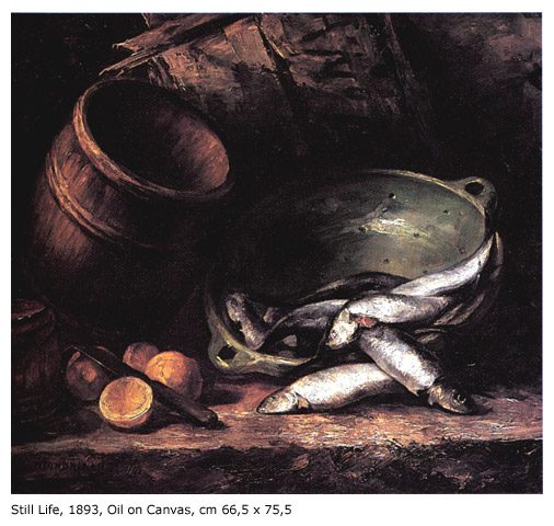
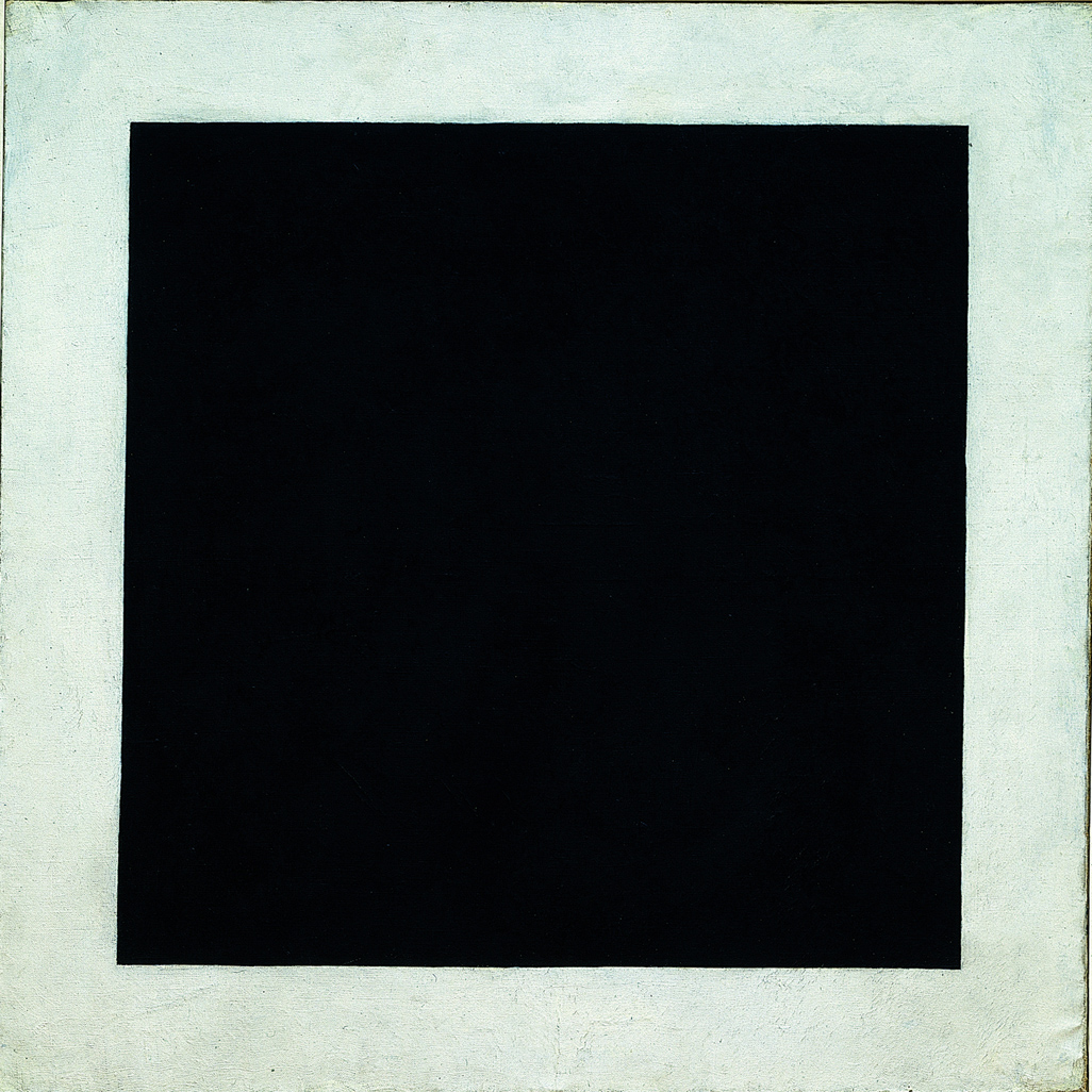
Here's a very nice pre-colored-rectangles Mondrian at a resolution (1600 × 1381) that shows a good bit of the brushwork. And here a small reproduction of a very very early Mondrian (painted at age 20 or 21) that's worth looking at for the holy-sh*t factor alone ("Holy sh*t, that's Mondrian? You mean the Mondrian?" Yep.) And as proof that the guy could paint, even before he found the particular thing he wanted to paint, and painted better than anyone else. Same search/compare strategy works for somebody like Kazimir Malevich, whose bare black and white and red rectangles will certainly mystify anyone mystified by Mondrian. Malevich grew and developed too, like everyone else. (N.b. when all those direct links to big jpegs finish loading, click on them with your browser's little magnifying glass cursor to see full resolution. Sorry about the Mondrian fishies, that's the only one I could find. But I'll bet money a 4000x6000 version pops up before I search again.)
> If Mondrian had had vector graphics available to him, he no doubt would have used that instead.
Heh. I think not. The whole point of vector graphics is that they look identical-the-same no matter how big you blow them up or how small you shrink them down. A painting looks different at every degree of viewing distance. Here's a vector graphics American flag. And over here is one of Jasper Johns's flags. Can't do that in Illustrator.
posted by jfuller at 9:58 AM on October 16, 2010 [2 favorites]
> careful, steps; starting with landscapes, people, and some rather Dutch themes like
> mills etc. (these days, picture-googling early piet mondriaan does a bit of the same
> for those interested).
Was interested, did that, and repeat-search pretty regularly because previously unavailable stuff continues to appear on the web at a prodigal rate. (Not just for Mondrian, for anybody you happen to be interested in. Thank Ghod HD storage is cheap!)
Here's a very nice pre-colored-rectangles Mondrian at a resolution (1600 × 1381) that shows a good bit of the brushwork. And here a small reproduction of a very very early Mondrian (painted at age 20 or 21) that's worth looking at for the holy-sh*t factor alone ("Holy sh*t, that's Mondrian? You mean the Mondrian?" Yep.) And as proof that the guy could paint, even before he found the particular thing he wanted to paint, and painted better than anyone else. Same search/compare strategy works for somebody like Kazimir Malevich, whose bare black and white and red rectangles will certainly mystify anyone mystified by Mondrian. Malevich grew and developed too, like everyone else. (N.b. when all those direct links to big jpegs finish loading, click on them with your browser's little magnifying glass cursor to see full resolution. Sorry about the Mondrian fishies, that's the only one I could find. But I'll bet money a 4000x6000 version pops up before I search again.)
> If Mondrian had had vector graphics available to him, he no doubt would have used that instead.
Heh. I think not. The whole point of vector graphics is that they look identical-the-same no matter how big you blow them up or how small you shrink them down. A painting looks different at every degree of viewing distance. Here's a vector graphics American flag. And over here is one of Jasper Johns's flags. Can't do that in Illustrator.
posted by jfuller at 9:58 AM on October 16, 2010 [2 favorites]
It's a very difficult and complex image, masquerading as a simple abstraction.
This sentence in the article got me all excited. I thought he was going to tell me something really cool, subtle thing about the colors or the shapes or the way they're related to each other or something.
But it was just, "the brush strokes give it more texture than you'd think." How incredibly disappointing.
posted by straight at 10:25 AM on October 16, 2010
Here is the Mondrian at the Art Institute that blows my gord. It's all there.
Great article, thanks.
posted by mike_bling at 10:47 AM on October 16, 2010 [1 favorite]
Great article, thanks.
posted by mike_bling at 10:47 AM on October 16, 2010 [1 favorite]
I haven't RTFA yet, but I'm guessing it's best to view a Mondrian mostly from the front, yes?
Really, though, the best way to view any art is with some working knowledge of its content and the context in which it was created. There's really not much more to it than that.
posted by Sys Rq at 11:50 AM on October 16, 2010
Really, though, the best way to view any art is with some working knowledge of its content and the context in which it was created. There's really not much more to it than that.
posted by Sys Rq at 11:50 AM on October 16, 2010
Alright, I've recovered from the facepalm that follows every art thread around here.
But it was just, "the brush strokes give it more texture than you'd think." How incredibly disappointing.
I choose this quote because it's the closest to the comment window. Did anyone read the introduction of the article? He's talking about what those brush strokes mean. You can look at paintings and see how it was made. How quickly or slowly a mark was made. What the artist changed their minds about. When they switched brushes. Where they ran out of a color and had to mix it again. What's more knowing what those strokes mean tells you what kind of attention was being used in making them. If you've used masking tape, you can tell by looking that the waviness is not bleed. Why did he put so much attention into the edge of the black? Why is the blue painted in one direction while the black square is scrubbed in? There aren't answers to these questions and there are an infinite number more. That is the point.
There is no, "this matters and that doesn't" about art. Good art has no boundaries at all and the more you think about it the more it encompasses. Things like the kind of paint, the things the artist didn't notice, the things they intended to hide, the kid of shoes he was wearing, what he'd had for breakfast, and the color of your shirt as you look at it are part of the art. If that's beanplating, then fine. Call it what you want, but it's the entire point of art. If it's good and if you're thoughtful it's no different from meditating under a Bodhi tree to connect with the universe.
posted by cmoj at 12:37 PM on October 16, 2010 [5 favorites]
RIP Benoit Mandelbrot
Mondrian was trying to segment spirals and compositions and you discovered infinite regression and the shapes it contains.
Zoom in closer on the edge of the black lines where they meet the white paint James. What do you see?
.
posted by vectr at 2:35 PM on October 16, 2010
Mondrian was trying to segment spirals and compositions and you discovered infinite regression and the shapes it contains.
Zoom in closer on the edge of the black lines where they meet the white paint James. What do you see?
.
posted by vectr at 2:35 PM on October 16, 2010
Really neat article; I thought it was very interesting. It's not The Key To All Art, it's a brief look into the details and context of a specific painting.
posted by threeants at 9:09 PM on October 16, 2010
posted by threeants at 9:09 PM on October 16, 2010
cmoj, the article is called "How to Look at Mondrian" which implies that he's going to say something specific about appreciating Mondrian's paintings.
But the whole, "Wow, look closely at the brush strokes! They can tell you stuff about how the painter worked! I'll bet you never noticed that before!" exercise could be done with just about any painting. Or, as you say, we could just forget the painting and meditate on some random detail around us and how it's connected to the rest of the universe.
Surely there's more to Mondrian than, "Dude, did you ever look at the back of your hand? I mean really look at it? Whoa!"
posted by straight at 4:14 AM on October 17, 2010 [1 favorite]
Oh ferchrissake. The article spends half its time wondering how Mondrian painted the edges, with guides or by free hand. But he missed the most obvious clue of all. When Mondrian died, he had an unfinished painting on his easel. It was covered with strips of masking tape, used to mask off areas (that's why they call it masking tape). That "rich hedge of short marks" is BS. That's the shrinking of oil paint as it ages.
posted by charlie don't surf at 2:19 PM on October 17, 2010 [1 favorite]
posted by charlie don't surf at 2:19 PM on October 17, 2010 [1 favorite]
The problems begin with the title, which promises way too much. As an examination of his technique; it is very interesting, but the author completely fails to offer any interpretation or critique of the painting in the context of 20th century art or even in the context of other Mondrians. Somehow, being painterly is enough. The swipe at other, unnamed pieces being flat and sterile also grates. I understand the heated reactions that this smugness brings out.
posted by Steakfrites at 2:24 AM on October 18, 2010
posted by Steakfrites at 2:24 AM on October 18, 2010
« Older If the Brooklyn Bridge could fit in her shopping... | See, look, we're reading it for the articles - RDJ... Newer »
This thread has been archived and is closed to new comments
posted by Max Power at 6:53 PM on October 15, 2010