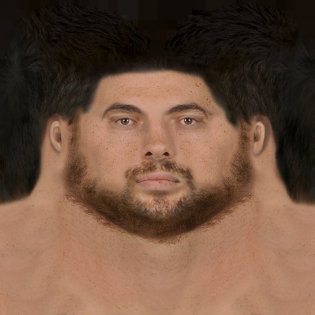
What four commonly used projections do, as shown on a human head
January 13, 2014 11:37 AM Subscribe
Maps can help make sense of the world, but they can also distory your sense of reality (Archive.org stream view, page 58 of Elements of Map Projection with Applications to Map and Chart Construction).
Obligatory XKCD, and the Wikipedia page on map projection, plus pages on map projections from National Atlas.gov and The Geographer's Craft, Department of Geography, University of Colorado at Boulder.
Obligatory XKCD, and the Wikipedia page on map projection, plus pages on map projections from National Atlas.gov and The Geographer's Craft, Department of Geography, University of Colorado at Boulder.
Came for the West Wing reference, left satisfied.
posted by blue_beetle at 12:06 PM on January 13, 2014 [4 favorites]
posted by blue_beetle at 12:06 PM on January 13, 2014 [4 favorites]
I don't understand the human head projection. Your head is roughly spherical, so if you project it like a map, you should see two eyes facing out, like this rather disturbing example. These images don't show how a 3D head is distorted, they show how a 2D drawing of a head is distorted.
On an unrelated note, let me take this opportunity to flog my own transverse Peirce Quincuncial projection.
posted by foobaz at 12:15 PM on January 13, 2014 [3 favorites]
On an unrelated note, let me take this opportunity to flog my own transverse Peirce Quincuncial projection.
posted by foobaz at 12:15 PM on January 13, 2014 [3 favorites]
On an unrelated note, let me take this opportunity to flog my own transverse Peirce Quincuncial projection.
Good at accurate projection of the shapes of landmasses, bad for navigation because the oceans are horribly distorted, but useful at the poles. Pretty much the exact opposite of the Mercator projection, which horribly abuses land shapes, but plots lines of constant course (rhumb lines) as straight lines, making ocean navigation easy, but can't show the poles, given the projection (the poles would be a line at the top and bottom of the map.)
The transverse is interesting, the norm Peirce Quincuncial project has the lovely feature of the equator showing up as a square on the map, and Antartica gets quartered. It's also only mostly conformal, except where you have those 90° turns.
The correct projection to use depends what you need to use the map for -- but any time you project a 3-D surface onto a 2-D plane, there will be large distortions somewhere in the map -- either distance scales won't remain constant, discontinuities will be present, or both.
posted by eriko at 12:32 PM on January 13, 2014 [3 favorites]
foobaz, I can't stop hearing "moisturize me" when I look at your projected human head texture.
posted by a halcyon day at 12:36 PM on January 13, 2014 [4 favorites]
posted by a halcyon day at 12:36 PM on January 13, 2014 [4 favorites]
Can we start calling Mercator the Jay Leno Projection?
posted by Horace Rumpole at 12:47 PM on January 13, 2014 [3 favorites]
posted by Horace Rumpole at 12:47 PM on January 13, 2014 [3 favorites]
This tool is pretty nifty to for exploring what changing center of a projection can do
http://www.worldmapgenerator.com/en/daVinci#
posted by bendybendy at 12:49 PM on January 13, 2014 [7 favorites]
http://www.worldmapgenerator.com/en/daVinci#
posted by bendybendy at 12:49 PM on January 13, 2014 [7 favorites]
And all of them are still better than the Gall-Peters Projection.
I'll bite. What's uninteresting about an equal area projection?
posted by justsomebodythatyouusedtoknow at 12:56 PM on January 13, 2014
I'll bite. What's uninteresting about an equal area projection?
posted by justsomebodythatyouusedtoknow at 12:56 PM on January 13, 2014
I like this variant of the Guyou Doubly Periodic Projection a lot.
posted by George_Spiggott at 1:00 PM on January 13, 2014
posted by George_Spiggott at 1:00 PM on January 13, 2014
What's uninteresting about an equal area projection?
Equal area projections are great, especially for displaying statistics. But Gall-Peters is a particularly ugly projection that distorts shapes badly. I prefer the Hammer equal-area projection.
posted by foobaz at 1:09 PM on January 13, 2014
Equal area projections are great, especially for displaying statistics. But Gall-Peters is a particularly ugly projection that distorts shapes badly. I prefer the Hammer equal-area projection.
posted by foobaz at 1:09 PM on January 13, 2014
This page has great information about the how and why of map projections
and this is a clever visualization of the variations in continent shape/area
posted by zachxman at 1:10 PM on January 13, 2014 [1 favorite]
and this is a clever visualization of the variations in continent shape/area
posted by zachxman at 1:10 PM on January 13, 2014 [1 favorite]
This puzzle was helpful for me to wrap my head around Mercator's distortions.
posted by lbebber at 1:26 PM on January 13, 2014 [9 favorites]
posted by lbebber at 1:26 PM on January 13, 2014 [9 favorites]
If this is puzzling you, this is a transverse Mercator, with the only difference to the common one being a change of centre to 0E 90N (i.e. the North Pole) rather than 0E 0N.
posted by cromagnon at 2:07 PM on January 13, 2014 [1 favorite]
posted by cromagnon at 2:07 PM on January 13, 2014 [1 favorite]
Most of those were very good. The ones I liked the most were the map of countries the British have never invaded and the map where half of all the people live inside that circle with China and India and Indonesia. Has anybody ever made a globe display screen so you could plot any data on an earth shape surface? If I had a bunch more money than I do have I would want one. As it is I don't have the space for a regular globe. One time I took a class where the professor was out for the day and the TA brought in a chalk-globe where he drew the spherical harmonic modes on it while he was giving his lecture. It was a better lecture than any of the thirty or so that the professor gave.
Google fetches this. It's from 2008 and no pics so I have doubts. Google image search has a few pics but nothing that looked worth clicking on.
posted by bukvich at 2:39 PM on January 13, 2014 [1 favorite]
Google fetches this. It's from 2008 and no pics so I have doubts. Google image search has a few pics but nothing that looked worth clicking on.
posted by bukvich at 2:39 PM on January 13, 2014 [1 favorite]
bukvich - there's this thing. To be honest though, one major purpose of map projections is to get around the problem with solid spheres seen from outside - you can't see the other side at all, and the detail gets less easy to work with as you approach the "edge" of the sphere as you see it. One solution of course is to place the viewer inside at the centre of a sphere and project the data onto it from that same location - this is what a planetarium does (for a hemisphere, usually). I've never seen a spherical room for global data projection, although I want one now.
posted by cromagnon at 3:16 PM on January 13, 2014 [2 favorites]
posted by cromagnon at 3:16 PM on January 13, 2014 [2 favorites]
Even the West Wing has that frustrating problem where writers will patch together some dorky devotees of a subject they are passingly familiar with from college 20 years ago.
Usually they show up and say something like "Hello, we are the official nerds from the nerd committee; patronize us by feigning interest in our stupid hobby and our lacking social skills". Then they proceed to get things just wrong enough to piss you off before starting to tell you about their level-30 Super Mage in D&D while playing Mario Bros. on a Genesis.
posted by Winnemac at 3:24 PM on January 13, 2014 [1 favorite]
One minor point, which is not so much about geometry as emphasis: irrespective of projection, maps in China commonly break on the Atlantic rather than the Pacific, because that way China's not on the far edge of the map and Europe at the center. Which is a reasonable thing for them to do, even if it does mean the middle of the map is pretty dominated by ocean.
posted by George_Spiggott at 3:39 PM on January 13, 2014
posted by George_Spiggott at 3:39 PM on January 13, 2014
Here’s that “There are more people living inside this circle than outside of it” map with an actual circle.
The original region is a circle on a Winkel tripel map, but would the ovoid on a globe. It’s the other way around with the corrected version.
Credit goes to BCMM on Reddit, where it was posted as a correction shortly after the original.
posted by Fongotskilernie at 10:32 PM on January 13, 2014 [1 favorite]
40 more maps that explain the world
Maps And Monsters
posted by the man of twists and turns at 6:25 AM on January 14, 2014 [1 favorite]
Maps And Monsters
posted by the man of twists and turns at 6:25 AM on January 14, 2014 [1 favorite]
Did anyone else notice that in that first link's series of maps, the McDonald's one shows that Iceland lacks McDonald's but also uses Iceland as one of the example prices for a burger?
posted by Ivan Fyodorovich at 3:19 PM on January 14, 2014
posted by Ivan Fyodorovich at 3:19 PM on January 14, 2014
A map showing just how freaky this winter really is
posted by homunculus at 5:13 PM on January 14, 2014
posted by homunculus at 5:13 PM on January 14, 2014
The Allure Of The Map
posted by the man of twists and turns at 5:51 AM on January 23, 2014 [1 favorite]
posted by the man of twists and turns at 5:51 AM on January 23, 2014 [1 favorite]
« Older Slight Future | Need to relax? Do yoga? Get a Chihuahua Newer »
This thread has been archived and is closed to new comments
posted by Navelgazer at 11:40 AM on January 13, 2014 [1 favorite]