40 Maps about food in America
June 10, 2014 7:58 AM Subscribe
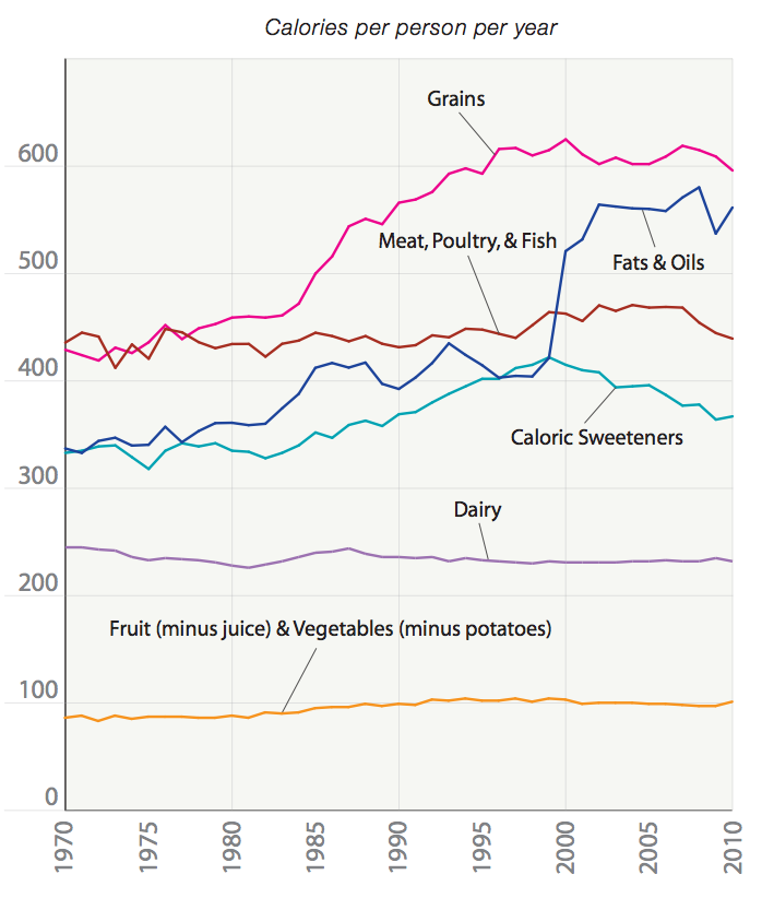
Since 1970, the incidence of obesity has more than doubled to about 35 percent of adults. At the same time, Americans are eating roughly 400 more calories a day, an increase of about 20 percent. Guyenet argues that the mathematics works out such that this one trend — the increase in calorie consumption — can account for the entire rise in obesity.
Huh, that's an interesting theory.
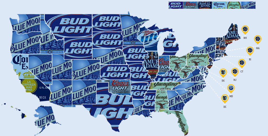
I'm surprised there is no statewide ban on public drinking in PA (#33), seems like something a state that doesn't even let private businesses run liquor stores would do. Also surprised my part of PA is dominated by wine tweeting over beer tweeting. (#35) Love that Yuengling is now a favorite in multiple states besides PA. (#36) Setting up in Florida was a good move.
Pretty cool set of maps, probably something there of interest for everyone.
posted by Drinky Die at 8:24 AM on June 10, 2014
Huh, that's an interesting theory.
I'm surprised there is no statewide ban on public drinking in PA (#33), seems like something a state that doesn't even let private businesses run liquor stores would do. Also surprised my part of PA is dominated by wine tweeting over beer tweeting. (#35) Love that Yuengling is now a favorite in multiple states besides PA. (#36) Setting up in Florida was a good move.
Pretty cool set of maps, probably something there of interest for everyone.
posted by Drinky Die at 8:24 AM on June 10, 2014
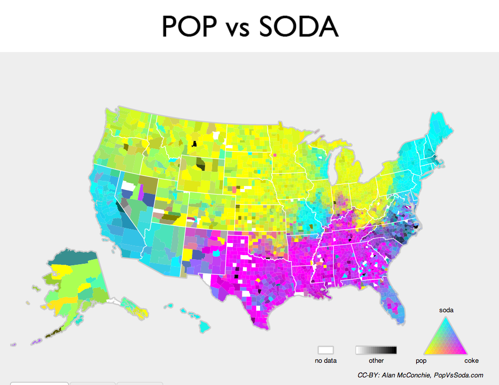
pop v. soda: one of the prettiest maps i've seen all week
Top beers per state: god that's depressing.
Leotrotsky: those are maps of the area on the graph that represent data
posted by rebent at 8:30 AM on June 10, 2014 [2 favorites]
Top beers per state: god that's depressing.
Leotrotsky: those are maps of the area on the graph that represent data
posted by rebent at 8:30 AM on June 10, 2014 [2 favorites]
Fascinating. Thank you.
posted by feckless fecal fear mongering at 8:34 AM on June 10, 2014
posted by feckless fecal fear mongering at 8:34 AM on June 10, 2014
Is this spike in fat/oil consumption around 2000 the result of Atkins and similar diets?
posted by sedna17 at 8:38 AM on June 10, 2014
posted by sedna17 at 8:38 AM on June 10, 2014
The Indianapolis and St. Louis outliers on the soda/pop/coke map are really interesting. I wonder historical quirks account for them?
posted by leotrotsky at 8:44 AM on June 10, 2014
posted by leotrotsky at 8:44 AM on June 10, 2014
I love that first map. It's beautiful even if it is from a meatpacking firm. Generally though I wish the maps were more easily expanded. Sometimes it's hard to see the detail as much as I would like.
posted by Carillon at 8:47 AM on June 10, 2014
posted by Carillon at 8:47 AM on June 10, 2014
Top beers per state: god that's depressing.
It comes with an interesting note, however: that California's population dwarfs that of all the "Blue Moon" states (Washington, Oregon, Idaho, Nevada, Utah, Arizona, New Mexico, Colorado, Nebraska, and Minnesota). Removing beer from the equation, that's a pretty stunning fact all by itself...
posted by gern at 8:50 AM on June 10, 2014
The Indianapolis and St. Louis outliers on the soda/pop/coke map are really interesting. I wonder historical quirks account for them?
Indianapolis is weirdly Southern in a lot of ways.
Note that both St. Louis and Milwaukee are the centers of large "soda" islands in "pop" territory -- I wonder whether beer production has anything to do with it.
posted by Etrigan at 8:50 AM on June 10, 2014
Indianapolis is weirdly Southern in a lot of ways.
Note that both St. Louis and Milwaukee are the centers of large "soda" islands in "pop" territory -- I wonder whether beer production has anything to do with it.
posted by Etrigan at 8:50 AM on June 10, 2014
Is this spike in fat/oil consumption around 2000 the result of Atkins and similar diets?
Atkins is too late coming into vogue in 2002.
From the source:
posted by Talez at 8:59 AM on June 10, 2014
Atkins is too late coming into vogue in 2002.
From the source:
(In 2000, the number of companies reporting data to the USDA jumped, so the rise was probably less steep than it appears.)So it just looks like reporting bias.
posted by Talez at 8:59 AM on June 10, 2014
Many maps focus on farms as the base unit, which is weird. Some farms are 20 acres, others are 10,000 acres, but those maps will count them equal. The unit should be acre of farmed land, not number of business entities.
For example, the average value per farm map is meaningless in terms of describing yield or value per area farmed. I can only assume that it's really a map of average farm size. The blue dot (20 farms gained)/red dot (20 farms lost) map is possibly a map of farm consolidation rather than loss of farmland, and so on.
posted by jsturgill at 9:03 AM on June 10, 2014 [1 favorite]
I love this tidbit about Waffle Houses reporting their status to FEMA after a hurricane! And the blatant pro WH bias of the author, hee.
posted by travertina at 9:07 AM on June 10, 2014 [2 favorites]
posted by travertina at 9:07 AM on June 10, 2014 [2 favorites]
I like the photosynthesis pictures. NASA has a video showing the rest of the world as well (good stuff starts 1:47).
Spain's looking pretty bleak compared to the rest of Europe. I'm guessing grapes, olives and oranges don't cut much oxygen.
posted by IndigoJones at 9:07 AM on June 10, 2014
Spain's looking pretty bleak compared to the rest of Europe. I'm guessing grapes, olives and oranges don't cut much oxygen.
posted by IndigoJones at 9:07 AM on June 10, 2014
Was surprised to see Alaska has so many more grocery stores than bars. This is definitely not my (limited) experience of Alaska.
posted by Mchelly at 9:12 AM on June 10, 2014
posted by Mchelly at 9:12 AM on June 10, 2014
People from those areas may not find this map entirely accurate
That is the worst map I have ever seen.
posted by the man of twists and turns at 9:19 AM on June 10, 2014 [5 favorites]
That is the worst map I have ever seen.
posted by the man of twists and turns at 9:19 AM on June 10, 2014 [5 favorites]
Surprisingly informative collection of visualizations. My favorite is the time series of calorie breakdown; the source PDF has more related charts. I'm mostly a believer in the theory that cheap carbohydrates are a big part of the obesity problem. But the jump in fat consumption in 2000 is not paired with a drop in carbs, and that surprises me.
And surprisingly only about 5 of the 40 are really awful. Particularly gob-stopped by the farmer age, which uses a sensible yellow to blue colorscale but then bins the data into "0-56, 56, 57, 58, 79, 60-120". Apparently we have USDA to thank for the idea that discriminating 57 vs 58 year old farmers is the most important way to visualize age.
posted by Nelson at 9:23 AM on June 10, 2014
At least in the most popular beers there's a nice swath of yuengling. Though I'm surprised NY isn't Genesee. Blue moon being so popular is unnerving though, at least bud light doesn't pretend to not be lightly alcohol infused water.
posted by Ferreous at 9:23 AM on June 10, 2014 [1 favorite]
posted by Ferreous at 9:23 AM on June 10, 2014 [1 favorite]
I'm looking at that obesity over time map, I didn't expect Colorado to be doing better than almost everywhere else.
posted by inertia at 9:24 AM on June 10, 2014
posted by inertia at 9:24 AM on June 10, 2014
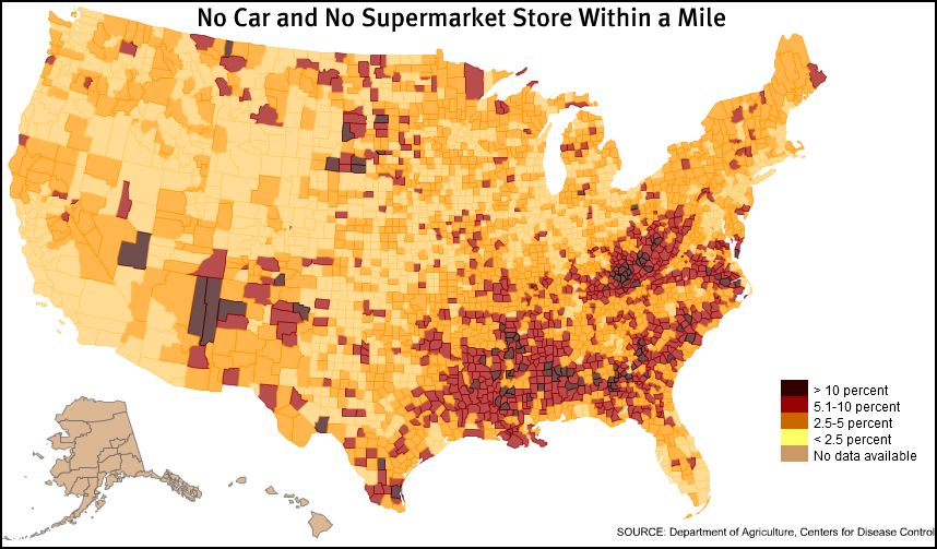
I would love to see some of these maps for Canada, as well. The food deserts one is particularly enlightening - it's not a concept I'd heard of until I moved to the US (though I'm sure that says more about my sheltered upbringing than it does about Canadian food access).
posted by Phire at 9:26 AM on June 10, 2014 [1 favorite]
posted by Phire at 9:26 AM on June 10, 2014 [1 favorite]
These maps for Canada would be interesting but we already know basically what they'd look like. A 200km swath following the border with the USA and then functionally nothing. (Not being Northern-ist, just a matter of population distribution.)
posted by feckless fecal fear mongering at 9:28 AM on June 10, 2014
posted by feckless fecal fear mongering at 9:28 AM on June 10, 2014
I'm looking at that obesity over time map, I didn't expect Colorado to be doing better than almost everywhere else.
It's because they're so far from the center of the earth. Less gravity.
posted by Etrigan at 9:35 AM on June 10, 2014 [2 favorites]
It's because they're so far from the center of the earth. Less gravity.
posted by Etrigan at 9:35 AM on June 10, 2014 [2 favorites]
Each person in the US is consuming roughly 250 pounds of meat — that's about three quarter-pounder burgers a day.
I have mentioned before that when I first stopped eating meat -- and don't worry, I was only evangelical for a few weeks about a quarter-century ago -- that just about everyone I ever discussed food with said "I don't eat much meat."
If this figure is right, it suggests that given some people actually do eat very little or no meat, there must be some others tucking into a couple of pounds of cow or pig per day.
posted by ricochet biscuit at 9:53 AM on June 10, 2014 [1 favorite]
It's because they're so far from the center of the earth. Less gravity.
And then when you move here, everybody's like, "You over the altitude sickness yet? Great, let's hike a 14er!"
posted by asperity at 10:00 AM on June 10, 2014 [4 favorites]
And then when you move here, everybody's like, "You over the altitude sickness yet? Great, let's hike a 14er!"
posted by asperity at 10:00 AM on June 10, 2014 [4 favorites]
A 200km swath following the border with the USA and then functionally nothing.
Mostly true in Ontario and Quebec, but not really in the rest of the country
posted by Pruitt-Igoe at 10:07 AM on June 10, 2014
Mostly true in Ontario and Quebec, but not really in the rest of the country
posted by Pruitt-Igoe at 10:07 AM on June 10, 2014
The food deserts one is particularly enlightening
I think maps like that one need to be done at the city level (the "no car" scale).
And some of those counties in the west might have 1000 people.
posted by Pruitt-Igoe at 10:11 AM on June 10, 2014 [2 favorites]
I think maps like that one need to be done at the city level (the "no car" scale).
And some of those counties in the west might have 1000 people.
posted by Pruitt-Igoe at 10:11 AM on June 10, 2014 [2 favorites]
I have mentioned before that when I first stopped eating meat -- and don't worry, I was only evangelical for a few weeks about a quarter-century ago -- that just about everyone I ever discussed food with said "I don't eat much meat."
If this figure is right, it suggests that given some people actually do eat very little or no meat, there must be some others tucking into a couple of pounds of cow or pig per day.
I've had the same experience of people telling me they don't eat much meat, but they really meant they don't eat a steak for dinner every night.
posted by inertia at 10:14 AM on June 10, 2014
That barbeque map is a travesty, and whomever designed it should be taken out back and shot along with anyone who says "But iHop's just as good!"
Hypothetical people, you're wrongthinking wrongfaces who are wrong.
More seriously, that fruit and veg consumption map was a shocking one for me, for whatever reason.
posted by MeghanC at 10:15 AM on June 10, 2014
Hypothetical people, you're wrongthinking wrongfaces who are wrong.
More seriously, that fruit and veg consumption map was a shocking one for me, for whatever reason.
posted by MeghanC at 10:15 AM on June 10, 2014
(On the jump in obesity - it's worth noting that in 1998, the standards for overweight and obese were changed, lowered by about ten pounds each. So people who were not previously considered overweight became overweight overnight, same with people who were overweight becoming "obese". That's not to say that the obesity rate hasn't risen, but if you're not correcting for the redefinition in 1998, you're getting a much greater rise than is really born out by actual change in weight/size.)
posted by Frowner at 10:36 AM on June 10, 2014 [2 favorites]
posted by Frowner at 10:36 AM on June 10, 2014 [2 favorites]
Love that Yuengling is now a favorite in multiple states besides PA.
I'm mostly impressed they managed to corner the Ohio market so quickly- they only started distributing here less than 3 years ago.
posted by damayanti at 11:21 AM on June 10, 2014 [1 favorite]
I'm mostly impressed they managed to corner the Ohio market so quickly- they only started distributing here less than 3 years ago.
posted by damayanti at 11:21 AM on June 10, 2014 [1 favorite]
Wait... this graph shows the rise in overweight people almost exactly tracking a corresponding rise in calories consumed per day! I don't believe it!
posted by Justinian at 11:32 AM on June 10, 2014 [2 favorites]
posted by Justinian at 11:32 AM on June 10, 2014 [2 favorites]
With our corn performing that much photosynthesis, who needs the Amazon rain forest?
posted by Renoroc at 12:37 PM on June 10, 2014
posted by Renoroc at 12:37 PM on June 10, 2014
I loved that corn photosynthesis map. Corn! You're so good at your job! It's too bad a diet based on you kills people from pellagra!
If you've never grown a little backyard patch of corn, it's worthwhile just because you're like HOLY HELL, PLANT, YOU WERE THE SIZE OF A TOOTH A MONTH AGO AND NOW YOU'RE SO BIG YOU MAKE YOUR OWN CREEPY-ASS PROP ROOTS SO YOU DON'T FALL OVER FROM YOUR OWN GIGANTIC SIZE. Corn is the one plant that makes me feel LIKE A GOD when I grow it because it comes up so fast and huge and I'm like MWAH HA HA HA, GROW, GROW, MY GREEN MINION! (Sunflowers are good too, but they're not quite so dramatic.) And then there's sweet corn to eat so it works out for everyone.
(I shall of course take corn's excellence at photosynthesizing as proof of the inherent superiority of the Midwest.)
posted by Eyebrows McGee at 12:46 PM on June 10, 2014 [4 favorites]
I think Bulgaroktonos needs to see the barbecue map.
He is interested in that stuff, he would probably find it informative. Maybe it could help him to locate a good place to eat some barbecue.
posted by agentofselection at 1:01 PM on June 10, 2014
He is interested in that stuff, he would probably find it informative. Maybe it could help him to locate a good place to eat some barbecue.
posted by agentofselection at 1:01 PM on June 10, 2014
Flagged for egregious barbeque misinformation.
KC BBQ 4 Lyfe.
posted by TypographicalError at 1:49 PM on June 10, 2014
KC BBQ 4 Lyfe.
posted by TypographicalError at 1:49 PM on June 10, 2014
"average american person eats 250 pounds of meat a year" factoid actualy just statistical error. average person doesn't eat much meat. Steak 'n Bacon Georg, who lives in cave & eats 10 cows and 20 pigs each day, is an outlier adn should not have been counted
posted by po at 4:56 AM on June 11, 2014
posted by po at 4:56 AM on June 11, 2014
"Who's eating meat? This map shows how much meat gets consumed in each country, with each nation's sized skewed accordingly. It's not all that surprising that the world's most populous nations — China, India, and the US — end up looking pretty huge, here."
... no shit, dudes. Ever hear of per capita consumption? Somehow this map #14 was the first one I saw, so after that analysis and the rest of your comments, I don't know if I'll make it through all 40.
posted by whatzit at 3:07 PM on June 11, 2014
... no shit, dudes. Ever hear of per capita consumption? Somehow this map #14 was the first one I saw, so after that analysis and the rest of your comments, I don't know if I'll make it through all 40.
posted by whatzit at 3:07 PM on June 11, 2014
After re-reading from the top, map #15 is per capita. Complaint retracted.
posted by whatzit at 3:08 PM on June 11, 2014
posted by whatzit at 3:08 PM on June 11, 2014
« Older All That He Left Behind | There are those who said this day would never come... Newer »
This thread has been archived and is closed to new comments
posted by leotrotsky at 8:03 AM on June 10, 2014 [3 favorites]