Pissed forth by gods!
February 9, 2009 4:49 PM Subscribe
And you thought Pepsi's redesign was just crappy. Well no. According to this ridiculous internal document (6MB, PDF), apparently leaked from their ad agency, the sugar-water's rebranding was 5,000 years in the making, and molded by the same elemental forces that shape the very cosmos.
Warning: Hilariously meaningless corporate drivel inside. [via]
Warning: Hilariously meaningless corporate drivel inside. [via]
> Warning: Hilariously meaningless corporate drivel inside.
Every time I get depressed about my own job I remind myself that at least I don't have to sell stuff for a living.
posted by The Card Cheat at 4:52 PM on February 9, 2009 [18 favorites]
Every time I get depressed about my own job I remind myself that at least I don't have to sell stuff for a living.
posted by The Card Cheat at 4:52 PM on February 9, 2009 [18 favorites]
All I see when I look at the new Pepsi logo is maxi-pads. The pad is white, a divider protecting the blue jeans from a belly full of blood.
I know that I'm terrible and piggish and awful for saying this, but I can't not see the damn maxi-pad.
posted by boo_radley at 4:53 PM on February 9, 2009 [6 favorites]
I know that I'm terrible and piggish and awful for saying this, but I can't not see the damn maxi-pad.
posted by boo_radley at 4:53 PM on February 9, 2009 [6 favorites]
"This is what I think whenever I see one of the new Pepsi ads." [Via Buzzfeed]
posted by tepidmonkey at 4:53 PM on February 9, 2009 [16 favorites]
posted by tepidmonkey at 4:53 PM on February 9, 2009 [16 favorites]
Huh. And yet the economy tanked anyway. Weird.
posted by uosuaq at 4:54 PM on February 9, 2009 [2 favorites]
posted by uosuaq at 4:54 PM on February 9, 2009 [2 favorites]
This is why I dislike reddit comments. The whole thread unjustifiably shits on the creative process. While the document is a little ludicrous, the comments are filled with a bunch of geeks that would cream over git, but if they don't understand a field, they think it's either stupid, irrelevant, or so wrong that they know how to improve that field.
Art and economics are the worst.
posted by amuseDetachment at 4:57 PM on February 9, 2009 [5 favorites]
Art and economics are the worst.
posted by amuseDetachment at 4:57 PM on February 9, 2009 [5 favorites]
The last few pages are, like, Time Cube crazy.
posted by you just lost the game at 4:58 PM on February 9, 2009 [5 favorites]
posted by you just lost the game at 4:58 PM on February 9, 2009 [5 favorites]
Also, holy god how did those morons not get laughed out of the room.
If I owned Pepsi stock, i'd be selling the shit out of it.
Also, is that what you're paying for with professional graphic designers? They could have gotten a better design with less bullshit at this place.
posted by empath at 5:00 PM on February 9, 2009 [2 favorites]
If I owned Pepsi stock, i'd be selling the shit out of it.
Also, is that what you're paying for with professional graphic designers? They could have gotten a better design with less bullshit at this place.
posted by empath at 5:00 PM on February 9, 2009 [2 favorites]
They should have gone for the anti-marketing dollar.
posted by scody at 5:01 PM on February 9, 2009 [3 favorites]
posted by scody at 5:01 PM on February 9, 2009 [3 favorites]
The whole thread unjustifiably shits on the creative process.
I think that creative process deserves to be shat on, honestly.
posted by empath at 5:02 PM on February 9, 2009 [11 favorites]
I think that creative process deserves to be shat on, honestly.
posted by empath at 5:02 PM on February 9, 2009 [11 favorites]
So that's what a dozen or souls look like, spread over 27 pages with the intent of selling carmelized sugar water.
posted by gottabefunky at 5:03 PM on February 9, 2009 [2 favorites]
posted by gottabefunky at 5:03 PM on February 9, 2009 [2 favorites]
We got a few of the new cans for free when we ordered some Chinese food delivered a week or so ago. I prefer Coca-Cola, but it mxed OK with some tequila, so no big deal.
posted by jonmc at 5:03 PM on February 9, 2009
posted by jonmc at 5:03 PM on February 9, 2009
you just lost the game: "The last few pages are, like, Time Cube crazy."
I was thinking "Time Cube" by page 8. "The Pepsi ethos"? Mary, mother of God...
If becoming a successful professional requires - as I fear it does - being able to drink your company's Kool-Aid and ask for seconds, I'm satisfied to remain underemployed.
posted by Joe Beese at 5:04 PM on February 9, 2009
I'm not gonna download a PDF, but this one screams hoax.
I agree with empath. lazy Obama knockoff.
posted by mrgrimm at 5:05 PM on February 9, 2009
I agree with empath. lazy Obama knockoff.
posted by mrgrimm at 5:05 PM on February 9, 2009
Warning, Houston -
We are unable to reach escape velocity. I repeat, we are unable to reach escape velocity from the 12 pack. We estimate impact in two minutes.
Tell my wife I love her...
posted by Samizdata at 5:06 PM on February 9, 2009 [1 favorite]
We are unable to reach escape velocity. I repeat, we are unable to reach escape velocity from the 12 pack. We estimate impact in two minutes.
Tell my wife I love her...
posted by Samizdata at 5:06 PM on February 9, 2009 [1 favorite]
Is it possible for an entire advertising agency to have Aspergers?
posted by MegoSteve at 5:08 PM on February 9, 2009 [6 favorites]
posted by MegoSteve at 5:08 PM on February 9, 2009 [6 favorites]
In other words, we can get out-of-the-ordinary, but we can't live there.
posted by Serf at 5:08 PM on February 9, 2009 [3 favorites]
posted by Serf at 5:08 PM on February 9, 2009 [3 favorites]
tepidmonkey, thank you. now I too will only ever see that.
posted by mwhybark at 5:09 PM on February 9, 2009
posted by mwhybark at 5:09 PM on February 9, 2009
Yeah, amusing as it is, I'm calling satire/hoax.
...of course, if it's not, it's the greatest document since the Magna Carta.
posted by Tomorrowful at 5:09 PM on February 9, 2009 [1 favorite]
...of course, if it's not, it's the greatest document since the Magna Carta.
posted by Tomorrowful at 5:09 PM on February 9, 2009 [1 favorite]
That PDF is insane genius. Can you imagine how baffled and entertained the Pepsi guys must have been? The guys who wrote it and closed the deal are probably spending 6 months laughing hysterically while snorting uncut cocaine off Brazilian bikini models.
If it's a hoax it should be true.
posted by fleetmouse at 5:09 PM on February 9, 2009 [3 favorites]
If it's a hoax it should be true.
posted by fleetmouse at 5:09 PM on February 9, 2009 [3 favorites]
I'm trying to imagine the meeting that went into putting that PDF together.
Either it was a laugh riot, or there was one intern in the room, who was sitting very quietly, wondering to himself if he should maybe speak up and say something... or thinking that maybe he was the one that was crazy.
posted by empath at 5:12 PM on February 9, 2009 [2 favorites]
Either it was a laugh riot, or there was one intern in the room, who was sitting very quietly, wondering to himself if he should maybe speak up and say something... or thinking that maybe he was the one that was crazy.
posted by empath at 5:12 PM on February 9, 2009 [2 favorites]
I'll give em some credit for going so far out with such uninspiring material. They made that shit Alchemical!
posted by Liquidwolf at 5:13 PM on February 9, 2009
mrgrimm: " this one screams hoax"
You're not taking into account how many millions these companies have invested in this shit. I recall reading - in Spy magazine, perhaps - some communication from Pillsbury to their advertising agency that explained in frightening detail the various personality traits of the Dough Boy that a proposed campaign was failing to properly articulate.
posted by Joe Beese at 5:13 PM on February 9, 2009 [5 favorites]
Ha, when I originally encountered the new logo I thought KAL had re-done their logo now thanks to upthread it is worst than KAL.
posted by jadepearl at 5:14 PM on February 9, 2009
posted by jadepearl at 5:14 PM on February 9, 2009
if this thing is real, at least these ad guys can sell themselves to a roomful of desperate marketing dweebs.
if it's fake, then, then.... yeah, it's definitely fake. noone is buying "Pepsi's gravitational field" and so on. noone.
posted by adamms222 at 5:14 PM on February 9, 2009
if it's fake, then, then.... yeah, it's definitely fake. noone is buying "Pepsi's gravitational field" and so on. noone.
posted by adamms222 at 5:14 PM on February 9, 2009
Silky Slim, this FPP has made you my most favoritest person in the universe.
This is... incredible. I mean... I've designed a few (very few) logos, and I'm all for symbolism and hidden meanings. But I get a little embarrassed even explaining simple symbolism to clients. It just makes me feel so... full of it.
I wish I had the cajones and lack of conscience of the author of this piece.
posted by Fuzzy Skinner at 5:19 PM on February 9, 2009 [5 favorites]
pepsi blew it?
posted by potsmokinghippieoverlord at 5:20 PM on February 9, 2009 [3 favorites]
posted by potsmokinghippieoverlord at 5:20 PM on February 9, 2009 [3 favorites]
pp. 18 --> "The diameter of the Nautilus Shell increases proportionally with the Golden Ration."
LMFAO
This whole thing reminds me of a schizoid ex-roommate who had all of these half baked theories about the weather, microbursts, and sunspots and would occasionally corner me and show me some bizarre amalgamation .pdf he'd put together from the NOAA's website and random peer reviewed publications.
posted by Derive the Hamiltonian of... at 5:21 PM on February 9, 2009 [1 favorite]
YOU ARE STUPID AND EVIL AND DO NOT KNOW YOU ARE STUPID AND EVIL. THE COCA COLA DRINK IS THE FALSE DRINK CREATED BY STUPID BELIEF IN MAN-GOD-APE WHILE ONLY PEPSI COLA BRINGS THE KNOWLEDGE OF TRUTH.
IT IS EASY TO SEE THE FALSITY AND DESTRUCTION COCA COLA BRINGS!!
DID YOU KNOW?
COCA COLA MAN-GOD-APE WORSHIPPERS FORMERLY ADULTERATED THEIR DRINK WITH THE ILLEGAL DRUG COCAINE WIDELY ACKNOWLEDGED BY US GOVERNMENT OFFICIALS TO BE A DEADLY POISON
COCA COLA DYNAMIC RIBBON "STRING THEORY" IS THE PERVERTED EXPLANATION OF THE UNIVERSE BY ARROGANT EVIL APES. ONLY THE PEPSI RATIO CONSTRUCTED PROPERLY FREE OF APE STINK CAN EXPLAIN EXISTENCE
ONE THEORY - PEPSI RATIO THEORY - EXPLAINS
EARTH MAGNETIC FIELD
EMOTION
GRAVITY
AND
THE EXPONENTIAL DIMENSIONALIZATION OF THE UNIVERSE
ONE HUNDRED BILLION DOLLARS AWARD TO THE STUPID COKE-DRINKING STRING THEORIST WHO CAN DISPROVE THE PEPSI RATIO
posted by TheOnlyCoolTim at 5:24 PM on February 9, 2009 [49 favorites]
I once worked next to a Pepsi sales branch office. Think "The Office," only with Pepsi instead of paper.
My office shared a central bathroom with the entire floor. So, I'm in one of the stalls, doing my business, when two salesguys walk in and use the urinals. They're chatting loudly while they tinkle, so I can't help but overhear them.
Guy No. 1: "And then I told him, I'd be emailing him the results later."
Guy No. 2: "Wow, that's funny."
(normal silence)
Guy No. 1: "So, where'd you guys end up going for lunch?"
Guy No. 2: "We went to that deli next to the movie theater."
(weird uncomfortable silence)
Guy No. 2: "Of course, Jake and I went next door to the taco place before hand and bought Pepsi."
Guy No. 1: "Oh, good, good."
They left. I thought, what the fuck was that last part about, about the deli and the taco place?
I had a hunch, so after work, I checked it out, and I was right.
The deli only served Coca-Cola products (Coke, Diet Coke, Sprite, etc), while the taco place next door only served Pepsi products (Pepsi, Diet Pepsi, Sierra Mist, etc). Guy No. 1 was concerned that, if Guy No. 2 and his buddy "Jake" had gone to the deli, they had ordered Coca-Cola, which was a complete no-no to a Pepsi salesperson. Guy No. 2 explained that, before going to the deli for a sandwich, he had bought a Pepsi and then had brought it into the deli, where he actually ate his lunch.
Later, I related the story to an acquaintance, who worked for Coca-Cola. Was this true? Did they actually do this kind of shit? Did the employees heap scorn on each other for going over the line to the dark side?
Ab-so-fucking-lutely, he said. He then told me stories of how Coke guys had to go out of their way to ensure their buddies never saw them ever, ever drinking a Pepsi product, no matter what.
posted by Cool Papa Bell at 5:24 PM on February 9, 2009 [34 favorites]
I'm confused, BBDO is Pepsi's ad agency. Who are the Arnell Group?
posted by Maisie Jay at 5:26 PM on February 9, 2009 [1 favorite]
posted by Maisie Jay at 5:26 PM on February 9, 2009 [1 favorite]
PEPSI == VALIS.
posted by eyeballkid at 5:26 PM on February 9, 2009 [12 favorites]
posted by eyeballkid at 5:26 PM on February 9, 2009 [12 favorites]
Wait, so every effing post about a commercial product as a FPP get a "pepsi blue" comment from mefi except this one? Isn't this clearly the viral marketing that pepsi is dying for?
posted by about_time at 5:26 PM on February 9, 2009 [4 favorites]
posted by about_time at 5:26 PM on February 9, 2009 [4 favorites]
Opps, my apologies to potsmokinghippieoverlord.
posted by about_time at 5:28 PM on February 9, 2009
posted by about_time at 5:28 PM on February 9, 2009
"dimensionalise exponentially"
if it's real then i am insanely jealous
on the other hand if it's fake then i kinda want it to be real
and then we're back where we started again
posted by doobiedoo at 5:29 PM on February 9, 2009
if it's real then i am insanely jealous
on the other hand if it's fake then i kinda want it to be real
and then we're back where we started again
posted by doobiedoo at 5:29 PM on February 9, 2009
And you thought Pepsi's redesign was just crappy.
Actually, it was always the product behind the label that I thought was crappy.
posted by IvoShandor at 5:32 PM on February 9, 2009
Actually, it was always the product behind the label that I thought was crappy.
posted by IvoShandor at 5:32 PM on February 9, 2009
I'm confused, BBDO is Pepsi's ad agency. Who are the Arnell Group?
Here they be.
posted by potsmokinghippieoverlord at 5:33 PM on February 9, 2009 [1 favorite]
Here they be.
posted by potsmokinghippieoverlord at 5:33 PM on February 9, 2009 [1 favorite]
Clearly, the only place to go from here is putting the board of directors in a locked conference room, and telling them to envision the Pepsi Brand-Sigil in their minds' eye while moaning Aleister Crowley's name and masturbating.
posted by naju at 5:33 PM on February 9, 2009 [3 favorites]
posted by naju at 5:33 PM on February 9, 2009 [3 favorites]
BBDO and Arnell are both owned by Omnicom Group.
posted by MegoSteve at 5:35 PM on February 9, 2009 [1 favorite]
posted by MegoSteve at 5:35 PM on February 9, 2009 [1 favorite]
Well, that's it. Someone's gone and dressed the essence of the Mad Arab's scribblings up in the trappings of 20th century graphic design theory. This is an attempt to break out of the sandbox and gain privileged access to space time.
If anyone needs me, I'll be on the red phone with Mr. Stross... or screaming in terror as dimensional shamblers rip my face off. We'll know in a bit.
posted by Kikkoman at 5:35 PM on February 9, 2009
If anyone needs me, I'll be on the red phone with Mr. Stross... or screaming in terror as dimensional shamblers rip my face off. We'll know in a bit.
posted by Kikkoman at 5:35 PM on February 9, 2009
Every time I get depressed about my own job I remind myself that at least I don't have to sell stuff for a living.
Shed a tear for mathowie. Every day he has to trudge to the new server and make cold calls hoping a few rubes will pony up five bucks.
posted by lukemeister at 5:35 PM on February 9, 2009 [4 favorites]
Shed a tear for mathowie. Every day he has to trudge to the new server and make cold calls hoping a few rubes will pony up five bucks.
posted by lukemeister at 5:35 PM on February 9, 2009 [4 favorites]
about_time: " Isn't this clearly the viral marketing that pepsi is dying for?"
I guess that depends on whether you believe any publicity is good publicity.
If Pepsi hopes to boost their bottom line by portraying themselves as a laughingstock, good luck to them.
posted by Joe Beese at 5:36 PM on February 9, 2009
I guess that depends on whether you believe any publicity is good publicity.
If Pepsi hopes to boost their bottom line by portraying themselves as a laughingstock, good luck to them.
posted by Joe Beese at 5:36 PM on February 9, 2009
I'm confused, BBDO is Pepsi's ad agency. Who are the Arnell Group?
Pepsi (partially) fired BBDO back in November ... apparently for this? They did indeed hire the Arnell Group for rebranding.
The Arnell Group is Peter Arnell's company. He is crazy, and I'm pretty sure this PDF is totally legit. You only need to look at the press releases to smell the same BS.
posted by malphigian at 5:36 PM on February 9, 2009 [3 favorites]
Oh god I'm glad I clicked on that link. That was the best thing I've read all week, and I read a lot of good things this week. The gravitational pull of Pepsi on page 26 had me in stitches. I don't think this is fake. I hope this is not fake.
The construction of the curves described on page 19 is kind of neat, actually. But the theory behind it... oh man.
posted by painquale at 5:39 PM on February 9, 2009 [2 favorites]
The construction of the curves described on page 19 is kind of neat, actually. But the theory behind it... oh man.
posted by painquale at 5:39 PM on February 9, 2009 [2 favorites]
Dr. Bronner's Magic Pepsi
posted by subbes at 5:39 PM on February 9, 2009 [4 favorites]
posted by subbes at 5:39 PM on February 9, 2009 [4 favorites]
I'm trying to imagine the meeting that went into putting that PDF together.
If I had been in that meeting, I know I would have been very, very tempted to raise my hand and complement the designers on how well they'd hid the fnords.
posted by EmpressCallipygos at 5:40 PM on February 9, 2009 [5 favorites]
If I had been in that meeting, I know I would have been very, very tempted to raise my hand and complement the designers on how well they'd hid the fnords.
posted by EmpressCallipygos at 5:40 PM on February 9, 2009 [5 favorites]
Arnell is a subsidiary of Omnicom, and... on preview nevermind.
Real, fake, I don't know, but what I do know is in their mad rush to "re-imagine" all of PepsiCo's drinks, they have committed brand suicide on Tropicana, PepsiCo's perennial orange juice line. Honestly, I don't know how the fuck those people convinced PepsiCo that the way to market a $4.00 a carton "premium" orange juice was as a generic store brand knockoff but it's just another gem in this crown of their account. Kill the Pepsi smile and lose any point to the brand? I think they're going to be lucky we're in this depression, because otherwise the tanking sales figures could be attributed straight to those numbskulls.
/bitter about talentless hacks getting large contracts
/rage
/finis
posted by cavalier at 5:46 PM on February 9, 2009 [9 favorites]
Oh, and the other bizarre thing about them picking up PepsiCo is that they took the design work from another Omnicom agency. Omnicom's one of those super ultra mega conglomerates these days, but anyhoo, kind of interesting they just went... sideways... instead of out the door.
posted by cavalier at 5:47 PM on February 9, 2009
posted by cavalier at 5:47 PM on February 9, 2009
PEPSI == VALIS.
PKD's Pepsexegesis:
1. One Cola there is; but under it two principles contend.
2. The Cola lets in the red, then the blue,in interaction; so profit is generated. At the end Cola awards victory to the ad company whose grand vision is to remake the logo into a sort of smiley anime maxipad or some shit; profit ceases and the Cola is complete.
posted by bunnytricks at 5:47 PM on February 9, 2009 [2 favorites]
Hilarious. It's got to be fake, but hilarious.
That's what I said when I first saw the new Pepsi logo, but boy was I in for a shock.
posted by katillathehun at 5:48 PM on February 9, 2009
That's what I said when I first saw the new Pepsi logo, but boy was I in for a shock.
posted by katillathehun at 5:48 PM on February 9, 2009
malphigian: thank you!
posted by Maisie Jay at 5:49 PM on February 9, 2009
posted by Maisie Jay at 5:49 PM on February 9, 2009
We do a lot of gravitational N-body simulations where I work.
This changes everything
posted by lukemeister at 5:51 PM on February 9, 2009
This changes everything
posted by lukemeister at 5:51 PM on February 9, 2009
Checking the PDF MetaData, there's a few identifying things in it. The original document title is "08.08.01_Pepsi Breathtaking_FRANCE.indd", and the author is "sarndt". Linkedin seems to think there's a Sandra Arndt working at the Arnell Group now, but I cannot find other information about her.
So ... might be real? Still crazy.
posted by barnacles at 6:03 PM on February 9, 2009 [6 favorites]
So ... might be real? Still crazy.
posted by barnacles at 6:03 PM on February 9, 2009 [6 favorites]
Pepsi Challenged.
posted by Sys Rq at 6:06 PM on February 9, 2009 [1 favorite]
posted by Sys Rq at 6:06 PM on February 9, 2009 [1 favorite]
cavalier: "in their mad rush to "re-imagine" all of PepsiCo's drinks, they have committed brand suicide on Tropicana, PepsiCo's perennial orange juice line. "
Great links. At first, I kinda liked how much "zippier" the new look was - including "the orange boobie" - and didn't mourn the loss of the orange-with-a-straw-in-it, which had become familiar to the point of invisibility anyway. But after looking at it for a minute... yeah, pretty generic.
But as my health insurance is paid for by a company that also tends to fix things that aren't broken, to the despair of all, I'm in no position to throw stones.
posted by Joe Beese at 6:08 PM on February 9, 2009
It's not "via Buzzfeed", it's the same link of the reddit thread to which this FPP links.
posted by Rhomboid at 6:14 PM on February 9, 2009
posted by Rhomboid at 6:14 PM on February 9, 2009
the pepsi logo sucks but it's crap sugarwater, which makes it kind of a good fit. I don't understand what you're getting so upset about. it's not like they screwed up something holy like the sesame street logo or god forbid apple's ahem apple. paul rand's ups logo being fucked up by I believe landor a while back, now THAT was a travesty.
the advertising agency that won pepsi two years ago is tbwa chiat/day in LA. this was done by arnell group, which only has a design contract. there were no advertising people involved in this, this is a branding project. regular graphic designers can take the blame there.
as far as the shitty explanation goes: that's just the usual bullshit the account executives make up for middle-management marketing people client-side who don't understand shit but need to be put at ease with something logical and tangible. it's the dog and pony show you need to do to sell your work, good and bad. you'e deluding yourself if you think that great commercial you saw last week wasn't sold using the exact same dribble.
many clients can't judge good or bad creative work. they have no taste. they are being convinced by pie charts to run things. I, being a creative working in advertising, am glad to have some account people who will use this doohicky shit to make them feel more confident. without them and their BS that the corporate pencilpushers so believe in half of my work would die.
I'm confused, BBDO is Pepsi's ad agency. Who are the Arnell Group?
dude, welcome back from your year-long vacation. BBDO pissed off pepsi by canning ted sann. they never forgot and once the right guy made it to head honcho level they took the assignment away. that was half a year ago. BBDO NY still has mountain dew and one or two other brands belonging to pepsi but that is nowhere near the size of an account.
posted by krautland at 6:21 PM on February 9, 2009 [13 favorites]
Now I know I'm not alone in thinking the new Pepsi look is an eyesore of staggering proportions. Thank you, MetaFilter.
posted by Yakuman at 6:28 PM on February 9, 2009
posted by Yakuman at 6:28 PM on February 9, 2009
Here is a goofy video sent to "digital and social media influencers" as part of the campaign.
Personally, I think most of the new Pepsi cans look like they should contain motor oil. The black one looks like crappy men's body spray.
posted by thinman at 6:31 PM on February 9, 2009 [2 favorites]
Personally, I think most of the new Pepsi cans look like they should contain motor oil. The black one looks like crappy men's body spray.
posted by thinman at 6:31 PM on February 9, 2009 [2 favorites]
Page 23 would be good for making blotter tabs.
posted by decagon at 6:32 PM on February 9, 2009 [2 favorites]
posted by decagon at 6:32 PM on February 9, 2009 [2 favorites]
As godawful as the new Pepsi can is, let's not forget what the old one was. Pepsi hasn't had a good-looking can in fifteen years.
posted by Sys Rq at 6:32 PM on February 9, 2009
posted by Sys Rq at 6:32 PM on February 9, 2009
Man, the 1906 circle graph looks like a space alien baby.
posted by delmoi at 6:40 PM on February 9, 2009
posted by delmoi at 6:40 PM on February 9, 2009
I read that PDF, and would just liketo say that is is utter utter utter utter utter utter utter utter utter utter utter utter utter utter utter utter utter utter utter utter utter utter utter utter utter utter utter utter utter utter utter
crap
posted by mattoxic at 6:40 PM on February 9, 2009
crap
posted by mattoxic at 6:40 PM on February 9, 2009
I work in the design business. I am a landscape architect. Trying to rationalize the irrational is not possible. That's why all the inane double speak and crap.
Nevertheless, people demand reasons, justifications. Especially when they are dropping many thousands of dollars on consultant fees, and possibly millions on advertising, products, and the possible future of the company. In my business, it's commercial real estate, functional city parks, or tract housing (not anymore, that last one :P)
When I am trying to communicate the basis for a conceptual design, I prefer to use appropriate metaphors that people understand, but that have no real justifications. You don't wear stripes and plaid together. You just don't do it. People understand that. There's no mystery. They don't question it.
And honestly, this document is actually pretty impressive. They spent a lot of time on it. It's got pretty pictures, lots of eye candy, and of course it's all bullshit. But it's impressive looking bullshit, and that's what matters.
Trust me, there is worse out there. Just look at the financial business.
posted by Xoebe at 6:48 PM on February 9, 2009 [3 favorites]
Holy shit. Where can I get some of that opium they're smoking?
posted by killdevil at 6:53 PM on February 9, 2009 [1 favorite]
posted by killdevil at 6:53 PM on February 9, 2009 [1 favorite]
A post on corporate graphic design about which I literally have nothing to say - this is - there are no words.
posted by Optimus Chyme at 7:01 PM on February 9, 2009
posted by Optimus Chyme at 7:01 PM on February 9, 2009
A post on corporate graphic design about which I literally have nothing to say - this is - there are no words.
So have a Coke and a smile.
posted by jonmc at 7:02 PM on February 9, 2009 [1 favorite]
So have a Coke and a smile.
posted by jonmc at 7:02 PM on February 9, 2009 [1 favorite]
That pdf is truly, truly hilarious. I hope, with every fiber of my being, that it's real.
posted by ob at 7:03 PM on February 9, 2009
posted by ob at 7:03 PM on February 9, 2009
One of the pages had a link to Coke's redesign. Coke has apparently cut out the crap and cruft, and gone back to the solid old design. Red can, white swoopy stripe, their name in the 1900s fancy-ass typeface. Pure and simple.
Many corporations could learn a lot from that. The latest special effects will always look dated within years. KISS rules.
posted by five fresh fish at 7:05 PM on February 9, 2009
Many corporations could learn a lot from that. The latest special effects will always look dated within years. KISS rules.
posted by five fresh fish at 7:05 PM on February 9, 2009
I have absolutely not a single creative design molecule in me, but I know a regurgitated "Donald Duck in Math-a-Magic Land" when I see it. Pepsi, the Golden Proportions, and the Parthenon? Come on. If the Pepsi boardroom bought that, it's no wonder this country is so utterly financially fucked.
posted by webhund at 7:07 PM on February 9, 2009 [3 favorites]
posted by webhund at 7:07 PM on February 9, 2009 [3 favorites]
Question: What do you call viral marketing about marketing?
posted by pwnguin at 7:09 PM on February 9, 2009
posted by pwnguin at 7:09 PM on February 9, 2009
KISS rules.
*rocks and rolls all nite. parties every day.*
posted by jonmc at 7:10 PM on February 9, 2009 [3 favorites]
*rocks and rolls all nite. parties every day.*
posted by jonmc at 7:10 PM on February 9, 2009 [3 favorites]
Thanks, krautland, for that reasonable explanation. It looks like quite a few here can distinguish between branding and advertising.
posted by slogger at 7:10 PM on February 9, 2009
posted by slogger at 7:10 PM on February 9, 2009
Oh, come on, people. Seriously. This sort of shit is the only reason half of you know what a "Pepsi" is. The doublespeak is just a way for getting people with the money to pay for actual thinking, of which there is very little demand. As crazy as Arnell may be. If there wasn't an internet meme about making fun of the new Pepsi logo and obnoxious advertising slamming in your face, nobody would be pissing their pants like this.
Also, I always used to avoid buying Tropicana because of the carton design. Now I reach for it first. Let Florida's Natural pull off the "Fresh from the Grove!!!!" look, it's the same stuff anyway.
posted by setanor at 7:18 PM on February 9, 2009 [1 favorite]
Also, I always used to avoid buying Tropicana because of the carton design. Now I reach for it first. Let Florida's Natural pull off the "Fresh from the Grove!!!!" look, it's the same stuff anyway.
posted by setanor at 7:18 PM on February 9, 2009 [1 favorite]
See, I love Coke's redesign. I mean, get real. You're selling soda. Put your name on it and put it on the shelf.
posted by empath at 7:18 PM on February 9, 2009
posted by empath at 7:18 PM on February 9, 2009
They should have totally gone for this retro design, I would buy that shit in a second.
posted by jeremias at 7:19 PM on February 9, 2009 [1 favorite]
posted by jeremias at 7:19 PM on February 9, 2009 [1 favorite]
See, I love Coke's redesign. I mean, get real. You're selling soda. Put your name on it and put it on the shelf.
Not to take up the unenviable position of corporate defender, but, other than this hammy PDF isn't that just what Pepsi did? They had lame "3D" gradients and effects and Nascars and "water droplets" and pictures of ice and whatever for so long, and now the just have the name and a circular logo.
posted by setanor at 7:20 PM on February 9, 2009
the pepsi logo sucks but it's crap sugarwater, which makes it kind of a good fit. I don't understand what you're getting so upset about. it's not like they screwed up something holy like the sesame street logo or god forbid apple's ahem apple. paul rand's ups logo being fucked up by I believe landor a while back, now THAT was a travesty.
I actually don't have a strong opinion about the new logo. I just think pretension is fucking hilarious.
posted by empath at 7:20 PM on February 9, 2009
I actually don't have a strong opinion about the new logo. I just think pretension is fucking hilarious.
posted by empath at 7:20 PM on February 9, 2009
Sandra Ardnt's linkedin profile reveals that before she was a "Design Strategist" at Arnell Group, she was a trader at Deutsche Bank.
Hmmm...now I get it.
posted by anniecat at 7:26 PM on February 9, 2009 [2 favorites]
Hmmm...now I get it.
posted by anniecat at 7:26 PM on February 9, 2009 [2 favorites]
krautland: Holy mother of fuck, I had no idea about Ted Sann. Yeah, I have been out of touch for a long time now. What a shame, he was one of the few head honchos there that wasn't a total tool. Why didn't they dump Charlie M. or Al M.? Idiots.
posted by Maisie Jay at 7:29 PM on February 9, 2009 [1 favorite]
posted by Maisie Jay at 7:29 PM on February 9, 2009 [1 favorite]
Ab-so-fucking-lutely, he said. He then told me stories of how Coke guys had to go out of their way to ensure their buddies never saw them ever, ever drinking a Pepsi product, no matter what.
I have friends who work in the beer distributing biz, and it's the same shit there with Bud vs. Miller products. To the point where I know which of my favorite bars are on which side of the line so I know not to order the wrong thing lest I be seen and given shit for it.
(And just to head off any "HURF DURF they both suck!" crap (they do,) the distribution of smaller, non-suck brands tends to fall in the orbit of one of the big two. So your Shiner is always coming on the Miller truck, etc.)
posted by Cyrano at 7:31 PM on February 9, 2009 [3 favorites]
fff: Couldn't agree more. Trouble with Pepsi in particular is that whenever they go back to their classic logo (which they do from time to time), they get slammed for "copying Coke." I still can't get over "improvements" like A/B (it's Rand, goddammit!) and this.
Personally, I'm a fan of the straight-sided 80's Diet Pepsi can with the lowercase lettering, which seems to be what the designers of the new one were inspired by (note the d and p). But whereas the original was typographic perfection (Wanky semiotic explanation: Lowercase=small=diet. Complicated, huh?), this is a coiled turd by comparison. It's crazy that they can get it so wrong while basically tracing over something so right.
posted by Sys Rq at 7:33 PM on February 9, 2009
Boy somebody must have gotten dumped by hot graphic designer once.
posted by tkchrist at 7:34 PM on February 9, 2009
posted by tkchrist at 7:34 PM on February 9, 2009
I don't understand why this is being so maligned. I've seen a lot worse in 15 years in marketing and design; at least it seems like these people have a sense of humor. Honestly, this is no more ridiculous or pompous than "Understanding Comics"--taking something fairly complex (branding and service marks and why they work/don't work) and boiling it down to its essence so that utter fucking noobs in suits can understand it (or think they do and approve your proposal). Am I missing something?
posted by littlerobothead at 7:42 PM on February 9, 2009 [2 favorites]
posted by littlerobothead at 7:42 PM on February 9, 2009 [2 favorites]
Don Draper would fire the shit out of those guys. And look damn good doing it.
posted by schoolgirl report at 7:45 PM on February 9, 2009 [1 favorite]
posted by schoolgirl report at 7:45 PM on February 9, 2009 [1 favorite]
Fake or not, they missed a good opportunity to throw in some fractal geometry and talk about how Pepsi can exist between the "traditional" notions of dimension and maybe the iterative process of product ethos dynamism.
posted by incompressible at 7:49 PM on February 9, 2009 [2 favorites]
posted by incompressible at 7:49 PM on February 9, 2009 [2 favorites]
Am I missing something?
Maybe the viewings of a hypothetical spherical version logo of the logo from many angles, with each translated into a different version of a smiley face?
Perhaps the illustrations of the Pepsi Planet, Galaxy and Universe on the last page?
Possibly the "Pepsi Energy Field?"
If it really is intended to be funny then good, but I doubt the client would be amused.
posted by JHarris at 8:00 PM on February 9, 2009
"Emotive forces shape the gestalt of brand identity."
The last time I had emotive forces for Pepsi was when they lit Michael Jackson's hair on fire.
posted by Andy's Gross Wart at 8:00 PM on February 9, 2009 [3 favorites]
The last time I had emotive forces for Pepsi was when they lit Michael Jackson's hair on fire.
posted by Andy's Gross Wart at 8:00 PM on February 9, 2009 [3 favorites]
I can't decide if this is more awesome if it is fake or real.
And as for ripping off Obama's logo, has anyone else seen the giant "HOPE" billboards with the O as the Pepsi logo?
posted by bradbane at 8:11 PM on February 9, 2009
And as for ripping off Obama's logo, has anyone else seen the giant "HOPE" billboards with the O as the Pepsi logo?
posted by bradbane at 8:11 PM on February 9, 2009
So have a Coke and a smile.
posted by jonmc at 7:02 PM on February 9
No man can feel joy after reading that PDF, jon. It is the All-Consuming, the Mind-Ruin, one half of the Anti-Life Equation.
posted by Optimus Chyme at 8:19 PM on February 9, 2009 [1 favorite]
posted by jonmc at 7:02 PM on February 9
No man can feel joy after reading that PDF, jon. It is the All-Consuming, the Mind-Ruin, one half of the Anti-Life Equation.
posted by Optimus Chyme at 8:19 PM on February 9, 2009 [1 favorite]
"The last few pages are, like, Time Cube crazy."
This is totally based on the Timecube (which is more of a sphere actually), or Time/Space to the people that study such things.
Joseph Campbell talks a lot about this shape too. It's got a universal appeal, hence the corporate boondoggery.
posted by wah at 8:32 PM on February 9, 2009
This is totally based on the Timecube (which is more of a sphere actually), or Time/Space to the people that study such things.
Joseph Campbell talks a lot about this shape too. It's got a universal appeal, hence the corporate boondoggery.
posted by wah at 8:32 PM on February 9, 2009
Heh! I like the Scribd Related Documents list: Understanding the Universe, Diffuse Matter in the Universe, The Quantam Theory of Fields Vol I - Foundations, Return of the Golden Age of Man, etc.
posted by tellurian at 8:41 PM on February 9, 2009 [1 favorite]
posted by tellurian at 8:41 PM on February 9, 2009 [1 favorite]
Man, this is too much fun...
Pepsi hasn't had a good-looking can in fifteen years.
That's what gym memberships are for.
Question: What do you call viral marketing about marketing?
Answer: The flu. Drink plenty of Brand© fluids and Brand© Chicken© Soup©. Get plenty of Rest in your SleepNumber© bed, with your MemoryPillow©, and don't forget to tune in to Oprah©!
That's why all the inane double speak and crap.
In the Beginning, there was a Plan...
My mother hates it when I say this, but I was practically weaned on Pepsi. It was Dad's drink, and even if we did have a coke..uh, Coke every once in a while, when we said "I want a coke" at home, we meant Pepsi. I still prefer it, even though I'm tapering off. If there's anything I'm more afraid of than calories, it's the possibility of ZOMGMERCURY!!!1. It's our lead in the water pipes. </tinfiolhat>
Ab-so-fucking-lutely, he said. He then told me stories of how Coke guys had to go out of their way to ensure their buddies never saw them ever, ever drinking a Pepsi product, no matter what.
I was a finalist for an IT job at Coke once. I was upfront about my drinking preferences, but they liked me anyway. Thankfully another job offer came through.
posted by lysdexic at 8:41 PM on February 9, 2009
I thought it was very strange, if overwrought, but those last two pages are just unbelievable. Astounding, even.
posted by zardoz at 8:46 PM on February 9, 2009
posted by zardoz at 8:46 PM on February 9, 2009
Also, I always used to avoid buying Tropicana because of the carton design. Now I reach for it first.
Seriously?
posted by taliaferro at 8:51 PM on February 9, 2009
Seriously?
posted by taliaferro at 8:51 PM on February 9, 2009
Seriously?
Well, among the cartons at the chain grocery store, yes.
posted by setanor at 8:53 PM on February 9, 2009
Well, among the cartons at the chain grocery store, yes.
posted by setanor at 8:53 PM on February 9, 2009
okay
posted by taliaferro at 8:56 PM on February 9, 2009
posted by taliaferro at 8:56 PM on February 9, 2009
A little more on the subject, including a video spot which Pepsi produced to hype the new designs. via.
posted by ooga_booga at 9:02 PM on February 9, 2009
posted by ooga_booga at 9:02 PM on February 9, 2009
The Pepsi ratio. Pepsi globe dynamics. The fucking gravitational pull of Pepsi.
This is the best PDF I've ever read.
posted by flatluigi at 9:04 PM on February 9, 2009
This is the best PDF I've ever read.
posted by flatluigi at 9:04 PM on February 9, 2009
I've seen a lot worse in 15 years in marketing and design; ... taking something fairly complex (branding and service marks and why they work/don't work) and boiling it down to its essence so that utter fucking noobs in suits can understand it (or think they do and approve your proposal).
Believing this level of distraction is necessary because your clients are such clueless idiots has to be part of the problem. Isn't it a variation of the mindset that dreamed up offering mortgages to people who can't repay them so they could be divided into little untraceable pieces and resold to cities and pension plans and retired people? March on, you successful young educated professional elites.
posted by TimTypeZed at 9:09 PM on February 9, 2009 [2 favorites]
Isn't it a variation of the mindset that dreamed up offering mortgages...
No, because in this instance you're trying to sell something that a client actually needs but won't admit to wanting.
But go ahead and rail against "successful young educated professional elites" - exactly which parts of that phrase are the bad ones?
posted by setanor at 9:14 PM on February 9, 2009 [1 favorite]
Did you guys watch the video thinman linked to? It's sufficiently convinced me that the PDF is real.
posted by roll truck roll at 9:17 PM on February 9, 2009
posted by roll truck roll at 9:17 PM on February 9, 2009
It is a variation of that mindset, because both this presentation and the mortgage boom were built around bullshit (DEF: bullshit = deceptive misrepresentation, generally of oneself, short of lying).
In the case of this presentation, either: (A) The rebrander knows this presentation is bullshit but believes that the exec being pitched to needs to hear it, in which case that executive is a huge moron because who would accept this crap as a basis for any decision at all, (B) the rebrander believes in it fully, and the exec thinks its bullshit but doesn't care because she knows that she needs a marketing campaign and she was ordered to oversee the rebranding, in which case the rebrander is a huge moron, (C) they both believe this shit, in which case god help us all, or (D) neither of them believe this shit but at least one of them assumes that the other one is stupid enough too, in which case, fuck them both.
posted by taliaferro at 9:23 PM on February 9, 2009 [3 favorites]
WOW! That video was poison!
posted by taliaferro at 9:26 PM on February 9, 2009
posted by taliaferro at 9:26 PM on February 9, 2009
I'm sure others out there who have actually worked for the guy can top this, but as a lowly sub-contractor this is my best Peter Arnell story:
So one day we're having this BIG strategy session for a new product launch and everybody is there: the brand team, the street team people, the celebrity outreach people, the interactive people, the print/FSI people, the manufacturing people, I mean EVERYBODY. And there is Peter Arnell, holding court, as he does, at the head of the table.
So he's waxing poetic about this and that and going off on various bizarre tangents and basically wasting everybody's day in order to prove to them what an eccentric genius he is. So sure enough lunch time rolls around and we're still going.
So all of a sudden in walks this statuesque blond (oh, yeah, BTW you can only work at Arnell Group if you are a struggling actor or part-time model or something. And NOBODY there is over 40.) who sets in front of Peter a whole steamed cabbage head, which he immediately tucks into with utter delight.
Meanwhile the other 30-40 people at this meeting are sitting there absolutely flabbergasted, but he continues on in his own bizarre idiom, all the while happily munching away on this ENTIRE head of cabbage until it is entirely consumed.
So let me assure you that this is EXACTLY the kind of document that AG would produce; it has both Peter Arnell and his wife's fingerprints ALL over it. He not only considers himself an eccentric genius, he goes to GREAT LENGTHS to demonstrate that fact to any- and everybody around him, as well.
posted by ChasFile at 9:31 PM on February 9, 2009 [27 favorites]
Sweet Jesus, I'd hate to have been anywhere near Peter Arnell the next day. Pheeee-yew.
posted by five fresh fish at 9:56 PM on February 9, 2009
posted by five fresh fish at 9:56 PM on February 9, 2009
As Joan Crawford once famously said (as part of the Pepsico BoD):
"DON'T FUCK WITH ME, FELLAS!"
posted by potsmokinghippieoverlord at 9:57 PM on February 9, 2009
"DON'T FUCK WITH ME, FELLAS!"
posted by potsmokinghippieoverlord at 9:57 PM on February 9, 2009
Guh. Thinman already linked to the video. Mea culpa.
posted by ooga_booga at 10:25 PM on February 9, 2009
posted by ooga_booga at 10:25 PM on February 9, 2009
Wow, this document is one of the best gems ever. It should be required reading material for every branding class.
If it was made by somebody else, it would be satire. That somebody got paid (and probably paid handsomely) is very interesting. Here are the points I want to make:
1) The new logo has no obvious deal-breakers.
2) As long as there are no deal-breakers, the following will happen: any new changes to a truly entrenched logo will cause a shock, and then in a couple month's time, we'll grow to liking it. After a while, nobody will know how we ever co-existed with the old logo.
3) When you look at interviews by people who have been successful at branding, such as Shepard Fairey with the Obama poster, or the guy that made the Obama logo (sorry, don't have any non-Obama related links), you find that they that they all have some sort of origin story that laces the logo with all this meaning that you wouldn't have ever noticed without the interview.
4) Which seems to me, that some sort of creative and inspired story tends to go hand in hand with the best logos.
5) Having said that, I think story means shit. You can definitely make awesome imagery without any underlying hidden meaning.
6) So, in a way, this document fakes that inspired narrative. Probably someone came up with the upward spiral swoosh, and then they went backwards and generated a winning story to rationalize it.
Hopefully brand experts will back me up here, that a great way to sell a logo to a client is to tell a story.
posted by philosophistry at 11:33 PM on February 9, 2009 [5 favorites]
ChasFile: That's the funniest thing I've read in like at least a day or two.
posted by delmoi at 11:37 PM on February 9, 2009
posted by delmoi at 11:37 PM on February 9, 2009
Haven't even RTFA or gotten half way through this thread, but about the brand loyalty thing as per employees: I'm working with a company that's got a contract with RJ Reynolds, and when we are outside copping a smoke with one of their reps, we have to ditch our Phillip Morris products and be puffing their brands or they literally harrumph at us. Seriously.
posted by bonefish at 11:51 PM on February 9, 2009
posted by bonefish at 11:51 PM on February 9, 2009
I'd love to hear some more Peter Arnell stories :^)
posted by Silky Slim at 12:02 AM on February 10, 2009
posted by Silky Slim at 12:02 AM on February 10, 2009
Just from reading this, I can tell that meth was somehow involved in the creative process.
posted by chillmost at 12:51 AM on February 10, 2009
posted by chillmost at 12:51 AM on February 10, 2009
philosophistry - that's about right. I think the trouble with most marketing departments is that they are terrified of paying a lot of money for something that isn't "good", or has some hidden "badness" that will cause everyone to laugh at them when they unveil their ludicrously expensive logo.
IMHO, this sort of brand story is analogous to those self-actualisation tapes that you are supposed listen to when you go to sleep, that just tell you over and over again how special you are. And certainly your suggestion that large swathes of this sort of bumf is usually formulated ex post-facto as designer/client pillow talk is absolutely spot on.
Plus, if you are charging $$$$'s for a brand redesign, you need to think of something that makes it look like you've done some work. "Yeah, we tinkered around with the bezier tool in Illustrator for ten minutes, then we went to the Maldives for a month, that'll be $50,000" doesn't really cut it. Although that would be more like the reality.
But then, I never formally learned design, so I've never got involved in this kind of extended "analytical" tapdancing, nor really saw it as integral to 99% of design. Thankfully, and probably as a result, my clients tend to be of the same mind.
posted by bokeh at 3:42 AM on February 10, 2009 [1 favorite]
Funnily, it doesn't make me want to drink their shitty product in the slightest.
On the bright side for them, nor am I any more inclined to drink Coke's equally shitty product.
posted by UbuRoivas at 4:09 AM on February 10, 2009 [1 favorite]
On the bright side for them, nor am I any more inclined to drink Coke's equally shitty product.
posted by UbuRoivas at 4:09 AM on February 10, 2009 [1 favorite]
Cool Papa Bell: "Later, I related the story to an acquaintance, who worked for Coca-Cola. Was this true? Did they actually do this kind of shit? Did the employees heap scorn on each other for going over the line to the dark side?"
I used to work as a planner for an agency in London. Amongst our clients at the time were Mazda, from whom we had a company RX-7 that one had to drive to their offices for meetings. People who arrived at Mazda in a non-Mazda car had to park their vehicle round the back the building where it wouldn't be seen.
We also had Britvic as a client, who distributed Pepsi and I recall going to a focus group meeting somewhere with the Head of Marketing at Britvic. At the time, I drank nothing but Diet Coke, and how - I opened the boot (trunk) of my car to get my briefcase and the HoM took a step back, aghast and pointed his finger at the cases of Diet Coke... "What.. wha..? What the hell is that?" he said in a tone which would have been more suited had he been pointing at a Toledo Salamanca broadsword stucking through his guts... Without missing a beat I replied: "Competitive research. Tastes like crap, but I have to understand just how bad it tastes to gauge responses correctly during these focus sessions." And that's why I got paid the big bucks...
posted by benzo8 at 4:30 AM on February 10, 2009 [10 favorites]
That PDF made me wish I was in the room when they presented it so I could vomit on command(...)
this is actually a tame example. it's bullshit alright but there is much worse to be experienced and it's not just the agency side that is doing it. I had a client once who carried around a book called "focus like a laser beam." she made damn sure we all saw the cover in the weeks she had it but somehow the bookmark never changed place.
I actually don't have a strong opinion about the new logo. I just think pretension is fucking hilarious.
fair enough. you'd enjoy some of the stuff I sadly can't share with anyone then.
reveals that before she was a "Design Strategist"
design strategist is not code for designer but for suit. it means she is a relatively low-level person picking up the phone jotting down clients musings. her job is to be nice and relatable and laugh at their unfunny jokes the clients make. I realize this sounds like I am talking her role down but it's actually a really important role in the agency world. without people filling these roles, we creatives would have to pick up the phone, haggle over money, write invoices and have awkward drinks with the client, all things we suck at. she is therefore buttering our bread and her heroic work (=these bullshit pdf's) are saving out butts.
also: spelling out her name here for google to find is a major asshole move, anniecat.
Why didn't they dump Charlie M. or Al M.? Idiots.
do you know phil dusenberry has died? bbdo is changing.
for anyone still confused about the pitfalls of branding I recommend this video.
posted by krautland at 5:10 AM on February 10, 2009 [1 favorite]
I'd love to hear some more Peter Arnell stories
adscam: PETER ARNELL PROVES HE'S A DOUCHENOZZLE... AGAIN!
adweek: CDs Say 3-D Fizzled on Game Day
adscam: MORE SHIT HITS THE ARNELL FAN!
bnet: Why Arnell’s Peapod Electric Car Launch Will Fail
read the adscam comments.
posted by krautland at 5:21 AM on February 10, 2009 [1 favorite]
adscam: PETER ARNELL PROVES HE'S A DOUCHENOZZLE... AGAIN!
adweek: CDs Say 3-D Fizzled on Game Day
adscam: MORE SHIT HITS THE ARNELL FAN!
bnet: Why Arnell’s Peapod Electric Car Launch Will Fail
read the adscam comments.
posted by krautland at 5:21 AM on February 10, 2009 [1 favorite]
"Trouble with Pepsi in particular is that whenever they go back to their classic logo (which they do from time to time), they get slammed for 'copying Coke.'"
Um... trouble with Pepsi is that they ARE a copy of Coke, and they know it, and they can't let it go. The classic script logo was done intentionally because Coke used a similar style.
Of course their previous red, white and blue disk logo was a copy of Studebaker. Turned sideways, but an exact copy nonetheless. Wonder who they are copying now?
posted by caution live frogs at 5:25 AM on February 10, 2009 [2 favorites]
Also: some watched Pi one too many times.
I admit it. That was me.
I watched Pi once.
posted by DevilsAdvocate at 5:34 AM on February 10, 2009 [2 favorites]
I admit it. That was me.
I watched Pi once.
posted by DevilsAdvocate at 5:34 AM on February 10, 2009 [2 favorites]
Ab-so-fucking-lutely, he said. He then told me stories of how Coke guys had to go out of their way to ensure their buddies never saw them ever, ever drinking a Pepsi product, no matter what.
My brother dated a girl for 7 years from high school through college. Her father was the Exec VP of Marketing and Sales for Pepsi, NorthEast. Big wig - free tickets to Show West, huge expense account, etc etc. We were NEVER EVER allowed to mention Coke in his house. There were no Coke products anywhere. Whenever we went out on his boat we had to find a landing that had a Pepsi machine. You could not bring a Coke product accidentally or otherwise into his house. Etc etc. I actually admired his devotion to the cause. You don't get to be Exec VP by drinking your competitors' products.
posted by spicynuts at 5:43 AM on February 10, 2009
also: spelling out her name here for google to find is a major asshole move, anniecat.
It wasn't me. Her name and linkedin profile was originally found out by barnacles (see post at 6:03 pm on Feb 9 because I can't figure out how to link to his post the way you guys do), who looked at the properties of the document. I just followed his link. But I don't think he's an asshole. I think it's fair game.
I don't really care what she does now, whatever design strategist means. I thought it was funny and somewhat meaningful that she had been a trader at Deutsche Bank previously.
posted by anniecat at 6:21 AM on February 10, 2009
Seriously?
Well, among the cartons at the chain grocery store, yes.
posted by setanor
Ok then. If you could be so kind, I need your help -- help me understand why.
When you see their old packaging and then their new packaging -- what is it about the new package that compels you? When, for example, this storebrand package is right next to it for a dollar less?
My concern is that they've taken a premium priced item and then displayed it as a generic item. All of the 80 or so years of Tropicana branding, it's like sticking a straw into an orange, look at these groves, etcetera, it's so pricey because it's so good.. replaced with.. "Orange Drink."
So help me understand, if they haven't lowered the price, how is this more competitive? Why are you reaching for it as opposed to the store brand next to it with the same royalty free looking glass of OJ?
posted by cavalier at 6:27 AM on February 10, 2009 [1 favorite]
Well, among the cartons at the chain grocery store, yes.
posted by setanor
Ok then. If you could be so kind, I need your help -- help me understand why.
When you see their old packaging and then their new packaging -- what is it about the new package that compels you? When, for example, this storebrand package is right next to it for a dollar less?
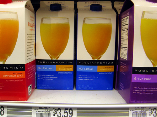
My concern is that they've taken a premium priced item and then displayed it as a generic item. All of the 80 or so years of Tropicana branding, it's like sticking a straw into an orange, look at these groves, etcetera, it's so pricey because it's so good.. replaced with.. "Orange Drink."
So help me understand, if they haven't lowered the price, how is this more competitive? Why are you reaching for it as opposed to the store brand next to it with the same royalty free looking glass of OJ?
posted by cavalier at 6:27 AM on February 10, 2009 [1 favorite]
Crap doodle. new packaging -- now with improved copy paste.
posted by cavalier at 6:28 AM on February 10, 2009
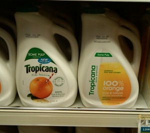
posted by cavalier at 6:28 AM on February 10, 2009
Jonmc: We got a few of the new cans for free when we ordered some Chinese food delivered a week or so ago. I prefer Coca-Cola[.]
Whew. I'm so glad that's settled.
posted by applemeat at 6:36 AM on February 10, 2009
Whew. I'm so glad that's settled.
posted by applemeat at 6:36 AM on February 10, 2009
You see, that's why you don't let the math guys into creative.
posted by aftermarketradio at 6:55 AM on February 10, 2009
posted by aftermarketradio at 6:55 AM on February 10, 2009
On the bright side for them, nor am I any more inclined to drink Coke's equally shitty product.
I agree. At the same time, if you can find yourself a Mexican Coke, it's an eye-opener. When it's made with cane sugar, that shit is good. I've only had it once, but I now know why Coke was so popular back in the day. It was really good.
Nowadays, of course, it's shite, and I normally won't touch it with a ten foot pole.
posted by five fresh fish at 7:06 AM on February 10, 2009 [1 favorite]
I actually admired his devotion to the cause. You don't get to be Exec VP by drinking your competitors' products.
that's actually quite common down to the lowest ranks.* corporate culture works that way. while working for a certain agency a few years back I witnessed a meeting in which the marketing manager for a large chewing gum company always ate exactly the gum we were discussing. we'd present a campaign for the next gum and he'd change what he was chewing on. once we discussed five gums in five minutes just to see if he'd give up. he did not.
I have been to more meetings than I can count where the client was way into their own products. (wearing adidas at wieden+kennedy is asking for hurt.) a lot of the cigarette people can't understand why anyone would hate them. I ran into this when presenting to a large chemical company** with a really extensive and nasty history of environmental and health-related scandals. if people who really suck think of themselves as great there is only so much you can do for them. that's why I don't see any hope for microsoft.
*= my theory is that the lower the employee, the more fanatic he gets. the most senior employee usually still buys into it to a large extend. it's the owners who usually turn out to be surprisingly level-headed. you know that scene
**=that chemical company story is one I'd love to tell in greater detail but I have a habit to support and this industry is too small to it not coming back to haunt me.
posted by krautland at 7:30 AM on February 10, 2009
Plus, if you are charging $$$$'s for a brand redesign, you need to think of something that makes it look like you've done some work. "Yeah, we tinkered around with the bezier tool in Illustrator for ten minutes, then we went to the Maldives for a month, that'll be $50,000" doesn't really cut it. Although that would be more like the reality.
This is precisely, exactly, it. I'm a graphic designer. Part of the job is selling the sizzle to the client. They don't want to know that you doodled around in Illustrator until the logo "looked right". They want you to tell them some kind of fluffy story about what the logo MEANS and how it's going to synergize their action items.
Part of the issue is that corporate types are firmly rooted in the time = money mentality. If it appears you designed a logo too quickly or easily, they don't think you worked on it hard enough.
It's bullshit, but when your paycheck comes from corporate types, you have to serve them the logo on a big satin cushion filled with bullshit so they feel like they got their money's worth.
posted by Fleebnork at 7:31 AM on February 10, 2009 [4 favorites]
MetaFilter: a big satin cushion filled with bullshit.
Sorry.. too great. Thanks!
posted by cavalier at 8:03 AM on February 10, 2009
Sorry.. too great. Thanks!
posted by cavalier at 8:03 AM on February 10, 2009
The new design sucks, but the explanation for it has advanced the bullshit arts and sciences by decades. It may be too farsighted for us even to grasp at this point in history. But one day, we'll look back on that PDF as a major turning point in humanity's ability to lie to itself.
posted by rusty at 8:20 AM on February 10, 2009
posted by rusty at 8:20 AM on February 10, 2009
So help me understand, if they haven't lowered the price, how is this more competitive? Why are you reaching for it as opposed to the store brand next to it with the same royalty free looking glass of OJ?
Well, that Publix brand carton doesn't strike me, though it's better than all the store brands we have in New England. It's full of dark colors, though - red, blue and purple? Orange is the dominant color on the new Tropicana carton (not white, or black text) and it's rich and bright. I think the font looks good in the context of an American grocery store - sure, Europe has been doing geometric serif fonts for a decade now, and better, but why can't we just have a little bit?
posted by setanor at 9:01 AM on February 10, 2009
Thank you -- strong orange, european serif style -- I can agree these are both appealing items. I think that's why I'm incensed about it -- the serif look makes it look so everywhere that it loses its identity, but if I were to look at from a fresh set of eyes not entrenched with Tropicana I could see now where it's attractive.
I still think it commoditizes what should be a premium, but we'll see how it works out..
posted by cavalier at 9:06 AM on February 10, 2009
I still think it commoditizes what should be a premium, but we'll see how it works out..
posted by cavalier at 9:06 AM on February 10, 2009
I love this PDF, it's a beautiful design document. Particularly the spidery-line ovals trying to extract some rational design evolution behind the logos. I think the new logo isn't terrible, either, a bit fresh. I like the asymmetry. I also like the emoticon treatment on page 22.
Of course the writing is absolute bullshit. It's advertising. They may think they're doing something important and relevant and objective But this isn't fucking science. It's selling empty calories with some blob of red-and-blue.
posted by Nelson at 9:15 AM on February 10, 2009
Of course the writing is absolute bullshit. It's advertising. They may think they're doing something important and relevant and objective But this isn't fucking science. It's selling empty calories with some blob of red-and-blue.
posted by Nelson at 9:15 AM on February 10, 2009
in this instance you're trying to sell something that a client actually needs
Pepsi needs their logo turned into a happy face to a greater extent than people need houses and safe investments?
which parts of that phrase are the bad ones?
Whichever part makes the down payment on the condo by producing bullshit they don't believe in for people who they believe are fools in fancy suits.
posted by TimTypeZed at 9:44 AM on February 10, 2009
Pepsi needs their logo turned into a happy face to a greater extent than people need houses and safe investments?
No, Pepsi needs their logo turned into a happy face to a greater extent than people who can't afford mortgages need mortgages to be pushed onto them with the expectation that they will default.
posted by setanor at 10:40 AM on February 10, 2009
No, Pepsi needs their logo turned into a happy face to a greater extent than people who can't afford mortgages need mortgages to be pushed onto them with the expectation that they will default.
posted by setanor at 10:40 AM on February 10, 2009
Dudes, this HAS to be fake. Doesn't it? Why would the brand manager not punt these idiots from the corporate suite for wasting his/her time and money? Is this really real?
I understand all to well the idea of selling the sizzle, of retro-fitting some process and meaning to the more banal realities of a logo redesign or new campaign, but this is totally nuts!
posted by Mister_A at 10:49 AM on February 10, 2009
I understand all to well the idea of selling the sizzle, of retro-fitting some process and meaning to the more banal realities of a logo redesign or new campaign, but this is totally nuts!
posted by Mister_A at 10:49 AM on February 10, 2009
So help me understand, if they haven't lowered the price, how is this more competitive? Why are you reaching for it as opposed to the store brand next to it with the same royalty free looking glass of OJ?
I'll tell you exactly how this happened:
pepsi co has a meeting. someone needs some bright idea to boost sales. the underunderundermarketingboss wants to hear shit. so this person says "hey, we could look into redesigning the packaging. maybe an updated logo. brand x did it and (silently: I read in some porn mag) their sales jumped 10.47% over the previous year!" so a committee gets formed. four to six low- to medium-level kids (they all have done some undergrad business school and started out as interns. that's maybe three years behind them and now they're making 35k and are wearing similar wardrobes to their bosses only they can barely afford it.) are put onto it. they ask their friends, who have about just as much experience with all this, who the cool designers are. someone has worked with someone. this is how people pretending to be knowing and cool like mr. arnell get jobs. the kids have no chance against him, just like that nice old couple from your block stands no chance against that used-car salesman. they are gonna pay sticker and they are gonna love it.
so a bunch of explorations and revisions are made. a budget comes into play. underunderundermarketingboss, who is just like these kids but has two to three more years experience and has learned to fake jadedness and knowledge to his underlings, has handed this up the ladder. by the time it reaches someone important enough money has been poured into this that they need to do something in order to not look like total morons in front of the real beancounters. besides, someone needs to make VP and get raised to those magic 50k/year. hey, they might even get a windowless office next to the cubicles.
the really important people get this at the very end. they will look at six months of clueless kids working on this, not know anything and decide within a second or two whether it's cool or not. the people below them are the ones who need the bullshit and brouhaha from arnell and co in order to be brave enough to show it to their bosses. remember, VP title! 50k! mom is gonna be so proud! so they get lulled into accepting something as a 'sure hit' that they are completely unable to judge.
I've seen this go down a million times. marketing, design, advertising and all that should never be handled by anyone other than the ceo. that's why apple is doing so well in this apartment and that's what companies like jetblue or nike used to do (both have somewhat changed). procter and gamble is a negative example. it's middle management on its own making stupid decisions based on pie charts and procedures they don't understand.
there is nothing wrong with not knowing why something works or how to judge a good design or ad. the great evil is that they still try to drive the process. you wouldn't want to tell the surgeon how to do your own surgery while you're on the table and without proper training shouldn't really mess with your brakes, yet when it comes to advertising judging the professional who you hired to do the job (and mind you: who is making three to five times your salary) is supposed to accept that you know better. this is how ugly billboards happen.
posted by krautland at 11:02 AM on February 10, 2009 [4 favorites]
50k? Do they really make that little? That can't be right, can it?
posted by empath at 11:42 AM on February 10, 2009
posted by empath at 11:42 AM on February 10, 2009
spelling out her name here for google to find is a major asshole move, anniecat.
What? Did somebody draw up a MetaFilter Privacy Policy while I was sleeping?
posted by UbuRoivas at 11:59 AM on February 10, 2009 [3 favorites]
What? Did somebody draw up a MetaFilter Privacy Policy while I was sleeping?
posted by UbuRoivas at 11:59 AM on February 10, 2009 [3 favorites]
if you can find yourself a Mexican Coke, it's an eye-opener. When it's made with cane sugar, that shit is good. I've only had it once, but I now know why Coke was so popular back in the day. It was really good.
Hm, as far as I know, Australian Coke would also be made with cane sugar - we grow heaps of the shit, but not a whole lot of corn - I don't think HFCS has made much of a dent in processed foods here.
But it still doesn't change the fact that those drinks are nothing but a cupful of sugar dissolved in artificially flavoured water. Why anybody would ever want to drink them is beyond me.
(it's just one of the main things that i'm orthorexic about. if you really really feel that you need to have a pointless sugar hit, why not at least go for a fruit juice, where you might get a few vitamins to make it slightly worthwhile? caffeine? hell, that's what coffee is for, and it's far more enjoyable)
posted by UbuRoivas at 12:08 PM on February 10, 2009
Mexican Coke, it's an eye-opener
Quoted for truth...
Wait, what were we talking about?
posted by empath at 12:16 PM on February 10, 2009 [4 favorites]
Quoted for truth...
Wait, what were we talking about?
posted by empath at 12:16 PM on February 10, 2009 [4 favorites]
UbuRoivas: What? Did somebody draw up a MetaFilter Privacy Policy while I was sleeping?
are you suggesting that because matt hasn't finished his pp yet it is okay to do that? wow, how delicate you are. what matters is that this is a "someone fucked up" thread and now the name is connected. it'll pop up in google whenever a hr department researches them. it's an asshole move.
empath: the minions don't make much.
posted by krautland at 12:31 PM on February 10, 2009 [1 favorite]
I'm not sure that I'm the one who's being delicate.
If somebody willingly puts up their real-life name in Linkedin, for example, that means they accept that they may be googled & found, and associated with their work.
The snooping by barnacle - linking what looks like a network logon name (that was probably associated with the PDF file without the author's knowlege) with a real-life name of an employee might have been pushing things a bit far.
But it's not uncommon for people to be mentioned by name in threads here. This guy Arnell has been mentioned by name; what makes this other woman different? It's not as if she's been trying very hard to keep her work activities secret on the internet, is it?
posted by UbuRoivas at 12:44 PM on February 10, 2009 [2 favorites]
(more Devil's advocacy there than anything else; I just don't see why this particular instance is assholish, when others are ok. is it just because people find the sales puff funny? a number of mefites have explained how that kind of stratospheric nonsense gets associated with the actual work of the creatives)
posted by UbuRoivas at 12:47 PM on February 10, 2009 [1 favorite]
posted by UbuRoivas at 12:47 PM on February 10, 2009 [1 favorite]
also - do you think that anybody who worked on something as huge as a complete pepsi rebranding *wouldn't* put that front-row-centre in their resume? in 40-point bold caps?
posted by UbuRoivas at 12:52 PM on February 10, 2009
posted by UbuRoivas at 12:52 PM on February 10, 2009
also - do you think that anybody who worked on something as huge as a complete pepsi rebranding *wouldn't* put that front-row-centre in their resume? in 40-point bold caps?
maybe not this one . . .
posted by jeremias at 2:14 PM on February 10, 2009
maybe not this one . . .
posted by jeremias at 2:14 PM on February 10, 2009
50k? Do they really make that little? That can't be right, can it?
The branding folk make that little. It's the advertising creatives that pull in bigger $$.
posted by Maisie Jay at 3:20 PM on February 10, 2009
The branding folk make that little. It's the advertising creatives that pull in bigger $$.
posted by Maisie Jay at 3:20 PM on February 10, 2009
maybe not this one . . .
No, you're right. Bold caps just wouldn't work.
The resume would need the full breathtaking gravitational field perimeter oscillation DNA energy field dynamo treatment, based on the golden ration.
posted by UbuRoivas at 3:46 PM on February 10, 2009 [2 favorites]
No, you're right. Bold caps just wouldn't work.
The resume would need the full breathtaking gravitational field perimeter oscillation DNA energy field dynamo treatment, based on the golden ration.
posted by UbuRoivas at 3:46 PM on February 10, 2009 [2 favorites]
Am I the only one who finds the quality dreadfully uneven? On one hand you've got the brilliant three-dimensional space-warp trip of the later pages, and on the other hand you've got "a reoccurring phenomena" on page 5. (Really? A reoccurring phenomena? Aren't inadequate doofus disguisers spelling/grammar checkers smart less-stupid enough to catch that stuff these days?) The ellipse-fitting stuff is like an obsessive approximation of design, but the Golden Ratio is way over-explained when they should have been getting to the Pepsi geometry. Very, very patchy. But I concede there are moments of true BSing genius in it.
posted by eritain at 4:40 PM on February 10, 2009
posted by eritain at 4:40 PM on February 10, 2009
If somebody willingly puts up their real-life name in Linkedin, for example, that means they accept that they may be googled & found, and associated with their work.
I'm not sure if you're trying to be cheeky or if you actually are that thick but wow, what a statement. this is a threat poo-pooing the work of a person. adding that person's name is making the connection for google. it was unnecessary and mean. it was the opposite of a classy move. it was an assholish move. this has absolutely nothing to do with linkedin.
But it's not uncommon for people to be mentioned by name in threads here.
that doesn't make it any more right to call this person -who isn't present- out in a threat where her work is being called nasty things. do you really find that so difficult to grasp?
This guy Arnell has been mentioned by name
arnell is the public face of this work. he puts himself out there and establishes the connection himself. the opposite is true here. this was in all likelihood the modern equivalent of a typist that got personally outed.
number of mefites have explained how that kind of stratospheric nonsense gets associated with the actual work of the creatives
that would have been me.
also - do you think that anybody who worked on something as huge as a complete pepsi rebranding *wouldn't* put that front-row-centre in their resume? in 40-point bold caps?
I think I understand at this point that you are in fact thick.
posted by krautland at 5:02 PM on February 10, 2009
It's bullshit, but when your paycheck comes from corporate types, you have to serve them the logo on a big satin cushion filled with bullshit so they feel like they got their money's worth.
Then they're not really getting their money's worth, are they?
posted by five fresh fish at 5:49 PM on February 10, 2009
Then they're not really getting their money's worth, are they?
posted by five fresh fish at 5:49 PM on February 10, 2009
Odd. An advertisement about an advertisement, in which unconscious associations regarding everything from DNA to emoticons to the Golden Ratio are hooked to the new Pepsi logo.
MetaFilter: Meta-advertising.
posted by FormlessOne at 6:18 PM on February 10, 2009
MetaFilter: Meta-advertising.
posted by FormlessOne at 6:18 PM on February 10, 2009
So what is she, krautland? A mere amanuensis for Arnell, or somebody actually responsible for the work? You can't have it both ways.
Any why do you think she should hide the Pepsi work from her resume? They won the contract & managed to sell their designs to the client even with this bizarre spin. That's gotta count for a lot, especially considering that they were dealing with a global megabrand.
Compared with what some snarksters say on a website, hell, she's got the runs on the board, no?
posted by UbuRoivas at 6:19 PM on February 10, 2009 [1 favorite]
Imagine how much cheaper the final bill would have been, had the ad agency not spent a month wanking-off on the sales pitch. They put more damn effort into the brochure than they did the logo. Were I the guy in charge, I'd kick the agency's ass to the curb and sue them for misappropriation. (A charge hardly any more ridiculous than the brochure.)
posted by five fresh fish at 6:55 PM on February 10, 2009
posted by five fresh fish at 6:55 PM on February 10, 2009
BTW: I just saw this stuff in the super market today. So the logo, anyway, is not fake, in case that's still an open question.
Oh -- and while I was snarking a bit with my pac man dig, the idea of a 3D logo that manifests itself in different ways depending on how it's captured on the label is actually kinda cool. It's still The Man selling sugar water though :)
posted by Toecutter at 7:27 PM on February 10, 2009
Oh -- and while I was snarking a bit with my pac man dig, the idea of a 3D logo that manifests itself in different ways depending on how it's captured on the label is actually kinda cool. It's still The Man selling sugar water though :)
posted by Toecutter at 7:27 PM on February 10, 2009
All I see when I look at the new Pepsi logo is maxi-pads. The pad is white, a divider protecting the blue jeans from a belly full of blood.
The old Pepsi logo always used to remind me of the South Korean flag (especially when it was red and blue against a white background).
posted by L.P. Hatecraft at 10:27 PM on February 10, 2009
The old Pepsi logo always used to remind me of the South Korean flag (especially when it was red and blue against a white background).
posted by L.P. Hatecraft at 10:27 PM on February 10, 2009
A mere amanuensis for Arnell, or somebody actually responsible for the work? You can't have it both ways.
of course I can, broaden your horizon. she is unimportant to someone like arnell but a client never gets to know that. account executives only matter to clients. they are the face they connect with the name, yet they don't actually do anything important internally. they have no link to creative.
Any why do you think she should hide the Pepsi work from her resume?
I don't. I think it's an asshole move to mention her by name in a thread where her work is being made fun of. wow, way to misunderstand me again. you really are not even trying to get it.
hell, she's got the runs on the board, no?
no. definitely no. you should sign up to do some focus groups. you have the ability to not understand the simplest constructions. clients would love that.
Imagine how much cheaper the final bill would have been, had the ad agency not spent a month wanking-off on the sales pitch.
it wouldn't have been. they wouldn't have accepted the task if it hadn't been a certain amount of cash, the client wouldn't have accepted the result if it hadn't been expensive. it's a death spiral.
posted by krautland at 4:42 AM on February 11, 2009
krautland you're the one being an asshole at this point. Just because your moral compass says that someone's work shouldn't be critiqued on a public forum where it should be googled does not make it so that Ubu or anyone else here is "thick" because they disagree with you.
posted by cavalier at 5:33 AM on February 11, 2009 [3 favorites]
posted by cavalier at 5:33 AM on February 11, 2009 [3 favorites]
Then they're not really getting their money's worth, are they?
The fact that I often must talk the client into recognizing that the work is done should not be construed to mean that I am not providing them with the best quality work that I can.
It's usually not sufficient to say "Trust me, it looks good, I'm a professional" and have them take me at my word. Often times it requires a bit of selling them on it to get them to relax.
Nothing on the order of the PDF above, however. That's pretty silly stuff.
posted by Fleebnork at 7:31 AM on February 11, 2009 [1 favorite]
krautland, i'm afraid you're not making any sense whatsoever.
the entire point was whether or not her name being mentioned in a thread like this would damage her in the eyes of future employers, no?
i know enough about the client - a/c exec - creative relationship *without even working in the industry* to understand that she is barely, if at all, responsible for the content here, but she handled the account for one of the biggest clients in the corporate world, and handled it despite the kooky sales pitch.
if i were an employer, i'd be impressed.
you - as somebody apparently working in the industry - should know this even better. in fact, from the knowledgeability of your responses, you supposedly do.
so, if you or your company were scouting around for a new a/c exec, and this lady applied, and you chose to google her name, and found this thread, would you throw all your industry knowledge out the window & think "shit, can't employ her; some people are making fun of 'her work' on the internet!" or would you use your intelligence & experience to realise that:
1) this kind of stuff is always a team effort (including the client as part of the team) with no single person ultimately responsible for the final concept or the pitch
2) the team effort often involves considerable tensions & back-and-forth between client & creatives, mediated by execs & directed by the head honcho
3) the larger the account, the more people will want to stick their noses in & influence the result - especially on the client side
4) the a/c exec is barely or not at all responsible for either the creative work or the ultimate success of the advertisement / branding / design in the marketplace
5) however, it takes skill, responsibility & professionalism to handle a major client like pepsico, and
6) it would take more of the above to handle a major client with a timecube pitch.
In summary, although I agree that it was unnecessary to call her out, I disagree that it has done her any realistic damage. If anything, it should increase her employability.
(any more of this derail should probably go to MeTa for a policy discussion, yeah?)
posted by UbuRoivas at 10:54 AM on February 11, 2009
Sandra Arndt used to live in the apartment I live in now (and based on the linkedin profile, it is the same person). We still get catalogs for her now and then. Too weird.
posted by Lazlo Hollyfeld at 1:01 PM on February 12, 2009
posted by Lazlo Hollyfeld at 1:01 PM on February 12, 2009
if i were an employer, i'd be impressed
oh man, you've got it so wrong. potential employer remembers brouhaha around pepsi design, sees this person being mentioned online, connects dots. that could be "well, she can't control the project" to "this is the person responsible for that getting out" to something way worse.
would you throw all your industry knowledge out the window & think "shit, can't employ her; some people are making fun of 'her work' on the internet!"
I would think she couldn't control her projects. someone forgot to cover the pot and now there's milk all over the stove. you don't want to stand near that mess when mommie finds out or you're gonna get blamed.
I don't hire account guys. I wouldn't know what to look for. sad thing is that seems to be true for the ones who do hire them as well.
posted by krautland at 4:24 PM on February 12, 2009
Idunno, I think it could go either way.
I'm cynical enough about employers to think that they're easily impressed by any big-name or big-project experience ("OMG! Worked for Google!!1!11") and for that reason, just having worked on the Pepsi account shows experience & credibility in the big end of town.
At the same time, I think any mature businessperson with decent exposure to the corporate world realises that project work involves so many people & factors that even if a project goes completely belly-up, that doesn't necessarily reflect on the abilities of any individual involved.
In this case, though, the project didn't fail by any measure. Her company successfully completed the rebranding of one of the world's major consumer brands. That's a big win for the company, no matter what Joe Public thinks of the design.
And in the process, a pdf got leaked by somebody - so what? Is she expected to be some kind of technical expert in digital rights management who can produce pdfs that can't be printed or emailed? Even that wouldn't guarantee the security of digital files. The best she could've done would've been to only hand out hard copies, and collect them for destruction at the end of every meeting with the client. I don't know if that's standard practice where you work, but I tend to think that level of mistrust would sour the relationship with the client.
So yeah, bit of a stink on the internet, but overall not her fault.
posted by UbuRoivas at 5:40 PM on February 12, 2009
(oh, it was apparently leaked from within the ad agency. well, if you can't trust your own colleagues, who can you trust?)
posted by UbuRoivas at 5:44 PM on February 12, 2009
posted by UbuRoivas at 5:44 PM on February 12, 2009
Calloo, callay! PepsiCo's Tropicana realized the new brand design was shit and they are reverting to last year's Sterling Brand's design. Looks like the ad campaign will continue though I bet that will change as well...
ny times
blog post sourcing times
fast company
posted by cavalier at 1:39 PM on February 23, 2009
ny times
blog post sourcing times
fast company
posted by cavalier at 1:39 PM on February 23, 2009
I just noticed that on the nixed Tropicana carton, except for fine print at the bottom next to "pasteurized" and "kosher," the label just says "100% orange." No "juice," no "drink," no "punch," no "cocktail," just "100% orange." Gotta wonder: Is that referring to the fruit, or the colour?
Anyway, I guess it kind of explains this:
He also made over Tropicana's packaging, tossing out the orange-with-a-straw-in-it image in favor of a glass of juice -- because, Arnell explained, consumers needed to be able to visualize the juice inside the orange.
Dude, just write the word "juice" on the carton.
posted by Sys Rq at 9:12 AM on February 24, 2009
« Older Double Muscle | Staring into the abyss Newer »
This thread has been archived and is closed to new comments
posted by empath at 4:52 PM on February 9, 2009 [5 favorites]