Typeset in the Future
May 2, 2019 4:25 PM Subscribe
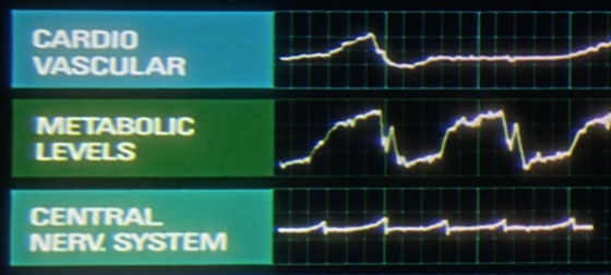
This final part of the film is visually eclectic, aurally stunning and philosophically challenging. Many thousands of words have been penned over the decades to try and fathom the meaning of the monolith, and the genesis and future of the space-baby. However, none of this act contains typography, and it is therefore of no concern to us. Let’s skip to the end credits.
Typset in the Future is the blog of Dave Addey, “dedicated to typography and iconography as it appears in sci-fi and fantasy movies and TV shows.”
Previously, Previouslier, Previousliest
Typset in the Future is the blog of Dave Addey, “dedicated to typography and iconography as it appears in sci-fi and fantasy movies and TV shows.”
However, there’s a deeper mission at work. In fact, I’ll let you in on a secret: this blog isn’t really about typography at all. It’s about storytelling through design. I wasn’t aware of this when I started, but here we are.It’s true! The blog is extremely digressive and as such, each of the following links should be considered to contain significant spoilers for the subject of the post (...especially “Moon”), plus probably mild spoilers for all of the earlier films covered, plus the occasional random spoiler for an unexpected classic, like “Terminator”. [I started with “Alien” and was instantly hooked.]
- 2001: A Space Odyssey
- Moon
- Alien
- Blade Runner
- WALL·E (please note the interpunct)
Spoiler!
A blog with seven posts has scored a book deal, featuring interviews with Paul Verhoven and the like.Previously, Previouslier, Previousliest
The writer unhelpfully did not warn us of a TV Tropes link in the 2001 article. I managed to extricate myself after only a few minutes
posted by lhauser at 6:56 PM on May 2, 2019 [3 favorites]
posted by lhauser at 6:56 PM on May 2, 2019 [3 favorites]
I love this stuff. Alien still has some of the best art design ever. Ron Cobb is a genius.
posted by octothorpe at 6:47 AM on May 3, 2019 [2 favorites]
posted by octothorpe at 6:47 AM on May 3, 2019 [2 favorites]
I'm in the Venn diagram intersection of people slightly interested in type face and those slightly interested in sci-fi.
Question about the buttons/labels in 2001- I think it's likely that the labels were hand-drawn. In that case, is it proper to call it a font? Or one with a known name?
In machines of that era, would a graphic designer of production machines (as opposed to one-offs) hand draw labels like that, or would there have been a template with a known font?
posted by MtDewd at 7:31 AM on May 3, 2019
I think it's likely that the labels were hand-drawn
Let me introduce you to Lettraset
posted by Insert Clever Name Here at 3:56 PM on May 3, 2019 [1 favorite]
Let me introduce you to Lettraset
posted by Insert Clever Name Here at 3:56 PM on May 3, 2019 [1 favorite]
10. Immediately upon awakening activate vibrator for 2 minutes.
Goddam right.
posted by GCU Sweet and Full of Grace at 4:22 PM on May 3, 2019
Goddam right.
posted by GCU Sweet and Full of Grace at 4:22 PM on May 3, 2019
This is a brilliant blog. Do not miss the Blade Runner ESPER sequence he mapped onto the base photograph so you can see exactly what's going on.
posted by lucidium at 11:30 AM on May 4, 2019 [1 favorite]
posted by lucidium at 11:30 AM on May 4, 2019 [1 favorite]
There's a book!
I bought the book.
I read the book.
I enjoyed the book.
posted by ragtag at 7:49 AM on May 11, 2019 [1 favorite]
I bought the book.
I read the book.
I enjoyed the book.
posted by ragtag at 7:49 AM on May 11, 2019 [1 favorite]
Actually, you know what? There's an interesting meditation there.
I live way out in rural America, which has been left behind on access to broadband Internet. Because of that, I couldn't really read the website—it has too many high resolution images which simply wouldn't load on my poor connection. Because of that, it probably actually was higher bandwidth to just purchase the book and get it shipped to me than it was to wait for the site to load (bonus content in the book aside).
The book talks a lot about how designers have needed to continually update their notions of what "the future" means, in order to keep their designs fresh and to keep hitting the moving target of "the future" in the face of technological progress. But the book dismisses the newspaper headline "WORLD WIDE COMPUTER LINKUP PLANNED" of Blade Runner's 2019 LA as being insufficiently forward-thinking. From where I'm sitting, though, it was too optimistic.
We may reach the point soon (if we have not already) where technological regression begins to make these films seem more optimistic, as time passes, rather than less. At least for substantial parts of the population.
posted by ragtag at 8:06 AM on May 11, 2019 [1 favorite]
« Older Who gives out more treats, dogs or wolves? | "Promise me that you will say kaddish for me." Newer »
This thread has been archived and is closed to new comments
posted by thatwhichfalls at 5:31 PM on May 2, 2019 [18 favorites]