Spliced
February 26, 2011 6:17 AM Subscribe
I don't understand what I'm seeing.
posted by ColdChef at 6:22 AM on February 26, 2011 [1 favorite]
posted by ColdChef at 6:22 AM on February 26, 2011 [1 favorite]
Seems to be a sampling of the color information on screen mapped out over time.
posted by nathancaswell at 6:23 AM on February 26, 2011 [1 favorite]
posted by nathancaswell at 6:23 AM on February 26, 2011 [1 favorite]
The Fountain is the most interesting one so far. Bad movie but you can see how he's working with palette.
posted by nathancaswell at 6:25 AM on February 26, 2011
posted by nathancaswell at 6:25 AM on February 26, 2011
The plot thickens.
posted by flapjax at midnite at 6:30 AM on February 26, 2011 [1 favorite]
posted by flapjax at midnite at 6:30 AM on February 26, 2011 [1 favorite]
I don't understand what ColdChef is seeing.
posted by cjorgensen at 6:33 AM on February 26, 2011
posted by cjorgensen at 6:33 AM on February 26, 2011
Seems to be a sampling of the color information on screen mapped out over time.
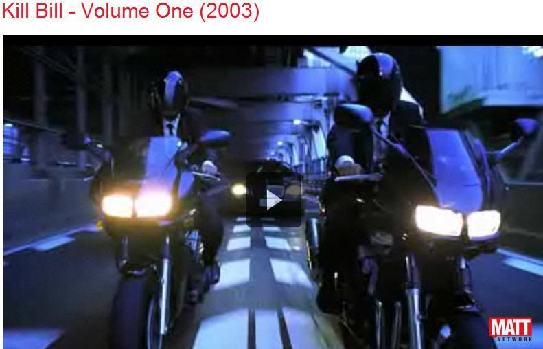
Any idea what the bright blue section towards the end of "Kill Bill" is?
posted by ColdChef at 6:33 AM on February 26, 2011
Any idea what the bright blue section towards the end of "Kill Bill" is?
posted by ColdChef at 6:33 AM on February 26, 2011
I like how it makes the overarching color theme of a film so clear -- the terminal green of The Matrix, the electric blue of Tron, the unexpectedly rich palette of Kung Fu Panda. The King's Speech is surprisingly dark, and Moon looks like, well, the surface of the moon. And is that a day/night cycle in Jaws, or a sky/cabin/water one? I don't remember the rhythm of the movie well enough to tell.
Also, I'm interested in the horizontal shapes in 2001. Is that an artifact of all the long shots?
posted by Rhaomi at 6:41 AM on February 26, 2011 [2 favorites]
Also, I'm interested in the horizontal shapes in 2001. Is that an artifact of all the long shots?
posted by Rhaomi at 6:41 AM on February 26, 2011 [2 favorites]
Any idea what the bright blue section towards the end of "Kill Bill" is?
This
posted by fearfulsymmetry at 6:41 AM on February 26, 2011
This
posted by fearfulsymmetry at 6:41 AM on February 26, 2011
Any idea what the bright blue section towards the end of "Kill Bill" is?
The really bright one is probably the motorcycle scene.
posted by nathancaswell at 6:41 AM on February 26, 2011
The really bright one is probably the motorcycle scene.
posted by nathancaswell at 6:41 AM on February 26, 2011
Any idea what the bright blue section towards the end of "Kill Bill" is?
That's the Zen garden showdown between The Bride and O-ren Ishii.
posted by carsonb at 6:42 AM on February 26, 2011
That's the Zen garden showdown between The Bride and O-ren Ishii.
posted by carsonb at 6:42 AM on February 26, 2011
The garden scene is the less bright blue section.
posted by nathancaswell at 6:43 AM on February 26, 2011
posted by nathancaswell at 6:43 AM on February 26, 2011
This would have saved me So Much Time in that film class.
posted by JeffK at 6:48 AM on February 26, 2011 [1 favorite]
posted by JeffK at 6:48 AM on February 26, 2011 [1 favorite]
I think the yellow stripe is a bit in the anime story of O-Ren (I had though it might have been the pussy wagon but it does not fit) - yes, I have just fired up the dvd and compared the progress bar to the barcode, why do you ask?
The greeny turquoise bit before is the hospital 'I'm Buck' section
I don't think it's a pure condensation of the film but samples taken at set points, but I could be wrong.
posted by fearfulsymmetry at 6:57 AM on February 26, 2011 [1 favorite]
The greeny turquoise bit before is the hospital 'I'm Buck' section
I don't think it's a pure condensation of the film but samples taken at set points, but I could be wrong.
posted by fearfulsymmetry at 6:57 AM on February 26, 2011 [1 favorite]
Rhaomi: mostly a day/night thing. I like how the underwater sequences show up.
posted by rmd1023 at 6:59 AM on February 26, 2011
posted by rmd1023 at 6:59 AM on February 26, 2011
shit i forgot about the part in the 88 fight where it goes blue, i think fearful has it
posted by nathancaswell at 7:08 AM on February 26, 2011
posted by nathancaswell at 7:08 AM on February 26, 2011
Here's Inception. The film struck me as having the most gimmicky colour palette ever, but it doesn't really show up in the image other than the big white area for the not-James-Bond sequence.
posted by Nelson at 7:10 AM on February 26, 2011
posted by Nelson at 7:10 AM on February 26, 2011
I want to see one for Derek Jarman's Blue.
I actually would realy like to see one for the Three Colours Trilogy.
posted by nathancaswell at 7:15 AM on February 26, 2011 [2 favorites]
I actually would realy like to see one for the Three Colours Trilogy.
posted by nathancaswell at 7:15 AM on February 26, 2011 [2 favorites]
The Matrix pretty much looks like the Matrix.
posted by mazola at 7:23 AM on February 26, 2011 [2 favorites]
posted by mazola at 7:23 AM on February 26, 2011 [2 favorites]
I like how there's a real possibility that this guy is mislabeling the movies so that commanders on the internet will wax pretentious about the palette of Larry the Cable Guy: Health Inspector.
posted by Riki tiki at 7:25 AM on February 26, 2011 [1 favorite]
posted by Riki tiki at 7:25 AM on February 26, 2011 [1 favorite]
Also: this would be my preferred way of seeing Spanglish.
posted by mazola at 7:28 AM on February 26, 2011 [1 favorite]
posted by mazola at 7:28 AM on February 26, 2011 [1 favorite]
I saw Spanglish, it actually wasn't THAT bad. I've watched way worse.
posted by nathancaswell at 7:30 AM on February 26, 2011
posted by nathancaswell at 7:30 AM on February 26, 2011
For instance, You've Got Mail, in which the main character is a psychopath.
posted by nathancaswell at 7:31 AM on February 26, 2011 [1 favorite]
posted by nathancaswell at 7:31 AM on February 26, 2011 [1 favorite]
Is there a publicly available program to do this? I want see how my own favorites fare.
And I'm imagining one of these blown up to massive size used as wall covering in an expensive modernist home:
Visitor: Oh! I love the artwork! Who's it by?
Homeowner: Michael Bay.
posted by Wemmick at 7:38 AM on February 26, 2011 [6 favorites]
And I'm imagining one of these blown up to massive size used as wall covering in an expensive modernist home:
Visitor: Oh! I love the artwork! Who's it by?
Homeowner: Michael Bay.
posted by Wemmick at 7:38 AM on February 26, 2011 [6 favorites]
I actually would realy like to see one for the Three Colours Trilogy.
Yeah, I'd like to see that...
Comparing the old and the new kinda confirms my hunch that films got much more samey in their palettes since digital grading became ubiquitous.
posted by fearfulsymmetry at 7:39 AM on February 26, 2011
Yeah, I'd like to see that...
Comparing the old and the new kinda confirms my hunch that films got much more samey in their palettes since digital grading became ubiquitous.
posted by fearfulsymmetry at 7:39 AM on February 26, 2011
I'd love to see one for Wings of Desire - imagine it starting out on the left entirely in black and white, patches here and there of a colorful memory... until finally the whole image is in color...
posted by Wemmick at 7:53 AM on February 26, 2011
posted by Wemmick at 7:53 AM on February 26, 2011
I like how you can see each of the flashback sequences delineated in Hero.
posted by MythMaker at 8:16 AM on February 26, 2011 [1 favorite]
posted by MythMaker at 8:16 AM on February 26, 2011 [1 favorite]
Heh, fun. I guessed the Matrix easily and misidentified The Prestige as Batman Begins, so at least I've got Nolan pegged I guess.
And Traffic certainly does look like it ought to.
Also, I'm interested in the horizontal shapes in 2001. Is that an artifact of all the long shots?
I think it must be, and this is in some way or another sampling a cohesive vertical strip of the film for every column. Maybe from center frame? Look also at Moon, where there's some horizontal banding near the beginning of the film that's likely from a long shot in the lab (I can't recall exactly what would have been going on at that point in the film), or at Exit Through The Gift Shop, which has banding at the start and then again later, what looks like a shot of a oldschool detuned television maybe? I haven't seen the film.
That's my guess anyway. At first I had thought it might be a single pixel averaging the color content of each whole screen per unit time, lined up in top to bottom one at a time before flowing to the next column, but these regularities in horizontal banding suggest not.
I'd love to see more Kubrick.
posted by cortex at 8:18 AM on February 26, 2011
I'd like to see one of the Teal-And-Orange blockbusters, like Twilight.
posted by empath at 8:23 AM on February 26, 2011 [1 favorite]
posted by empath at 8:23 AM on February 26, 2011 [1 favorite]
Exit Through The Gift Shop, which has banding at the start and then again later, what looks like a shot of a oldschool detuned television maybe?
The titles of Exit here with the banding... I'd guess the later bit is probably Mr Brainwash's 'film' within the film, similarly banded, but I've not got a copy handy to check.
posted by fearfulsymmetry at 8:38 AM on February 26, 2011
The titles of Exit here with the banding... I'd guess the later bit is probably Mr Brainwash's 'film' within the film, similarly banded, but I've not got a copy handy to check.
posted by fearfulsymmetry at 8:38 AM on February 26, 2011
Needs more The Cook, the Thief, His Wife, and Her Lover. But I do like how easily you can see both the difference in edit pacing and in color palette with the few golden-age-of-Technicolor titles they've done.
posted by RogerB at 9:32 AM on February 26, 2011
posted by RogerB at 9:32 AM on February 26, 2011
Hero is insanely vibrant compared to the rest.
I never realized how golden Amelie is.
The bright segment at the end of Black Swan is also interesting.
posted by mtphoto at 9:42 AM on February 26, 2011
I never realized how golden Amelie is.
The bright segment at the end of Black Swan is also interesting.
posted by mtphoto at 9:42 AM on February 26, 2011
What I want to see is if the "color palette" idea is complete bs based on palette-like effects showing up in Troll 2.
posted by gorgor_balabala at 12:58 PM on February 26, 2011
posted by gorgor_balabala at 12:58 PM on February 26, 2011
Wemmick: "
Visitor: Oh! I love the artwork! Who's it by?
Homeowner: Michael Bay"
Here you go.
posted by mindless progress at 1:20 PM on February 26, 2011 [2 favorites]
Visitor: Oh! I love the artwork! Who's it by?
Homeowner: Michael Bay"
Here you go.
posted by mindless progress at 1:20 PM on February 26, 2011 [2 favorites]
What I want to see is if the "color palette" idea is complete bs based on palette-like effects showing up in Troll 2.
I think it depends on the film. Some filmmakers intentionally use colors for mood or metaphor and a variety of other reasons. Of course there are a lot who don't care, and some just like to make it flashy with teal and orange.
posted by P.o.B. at 2:17 PM on February 26, 2011
I think it depends on the film. Some filmmakers intentionally use colors for mood or metaphor and a variety of other reasons. Of course there are a lot who don't care, and some just like to make it flashy with teal and orange.
posted by P.o.B. at 2:17 PM on February 26, 2011
What I want to see is if the "color palette" idea is complete bs
What, do you think production designers just throw darts at a bunch of paint chips when deciding what color to paint a three hundred thousand dollar set?
posted by nathancaswell at 2:49 PM on February 26, 2011
What, do you think production designers just throw darts at a bunch of paint chips when deciding what color to paint a three hundred thousand dollar set?
posted by nathancaswell at 2:49 PM on February 26, 2011
This is great- I wonder how many other people almost skipped over it due to mystery meatiness.
posted by zamboni at 4:26 PM on February 26, 2011
posted by zamboni at 4:26 PM on February 26, 2011
And is that a day/night cycle in Jaws, or a sky/cabin/water one?
On memory alone, I think there is a nightime attack early on, then I would guess the second one would be when they go out early on, pre-Shaw and Dreyfuss goes underwater (with the severed head in the porthole!). Not sure about the third.
posted by biffa at 5:01 PM on February 26, 2011
On memory alone, I think there is a nightime attack early on, then I would guess the second one would be when they go out early on, pre-Shaw and Dreyfuss goes underwater (with the severed head in the porthole!). Not sure about the third.
posted by biffa at 5:01 PM on February 26, 2011
Nathancaswell, it isn't the appearance of a single set we are seeing here, but the overall color scheme (whether real or imagined) of the whole movie, over time. That is not necessarily done as a palette, but for all kinds of dramatic reasons. All of these examples are of admirable, well designed movies. I'd like to see some of not-so-well-designed movies, so we can attribute design where it's attributable.
posted by gorgor_balabala at 5:20 PM on February 26, 2011
posted by gorgor_balabala at 5:20 PM on February 26, 2011
It seems like he compresses each frame down to a single vertical line, then averages them out over the length of the film.
I wonder what the result would look like if he'd instead compressed each frame down to a single pixel, and then used the height to represent time more fine-grained, with each vertical strip covering a ten-second time span from top to bottom.
posted by ymgve at 9:32 PM on February 26, 2011
I wonder what the result would look like if he'd instead compressed each frame down to a single pixel, and then used the height to represent time more fine-grained, with each vertical strip covering a ten-second time span from top to bottom.
posted by ymgve at 9:32 PM on February 26, 2011
It's looks like a Pantene commercial for emo muppets.
posted by blueberry at 12:32 AM on February 27, 2011
posted by blueberry at 12:32 AM on February 27, 2011
This seems to be a variation of the slit scan technique. So, very close to what ymgve said, with them taking the vertical line of the center of the frame. Similar results seen in these travelimages.
And I love the Hero one.
posted by Henrik at 1:13 AM on February 27, 2011
And I love the Hero one.
posted by Henrik at 1:13 AM on February 27, 2011
I've worked out how to create these with a combination of VLC (to extract frames) and ImageMagick to compress and reassemble the images into a montage. I'll write up the method and post it to Projects.
posted by alby at 6:41 AM on February 27, 2011
posted by alby at 6:41 AM on February 27, 2011
I'd love to see Traffic.
See above!
I've worked out how to create these with a combination of VLC (to extract frames) and ImageMagick to compress and reassemble the images into a montage. I'll write up the method and post it to Projects.
Awesome.
posted by cortex at 8:06 AM on February 27, 2011
See above!
I've worked out how to create these with a combination of VLC (to extract frames) and ImageMagick to compress and reassemble the images into a montage. I'll write up the method and post it to Projects.
Awesome.
posted by cortex at 8:06 AM on February 27, 2011
Instructions for making your own Movie Barcodes are now live at Projects.
posted by alby at 10:25 AM on February 27, 2011 [3 favorites]
posted by alby at 10:25 AM on February 27, 2011 [3 favorites]
dude, spoilers!
posted by Uther Bentrazor at 11:24 AM on February 28, 2011 [1 favorite]
posted by Uther Bentrazor at 11:24 AM on February 28, 2011 [1 favorite]
They've now done the Three Colours trilogy... the're a bit less colourey than what I expected/remembered
posted by fearfulsymmetry at 2:16 AM on March 17, 2011
posted by fearfulsymmetry at 2:16 AM on March 17, 2011
« Older Silent Strawberries | The middle east: a future. Newer »
This thread has been archived and is closed to new comments
posted by Saddo at 6:21 AM on February 26, 2011 [1 favorite]