3-D graphs belong in Time magazine and 1st grade
April 7, 2012 6:03 AM Subscribe
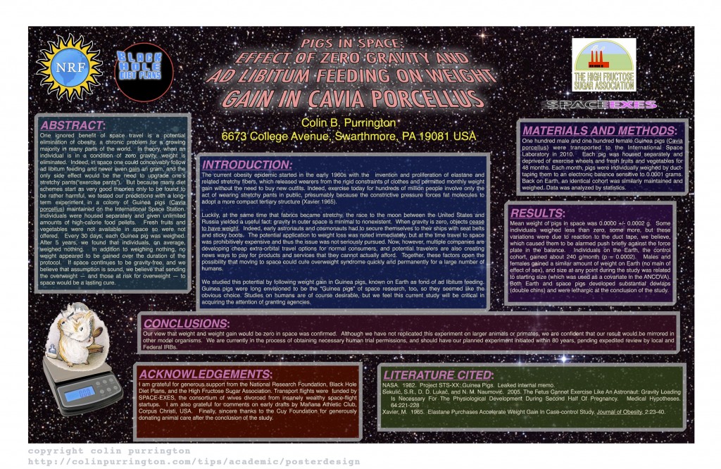
Poster mixes up weight and mass, I automatically hate it.
posted by the man of twists and turns at 6:08 AM on April 7, 2012
posted by the man of twists and turns at 6:08 AM on April 7, 2012
I reckon there's a bit of field-specific stuff in here. I can't imagine any poster being better than a talk at an archaeology conference (though, then again, that's probably my personal bias coming out, too). Good talks and good sessions will be remembered after the conference. A poster is a poster is another poster you walked during the poster session that just fills time between the last set of talks on Day 2 and the open bar that night. I think any student that "sucks" at public speaking would be far better served devoting their time to improving their public speaking rather than their poster work.
Also, what Shutterbun said.
posted by barnacles at 6:15 AM on April 7, 2012 [1 favorite]
Also, what Shutterbun said.
posted by barnacles at 6:15 AM on April 7, 2012 [1 favorite]
Waiting for Edward Tufte to weigh in on the awfulness of this.
posted by Mcable at 6:24 AM on April 7, 2012 [1 favorite]
posted by Mcable at 6:24 AM on April 7, 2012 [1 favorite]
I love this sentence in that worst poster:
"Some individuals weighed less than zero, some weighed more, but these variations were due to reaction against the duct tape, we believe, which caused them to be alarmed push briefly against the duct tape".
100% WEIGHT LOSS GUARANTEED!
I am sad that this wasn't a real poster, it's the best troll ever.
posted by jaduncan at 6:27 AM on April 7, 2012
Suggested legal note: for verifiable 100% weight loss, do not resist your weekly immobilisation with duct tape.
posted by jaduncan at 6:31 AM on April 7, 2012 [1 favorite]
posted by jaduncan at 6:31 AM on April 7, 2012 [1 favorite]
I have to disagree, barnacles. Archaeologists tend to read their papers at conferences and I would rather stab myself repeatedly in the eye than listen to another scripted archaeology paper that inevitably also includes 5 minutes of background theory, 6 old references, and nothing but a blurry photograph of an empty trench - possibly line drawing copied from some uncredited reference. Make a poster that includes a location map, site plans, and artifact photos and then let me ask you questions. Infinitely better.
posted by Eumachia L F at 6:36 AM on April 7, 2012 [2 favorites]
posted by Eumachia L F at 6:36 AM on April 7, 2012 [2 favorites]
Eumachia L F,I guess it depends on the conference, then. I'm mostly familiar with the AAA and the SHA conferences – mind you, that's the Australian Archaeology Association and the Society for Hawaiian Archaeology, not their better-known and more staid cousins.
posted by barnacles at 6:45 AM on April 7, 2012
posted by barnacles at 6:45 AM on April 7, 2012
How could archaeology talks or posters be in any way boring? It's all crazy adventures leading up to the unearthing of Biblical artifacts of unspeakable power AND/OR trysts with hot women who turn out to be Nazis, right?
posted by sleevener at 6:46 AM on April 7, 2012 [3 favorites]
posted by sleevener at 6:46 AM on April 7, 2012 [3 favorites]
this was amazing! i need to make a poster for my first-ever conference and i was just starting to ask myself how on earth i was going to do it. thanks!
posted by andreapandrea at 6:58 AM on April 7, 2012
posted by andreapandrea at 6:58 AM on April 7, 2012
"Guinea Pigs were long envisioned to be the 'guinea pigs' of space research."
What's the opposite of "worst," but something even better than "best"?
This is that.
posted by ShutterBun at 7:03 AM on April 7, 2012 [10 favorites]
What's the opposite of "worst," but something even better than "best"?
This is that.
posted by ShutterBun at 7:03 AM on April 7, 2012 [10 favorites]
This is the exact source of poster advice I used for my last poster. Mixed-case title was a new one for me, but at the conference I noticed a lot of people were doing it.
At his suggestion, I put a QR code on my poster. Perhaps I'm not in the right field for that, because I didn't see a single person scan it while I was standing by it. I was a little worried that it made me seem like kind of a tool. Well, not a tool, per se. Just maybe the wrong kind of dork.
posted by gurple at 7:32 AM on April 7, 2012
That is not the worst poster ever. I saw the worst poster ever at Society for Neuroscience in 2002 or so. Some South American student, I think? Don't remember anything about the country of origin or the poster content, just the design.
The entire poster was made of separate panels, each painstakingly cut out of pieces of poster board, in intricate shapes. Snowflakes, multi-pointed stars, and the like. Rainbow colored fonts. As in, each letter in the titles was a multitude of colors. Insane curlicue fancy font, unreadable at best and brain-aching at worst.
And this was a serious attempt at presenting data at a real conference, not a joke poster made to illustrate poor design decisions. I felt so bad for the person presenting it, forlornly standing there, knowing that 95% of the people who stopped by did so only to marvel at the insanity of the ransom-note-aesthetics of the poster. No one I saw made any attempt to engage the student in conversation, they just stared at the unholy glory of the thing.
And the professor who let the student print the thing... I just don't know what was up with that.
posted by caution live frogs at 7:45 AM on April 7, 2012 [1 favorite]
I'm with Eumachia. Any conference, generally, where people still read their papers is crushingly boring. I don't really understand why that's still the going rate for many disciplines. But then, I may well have been spoiled - educational conferences tend to have a nice mix of slides-augmented talks given by people who understand that human brains don't learn well from lectures, and then one of my other disciplines has been game design - meaning I've gotten to see Sims creator Will Wright's legendarily elegant presentations at GDC.
posted by gusandrews at 8:07 AM on April 7, 2012
posted by gusandrews at 8:07 AM on April 7, 2012
It's surprising to me how different conference presentation styles are. Reading a text is deadly dull. Timed performances are awesome. I remember when I first heard Larry Lessig speak and the quality of the presentation was just so fantastic; I was in awe and more than a bit humbled.
As for posters, if you don't mind making fun of earnest high school kids here's 41 hilarious science fair posters. A lot of them actually have pretty good design.
posted by Nelson at 8:16 AM on April 7, 2012
As for posters, if you don't mind making fun of earnest high school kids here's 41 hilarious science fair posters. A lot of them actually have pretty good design.
posted by Nelson at 8:16 AM on April 7, 2012
I've sat through some boring presentations where people pretty much read what was on their slides. I haven't had anyone read off verbatim from a conference paper yet, that sounds awful.
In my experience, having fewer words and more pictures on slides and on posters is generally a good thing. That tip about the 3D images with attached glasses is clever.
posted by demiurge at 8:44 AM on April 7, 2012
In my experience, having fewer words and more pictures on slides and on posters is generally a good thing. That tip about the 3D images with attached glasses is clever.
posted by demiurge at 8:44 AM on April 7, 2012
Shouldn't a web page espousing the benefits of good poster design at least try to have thumbnails that when clicked, open an image larger than the thumbnail?
posted by KevinSkomsvold at 8:52 AM on April 7, 2012
posted by KevinSkomsvold at 8:52 AM on April 7, 2012
I'll never forget the poster I had to make for the honors symposium in college. Not being in the hard sciences, I hadn't really made a poster for something like that before. No one told me that you should make a poster on the computer and take it to some place where they would print and laminate it. I bought a poster board from Walgreens and proceeded to cut out and gluestick a very errr...elementary school science fair sort of thing together. I noticed towards the end of the day that parts of it were falling off.
posted by melissam at 9:16 AM on April 7, 2012 [1 favorite]
posted by melissam at 9:16 AM on April 7, 2012 [1 favorite]
I learned an important lesson from the one poster session I've participated in: print the poster before you go to the conference.
I'm honestly not sure why we didn't. We assumed Kinko's wouldn't charge an arm and a leg, so doing it in San Diego would be easier than taking it there on a plane, maybe. Someone we knew ended up getting it printed at a university in Los Angeles, but was only coming to the conference the morning of the poster session or something, so we had a few days with no poster. Needless to say, I'm going to carry a damn poster half way round the word this summer rather than repeat that farce in a language I don't speak.
posted by hoyland at 9:52 AM on April 7, 2012
In my experience, having fewer words and more pictures on slides and on posters is generally a good thing.
THIS!
I had a presentation about my little thing that I did at a conference a while back, but then I had to revise it for people who had little to no experience with immunoassay. Rather than try to explain more, I massively deworded it and redid my slides in a rebus language where laboratory animals were a little white rabbit image, patients were Da Vinci's Vitruvian Man, different immunogens were different colored ribbon diagrams and antibodies were sans serif Y's.
After the first few slides where I introduced the problem, I had also taught the audiencehow to play my video game the rules of my symbolic language of immunology, like orange antibodies stick to orange antigens. A few slides later, after I examined the distribution of proteins in my heterogeneous standard and talked about how some species (which were red) will elicit a strong immune response, some middle of the road species (green) elicit a more typical response and some (blue) species are not immunogenic at all. When I got to my line chart of different dose response curves, I didn't have to say a word because the audience already knew what the different colors meant.
After that, I could explain a mountain of observations with a simple three color pie graphs and an associated line chart that would have taken me a mountain of words to describe.
If you're doing a presentation, I heartily recommend you watch this!
posted by Kid Charlemagne at 4:07 PM on April 7, 2012
THIS!
I had a presentation about my little thing that I did at a conference a while back, but then I had to revise it for people who had little to no experience with immunoassay. Rather than try to explain more, I massively deworded it and redid my slides in a rebus language where laboratory animals were a little white rabbit image, patients were Da Vinci's Vitruvian Man, different immunogens were different colored ribbon diagrams and antibodies were sans serif Y's.
After the first few slides where I introduced the problem, I had also taught the audience
After that, I could explain a mountain of observations with a simple three color pie graphs and an associated line chart that would have taken me a mountain of words to describe.
If you're doing a presentation, I heartily recommend you watch this!
posted by Kid Charlemagne at 4:07 PM on April 7, 2012
By "read their papers," do you mean... read their papers? As in, aloud, verbatim? I've seen a lot of rookie presenters reading their presentation slides pretty much word-for-word, but I don't know that I've ever had the pleasure of seeing somebody just straight up read their paper.
posted by aaronetc at 12:44 PM on April 8, 2012
posted by aaronetc at 12:44 PM on April 8, 2012
By "read their papers," do you mean... read their papers? As in, aloud, verbatim?
Yeah. At least in my extensive experience of having gone to the same German conference twice. Some people can actually do it well, but it makes the average presentation worse. (I'm inclined to say 'just like slides make presentations worse', but I gave a talk a few weeks back with slides that I actually think went well.)
posted by hoyland at 7:31 PM on April 8, 2012
« Older Fantastic Maps | The Talk: Nonblack Version Newer »
This thread has been archived and is closed to new comments
posted by ShutterBun at 6:08 AM on April 7, 2012 [18 favorites]