The Top 25 NHL, NBA, MLB, and NFL Sports Uniforms
August 24, 2012 11:49 AM Subscribe
From Paul Lukas of Uni Watch, a list of the 25 best uniforms in the four major North American professional sports.
Uniforms 122-101
Uniforms 100-76
Uniforms 76-51
Uniforms 50-26
Uniforms 122-101
Uniforms 100-76
Uniforms 76-51
Uniforms 50-26
Metafilter: we're all just wasting time until we die.
posted by Fizz at 11:53 AM on August 24, 2012 [6 favorites]
posted by Fizz at 11:53 AM on August 24, 2012 [6 favorites]
We're all just tasting lime until we die.
posted by Sticherbeast at 11:54 AM on August 24, 2012 [1 favorite]
posted by Sticherbeast at 11:54 AM on August 24, 2012 [1 favorite]
I don't understand how the Browns ended up 16 in the NFL. Their logo is a helmet.
posted by morganannie at 11:55 AM on August 24, 2012 [7 favorites]
posted by morganannie at 11:55 AM on August 24, 2012 [7 favorites]
Yes, I suppose in the end we are just rooting for laundry. But that doesn't make sports less important to me. It makes the laundry more important to me. Those uniforms have tremendous symbolic value, and Uni Watch is so refreshing because they realize that and celebrate it.
posted by workingdankoch at 11:56 AM on August 24, 2012 [3 favorites]
posted by workingdankoch at 11:56 AM on August 24, 2012 [3 favorites]
I miss the Whalers' uniform.
posted by Sticherbeast at 11:57 AM on August 24, 2012 [10 favorites]
posted by Sticherbeast at 11:57 AM on August 24, 2012 [10 favorites]
Because if the Habs aren't winning on the ice, we might as well win off of it.
posted by Capt. Renault at 11:58 AM on August 24, 2012 [2 favorites]
posted by Capt. Renault at 11:58 AM on August 24, 2012 [2 favorites]
As a handy reference, here's Flip Flop Fly's MLB Uniforms for 2010 & 2011.
posted by zamboni at 12:02 PM on August 24, 2012
posted by zamboni at 12:02 PM on August 24, 2012
Too bad the article didn't cover college teas. The new Oregon Ducks football uniform is yellow and gray. It looks like an Oregon State Beavers' orange and black uniform was washed with too much bleach.
posted by Cranberry at 12:03 PM on August 24, 2012
posted by Cranberry at 12:03 PM on August 24, 2012
I'd much prefer Paul went back to reviewing cat beverages and product design.
posted by computech_apolloniajames at 12:05 PM on August 24, 2012 [2 favorites]
posted by computech_apolloniajames at 12:05 PM on August 24, 2012 [2 favorites]
We're all just pasting rhyme until we die.
posted by weapons-grade pandemonium at 12:07 PM on August 24, 2012 [1 favorite]
posted by weapons-grade pandemonium at 12:07 PM on August 24, 2012 [1 favorite]
Here's a different list along the same lines. Terrible interface, though.
posted by tonycpsu at 12:07 PM on August 24, 2012
posted by tonycpsu at 12:07 PM on August 24, 2012
Uni Watch is a treasure, and this kind of loving, unapologetic obsessiveness is one of the best features of the Internet era of journalism.
But I have to say that it came through for me much more strongly after looking at this list than ever before that Lukas's design sensibility is based on a very, very conservative aesthetic. It's all "old-school" and "clean lines" here; given the current trend toward "classic"-looking uniforms he has a lot to like, but I'd love to see him applauding one or two new-looking things here and there amid the tiny updates to decades-old looks. Not that I don't revere a Cardinals or Dodgers uniform as much as any other right-thinking baseball fan — hell, I think Lukas deserves a medal just for leading the crusade against the Mets' black alternate jersey — but maybe just drop a word in favor of the insane spectacle that is the Marlins' John Buck's catcher's mask or something, to let us know you're not taking this too seriously?
posted by RogerB at 12:08 PM on August 24, 2012 [4 favorites]
How can the Cardinals have the best uniform in baseball when the bird is so ridiculously out of proportion with the bat?
His older article on vertically arched lettering is pretty neat.
posted by exogenous at 12:10 PM on August 24, 2012 [2 favorites]
His older article on vertically arched lettering is pretty neat.
posted by exogenous at 12:10 PM on August 24, 2012 [2 favorites]
If only the SF Giants didn't have those horrific orange road unis. Their home gear is so beautifully understated and classic.
posted by Thorzdad at 12:12 PM on August 24, 2012
posted by Thorzdad at 12:12 PM on August 24, 2012
How can the Cardinals have the best uniform in baseball when the bird is so ridiculously out of proportion with the bat?
I like to think that enormous flightless cardinals stalk the streets of St Louis.
That said,
St. Louis Cardinals Logos with Proportionally Correct Birds and Bats
posted by zamboni at 12:14 PM on August 24, 2012 [6 favorites]
I like to think that enormous flightless cardinals stalk the streets of St Louis.
That said,
St. Louis Cardinals Logos with Proportionally Correct Birds and Bats
posted by zamboni at 12:14 PM on August 24, 2012 [6 favorites]
I noticed that he praised the Bears without mentioning their ghastly orange jerseys, which it looks like they won't wear this year. Hopefully they have been relegated to the dust bin of history where they belong.
posted by Bulgaroktonos at 12:14 PM on August 24, 2012
posted by Bulgaroktonos at 12:14 PM on August 24, 2012
Sticherbeast: "I miss the Whalers' uniform."
I end up in the Hartford airport fairly often and they're still selling Whaler's logo stuff all these years later.
posted by octothorpe at 12:17 PM on August 24, 2012
I end up in the Hartford airport fairly often and they're still selling Whaler's logo stuff all these years later.
posted by octothorpe at 12:17 PM on August 24, 2012
I think they had to put the Habs 1st simply to avoid a riot. Even if they come in 2nd on a random internet list, at least one police car might burn.
posted by mannequito at 12:17 PM on August 24, 2012 [1 favorite]
posted by mannequito at 12:17 PM on August 24, 2012 [1 favorite]
This fails because the Steelers are #7. I mean, I know the history and origin of the logo, but it's the worst design ever for a jersey you're going to be looking at from far away.
Also,
Black has never felt like a good color for this team. You're the Flames, not the charred ashes!
Black does too feel like a good colour for this team.
posted by Pruitt-Igoe at 12:19 PM on August 24, 2012
Also,
Black has never felt like a good color for this team. You're the Flames, not the charred ashes!
Black does too feel like a good colour for this team.
posted by Pruitt-Igoe at 12:19 PM on August 24, 2012
While he is pretty conservative, he does praise some uniforms for being unusual. He likes the contrasting color nameplates on the Flyers jerseys (making the unfortunate choice of liking anything about the Flyers) and he praises the Golden State Warriors for being innovative. I think it's mostly baseball where he is rigorous about wanting everyone to look like they played in the 50s, but someone having conservative opinions about baseball isn't exactly unexpected.
I end up in the Hartford airport fairly often and they're still selling Whaler's logo stuff all these years later.
They also sell them in the Providence airport; I see Whalers gear a fair bit just randomly on the street (certainly way more than other defunct sports franchises). As I usually do, I blame hipsters.
posted by Bulgaroktonos at 12:20 PM on August 24, 2012
Now this list is legally binding, right?
posted by inturnaround at 12:20 PM on August 24, 2012
posted by inturnaround at 12:20 PM on August 24, 2012
I end up in the Hartford airport fairly often and they're still selling Whaler's logo stuff all these years later.
Sure it's not just merch for their AHL team, the Connecticut Whale?
posted by mannequito at 12:21 PM on August 24, 2012
Sure it's not just merch for their AHL team, the Connecticut Whale?
posted by mannequito at 12:21 PM on August 24, 2012
Bulgaroktonos: "making the unfortunate choice of liking anything about the Flyers"
Haters gonna hate, skaters gonna skate.
posted by tonycpsu at 12:23 PM on August 24, 2012
Haters gonna hate, skaters gonna skate.
posted by tonycpsu at 12:23 PM on August 24, 2012
The new Oregon Ducks football uniform is yellow and gray.
The Oregon ducks have no set uniform. They merely have whatever godawful mismatched monstrosity of colors has coalesced from the quantum foam that day.
posted by stevis23 at 12:32 PM on August 24, 2012 [4 favorites]
The Oregon ducks have no set uniform. They merely have whatever godawful mismatched monstrosity of colors has coalesced from the quantum foam that day.
posted by stevis23 at 12:32 PM on August 24, 2012 [4 favorites]
> I think Lukas deserves a medal just for leading the crusade against the Mets' black alternate jersey
I like the Mets' black alternate jersey.
Also, fuck the Yankees, classic pinstripes and all.
posted by languagehat at 12:32 PM on August 24, 2012 [4 favorites]
I like the Mets' black alternate jersey.
Also, fuck the Yankees, classic pinstripes and all.
posted by languagehat at 12:32 PM on August 24, 2012 [4 favorites]
"I miss the Whalers' uniform."
I miss the Hartford Civic Center logo.
posted by ChurchHatesTucker at 12:33 PM on August 24, 2012
I miss the Hartford Civic Center logo.
posted by ChurchHatesTucker at 12:33 PM on August 24, 2012
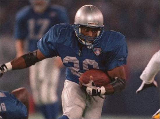
#108. Detroit Lions: Matt Millen may be gone from Detroit, but his ghost lives on in the form of all the black trim on the Lions' uniforms. Every stripe, every numeral, every letter, the color break in the socks, the helmet logo, the facemask -- all accented in black. Look, gang, here's how it works: You've got that Honolulu blue thing going. You should own that color. Don't tart it up with black.
Goddamn right. I still say the best-looking unis in the NFL are the Lions' throwbacks: blue and silver. And nothing else.
posted by eoden at 12:36 PM on August 24, 2012 [5 favorites]
Goddamn right. I still say the best-looking unis in the NFL are the Lions' throwbacks: blue and silver. And nothing else.
posted by eoden at 12:36 PM on August 24, 2012 [5 favorites]
The problem with uni-watch is that you can basically predict what he'll like by asking how long it's gone without changing. The longer a uniform has looked basically the same, the more he's likely to think it's great. Even his praise for the new Warriors and Jazz uniforms is grounded in their being basically throwbacks in design and a return to more a typical color scheme, respectively.
Yeah, he has a good eye for detail and he's not so conservative as to be reactionary, but he's is utterly predictable.
posted by oddman at 12:36 PM on August 24, 2012 [1 favorite]
Yeah, he has a good eye for detail and he's not so conservative as to be reactionary, but he's is utterly predictable.
posted by oddman at 12:36 PM on August 24, 2012 [1 favorite]
The problem with uni-watch is that you can basically predict what he'll like by asking how long it's gone without changing.
Except he doesn't like the Lions' uniforms because they still have everything outlined in black.
posted by morganannie at 12:39 PM on August 24, 2012
Except he doesn't like the Lions' uniforms because they still have everything outlined in black.
posted by morganannie at 12:39 PM on August 24, 2012
I don't understand how the Browns ended up 16 in the NFL. Their logo is a helmet
If the helmet on their logo had a smaller helmet on it it (and smaller helmets on to infinity) it would have made the top five.
posted by justsomebodythatyouusedtoknow at 12:40 PM on August 24, 2012 [4 favorites]
If the helmet on their logo had a smaller helmet on it it (and smaller helmets on to infinity) it would have made the top five.
posted by justsomebodythatyouusedtoknow at 12:40 PM on August 24, 2012 [4 favorites]
"The problem with uni-watch is that you can basically predict what he'll like by asking how long it's gone without changing.
Except he doesn't like the Lions' uniforms because they still have everything outlined in black."
Uh, his complaint is that they went away from the traditional look that didn't have the black out-line (Matt Millen was a pretty recent GM.): "Look, gang, here's how it works: You've got that Honolulu blue thing going. You should own that color. Don't tart it up with black."
posted by oddman at 12:45 PM on August 24, 2012
I can't recall which tv network it is but when they do a "this team vs. that team" image they will often put the logos in a square. All the other teams have a logo to put in the square. The browns get an orange filled-square. No helmet. Just orange.
posted by morganannie at 12:45 PM on August 24, 2012
posted by morganannie at 12:45 PM on August 24, 2012
*orange-filled square.
posted by morganannie at 12:47 PM on August 24, 2012
posted by morganannie at 12:47 PM on August 24, 2012
How can anyone improve upon this? (Ignore the 75th-anniversary patch)
posted by eoden at 12:51 PM on August 24, 2012 [2 favorites]
posted by eoden at 12:51 PM on August 24, 2012 [2 favorites]
The restrictions on this list mean it misses out on the glorious Double Blue of the Toronto Argonauts of the CFL. I'm not actually a CFL fan, but those are some nice colours.
Actually, I'd put several of the CFL's uniforms in my top 25. Except the BC Lions.
The new/old Blue Jays uniforms have been a total hit in Toronto this year. Even with the team in the tank, their merch is everywhere.
posted by dry white toast at 1:02 PM on August 24, 2012 [1 favorite]
Actually, I'd put several of the CFL's uniforms in my top 25. Except the BC Lions.
The new/old Blue Jays uniforms have been a total hit in Toronto this year. Even with the team in the tank, their merch is everywhere.
posted by dry white toast at 1:02 PM on August 24, 2012 [1 favorite]
If only the SF Giants didn't have those horrific orange road unis.
I'm pretty sure they only wear those for Friday night home games (Orange Friday!)
posted by mach at 1:03 PM on August 24, 2012
I'm pretty sure they only wear those for Friday night home games (Orange Friday!)
posted by mach at 1:03 PM on August 24, 2012
Yankees:
They deserve major credit for staying the course and avoiding trends (no throwbacks, no alternates, no names on the jerseys, no Cool-Flo batting helmets, etc.), but those pinstripes don't look so great in the pajama pants era (or when CC Sabathia pitches), the "NY" on the home jersey doesn't match the one on the cap, and the road jersey treads a fine line between minimalist and plain. An excellent wardrobe, but not quite the flawless masterpiece it's often assumed to be.
That error is easy to spot. Link.
posted by bukvich at 1:04 PM on August 24, 2012
He likes the contrasting color nameplates on the Flyers jerseys (making the unfortunate choice of liking anything about the Flyers)
I LOVE the orange Flyers jerseys, particularly the nameplates. Too bad I am basically legally obligated (as a Bruins fan) to hate the Flyers, and therefore can never own one. They are awesome.
posted by rollbiz at 1:04 PM on August 24, 2012
I LOVE the orange Flyers jerseys, particularly the nameplates. Too bad I am basically legally obligated (as a Bruins fan) to hate the Flyers, and therefore can never own one. They are awesome.
posted by rollbiz at 1:04 PM on August 24, 2012
Also clashing colors (red-green; blue-orange; purple-yellow) disqualify the Mets and the Lakers. Not to mention the Jazz. Purple and yellow and green should never be displayed together except maybe in New Orleans on Mardi Gras day and the four days before it. Definitely not on an everyday team uniform.
posted by bukvich at 1:10 PM on August 24, 2012
posted by bukvich at 1:10 PM on August 24, 2012
If you want to understand the difference between designing by hand and designing by computer, take a close look at the Wings' logo -- you'd never come up with that on a Mac.
Ugh. This ruined it for me.
posted by mullacc at 1:14 PM on August 24, 2012
Ugh. This ruined it for me.
posted by mullacc at 1:14 PM on August 24, 2012
Sure, some of those uniforms are pretty nice, but how many teams out there have pictures of their fans on their jerseys, huh? Just one.
I'm on the five.
posted by nickmark at 1:22 PM on August 24, 2012 [2 favorites]
I'm on the five.
posted by nickmark at 1:22 PM on August 24, 2012 [2 favorites]
Biggest before-and-after success story since Jared lost all of that weight eating at Subway. Last year, the Jays were in the running for the worst-dressed team in North America; this year they're among the best, thanks to an ingenious makeover that provides a snappy updating of the team's early 1990s look. A textbook case of how a team can acknowledge its past while embracing its future.
This is so true. But they could still improve it by adding back some more of that light blue from the 70's/80's.
posted by Kabanos at 1:27 PM on August 24, 2012
This is so true. But they could still improve it by adding back some more of that light blue from the 70's/80's.
posted by Kabanos at 1:27 PM on August 24, 2012
We're all just basting dimes until we cry.
posted by lazaruslong at 1:31 PM on August 24, 2012
posted by lazaruslong at 1:31 PM on August 24, 2012
The Minnesota Vikings' current uniforms are pretty bad, but their '70s unis are classics.
posted by kirkaracha at 1:37 PM on August 24, 2012 [1 favorite]
posted by kirkaracha at 1:37 PM on August 24, 2012 [1 favorite]
I love the Canucks. I absolutely love the Canucks. They can do no wrong.
Except for the uniforms. Flaming Taco Skate was okay-ish out of all of the red/yellow/black abominations. The Orca? Is this a Saturday morning cartoon franchise?
Not sure how this team ended up not in last place. Maybe on the strength of their first uniform set, which I really like even though it was Hartford-light.
posted by Fezboy! at 2:06 PM on August 24, 2012
Every time anybody in this thread says "Uni," I keep thinking that they're referring to unisuits.
posted by schmod at 2:08 PM on August 24, 2012
posted by schmod at 2:08 PM on August 24, 2012
His choices are conservative, yes, but conservative to specific eras. I agree with most of his choices, but the Oilers uniforms are awesome precisely because of how 70s they are. And the Nationals uniforms are better than I think he gives them credit for, though if the stars-and-stripes alt is what is dragging them down I have no defense for that.
I give him credit for encouraging the Padres to not attempt old-school traditionalism, though, and rather to "embrace the wackiness," so there's that. Plus the Thunder ranked pretty highly.
posted by Navelgazer at 2:16 PM on August 24, 2012
I give him credit for encouraging the Padres to not attempt old-school traditionalism, though, and rather to "embrace the wackiness," so there's that. Plus the Thunder ranked pretty highly.
posted by Navelgazer at 2:16 PM on August 24, 2012
The problem with uni-watch is that you can basically predict what he'll like by asking how long it's gone without changing.
He does decry the Edmonton Oilers for not updating their logo in like 40 years.
Anyway, I love the uni-watch blog. Love, love, love. There are all these little intricacies he and his crew pick up on and then write long screeds about, and for some reason, it's just super pleasant to read. Thanks for the post!
posted by King Bee at 2:39 PM on August 24, 2012
He does decry the Edmonton Oilers for not updating their logo in like 40 years.
I imagine the Edmonton Oilers would want to keep a logo from the era when they won the Stanley Cup all the time, as opposed to the current era when they win the draft lottery all the time.
posted by Homeboy Trouble at 3:06 PM on August 24, 2012 [1 favorite]
I imagine the Edmonton Oilers would want to keep a logo from the era when they won the Stanley Cup all the time, as opposed to the current era when they win the draft lottery all the time.
posted by Homeboy Trouble at 3:06 PM on August 24, 2012 [1 favorite]
[Spoiler Alert]
I did not expect to see a hockey team at #1.
posted by Jaybo at 3:10 PM on August 24, 2012
I did not expect to see a hockey team at #1.
posted by Jaybo at 3:10 PM on August 24, 2012
bukvich, the Jazz uniform colors don't include purple any more—they're white, gold, green and navy (away). I miss the purple, though, and I hope they bring it back as a retro/alternate at some point.
The Jazz had some pretty awful uniform designs from 1996-2010. I'm really glad they switched back to the classic style and logo.
posted by aparrish at 3:15 PM on August 24, 2012
The Jazz had some pretty awful uniform designs from 1996-2010. I'm really glad they switched back to the classic style and logo.
posted by aparrish at 3:15 PM on August 24, 2012
Speaking of the Jazz, they should be required to change their name. New Orleans Jazz was fine, but there aren't many cities I'd associate less with jazz than SLC.
Ditto for the Lakers. If your team name is generic and you move, whatever, but if it has a city tie-in, you should lose the name when you move.
posted by tonycpsu at 3:24 PM on August 24, 2012
Ditto for the Lakers. If your team name is generic and you move, whatever, but if it has a city tie-in, you should lose the name when you move.
posted by tonycpsu at 3:24 PM on August 24, 2012
The new Oregon Ducks football uniform is yellow and gray
I think you mean "the new Nike Ducks football uniform" as they stopped representing the school colors a while ago.
posted by madajb at 3:39 PM on August 24, 2012
I think you mean "the new Nike Ducks football uniform" as they stopped representing the school colors a while ago.
posted by madajb at 3:39 PM on August 24, 2012
Alas, the federal Municipal Sporting Nomenclature Appropriateness Act, originally enacted by congress in 1988, was later ruled unconstitutional.
posted by aparrish at 3:45 PM on August 24, 2012 [2 favorites]
posted by aparrish at 3:45 PM on August 24, 2012 [2 favorites]
I quite like the orange Bears jersey, but the above mentioned throwback Lions is, to me, the best uniform in the history of sport, though the Bears throwback (navy with vertical orange stripes) is pretty awesome, as it goes back to a time when uniform design clearly had no rhyme or reason. It's like the bears get to thumb their nose at the majority of the league, saying, back when we started playing, nothing had to make sense!
Also,the current Pistons uniform deserves to be higher, if only as a reward for a return to sanity after the teal excesses of the nineties.
posted by Ghidorah at 3:52 PM on August 24, 2012
Also,the current Pistons uniform deserves to be higher, if only as a reward for a return to sanity after the teal excesses of the nineties.
posted by Ghidorah at 3:52 PM on August 24, 2012
The problem with uni-watch is that you can basically predict what he'll like by asking how long it's gone without changing.
In his defense, this does happen to be the objectively correct way to judge athletic uniforms.
posted by no regrets, coyote at 4:07 PM on August 24, 2012 [1 favorite]
In his defense, this does happen to be the objectively correct way to judge athletic uniforms.
posted by no regrets, coyote at 4:07 PM on August 24, 2012 [1 favorite]
but the above mentioned throwback Lions is, to me, the best uniform in the history of sport
Every time I mention that, I worry that I'm alone. I HAVE A FRIEND! Bless you, Ghidorah!
posted by eoden at 4:24 PM on August 24, 2012
Every time I mention that, I worry that I'm alone. I HAVE A FRIEND! Bless you, Ghidorah!
posted by eoden at 4:24 PM on August 24, 2012
The height of sports uniforms were 1980s baseball uniforms (up to and including the White Sox wearing shorts).
posted by drezdn at 4:37 PM on August 24, 2012
posted by drezdn at 4:37 PM on August 24, 2012
There's a typo in your comment; it should be:
The height of sports uniforms were 1880s baseball uniforms.
posted by languagehat at 4:57 PM on August 24, 2012 [2 favorites]
The height of sports uniforms were 1880s baseball uniforms.
posted by languagehat at 4:57 PM on August 24, 2012 [2 favorites]
Yay! The Royals are #25. We're finally in the top quartile of something!
posted by reenum at 6:11 PM on August 24, 2012 [1 favorite]
posted by reenum at 6:11 PM on August 24, 2012 [1 favorite]
I only know baseball and football uniforms, but I'll say that the entries for those sports in the top twenty-five are correct. Out of order, but correct.
The Detroit Tigers' uniforms are glorious perfection, and their jersey is what Jesus would wear if he showed up on my house on a random Monday night looking for beers and bratwursts and hoping to catch the game. (Which, if my reading of Thessalonians is correct, will indeed happen sometime before 2014.)
posted by Harvey Jerkwater at 7:13 PM on August 24, 2012 [1 favorite]
I've never understood how he went from reviewing change-makers and that foot-measuring thingie to sports uniforms. I miss what he used to do.
posted by Mavri at 8:03 PM on August 24, 2012
posted by Mavri at 8:03 PM on August 24, 2012
why isn't Paul Lukas critiquing outfits from the Pro Bowling Tour?
The Portland Trailblazer's (#10 on the NBA list) uniform is very similar to one they wore in the 1970, except the the players are wearing clam-diggers instead of proper athletic shorts! (bring back the short shorts! and headbands!)
posted by vespabelle at 9:55 PM on August 24, 2012
The Portland Trailblazer's (#10 on the NBA list) uniform is very similar to one they wore in the 1970, except the the players are wearing clam-diggers instead of proper athletic shorts! (bring back the short shorts! and headbands!)
posted by vespabelle at 9:55 PM on August 24, 2012
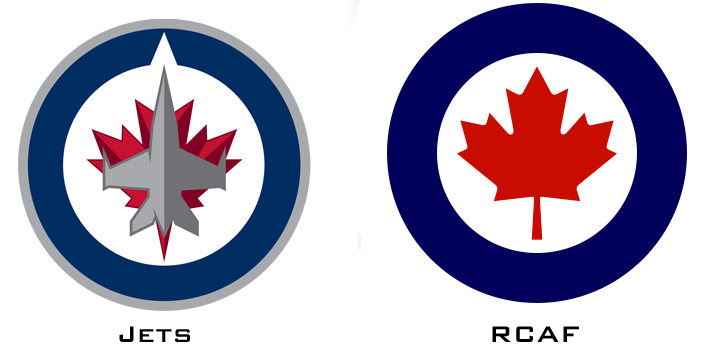
The Jets are ahead of the curve: While every other NHL team rolls out a blue alternate uniform with a circular crest, the Jets have used that concept for their primary uniform. It's fine, but it's nothing special. Also, there's only one NHL team that should be wearing a maple leaf on its chest, and Winnipeg isn't it.This is far, far too kind to the jingoistic monstrosity that is the reborn Jets logo. The original Jets logo was the essence of rad, a retro-cool '70s classic logo; it evolved into something that was still pretty stylin'. The original Jets, in any case, sported a commercial airliner's outline on their chests.
So what'd they do for the relaunch of a team that was still selling merch at the Winnipeg airport and could've been the toast of the nation with the right look? A direct, lunkheaded copy of the Canadian Air Force logo. Not an homage or reference - the actual goddamn crest, with a fighter jet slapped clumsily on top of it. (Here they are side by side.) It's so bad not even John K. Samson of the Weakerthans - Winnipeg's unofficial poet laureate - can bring himself to wear it.
It's a travesty, and it deserves Bottom 5 all-time on this list for how badly it wrecked such a great story.
posted by gompa at 10:05 AM on August 25, 2012 [1 favorite]
While we are on the subject of uniforms... Can anyone explain why Nike would put a reverse image of their logo on the right shoulder if NFL jerseys? It just looks backwards.
posted by morganannie at 5:53 PM on August 26, 2012
posted by morganannie at 5:53 PM on August 26, 2012
Sounds like a nod to the "backwards" US flag worn on the right shoulder of soldiers.
posted by exogenous at 6:37 PM on August 26, 2012
posted by exogenous at 6:37 PM on August 26, 2012
Paul Lukas, for those in the know (computech_apolloniajames clearly is) used to run the much-loved, rarely-read Beer Frame 'zine (remember zines?!) which is still pretty genius.
Also: the ABA had the best logos, ever.
posted by jlittlew at 2:36 PM on August 27, 2012
Also: the ABA had the best logos, ever.
posted by jlittlew at 2:36 PM on August 27, 2012
drezdn: "The height of sports uniforms were 1980s baseball uniforms (up to and including the White Sox wearing shorts)."
The White Sox shorts were 1976.
posted by Chrysostom at 6:56 PM on August 29, 2012
The White Sox shorts were 1976.
posted by Chrysostom at 6:56 PM on August 29, 2012
« Older Fear and Loathing in Amundsen-Scott Station | Neurosciencey stuff→Loss of critical faculties Newer »
This thread has been archived and is closed to new comments
posted by Malice at 11:52 AM on August 24, 2012 [19 favorites]