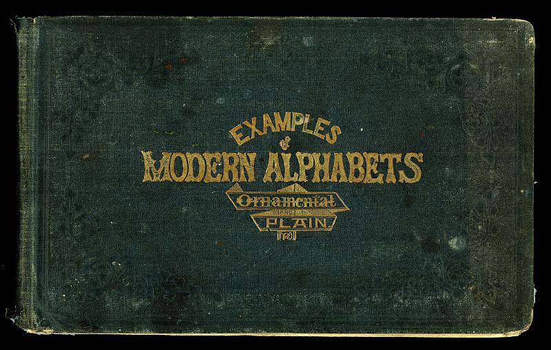
Easy As ABC
December 14, 2009 5:36 PM Subscribe
Okay, the lettering is awesome, and the fact that we're only allowed 500 pixel wide scans of each page is not.
posted by ardgedee at 6:13 PM on December 14, 2009 [1 favorite]
posted by ardgedee at 6:13 PM on December 14, 2009 [1 favorite]
Showing this in such low resolution is a real tease, you know.
posted by echo target at 6:16 PM on December 14, 2009 [1 favorite]
posted by echo target at 6:16 PM on December 14, 2009 [1 favorite]
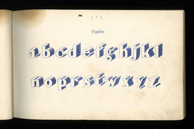
These are great! Here's one I certainly wouldn't have guessed was from 1864.
posted by flapjax at midnite at 6:16 PM on December 14, 2009
posted by flapjax at midnite at 6:16 PM on December 14, 2009
And not only this linked set, but this flickr user has tons of other cool stuff as well. What I wanna know, though, is how did he get into my house and get this shot of my computer?
posted by flapjax at midnite at 6:21 PM on December 14, 2009
posted by flapjax at midnite at 6:21 PM on December 14, 2009
Why are some of the letters missing?
posted by TooFewShoes at 6:24 PM on December 14, 2009
posted by TooFewShoes at 6:24 PM on December 14, 2009
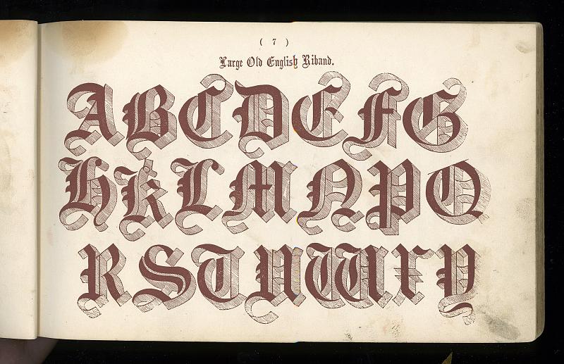
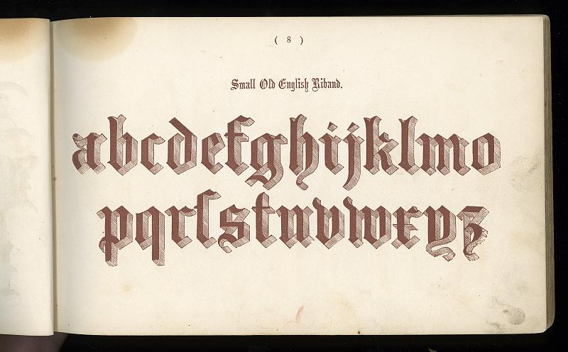
Some of these, particularly the one that flapjax singled out and this one, seem to carry the seeds of 20th-century typography in them, while retaining some of the idiosyncrasies I associate with lettering and typography of the 19th century. Check out some of the lower-case "y"s in these designs -- you don't see descenders like those very often.
posted by heurtebise at 6:37 PM on December 14, 2009
posted by heurtebise at 6:37 PM on December 14, 2009
I was all set to get on my hobbyhorse about why in some cultures "alphabet" is considered an acceptable substitute for "letter" and how come no one can ever explain it to me, but this is just some really cool historical documents photographed well. :(
{/}
posted by kittyprecious at 6:39 PM on December 14, 2009
{/}
posted by kittyprecious at 6:39 PM on December 14, 2009
TooFewShoes: The alphabets are examples of older type, so some of them are missing certain letters or have additional letters, such as ſ (long s).
The user's other albums are equally awesome - check out typecase, theatretype and retrologo. I love this old book with a song hidden in the spine.
posted by oulipian at 6:45 PM on December 14, 2009
The user's other albums are equally awesome - check out typecase, theatretype and retrologo. I love this old book with a song hidden in the spine.
posted by oulipian at 6:45 PM on December 14, 2009
Typography never gets old for me.
posted by rageagainsttherobots at 6:53 PM on December 14, 2009
posted by rageagainsttherobots at 6:53 PM on December 14, 2009
This is so effing awesome. The caption at the beginning of the set is even better: "Me, a scanner and insomnia."
posted by blucevalo at 6:55 PM on December 14, 2009
posted by blucevalo at 6:55 PM on December 14, 2009
Awesome, but not a lot of use without scanning at higher resolution, converting to a font, and fixing up the kerning (which would be quite a task, in some cases).
posted by aeschenkarnos at 7:00 PM on December 14, 2009
posted by aeschenkarnos at 7:00 PM on December 14, 2009
I would love the opportunity to reproduce this. Considering that I have several idle antique printing presses, that is not an unlikely possibility. Grumblebee, we should talk.
posted by pantsonfire at 7:12 PM on December 14, 2009
posted by pantsonfire at 7:12 PM on December 14, 2009
We could talk, but you'd be better off talking to the guy who owns the flickr account (see link, above).
posted by grumblebee at 7:14 PM on December 14, 2009
posted by grumblebee at 7:14 PM on December 14, 2009
Ahh, darn. For some reason I thought it was yours. That dude has tons of fantastic specimen books. Delicious. Looks like he's got his own printing presses. I'll just have to find some other way to exploit expired copyrights.
posted by pantsonfire at 7:19 PM on December 14, 2009
posted by pantsonfire at 7:19 PM on December 14, 2009
Published the year my house was built. I'd kill for a time machine.
posted by Michael Roberts at 7:41 PM on December 14, 2009
posted by Michael Roberts at 7:41 PM on December 14, 2009
Or rather, "about the year my house was built", there being some dispute as to when my house was actually built.
posted by Michael Roberts at 7:42 PM on December 14, 2009
posted by Michael Roberts at 7:42 PM on December 14, 2009
Oh man these are so great, thank you! I really love all the super ornate, almost illegible fonts.
posted by drinkyclown at 7:59 PM on December 14, 2009
posted by drinkyclown at 7:59 PM on December 14, 2009
the fact that we're only allowed 500 pixel wide scans of each page is not
If you use the slideshow you get 800 pixel wide versions (e.g. 1 2 3 4) I don't know why the flickr interface is so broken that you can't select that size outside of the slideshow, but it's one of many minor annoyances that all add up to make me really dislike using that site with a passion.
posted by Rhomboid at 10:37 PM on December 14, 2009
It makes sense that older type should have a long S. But how does the fact that it's older explain the missing M? It's not like we invented that one last week — it goes right back to the Romans.
posted by nebulawindphone at 10:46 PM on December 14, 2009
posted by nebulawindphone at 10:46 PM on December 14, 2009
oulipan, are you telling me that somebody found a bunch of sets of moveable type and that some of the sets were incomplete? Is that why there are letters missing?
posted by TooFewShoes at 6:05 AM on December 15, 2009
posted by TooFewShoes at 6:05 AM on December 15, 2009
> I don't know why the flickr interface is so broken that you can't select that size outside of the slideshow
The person who posted the images disabled the option to view larger sizes. Flickr's not to blame on this one.
posted by ardgedee at 6:56 AM on December 15, 2009
The person who posted the images disabled the option to view larger sizes. Flickr's not to blame on this one.
posted by ardgedee at 6:56 AM on December 15, 2009
And yet you can still view the larger images if you go through the slideshow, so they're not really disabled at all, just terribly, terribly obfuscated. Flickr is certainly to blame if they offer an option to disable something that doesn't really disable anything.
posted by Rhomboid at 3:48 PM on December 15, 2009
posted by Rhomboid at 3:48 PM on December 15, 2009
« Older Is Racism Alive and Well in China? | Roommate Leaves Town, Christmas Prank Ensues... Newer »
This thread has been archived and is closed to new comments
posted by ardgedee at 6:08 PM on December 14, 2009