Project Thirty-Three--Vintage Record Jackets
June 13, 2011 7:55 AM Subscribe
Project Thirty-Three "The seemingly infinite number of vintage record jackets that convey their message with only simple shapes and typography never cease to amaze me. Project Thirty-Three is my personal collection and shrine to circles and dots, squares and rectangles, and triangles, and the brilliant designers that made them come to life on album covers."
click
ctrl-f
No posts matching the query: genesis.
ಠ_ಠ
posted by tapesonthefloor at 8:00 AM on June 13, 2011 [1 favorite]
ctrl-f
No posts matching the query: genesis.
ಠ_ಠ
posted by tapesonthefloor at 8:00 AM on June 13, 2011 [1 favorite]
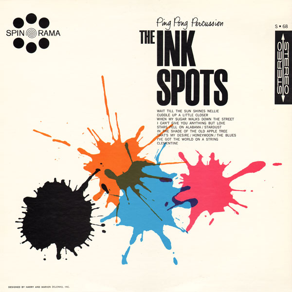
hey, I have that Ink Spots record! I should probably get around to listening to it.
posted by namewithoutwords at 8:02 AM on June 13, 2011
posted by namewithoutwords at 8:02 AM on June 13, 2011
Bravo! Thanks, OmieWise!
posted by flapjax at midnite at 8:21 AM on June 13, 2011
posted by flapjax at midnite at 8:21 AM on June 13, 2011
One of my favoritest of all design styles.
Funny story. A pretty well-known artist friend of mine (won't mention his name in case Im getting the attribution wrong) was telling me about Reid Miles, the wunderdesigner behind all those amazing golden age Blue Note covers.
He told me that Reid was a flamboyantly gay country western fan. The reason I mention the gayness btw is because it makes me visualize him as Henry Gibson, and that is an awesome image indeed.
So anyhoo, he said that Reid never really felt like his heart was in the Blue Note stuff and that to him it was just...work. When Miles had a chance to really put his soul into a sleeve, the results were quite different.
posted by Senor Cardgage at 8:40 AM on June 13, 2011 [3 favorites]
Wowser - this is great. This is this style of album art - it's what I always seem to return to whenever I'm looking through graphic and/or album cover books. Although they seem to be missing a little if they don't have a giant MONO or STEREO somewhere up top.
posted by Slack-a-gogo at 8:43 AM on June 13, 2011
posted by Slack-a-gogo at 8:43 AM on June 13, 2011
Although they seem to be missing a little if they don't have a giant MONO or STEREO somewhere up top.
Stereostack, another blog by the same guy, was previously featured on the Blue.
posted by OmieWise at 8:46 AM on June 13, 2011 [1 favorite]
Stereostack, another blog by the same guy, was previously featured on the Blue.
posted by OmieWise at 8:46 AM on June 13, 2011 [1 favorite]
Is this where all of the Partridge Family kids came from?
posted by Slack-a-gogo at 8:47 AM on June 13, 2011
posted by Slack-a-gogo at 8:47 AM on June 13, 2011
This is a great, great site. My grandmother actually had that Inkspots album!
I only fear that we will now be inundated with countless hipsters-armed-with Illustrator sites, treating us to their re-design of contemporary album covers in this style.
posted by Thorzdad at 8:59 AM on June 13, 2011 [1 favorite]
I only fear that we will now be inundated with countless hipsters-armed-with Illustrator sites, treating us to their re-design of contemporary album covers in this style.
posted by Thorzdad at 8:59 AM on June 13, 2011 [1 favorite]
Looking at these album covers I can't avoid feeling like good layout, design and typography used to be a lot more present in everyday life.
posted by scelerat at 9:00 AM on June 13, 2011
posted by scelerat at 9:00 AM on June 13, 2011
I only fear that we will now be inundated with countless hipsters-armed-with Illustrator sites, treating us to their re-design of contemporary album covers in this style.
Duuuuuude, shut uuuuuuuuuuuuuup.
Shhhhhh!
posted by Senor Cardgage at 9:02 AM on June 13, 2011
Duuuuuude, shut uuuuuuuuuuuuuup.
Shhhhhh!
posted by Senor Cardgage at 9:02 AM on June 13, 2011
tapesonthefloor: No posts matching the query: genesis.
Which Genesis were you looking for? If it's the band, I'd say they came too late for the aesthetic of this blog, which consists of the 50s/60s look and feel (back when the Sterephonic label meant something).
posted by filthy light thief at 9:17 AM on June 13, 2011
Which Genesis were you looking for? If it's the band, I'd say they came too late for the aesthetic of this blog, which consists of the 50s/60s look and feel (back when the Sterephonic label meant something).
posted by filthy light thief at 9:17 AM on June 13, 2011
This is awesome, thanks OmieWise!
Looking at these album covers I can't avoid feeling like good layout, design and typography used to be a lot more present in everyday life.
I've felt this way for just about as long as I can remember, even as a kid in the 70s and 80s looking back at artifacts of the 50s, 60s and earlier. I'm never sure if it's because attention to design really was just apples-to-apples better back then, or if it's just that I like older styles. Probably a little of both.
In the case of album art, I think the medium has quite a bit to do with it; 12.375 inches square is such a luxurious amount of real estate to work with, and the big, bold designs featured here would read well even from the other side of the record store. Cassette and CD inserts, not so much. And nowadays, of course, anyone with a copy of Adobe Creative Suite can cobble together an album cover, so the signal to noise ratio is quite a bit lower.
posted by usonian at 9:33 AM on June 13, 2011
I only fear that we will now be inundated with countless hipsters-armed-with Illustrator sites, treating us to their re-design of contemporary album covers in this style.
I for one welcome our new* geometric overlords.
*Okay, not all that new.
posted by hydrophonic at 9:39 AM on June 13, 2011
I for one welcome our new* geometric overlords.
*Okay, not all that new.
posted by hydrophonic at 9:39 AM on June 13, 2011
I'd just like to point out that if you are collecting albums for the cover art, you may be missing out on the best part of collecting albums.
posted by The 10th Regiment of Foot at 10:01 AM on June 13, 2011 [1 favorite]
posted by The 10th Regiment of Foot at 10:01 AM on June 13, 2011 [1 favorite]
For reals. Liner notes are amazing!
posted by hydrophonic at 10:04 AM on June 13, 2011 [5 favorites]
posted by hydrophonic at 10:04 AM on June 13, 2011 [5 favorites]
Thanks for finding this!
I feel it is a shame as many people in my generation (mid 20s) or younger will never appreciate the album as a whole. With liner notes, shout outs to influences (where id find more awesome music) and the hard work that went into creating beautiful albums from an aesthetic perspective.
/damn itunes, get off my lawn
posted by handbanana at 10:30 AM on June 13, 2011 [1 favorite]
This chap is under-recognized:
In 1938, Columbia records hired Alex Steinweiss as its first art director. He is credited with inventing the concept of album covers and cover art, replacing plain covers used before. After his initial efforts at Columbia, other record companies followed his lead. (WP) Columbia's sales were multiplied by 8 in months!
He did over 2500 covers at Remington, RCA, Decca and London. Here are a couple of his first covers (1940)(1941). Some further links: Remington site, Bio (AIGA), (more covers). Taschen published a limited-edition a 400-page book of his covers just 2 months ago (April 2011).
posted by Twang at 1:47 PM on June 13, 2011
« Older Doom and Gloom on Young Adults' Bookshelves? | Frenzy Mackenzie Newer »
This thread has been archived and is closed to new comments
posted by The Card Cheat at 7:59 AM on June 13, 2011