Not Dali But An Incredible Simulation
December 27, 2011 9:32 AM Subscribe
The art/design blog Booooooom (with 7 O's) held a contest "to remake famous works of art using photography". No Photoshoppery allowed (but ironically, Photoshop was part of the Adobe-provided prize). A couple hundred entries were received and shown off on the blog (all on this big page, some NSFW), and the winner is...
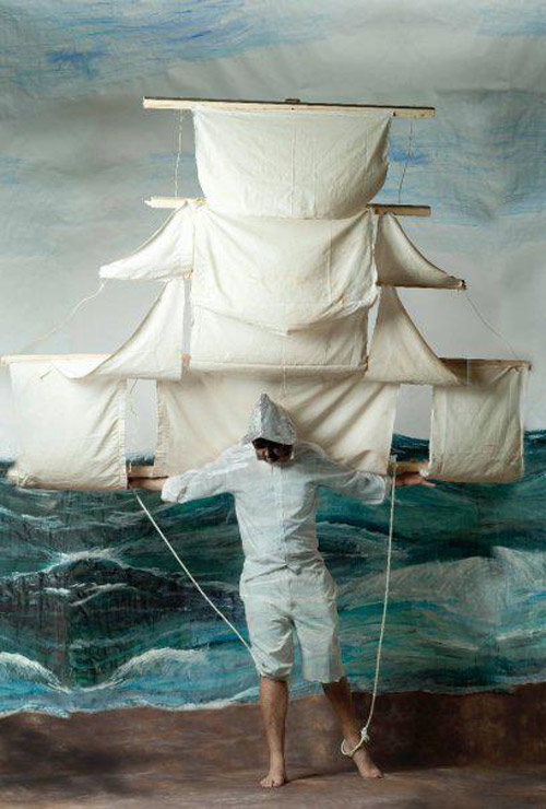
...this re-imagining of a Dali painting (no photo effects but a lot of construction involved). Larger image.
But there were a lot of entries I liked* including...
a youthful edition of El Greco's “Gentleman with his hand on his chest”
an obvious (but still welcome) real-life version of Van Gogh's “Skull with a burning cigarette”
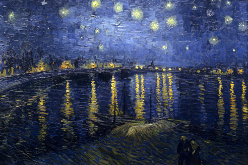
an appropriately modernized but still beautifully similar “Starry Night over the Rhone”
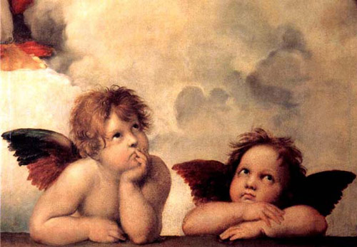
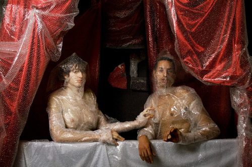
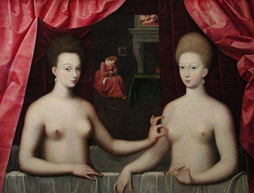
one of the most creative substitutions of contemporary people with Raphael's “Two Cherubs”
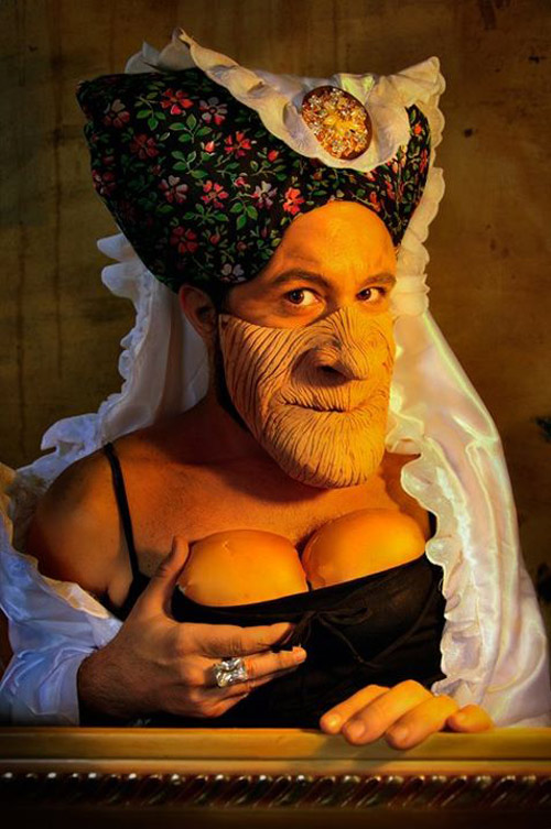
a very whimsical “Ugly Duchess”
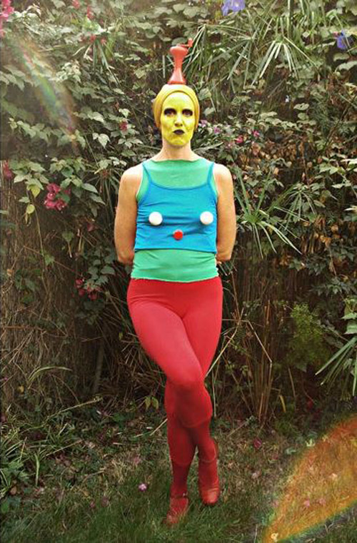
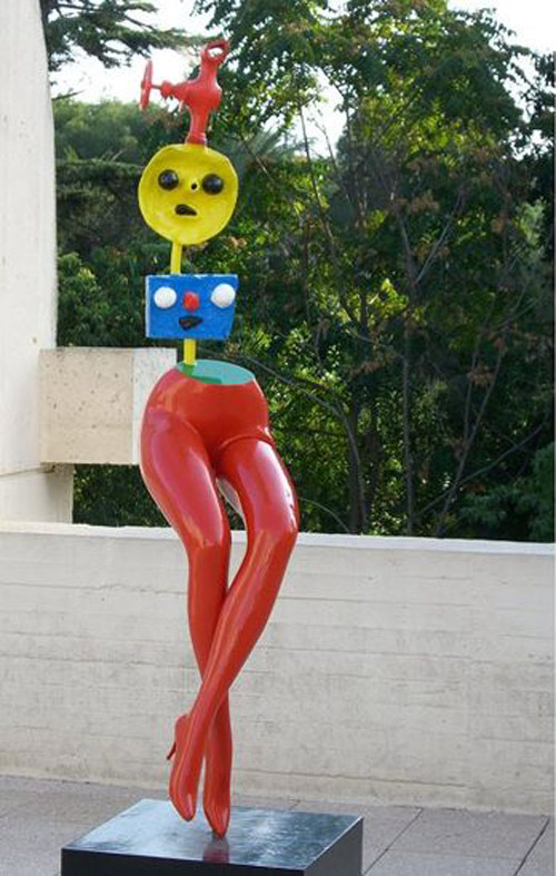
the un-abstracting of Joan Miro's “Young Woman Escaping”
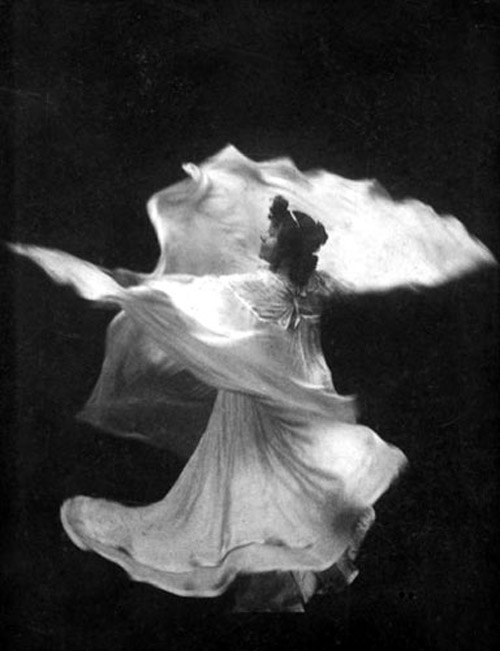
a precise re-creation of “Loie Fuller in La danse blanche”
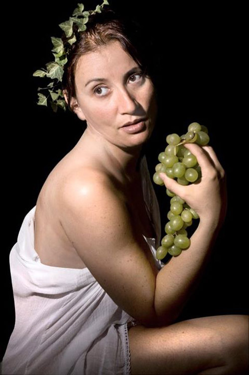
the most subtle but nicely-done of many gender-swaps was of Caravaggio's “Bacchino”
another nicely done Caravaggio remake is “Medusa”
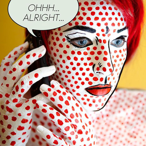
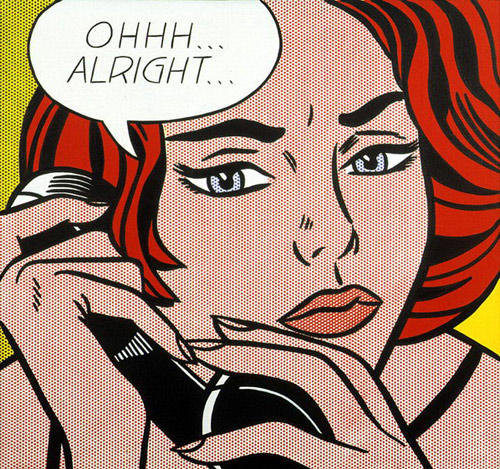
somebody got quite 'dotty' with Lichtenstein's “Ohhh…Alright…”
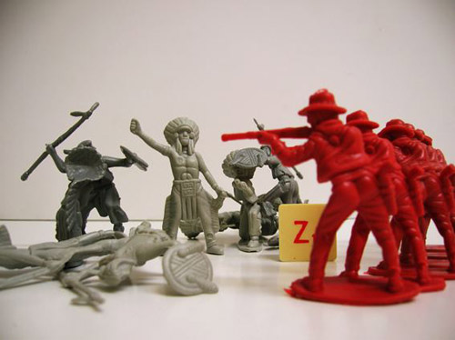
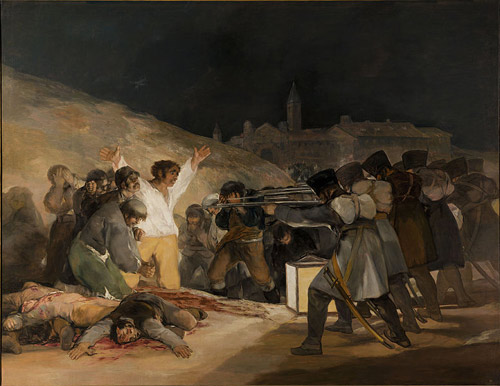
best use of small plastic toys goes to this version of Goya's “El Tres de Mayo”
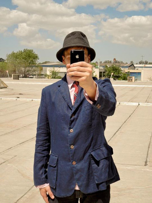
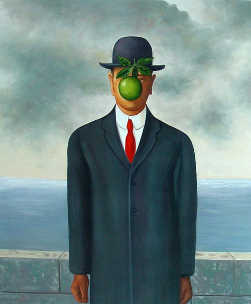
winner of 'most obvious updating' (so obvious it was done twice) is Magritte's “Son Of Man”
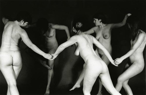
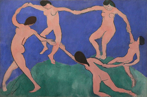
a standout for group effort (and group nudity, NSFW) is Matisse's “Dance”
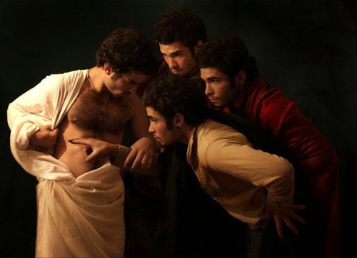
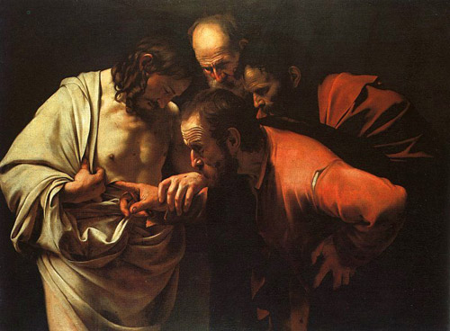
another good group shot (no nudity except for an exposed wound done with skillful makeup) is “The Incredulity of Saint Thomas”
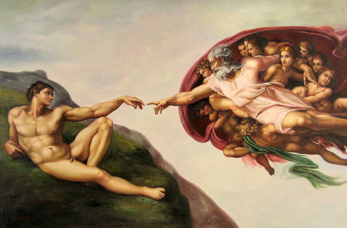
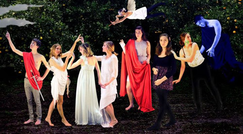
the most whimsical of several loose interpretations of “Creation of Adam” (although I would have swapped the two figures for historical accuracy)
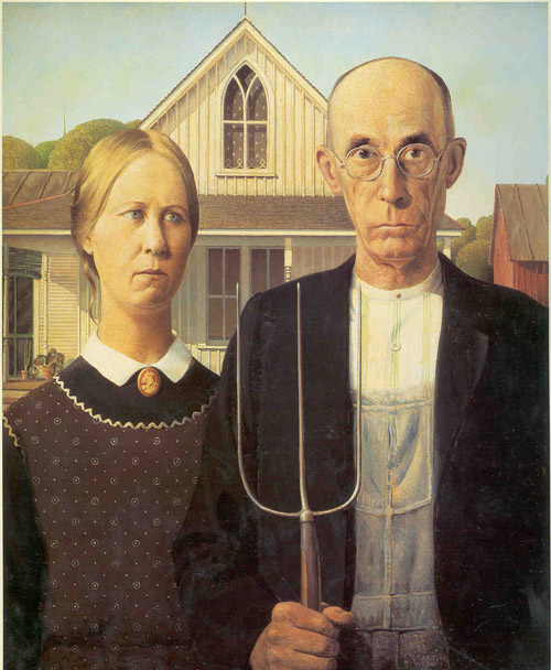
“American Gothic” got remade way too often (most often with 'hipsters') but this one was appropriately non-serious
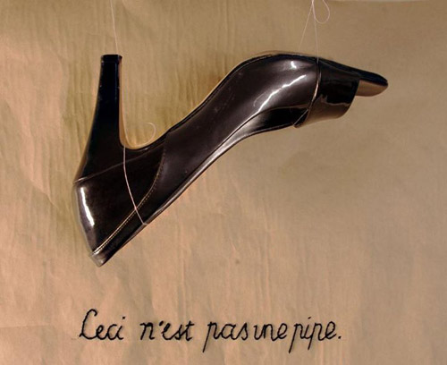
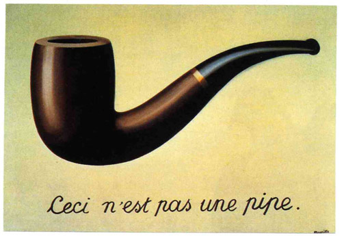
somebody stripped out the irony and added humor to Magritte's “The Treachery of Images”
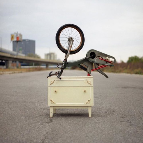
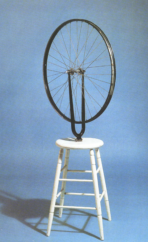
I'd call this an actual improvement on Duchanp's “Bicycle Wheel”
a nicely scaled-down version of Christo's “Umbrellas”
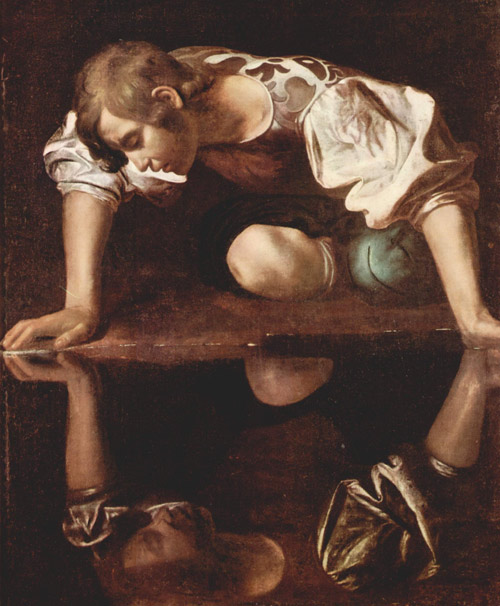
more than one good version of “Narcissus” (how come Caravaggio got so many of the best faithful re-creations)
Vermeer's “The Girl With The Pearl Earring” got a LOT of remakes, most very pretty, but I have to go for this gender-swap earring-swap.
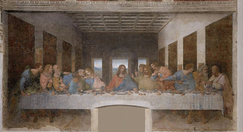
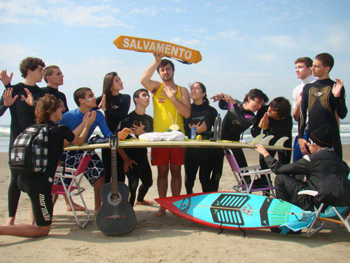
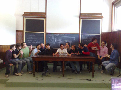
Lots of “The Last Supper” too - it's an obvious theme, but none quite match MetaFilter's Own. Still, the surfer, academic, independent movie and what I keep thinking of as 'business meeting' themed ones are worthy additions to the meme.
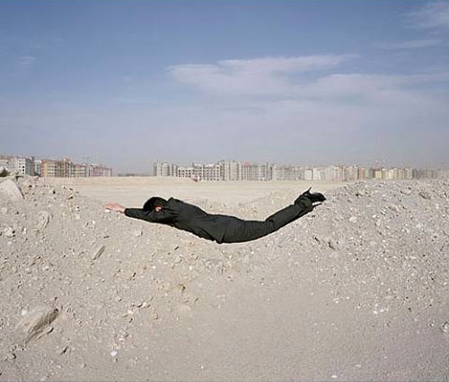
somebody took the stress out of Dennis Openheim's “Parallel Stress”
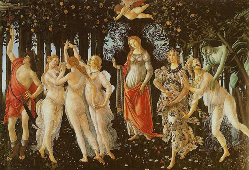
it's a toss-up between this and this for Botticelli's “Primavera”
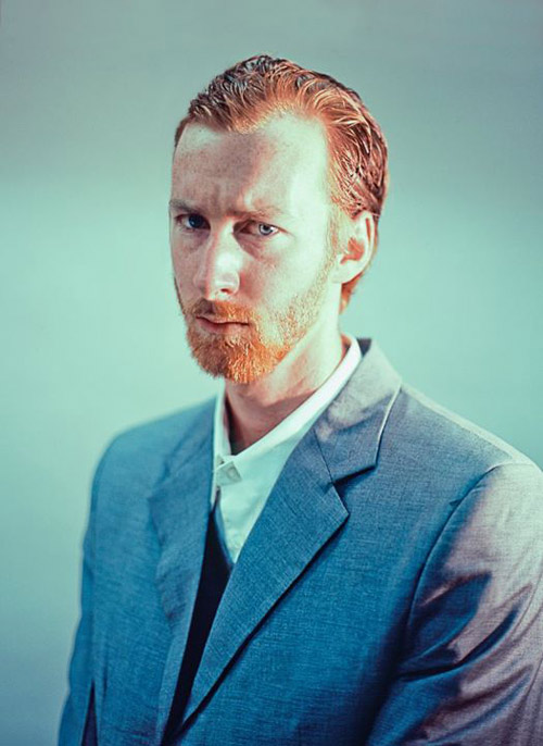
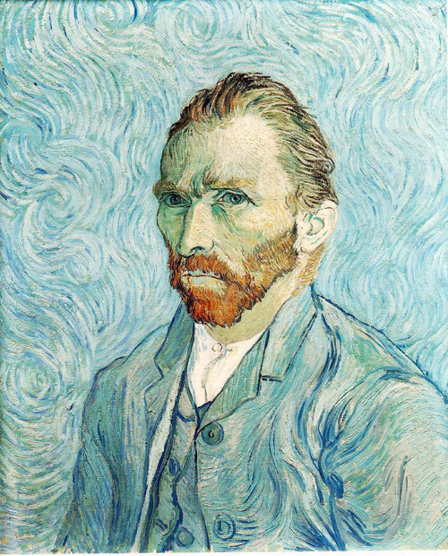
a lot of portrait models had solid resemblances, but the most striking was of Van Gogh's “Self Portrait 1889″
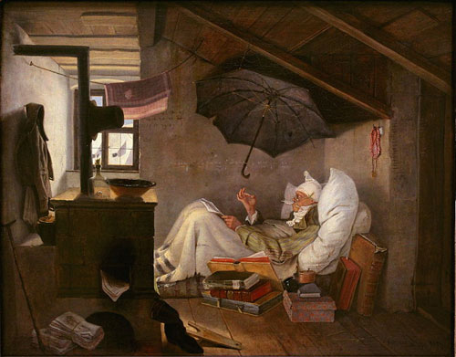
a good non-arbitrary modernization of Carl Spitzweg's “Der Arme Poet”
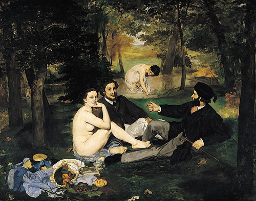
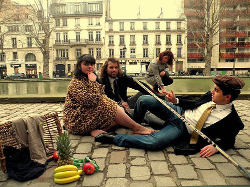
“Luncheon on the Grass” by Manet got urbanized (SFW) and gender-swapped (NSFW)
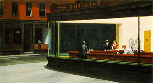
a proper update for Hopper's iconic “Nighthawks”
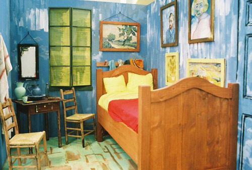
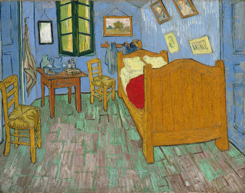
somebody can actually sleep in this version of Van Gogh's “Bedroom in Arles”
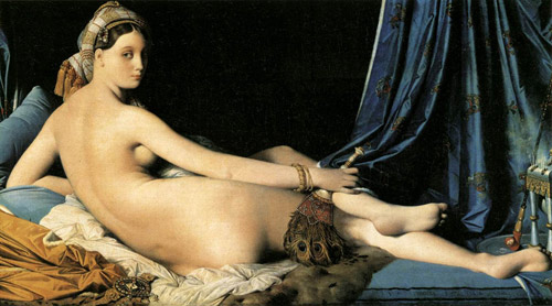
probably the funniest gender swap (NSFW) was of Ingres' “Grande Odalisque”
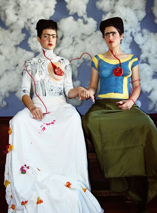
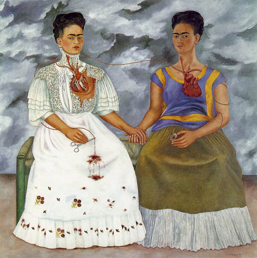
there were almost too many re-creations of Frida Kahlo's eyebrows, but by far the best was this vivid re-creation (NSFW) of “The Two Fridas”
how do you do a photographic version of Picasso's “Weeping Woman”? like this
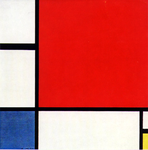
and last but not least, turning abstraction into organization with Mondrian's “Composition With Red, Blue and Yellow”
*because it's MY post. If there are some you like better, put 'em in the comments, art critic.
...this re-imagining of a Dali painting (no photo effects but a lot of construction involved). Larger image.
But there were a lot of entries I liked* including...
a youthful edition of El Greco's “Gentleman with his hand on his chest”
an obvious (but still welcome) real-life version of Van Gogh's “Skull with a burning cigarette”
an appropriately modernized but still beautifully similar “Starry Night over the Rhone”
one of the most creative substitutions of contemporary people with Raphael's “Two Cherubs”
a very whimsical “Ugly Duchess”
the un-abstracting of Joan Miro's “Young Woman Escaping”
a precise re-creation of “Loie Fuller in La danse blanche”
the most subtle but nicely-done of many gender-swaps was of Caravaggio's “Bacchino”
another nicely done Caravaggio remake is “Medusa”
somebody got quite 'dotty' with Lichtenstein's “Ohhh…Alright…”
best use of small plastic toys goes to this version of Goya's “El Tres de Mayo”
winner of 'most obvious updating' (so obvious it was done twice) is Magritte's “Son Of Man”
a standout for group effort (and group nudity, NSFW) is Matisse's “Dance”
another good group shot (no nudity except for an exposed wound done with skillful makeup) is “The Incredulity of Saint Thomas”
the most whimsical of several loose interpretations of “Creation of Adam” (although I would have swapped the two figures for historical accuracy)
“American Gothic” got remade way too often (most often with 'hipsters') but this one was appropriately non-serious
somebody stripped out the irony and added humor to Magritte's “The Treachery of Images”
I'd call this an actual improvement on Duchanp's “Bicycle Wheel”
a nicely scaled-down version of Christo's “Umbrellas”
more than one good version of “Narcissus” (how come Caravaggio got so many of the best faithful re-creations)
Vermeer's “The Girl With The Pearl Earring” got a LOT of remakes, most very pretty, but I have to go for this gender-swap earring-swap.
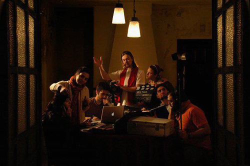
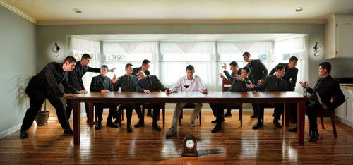
Lots of “The Last Supper” too - it's an obvious theme, but none quite match MetaFilter's Own. Still, the surfer, academic, independent movie and what I keep thinking of as 'business meeting' themed ones are worthy additions to the meme.
somebody took the stress out of Dennis Openheim's “Parallel Stress”
it's a toss-up between this and this for Botticelli's “Primavera”
a lot of portrait models had solid resemblances, but the most striking was of Van Gogh's “Self Portrait 1889″
a good non-arbitrary modernization of Carl Spitzweg's “Der Arme Poet”
“Luncheon on the Grass” by Manet got urbanized (SFW) and gender-swapped (NSFW)
a proper update for Hopper's iconic “Nighthawks”
somebody can actually sleep in this version of Van Gogh's “Bedroom in Arles”
probably the funniest gender swap (NSFW) was of Ingres' “Grande Odalisque”
there were almost too many re-creations of Frida Kahlo's eyebrows, but by far the best was this vivid re-creation (NSFW) of “The Two Fridas”
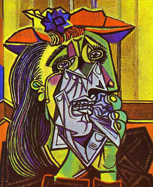
how do you do a photographic version of Picasso's “Weeping Woman”? like this
and last but not least, turning abstraction into organization with Mondrian's “Composition With Red, Blue and Yellow”
*because it's MY post. If there are some you like better, put 'em in the comments, art critic.
Man, so many Frida Kahlos.
posted by daniel_charms at 9:53 AM on December 27, 2011
posted by daniel_charms at 9:53 AM on December 27, 2011
Boy I wish I heard about these things before they happened.
posted by phaedon at 9:57 AM on December 27, 2011 [1 favorite]
posted by phaedon at 9:57 AM on December 27, 2011 [1 favorite]
This is really wonderful. People are cool.
posted by gwint at 10:04 AM on December 27, 2011 [2 favorites]
posted by gwint at 10:04 AM on December 27, 2011 [2 favorites]
This is excellent! I especially love the way you set it up. I've opened all of these in tabs and am having great fun switching between the remakes and originals.
posted by troika at 10:08 AM on December 27, 2011
posted by troika at 10:08 AM on December 27, 2011
the winner was nice and all, but there were others that seemed to put in a bit more effort than a helmet made of aluminum foil. kudos for the ship rigging, but not the best effort imo.
posted by OHenryPacey at 10:09 AM on December 27, 2011
posted by OHenryPacey at 10:09 AM on December 27, 2011
the metafilter last supper is absolutely amazing.
posted by liza at 10:09 AM on December 27, 2011 [4 favorites]
posted by liza at 10:09 AM on December 27, 2011 [4 favorites]
I really really really enjoyed this post. Thanks so much.
I enjoy the ones that aren't reproductions as much as they are clever reimaginings.
I know I'll be like your grandmother, sending this like to everyone i know.
posted by cccorlew at 10:29 AM on December 27, 2011
I enjoy the ones that aren't reproductions as much as they are clever reimaginings.
I know I'll be like your grandmother, sending this like to everyone i know.
posted by cccorlew at 10:29 AM on December 27, 2011
Some of these might have shown more effort, exactitude, or cleverness in their execution, but the Dali remake is one of the few that stand as a stunning image in its own right. I love how the painted backdrop and the draping of the sails work together to evoke more movement than what's actually there. I think it's a wonderful study in not overdoing it, which you could so easily go for with Dali. I'd really like to see a higher quality image of it without all the artifacts.
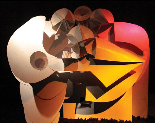
Apart from the winner, I think my favorite is this remake of “The Incredulity of Saint Thomas” made of (I think) posterboard and colored light. It perfectly boils down some of the most important aspects of Caravaggio's work but also has a dimension and life of its own.
posted by Mizu at 10:37 AM on December 27, 2011
how come Caravaggio got so many of the best faithful re-creations
Because they were already optical. It's like recreating in photograph a painting of a photograph.
I'd call this an actual improvement on Duchanp's “Bicycle Wheel”
And you would miss the point by a century.
posted by cmoj at 10:45 AM on December 27, 2011 [1 favorite]
Because they were already optical. It's like recreating in photograph a painting of a photograph.
I'd call this an actual improvement on Duchanp's “Bicycle Wheel”
And you would miss the point by a century.
posted by cmoj at 10:45 AM on December 27, 2011 [1 favorite]
As far as faithful recreations, I thought this one matched the original beautifully.
posted by effwerd at 11:29 AM on December 27, 2011 [3 favorites]
posted by effwerd at 11:29 AM on December 27, 2011 [3 favorites]
So many of these were just awesome.
Way too many Frida Kahlos and Last Suppers (which has already been done to death and always seems to stem from 'hey, let's put our friend with long hair in the middle').
My absolute favourite is the Van Gogh self portrait because even though he doesn't really look like him, and he (thankfully) didn't put swirly brushstrokes everywhere, you still know exactly what image he's going for. Just captured the vibe and the spirit perfectly.
posted by chococat at 11:42 AM on December 27, 2011 [4 favorites]
This one (original) (both NSFW) took me a minute to get.
posted by MtDewd at 12:07 PM on December 27, 2011
posted by MtDewd at 12:07 PM on December 27, 2011
As expected, a mixed bag; some works very clever, some predictable and pretentious and ax-grindey.
The Mondrian made me smile. The Van Gogh self portrait has feeling and heft; Otto's Dix's “Portrait of Sylvia Von Harden” is regrettably a vacuous failure. Capa's "Falling Soldier" chilled me to the bone.
posted by Scoo at 12:29 PM on December 27, 2011
The Mondrian made me smile. The Van Gogh self portrait has feeling and heft; Otto's Dix's “Portrait of Sylvia Von Harden” is regrettably a vacuous failure. Capa's "Falling Soldier" chilled me to the bone.
posted by Scoo at 12:29 PM on December 27, 2011
Loved it. I was scrolling through fairly fast and there was once or twice when I quickly thought one of the recreations was the original.
posted by bongo_x at 9:58 PM on December 27, 2011
posted by bongo_x at 9:58 PM on December 27, 2011
Not only a great post, but I (gasp!) agree with many of your assessments.
Too many obvious gags, like Frida's eyebrows and gender reversal.
The winner deserved to win. Probably.
Your linked "Grand Odalisque" (there were multiple renditions) was a real contender.
BTW, your first link to a youthful edition of El Greco's “Gentleman with his hand on his chest” goes awry.
And, MtDewd:
This one (original) (both NSFW) took me a minute to get.
Maybe it's because I'm both a medievalist, and a huge Cindy Sherman fan, but I got that right away. Not sure even Cindy could have done better. That was wonderful.
posted by IAmBroom at 11:01 PM on December 27, 2011
oneswellfoop: I'd call this an actual improvement on Duchanp's “Bicycle Wheel”
And you would miss the point by a century.
Care to explain your snark, cmoj?
posted by IAmBroom at 11:04 PM on December 27, 2011
And you would miss the point by a century.
Care to explain your snark, cmoj?
posted by IAmBroom at 11:04 PM on December 27, 2011
Care to explain your snark, cmoj?
I can't speak for cmoj, but the point of Bicycle Wheel was that it was a readymade.
At least to me, the question that the Duchamp piece provokes is, "why is this?" while the recreation makes me ask, "why is that there?" and I find the former to be a more interesting question.
Lastly, the original is a physical object with moving parts that the artist and/or viewers could interact with, which the picture is not. One can take impressive photos of Rodin sculptures but few would argue that they improve on the originals.
posted by Candleman at 1:27 AM on December 28, 2011
I can't speak for cmoj, but the point of Bicycle Wheel was that it was a readymade.
A point that I very much want to establish is that the choice of these Readymades was never dictated by an aesthetic delectation. The choice was based on visual indifference—a total absence of good or bad taste—in fact, a complete anesthesia. -DuchampThus, it is hard to improve upon the piece visually if indifference is the point.
At least to me, the question that the Duchamp piece provokes is, "why is this?" while the recreation makes me ask, "why is that there?" and I find the former to be a more interesting question.
Lastly, the original is a physical object with moving parts that the artist and/or viewers could interact with, which the picture is not. One can take impressive photos of Rodin sculptures but few would argue that they improve on the originals.
posted by Candleman at 1:27 AM on December 28, 2011
I'm not an art critic, but I know what I like. And, frankly, I'm somewhat relieved I got more agreements than disagreements with my jerky-knee reactions (and thankful to those of you who went down the long list of entries come back with a YOU SHOULDA INCLUDED THIS).
I liked that the Duchamp (did I misspell it Duchanp? AAARRRGGGHHH.) remake was more complicated than the original but still within the parameters of "why is this"? (My reaction to "indifference is the point" is "meh".) But I certainly should have used terminology like "amplified" or "added to" rather than "improved on".
I also misused the term "irony" for the description of the Magritte piece. I'm more used to writing about TV shows (where "irony" is almost ALWAYS misused).
But the whole purpose of the contest was using unedited photographs to re-make/re-define/re-contextualize familiar works of art. It worked for me.
posted by oneswellfoop at 11:43 AM on December 28, 2011
Well put, Candleman. Plus, it's very possible that the readymades were not what he said. Given that he was a chess master, that every time he spoke about Dada he was basically screaming, "THIS MAKES NO SENSE I AM LYING TO YOU," and that the art historians generally don't want to consider the idea makes me very inclined to believe the theory. Not to mention that if you look at the Mona Lisa next to L.H.O.O.Q. it's clear that the face is modified.
As you'll see most of the way down the last link, there's something fishy going on with the Bicycle Wheel. At the very least, an un-doctored photograph is missing the point, and it's likely that using an actual readymade is missing the point if the physical wheel ever existed. Even without that "improving" on a readymade is a nonsensical proposition (but I can see how it could be taken as an extension, but then, so what a century later?).
I should say, Candleman, that I love all of this Duchamp trickery so much because its discovery doesn't invalidate your explanation. At least not without invalidating everything from Mondrian to Cristo. It still overtly shaped the following century of art, with a built-in time release to carry it (or us) into the next era!
posted by cmoj at 12:26 PM on December 28, 2011
Late to the party here, but this totally reminded me of the awesome music video for "70 Million" by Hold Your Horses (a great song in its own right, discussed previously).
posted by Rhaomi at 11:55 PM on December 28, 2011
posted by Rhaomi at 11:55 PM on December 28, 2011
« Older Humans are Beautiful! | Pucking Fantastic Newer »
This thread has been archived and is closed to new comments
That wasn't irony. That was commentary on the nature of images and reality.
posted by DU at 9:48 AM on December 27, 2011 [3 favorites]