Kerning panic in Amsterdam
May 4, 2013 4:58 AM Subscribe
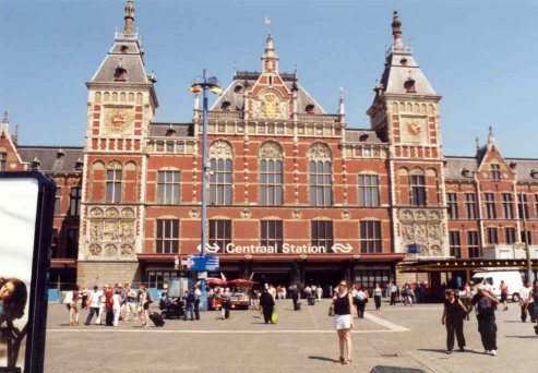
Amsterdam Central Station has been the subject of intense renovation in the past decade. Not only is the station being given a revamp, there's also a new metro line being built under it,
as well as a new bus station and ferry terminal being added to the northside. During the course of this still not completed renovation a number of complex problems had to be solved. One pressing issue however is still open: will the kerning of the giant "Amsterdam" on the roof of the new bus terminal actually work?
While Piet Schreuders, as a graphical designer, might have his doubts, the architects Benthem Crouwel and the roof's designers don't share them. For the Dutch newspaper NRC they explained that the kerning was out of balance to make sure no rafters were bisecting any of the characters (link in Dutch). However since these rafters are only visible on the inside, that still leaves a slightly skewed perception when looking at it from the outside, annoying pedants everywhere.
While Piet Schreuders, as a graphical designer, might have his doubts, the architects Benthem Crouwel and the roof's designers don't share them. For the Dutch newspaper NRC they explained that the kerning was out of balance to make sure no rafters were bisecting any of the characters (link in Dutch). However since these rafters are only visible on the inside, that still leaves a slightly skewed perception when looking at it from the outside, annoying pedants everywhere.
Yes, this detracts from the subtlety and grace of a four-block long all-cap red word that may only be seen in full, oddly enough, from space.
posted by hal9k at 5:32 AM on May 4, 2013 [8 favorites]
posted by hal9k at 5:32 AM on May 4, 2013 [8 favorites]
Wow, I sure miss the old days when I used to be in Amsterdam once or twice a year. I have many fond memories of that great little town.
As for the kerning, I don't think it'd bother me in the slightest.
posted by flapjax at midnite at 5:33 AM on May 4, 2013
As for the kerning, I don't think it'd bother me in the slightest.
posted by flapjax at midnite at 5:33 AM on May 4, 2013
May be useful so pilots know where to land.
Nevermind. A bus depot?
posted by hal9k at 5:33 AM on May 4, 2013
Nevermind. A bus depot?
posted by hal9k at 5:33 AM on May 4, 2013
*looks up wondering what everyone else is looking up at*
posted by infini at 5:38 AM on May 4, 2013 [2 favorites]
posted by infini at 5:38 AM on May 4, 2013 [2 favorites]
o shit light up the Knuth Signal, this is an emergency
posted by indubitable at 6:03 AM on May 4, 2013 [8 favorites]
posted by indubitable at 6:03 AM on May 4, 2013 [8 favorites]
Folk are worried about the kerning? Not, you know, about the sheer tackiness of the damn thing? That sign is vile and horrific, fit only for Las Vegas.
posted by Jehan at 6:27 AM on May 4, 2013
posted by Jehan at 6:27 AM on May 4, 2013
Oh, font geeks. Don't ever change.
posted by octothorpe at 6:27 AM on May 4, 2013 [6 favorites]
posted by octothorpe at 6:27 AM on May 4, 2013 [6 favorites]
Don't worry, you only see it coming in from the back end of Centraal Station from the north. As a normal person you never have to see this.
posted by Meatbomb at 6:32 AM on May 4, 2013 [1 favorite]
posted by Meatbomb at 6:32 AM on May 4, 2013 [1 favorite]
Fun fact: the city was originally named Arnsterdam.
posted by hal9k at 6:45 AM on May 4, 2013 [36 favorites]
posted by hal9k at 6:45 AM on May 4, 2013 [36 favorites]
OK, typography geeks complaining, that could happen anywhere.
The designers taking the time to defend their kerning rationale in a newspaper interview? Only in Amsterdam.
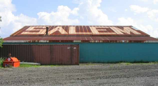
Meanwhile in Geffen.
posted by pont at 6:45 AM on May 4, 2013 [9 favorites]
The designers taking the time to defend their kerning rationale in a newspaper interview? Only in Amsterdam.
Meanwhile in Geffen.
posted by pont at 6:45 AM on May 4, 2013 [9 favorites]
Gotta love how the artist's impression has all the beams and stuff painted white, nice and clean and light and airy and shiny, while the actual thing is all black and stained concrete and shadow and shit.
As for the lettering: It's not only hideous and unnecessary; it's also only fully viewable from underneath, where it's all backwards.
posted by Sys Rq at 6:48 AM on May 4, 2013 [1 favorite]
As for the lettering: It's not only hideous and unnecessary; it's also only fully viewable from underneath, where it's all backwards.
posted by Sys Rq at 6:48 AM on May 4, 2013 [1 favorite]
As a normal person you never have to see this.
Oi. Coming in from Noord on the ferry that stupid thing is thrust in my face every time (and yes, I have been worrying about the kerning.)
posted by MartinWisse at 7:00 AM on May 4, 2013 [1 favorite]
Oi. Coming in from Noord on the ferry that stupid thing is thrust in my face every time (and yes, I have been worrying about the kerning.)
posted by MartinWisse at 7:00 AM on May 4, 2013 [1 favorite]
That Geffen memorial is a real scandal, though. Someone should be fired.
posted by mumimor at 7:18 AM on May 4, 2013 [2 favorites]
posted by mumimor at 7:18 AM on May 4, 2013 [2 favorites]
Great pun in the title.
posted by thelonius at 7:22 AM on May 4, 2013 [1 favorite]
posted by thelonius at 7:22 AM on May 4, 2013 [1 favorite]
>Meanwhile in Geffen.
posted by pont at 9:45 AM on May 4 [+] [!]
Ick!
posted by NikitaNikita at 7:26 AM on May 4, 2013
posted by pont at 9:45 AM on May 4 [+] [!]
Ick!
posted by NikitaNikita at 7:26 AM on May 4, 2013
*looks up wondering what everyone else is looking up at*
I used to do that thing at the bus stop -- look intently at a blank spot in the sky, just to get all the other people at the bus stop to look up to see what I was looking at.
posted by Devils Rancher at 7:35 AM on May 4, 2013
I used to do that thing at the bus stop -- look intently at a blank spot in the sky, just to get all the other people at the bus stop to look up to see what I was looking at.
posted by Devils Rancher at 7:35 AM on May 4, 2013
Meanwhile in Geffen.
"Well, it's a holocaust memorial. What typeface says 'fun'"?
o_0
posted by Devils Rancher at 7:38 AM on May 4, 2013 [2 favorites]
"Well, it's a holocaust memorial. What typeface says 'fun'"?
o_0
posted by Devils Rancher at 7:38 AM on May 4, 2013 [2 favorites]
Comic sans on a war memorial is hilarious, unfortunately.
posted by marienbad at 7:55 AM on May 4, 2013
posted by marienbad at 7:55 AM on May 4, 2013
Comic sans == without laughter, dammit!
posted by mazola at 7:58 AM on May 4, 2013 [3 favorites]
posted by mazola at 7:58 AM on May 4, 2013 [3 favorites]
Typographers are a luxury we can no longer.... wait, you mean a guy can make a living at that?
posted by R. Mutt at 8:18 AM on May 4, 2013
posted by R. Mutt at 8:18 AM on May 4, 2013
In this picture from Geffen, I like to imagine that the priest is attempting to exorcise the Comic Sans.
"The power of Caslon compels you! The power of Caslon compels you! The power of Caslon compels you!"posted by pont at 8:23 AM on May 4, 2013 [5 favorites]
"Blaaaaagh! Your mother letterspaces blackletter in hell!"
Uggggh. We just shipped a magazine to the printer at work this week. I can't read anything right now without noticing the kerning, tracking, leading, etc. This isn't helping.
posted by limeonaire at 8:31 AM on May 4, 2013
posted by limeonaire at 8:31 AM on May 4, 2013
Typographers are a luxury we can no longer.... wait, you mean a guy can make a living at that?
Aren't they a necessity? Any time you read or produce written material that hasn't been handwritten you're handling something that at least one typographer (most probably more) has worked on. Who else decides what letters look like, individually and in combinations?
posted by quosimosaur at 8:32 AM on May 4, 2013
I have to say, the type setters working behind the scenes at Metafilter are doing a fantastic jod.
posted by Slarty Bartfast at 8:37 AM on May 4, 2013 [4 favorites]
posted by Slarty Bartfast at 8:37 AM on May 4, 2013 [4 favorites]
It doesn't look so ba.d
posted by Uther Bentrazor at 8:53 AM on May 4, 2013 [2 favorites]
posted by Uther Bentrazor at 8:53 AM on May 4, 2013 [2 favorites]
I have to say, the type setters working behind the scenes at Metafilter are doing a fantastic jod.
I don't know if this is directed at my comment but I'll have a pop.
Even if this site wasn't designed by a person who goes by the label of graphic designer or typographer, somebody designed Verdana (or which ever font you've set) and somebody else decided how your browser renders text, so that's at least two people whose typographic work we are indebted to.
posted by quosimosaur at 9:02 AM on May 4, 2013
I'd be more concerned about the colour used. That shade of red orange reminds me of the curtains in a cottage my parents rented in the 70's that smelt of damp and broken dreams. It's not the usual orange used by the Dutch for celebration is it?
posted by arcticseal at 9:05 AM on May 4, 2013 [1 favorite]
posted by arcticseal at 9:05 AM on May 4, 2013 [1 favorite]
Must.........be.......fixed
posted by anothermug at 9:10 AM on May 4, 2013
posted by anothermug at 9:10 AM on May 4, 2013
As a normal person you never have to see this.
BUT WE'LL KNOW IT'S THERE
posted by elizardbits at 9:19 AM on May 4, 2013 [3 favorites]
BUT WE'LL KNOW IT'S THERE
posted by elizardbits at 9:19 AM on May 4, 2013 [3 favorites]
May be useful so pilots know where to land.
Nevermind. A bus depot?-- hal9k
Yes, it reminds me of an old, run-down airport. Not the image that comes to mind when I think of Amsterdam. Maybe the city is tired of being admired for its historical beauty.
posted by eye of newt at 10:42 AM on May 4, 2013
Nevermind. A bus depot?-- hal9k
Yes, it reminds me of an old, run-down airport. Not the image that comes to mind when I think of Amsterdam. Maybe the city is tired of being admired for its historical beauty.
posted by eye of newt at 10:42 AM on May 4, 2013
This weekend I'm going to paint 'Greetings Google Maps Visitor" on my roof.
posted by George_Spiggott at 11:07 AM on May 4, 2013 [2 favorites]
posted by George_Spiggott at 11:07 AM on May 4, 2013 [2 favorites]
MSPaint.exe, Arial, outline orange, fill red, Caps Lock, "AMSTERDAM", done and DONE, time for a falafel.
posted by RobotVoodooPower at 11:08 AM on May 4, 2013
posted by RobotVoodooPower at 11:08 AM on May 4, 2013
Also: Panic on the streets of Kerningham
posted by RobotVoodooPower at 11:11 AM on May 4, 2013
posted by RobotVoodooPower at 11:11 AM on May 4, 2013
It doesn't look so ba.d
I agre.e, yo.u'd have to b.e hy.persens..itive to even not.ic.e it.
posted by benito.strauss at 11:17 AM on May 4, 2013 [3 favorites]
I agre.e, yo.u'd have to b.e hy.persens..itive to even not.ic.e it.
posted by benito.strauss at 11:17 AM on May 4, 2013 [3 favorites]
So any relation between Benthem Crouwel Architects and graphic designer and type designer Wim Crouwel? I mean, he even designed a typeface called Gridnik, which is as grid-like as the top of that bus station. Crouwel could’ve called up Crouwel for this job.
posted by romanb at 11:19 AM on May 4, 2013
posted by romanb at 11:19 AM on May 4, 2013
The view from the inside, in the second to last link, looks pretty cool. I still think it is ugly from the outside.
posted by eye of newt at 11:19 AM on May 4, 2013
posted by eye of newt at 11:19 AM on May 4, 2013
Fun fact: the city was originally named Arnsterdam.
And before it even existed, it was Aren'tsterdam.
posted by weapons-grade pandemonium at 12:14 PM on May 4, 2013 [1 favorite]
And before it even existed, it was Aren'tsterdam.
posted by weapons-grade pandemonium at 12:14 PM on May 4, 2013 [1 favorite]
I never knew this station existed, and I'd one day visited Amsterdam and seen it, I would never have noticed these problems. I probably would have been impressed by the scale of the lettering.
But now that I've been told about it, the kerning makes me unaccountably itchy.
posted by figurant at 12:28 PM on May 4, 2013
But now that I've been told about it, the kerning makes me unaccountably itchy.
posted by figurant at 12:28 PM on May 4, 2013
My work here is done.
posted by MartinWisse at 12:42 PM on May 4, 2013 [1 favorite]
posted by MartinWisse at 12:42 PM on May 4, 2013 [1 favorite]
*contemplates when might be a good day to run up and take a gander*
posted by infini at 12:54 PM on May 4, 2013
posted by infini at 12:54 PM on May 4, 2013
DO YOU THINK I CAN'T SEE YOUR TINY DOTS
DO YOU
posted by elizardbits at 1:18 PM on May 4, 2013 [1 favorite]
DO YOU
posted by elizardbits at 1:18 PM on May 4, 2013 [1 favorite]
Amsterdamerung?
I like the overall design, I like the massive typography and its (presumably) intentional evocation of historic aerodromes, and I like the idea that this will be a new entry for Google Sightseeing -- a landmark visible from 30,000 feet, so to speak.
posted by dhartung at 2:31 PM on May 4, 2013
I like the overall design, I like the massive typography and its (presumably) intentional evocation of historic aerodromes, and I like the idea that this will be a new entry for Google Sightseeing -- a landmark visible from 30,000 feet, so to speak.
posted by dhartung at 2:31 PM on May 4, 2013
W hat t i ny dot s?
posted by hattifattener at 5:07 PM on May 4, 2013
posted by hattifattener at 5:07 PM on May 4, 2013
« Older Forgot to Celebrate D-Day, Sister Woman. | Imagining and sharing desires and fears about the... Newer »
This thread has been archived and is closed to new comments
posted by blue_beetle at 5:04 AM on May 4, 2013 [54 favorites]