all that is gold does not glitter
June 2, 2014 7:17 PM Subscribe
Wonderful; LOTR translated almost as Christian iconography. But why if these are original Russian illustrations for a Russian edition, is the Roman alphabet and even English text used?
posted by George_Spiggott at 7:38 PM on June 2, 2014 [1 favorite]
posted by George_Spiggott at 7:38 PM on June 2, 2014 [1 favorite]
Oh look, the Balrog has wings.
posted by Phssthpok at 7:38 PM on June 2, 2014 [2 favorites]
posted by Phssthpok at 7:38 PM on June 2, 2014 [2 favorites]
Holy cow those are beautiful. Unspeakably so.
posted by notsnot at 7:41 PM on June 2, 2014 [1 favorite]
posted by notsnot at 7:41 PM on June 2, 2014 [1 favorite]
I like that the Balrog is wearing that Sutton Hoo helmet everyone knows.
These are delightful! I also like the creepy, skeletal ringwraiths and the wispy ents.
posted by branduno at 7:43 PM on June 2, 2014 [1 favorite]
These are delightful! I also like the creepy, skeletal ringwraiths and the wispy ents.
posted by branduno at 7:43 PM on June 2, 2014 [1 favorite]
I would really like to see The Adventures of Huckleberry Finn illustrated this way.
(Finn is used in Russian primary school curricula, or was during the Communist era.)
posted by George_Spiggott at 7:48 PM on June 2, 2014 [1 favorite]
(Finn is used in Russian primary school curricula, or was during the Communist era.)
posted by George_Spiggott at 7:48 PM on June 2, 2014 [1 favorite]
ThEODEN:REX:INTERFECTVS:EST
posted by XMLicious at 7:49 PM on June 2, 2014 [1 favorite]
posted by XMLicious at 7:49 PM on June 2, 2014 [1 favorite]
Talk about "quasi"! The pictures leap around about 1000 years of art history, and include styles that weren't found in medieval times. They are not stylistically a piece, or even near to being so, so their use in the same book is kinda disappointing.
posted by Thing at 7:59 PM on June 2, 2014
posted by Thing at 7:59 PM on June 2, 2014
They're not period, sure, but they're pretty nonetheless.
posted by immlass at 8:06 PM on June 2, 2014
posted by immlass at 8:06 PM on June 2, 2014
What I really want to see is LOTR illustrated in the style of Hieronymus Bosch.
posted by thecjm at 8:10 PM on June 2, 2014 [3 favorites]
posted by thecjm at 8:10 PM on June 2, 2014 [3 favorites]
Considering that Middle Earth is already a mish-mash of about 1000 years of European history and legend, I don't think the varying art styles matter much at all. It's all very peculiarly Russian, which is great by me.
posted by Strange Interlude at 8:11 PM on June 2, 2014 [9 favorites]
posted by Strange Interlude at 8:11 PM on June 2, 2014 [9 favorites]
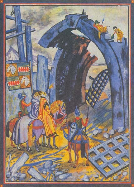
Now that I've dug through them all, I love the Scouring of the Shire image (NO ENTRY) from part 3. And the one right after with Theoden as William the Conqueror.
posted by thecjm at 8:12 PM on June 2, 2014
posted by thecjm at 8:12 PM on June 2, 2014
Wow! These are as wild as the Scivias of Hildegard Von Bingen.
posted by DrMew at 8:17 PM on June 2, 2014
posted by DrMew at 8:17 PM on June 2, 2014
Wow, those are gorgeous. Not disappointing to me — delightful!
Seriously, as a non-art historian, do I care the art styles are from a bunch of different centuries? No, I do not. I care that the art is beautiful and helps me see this book from my childhood in a new way.
posted by Lexica at 8:36 PM on June 2, 2014 [1 favorite]
Seriously, as a non-art historian, do I care the art styles are from a bunch of different centuries? No, I do not. I care that the art is beautiful and helps me see this book from my childhood in a new way.
posted by Lexica at 8:36 PM on June 2, 2014 [1 favorite]
These are mad, but also charming. I especially liked "Flotsam and Jetsam." Thanks, michaelh.
posted by ob1quixote at 8:50 PM on June 2, 2014 [1 favorite]
posted by ob1quixote at 8:50 PM on June 2, 2014 [1 favorite]
Thin, heavy-lidded Boromir. I never thought of him that way – always figured he was beefy and boisterous – but this conception of him totally works.
posted by ignignokt at 8:57 PM on June 2, 2014
posted by ignignokt at 8:57 PM on June 2, 2014
I especially liked "Flotsam and Jetsam."
Perfect representation of one of my favorite scenes. "Oh hey guys, long time no see! What have we been up to? Oh, not much, just kicking back after totally wrecking Saruman. What took you so long?"
posted by jason_steakums at 9:11 PM on June 2, 2014 [1 favorite]
Perfect representation of one of my favorite scenes. "Oh hey guys, long time no see! What have we been up to? Oh, not much, just kicking back after totally wrecking Saruman. What took you so long?"
posted by jason_steakums at 9:11 PM on June 2, 2014 [1 favorite]
How could we have never known about this? These are fantastic!
posted by a humble nudibranch at 9:42 PM on June 2, 2014
posted by a humble nudibranch at 9:42 PM on June 2, 2014
I love the chance of seeing an alternate visual sensibility take on familiar pop culture. These Polish movie posters are a fave of mine as well. (Previously)
posted by George_Spiggott at 10:06 PM on June 2, 2014 [1 favorite]
posted by George_Spiggott at 10:06 PM on June 2, 2014 [1 favorite]
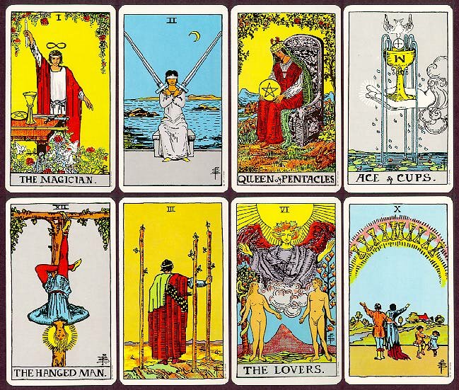
These are incredible. They would make great tarot cards! I think it's the use of all the background yellow that made me think of it.
posted by WidgetAlley at 11:55 PM on June 2, 2014
posted by WidgetAlley at 11:55 PM on June 2, 2014
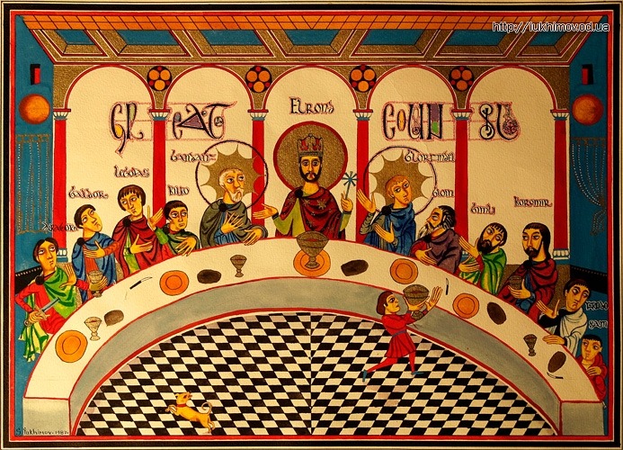
Interesting how everywhere underground is tiled, like stations on the Moscow Metro.
posted by Prince Lazy I at 12:01 AM on June 3, 2014 [1 favorite]
posted by Prince Lazy I at 12:01 AM on June 3, 2014 [1 favorite]
I think it's a bit unfair to make a whole post of an artist's work and not even mention their name. Sergey Yuhimov, apparently.
posted by Azara at 1:09 AM on June 3, 2014 [1 favorite]
posted by Azara at 1:09 AM on June 3, 2014 [1 favorite]
Could the different styles be interpreted as coming from different areas in Middle Earth?
posted by Harald74 at 1:10 AM on June 3, 2014
posted by Harald74 at 1:10 AM on June 3, 2014
While we are talking about Russians and alternative interpretations of The Lord of the Rings; I recently read the newer English translation of Kiril Eskov's The Last Ringbearer and it was surprisingly good!
posted by Harald74 at 1:12 AM on June 3, 2014
posted by Harald74 at 1:12 AM on June 3, 2014
Oh. My. Loving the way the 60's/70's style of illustration bleeds through the pastiche - not a criticism. A comparison would be Pauline Baines with her personal style equally recognisable whether she was making work derived from Persian miniatures or from medieval manuscripts.
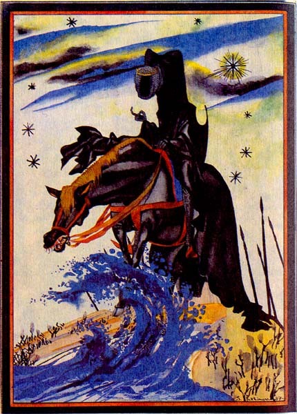
Personal favourites are Aragorn at the Prancing Pony and Frodo, Sam and Gollum in the marshes. These are just lovely and so accomplished - in the destruction of the Nazgul king for instance, that little shorthand delineation, skull and cloak - understated, creepy, bang on.
Little bit disconcerted by all the angels hanging about though, and halos.
posted by glasseyes at 3:32 AM on June 3, 2014
Absolutely amazing. My mom may be the world's biggest Tolkien geek and she's loving this. Thanks!
posted by sotonohito at 4:04 AM on June 3, 2014 [1 favorite]
posted by sotonohito at 4:04 AM on June 3, 2014 [1 favorite]
These are amazing! Big time Tolkien fan here and I never knew these had existed.
I found a handful more here as well.
posted by Woodroar at 4:52 AM on June 3, 2014
I found a handful more here as well.
posted by Woodroar at 4:52 AM on June 3, 2014
I think it's a bit unfair to make a whole post of an artist's work and not even mention their name. Sergey Yuhimov, apparently.
He's in the tags, but yes, I should have.
posted by michaelh at 5:20 AM on June 3, 2014
He's in the tags, but yes, I should have.
posted by michaelh at 5:20 AM on June 3, 2014
Most endearing detail: Faramir's hospital chamberpot, fifth from the bottom.
Tolkien may not have though about these things, but you can bet Sergey Yuhimov did.
posted by ostro at 6:57 AM on June 3, 2014
Tolkien may not have though about these things, but you can bet Sergey Yuhimov did.
posted by ostro at 6:57 AM on June 3, 2014
I adore these. They remind me of one of the projects I have that I will never really undertake, much less finish, which is to create quasi-medieval illustrations for the Kristin Lavransdatter novels.
posted by Countess Elena at 7:35 AM on June 3, 2014
posted by Countess Elena at 7:35 AM on June 3, 2014
Could the different styles be interpreted as coming from different areas in Middle Earth?
I think it more likely that these were a labor of love, done over a substantial part of the artist's career, and he varied the style as a matter of personal artistic choice. You don't knock out this amount of work to this kind of standard in the few months typically granted to an illustrator for hire.
I'm only speculating here and have no idea how it all went down but but I'm very inclined to believe that at least some of this set of illustrations existed prior to the decision to publish this edition, and that possibly the illustrations informed the decsion to produce it.
posted by George_Spiggott at 8:52 AM on June 3, 2014 [1 favorite]
These are lovely! Thanks, michaelh.
posted by homunculus at 5:29 PM on June 3, 2014
posted by homunculus at 5:29 PM on June 3, 2014
You don't knock out this amount of work to this kind of standard in the few months typically granted to an illustrator for hire.
If it was published during the Soviet era, the economics of it wouldn't necessarily make much sense by today's standards, and he might have been able to spend quite a bit of time on it.
But I'm just happy that the art was done and released.
posted by Harald74 at 2:29 AM on June 4, 2014
If it was published during the Soviet era, the economics of it wouldn't necessarily make much sense by today's standards, and he might have been able to spend quite a bit of time on it.
But I'm just happy that the art was done and released.
posted by Harald74 at 2:29 AM on June 4, 2014
I liked this turn of phrase from the poster in the first link: i obviously wanted something more aesthetically obvious.
Describes a phenomena I've noticed, but haven't been able to put into words.
posted by Harald74 at 2:31 AM on June 4, 2014
Describes a phenomena I've noticed, but haven't been able to put into words.
posted by Harald74 at 2:31 AM on June 4, 2014
« Older The Big Game. | I mean, I guess that is how it has to work Newer »
This thread has been archived and is closed to new comments
posted by suelac at 7:33 PM on June 2, 2014 [1 favorite]