Here's a bunch of flags to look at.
November 9, 2023 12:13 AM Subscribe
Today, Minnesota's State Emblems Redesign Commission published 2,123 state flag designs and 398 state seal designs that have been submitted by the public for consideration by the commission.
Earlier this year, Minnesota's legislature passed a bill to replace the state's current (racist and boring) flag and seal. The redesign commission is tasked with presenting a new flag and seal design to the legislature by January 1, 2024.
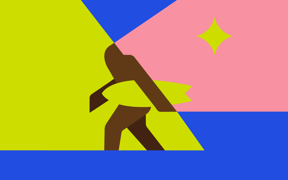
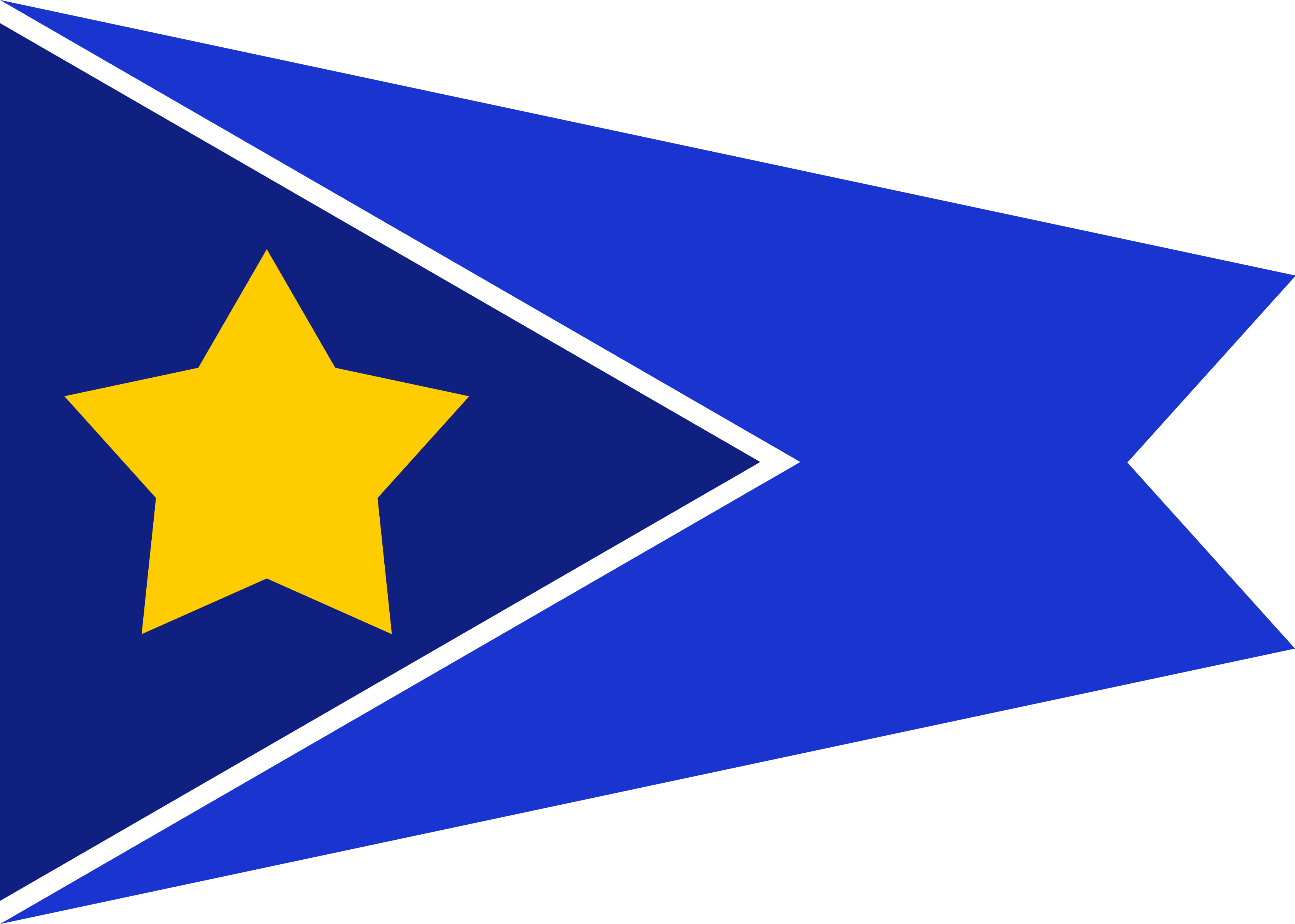
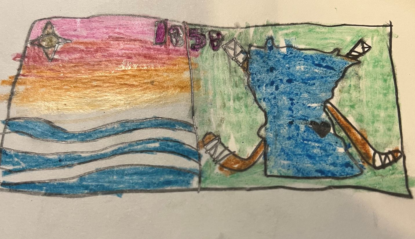
There are some fun and creative designs in there. Local news source Racket has compiled their picks for the goofiest flag submissions, although I can assure you that there are several more gems to be found.
Unfortunately, there isn't a convenient way to link to individual flags or seals. You can search by a flag or seal's submission number, or you can link directly to one of the image files.
Disclosure: I submitted one of these flag designs. I won't tell you which one.
This is the worst flag in the Union.
posted by kliuless at 12:26 AM on November 9, 2023 [4 favorites]
posted by kliuless at 12:26 AM on November 9, 2023 [4 favorites]
I admit it, I looked at them all.
Times like this I miss being a pot-head because there are some corkers here and I occasionally snorted tea out of my nose.
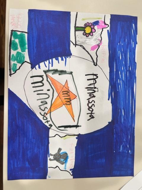
Clearly Minnesota schools assigned a flag design lesson for a sub teacher to deal with. She just counted off the attendance roll, gave the kids some paper, crayons or pencils, put on her headphones for an hour, collected up the bits of paper in an envelope, threw it in the mailbox and moved on with her life.
Eg #1105 and #1601 are ‘our teacher told us to do a Minnesota is…’ picture, so…
Lots of them just printed off instructions from the internet about flags and sent that in, or there are two of the same so I guess they just photocopied their friend’s.
Who cares? They were colouring! they were busy! and the hour passed without the teacher losing her shit. High fives.
To be fair, some of the kids’ entries really tried like, bless ‘em, #1634, #1684, #2122.
#1966 tried to do a Fort Snelling thing. I think #981 is cool.
But these had me absolutely cracking up:
#156 photo of a Golden Labrador hanging out in a grassy yard
#163 pencil-drawn, randomly placed spiderweb
#201 a hand-painted loon that looks like its about to be dissected in a lab
#223 California state flag
#253 a acid-tripping Alf [?] in a psychedelic wind tunnel
#419 a bunch of tiny pencil drawn loons flying over what looks likes a half eaten sandwich that’s probably a map of Minnesota, above a corn-adjacent representation of a yellow oblong object, with ‘Don’t Turd On Me’
#1018 a pencil drawn amoeba with a smiley face
#1503 a North Star above a hammer and sickle because everyone hates the Walz socialist school lunches #1645 just puts a giant hammer and sickle on bright green
#1545 Minnesota map as collage of toothy shark opening wide to eat a kid swimming towards the North Star in Lake Superior [that’s pretty cool actually]
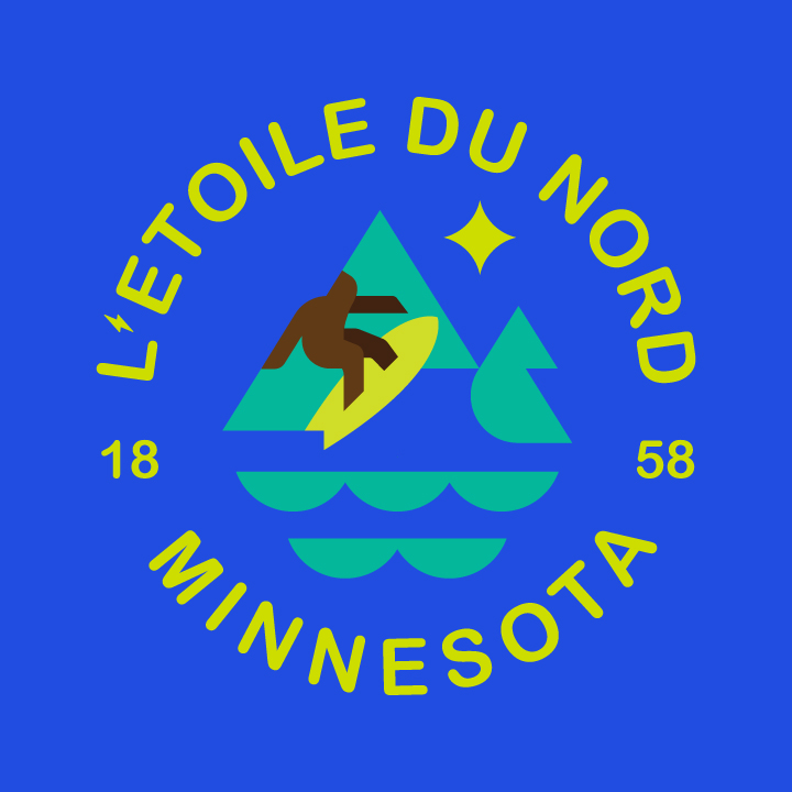
#1960 a stylised yeti stomping through the north shore with a surfboard [very cool]
My favourites that aren’t totally hilarious
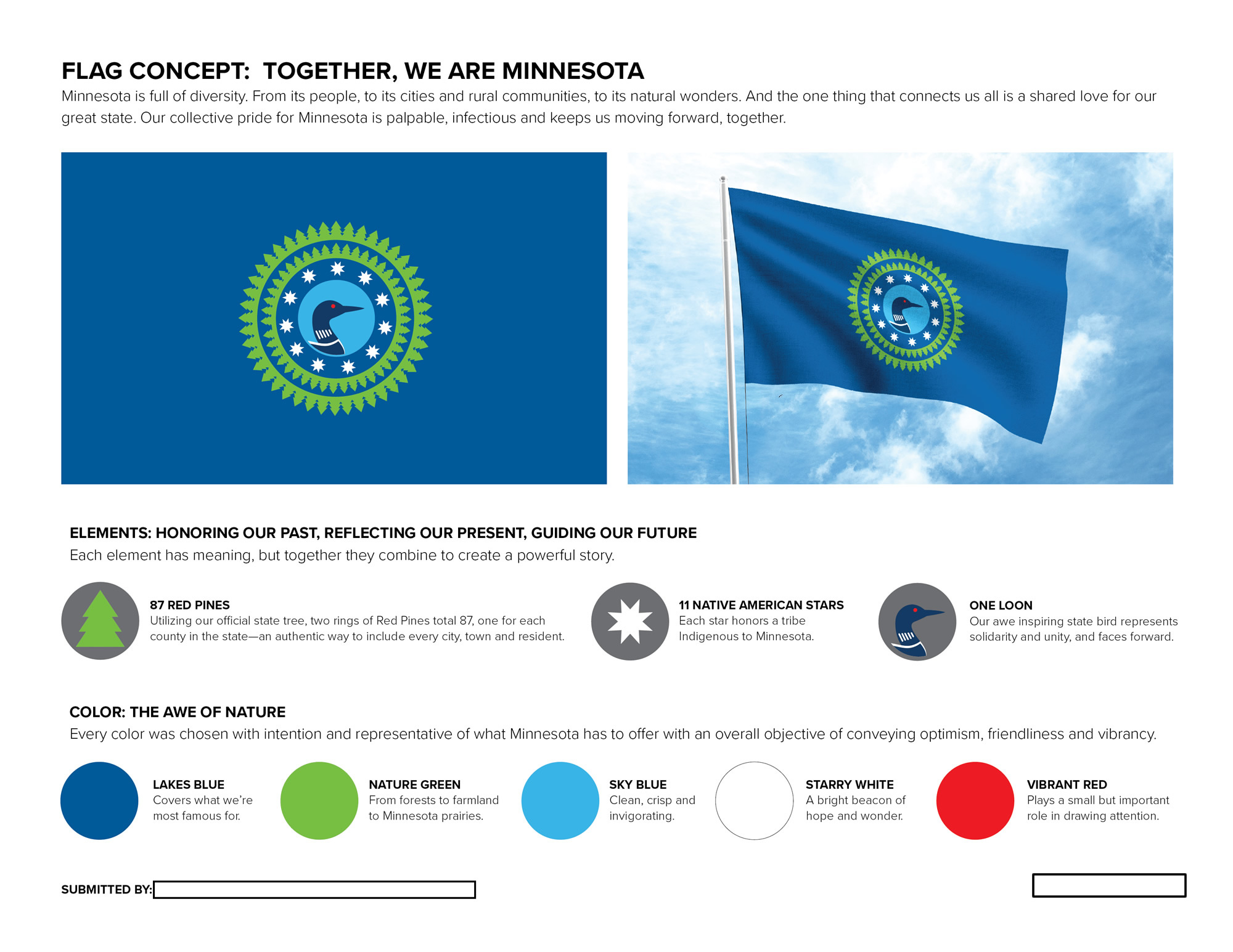
#351 because it has a stylised loon, a light blue lake and a star which makes it very recognisably Minnesotan
#710 even though I guess red and black checked flannel is worn for only 9 months of a Minnesota year
Since I have recently learned that Minnesota has the most wolves of any state, I am shocked to only count about five flags with representations of wolves on them.
I can’t believe I spent over an hour on this FPP, but it was worth it.
[GO THE GOLDEN LAB IN THE YARD!]
posted by honey-barbara at 2:10 AM on November 9, 2023 [19 favorites]
Times like this I miss being a pot-head because there are some corkers here and I occasionally snorted tea out of my nose.
Clearly Minnesota schools assigned a flag design lesson for a sub teacher to deal with. She just counted off the attendance roll, gave the kids some paper, crayons or pencils, put on her headphones for an hour, collected up the bits of paper in an envelope, threw it in the mailbox and moved on with her life.
Eg #1105 and #1601 are ‘our teacher told us to do a Minnesota is…’ picture, so…
Lots of them just printed off instructions from the internet about flags and sent that in, or there are two of the same so I guess they just photocopied their friend’s.
Who cares? They were colouring! they were busy! and the hour passed without the teacher losing her shit. High fives.
To be fair, some of the kids’ entries really tried like, bless ‘em, #1634, #1684, #2122.
#1966 tried to do a Fort Snelling thing. I think #981 is cool.
But these had me absolutely cracking up:
#156 photo of a Golden Labrador hanging out in a grassy yard
#163 pencil-drawn, randomly placed spiderweb
#201 a hand-painted loon that looks like its about to be dissected in a lab
#223 California state flag
#253 a acid-tripping Alf [?] in a psychedelic wind tunnel
#419 a bunch of tiny pencil drawn loons flying over what looks likes a half eaten sandwich that’s probably a map of Minnesota, above a corn-adjacent representation of a yellow oblong object, with ‘Don’t Turd On Me’
#1018 a pencil drawn amoeba with a smiley face
#1503 a North Star above a hammer and sickle because everyone hates the Walz socialist school lunches #1645 just puts a giant hammer and sickle on bright green
#1545 Minnesota map as collage of toothy shark opening wide to eat a kid swimming towards the North Star in Lake Superior [that’s pretty cool actually]
#1960 a stylised yeti stomping through the north shore with a surfboard [very cool]
My favourites that aren’t totally hilarious
#351 because it has a stylised loon, a light blue lake and a star which makes it very recognisably Minnesotan
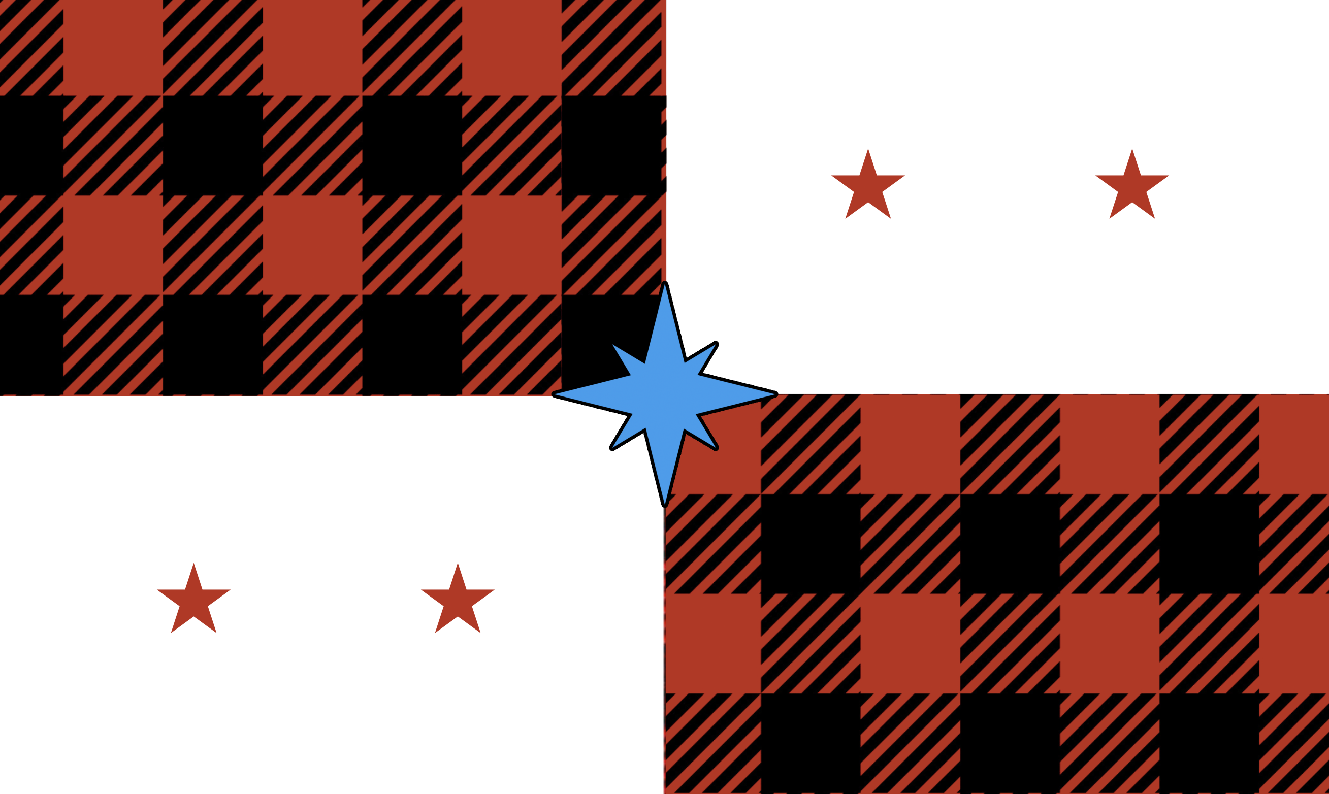
#710 even though I guess red and black checked flannel is worn for only 9 months of a Minnesota year
Since I have recently learned that Minnesota has the most wolves of any state, I am shocked to only count about five flags with representations of wolves on them.
I can’t believe I spent over an hour on this FPP, but it was worth it.
[GO THE GOLDEN LAB IN THE YARD!]
posted by honey-barbara at 2:10 AM on November 9, 2023 [19 favorites]
Oh well that serves me right - I didn’t open the ‘goofiest’ link.
Some gems. Minnesotans are obviously funnier than I had hitherto believed.
posted by honey-barbara at 2:15 AM on November 9, 2023 [3 favorites]
Some gems. Minnesotans are obviously funnier than I had hitherto believed.
posted by honey-barbara at 2:15 AM on November 9, 2023 [3 favorites]
I expected more of the designs to depict hot dish.
posted by Nerd of the North at 2:52 AM on November 9, 2023 [4 favorites]
posted by Nerd of the North at 2:52 AM on November 9, 2023 [4 favorites]
Since I have recently learned that Minnesota has the most wolves of any state..Minnesota DNR estimate: 2,691 wolves
Alaska Dept. of Fish & Game estimate: 7,000 to 11,000 wolves
posted by Nerd of the North at 2:56 AM on November 9, 2023 [2 favorites]
I'm a lifelong Minnesotan. I looked at them all and they're all terrible (but some are funny). I hope they pick something bland enough that I can go back to never thinking about my state flag.
posted by paper chromatographologist at 3:06 AM on November 9, 2023
posted by paper chromatographologist at 3:06 AM on November 9, 2023
The problem with most of these is that a flag needs to navigate between being too busy and looking like a logo (which will immediately look antiquated) while still having enough uniqueness to be identifiable when not completely spread out.
The seals, which are supposed to be sort-of logos and can reasonably contain letters and dates and so on have some much better options.
posted by GenjiandProust at 3:54 AM on November 9, 2023
The seals, which are supposed to be sort-of logos and can reasonably contain letters and dates and so on have some much better options.
posted by GenjiandProust at 3:54 AM on November 9, 2023
Minnesota DNR estimate: 2,691 wolves
Alaska Dept. of Fish & Game estimate: 7,000 to 11,000 wolves
I mean, you're not wrong, but by area:
Minnesota: 1 wolf/32 square miles (2691 wolves/87000 sq mi)
Alaska: 1 wolf/61 square miles (11000 wolves/665000 sq mi)
So MN has about twice as many wolves per square mile. That's worth at least 2 wolf flag submissions per 100 laser-shooting loon flag submissions.
posted by mcstayinskool at 4:01 AM on November 9, 2023 [10 favorites]
Oh yeah, did I not remember the qualifying with *contiguous* states for wolfiness.
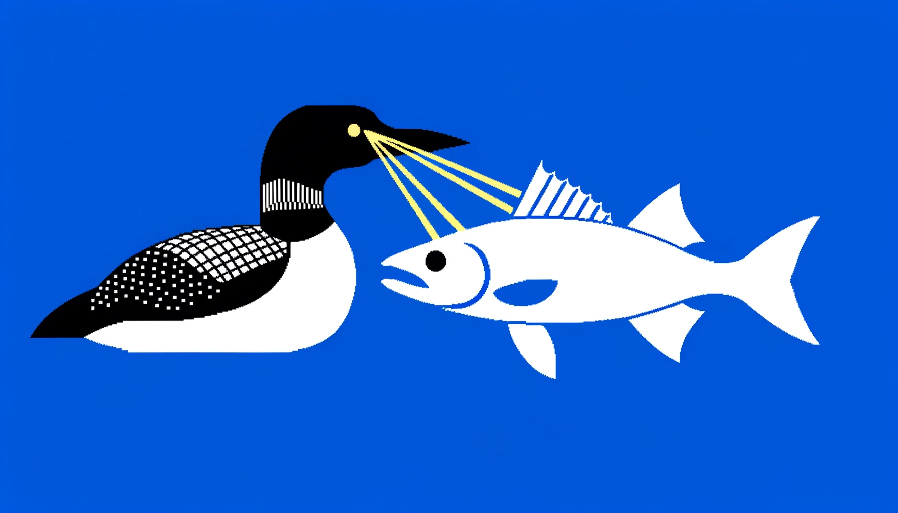
‘Laser-shooting Loons’ is going to be my new band name.
posted by honey-barbara at 4:08 AM on November 9, 2023
‘Laser-shooting Loons’ is going to be my new band name.
posted by honey-barbara at 4:08 AM on November 9, 2023
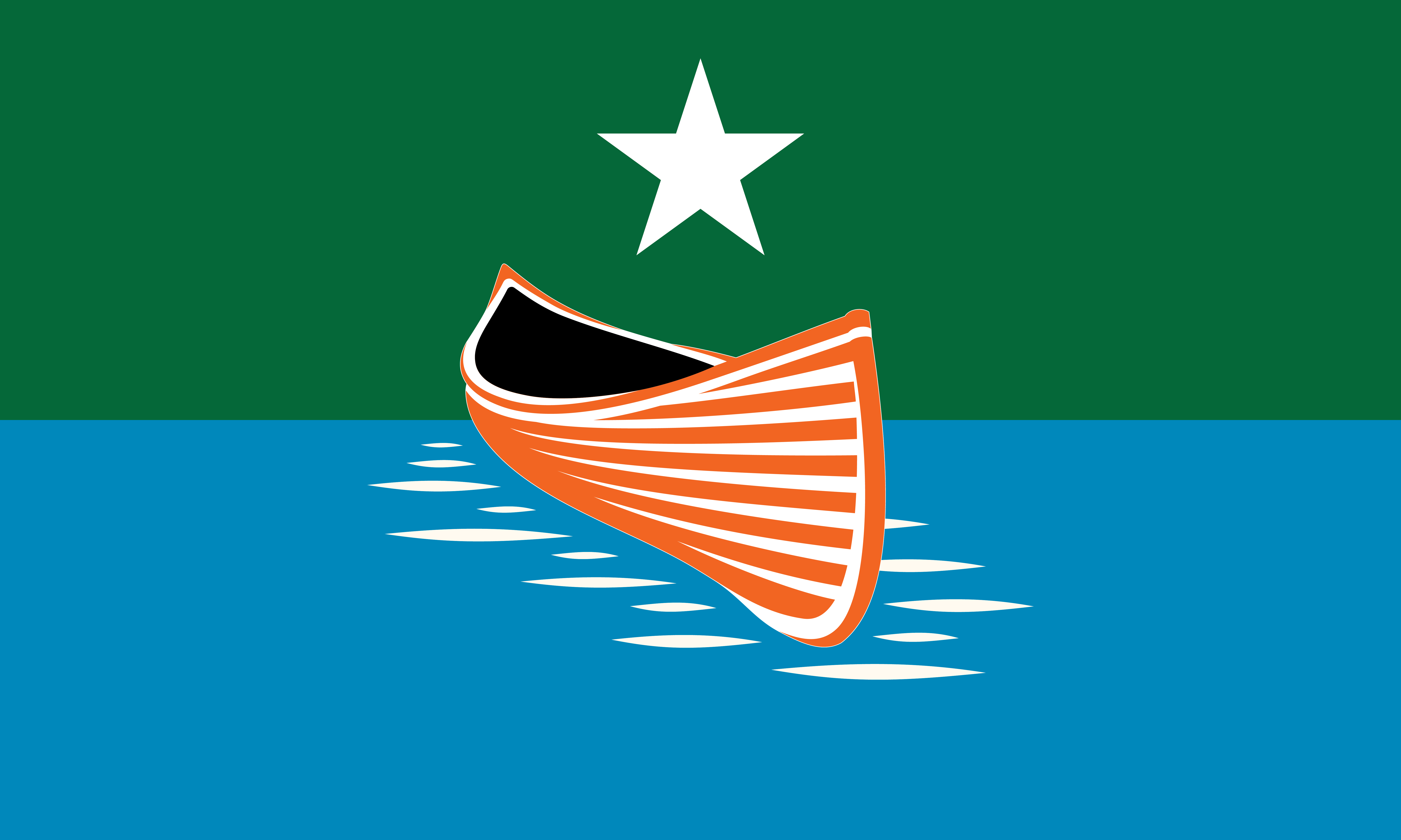
I appreciate the lack of curation in the presentation of the flag options, so we can view several designs that were submitted twice and some submissions that aren't designs at all, but rather general suggestions like "there should be a canoe in there somewhere."
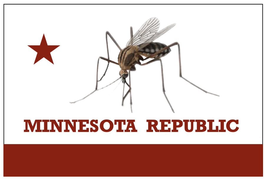
I do not have the fortitude to scroll through 2,000+ flag designs at this time (hat tip to honey-barbara) but there are some funny ones that did not make the "goofiest flag submissions" roundup, so it's worth your time to dip in and out a bit to sample the offerings. Although that link did highlight some gems (the Confederate flag one isn't going to fly, of course, but mocking Virginia over that battle flag is always fun), I feel like they should have spent less time making fun of children's drawings and used that space to include some of the other presumably adult weirdness. They totally skipped the mosquito flag, for instance, which is certainly a choice.
Good luck Minnesota, and congrats on trying to ditch your current seal on a bedsheet design.
posted by the primroses were over at 4:53 AM on November 9, 2023 [2 favorites]
From Racket's picks: what is the art style of the flag they said "smacks of The Worker & The Parasite Show"? I had an unexpected "it's beautiful, I've looked at this for five hours now" reaction to that one
posted by Baethan at 5:24 AM on November 9, 2023
posted by Baethan at 5:24 AM on November 9, 2023
As a Minnesotan (transplanted from Michigan, which has an equally boring state-seal-on-blue-field flag) I am looking forward to seeing the short list, where 99% of the utterly nuts flags have been removed. My hope? No words, no more than 3 colors, simple enough that a grade school kid could draw a recognizable copy. And a North Star somewhere, because seriously.
posted by caution live frogs at 5:43 AM on November 9, 2023 [2 favorites]
posted by caution live frogs at 5:43 AM on November 9, 2023 [2 favorites]
Minnesota DNR estimate: 2,691 wolves
Alaska Dept. of Fish & Game estimate: 7,000 to 11,000 wolves
Yes, but Minnesota has a larger population of werewolves. You don't really notice them because they're midwestern werewolves.
posted by RonButNotStupid at 5:48 AM on November 9, 2023 [7 favorites]
Alaska Dept. of Fish & Game estimate: 7,000 to 11,000 wolves
Yes, but Minnesota has a larger population of werewolves. You don't really notice them because they're midwestern werewolves.
posted by RonButNotStupid at 5:48 AM on November 9, 2023 [7 favorites]
What, no "Flaggy McFlagFace" ?
Am dissapoint. Much sorrow.
Agree with honey-barbara that teachers must have been using this as an activity excersise.
posted by rozcakj at 6:09 AM on November 9, 2023 [1 favorite]
Am dissapoint. Much sorrow.
Agree with honey-barbara that teachers must have been using this as an activity excersise.
posted by rozcakj at 6:09 AM on November 9, 2023 [1 favorite]
Some of my "designer" friends in MN are kinda stoaked about making submissions for this... I'm currently scanning for any vaguely familiar submissions.
Top dog currently
Nod to the simplicity of the Lebanese flag
Personal favorite
My guess that locals would like 1
My guess that locals would like 2
Great but too clever for most
Boaty-Mc-Moat-Face-Esque Submission
posted by djseafood at 6:43 AM on November 9, 2023 [1 favorite]
Top dog currently
Nod to the simplicity of the Lebanese flag
Personal favorite
My guess that locals would like 1
My guess that locals would like 2
Great but too clever for most
Boaty-Mc-Moat-Face-Esque Submission
posted by djseafood at 6:43 AM on November 9, 2023 [1 favorite]
I'm sure teachers do use this as an exercise, because long ago, when I student-taught, we did - and the state wasn't even changing its flag. I'm surprised, if anything, that there aren't more student submissions.
F605 and F5091 are my favorites, although we'll probably get something bland and simple. I mean, come on, we are not rallying on the battle field, we can have something with a little complexity. If there is anything at all likeable about Racist Flag, it is that there's some complexity to it, not just, like, a band of blue and a band of green.
Sadly, I think the fairisle/nordic star ones won't do - they will have to be for some kind of Minnesota Norwegian Association type thing. I think they're pretty but they do suggest an outsized place for Scandinavianness here, and that's all fun as a joke but not so fun when people don't want to recognize our colonizer history or our present diversity. Everyone should definitely have access to the upsides to Minnesota-Scandinavianness, like buttered lefse and fairisle sweaters and little straw horse decorations and the Swedish Museum and Æbleskiver and so on - I bet we could have our state food be Æbleskiver without complaints once everyone had tried them - and I do think that those are all things that are part of our state identity, but I think the flag has to be more universal.
posted by Frowner at 6:48 AM on November 9, 2023 [3 favorites]
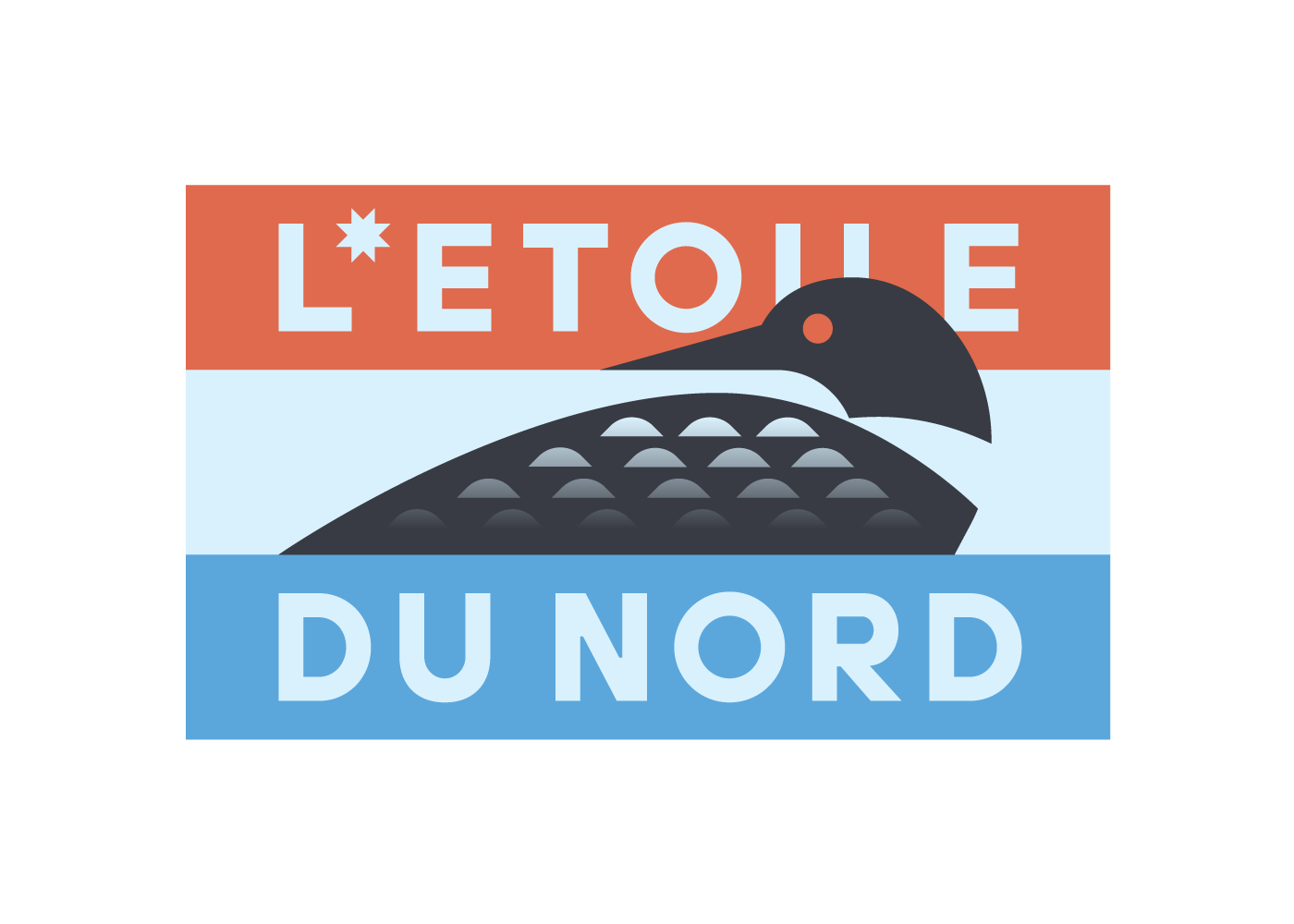
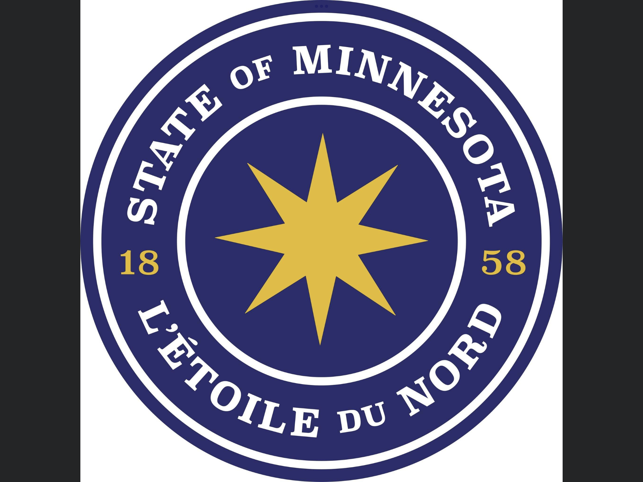
I love the one that looks like it says "Etoile du Nerd"; star of the nerds is a slogan I can rally behind
posted by I_Love_Bananas at 6:52 AM on November 9, 2023 [5 favorites]
posted by I_Love_Bananas at 6:52 AM on November 9, 2023 [5 favorites]
“BAYG”
posted by Windopaene at 7:09 AM on November 9, 2023 [4 favorites]
posted by Windopaene at 7:09 AM on November 9, 2023 [4 favorites]
I like this one; why should Ohio be the only state to have a non-rectangular flag?
And I agree with the primroses were over that the capture the flag submission is hilarious, but would be misconstrued.
posted by TedW at 7:23 AM on November 9, 2023
And I agree with the primroses were over that the capture the flag submission is hilarious, but would be misconstrued.
posted by TedW at 7:23 AM on November 9, 2023
This is also another opportunity for me to point out that South Carolina (aka the home office of American sedition) still doesn’t have a standardized version of its flag.
posted by TedW at 7:29 AM on November 9, 2023
posted by TedW at 7:29 AM on November 9, 2023
Here is your reminder that the City of Minneapolis flag would also work well as a Devo album cover.
posted by gimonca at 7:39 AM on November 9, 2023
posted by gimonca at 7:39 AM on November 9, 2023
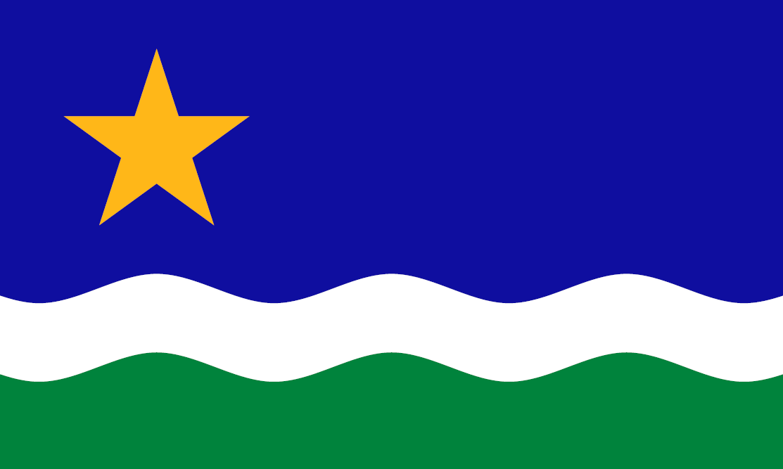
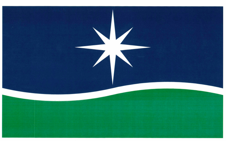
A bunch of these submissions are duplications or slight variations on the North Star Flag.
From that link:
posted by OnceUponATime at 8:54 AM on November 9, 2023 [3 favorites]
From that link:
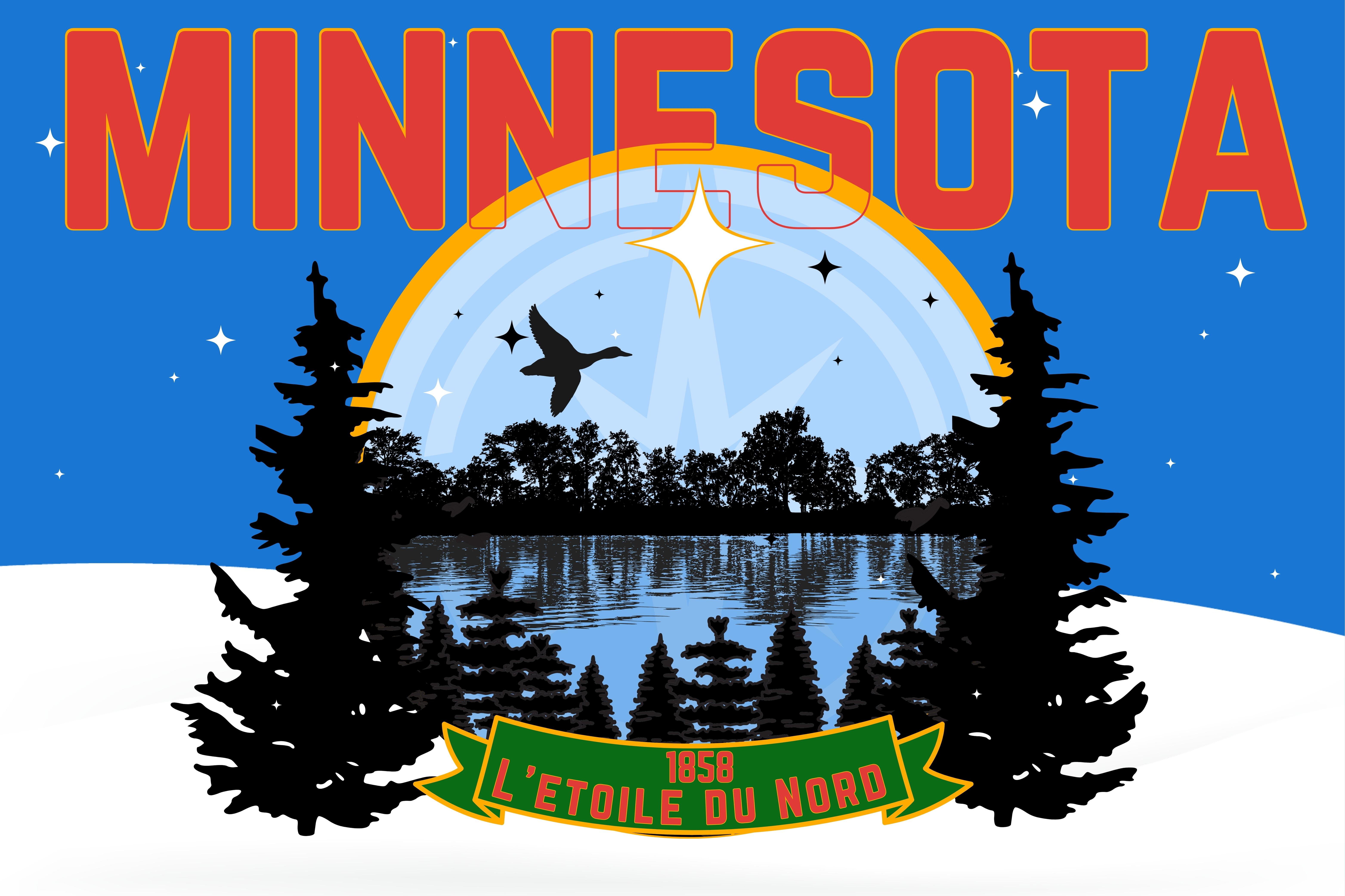
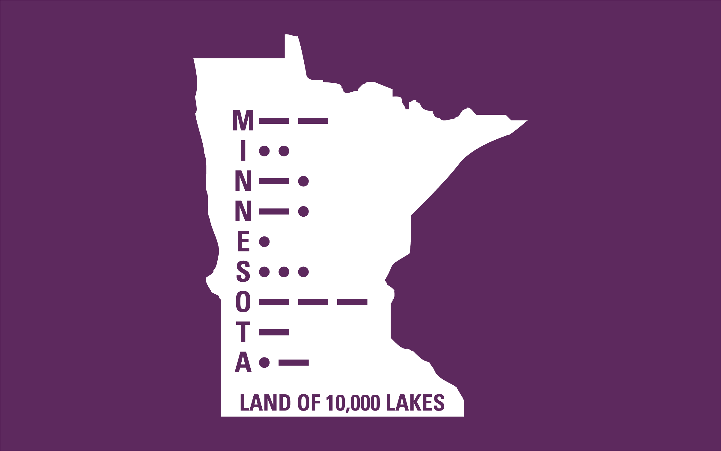
The North Star Flag was proposed in 1989 by two flag specialists, due to longstanding problems with the legal state flag and seal. It has received various endorsements and tributes, and won an unofficial contest sponsored by the Saint Paul Pioneer Press in 2001. It has since become an alternate state flag for many Minnesotans, and remains a rallying symbol for change. Its design is dedicated to the Public Domain [...]Anyway, that'd be my pick.
Like other effective state flags, the Minnesota North Star Flag is...
-highly visible when flying at a distance
-simple to remember, sketch, or apply to common items
-clean of clutter from words, complex seals, etc.
-an iconic design with instinctive symbolism & parallels
-highly distinctive among state & national flags; a recognizable "brand"
-respectful of both Indian & pioneer legacies, without privileging any ethnicity
-praised by state newspapers & experts who have designed national flags
-timeless: rooted in our heritage but open to our future
-symbolic: uses time-honored principles of heraldry & flag graphics
-proven: the only alternative Minnesota flag with actual traction
Heritage & Heraldry
The North Star Flag symbolically illustrates the state name ("mnisota," or "sky-tinted water") and motto ("The North Star") – a technique called "canting heraldry." Since the name comes from the Indian natives, and the motto from the pioneer settlers, both founding legacies are duly honored – but with symbolism open to all people and generations. The flag's evocative northern colors appear statewide in various flags and emblems. The flag also avoids the problems associated with the current state flag and seal.
posted by OnceUponATime at 8:54 AM on November 9, 2023 [3 favorites]
Looking at these, I find myself singing “laser loons, laser loons,” like the Spider-Man theme.
djseafood, “Great but too clever for most” is too clever for me. Could you explain?
posted by Comet Bug at 9:30 AM on November 9, 2023 [1 favorite]
djseafood, “Great but too clever for most” is too clever for me. Could you explain?
posted by Comet Bug at 9:30 AM on November 9, 2023 [1 favorite]
The top goofiest flag submission contains the text "獨立建国 平安喜楽" which appears to be a slogan of Taiwanese independence, making this an epic piece of anti-CCP trolling.
posted by The genius who rejected Anno's budget proposal. at 10:04 AM on November 9, 2023 [1 favorite]
posted by The genius who rejected Anno's budget proposal. at 10:04 AM on November 9, 2023 [1 favorite]
There's one that says "STAR OF THE NORTH" which to me feels like "screw you, Francophiles"
Also, the one with a two-headed loon? I mean, it isn't terrible, but it does lead one to wonder about the safety of drinking the water here (for the record MN has stricter laws on water quality than the rest of the US)
posted by caution live frogs at 10:30 AM on November 9, 2023
Also, the one with a two-headed loon? I mean, it isn't terrible, but it does lead one to wonder about the safety of drinking the water here (for the record MN has stricter laws on water quality than the rest of the US)
posted by caution live frogs at 10:30 AM on November 9, 2023
Like other effective state flags, the Minnesota North Star Flag is...
Laser Loons also ticks most of these boxes ¯\_(ツ)_/¯
posted by nathan_teske at 11:26 AM on November 9, 2023
Laser Loons also ticks most of these boxes ¯\_(ツ)_/¯
posted by nathan_teske at 11:26 AM on November 9, 2023
I really like the ones that use colors that are less common to flags -- like F78, F79 and F80 that use pink. I understand that Minnesota is green, but the green/blue/gold colors feel so 19th century. Yes 19th.
posted by OrangeDisk at 11:49 AM on November 9, 2023
posted by OrangeDisk at 11:49 AM on November 9, 2023
I feel especially unimpressed by flags celebrating the fact that Minnesota has vegetation and water. Also, snow.
posted by paper chromatographologist at 12:14 PM on November 9, 2023
posted by paper chromatographologist at 12:14 PM on November 9, 2023
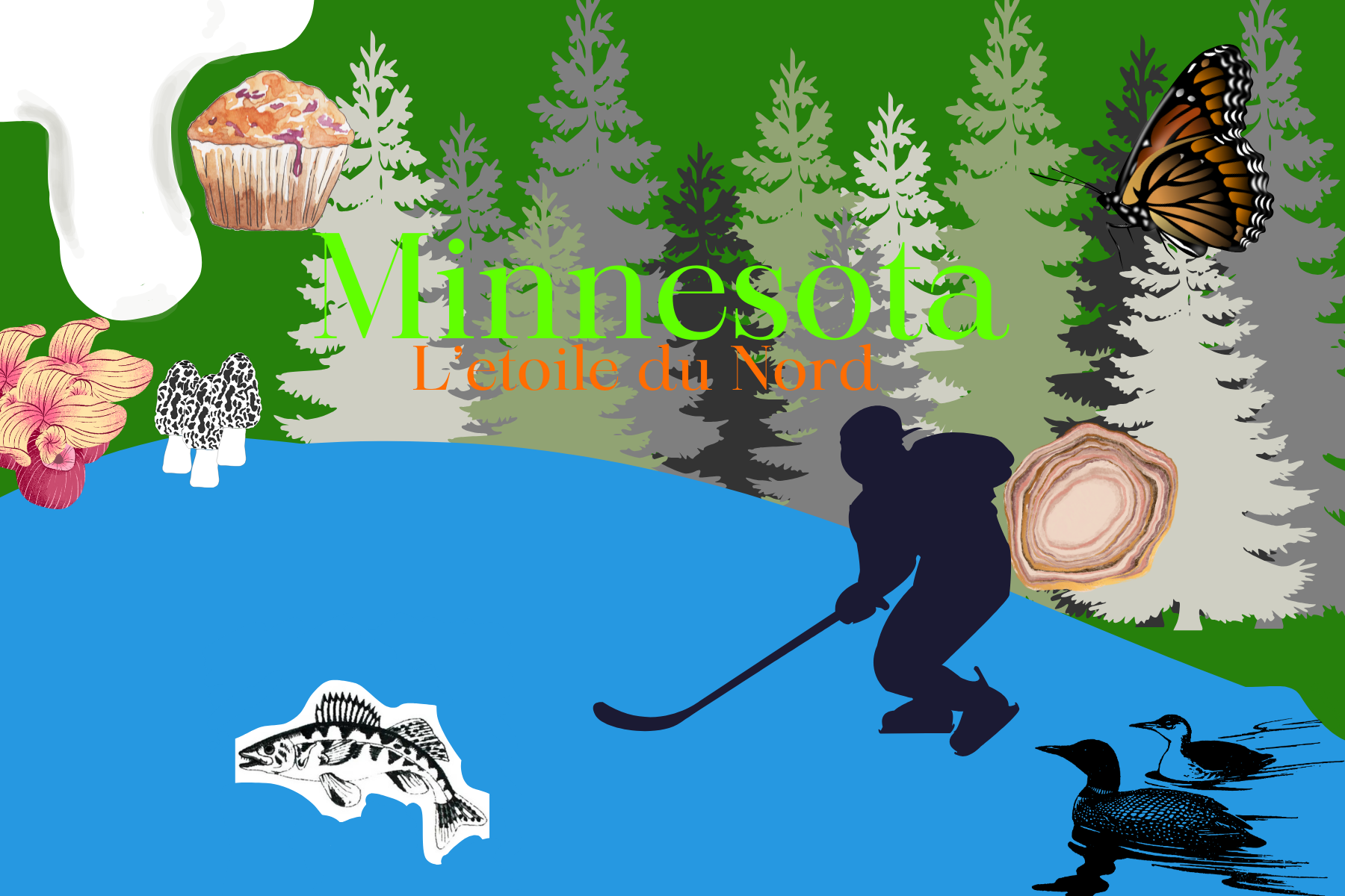
I laughed out loud when I came to the California state flag, complete with "california republic" still on it. A lot of these have a feel of "they're gonna give out a million bux for the winner, we gotta gets one in there" (despite that not being true, I hope), while others are definitely "I've always been artistic, everyone says so, here's my collage of clip art" and others are bored kids. The earnest kids are cool, the very first submission is graphically strong, and bigfoot with a surfboard is quite excellent, honestly.
Please: No words, no complex seals.
posted by maxwelton at 1:03 PM on November 9, 2023 [2 favorites]
Please: No words, no complex seals.
posted by maxwelton at 1:03 PM on November 9, 2023 [2 favorites]
ok I'm only from Wisconsin but I got Opinions let's goooooo
F16 is clearly already the best, no notes other than I am impressed by the ability of Minnesota schoolkids to draw the state of Minnesota
F118 would look amazing on a casserole dish, I'm sorry, a hot dish dish?
F138 - sure it's chaotic and there's an inexplicable floating muffin but take just the font choices and tree background and you've got a delightfully retro hipster greeting card
F159 - nice Duck Duck Grey Duck reference
F233 - this one slaps
F276 - "I don't have a flag design per se but I feel strongly that the winning one should incorporate a canoe, so God help me; here are some facts about canoes"
F277 - I am not sure this is how loons hunt fish
F313 - "the state flag should be the state license plate, sideways"
F328 - I would eat at the diner this mural was painted on the side of
F445 & F468 - under no circumstances is the Minnesota Morse Code submitter having their design rejected because the voters would have preferred a purple on white as opposed to a white on purple, that's really the only possible obstacle to this one going all the way to the top
F508 - kinda trippy but I dig it, big "manufacturing logo from the 1950s Rust Belt" vibes
F509 - this submitter is willing to get really excited about Minnesota and I respect that (please clap)
F516 - okay nobody else is going to care about this but in one of our D&D campaigns there's this demon artifact that creepily duplicates things in its vicinity & in addition to having given all of one NPC's pet birds an extra head, it gave the bird pattern on her wallpaper two heads, and that's all this flag design makes me think about, how did the artifact get to Minnesota and how do we get it back
F525 - this would be really nice on a state quarter or postage stamp or coffee mug or something, the composition and color is real pleasant
F575 - this one's a real contender IMO, hits that sweet spot of being simple but visually distinct, like, if nothing else, this submitter knows how to Flag -- also the blue & turquoise combo is just gonna beat blue & green for me every time
F587 - I didn't initially see the walleye and now I am FREAKING OUT
F672 - lose the exact symmetry with the star in the water and I think this one's got legs, I say as though the submitter is receiving my feedback and will clearly want to act on it
F679 - another one that would make a good small town hipster diner mural or commemorative plate; it's cool that in Minnesota you can back your tractor right up to the lake and go canoeing
F713 - it's cribbing a little bit font and color-wise from Obama's Hope posters but it'd be absolutely bangin' as a "donate to this Minnesota nonprofit" postcard
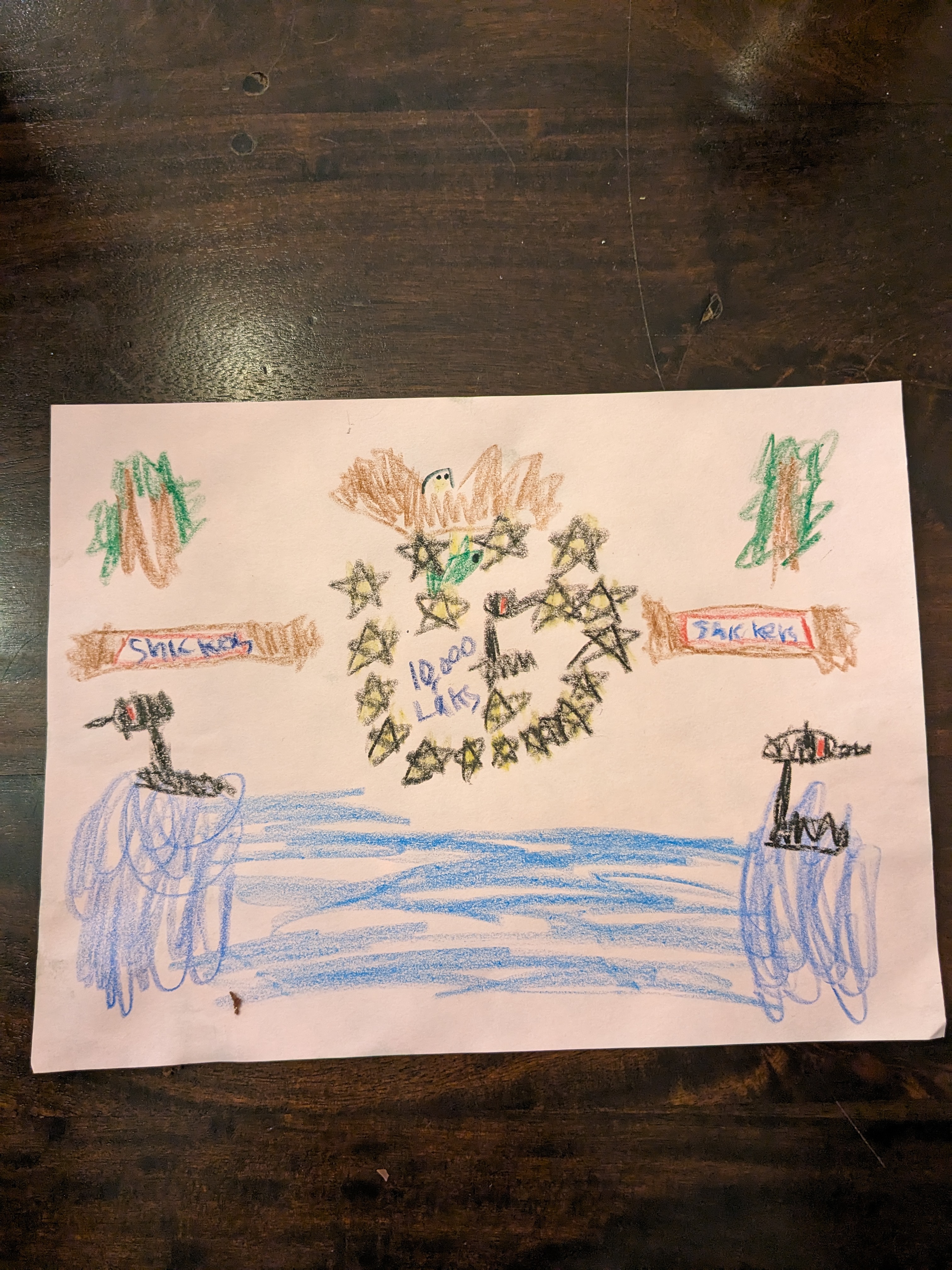
F726 - I may have just missed this on the "goofiest" link... Snickers bar?? are Snickers made in... no, New Jersey? clearly the child submitter was feelin' hungy
F736 - THIS BIRD SCARES ME
F789 - I used to work at an organic grocery store and this is definitely the label for some kind of vegan fruit snack, the composition only looks bottom-heavy because it's waiting for "FROOT LOONS" or whatever the brand name is to be printed up top -- this sounds like shade but nah I dig it
F876 - c'mon Minnesota y'all could do a lot worse for a flag concept than "small child adorably misspells Minnesota and also there is, I think, a turkey"
F950 - I main a warlock and this is clearly someone summoning a giant tentacle from inside a forest
F996 - this is nice, it maybe gives me "upscale arts program logo" vibes more than state flag vibes? but it's attractive & mostly within the simple/distinct sweet spot
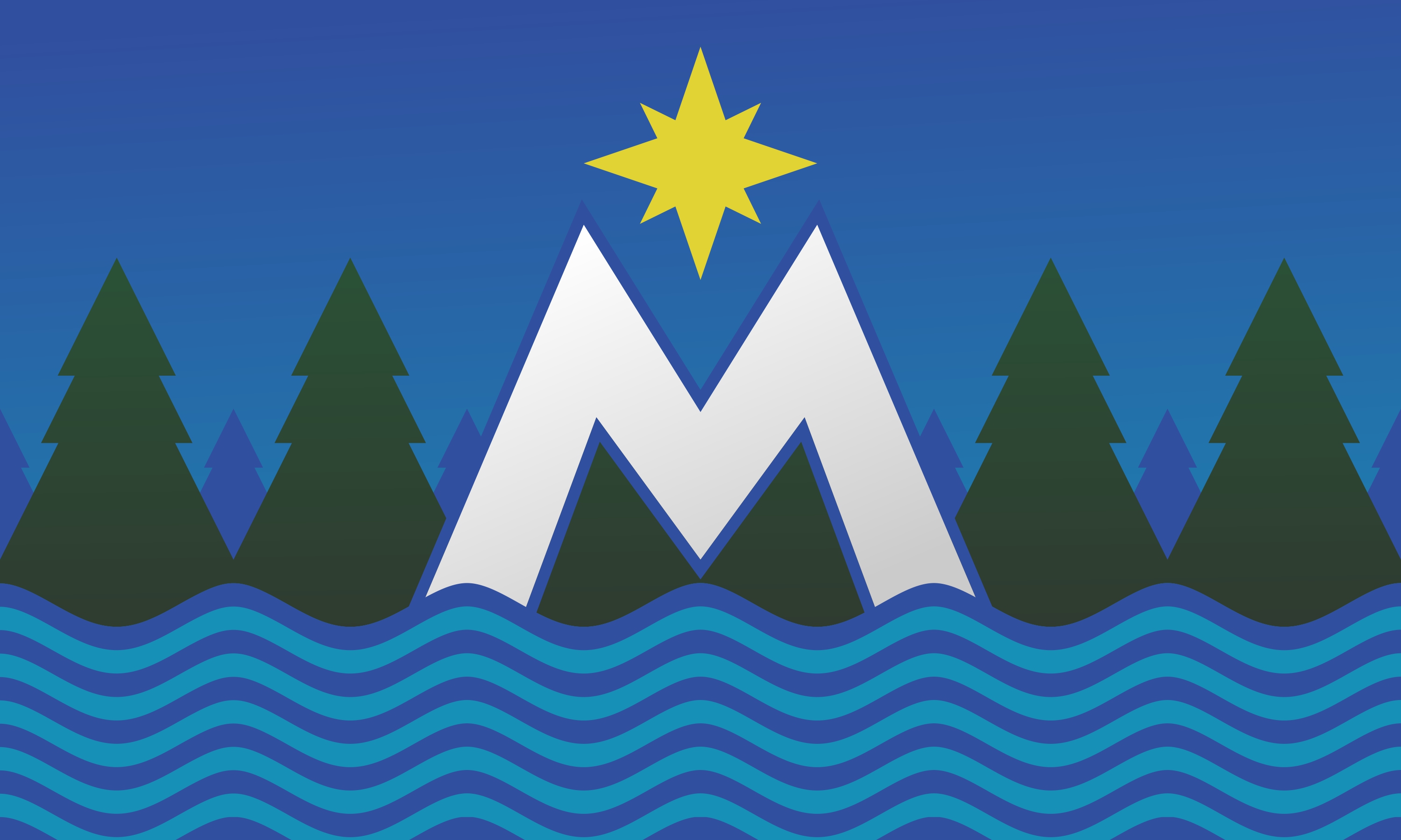
F1021 - I'd tweak some things on this one probably but by God it's got a power to it, that big M is giving me chills, I'm not even kidding
F1051 - kinda like this one, somehow it viscerally conveys how friggin' cold the state is
F1105 - friends win! this one is the new state flag in my heart
F1174 - this would look so good on like a beer bottle
F1196 - the image that finally makes me realize that Minnesota is iconographically basically just the Star major arcana card from the tarot except with slightly more waterfowl... I may have been looking at these for too long now
F1304 - hard to hate an Uff da! in Wide Latin
F1352 - see this is exactly the kind of thing F276 was hoping would happen
F1411 - idk who let this loon sign up for Starfleet but I dig it
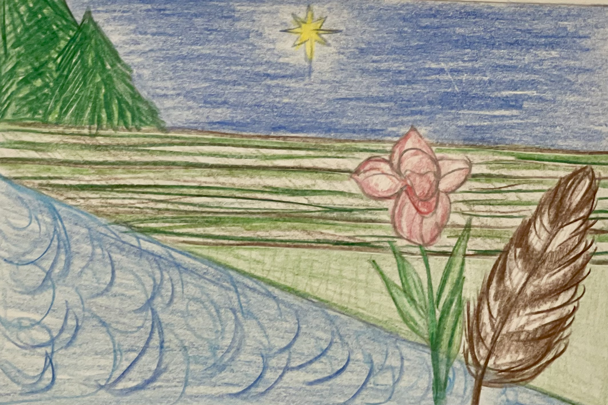
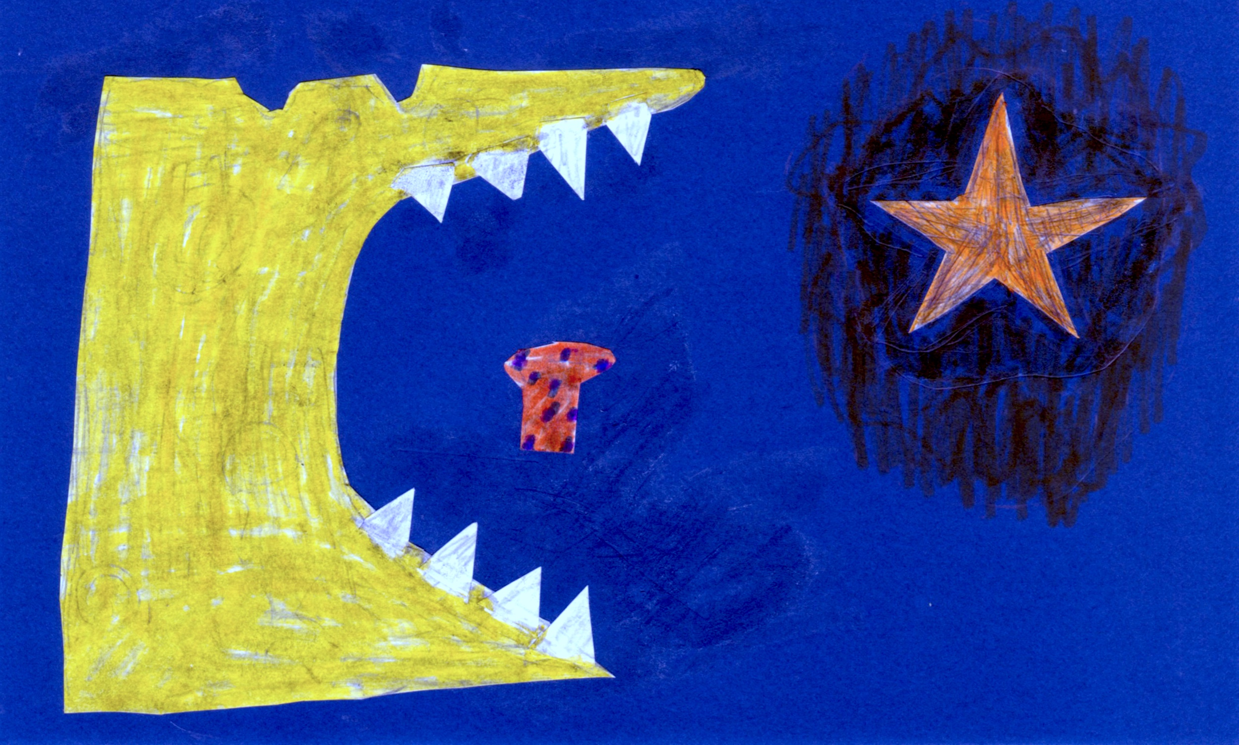
F1545 - why does Minnesota, the toothiest state, not simply eat the... whatever that is?
F1561 - not sure if this is lumberjack flannel pride or if someone is really excited about the 3M corporation tbh
F1603 - another submitter who knows how to Flag, I feel like the loon should be a little bigger tho? I am straining to look at this loon without my contacts in, and that is not a position in which I have found myself while looking at the past 1602 flags, the loons have been real in your face
F1632 - not the flashiest but kinda nice, enjoy a non-rectangle
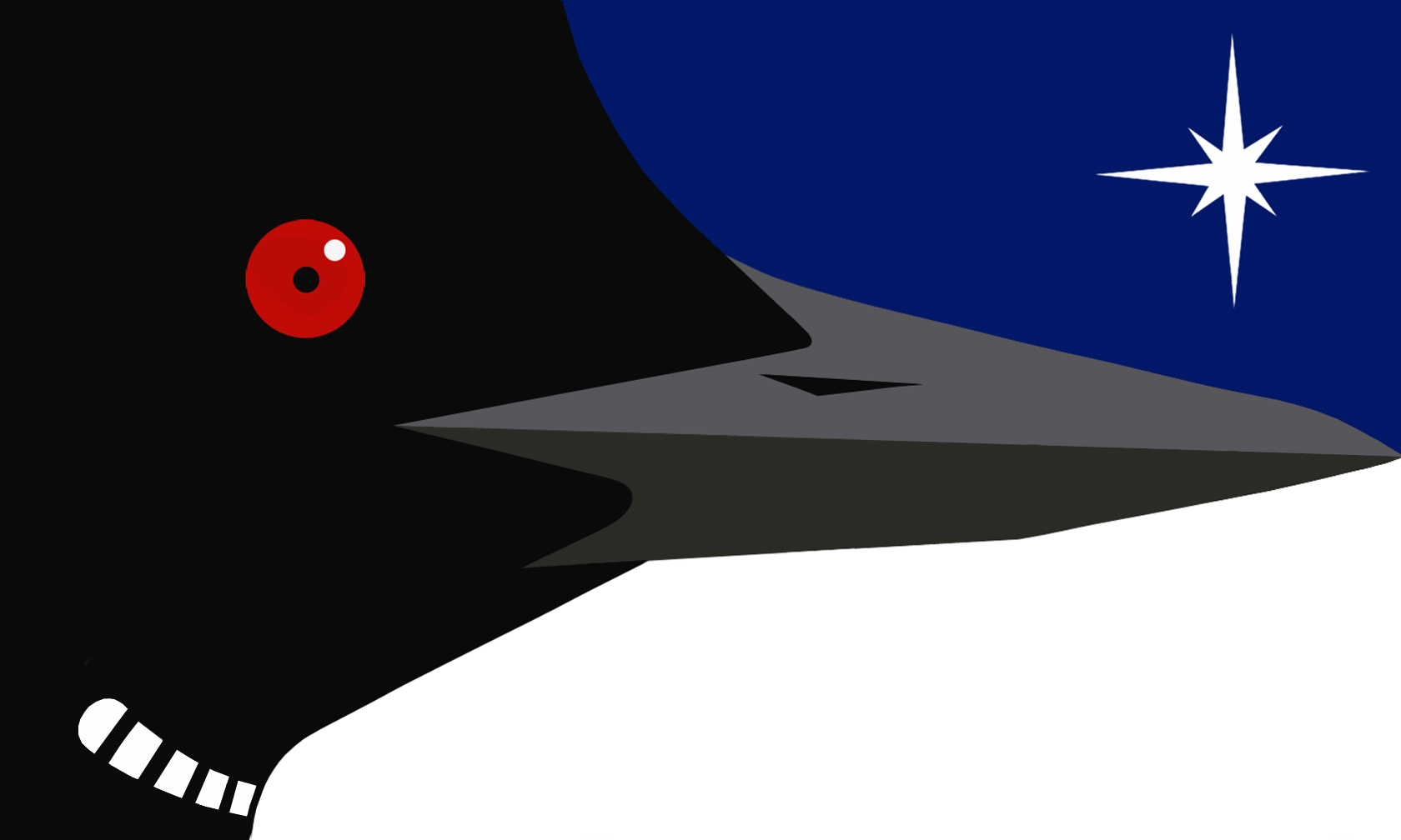
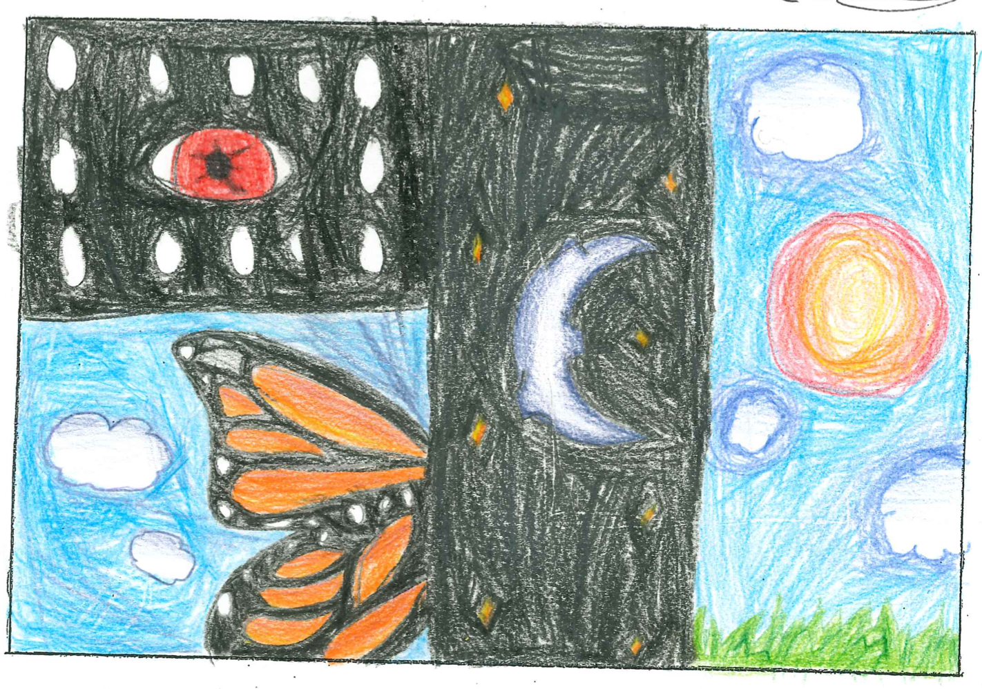
F1654 - nice to see someone leaning in to the core imagery of the loon as a red-eyed nightmare being by really focusing in on the eye part to the exclusion of the rest of the bird; I feel like this is the one Minnesotan who's going to be straight with me about the Horrors
F1802 - CORN STAR! I love it
ok sorry to the rest of the Minnesota state flag submissions but my doctor says I'm not allowed to look at any more loons today
posted by taquito sunrise at 1:44 PM on November 9, 2023 [25 favorites]
F16 is clearly already the best, no notes other than I am impressed by the ability of Minnesota schoolkids to draw the state of Minnesota
F118 would look amazing on a casserole dish, I'm sorry, a hot dish dish?
F138 - sure it's chaotic and there's an inexplicable floating muffin but take just the font choices and tree background and you've got a delightfully retro hipster greeting card
F159 - nice Duck Duck Grey Duck reference
F233 - this one slaps
F276 - "I don't have a flag design per se but I feel strongly that the winning one should incorporate a canoe, so God help me; here are some facts about canoes"
F277 - I am not sure this is how loons hunt fish
F313 - "the state flag should be the state license plate, sideways"
F328 - I would eat at the diner this mural was painted on the side of
F445 & F468 - under no circumstances is the Minnesota Morse Code submitter having their design rejected because the voters would have preferred a purple on white as opposed to a white on purple, that's really the only possible obstacle to this one going all the way to the top
F508 - kinda trippy but I dig it, big "manufacturing logo from the 1950s Rust Belt" vibes
F509 - this submitter is willing to get really excited about Minnesota and I respect that (please clap)
F516 - okay nobody else is going to care about this but in one of our D&D campaigns there's this demon artifact that creepily duplicates things in its vicinity & in addition to having given all of one NPC's pet birds an extra head, it gave the bird pattern on her wallpaper two heads, and that's all this flag design makes me think about, how did the artifact get to Minnesota and how do we get it back
F525 - this would be really nice on a state quarter or postage stamp or coffee mug or something, the composition and color is real pleasant
F575 - this one's a real contender IMO, hits that sweet spot of being simple but visually distinct, like, if nothing else, this submitter knows how to Flag -- also the blue & turquoise combo is just gonna beat blue & green for me every time
F587 - I didn't initially see the walleye and now I am FREAKING OUT
F672 - lose the exact symmetry with the star in the water and I think this one's got legs, I say as though the submitter is receiving my feedback and will clearly want to act on it
F679 - another one that would make a good small town hipster diner mural or commemorative plate; it's cool that in Minnesota you can back your tractor right up to the lake and go canoeing
F713 - it's cribbing a little bit font and color-wise from Obama's Hope posters but it'd be absolutely bangin' as a "donate to this Minnesota nonprofit" postcard
F726 - I may have just missed this on the "goofiest" link... Snickers bar?? are Snickers made in... no, New Jersey? clearly the child submitter was feelin' hungy
F736 - THIS BIRD SCARES ME
F789 - I used to work at an organic grocery store and this is definitely the label for some kind of vegan fruit snack, the composition only looks bottom-heavy because it's waiting for "FROOT LOONS" or whatever the brand name is to be printed up top -- this sounds like shade but nah I dig it
F876 - c'mon Minnesota y'all could do a lot worse for a flag concept than "small child adorably misspells Minnesota and also there is, I think, a turkey"
F950 - I main a warlock and this is clearly someone summoning a giant tentacle from inside a forest
F996 - this is nice, it maybe gives me "upscale arts program logo" vibes more than state flag vibes? but it's attractive & mostly within the simple/distinct sweet spot
F1021 - I'd tweak some things on this one probably but by God it's got a power to it, that big M is giving me chills, I'm not even kidding
F1051 - kinda like this one, somehow it viscerally conveys how friggin' cold the state is
F1105 - friends win! this one is the new state flag in my heart
F1174 - this would look so good on like a beer bottle
F1196 - the image that finally makes me realize that Minnesota is iconographically basically just the Star major arcana card from the tarot except with slightly more waterfowl... I may have been looking at these for too long now
F1304 - hard to hate an Uff da! in Wide Latin
F1352 - see this is exactly the kind of thing F276 was hoping would happen
F1411 - idk who let this loon sign up for Starfleet but I dig it
F1545 - why does Minnesota, the toothiest state, not simply eat the... whatever that is?
F1561 - not sure if this is lumberjack flannel pride or if someone is really excited about the 3M corporation tbh
F1603 - another submitter who knows how to Flag, I feel like the loon should be a little bigger tho? I am straining to look at this loon without my contacts in, and that is not a position in which I have found myself while looking at the past 1602 flags, the loons have been real in your face
F1632 - not the flashiest but kinda nice, enjoy a non-rectangle
F1654 - nice to see someone leaning in to the core imagery of the loon as a red-eyed nightmare being by really focusing in on the eye part to the exclusion of the rest of the bird; I feel like this is the one Minnesotan who's going to be straight with me about the Horrors
F1802 - CORN STAR! I love it
ok sorry to the rest of the Minnesota state flag submissions but my doctor says I'm not allowed to look at any more loons today
posted by taquito sunrise at 1:44 PM on November 9, 2023 [25 favorites]
Flagged as fantastic, taquito sunrise. Thanks for looking through them all and curating!
posted by a non mouse, a cow herd at 1:59 PM on November 9, 2023 [2 favorites]
posted by a non mouse, a cow herd at 1:59 PM on November 9, 2023 [2 favorites]
djseafood, “Great but too clever for most” is too clever for me. Could you explain?
posted by Comet Bug at 11:30 AM on November 9 [1 favorite +] [!]
I immediately read it as the northern lights!
But also waterfalls (source of the Mississippi river)
and arched bridges over rivers (stone arch bridge in Minneapolis)
posted by djseafood at 2:05 PM on November 9, 2023 [2 favorites]
posted by Comet Bug at 11:30 AM on November 9 [1 favorite +] [!]
I immediately read it as the northern lights!
But also waterfalls (source of the Mississippi river)
and arched bridges over rivers (stone arch bridge in Minneapolis)
posted by djseafood at 2:05 PM on November 9, 2023 [2 favorites]
I was seeing Northern Lights and also that bridge in Minneapolis that lights up, but I felt like I was missing something.
“Don’t Turd on Me” kid is going places. I’m not what places those are, but they are places.
posted by Comet Bug at 3:43 PM on November 9, 2023 [4 favorites]
“Don’t Turd on Me” kid is going places. I’m not what places those are, but they are places.
posted by Comet Bug at 3:43 PM on November 9, 2023 [4 favorites]
Just noticed that BAYG (F119) is a picture of a screen. Perfection
posted by Baethan at 4:02 PM on November 9, 2023 [1 favorite]
posted by Baethan at 4:02 PM on November 9, 2023 [1 favorite]
I went to college in Southern MN the early 80s. We had a few Minnesotans on our floor my freshman year, one was my roommate, from southern MN. The other was from “Dulute”. “Flayg” would also be appropriate.
posted by Windopaene at 4:14 PM on November 9, 2023
posted by Windopaene at 4:14 PM on November 9, 2023
See also: “Brin me the flayg”. What?
posted by Windopaene at 4:25 PM on November 9, 2023
posted by Windopaene at 4:25 PM on November 9, 2023
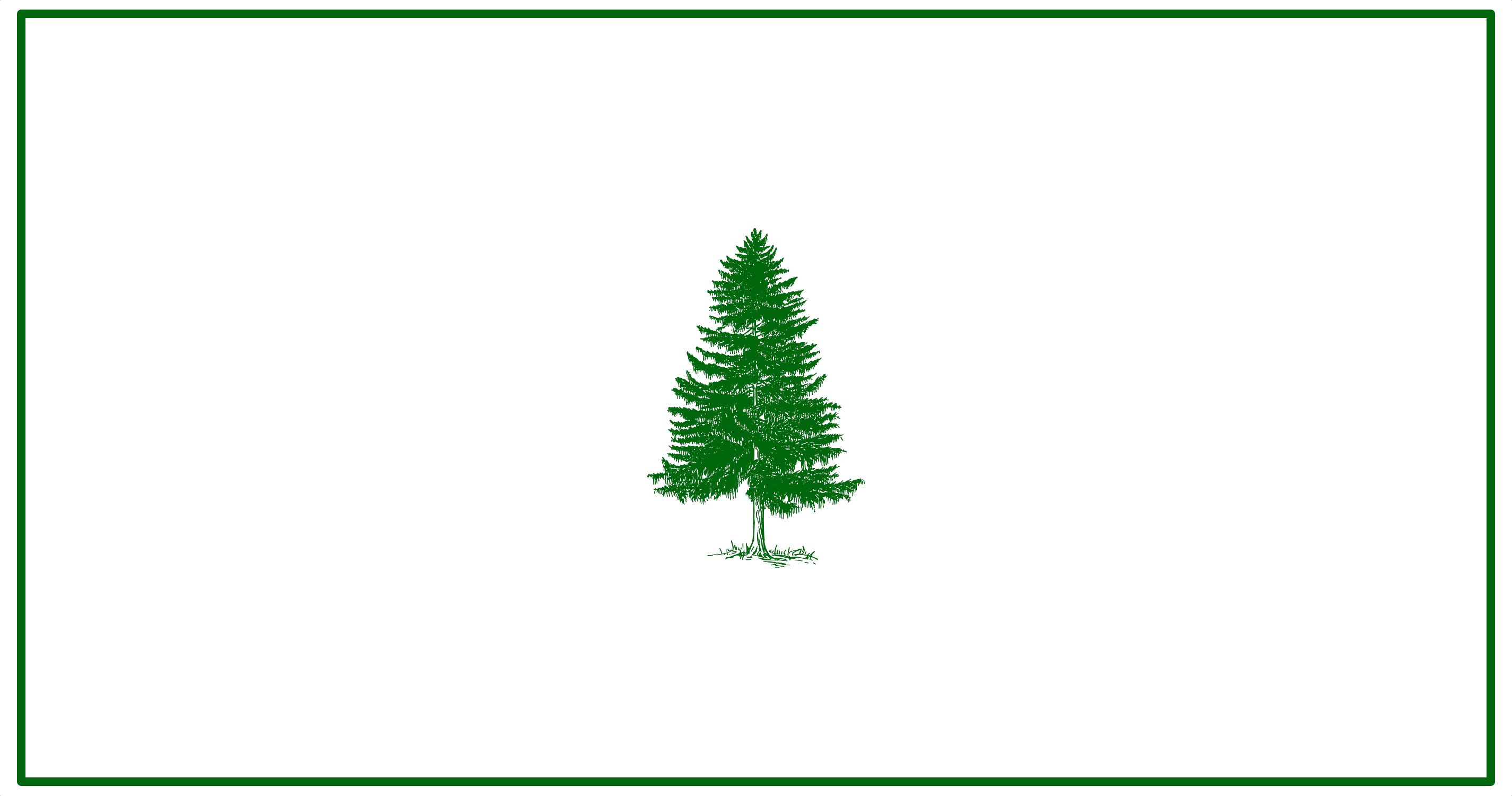
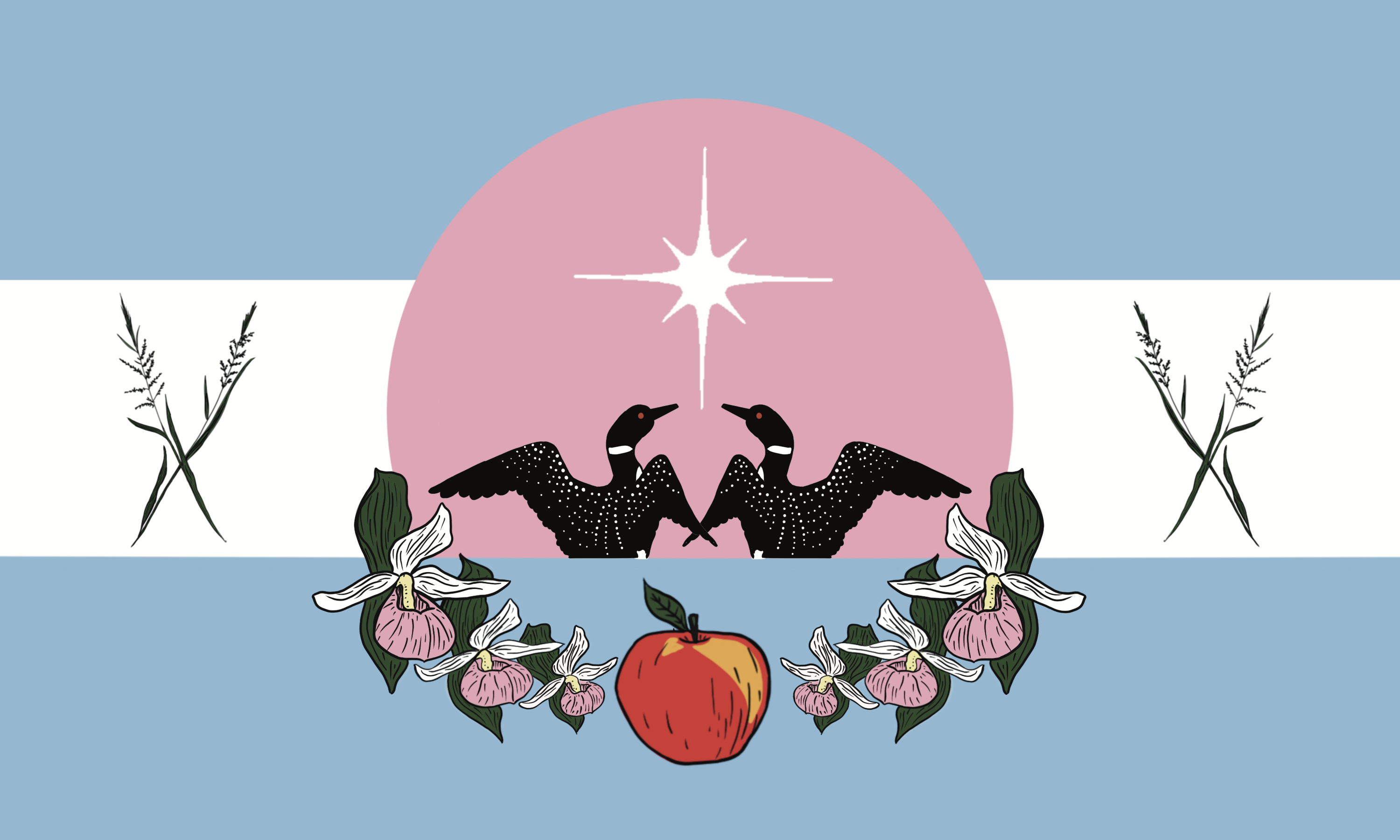
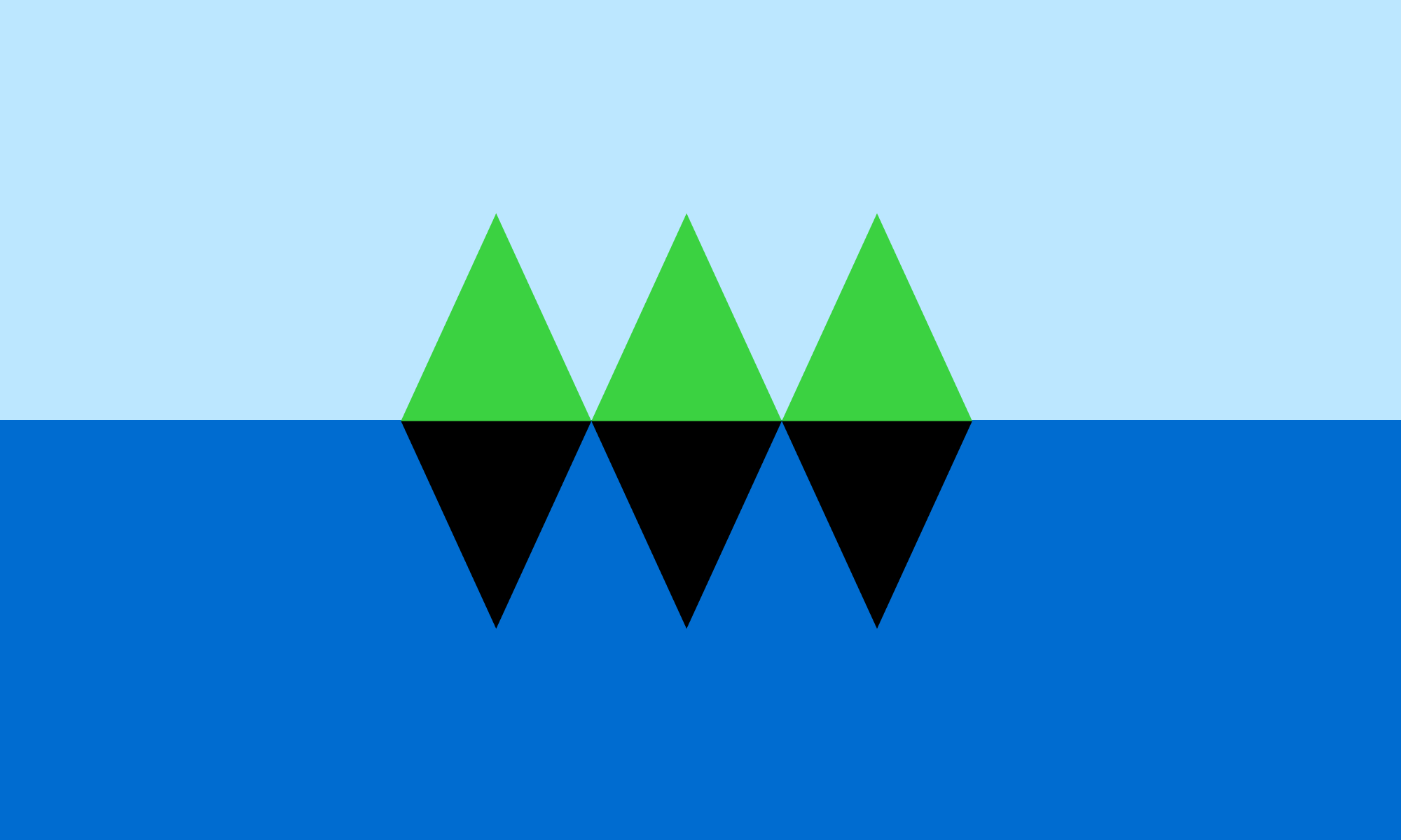
Besides the North Star Flag (F3), the only other one I really love is F1373.
Very simple and geometric, yet it really looks like conifers reflecting in a lake. I like how it can be so literal and also just a bunch of triangles. I think it's genuinely beautiful, and might like to buy some merch with that design even if it doesn't become the flag.
posted by OnceUponATime at 5:59 PM on November 9, 2023 [1 favorite]
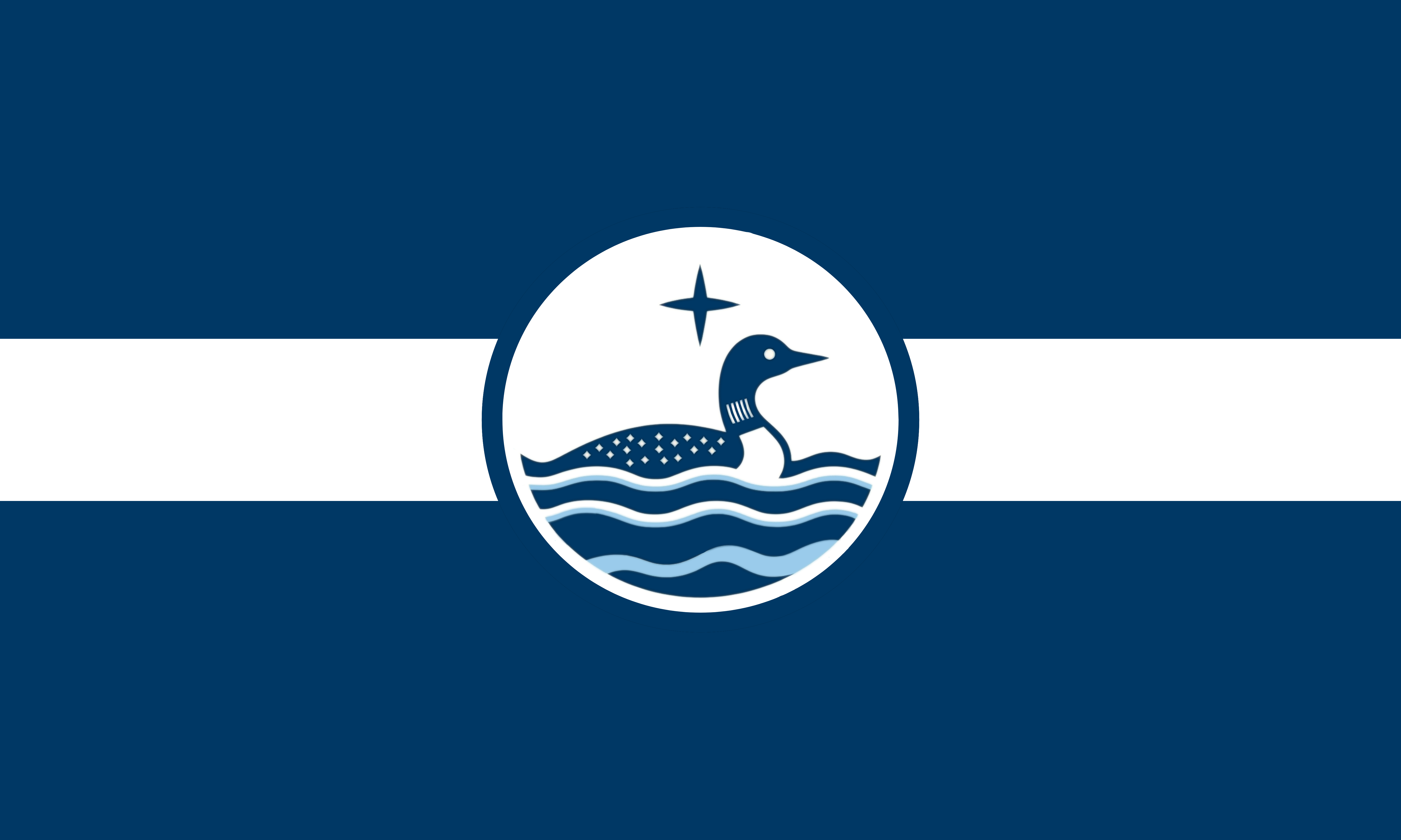
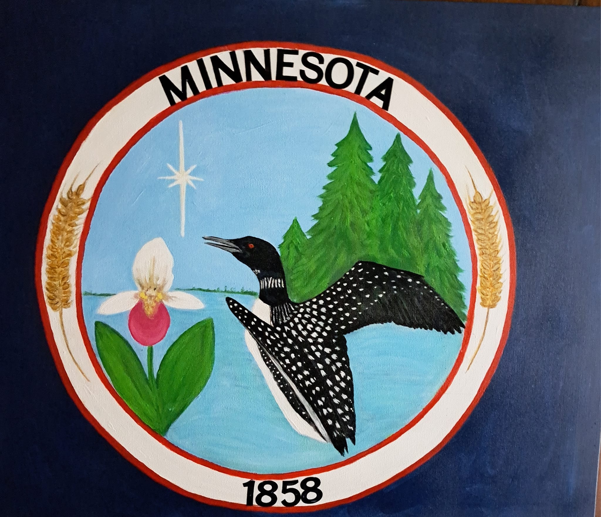
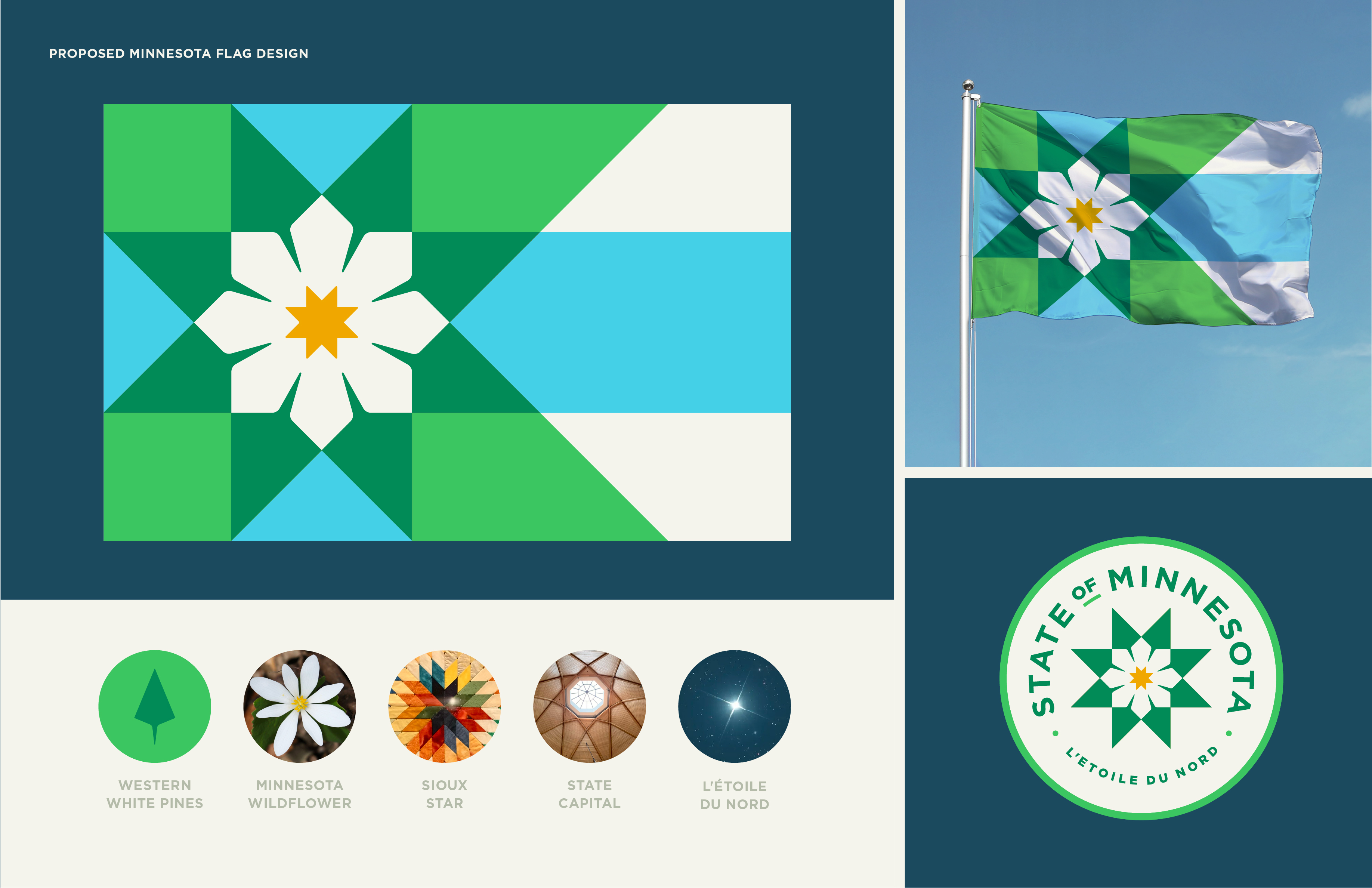
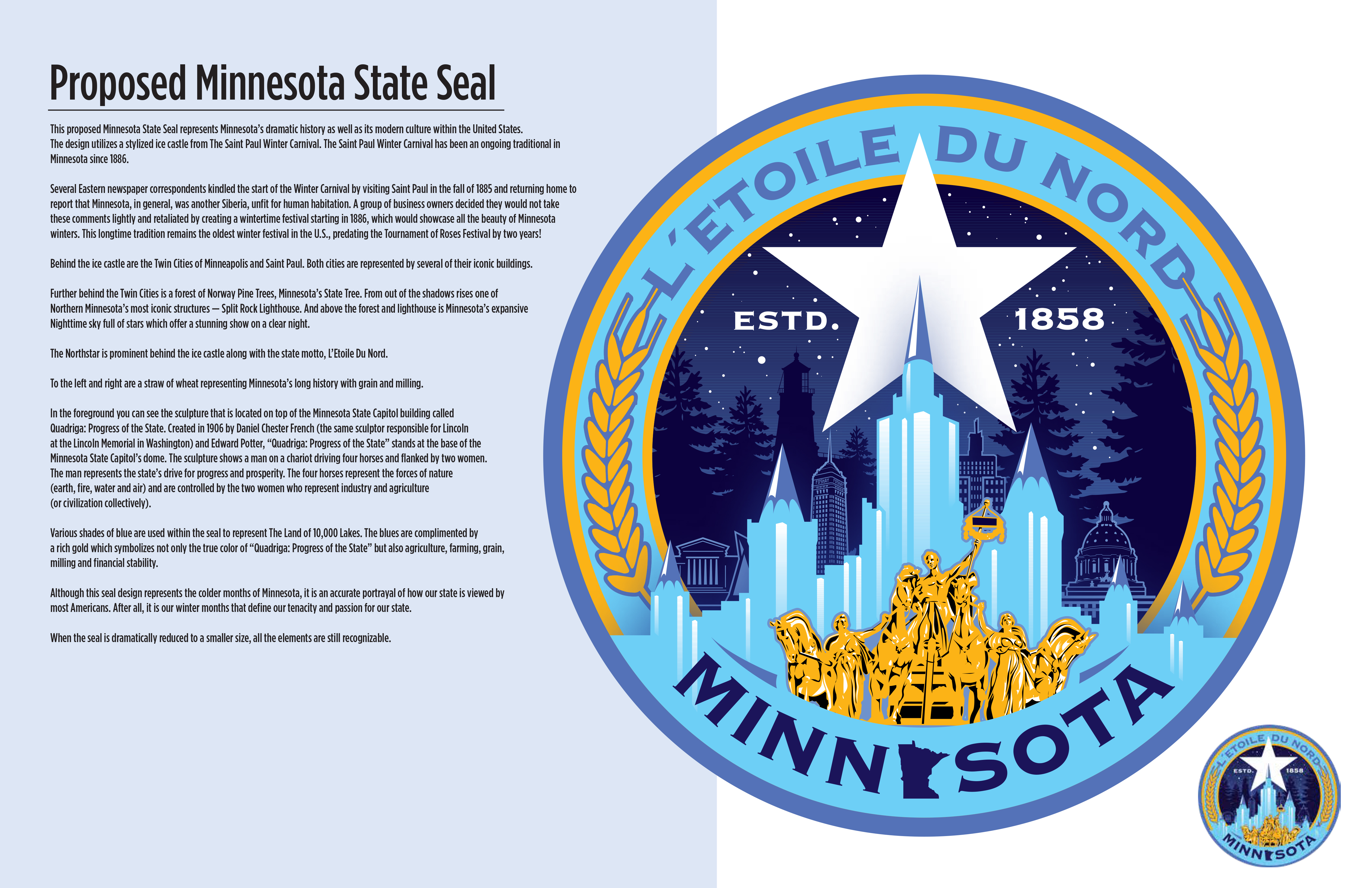
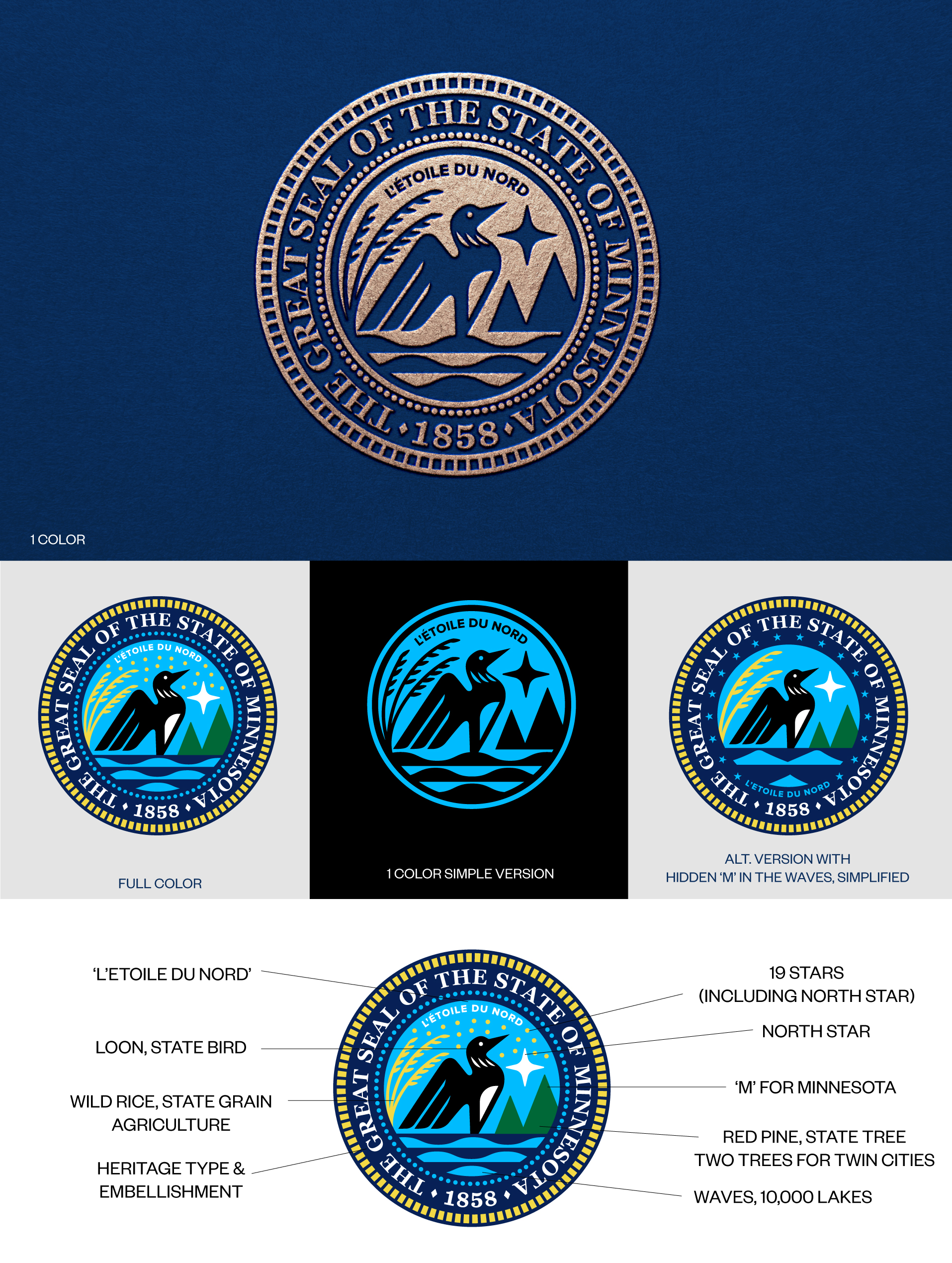
Since no one's commented much on the seals...
I like S14. A loon design is too much detail for a flag, but perfect for a seal. This looks beautiful, simple, professional, and very Minnesotan.
S53 is also a nice loon.
I like S125 among the non-loon designs, because it acknowledges that there are urban areas as well and because I think the details are well rendered.
posted by OnceUponATime at 6:12 PM on November 9, 2023 [2 favorites]
As someone who voted in the New Zealand flag referendum, only to have mouth-breathing curmudgeons ruin the whole thing by voting to keep the same-old flag, I really hope this works out for you Minnesota. There are some good-looking and fun ones in there. Best of luck!
posted by Metro Gnome at 8:43 PM on November 9, 2023 [1 favorite]
posted by Metro Gnome at 8:43 PM on November 9, 2023 [1 favorite]
Which flag fits? Superlatives and accolades for Minnesota’s flag redesigns from Minnesota Public Radio
posted by OnceUponATime at 8:51 AM on November 10, 2023
posted by OnceUponATime at 8:51 AM on November 10, 2023
Mod note: [btw, this thread has been added to the sidebar and the Best Of blog.]
posted by taz (staff) at 2:19 AM on November 11, 2023 [1 favorite]
posted by taz (staff) at 2:19 AM on November 11, 2023 [1 favorite]
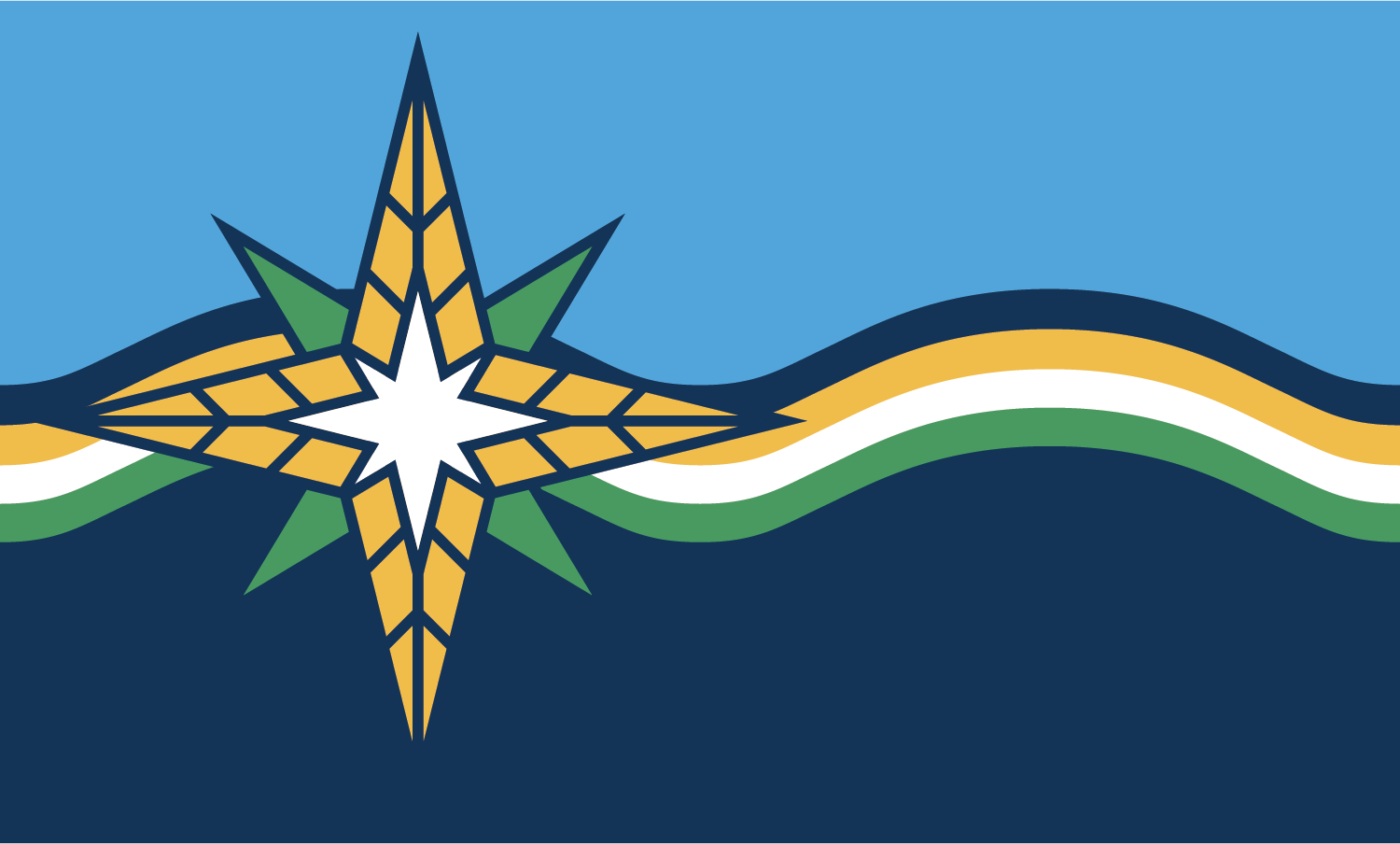
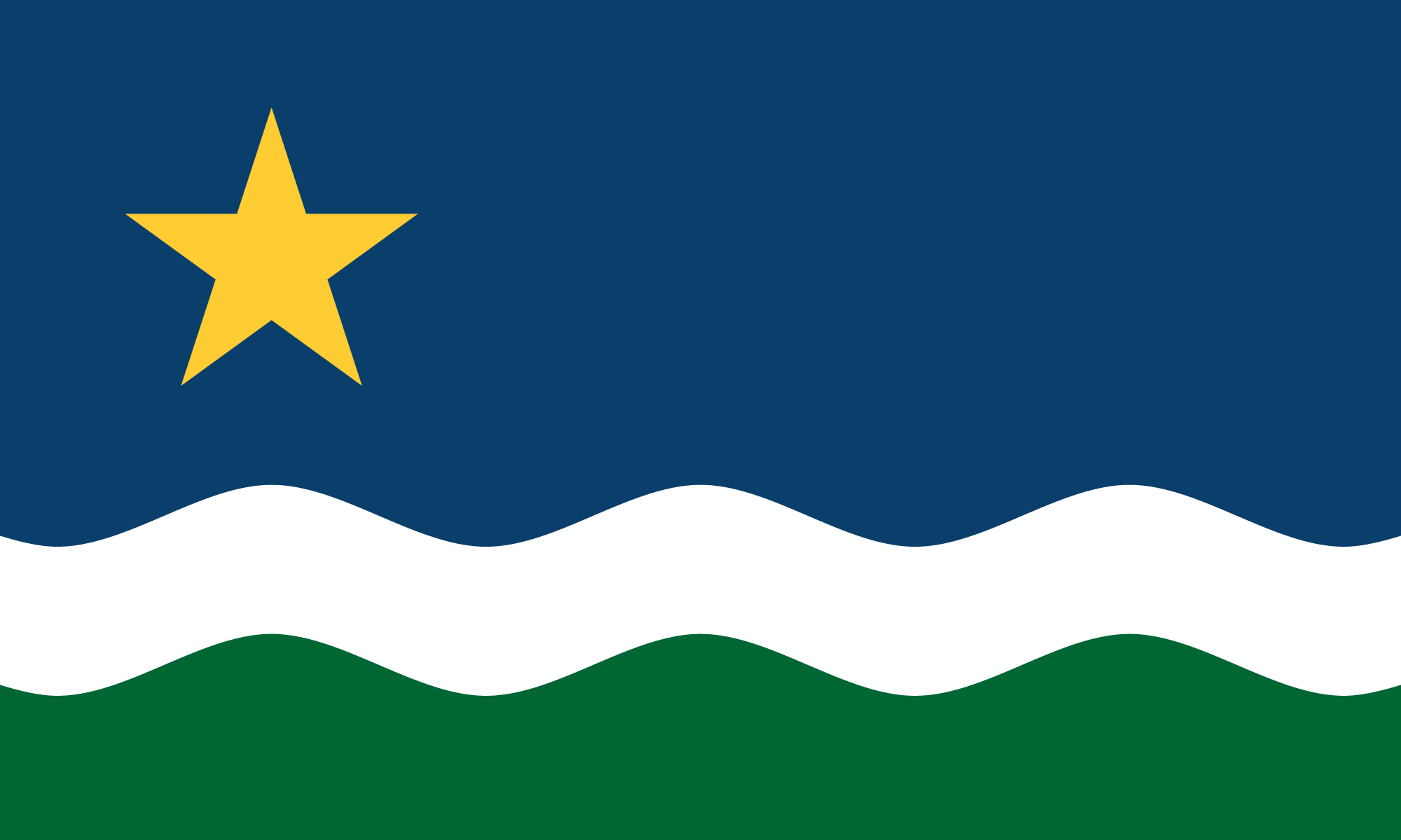
The commission has narrowed it down to six flag design finalists and five finalists for the seal . Sadly (to me anyway) the North Star Flag is not one of the finalists, though one of them certainly seems INSPIRED by that design.
I'd vote for that one and the only seal with a loon that made it into the finalists.
Per the first link above:
I'd vote for that one and the only seal with a loon that made it into the finalists.
Per the first link above:
The commission has a deadline to pick new emblems before the end of the year. Their choices will replace the current state flag and seal in May unless the Legislature vetoes them.posted by OnceUponATime at 2:40 PM on November 22, 2023 [1 favorite]
Members of the public can weigh in and provide feedback during the panel’s Dec. 12 meeting.
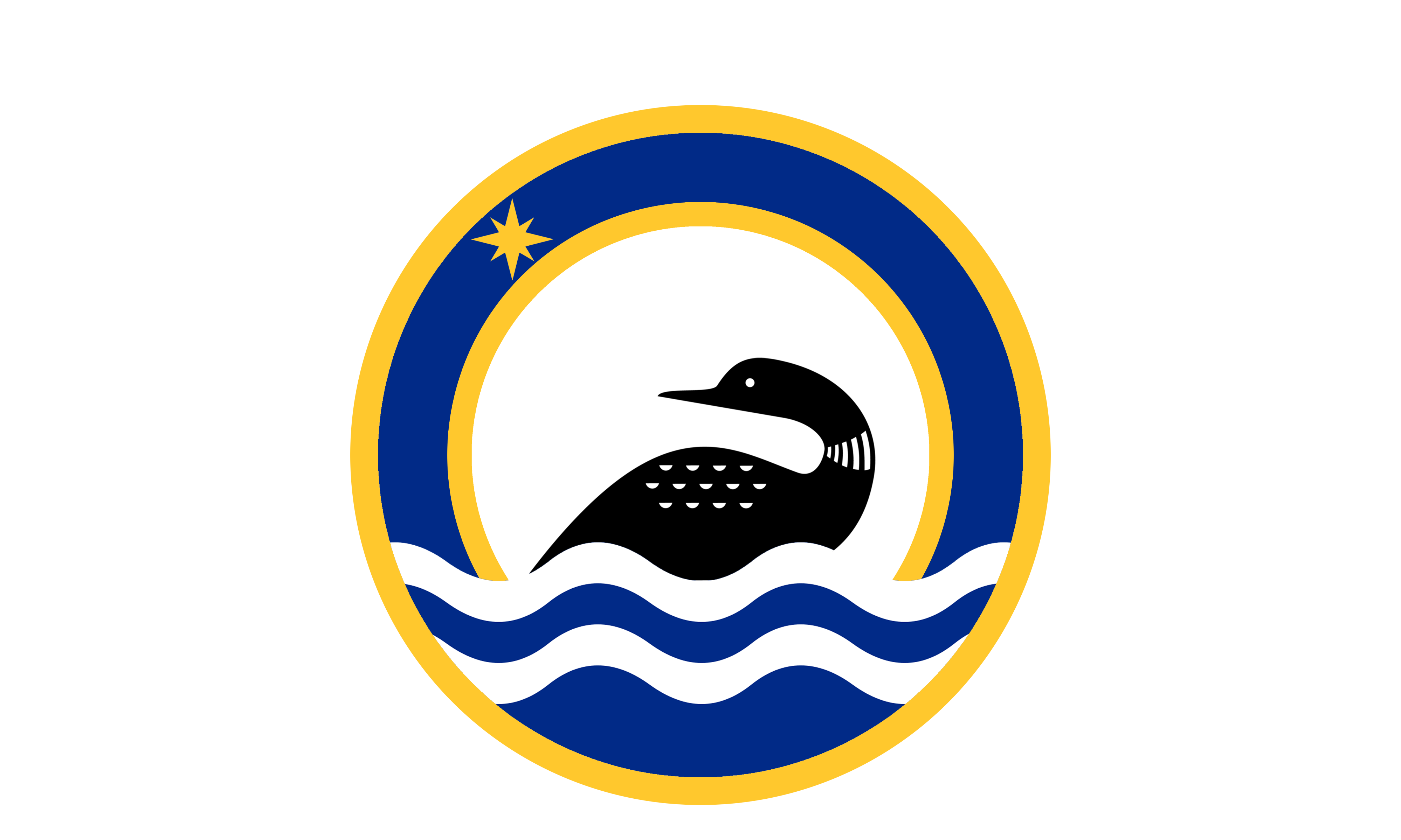
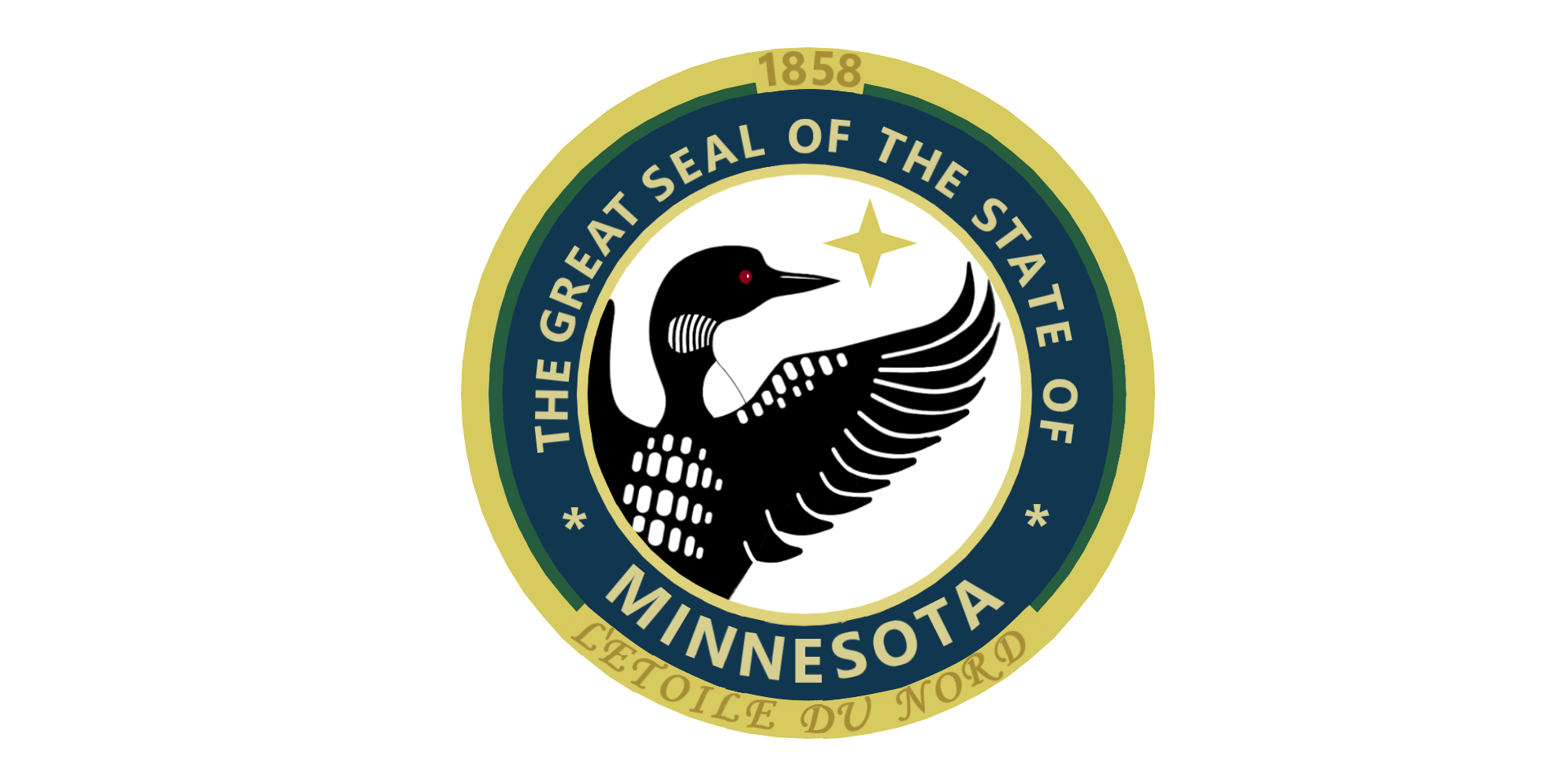
We have a winner for the state seal!
It's the one with the loon!
posted by OnceUponATime at 1:11 AM on December 7, 2023 [1 favorite]
It's the one with the loon!
posted by OnceUponATime at 1:11 AM on December 7, 2023 [1 favorite]
« Older Surströmming v Fondue | “Mujer saliendo del psicoanalista (Podría... Newer »
This thread has been archived and is closed to new comments
Simple and memorable.
I'm worried that the committee will end up doing what committees do best, and play it safe, boring, and wrong.
posted by Ickster at 12:20 AM on November 9, 2023 [12 favorites]