Minnesota has a new state flag (almost)
December 16, 2023 2:31 PM Subscribe
Flag selected - tweaks expected! Minnesota is almost certainly getting a new flag and a new state seal next spring, and now we more or less know what they look like. But the devil is in the details...
Previously on Metafilter we had fun critiquing the thousands of flag designs submitted in the selection process for Minnesota's new state flag (and hundreds of state seal designs). Now the results are in. The selection committee first narrowed the flag designs to 6 and seal designs to 5, then made their choice for the state seal (announcing they might tweak it) and picked three finalists for the flag.
Finally, the tweaked version of the state seal was revealed - the loon now has red eyes, and the French state motto "L’etoile du Nord" was replaced with the Dakota phrase from which the state takes its name, Mni Sóta Makoce, with conservatives predicting lawsuits as a result of the change.
Meanwhile, the winning flag design (number 1953 in the original list of submitted designs) is probably going to get some tweaks too. In addition to the variations shown in the main link (all of which move the white stripe to the center or ditch it entirely) the commission brainstormed a number of other variations. One selling point of the winning design is that the blue field with the triangle indent roughly matches the shape of the state itself. Some of the commission's ideas involve making this relationship more literal by making the flag less symmetrical.
The final results should be available in time to be shared in this thread before it closes - the deadline is the end of the year.
All three of these are a big improvement! Now, can please we do something similar with my state's flag (Wisconsin)?
posted by JonathanB at 2:56 PM on December 16, 2023 [7 favorites]
posted by JonathanB at 2:56 PM on December 16, 2023 [7 favorites]
I like new design - simple but pretty.
posted by davidmsc at 3:02 PM on December 16, 2023 [2 favorites]
posted by davidmsc at 3:02 PM on December 16, 2023 [2 favorites]
The Seal Reveal in the linked video is delightfully over-the-top, and I'm fond of the loon, although overall the design seems a tad busy. I'm pretty meh on the flag designs, but then any of them is miles ahead of the old one.
I realized I don't even know what the flag of Oregon (my current state) looks like, and discovered that there was a push back in 2008 to adopt a new one; designs were drawn up, a vote was held, and the ultimate final winner was "none of the above." Honestly, I think they should just use the reverse side of the current flag--a very dignified golden beaver, squarely centered in a blue field.
posted by Kat Allison at 3:32 PM on December 16, 2023 [1 favorite]
I realized I don't even know what the flag of Oregon (my current state) looks like, and discovered that there was a push back in 2008 to adopt a new one; designs were drawn up, a vote was held, and the ultimate final winner was "none of the above." Honestly, I think they should just use the reverse side of the current flag--a very dignified golden beaver, squarely centered in a blue field.
.svg)
posted by Kat Allison at 3:32 PM on December 16, 2023 [1 favorite]
They should pick the one that, when turned 90 degrees clockwise, doesn't resemble the asshole on a person who is squatting over the viewer.
OH WAIT that's all of them
posted by seanmpuckett at 3:35 PM on December 16, 2023 [4 favorites]
OH WAIT that's all of them
posted by seanmpuckett at 3:35 PM on December 16, 2023 [4 favorites]
they should do a Nepal and remove all 3 stripes
posted by torokunai at 4:09 PM on December 16, 2023 [1 favorite]
posted by torokunai at 4:09 PM on December 16, 2023 [1 favorite]
BOOOO! Not enough loons!
posted by blnkfrnk at 4:28 PM on December 16, 2023 [3 favorites]
posted by blnkfrnk at 4:28 PM on December 16, 2023 [3 favorites]
I live in Georgia, where the State Legislature briefly considered adding a swastika and middle finger to the blue stripe beside the Confederate flag, all before (rather cleverly, frankly) borrowing an old state flag from Confederate times, but it's one that nobody recognizes as Confederate, so, fuck it.
I come from Michigan, which has a terrible state flag and could totally borrow this idea and go with it. Put the middle finger on there for the anti-choice and anti-weed people.
posted by outgrown_hobnail at 4:53 PM on December 16, 2023 [5 favorites]
I come from Michigan, which has a terrible state flag and could totally borrow this idea and go with it. Put the middle finger on there for the anti-choice and anti-weed people.
posted by outgrown_hobnail at 4:53 PM on December 16, 2023 [5 favorites]
What? The Wisconsin flag is awesome! They just need to drop the text, zoom in on the flag, and make the two dudes more anime.
(I mean, one of the Wisconsin Flag Dudes has a little open-flame oil lamp on his hat! Come on!)
posted by phooky at 5:20 PM on December 16, 2023 [2 favorites]
(I mean, one of the Wisconsin Flag Dudes has a little open-flame oil lamp on his hat! Come on!)
posted by phooky at 5:20 PM on December 16, 2023 [2 favorites]
Not very Christmasy.
posted by ixipkcams at 6:02 PM on December 16, 2023 [1 favorite]
posted by ixipkcams at 6:02 PM on December 16, 2023 [1 favorite]
Wow, they picked the best design! That K really is cool. It looks like the state! But it also looks like it belongs on a flag. And the whole thing is simple enough that it can withstand the various uses and abuses that flags are subjected to, and it'll still read.
posted by surlyben at 6:05 PM on December 16, 2023 [1 favorite]
posted by surlyben at 6:05 PM on December 16, 2023 [1 favorite]
Needs to be a laser loon. (Reference: proposed NZ national flag.)
posted by rednikki at 6:18 PM on December 16, 2023 [5 favorites]
posted by rednikki at 6:18 PM on December 16, 2023 [5 favorites]
I come from Michigan, which has a terrible state flag and could totally borrow this idea and go with it.I mean.. on the one hand, yeah, the state coat of arms is not terribly inspired, particularly "Tuebor."
But on the other hand "Si Quæris Peninsulam Amœnam Circumspice."
It could certainly be worse.
posted by Nerd of the North at 6:51 PM on December 16, 2023 [2 favorites]
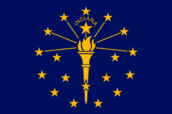
I don’t usually have much in the way of nice things to say about my home state, Indiana, but I’ve always liked the state flag. For an early 20th century design, it’s pretty restrained and graphically pleasing. About the only quibble I have is the “Indiana” neat the top, but even that is pretty minimal.
posted by Thorzdad at 6:55 PM on December 16, 2023 [2 favorites]
posted by Thorzdad at 6:55 PM on December 16, 2023 [2 favorites]
Why the 8-point star? Whatever the reason, I hope they go with (for lack of the correct vexillological terms) the compass-rose shaped one and not the quilt-panel shaped star.
posted by Nerd of the North at 7:02 PM on December 16, 2023 [2 favorites]
posted by Nerd of the North at 7:02 PM on December 16, 2023 [2 favorites]
Look suspiciously like the merch for Minnesota's pro soccer team!
posted by wenestvedt at 7:16 PM on December 16, 2023
posted by wenestvedt at 7:16 PM on December 16, 2023
Rolling my eyes at whoever is being triggered by the change from the state motto to the Dakota phrase in the seal.
posted by jimw at 7:17 PM on December 16, 2023 [3 favorites]
posted by jimw at 7:17 PM on December 16, 2023 [3 favorites]
Why the 8-point star?
For some reason, L'Étoile du Nord is frequently depicted with eight points.
posted by zamboni at 10:06 PM on December 16, 2023 [3 favorites]
For some reason, L'Étoile du Nord is frequently depicted with eight points.
posted by zamboni at 10:06 PM on December 16, 2023 [3 favorites]
posted by Nerd of the North
*submits complaint to the nerd licensing board*
posted by zamboni at 10:08 PM on December 16, 2023 [3 favorites]
*submits complaint to the nerd licensing board*
posted by zamboni at 10:08 PM on December 16, 2023 [3 favorites]
OK, the state seal is still a bit iffy but VASTLY better than it was before. WTF were people thinking when they authorized all those godawful hyper detailed drawings with text state seals that so plague America's glorified postal districts?
I'd preferred a different of the contenders for state flag, but the winner isn't bad.
Thorzdad Indiana is a strong A rank state flag. Texas clocks in with an S ranking, and the state seal is also pretty good. I'd class Alaska and New Mexico as the only other S rank flags, though Arizona is right up there with Indiana at the top of A ranking.
The new Minnesota flag boosts them from F tier up to at least a B or A. I think if they went with the asymmetric version it'd be a sold A rank flag with the symmetrical no stripe version being the worst of the four final contenders in the mid B tier.
Here's to hoping some of the other F tier states can start upping their game. With one exception, Oregon, every single seal + state name flag is F tier. But Oregon, despite still being a shitty seal+name flag gets points for two things: it went with a clean blue and gold color scheme instead of trying to fill in all the pointless detail on the seal, and it HAS A DIFFERENT REVERSE DESIGN! That beaver is way too damn detailed to be anywhere near a flag but goddamn it's just so unexpected and unique that I have got boost Oregon out of F rank and up to at least D, maybe even C.
I classify Maryland as a solid A tier because while it breaks most of the rules for good flag design it does so with flair, style, and utter gusto, so good on 'em. And of course Rhode Island would have been down in the C tier for the pale gold on white design but going with a non-rectangular flag boosts them to at least B tier if not A.
But seriously America, if an 8 year old can't draw your state flag in under a minute with no more than three crayons then you're doing something wrong.
posted by sotonohito at 10:20 PM on December 16, 2023 [6 favorites]
"1953" is a solid flag design. And the variations, somewhat surprisingly, aren't bad either. (I don't like white at the top of flags; it can be confused with a flag of surrender in a calm.)
I suspect the North Star having 8 points is a reference to a compass rosette, so I would depict it more like that.
posted by ChurchHatesTucker at 10:23 PM on December 16, 2023 [3 favorites]
I suspect the North Star having 8 points is a reference to a compass rosette, so I would depict it more like that.
posted by ChurchHatesTucker at 10:23 PM on December 16, 2023 [3 favorites]
The first link from the MPR News... drop down to the photo of the three flags in front of the judges... is it just me, or does the white compass rose look like a spider at that angle?
Bold statement, Minnesota!
posted by TrishaU at 1:58 AM on December 17, 2023 [1 favorite]
Bold statement, Minnesota!
posted by TrishaU at 1:58 AM on December 17, 2023 [1 favorite]
A spider flag would be cool, but a mosquito seal would have actually made a kind of sense. I've heard more references to the "state bird" than to the actual state bird. Just goes along with the 10,000 lakes (and 1,000,000 greenish ponds, probably.)
posted by OnceUponATime at 6:06 AM on December 17, 2023
posted by OnceUponATime at 6:06 AM on December 17, 2023
Yeah, no on the mosquitos. The jokes about the state bird are apt but I don't care. I've lived in Minnesota my whole life. I'm also the kind of person that mosquitos are especially attracted too. I step outside to grab a package off my door step and I get a new bite. If I go out with bug spray when and where mosquitos are about like if I go do some yard work on a whim (which is how it happened this year) I'll get more than 100 bites. Legs arms back and chest will be covered in welts.
On top of that I'm also a lot more reactive to the bites so they get to be big angry welts that stick around for two months or more. I should pop over to that mosquito thread and rant some more. I know they're an important part of the food chain ('cause they're carrying all of my delicious blood) so we can't just outright eliminate them...but I could be convinced.
Last time I checked we actually have just a bit more than 11,000 lakes (which feels on brand for us tbh) and like OnceUponATime said, that makes for x10 ponds. That's a LOT of stagnant water.
Give me bats, spiders*, birds, dragon flies, and whatever else eats mosquitos. Those critters are my friends, they should be on the flag and the seal.
*Though spiders in my house do need to follow the rule: The penalty for falling beneath my notice is death. I can't have them crawling on me and they don't know any better, sorry little buddies.
posted by VTX at 6:53 AM on December 17, 2023 [3 favorites]
it is so weird but that flag's message seems to be telling me to expect a package by 8 PM with some serious hidden fedex arrow
posted by MonsieurPEB at 8:23 AM on December 17, 2023 [2 favorites]
posted by MonsieurPEB at 8:23 AM on December 17, 2023 [2 favorites]
I don't know, but I suspect the new star was chosen to placate backers of the snowflake flag and also because it kinda looks like a bunch of Ms stuck together.
posted by Ickster at 9:10 AM on December 17, 2023 [4 favorites]
posted by Ickster at 9:10 AM on December 17, 2023 [4 favorites]
All y'all just super jealous that you don't have a burgee instead of a flag.
posted by cooker girl at 9:26 AM on December 17, 2023 [1 favorite]
posted by cooker girl at 9:26 AM on December 17, 2023 [1 favorite]
Well I don’t hate any of them, but do prefer the compass rose star over the quilting star. Anyway, all are better than the current one - looking forward to the final selection!
posted by caution live frogs at 9:35 AM on December 17, 2023 [1 favorite]
posted by caution live frogs at 9:35 AM on December 17, 2023 [1 favorite]
I’m not super jazzed about these, but I kind of think my mom, born and bred in St. Paul in the early part of last century, would have really dug it. She got really into making those classic hand-hooked wool rugs and I think the blues would have lit her up enough to make a rug or hanging, since she dyed all her own wool and once said to me that blues were a bit challenging.
posted by kitten kaboodle at 12:29 PM on December 17, 2023 [3 favorites]
posted by kitten kaboodle at 12:29 PM on December 17, 2023 [3 favorites]
They can use a mosquito flag since Mississippi made the mistake of not selecting their awesomest entry. (previously)
posted by autopilot at 12:32 PM on December 17, 2023
posted by autopilot at 12:32 PM on December 17, 2023
Illinois just put together a commission to replace the current state flag, which is so generically awful they had to add the word “Illinois” on it at a later date because no one could recognize it.
posted by leotrotsky at 2:00 PM on December 17, 2023 [2 favorites]
posted by leotrotsky at 2:00 PM on December 17, 2023 [2 favorites]
I like it - simple but has a certain feel. I really hope that they go with the version that has the blue, white, and green - a good reminder that the state isn't only lakes and snow. There is so much beautiful green in Minnesota.
posted by past unusual at 7:00 PM on December 17, 2023 [2 favorites]
posted by past unusual at 7:00 PM on December 17, 2023 [2 favorites]
> I classify Maryland as a solid A tier because while it breaks most of the rules for good flag design it does so with flair, style, and utter gusto, so good on 'em
hey so fyi you look at one seriously just one picture of someone wearing a zentai suit version of the maryland state flag and then sweartogod the whole Internet spends the next six months trying to sell you maryland swag
posted by bombastic lowercase pronouncements at 9:29 PM on December 17, 2023 [4 favorites]
I just did that specifically in hopes that you agree right because Maryland flag merch beats the current ad mix I'm getting
posted by sotonohito at 8:54 AM on December 18, 2023 [2 favorites]
posted by sotonohito at 8:54 AM on December 18, 2023 [2 favorites]
Is there any state that doesn’t joke about the mosquito being its state bird?
posted by naoko at 6:27 PM on December 18, 2023
posted by naoko at 6:27 PM on December 18, 2023
The committee has chosen one.
If the dark blue part is the stylized shape of Minnesota, then I guess the light blue part -- the majority of the flag -- is the stylized shape of Wisconsin. Congratulations Wisconsin!
posted by paper chromatographologist at 9:18 AM on December 19, 2023 [3 favorites]
If the dark blue part is the stylized shape of Minnesota, then I guess the light blue part -- the majority of the flag -- is the stylized shape of Wisconsin. Congratulations Wisconsin!
posted by paper chromatographologist at 9:18 AM on December 19, 2023 [3 favorites]
> Is there any state that doesn’t joke about the mosquito being its state bird?
california
posted by bombastic lowercase pronouncements at 9:35 AM on December 19, 2023
california
posted by bombastic lowercase pronouncements at 9:35 AM on December 19, 2023
The committee has chosen one.
Knowing that the star made of M's echoes the design in the rotunda of the State Capitol does make me like it better. And I guess I like the solid blue rather than the stripes on the right? It looks a little more clean and elegant.
I think overall I'm happy, even though I liked the wavy designs better originally. No matter what, it's a huge improvement over the old one!
posted by OnceUponATime at 11:31 AM on December 19, 2023
Someone who watched the committee testimony tells me that "The Committee chair explained the significance of all people coming here because of the Mississippi River, from the Indigenous people who lived off of it, to the settlers and immigrants who came here because of it. How the water points toward the star"
So that make me like it more. The Mississippi river, leading to the north star... But that really makes more sense if it's hung vertically, since north is usually "up" on maps.
posted by OnceUponATime at 2:02 PM on December 19, 2023
So that make me like it more. The Mississippi river, leading to the north star... But that really makes more sense if it's hung vertically, since north is usually "up" on maps.
posted by OnceUponATime at 2:02 PM on December 19, 2023
« Older ...a dialogue with yourself under two names in the... | Recognizing birds, by sound, at scale Newer »
This thread has been archived and is closed to new comments
I just watched CGP Grey's video on the three finalists, which is public. (His video on the shortlist is only available to members.)
posted by invokeuse at 2:42 PM on December 16, 2023 [9 favorites]