The Mystery of the Dune Font
January 31, 2023 5:16 PM Subscribe
Putting a name to the typeface that defined the visual identity of the science fiction series and its author, Frank Herbert—around 2000 words from Florian Hardwig for Fonts In Use.
I appreciate that they didn't make a faux mystery out of it. "It's Davison Art Nouveau. Here's what we know."
posted by ChurchHatesTucker at 6:33 PM on January 31, 2023 [10 favorites]
posted by ChurchHatesTucker at 6:33 PM on January 31, 2023 [10 favorites]
Fonts in Use is a treasure.
posted by gentlyepigrams at 7:36 PM on January 31, 2023 [3 favorites]
posted by gentlyepigrams at 7:36 PM on January 31, 2023 [3 favorites]
the first edition of Dune was published by Chilton, the publisher that specialized in automotive repair books. It appears to be Chilton's only fiction release.
i guess that's not really relevant to the post except that i kinda prefer the font on the first edition cover. seems more thematically appropriate.
posted by logicpunk at 8:01 PM on January 31, 2023 [15 favorites]
i guess that's not really relevant to the post except that i kinda prefer the font on the first edition cover. seems more thematically appropriate.
posted by logicpunk at 8:01 PM on January 31, 2023 [15 favorites]
DÜN☐
posted by gwint at 8:05 PM on January 31, 2023 [1 favorite]
posted by gwint at 8:05 PM on January 31, 2023 [1 favorite]
It's a pity that such an interesting font is all but lost, but I suppose that's true of a lot of fonts from the letraset era, though of course this was even more limited as it was never released to the public.
posted by tavella at 8:11 PM on January 31, 2023 [1 favorite]
posted by tavella at 8:11 PM on January 31, 2023 [1 favorite]
like the lettering on Herb Alpert and Tijuana Brass album covers
One of the commenters on the article comes to a similar conclusion, speculatively suggesting Davison Art Nouveau was inspired by South of the Border.
posted by zamboni at 9:30 PM on January 31, 2023 [1 favorite]
One of the commenters on the article comes to a similar conclusion, speculatively suggesting Davison Art Nouveau was inspired by South of the Border.
posted by zamboni at 9:30 PM on January 31, 2023 [1 favorite]
Meanwhile, the film "ᑐ ᑌ ᑎ ᕮ" seems to use Unified Canadian Aboriginal Syllabics.
posted by rum-soaked space hobo at 11:52 PM on January 31, 2023 [7 favorites]
posted by rum-soaked space hobo at 11:52 PM on January 31, 2023 [7 favorites]
I'd just like to register the pleasant wistfulness I felt at seeing "The climax of the classic Dune trilogy" above the title for Children of Dune.
I mean, God Emperor does some interesting stuff, but if the whole thing had just ended at Children... it wouldn't be so bad, right?
posted by Ghidorah at 1:08 AM on February 1, 2023 [5 favorites]
I mean, God Emperor does some interesting stuff, but if the whole thing had just ended at Children... it wouldn't be so bad, right?
posted by Ghidorah at 1:08 AM on February 1, 2023 [5 favorites]
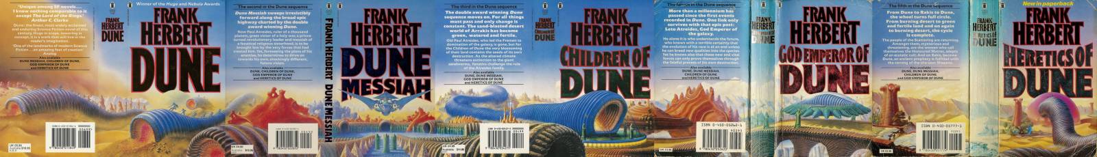
That article also links to the fascinating retrospective on Dune's covers.
I was amazed to see that the (to me) iconic blue worm covers actually formed a panorama. I *worshipped* those books as a teenager, pored over those covers and somehow never realised.
posted by Lorc at 2:48 AM on February 1, 2023 [5 favorites]
I was amazed to see that the (to me) iconic blue worm covers actually formed a panorama. I *worshipped* those books as a teenager, pored over those covers and somehow never realised.
posted by Lorc at 2:48 AM on February 1, 2023 [5 favorites]
It's funny, I had a different edition of Dune (black covers) but I still knew exactly which font the article would be about. How did I know that? Osmosis I guess.
posted by subdee at 3:36 AM on February 1, 2023
posted by subdee at 3:36 AM on February 1, 2023
Orthodox Herbertarian was created in 2009, painstakingly traced from scans of the typeface that was used on the American Ace Editions (Published by The Berkley Publishing Group) of Dune and many other Frank Herbert books. In the US this is does not infringe the original's copyright protection, but that is unlikely to be true in other countries.
posted by Lanark at 4:26 AM on February 1, 2023 [3 favorites]
posted by Lanark at 4:26 AM on February 1, 2023 [3 favorites]
The article discusses both Orthodox and Extended Herbertarian, and the deficiencies thereof.
posted by zamboni at 5:02 AM on February 1, 2023 [2 favorites]
posted by zamboni at 5:02 AM on February 1, 2023 [2 favorites]
Argh, no, Dune was not Chilton's only fiction release. It wasn't even their only sci-fi release. I hate that that bit of erroneous trivia has taken over the internet.
posted by goatdog at 5:41 AM on February 1, 2023 [7 favorites]
posted by goatdog at 5:41 AM on February 1, 2023 [7 favorites]
Argh, no, Dune was not Chilton's only fiction release
my mistake; i guess you unlearn something old every day.
posted by logicpunk at 6:34 AM on February 1, 2023
Sorry, I came on too strong. I actually wrote an article about it. Hill of beans.
posted by goatdog at 6:49 AM on February 1, 2023 [1 favorite]
posted by goatdog at 6:49 AM on February 1, 2023 [1 favorite]
Interesting article! Also glad they just got right to the point here. And what a handsome website.
I haven't done any research on this. But it looks to me like the font has been scaled to about 90% horizontally, even in the first book "Dune" even where the word Dune stands by itself. I worked as an art director for 20 years starting in 1999 when everything had pretty much shifted 100% to desktop type setting (though we still used Quark back in those days... shudder). Scaling type like that would have been done optically, likely at the service provider—I think. I can't imagine how time consuming that must have been, and how much back and forth must have happened to get everything to look just right.
Real craftsmanship. I know DIY design and desktop publishing has democratized the business in ways, but so much of the skill and art involved has been lost. Guess that always happens when new technology takes over.
posted by SoberHighland at 7:15 AM on February 1, 2023
we still used Quark back in those days... shudder
Aldus.
I miss having DTP software that isn't a buggy install of Scribus.
posted by snuffleupagus at 7:25 AM on February 1, 2023
Aldus.
I miss having DTP software that isn't a buggy install of Scribus.
posted by snuffleupagus at 7:25 AM on February 1, 2023
But it looks to me like the font has been scaled to about 90% horizontally, even in the first book "Dune" even where the word Dune stands by itself. I worked as an art director for 20 years starting in 1999 when everything had pretty much shifted 100% to desktop type setting (though we still used Quark back in those days... shudder). Scaling type like that would have been done optically, likely at the service provider—I think. I can't imagine how time consuming that must have been, and how much back and forth must have happened to get everything to look just right.
Hardwig does touch on this, but makes light of the difficulty:
posted by zamboni at 7:37 AM on February 1, 2023 [1 favorite]
Hardwig does touch on this, but makes light of the difficulty:
The letterforms were used with varying degrees of condensation, something that was easily done with phototype.This essay on TypeCulture, Display Phototype in New York: Folks, Firms and Fonts (downloadable PDF) discusses photocomposition in New York, including Photo-Lettering Inc., source of Davison Art Nouveau.
posted by zamboni at 7:37 AM on February 1, 2023 [1 favorite]
Shoulda used Cosmic Sands.
posted by erpava at 7:45 AM on February 1, 2023 [5 favorites]
posted by erpava at 7:45 AM on February 1, 2023 [5 favorites]
or possibly Times New Bildungsroman
posted by cortex at 7:48 AM on February 1, 2023 [3 favorites]
posted by cortex at 7:48 AM on February 1, 2023 [3 favorites]
I mean, God Emperor does some interesting stuff, but if the whole thing had just ended at Children... it wouldn't be so bad, right?The series really went downhill after "The Plumbers of Dune" with "Been there, Dune that".
posted by TheHuntForBlueMonday at 7:51 AM on February 1, 2023 [3 favorites]
The article did make me curious about Herbert's other books. Are any of them good? Or...otherwise worth reading?
posted by snuffleupagus at 7:54 AM on February 1, 2023 [1 favorite]
posted by snuffleupagus at 7:54 AM on February 1, 2023 [1 favorite]
It's a pity that such an interesting font is all but lost[...]Where the font has gone there will be nothing. Only I will remain.
posted by TheHuntForBlueMonday at 7:58 AM on February 1, 2023 [2 favorites]
Yes to his other books. They're very much of a time, but, personally, I was a big fan of the Godmakers.
posted by kokaku at 9:25 AM on February 1, 2023
posted by kokaku at 9:25 AM on February 1, 2023
The supporting typeface was originally going to be New Caladania, but ultimately the shift to Frizatz Quadratarach felt inevitable.
posted by mubba at 6:13 AM on February 2, 2023 [1 favorite]
posted by mubba at 6:13 AM on February 2, 2023 [1 favorite]
« Older Not World First | I Cut 100 Foods with a Pizza Cutter Newer »
This thread has been archived and is closed to new comments
posted by snuffleupagus at 5:41 PM on January 31, 2023 [5 favorites]