The state of hipster typography
September 5, 2008 4:20 AM Subscribe
Ever since Napoleon Dynamite became a surprise hit in the summer of 2003, and the subsequent rise of Judd Apatow a trend in sentimental but cynical film comedy was born. But this post isn't about the comedy..
Napoleon Dynamite was a film dominated by artwork, specifically the pencil sketches of the protagonist. The child-like scrawlings meant to incite the memories of unbridled enthusiasm that youth brings.
Moreso then any other specific typography, the words in the film were either a crude script of dubious penmanship or something akin to Action Jackson. Variants are seen, but it is most often seen as a hand-drawn, blocky font, often shadowed for added awesome.
Soon, more movies with similarly quirky characters started coming out. The colored-pencil scrawl style has become a means of pandering to a specific demographic. The hipster.
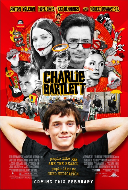
When your movie poster needs to convey a youthful romanticism, go for Action Jackson. When you need to appeal to the ironic sentimentality of your late teenage years, Action Jackson is where it's at. It doesn't stop at movies and television either. Are you a comedian and need to convey cynicism but with a childlike wink and a nod? Go for Action Jackson. Or just write it poorly, possibly with the wrong hand.
What does the future of Action Jackson hold? Only time will tell..
Napoleon Dynamite was a film dominated by artwork, specifically the pencil sketches of the protagonist. The child-like scrawlings meant to incite the memories of unbridled enthusiasm that youth brings.
Moreso then any other specific typography, the words in the film were either a crude script of dubious penmanship or something akin to Action Jackson. Variants are seen, but it is most often seen as a hand-drawn, blocky font, often shadowed for added awesome.
Soon, more movies with similarly quirky characters started coming out. The colored-pencil scrawl style has become a means of pandering to a specific demographic. The hipster.
When your movie poster needs to convey a youthful romanticism, go for Action Jackson. When you need to appeal to the ironic sentimentality of your late teenage years, Action Jackson is where it's at. It doesn't stop at movies and television either. Are you a comedian and need to convey cynicism but with a childlike wink and a nod? Go for Action Jackson. Or just write it poorly, possibly with the wrong hand.
What does the future of Action Jackson hold? Only time will tell..
I don't get how the rise of Judd Apatow is "subsequent" to Napoleon Dynamite, unless you mean it simple as "after". To be sure, that is the definition of the word, but it usually connotes some causal relationship.
I also don't get how this panders specifically to hipsters, unless by that is meant "people younger than 40 and older than 15".
Anyway, it's interesting to compare the typography of the ND cover with Action Jackson. AJ seems to be more carefully random in where the 3D blockiness is revealed. ND is all on the right side. By comparison, AJ seems to have made a mistake, if the object was to look child-like. Kids are often unmindful of details like this, but in my experience a child who is doing something like 3D perspective will generally blindly follow a rule like "put all the 3D stuff on one side". (The "wrong" rule in this case, which is also symptomatic.)
ND also has the accent lines on the blocks. Overall it seems like a more genuine child-like scrawl. Which I guess it is--you can tell by the variation that it isn't a "font".
posted by DU at 5:04 AM on September 5, 2008
This is where the difference between someone who actually knows what the hell they are talking about in typography. I've just noticed a casual relationship in these cynical-but-sentimental movies that are Apatow-esque or directly related to him or his motley crew and their frequent use of blocky, hand drawn text. The hipster appeal is purely anecdotal, based on my own views as just another white kid in Portland, OR.
And yes, I meant subsequent simply as "after", it was an asinine verbal flourish. If I could somehow type with a large feathered pen and stamp my waxen seal as the enter key, I would with a girlish giggle.
posted by mediocre at 5:16 AM on September 5, 2008
And yes, I meant subsequent simply as "after", it was an asinine verbal flourish. If I could somehow type with a large feathered pen and stamp my waxen seal as the enter key, I would with a girlish giggle.
posted by mediocre at 5:16 AM on September 5, 2008
This seems to be just another "hipsters suck" posts: "Just look at how childish their typography is!"
I don't think I'll ever get tired of those.
posted by daniel_charms at 5:24 AM on September 5, 2008
I don't think I'll ever get tired of those.
posted by daniel_charms at 5:24 AM on September 5, 2008
^ mediocre: "And yes, I meant subsequent simply as "after", it was an asinine verbal flourish. If I could somehow type with a large feathered pen and stamp my waxen seal as the enter key, I would with a girlish giggle."
I'ma Punch Ya in the Dick!
posted by not_on_display at 5:45 AM on September 5, 2008
I'ma Punch Ya in the Dick!
posted by not_on_display at 5:45 AM on September 5, 2008
How does Carl Weathers feel about this?
Whoa, there's plenty of meat left on those vowels! Baby, you can get a stew goin'...
posted by Strange Interlude at 5:50 AM on September 5, 2008 [5 favorites]
Whoa, there's plenty of meat left on those vowels! Baby, you can get a stew goin'...
posted by Strange Interlude at 5:50 AM on September 5, 2008 [5 favorites]
I don't know if you can reach the "hipster" demographic, through unusual methods of titling.
...or anything for that matter.
Being a hipster requires one to change their style just prior to just before it becomes mainstream. As any meme or fad is at the precipice of breaking into the mainstream, you must have at least 4 disenfranchised guys sipping OV (because pabst is so early 2008) saying "hey remember last month when we were doing that?" Whatever you're putting in your media today is something they were bored with yesterday.
You see them do this awkward laugh that falls somewhere between a chortle and a wincing pained cry, because, sadly, being a true hipster means avoiding the prospect of "selling out", a euphemism for "sticking with something until it becomes profitable enough for me to not have to act surprised when the bartender at that quirky back-alley bar tells me my credit card keeps getting rejected."
posted by Bathtub Bobsled at 5:59 AM on September 5, 2008 [5 favorites]
Good post. I cringe a little bit anytime I see a handwriting font. As a type fan, the first thing I do is look to see if certain characters are identical. Then I cluck my tongue, because the designer obviously didn't draw the letters themselves.
posted by cusack at 6:17 AM on September 5, 2008 [1 favorite]
posted by cusack at 6:17 AM on September 5, 2008 [1 favorite]
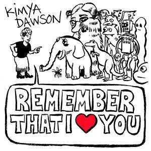
The typography (which totally sold me on seeing those films) reminds me a lot of K Records and the similar cynical-but-sentimental, sweet-but-sexual style of diy graphics (and less punk rock zines) - this Kimya Dawson album cover too.
So, even if it's not hipster by early adoption, it evokes a lot of stuff that is hipsterish, or nichey, or at least where diy and hipster converge.
Aesthetically it tends to fall under "the stuff I like" for me - handmade, playful, slightly cynical, probably a bit uncool/confessional - which isn't very scientific. But Hand Job is a particularly nice book on handlettered type which is similar in aesthetic too.
posted by carbide at 6:22 AM on September 5, 2008
the similar cynical-but-sentimental, sweet-but-sexual style of diy graphics
Duh, sorry. Strike 'graphics', replace with 'culture', and add an allusion that the graphics relate to the culture - the graphics are only one part of it and the playful tends to come up there, while the cynical and sexual sides are more in the music/narrative/content.
posted by carbide at 6:25 AM on September 5, 2008
mediocre: "This is where the difference between someone who actually knows what the hell they are talking about in typography."
I wonder what the difference is between making sense.
posted by Plutor at 6:33 AM on September 5, 2008 [7 favorites]
I wonder what the difference is between making sense.
posted by Plutor at 6:33 AM on September 5, 2008 [7 favorites]
Apatow's movies drive me nuts. Not because they're particularly bad (or good; all of the ones I've seen - Virgin, Superbad, Knocked Up - have been just a *tiny* bit better than okay) but because the formula is so cynical and obvious; throw in lots of sex, weed and shit jokes for The Guys, but make the male characters sensitive fellas, deep down inside, so The Ladies will like them, too. But I suppose you can't argue with success. Or, rather, you can...but success will be too busy counting its money to pay attention to you.
As for movies which feature Quirky People And Their Quirky Lives, I am thoroughly sick and tired of them (Napoleon Dynamite and its empty plastic heart being the worst transgressor). But if you're into that sort of thing, may I suggest a subtler, catchphrase-free alternative with real heart and soul (which just happens to be my personal favourite film of all time)?
YMMV
posted by The Card Cheat at 6:47 AM on September 5, 2008 [6 favorites]
TCC: The favorite was for Local Hero. One of my all time favourites too. Comfort and Joy is another quiet, lovely film by Bill Forsyth (as you of course know).
posted by Turtles all the way down at 6:57 AM on September 5, 2008
posted by Turtles all the way down at 6:57 AM on September 5, 2008
Cheers, turtles. Always glad to meet another Local Hero enthusiast. Actually, I've never seen Comfort and Joy...I've never been able to find it. But I love LH so much that I deliberately limit the number of times I watch it because I never want it to grow over-familiar or stale. I haven't seen it in almost five years, but the DVD sits on my bookshelf, ready for the next time I really need it.
posted by The Card Cheat at 7:04 AM on September 5, 2008
posted by The Card Cheat at 7:04 AM on September 5, 2008
>As for movies which feature Quirky People And Their Quirky Lives
Agreed. I think its an artistic cop-out to write about characters who are independatly wealthy and have cool, hip problems and have an excess of creativity no one understands. No need to learn how to write real people or understand people on a deeper level.
Its like an art school students fantasy. No responsibilities, no jobs, lots of excess money, and just drama and hip clothes.
posted by damn dirty ape at 7:10 AM on September 5, 2008
the formula is so cynical and obvious
Indeed, but it is all viewed very sentimentally. With the rose tinted glasses of nostalgia. The movie works because it's so drippingly sweet in its bro-love sentiment and the fact that it was written by guys so whimsically ponderous of their own youths that it came across with glee instead of creepiness like so many other failed teen sex comedies. It wouldn't have worked at all if it didn't have the ending with the two parting, and the "I love you" cuddle scene, etc..
And that's where the hand drawn/hand written font comes into play, as I see it. Ad execs see the font as sweet, but with a sense of something slightly menacing.. exactly what they want for their sentimental comedy for apathetic people. I'm probably not making much sense.. I haven't slept in far too long..
posted by mediocre at 7:11 AM on September 5, 2008
It took me like three hours to finish the shading on your upper lip.
posted by exlotuseater at 7:15 AM on September 5, 2008
posted by exlotuseater at 7:15 AM on September 5, 2008
And for many of us, Judd Apatow began his rise in 1999, long before Napoleon Dynamite. Some would say it was his finest work.
posted by sadiehawkinstein at 7:17 AM on September 5, 2008 [1 favorite]
posted by sadiehawkinstein at 7:17 AM on September 5, 2008 [1 favorite]
How [is] "Juno" ... pandering to hipsters?*
I think that Juno was the biggest pandering-to-hipsters piece of garbage in movie history. At least Napoleon Dynamite presented a unique view. Juno was scientifically designed to seem hip and with it and down with what teh kids like, and the fucking miracle of it is that it fooled everyone. That piece of shit movie by a no talent blogger is the biggest con in recent Hollywood history, it ballyhooed the populace and the Acadamy into thinking it was good cinema.
*judicious editing of quote inspired barely on topic rant
posted by mediocre at 7:19 AM on September 5, 2008 [4 favorites]
How can this thread have gotten this far without a mention of Rushmore, or the other Wes Anderson films that really originated this colored-pencil typographical affectation, at least in their DVD releases?
posted by eschatfische at 7:20 AM on September 5, 2008 [1 favorite]
posted by eschatfische at 7:20 AM on September 5, 2008 [1 favorite]
How does Carl Weathers feel about this?
Whoa, there's plenty of meat left on those vowels! Baby, you can get a stew goin'...
It's a wonderful restaurant!
[narrator] It sure is.
posted by porn in the woods at 7:23 AM on September 5, 2008 [2 favorites]
Whoa, there's plenty of meat left on those vowels! Baby, you can get a stew goin'...
It's a wonderful restaurant!
[narrator] It sure is.
posted by porn in the woods at 7:23 AM on September 5, 2008 [2 favorites]
You sure use a lot of tenuously related links to prove the point that many light comedies intended for youngish audiences use a certain approach to typography. Wow. Eponysterical.
posted by Mister_A at 7:31 AM on September 5, 2008
posted by Mister_A at 7:31 AM on September 5, 2008
eschatfische: In the same way a conversation about the USSR doesn't usually need to bring up Karl Marx. Everybody knows who started it all, and the horror their good intentions have wrought.
posted by rusty at 7:43 AM on September 5, 2008
posted by rusty at 7:43 AM on September 5, 2008
How can this thread have gotten this far without a mention of Rushmore, or the other Wes Anderson films that really originated this colored-pencil typographical affectation, at least in their DVD releases?
Max Fisher would rip Napoleon Dynamite's head off and shit down his neck, that's why.
posted by Dr-Baa at 7:44 AM on September 5, 2008 [6 favorites]
Max Fisher would rip Napoleon Dynamite's head off and shit down his neck, that's why.
posted by Dr-Baa at 7:44 AM on September 5, 2008 [6 favorites]
not everything that's cool and snarky is hipster
We are going to need Venn diagrams.
posted by everichon at 7:46 AM on September 5, 2008 [2 favorites]
We are going to need Venn diagrams.
posted by everichon at 7:46 AM on September 5, 2008 [2 favorites]
I'm sorry: Forgetting Sarah Silverman?
Yeah didn't you see it? it's the sad story of a girl who jumps the shark when her "transgression" descends into obvious formula.
posted by drjimmy11 at 8:09 AM on September 5, 2008
Yeah didn't you see it? it's the sad story of a girl who jumps the shark when her "transgression" descends into obvious formula.
posted by drjimmy11 at 8:09 AM on September 5, 2008
also, "Napoleon Dynamite" is flagrantly derived from Wes Anderson and Owen Wilson's* "Rushmore," only without the heart and actual funny parts.
* I refer to it this way now, because I think O. Wilson deserves a tremendous amount of credit as Anderson's co-writer on "Rushmore" and "Tennenbaums." Especially after seeing Anderson's output when writing with someone else.
posted by drjimmy11 at 8:13 AM on September 5, 2008
* I refer to it this way now, because I think O. Wilson deserves a tremendous amount of credit as Anderson's co-writer on "Rushmore" and "Tennenbaums." Especially after seeing Anderson's output when writing with someone else.
posted by drjimmy11 at 8:13 AM on September 5, 2008
the formula is so cynical and obvious; throw in lots of sex, weed and shit jokes for The Guys, but make the male characters sensitive fellas, deep down inside, so The Ladies will like them, too. But I suppose you can't argue with success
As far as I can tell there are three kinds of movies: Movies that fit into an established genre, movies that spark a whole new genre, and movies that fail miserably. You can't really blame Juno for fitting into the hip indie comedy mold any more than you can blame a Pixar movie or serious Oscar-winning docudrama for following their own genre conventions. It's fine to not like a certain genre, but it's unreasonable to expect that new films completely abandon established tropes.
Agreed. I think its an artistic cop-out to write about characters who are independatly wealthy and have cool, hip problems and have an excess of creativity no one understands. No need to learn how to write real people or understand people on a deeper level.
My opinion is that, in our society, films and entertainment in general function as escapism. People in the US in the thirties and forties didn't want to see movies about the Great Depression or the war, they wanted to see big majestic happy musicals where nobody had any real problems and everything worked out in the end. These days people don't want to see movies with characters that work a boring low-paying job and are stuck in a dysfunctional marriage, they want to see characters who goof off and get into wacky exciting situations. Regardless of the relative artistic merits of realism versus fantasy, the ultimate consumers of the film industry have clearly shown more interest in the fantasy side.
posted by burnmp3s at 8:34 AM on September 5, 2008 [2 favorites]
Yes! Nice one Card Cheat. One of the most underrated films of all time.
posted by Grundlebug at 8:43 AM on September 5, 2008
posted by Grundlebug at 8:43 AM on September 5, 2008
drjimmy11,
I like Napoleon and Rushmore; I don't see the flagrant connection. What am I missing?
posted by aperture_priority at 8:45 AM on September 5, 2008
I like Napoleon and Rushmore; I don't see the flagrant connection. What am I missing?
posted by aperture_priority at 8:45 AM on September 5, 2008
This is just a public service message to my fellow mefites: Don't Ever Watch Eagle and Shark. Ever.
That's all. Seriously, you'll thank me for saving 90 minutes of your life that would otherwise be wasted on banality punctuated by perhaps two 5 second moments where you might chuckle. (and I'm normally the biggest fan ever of the people involved with it and Flight of the Conchords, etc but the script was utter shit)
posted by mathowie at 8:54 AM on September 5, 2008 [2 favorites]
I agree with drjimmy, above–Owen Wilson is The Man.
posted by Mister_A at 9:01 AM on September 5, 2008
posted by Mister_A at 9:01 AM on September 5, 2008
mediocrePoster.. it ballyhooed the populace and the Acadamy into thinking it was good cinema. "
See, I have a theory... If everyone thinks something in popular culture is good, then it's good. There's no fooling, no charade, no scam - if everyone likes something, then it's, almost by definition, good. Only hipsters think otherwise - after all, the hipster credo is "If everyone likes it, it must be shit!"
posted by benzo8 at 9:05 AM on September 5, 2008 [2 favorites]
also, "Napoleon Dynamite" is flagrantly derived from Wes Anderson and Owen Wilson's* "Rushmore," only without the heart and actual funny parts.
I think you meant "without the budget, the well-connected Coppola kin, and Wes Anderson's completely gratuitous and sickening reliance on cigarette smoking as a proxy for coolth, independence and personal growth."
posted by ethnomethodologist at 9:06 AM on September 5, 2008 [1 favorite]
I think you meant "without the budget, the well-connected Coppola kin, and Wes Anderson's completely gratuitous and sickening reliance on cigarette smoking as a proxy for coolth, independence and personal growth."
posted by ethnomethodologist at 9:06 AM on September 5, 2008 [1 favorite]
I'm a little confused on Wes Anderson and handwriting fonts -- I thought he was all about Futura?
posted by metrocake at 9:09 AM on September 5, 2008
posted by metrocake at 9:09 AM on September 5, 2008
> Don't Ever Watch Eagle and Shark. Ever.
My wife is a serious Jemainiac, and not even she liked Eagle vs. Shark.
posted by The Card Cheat at 9:10 AM on September 5, 2008
My wife is a serious Jemainiac, and not even she liked Eagle vs. Shark.
posted by The Card Cheat at 9:10 AM on September 5, 2008
Also, here's the site for Boris Dworschak , font designer for The Darjeeling Limited. He did a custom job that looks more Futura-esque to me than a typical handwriting font...
posted by metrocake at 9:13 AM on September 5, 2008
posted by metrocake at 9:13 AM on September 5, 2008
...Quirky People And Their Quirky Lives, I am thoroughly sick and tired of them (Napoleon Dynamite and its empty plastic heart being the worst transgressor)...
How did ND have an empty plastic heart? It took genuinely unattractive, unpleasant people (i.e. not just prom queens with a pair of glasses) and made them sympathetic.
posted by DU at 9:19 AM on September 5, 2008 [1 favorite]
How did ND have an empty plastic heart? It took genuinely unattractive, unpleasant people (i.e. not just prom queens with a pair of glasses) and made them sympathetic.
posted by DU at 9:19 AM on September 5, 2008 [1 favorite]
How can this thread have gotten this far without a mention of Rushmore, or the other Wes Anderson films that really originated this colored-pencil typographical affectation, at least in their DVD releases?
Max Fisher would rip Napoleon Dynamite's head off and shit down his neck, that's why.
Well said. Points to the fact that Rushmore is actually dangerous and thus, for all its irony and skepticism, is very real. Max Fisher's passion leads him to actually cut the brake line in his "enemy's" car. This is an act of serious psychopathology, which is often the end result of youthful romanticism taken too far.
And for the record, to quote an old late night radio DJ of the 1980s: "I fucking hate cute in anything beyond puppy dogs, pussy cats and small children. Grow the fuck up or I'm sending you on a Holiday to Cambodia." (change Cambodia to Darfur to give it some modern relevance).
posted by philip-random at 9:19 AM on September 5, 2008 [2 favorites]
How did ND have an empty plastic heart?
Because it didn't have any real characters or dialogue, only walking collections of eccentric tics and catchphrases designed to be printed on t-shirts.
It took genuinely unattractive, unpleasant people...
This much I will grant you.
...and made them sympathetic.
I must have missed that part.
posted by The Card Cheat at 9:25 AM on September 5, 2008 [2 favorites]
Everything old is new again...
http://www.youtube.com/watch?v=lJCL9yc-R1g
http://www.youtube.com/watch?v=6eYU2B67a0s
posted by lovejones at 9:25 AM on September 5, 2008
http://www.youtube.com/watch?v=lJCL9yc-R1g
http://www.youtube.com/watch?v=6eYU2B67a0s
posted by lovejones at 9:25 AM on September 5, 2008
I hated Juno, but I rarely mention the fact in public. It just sort of tires me out to even discuss it with people. It usually goes down like this.
Elwood: Juno is a terrible film - it is badly written, badly edited and the few parts that are any good are badly ripped off. I felt like I was watching Napoleon Dynamite getting Knocked Up while singing along to a copy of the Garden State sound track.
Anyone else: But the writer was a stripper!
Elwood: Yes, but the movie itself....
Anyone else: And she blogs!
Elwood: But the screenplay was a mess it.....
Antone else: She has tattoos!
posted by elwoodwiles at 9:37 AM on September 5, 2008 [6 favorites]
I hate hipsters too, but only because it's trendy.
Wait, what are we talking about?
posted by Caduceus at 10:00 AM on September 5, 2008
Wait, what are we talking about?
posted by Caduceus at 10:00 AM on September 5, 2008
I think the Wes Anderson-Owen Wilson duo is stronger together than apart. While I've missed Anderson's movies past 'The Life Aquatic' (which I did kinda like, but it just didn't go anywhere for me), I saw an Wilson movie (I can't remember the title, he was a dude who got busted for making fake IDs to illegal mexicans, ends up owning a hotel in the end) and it was lacking the emotional bite that Anderson added.
'Rushmore' and 'Tenenbaums' are two of my favorite movies of all time, along with 'Clerks' and 'Kafka'.
posted by The Power Nap at 10:12 AM on September 5, 2008
'Rushmore' and 'Tenenbaums' are two of my favorite movies of all time, along with 'Clerks' and 'Kafka'.
posted by The Power Nap at 10:12 AM on September 5, 2008
Actually, having now read the thread, I've got to quote one of you above and then say something.
See, I have a theory... If everyone thinks something in popular culture is good, then it's good. There's no fooling, no charade, no scam - if everyone likes something, then it's, almost by definition, good. Only hipsters think otherwise - after all, the hipster credo is "If everyone likes it, it must be shit!"
benzo8 was polite enough not to come right out and say it, but a significant contingent of you guys seriously sound like hipsters in this thread.
(I'll give you a hint: it's those of you calling all these films crappy and bashing hipsters.)
posted by Caduceus at 10:16 AM on September 5, 2008 [1 favorite]
elwoodwiles: It's funny you mention the whole stripper blogger argument... Nobody I know who liked Juno (myself included) had any idea that the writer was a stripper/blogger/whatever. We just liked the movie. I personally only found out when I watched the Oscars. But maybe that's because all we heard about up here in Canada was how "Ellen Page is in it! And she's Canadian! There's a Canadian starring in the movie! OMG!" Nevermind that Michael Cera is also a Canadian. And I like him way better than Ellen Page. And now I'm just starting to ramble.
posted by antifuse at 10:30 AM on September 5, 2008
posted by antifuse at 10:30 AM on September 5, 2008
a significant contingent of you guys seriously sound like hipsters in this thread. (I'll give you a hint: it's those of you calling all these films crappy and bashing hipsters
This is kind of annoying, employing a circular logic that ends up being more of a spiral headed in the wrong direction (ie: down the drain). I for one have no idea what a hipster is. I do however empathize big time with a lot of the spite being directed at the likes of Juno in particular, which being a Canadian with roots in both Nova Scotia and Ontario, I'm supposed to love.
Why do I hate it so? Because it wimps out. It starts out being about a cool, tough young girl with a definite edge toward transgression and by the time it's over, she's giving her baby to a dangerously needy woman and playing really lame music with her lame boyfriend. I would've loved JUNO if she'd kept the baby and formed a kick ass band with Jason Bateman (sort of Butthole Surfers meets L7) and disappeared from the suburbs forever.
posted by philip-random at 10:57 AM on September 5, 2008 [1 favorite]
Antifuse: Yeah, I'm probably being a touch unfair. The real problem I had with Juno was not that it was bad (it was) but that it won an academy award for being good. Clearly, Michael Clayton was a much, much better written movie, but the Oscars wanted something light, cute and hip, so Juno got the nod.
After the Oscars it seemed no one wanted to talk about the movie, but prattled endlessly on about Diablo Cody, Diablo Cody included. To me this was very telling.
If I had seen Juno before the Oscars I would have thought it was light and forgettable, another mediocre movie in the current Apatow style. The awards and praise, however, created an expectation that the movie couldn't even begin to approach.
Oh, and about the font: Yes, there is a visual language that hipster arts (and crafts) share. Generally it is some kind of nod toward the nostalgia of childhood made by people who haven't yet grown up.
posted by elwoodwiles at 11:14 AM on September 5, 2008
eschatfische: "How can this thread have gotten this far without a mention of Rushmore, or the other Wes Anderson films that really originated this colored-pencil typographical affectation, at least in their DVD releases?"
First of all, because it is a not at all the same style. The Criterion DVD covers you are referring to do have a sort of twee, coloured-pencil look, but none of them have the scrawled, intentionally messy look that this post is about, nor is the lettering used at all blocky. Secondly, as far as I know, the style used for the Criterion DVD covers isn't actually used in any of the films. It's just tacked-on marketing style.
posted by ssg at 11:24 AM on September 5, 2008
What bothered me about Juno was the weird mixture of generational references. Juno was way too young to be yelling "thundercats ho!" as anything but a nod to her coolness, and if she was really into 70s rock, why wasn't she playing that with her boyfriend, instead of Kimya Dawson? Movie would have made much more sense if it was set 10 years ago.
Other than that, I thought it was pretty cute, if shallow. My favorite hipster (and hipster font) film is Rocket Science, though, which had a lot more depth. It felt more like the heir to Rushmore that I wished Juno was, but it seemed to get totally eclipsed in the Diablo Cody madness, despite the fact that it was released first.
posted by PhoBWanKenobi at 11:24 AM on September 5, 2008
I saw an Wilson movie (I can't remember the title, he was a dude who got busted for making fake IDs to illegal mexicans, ends up owning a hotel in the end)
That was Luke Wilson, and the movie, which he directed and co-wrote (with the third Wilson brother, Andrew), is called "The Wendell Baker Story". Owen Wilson does have a part in it too, but he's a secondary character, not the lead.
posted by Kraftmatic Adjustable Cheese at 11:50 AM on September 5, 2008
I refuse to like any movie that includes the phrase "honest to blog." What in flying fuck does that mean?
posted by brundlefly at 1:58 PM on September 5, 2008 [2 favorites]
posted by brundlefly at 1:58 PM on September 5, 2008 [2 favorites]
When your movie poster needs to convey a youthful romanticism, go for Action Jackson. When you need to appeal to the ironic sentimentality of your late teenage years, Action Jackson is where it's at.
So Action Jackson is the new Comic Sans?
posted by the_bone at 4:28 PM on September 5, 2008
So Action Jackson is the new Comic Sans?
posted by the_bone at 4:28 PM on September 5, 2008
I dislike Nap D. It pitched itself as a film about nerds, but actually laughed at them rather than with them, and the more I watched it, the more cruel and uncomfortable I felt.
It might have looked really good, but Christ, was it ever unfunny.
posted by mippy at 2:44 AM on September 7, 2008 [1 favorite]
It might have looked really good, but Christ, was it ever unfunny.
posted by mippy at 2:44 AM on September 7, 2008 [1 favorite]
« Older The short life of an aquatot | genome quilts Newer »
This thread has been archived and is closed to new comments
posted by chillmost at 4:43 AM on September 5, 2008 [5 favorites]