Pepsi Blue Square
October 6, 2010 8:50 AM Subscribe
Oh, no no no.
posted by emyd at 8:53 AM on October 6, 2010 [2 favorites]
posted by emyd at 8:53 AM on October 6, 2010 [2 favorites]
What is their current interest rate on basic checking?
posted by fourcheesemac at 8:53 AM on October 6, 2010 [79 favorites]
posted by fourcheesemac at 8:53 AM on October 6, 2010 [79 favorites]
Wow that really is objectively terrible.
The only redeeming quality I can see is that would be more legible as a favicon but they don't even use it as that in their website.
posted by mazola at 8:53 AM on October 6, 2010
The only redeeming quality I can see is that would be more legible as a favicon but they don't even use it as that in their website.
posted by mazola at 8:53 AM on October 6, 2010
Why does this remind me of the windows logo?
posted by I_pity_the_fool at 8:54 AM on October 6, 2010 [2 favorites]
posted by I_pity_the_fool at 8:54 AM on October 6, 2010 [2 favorites]
Cue the typesetting freaks...
posted by Brodiggitty at 8:54 AM on October 6, 2010 [4 favorites]
posted by Brodiggitty at 8:54 AM on October 6, 2010 [4 favorites]
How square.
posted by 8dot3 at 8:54 AM on October 6, 2010 [1 favorite]
posted by 8dot3 at 8:54 AM on October 6, 2010 [1 favorite]
meh
posted by bardophile at 8:54 AM on October 6, 2010 [1 favorite]
posted by bardophile at 8:54 AM on October 6, 2010 [1 favorite]
It looks like one of those squares you get when an image isn't rendered correctly and your browser is all WTFBBQ?
posted by misha at 8:54 AM on October 6, 2010 [2 favorites]
posted by misha at 8:54 AM on October 6, 2010 [2 favorites]
Alternately, the logo finally looks as cheap as the quality of their clothes.
posted by mazola at 8:55 AM on October 6, 2010 [4 favorites]
posted by mazola at 8:55 AM on October 6, 2010 [4 favorites]
Looks like Lisa Simpson giving a beejay.
posted by hermitosis at 8:56 AM on October 6, 2010 [22 favorites]
posted by hermitosis at 8:56 AM on October 6, 2010 [22 favorites]
I like it the same way I like comic sans: ironic love that kinda turns around into real love.
posted by The Devil Tesla at 8:56 AM on October 6, 2010
posted by The Devil Tesla at 8:56 AM on October 6, 2010
I'll never fail to be surprised at people's wildly zealous opinions over something for which I could not give a shit.
posted by fungible at 8:57 AM on October 6, 2010 [12 favorites]
posted by fungible at 8:57 AM on October 6, 2010 [12 favorites]
Has anyone determined what design company did this? I'd really like to start poaching their clients.
posted by milarepa at 8:58 AM on October 6, 2010 [11 favorites]
posted by milarepa at 8:58 AM on October 6, 2010 [11 favorites]
Pretty weak. Are they aiming to expand into the middle-aged businessman market?
posted by aught at 8:58 AM on October 6, 2010
posted by aught at 8:58 AM on October 6, 2010
Does this mean Helvetica is finally over?
posted by a young man in spats at 8:58 AM on October 6, 2010 [6 favorites]
posted by a young man in spats at 8:58 AM on October 6, 2010 [6 favorites]
Surprise surprise! It sucks! Typical modern font But it's not worse than the current (or now outdated) logo which is abysmally 90s looking.
They'll never top their 1970s logo. Which is the case with almost every company who can't learn the rule of "logo consistency" and "if its ain't broke, don't fix it".
posted by Liquidwolf at 8:58 AM on October 6, 2010 [3 favorites]
They'll never top their 1970s logo. Which is the case with almost every company who can't learn the rule of "logo consistency" and "if its ain't broke, don't fix it".
posted by Liquidwolf at 8:58 AM on October 6, 2010 [3 favorites]
HELVETICA?!?!?!?
they went from Spire Regular to Helvetica?!??! WTF!
why do companies feel compelled to fix what wasnt even broken?
posted by liza at 8:58 AM on October 6, 2010
they went from Spire Regular to Helvetica?!??! WTF!
why do companies feel compelled to fix what wasnt even broken?
posted by liza at 8:58 AM on October 6, 2010
I bought a jacket at the Gap recently. I like it and it doesn't look cheap, you fuckfaces.
posted by mullacc at 8:59 AM on October 6, 2010 [35 favorites]
posted by mullacc at 8:59 AM on October 6, 2010 [35 favorites]
Maybe it's just me, but I see a graphical interpretation of "man's inhumanity to man" with a touch of "pudding is delicious". Oh wait, now that I look closer it's just a word and square.
posted by Slack-a-gogo at 8:59 AM on October 6, 2010 [18 favorites]
posted by Slack-a-gogo at 8:59 AM on October 6, 2010 [18 favorites]
It reminds me of the recent Price Waterhouse Cooper (sorry, "PwC") rebrand.
And of Aol. Ha ha ha.
posted by timshel at 9:00 AM on October 6, 2010
And of Aol. Ha ha ha.
posted by timshel at 9:00 AM on October 6, 2010
they went from Spire Regular to Helvetica?!??! WTF!
Spire Regular looks like 1995. Not good.
posted by Liquidwolf at 9:00 AM on October 6, 2010 [1 favorite]
Spire Regular looks like 1995. Not good.
posted by Liquidwolf at 9:00 AM on October 6, 2010 [1 favorite]
Old logo sucked and was too "'90s", new logo sucks and is to "aughts".
posted by 2bucksplus at 9:00 AM on October 6, 2010 [1 favorite]
posted by 2bucksplus at 9:00 AM on October 6, 2010 [1 favorite]
Wow that really is objectively terrible.
Objectively, really? Because what I'm seeing there is a bunch of self-important people who'd never be caught dead in an actual Gap creating "redesigns" that (1) aren't discernibly any better, and (2) reinforce my idea that "designer" has become a trendy umbrella term that most people seem to think means "graphic artist but I've got a lot of fonts on my photoshop."
posted by mhoye at 9:00 AM on October 6, 2010 [5 favorites]
It's a logo, people. Get a grip.
posted by zarq at 9:01 AM on October 6, 2010 [2 favorites]
posted by zarq at 9:01 AM on October 6, 2010 [2 favorites]
At Gap we hate serifs and double stitched hems.
posted by Babblesort at 9:01 AM on October 6, 2010 [2 favorites]
posted by Babblesort at 9:01 AM on October 6, 2010 [2 favorites]
Brand New is pretty consistently one of the best things on my Google Reader (along with BLDG BLOG).
posted by shakespeherian at 9:02 AM on October 6, 2010
posted by shakespeherian at 9:02 AM on October 6, 2010
Metafilter: I like it and it doesn't look cheap, you fuckfaces.
posted by azpenguin at 9:02 AM on October 6, 2010 [10 favorites]
posted by azpenguin at 9:02 AM on October 6, 2010 [10 favorites]
I like it when companies change their logos as it helps me assess for how long I've been keeping the clothing that no longer fits. Did you know that Topshop have changed their labelling four times since 2004? I do, because I got round to clearing out the boxes under my bed.
posted by mippy at 9:02 AM on October 6, 2010 [2 favorites]
posted by mippy at 9:02 AM on October 6, 2010 [2 favorites]
Well, at least now it's on a professional, white background.
posted by phunniemee at 9:03 AM on October 6, 2010 [8 favorites]
posted by phunniemee at 9:03 AM on October 6, 2010 [8 favorites]
I'm not a design person, and at first I didn't see anything wrong with the new logo. Then I looked at the design contest link... and then I saw how the logo worked (or rather didn't) on their website, and now I understand. I'm sorry for doubting you, hypercritical design people. My bad.
posted by yeolcoatl at 9:03 AM on October 6, 2010 [2 favorites]
posted by yeolcoatl at 9:03 AM on October 6, 2010 [2 favorites]
Crap▘
posted by leotrotsky at 9:03 AM on October 6, 2010 [27 favorites]
posted by leotrotsky at 9:03 AM on October 6, 2010 [27 favorites]
I'll never fail to be surprised at people's wildly zealous opinions over something for which I could not give a shit.
There are people who do design for a living, you know.
posted by Ratio at 9:04 AM on October 6, 2010 [4 favorites]
There are people who do design for a living, you know.
posted by Ratio at 9:04 AM on October 6, 2010 [4 favorites]
needs a semicolon.
posted by Theta States at 9:05 AM on October 6, 2010 [2 favorites]
posted by Theta States at 9:05 AM on October 6, 2010 [2 favorites]
I'm not hugely invested in this, but, yeah, I wonder what they were thinking? Maybe they have some overall marketing thing that creates a context in which it looks good? I'll wait this one out with my popcorn over in the corner.
posted by jeffamaphone at 9:05 AM on October 6, 2010 [2 favorites]
posted by jeffamaphone at 9:05 AM on October 6, 2010 [2 favorites]
WTF is it with designers and gradients?
At least there's no 'swoosh.'
posted by ChurchHatesTucker at 9:05 AM on October 6, 2010
At least there's no 'swoosh.'
posted by ChurchHatesTucker at 9:05 AM on October 6, 2010
It's... it's the Crate and Barrel logo.
It's also the American Airlines logo and the American Apparel logo and the CVS logo and the Panasonic logo and the freakin' Tupperware logo. Just off the top of my head, there are dozens more.
The "G" truly accentuates it's "helveticaness" as well.
The UPS logo re-design from a few years ago was terrible but at least you can see all of the wasted money in the final product. Here it looks like the agency was challenged to do a logo using only Microsoft Word.
posted by jeremias at 9:06 AM on October 6, 2010 [10 favorites]
Awful. Far too corporate. This would work great if they were a CRM consultancy. Not for fashion.
posted by londonmark at 9:06 AM on October 6, 2010 [2 favorites]
posted by londonmark at 9:06 AM on October 6, 2010 [2 favorites]
If you look at the Helvetica logo closely, you can almost read the words "We're afraid of American Apparel."
posted by Cool Papa Bell at 9:07 AM on October 6, 2010 [14 favorites]
posted by Cool Papa Bell at 9:07 AM on October 6, 2010 [14 favorites]
Gap logo --> J. H. Lynch and Tina --> The Top.
It's a long story, but a huge gap in my understanding has just been filled.
posted by studentbaker at 9:08 AM on October 6, 2010
It's a long story, but a huge gap in my understanding has just been filled.
posted by studentbaker at 9:08 AM on October 6, 2010
Ratio: There are people who do design for a living, you know.
And probably many more here that just appreciate good design and can't help but to overthink things like logos. I know I can't read a magazine without critiquing logos and layouts. It took me a few years to realize that Mrs Agogo does not share the same enthusiasm for design minutia.
posted by Slack-a-gogo at 9:09 AM on October 6, 2010 [3 favorites]
I'm surprised a clothing manufacturer would use a gradient on their logo. Seems like that would single-handedly cost them so much extra in printing costs on labels and such that it will be immediately discarded in actual use.
posted by smackfu at 9:10 AM on October 6, 2010 [4 favorites]
posted by smackfu at 9:10 AM on October 6, 2010 [4 favorites]
I just find it odd that a company would spend (probably not insubstantial amounts of) time and money to actually make their logo worse. To me it looks like someone typed the word "Gap," forgot about it and wandered away from the computer.
posted by hurdy gurdy girl at 9:11 AM on October 6, 2010 [1 favorite]
posted by hurdy gurdy girl at 9:11 AM on October 6, 2010 [1 favorite]
Someone actually thinks "outside the box" is clever?
posted by freebird at 9:11 AM on October 6, 2010 [3 favorites]
posted by freebird at 9:11 AM on October 6, 2010 [3 favorites]
Swooshes and bevels are expensive.
posted by entropicamericana at 9:12 AM on October 6, 2010 [2 favorites]
posted by entropicamericana at 9:12 AM on October 6, 2010 [2 favorites]
If you look at the Helvetica logo closely, you can almost read the words "We're afraid of American Apparel."
posted by Cool Papa Bell at 9:07 AM on October 6 [1 favorite +] [!] [quote]
I think you've got it.
posted by tula at 9:13 AM on October 6, 2010
posted by Cool Papa Bell at 9:07 AM on October 6 [1 favorite +] [!] [quote]
I think you've got it.
posted by tula at 9:13 AM on October 6, 2010
If you look at the Helvetica logo closely, you can almost read the words "We're afraid of American Apparel."
Mmn, don't think so. American Apparel is teetering on the brink of bankruptcy at the moment. The Gap's Q2 was tremendous.
posted by thinkpiece at 9:14 AM on October 6, 2010
Mmn, don't think so. American Apparel is teetering on the brink of bankruptcy at the moment. The Gap's Q2 was tremendous.
posted by thinkpiece at 9:14 AM on October 6, 2010
I do this crap for a living and I'd be embarrassed to lay claim to that thing.
The gradient is like the cherry on top of a turd.
posted by unigolyn at 9:15 AM on October 6, 2010 [1 favorite]
The gradient is like the cherry on top of a turd.
posted by unigolyn at 9:15 AM on October 6, 2010 [1 favorite]
Not nearly as subtle as Fed-Ex. I totally saw the hidden Pac Man right away.
posted by quin at 9:16 AM on October 6, 2010 [1 favorite]
posted by quin at 9:16 AM on October 6, 2010 [1 favorite]
but it seriously does not fit their brand.
OTOH, the 1969 branding they've been using is very prominent and all over their physical stores. And is all Helvetica.
posted by smackfu at 9:16 AM on October 6, 2010 [1 favorite]
OTOH, the 1969 branding they've been using is very prominent and all over their physical stores. And is all Helvetica.
posted by smackfu at 9:16 AM on October 6, 2010 [1 favorite]
Wait - People actually care about this crap?
Personally, I have no interest in Gap or its logo, with the sole exception that I buy most of my jeans there (I like their style, fit, and price).
This change won't result in me buying any more or less product from them. I suppose, if I feel anything about it, I'd have to say, "Why bother? Skip the expensive PR firm and pass the savings on to my jeans".
Now, if they'd gone to Comic Sans just to piss pretentious people off - That would have impressed me greatly. ;)
posted by pla at 9:16 AM on October 6, 2010 [2 favorites]
Most of the proposed redesigns linked in the FPP are pretty awful, too. Creating logos is hard, y'all.
But would it have killed The Gap to build something around argyle?
Also: the Tropicana debacle.
posted by maudlin at 9:16 AM on October 6, 2010 [2 favorites]
But would it have killed The Gap to build something around argyle?
Also: the Tropicana debacle.
posted by maudlin at 9:16 AM on October 6, 2010 [2 favorites]
Wow. 9 year olds in sweatshops are crap at making logos.
posted by w0mbat at 9:17 AM on October 6, 2010 [5 favorites]
posted by w0mbat at 9:17 AM on October 6, 2010 [5 favorites]
I'll never fail to be surprised at people's wildly zealous opinions over something for which I could not give a shit.
posted by fungible at 11:57 AM on October 6 [2 favorites +] [!]
If you are prepared to thread-shit, be prepared for being shat upon thyself.
Why use "wildly zealous" when just zealous would do?
In the future, please tell us which things you give a shit about so we may tailor your reading experience.
posted by jeremias at 9:18 AM on October 6, 2010 [3 favorites]
Wait - People actually care about this crap?
Yes. Good design makes the world a better place.
posted by smackfu at 9:18 AM on October 6, 2010 [7 favorites]
Yes. Good design makes the world a better place.
posted by smackfu at 9:18 AM on October 6, 2010 [7 favorites]
Think outside the square box?
posted by francesca too at 9:19 AM on October 6, 2010
posted by francesca too at 9:19 AM on October 6, 2010
"The "G" truly accentuates it's "helveticaness" as well. "
The G is actually the tip off that it isn't strictly Helv. The squared-off descender suggests A Grotesk. Univers and Arial don't have descenders on the capital G, of course.
posted by beschizza at 9:22 AM on October 6, 2010
The G is actually the tip off that it isn't strictly Helv. The squared-off descender suggests A Grotesk. Univers and Arial don't have descenders on the capital G, of course.
posted by beschizza at 9:22 AM on October 6, 2010
It is more readable when small, I guess. But other than that, nothing.
posted by R. Mutt at 9:25 AM on October 6, 2010
posted by R. Mutt at 9:25 AM on October 6, 2010
I think I just bought some storage from them.
posted by jquinby at 9:27 AM on October 6, 2010 [1 favorite]
posted by jquinby at 9:27 AM on October 6, 2010 [1 favorite]
I think it was mandated that the logo be possible to reproduce in Word in less than 60 seconds.
posted by CaseyB at 9:29 AM on October 6, 2010 [3 favorites]
posted by CaseyB at 9:29 AM on October 6, 2010 [3 favorites]
"Hey, Jason. We're all going out over to Ricky's place to watch the game and, whoa. What ARE you doing?"
"Dude, my lame marketing professor told us we could score some extra credit in his class by submitting a logo to this lame Gap contest. I'm trying to figure out how to screen capture a Powerpoint slide. I'm totally failing that class, trying to bring up my grade."
"You are WAY over-thinking this. Do you get points only if it's GOOD? Or just for submitting it?"
"Naw, I just gotta submit it."
"Bro. Word-box. Done. Game starts in 10 minutes. Let's go."
posted by jeanmari at 9:32 AM on October 6, 2010 [18 favorites]
It looks so B2B. I want them to support my ERP systems, not sell me clothes.
posted by fremen at 9:33 AM on October 6, 2010
posted by fremen at 9:33 AM on October 6, 2010
Dammit orme, I just wasted five minutes Googling "old Gap logo" and "70s Gap logo" and there's your awesome old commercial with the stitching animation and the color coordinated sweatsuits and the moustaches. You win.
I really like that old logo.
posted by mintcake! at 9:35 AM on October 6, 2010
I really like that old logo.
posted by mintcake! at 9:35 AM on October 6, 2010
This is one of those "bad" things that the kids are always talking about.
posted by Senor Cardgage at 9:36 AM on October 6, 2010
posted by Senor Cardgage at 9:36 AM on October 6, 2010
Visceral hatred...
I'm reminded of that character in a Gibson novel who had allergic reactions to certain logos and adverts. Ugh.
posted by jet_manifesto at 9:37 AM on October 6, 2010 [1 favorite]
I'm reminded of that character in a Gibson novel who had allergic reactions to certain logos and adverts. Ugh.
posted by jet_manifesto at 9:37 AM on October 6, 2010 [1 favorite]
Dear Everybody: If everything looks "2.0" then nothing looks 2.0
P.S. You guys suck
posted by Senor Cardgage at 9:37 AM on October 6, 2010 [1 favorite]
P.S. You guys suck
posted by Senor Cardgage at 9:37 AM on October 6, 2010 [1 favorite]
It's very....corporate. They should have kept the blue square, replaced the wordmark with a more modern typeface, and left it at that.
#18 and #27 here provide nice homage to the iconic logo, while also looking fresh and relevant. #48 is the only one that I liked that did away with the square.
Even, the plain blue square at #1 would have been tolerable if accompanied by good-looking text outside of the box in a nice, strong old-timey sans-serif.
Actually, I really liked #18. It even uses a serif typeface without looking dated, and the baby/maternity logos were clever. Possible confusion with The Guardian, though. #27 looks a bit...Photoshop. #28's similar, but less ambiguous.
Like others have said, this stuff is hard, although the Gap should have waited until their designers came up with something good before flipping the switch, even if it took time. Bad design is not a good business decision for a clothing retailer.
posted by schmod at 9:40 AM on October 6, 2010
Recently it seems like every time I hear about some company getting a new logo, it's always a step down. Are logo designers getting worse? Am I that out of step with design trends?
Because this logo sucks dingo kidneys. At least it's better than the WGN logo.
posted by brundlefly at 9:42 AM on October 6, 2010 [3 favorites]
Because this logo sucks dingo kidneys. At least it's better than the WGN logo.
posted by brundlefly at 9:42 AM on October 6, 2010 [3 favorites]
Scratch that, the WGN logo has campy awesomeness going for it.
posted by brundlefly at 9:43 AM on October 6, 2010
posted by brundlefly at 9:43 AM on October 6, 2010
What gets me is how many tens or hundreds of thousands of dollars (millions?) get spent on crappy rebranding like this... in the late 90's I worked at a company that was using the logo it had had since the 1960s. It was nothing remarkable, but it was classic, identifiable within its market, and projected a sense of permanence and character.
As part of a major web site overhaul, somebody decided that the company had to be officially renamed as a dot com, and needed a new logo. Consultants were brought in and tens of thousands of dollars later, we got a logo consisting of a clip art graphic and the company name in Futura Medium Condensed. There dozens of pages of pseudo-psychological babble provided about why this was The Best Logo Ever, but it was just fluff to justify the outrageous amount of money they were charging for this amateurish logo with none of the character or history of the old one.
I always wonder how much money gets spent on projects like this before the grand unveiling of the new look; I suspect that a lot of the time the powers that be are shamed into using these crappy designs rather than admit that they just flushed a bunch of money down the toilet.
posted by usonian at 9:43 AM on October 6, 2010 [3 favorites]
Good lord, this thing has "passed around between about 27 upper-level executives for their input" splashed all over it like the final scene of a GGG video.
The thing is so tortured, I can actually feel the designer giving-up about half-way through the job and just giving the suits every edit they order.
posted by Thorzdad at 9:44 AM on October 6, 2010 [3 favorites]
The thing is so tortured, I can actually feel the designer giving-up about half-way through the job and just giving the suits every edit they order.
posted by Thorzdad at 9:44 AM on October 6, 2010 [3 favorites]
The Gap closed down at my local small-town mall a few years ago. In its place is one of those stores that sells men's suits that make them look like pimps. This doesn't have anything to do with Gap's logo. Or maybe it does. I don't know.
posted by Gator at 9:46 AM on October 6, 2010 [2 favorites]
posted by Gator at 9:46 AM on October 6, 2010 [2 favorites]
Recently it seems like every time I hear about some company getting a new logo, it's always a step down. Are logo designers getting worse?
Corporate logos always get worse. It's a rule. It's like as soon as it's been around long enough to become classic, some dickweed in marketing says "We need to modernize it!" and it inevitably sucks because those people are tasteless.
posted by Liquidwolf at 9:52 AM on October 6, 2010 [2 favorites]
Corporate logos always get worse. It's a rule. It's like as soon as it's been around long enough to become classic, some dickweed in marketing says "We need to modernize it!" and it inevitably sucks because those people are tasteless.
posted by Liquidwolf at 9:52 AM on October 6, 2010 [2 favorites]
In ten years, when Gap announces its new logo, we will all look back on this Gap logo as the old great.
posted by chavenet at 9:52 AM on October 6, 2010
posted by chavenet at 9:52 AM on October 6, 2010
Holyshitminecraftgottothemtoo
posted by Durn Bronzefist at 9:54 AM on October 6, 2010 [2 favorites]
posted by Durn Bronzefist at 9:54 AM on October 6, 2010 [2 favorites]
From the "new" link: I really like #16, and #33 is quite imaginative. Most of the others seem either insufficiently daring or too far away from the established identity.
posted by Miko at 9:55 AM on October 6, 2010
posted by Miko at 9:55 AM on October 6, 2010
In ten years, when Gap announces its new logo, we will all look back on this Gap logo as the old great.
I don't think so. I grew up with the original (ie, best) logo, and even though I worked at the gap in high school, the blue square w/caps logo really never looked great, and it doesn't look great now. It just is.
posted by Miko at 9:56 AM on October 6, 2010
I don't think so. I grew up with the original (ie, best) logo, and even though I worked at the gap in high school, the blue square w/caps logo really never looked great, and it doesn't look great now. It just is.
posted by Miko at 9:56 AM on October 6, 2010
As someone above said, this looks like something done in MS Word - not like an image, but like something someone just typed. It is really weird to me how much I enjoy recent book covers, and how consistently crappy logo redesigns have been.
I don't know if that's because people with an artistic eye are getting out of corporate design, or if the guys who give the final approval for new logos are turning down a bunch of good stuff, or if there is some actual research that supports what looks to me like a step in the wrong direction as actually-for-some-reason good business.
posted by mdn at 9:57 AM on October 6, 2010 [1 favorite]
I think companies tremendously overvalue rebranding. Unless this is part of a complete marketing overhaul (total shift towards a different target market), I just don't see how this is worth the investment. I'm not judging the logo design because I have no idea what's behind it, but I suspect the impact of the revision will be trivial.
posted by davebush at 9:57 AM on October 6, 2010
posted by davebush at 9:57 AM on October 6, 2010
Laird + Partners are the firm alleged to have produced this masterpiece. For my two cents, I stopped designing logos awhile ago when I realized that designing at that level is something that requires exclusive concentration in sacrifice of everything else that makes creative work enjoyable, all the while subjecting your process and product to the scrutiny of a multitude of people who could not discern between shit and Shinola. Yes, I've had admin assistants review and provide discretionary feedback for design when their boss wasn't available. I don't envy the person(s) responsible for this masterpiece, but c'mon, they had to know it was shite.
posted by jsavimbi at 10:00 AM on October 6, 2010 [4 favorites]
posted by jsavimbi at 10:00 AM on October 6, 2010 [4 favorites]
Well, my boss at the marketing company I work at kinda likes it. *facepalm*
posted by brundlefly at 10:00 AM on October 6, 2010
posted by brundlefly at 10:00 AM on October 6, 2010
Looks like a CSS bounding box error.
posted by The Winsome Parker Lewis at 10:00 AM on October 6, 2010 [6 favorites]
posted by The Winsome Parker Lewis at 10:00 AM on October 6, 2010 [6 favorites]
OK, here's how the new logo got greenlighted:
Designer Guy: "OK sirs, here is the text of your logo and the blue square is actually a pantone chip of the proposed color of the text."
*meanwhile, the Gap executive in charge of this project is distracted with a phone call with a lawyer or concubine or plumber or something*
Distracted Gap Exec (to Designer Guy): "Yeah yeah, new logo looks great. Get it me by tomorrow morning."
posted by NoMich at 10:02 AM on October 6, 2010 [1 favorite]
Most of those contest submissions are fantastic though! Some really nice work in there.
posted by The Winsome Parker Lewis at 10:03 AM on October 6, 2010 [2 favorites]
posted by The Winsome Parker Lewis at 10:03 AM on October 6, 2010 [2 favorites]
Last thing I bought at the Gap: selvage jeans. Cost half as much as they would from APC or any other designer, and I love the crap out of them.
posted by l33tpolicywonk at 10:05 AM on October 6, 2010
posted by l33tpolicywonk at 10:05 AM on October 6, 2010
Well that sucks.
Seriously. That's just fucking awful. And the one they had before was pretty classic. I don't understand this at all.
And if they were going to change it at all, then #23 on the list of entries is the clear winner, to me.
posted by Navelgazer at 10:06 AM on October 6, 2010
Seriously. That's just fucking awful. And the one they had before was pretty classic. I don't understand this at all.
And if they were going to change it at all, then #23 on the list of entries is the clear winner, to me.
posted by Navelgazer at 10:06 AM on October 6, 2010
MY LIFE AND EVERYTHING I CARE ABOUT IS OVER NOW
posted by everichon at 10:08 AM on October 6, 2010 [4 favorites]
posted by everichon at 10:08 AM on October 6, 2010 [4 favorites]
WTF is it with designers management and gradients?
posted by juiceCake at 10:12 AM on October 6, 2010
posted by juiceCake at 10:12 AM on October 6, 2010
Metafilter: a multitude of people who could not discern between shit and Shinola.
posted by jquinby at 10:12 AM on October 6, 2010 [2 favorites]
posted by jquinby at 10:12 AM on October 6, 2010 [2 favorites]
Can you imagine what the designers went through to get to this insipid piece of crap? It clearly symbolizes bloated corporate bureaucracy, indecision, blame-shifting and responsibility-dodging. This logo tells me "We can't make a decision."
Gap is going to go the way of Circuit City. The logo is the lipstick on a pig, a pig sick with coccidiosis. They'll change the color of the lipstick, and ignore the fact that the pig is dying.
posted by Xoebe at 10:17 AM on October 6, 2010 [2 favorites]
Gap is going to go the way of Circuit City. The logo is the lipstick on a pig, a pig sick with coccidiosis. They'll change the color of the lipstick, and ignore the fact that the pig is dying.
posted by Xoebe at 10:17 AM on October 6, 2010 [2 favorites]
What a shame. The old logo was distinctive and iconic. Now, would you kids please remove yourselves from my lawn?
posted by theora55 at 10:19 AM on October 6, 2010
posted by theora55 at 10:19 AM on October 6, 2010
WTF is it with designers management and gradients?
Can I get that in a cornflower-blue gradient?
posted by Threeway Handshake at 10:21 AM on October 6, 2010 [2 favorites]
Can I get that in a cornflower-blue gradient?
posted by Threeway Handshake at 10:21 AM on October 6, 2010 [2 favorites]
There are many things I do not like about myself. Not amongst this number is the fact that I am the sort of person who finds himself entirely unable to give the tiniest, most odour-free shit about the particular visual aspect a business chooses to give its company or brand name.
posted by Decani at 10:24 AM on October 6, 2010
posted by Decani at 10:24 AM on October 6, 2010
HAY GUYZ I ALSO DO NOT CARE ABOUT DESIGN!!11ELEVENS
ALSO I AM ONLY CAPABLE OF CARING ABOUT ONE THING AT A TIME11111
posted by entropicamericana at 10:27 AM on October 6, 2010 [2 favorites]
ALSO I AM ONLY CAPABLE OF CARING ABOUT ONE THING AT A TIME11111
posted by entropicamericana at 10:27 AM on October 6, 2010 [2 favorites]
Sans serif type in association with a rectangular color field is the new weird generic "whoosh" thing.
posted by Mister_A at 10:31 AM on October 6, 2010
posted by Mister_A at 10:31 AM on October 6, 2010
I'm amazed at the staying power of Shinola, a brand whose main claim to fame is to be compared to shit. But I have to say, and it seems pertinent in the context of this new Gap logo, that shit has real staying power. After all, we still have shit, but where's the Shinola?
posted by chavenet at 10:32 AM on October 6, 2010 [1 favorite]
posted by chavenet at 10:32 AM on October 6, 2010 [1 favorite]
Can I get that in a cornflower-blue gradient?
Wo-wo-wo-Windows! Windows 386!
posted by mintcake! at 10:35 AM on October 6, 2010
Wo-wo-wo-Windows! Windows 386!
posted by mintcake! at 10:35 AM on October 6, 2010
So, either they got this for free from a design contest quietly held via high school art classes...
...or they paid tens of millions for a new corporate identity. And got Helvetica with a blue gradient box.
I think maybe we should be pleased it's not Verdana.
Oh, Paul Rand, we miss you sir.
posted by zoogleplex at 10:36 AM on October 6, 2010 [4 favorites]
...or they paid tens of millions for a new corporate identity. And got Helvetica with a blue gradient box.
I think maybe we should be pleased it's not Verdana.
Oh, Paul Rand, we miss you sir.
posted by zoogleplex at 10:36 AM on October 6, 2010 [4 favorites]
mintcake, that video - wow, what an awesome time piece, in so many ways.
posted by Miko at 10:36 AM on October 6, 2010
posted by Miko at 10:36 AM on October 6, 2010
I understand the cavils & caterwauling of the designers who've got fits with the new GAP logo. That's understandable. Shoot, I remember arguing about the design of the Altria logo in a rhetoric class, and I'm no designer. At least Philip Morris had reason to want a faceless nameless nondescript logo. Gap should want to make me feel comfortable (I think?) and their logo is a fail on that level.
I do have to say that I am in the category of people who never give Gap or any of their brands a second thought as they eliminated me as a customer about 15 years ago when they stopped stocking 40 x 36 jeans and any shirts that approximated my size. Too bad. I kinda liked them. I do realize that it doesn't make sense for them economically to give two shits about the 2% or fewer people my size in America, so I am inclined to feel the same about them. Nice that they made a logo I can completely ignore, too.
posted by beelzbubba at 10:39 AM on October 6, 2010
Wait, what? A box overlapping the 'p' in "gap"? Are they trying to be ironic?
posted by iamkimiam at 10:40 AM on October 6, 2010
posted by iamkimiam at 10:40 AM on October 6, 2010
Gap (square). We don't care what our clothes look like either.
posted by gorgor_balabala at 10:41 AM on October 6, 2010 [1 favorite]
posted by gorgor_balabala at 10:41 AM on October 6, 2010 [1 favorite]
I wonder if Old Navy will change. The old Gap is very similar.
posted by stormpooper at 10:43 AM on October 6, 2010
posted by stormpooper at 10:43 AM on October 6, 2010
This is not going to be a popular sentiment, but this logo actually evokes the essence of the Gap brand surprisingly well. It says, "Hey! Are you white? Do you like jeans? Are you not really edgy–and not really concerned about not being edgy? Come to the Gap!"
As to this: Are they aiming to expand into the middle-aged businessman market?
The answer is yes. Go walk around one of their stores, you'll see what I mean.
Also, in defense of the design team, we don't know, nor will we ever know, what they proposed that got shot down. We'll never know how involved the client was–could've been an over-the-shoulder design deal. We'll never know if the person who set up the market research stacked the focus groups wrong.
But I'll come back to this point—this logo looks like a logo for the kind of business for which it is a logo. If it doesn't knock your socks off, you may not be the target audience.
Funny though, the favicon on the Gap tab seems to be the old logo. Someone with better eyes than mine should verify.
posted by Mister_A at 10:47 AM on October 6, 2010
The favicon looks the same to me.
posted by elizardbits at 10:51 AM on October 6, 2010
posted by elizardbits at 10:51 AM on October 6, 2010
Er. Same as the old one, I mean.
posted by elizardbits at 10:51 AM on October 6, 2010
posted by elizardbits at 10:51 AM on October 6, 2010
Yeah, sloppy isn't it? Devil is in the details. I have 8 people on my team and if one of 'em did (or didn't do) that I'd have 7. Mwa-haa-haa!
posted by Mister_A at 10:52 AM on October 6, 2010
posted by Mister_A at 10:52 AM on October 6, 2010
Are you sure that it wasn't designed by this guy, you know, as a joke that then got taken seriously?
posted by gern at 10:54 AM on October 6, 2010 [1 favorite]
posted by gern at 10:54 AM on October 6, 2010 [1 favorite]
I think it went something like this: we need to stay relevant, so we want to appeal to the market that wants to be hip, the American Apparel audience. But we don't want to alienate the huge segment of our audence that wants safe and easy, or a cheaper Banana Republic. Er, the squares. So quite literally, let's mash up the American Apparel logo with a square.
posted by naju at 10:55 AM on October 6, 2010 [1 favorite]
posted by naju at 10:55 AM on October 6, 2010 [1 favorite]
And remember, one thing the Gap has is a really iconic name, more than a logo. Coke and Levi's are different - those logos, while they've been refined and tweaked over the years, have always had to have the same basic character (LET US NOT SPEAK OF NEW COKE–THAT NEVER HAPPENED). The Gap logo, well, not so much.
posted by Mister_A at 10:57 AM on October 6, 2010
posted by Mister_A at 10:57 AM on October 6, 2010
The consensus among my friends is that the new logo was designed by drunk Don Draper.
posted by immlass at 10:58 AM on October 6, 2010 [5 favorites]
posted by immlass at 10:58 AM on October 6, 2010 [5 favorites]
Let's hold a contest to see who can recreate the new logo in Paint Shop Pro!
posted by Soliloquy at 10:59 AM on October 6, 2010 [1 favorite]
posted by Soliloquy at 10:59 AM on October 6, 2010 [1 favorite]
Anyway, they didn't sell these guys a logo, they sold 'em an explanation for a logo.
posted by Mister_A at 11:02 AM on October 6, 2010
posted by Mister_A at 11:02 AM on October 6, 2010
Good design makes the world a better place.
Graphic arts isn't design, outside of the minds of graphic artists who want to call themselves designers.
posted by mhoye at 11:03 AM on October 6, 2010
Graphic arts isn't design, outside of the minds of graphic artists who want to call themselves designers.
posted by mhoye at 11:03 AM on October 6, 2010
I always wonder how much money gets spent on projects like this before the grand unveiling of the new look.
I used to work at a very large firm that was famous for just this sort of this. (However, I worked in naming, which has even weirder results.)
I've seen a 1.2 million dollar logo exploration including brand repositioning, global research, presentations, logo unveiling videos, redos of all of those things -- end in the CEO saying, "You spent what? It's a perfectly fine logo. End of story." The process costs. The design itself is the cheapest bit.
It's about $60k to legally clear and protect a new visual mark globally for a company their size, not including consumer testing which, if done close to right, should cost them $100K. Plus any research they did on the mark before they embarked on the redesign. Plus any brand positioning they explored, signage change, reprinting of business cards, redesign of paper goods, etc.
posted by Gucky at 11:03 AM on October 6, 2010 [1 favorite]
The Gap logos were ubiquitous in San Francisco (especially in the Union Square area), but at least they were distinctive. This logo all over the place is just one more pollutant.
I can see Mister_A's point about the target audience. On the other hand, that target audience may be just as likely to dislike the new logo because it represents change.
posted by blucevalo at 11:11 AM on October 6, 2010
I can see Mister_A's point about the target audience. On the other hand, that target audience may be just as likely to dislike the new logo because it represents change.
posted by blucevalo at 11:11 AM on October 6, 2010
Hmm, looks like the "the" link just got changed. Here's the new link, can a moderator fix it?
posted by naju at 11:16 AM on October 6, 2010
posted by naju at 11:16 AM on October 6, 2010
Er, the squares.
Exactly their customer base. Unfortunately, that base is getting older and spending less money maintaining the little edge they've acquired over the years and the Gap needs to begin to cultivate someone else. If you do a quick retail survey at a mall, you may find that most outlets now feature clothes that would appeal more to the Ed Hardy/UFC/meathead set than to the nerdkhaki set. The trend for higher-end casual design is what is driving sales at the moment and the Gap is responding not to just to current market conditions but also trying to position themselves appropriately for what appears to be the future of jeans-focused apparel culture. With a shitty logo.
posted by jsavimbi at 11:23 AM on October 6, 2010 [2 favorites]
Oh good, now I can get my mortgage refinanced and a pair of jeans in the same trip.
posted by miyabo at 11:28 AM on October 6, 2010
posted by miyabo at 11:28 AM on October 6, 2010
Uhm. Yes, the old logo looked "'90s," but this is a clothing brand, and the '90s are just now experiencing their first big revival fashion-wise (if that makes you feel old, it's because you are). So that they would choose this precise moment to start aping American Apparel—which is in the shitter financially and rapidly losing its cultural cachet—admixed with early-aughts dot-com style is bewildering.
posted by wreckingball at 11:28 AM on October 6, 2010
posted by wreckingball at 11:28 AM on October 6, 2010
And if your name is the freakin' GAP why have no space between the name and square?
G A P ▇
posted by mazola at 11:29 AM on October 6, 2010
G A P ▇
posted by mazola at 11:29 AM on October 6, 2010
The old logo was awful and anachronistic. The new one, I don't care about.
Progress!
posted by Mister_A at 11:33 AM on October 6, 2010
Progress!
posted by Mister_A at 11:33 AM on October 6, 2010
3, 11, 16, 23, 24, 32, 34, 39, 52, 55, 58, 60, 61
these entries are amazing. can't believe with
all the good stuff people came up with, GAP
had only that horrid choice.
posted by liza at 11:34 AM on October 6, 2010
these entries are amazing. can't believe with
all the good stuff people came up with, GAP
had only that horrid choice.
posted by liza at 11:34 AM on October 6, 2010
Protip: Designing a logo that even 2 people—much less a whole company—can agree on may be harder than it looks.
posted by Mister_A at 11:37 AM on October 6, 2010 [2 favorites]
posted by Mister_A at 11:37 AM on October 6, 2010 [2 favorites]
In the future, please tell us which things you give a shit about so we may tailor your reading experience.
Okay, since you asked...
It's a fucking logo for a clothing company. It's not important. It's not even a bad logo, really, it's just a boring logo.
It's just helvetica and a square. But people here (and elsewhere) are acting like they took a picture of your daughter and replaced her face with goat.se and covered it with swastikas while in the background Obama eats watermelon and fried chicken and Glenn Beck sodomizes him with a bacon-covered Koran, and then said "There's your fucking logo."
Get over it.
posted by fungible at 11:39 AM on October 6, 2010 [3 favorites]
Metafilter ▇
posted by 2bucksplus at 11:43 AM on October 6, 2010 [3 favorites]
posted by 2bucksplus at 11:43 AM on October 6, 2010 [3 favorites]
It's not important.
As opposed to monkeys riding pigs.
posted by Gator at 11:44 AM on October 6, 2010
As opposed to monkeys riding pigs.
posted by Gator at 11:44 AM on October 6, 2010
It's a fucking logo for a clothing company. It's not important. It's not even a bad logo, really, it's just a boring logo.
Sure, but that's the only thing to talk about in this thread. So that's what people are going to talk about. It's not like someone can post 'Hey look, the Gap changed their logo!' and then everyone should go 'Okay but seriously how about that military junta in Myanmar?'
posted by shakespeherian at 11:45 AM on October 6, 2010 [11 favorites]
It's a fucking logo for a clothing company. It's not important.
Funny, I think it's more tragic when people waste time debating "important" stuff here.
posted by smackfu at 11:48 AM on October 6, 2010 [2 favorites]
Funny, I think it's more tragic when people waste time debating "important" stuff here.
posted by smackfu at 11:48 AM on October 6, 2010 [2 favorites]
Still not getting the point, okay...
I don't care if people debate logos or monkeys riding pigs or whatever. Just don't act like it's an affront to your lifestyle or an insult to your intelligence. If you're sobbing into your keyboard because the Gap changed their logo, you really should reexamine your priorities. I'll go shit somewhere else now, thanks.
posted by fungible at 11:54 AM on October 6, 2010
Some of us like talking about logos and stuff. And as shakes said, this is the spot to do it. In short, if you must derail this thread, make sure it's a MineCraft derail.
posted by Mister_A at 11:55 AM on October 6, 2010
posted by Mister_A at 11:55 AM on October 6, 2010
If you want thoughtful discussion of logos, Brand New (linked in the OP) is a pretty good blog. The Typophile Forums are wonderful if you enjoy watching a designer craft a logo over multiple iterations. I feel like if you're going to criticize designers who produce work for corporations, you should acknowledge all the great designs for small companies, agencies, bakeries, etc.
posted by yaymukund at 11:56 AM on October 6, 2010
posted by yaymukund at 11:56 AM on October 6, 2010
Design is important to some of us. Please go on and take your own advice.
posted by cavalier at 11:59 AM on October 6, 2010
posted by cavalier at 11:59 AM on October 6, 2010
My previous comment isn't directed at anyone in particular. I'm just responding to this general sentiment because good design is often invisible when it's done well.
posted by yaymukund at 12:02 PM on October 6, 2010
posted by yaymukund at 12:02 PM on October 6, 2010
It's a fucking logo for a clothing company. It's not important.
Simple fix. Stay the fuck out of discussions you deem unimportant. See how that works?
posted by Thorzdad at 12:15 PM on October 6, 2010
Simple fix. Stay the fuck out of discussions you deem unimportant. See how that works?
posted by Thorzdad at 12:15 PM on October 6, 2010
Mod note: folks, if you're arguing about whether this should be an FPP at all, you maybe need to take this to metatalk and not just grar in this thread, thanks
posted by jessamyn (staff) at 12:18 PM on October 6, 2010
posted by jessamyn (staff) at 12:18 PM on October 6, 2010
Just don't act like it's an affront to your lifestyle or an insult to your intelligence. If you're sobbing into your keyboard because the Gap changed their logo, you really should reexamine your priorities.
Expressing a negative opinion about a logo in a post about a logo? I've got some nerve.
posted by usonian at 12:31 PM on October 6, 2010 [2 favorites]
Expressing a negative opinion about a logo in a post about a logo? I've got some nerve.
posted by usonian at 12:31 PM on October 6, 2010 [2 favorites]
I wonder if Old Navy will change
Comic Sans is looking nervous.
posted by Blazecock Pileon at 12:31 PM on October 6, 2010 [5 favorites]
Comic Sans is looking nervous.
posted by Blazecock Pileon at 12:31 PM on October 6, 2010 [5 favorites]
Incidentally, I have a few years old Gap t-shirt where the tag logo is a lower-cased Helvetica "gap". And I have Old Navy stuff with random one-off logos.
posted by smackfu at 12:58 PM on October 6, 2010
posted by smackfu at 12:58 PM on October 6, 2010
It's a fucking logo for a clothing company. It's not important.
Ever talk about oh, I don't know, a tv show, a car, a phone, a computer, a fart, a slip on the ice, a shovel, tools, toolboxes, birthday cards, the weather, an upcoming holiday? What do people who tell other people that something is not important discuss and how is they know that it's important or not, and that that importance (or not) is applicable to everyone.
posted by juiceCake at 1:01 PM on October 6, 2010 [1 favorite]
Let's hold a contest to see who can recreate the new logo in Paint Shop Pro!
posted by Soliloquy at 1:59 PM on October 6
I just did it in MS Paint. Took me three times as long as it should have because there's no gradient tool! Pain in the ass.
Also, I used Arial to make it even more corporatelicious . .
posted by jeremias at 1:02 PM on October 6, 2010 [4 favorites]
posted by Soliloquy at 1:59 PM on October 6
I just did it in MS Paint. Took me three times as long as it should have because there's no gradient tool! Pain in the ass.
Also, I used Arial to make it even more corporatelicious . .
posted by jeremias at 1:02 PM on October 6, 2010 [4 favorites]
Recently it seems like every time I hear about some company getting a new logo, it's always a step down
Actually, I thought that BP's "green" logo was pretty brilliant - in an evil misdirection kind of way. But after they dumped a shit load of oil in the Gulf, the green logo just reinforced what massive liars they are.
posted by R. Mutt at 1:03 PM on October 6, 2010
Actually, I thought that BP's "green" logo was pretty brilliant - in an evil misdirection kind of way. But after they dumped a shit load of oil in the Gulf, the green logo just reinforced what massive liars they are.
posted by R. Mutt at 1:03 PM on October 6, 2010
smackfu - it stops counterfeiting.
I see. Who would counterfeit gap clothing?
posted by I_pity_the_fool at 1:05 PM on October 6, 2010
I see. Who would counterfeit gap clothing?
posted by I_pity_the_fool at 1:05 PM on October 6, 2010
I liked the old logo. Now they have to spend more money convincing me that they're not totally different. Which I guess is good for whatever ad agency or whoever comes up with logos and branding and stuff that I'm glad I don't have to work on. I don't really do anything incredible at work that's particularly meaningful to me or anybody really, but I guess I prefer it to being the person working on designing GAP's new logo. I'd make a mess of it and have no confidence.
And by that I mean I don't feel real excited at the prospect. It brings back memories of how when I was an intern I was responsible for "desiging" a brochure and everytime I looked at samples from the vendor, my brain would go numb and shut off. I don't know why. Poor self esteem in the arts, I guess.
posted by anniecat at 1:11 PM on October 6, 2010
I am adding Sans-Serif typefaces to Things Metafilter Doesn't Do Well.
posted by hellojed at 1:18 PM on October 6, 2010 [1 favorite]
posted by hellojed at 1:18 PM on October 6, 2010 [1 favorite]
The new Gap Logo has a twitter feed (and, apparently, feelings): http://twitter.com/#!/GapLogo
posted by not.so.hip at 1:40 PM on October 6, 2010
posted by not.so.hip at 1:40 PM on October 6, 2010
When I first glanced at the logo and looked away again, I honestly thought it said, "Crap."
posted by katillathehun at 1:41 PM on October 6, 2010
posted by katillathehun at 1:41 PM on October 6, 2010
One thing I will say about this logo - it is not over-designed.
posted by Mister_A at 1:50 PM on October 6, 2010
posted by Mister_A at 1:50 PM on October 6, 2010
I see. Who would counterfeit gap clothing?
Yeah, someone would have to find a location cheaper than an Indonesian sweatshop and then compete with all the other brands that release one-offs, overruns, misfits or polo shirts with a gigantic Ralph Lauren logo on the chest which festoon the marketplaces wherever a budget-conscious shopper can be found.
posted by jsavimbi at 2:08 PM on October 6, 2010
This isn't serious. Is this serious?
posted by Hartham's Hugging Robots at 2:17 PM on October 6, 2010
posted by Hartham's Hugging Robots at 2:17 PM on October 6, 2010
Anytime Gap clothing lasts more than six months I fear I have bought counterfeits.
posted by mazola at 2:17 PM on October 6, 2010 [1 favorite]
posted by mazola at 2:17 PM on October 6, 2010 [1 favorite]
Okay, I have a thought on why we have a certain level of hostility in this thread between those who care about graphic design, and those who don't. We have a simple failure to communicate, in that those who appear to care about the issue seem unable to say why in meaningfully objective terms.
I would like to know, as one of the "couldn't care less" people, specifically what this logo has wrong with it. So far, all the comments in the "care" camp seem to vaguely involve the color blue, the use of a gradient, a square that only overlaps part of the words, and the fact that they changed it at all.
So really - What does this logo have so wrong with it? Especially considering their previous logo, just three letters in a blue square - Not exactly talkin' about defacing the Mona Lisa here.
Actually, not fair - The single most well articulated argument so far, which took a "don't care, but only in the ironic sense", managed to turn the Gap logo into yet another MeFi screed on the disparity of race relations within the American middle class - And I have to admit, I honestly can't tell if Mister_A meant that mockingly or seriously, but Kudos either way, dude, truly beautiful to read.
posted by pla at 2:26 PM on October 6, 2010
I would like to know, as one of the "couldn't care less" people, specifically what this logo has wrong with it.
It is ugly, it is far less distinctive than their previous mark (as mentioned upthread, it looks like a million other marks already out there), its typography smacks of me-too-ism w/r/t American Apparel, it conveys no sense of brand identity or interest, it is unmemorable, the blue box doesn't seem to serve any purpose other than to recall their previous logo, which was far more distinctive, and it's ugly.
posted by shakespeherian at 2:38 PM on October 6, 2010 [1 favorite]
There is not enough contrast between the blue square and the type. They tried to fake some by using a gradient on the square but it doesn't solve the fundamental issue. The 'P' ends up looking grotesque.
posted by smackfu at 2:39 PM on October 6, 2010 [1 favorite]
posted by smackfu at 2:39 PM on October 6, 2010 [1 favorite]
(I mention that detail in particular because I think a Helvetica "Gap" plus a separate blue square would have been merely inoffensive and not gotten the hate.)
posted by smackfu at 2:42 PM on October 6, 2010
posted by smackfu at 2:42 PM on October 6, 2010
They should have shortened their name, a la FedEx. So as to be hipper.
posted by jeremy b at 2:52 PM on October 6, 2010 [1 favorite]
posted by jeremy b at 2:52 PM on October 6, 2010 [1 favorite]
So really - What does this logo have so wrong with it?
It's ugly and generic. As irksome as the saying can be, I'm going to go ahead and say it: "My 8 year old nephew could have designed that." (If I had an 8-year old nephew.)
There is nothing about it that distinguishes it from any other blob of Helvetica text on a page or a screen, except the blue square... and the blue square is small and looks sort of like a misprint.
I hate marketers as much as the next person, but good branding makes you feel something about a company or product; it's hip, it's classic, it's old-fashioned and reliable... something. This logo is just totally bland and without identity.
Especially considering their previous logo, just three letters in a blue square - Not exactly talkin' about defacing the Mona Lisa here.
I think this is the crux of the disconnect that's happening. As a person who's interested in design and branding, my reaction to any new, badly designed logo is immediate and visceral. I really don't care about the Gap's logos in the soap opera or high art sense that people seem to be trying to read into this. Hell, I don't think I've ever even owned a Gap garment in my life.
In other words: It's just plain crappy looking.
I am a person who doesn't like crappy looking things, therefore it bugs me to think that this is the best they could come up with when they set out to accomplish whatever they thought this would accomplish. All the more so when I think of how much this must have cost them.
posted by usonian at 2:53 PM on October 6, 2010
Remember when Alex Trebek shaved his mustache? I didn't like that either.
I still don't.
posted by ryecatcher at 3:01 PM on October 6, 2010 [3 favorites]
I still don't.
posted by ryecatcher at 3:01 PM on October 6, 2010 [3 favorites]
> I would like to know, as one of the "couldn't care less" people, specifically what this logo has wrong with it.
I'm a "couldn't care less" guy myself, but it looks pretty objectively bad to me. I don't think anyone is going to be able to explain specifically what's wrong with it: there aren't hard and fast rules that are being violated. It's a fashion thing, it's about what the design connotes and what it brings to mind. It's about what you feel when you look at it, and all of that is influenced by your context and what your experience has been with other logos and other fashions.
Personally, this looks very much like what I have seen in poorly made power point presentations using tacky clip art. For me, it brings to mind very small, one-man businesses making their own ads and who have no sense of design, or spelling. It makes me think of websites made by web developers who just learned that they can use CSS to make boxes, and abuse it. These same websites usually have spinning "EMAIL ME" icons. It makes me think of the sort of designs I see in internet forwards from people who clearly don't understand the way the net works.
That's why it's so terrible. Not objectively so. 20 years ago it may have been brilliant. But for me, and people like me who (for example) hate getting internet forwards, it's probably going to call to mind a bunch of stuff that just is not very classy at all.
posted by brenton at 3:02 PM on October 6, 2010 [2 favorites]
Okay, shakespeherian, I can appreciate the "useless" angle, as something of a fan of functional-to-an-absurdity, myself. I don't know that I agree on the AA similarities, since they don't really seem to have a logo, just their name (sometimes on one line, sometimes on two), with either an R or a TM after it (I've seen both). But ugly and the square does nothing, I have to agree wholeheartedly.
As for the low contrast, smackfu (a very concrete point, thanks!)... Would a brighter color have helped (for either the text or the box)?
Your comment, usonian, I think makes the most sense to me here: "I really don't care about the Gap's logos in the soap opera or high art sense that people seem to be trying to read into this." That works for me - The people I had labeled as "care", don't really care, so much as they have the background to somewhat formally dismiss it as not very good.
I have to wonder about your point, though, brenton... "For me, it brings to mind very small, one-man businesses making their own ads and who have no sense of design, or spelling". Could they have done that deliberately? Sort of a conscious effort to not look so stuffy and polished that even the dirt on their floors sparkles?
posted by pla at 3:18 PM on October 6, 2010
The new Gap Logo has a twitter feed (and, apparently, feelings): http://twitter.com/#!/GapLogo
"When corporate found out they had a tweeting logo they were none too pleased. Then they actually saw the logo."
Okay, I'm liking this a little better now. They designed a sense of humor into it, at least!
posted by misha at 3:24 PM on October 6, 2010
"When corporate found out they had a tweeting logo they were none too pleased. Then they actually saw the logo."
Okay, I'm liking this a little better now. They designed a sense of humor into it, at least!
posted by misha at 3:24 PM on October 6, 2010
The logo reminds me of my Province's recent logo redesign. The type at least has some character there, even if it does wind up making the Province look like 'Mbutu'.
This Gap logo just looks like a generic riff on the same idea. It's cookie cutter. There's no personality. The old one was at least distinctive. This logo doesn't want to stand out, it wants to hide.
I really do wonder what the strategy is behind this.
posted by mazola at 3:24 PM on October 6, 2010
This Gap logo just looks like a generic riff on the same idea. It's cookie cutter. There's no personality. The old one was at least distinctive. This logo doesn't want to stand out, it wants to hide.
I really do wonder what the strategy is behind this.
posted by mazola at 3:24 PM on October 6, 2010
Could they have done that deliberately? Sort of a conscious effort to not look so stuffy and polished that even the dirt on their floors sparkles?
There's a difference between "not looking stuffy" and "looking bad." There's also consideration for demographics and the product being marketed. People who shop at Gap do not want to buy their clothes from that guy down the street who bought into drop-shipping and sells his crap on eBay.
posted by katillathehun at 3:27 PM on October 6, 2010
Is that GapLogo Twitter thing for real? I assumed it was some comedian having a laugh.
posted by Gator at 3:30 PM on October 6, 2010
posted by Gator at 3:30 PM on October 6, 2010
This logo looks like a place to get office supplies, not a place to get clothing. I can see it easily reprinted on business cards and letterhead and informative flyers (50% off printer ink! This week only!) but cannot for the life of me figure out how it is supposed to be reproduced on clothing. I want to know how they plan to install a gradient on tags on the backs of shirts and leather tabs on the backs of jeans.
After looking through that rebranding contest it seems as though everything has gone John Irving and GARP, GARP, GARP, GARP, GARP
posted by cmyk at 3:40 PM on October 6, 2010
After looking through that rebranding contest it seems as though everything has gone John Irving and GARP, GARP, GARP, GARP, GARP
posted by cmyk at 3:40 PM on October 6, 2010
I commiserated with the Gap Logo on the Twitter feed ("at least when I get a haircut, I know it will grow back"), and got a simple, "I'm resigned to my fate."
So, if it is a comedian, I'd be surprised. I think someone wants Gap more into this whole social media stuff they keep hearing about, and created an account where they respond to every DM.
posted by misha at 3:43 PM on October 6, 2010
So, if it is a comedian, I'd be surprised. I think someone wants Gap more into this whole social media stuff they keep hearing about, and created an account where they respond to every DM.
posted by misha at 3:43 PM on October 6, 2010
I don't even KNOW anything about iconography and logos but this thing SUCKS!
posted by ReeMonster at 3:55 PM on October 6, 2010
posted by ReeMonster at 3:55 PM on October 6, 2010
The possibility that this is all a strange publicity stunt, complete with a chatty, self-aware twitter account, has made this whole thing even more hilarious. I'm still going with 'unintentionally awful', though.
posted by naju at 4:01 PM on October 6, 2010
posted by naju at 4:01 PM on October 6, 2010
This is not going to be a popular sentiment, but this logo actually evokes the essence of the Gap brand surprisingly well. It says, "Hey! Are you white? Do you like jeans? Are you not really edgy–and not really concerned about not being edgy? Come to the Gap!"
This logic doesn't scale very well though, although there's a bit of merit. The problem is that if you extend the logic to the brands of the Fortune 100, for example, then there would be a race to the bottom. (Or perhaps the middle). Logos set in Arial on top of a blue square would be the norm, not the exception.
In other words, if a company has an image that is non-controversial and bland and they feel the need to represent that in their logo, well that pretty much describes all of the Fortune 100. Yet it's obvious that this is not the case.
Please don't think I'm presenting these as great logos, just showing the range of options.
Is the audience for Target, for example, really all that different than the Gap? Did Target make a mistake by not setting their name as text?
So Gap may be courting a middle-of-the road audience, but this doesn't mean their thinking has to be middle-of-the road. Yet this logo has just claimed to the whole world that it is.
posted by jeremias at 4:21 PM on October 6, 2010 [2 favorites]
What does this logo have so wrong with it?
I think you'd have to write a long essay to explain this to someone who's missing the reasons for the objection, because we're not talking about just the simple observable level of information but a piece of visual language. The colors, shapes, the way the gradient is used and rendered, the typeface and its line weight and size - these all have an accumulated history that sets of subtle, even subconscious triggers, in the minds of viewers who see them. In part, people are reacting to the unambitiousness of a design that references late-80s and early-90s user manuals and restroom signs, using the cool and medium-toned colors of the bland business world (in which IBM owned blue, and then Windows did), in one of the most ubiquitous and overused typefaces available -- even in a world where any computer user has access to literally thousands of free fonts, and designers have many many more choices. The floating blue gradient box is indeed derivative of the halfhearted and generic design aesthetic of clip art for annual reports (try to suggest energy, freshness, and motion, at the same time assiduously avoiding any radical shapes or colors, knowing they will be challenged as too bold). Even the fact that they've chosen a black line weight for the font that really is reminiscent of Crate & Barrel and American Apparel is sort of sad and dated, because those looks aren't fresh or cool anymore, if indeed they ever were. There are things you can observe immediately about the logo's aesthetic just by looking at it, but then there is also the accumulated weight of all the allusions it's making - and for many people, the allusions all have to do with the bland world of khakis, TPS reports and flourescent lighting, with perhaps the wan hope of being able to wear jeans on Friday.
So there are things you can observe about it based on just looking: the typeface is common, the overall effect doesn't stand out from the crowd; and then there is a second level of design language at play, even if you don't realize it: what vocabulary is being used here? What's being referenced? When, where, and why did elements of this aesthetic first appear? What associations and moods do those elements bring to this piece?
posted by Miko at 4:55 PM on October 6, 2010 [10 favorites]
This new logo is HIDEOUS!
posted by 1000monkeys at 5:14 PM on October 6, 2010
posted by 1000monkeys at 5:14 PM on October 6, 2010
OK, so when I hear stuff like "the logic doesn't scale," I vomit all over the place.
Logos set in Arial on top of a blue square would be the norm, not the exception.
Excuse me? Did I suggest that this is the only path to appeal to a middle-of-the-road audience? That Verizon logo is about as bland and middling as it gets, by the way, stealing the sense of the omnipresent "whoosh" thing from the 90s and making it (literally) edgy by using straight lines... not metaphorically edgy though, mind you.
I'm just not really sure what you're getting at here. The "logic" behind the Gap logo doesn't have to scale. You sound like someone who heard that phrase in a meeting and couldn't wait to use it. Gap and GE are completely different brands. I would never suggest that Gap go about designing their logo to evoke the same feeling as the GE logo; I'd have to be an idiot. It's kind of irritating to have someone put words in my mouth, so to speak, especially preposterously ill-informed words like you've used, jeremias. I just can't believe you would read what I wrote and decide, "Hey—this guy thinks that all consumer brands need to have sans serif logo text on or near a rectangle!"
posted by Mister_A at 5:41 PM on October 6, 2010
Piperlime? That's not a real thing, is it?
posted by Horace Rumpole at 6:41 PM on October 6, 2010 [1 favorite]
posted by Horace Rumpole at 6:41 PM on October 6, 2010 [1 favorite]
I just can't believe you would read what I wrote and decide, "Hey—this guy thinks that all consumer brands need to have sans serif logo text on or near a rectangle!"
Methinks you are taking the critique too literally, from your original post you said:
But I'll come back to this point—this logo looks like a logo for the kind of business for which it is a logo. If it doesn't knock your socks off, you may not be the target audience.
Your statement was that the people who buy Gap clothes and by extension, are the company's target audience are "white", "not edgy", "middle-aged businessmen". This logo, in your words "evokes the essence of the Gap brand surprisingly well".
My point is that there are many other companies whose target audience is "white", "not edgy", and "middle-aged businessmen". Yet somehow their logos are not always dull, bland and unimaginative. That's what I mean by your logic not scaling. It's faulty. it doesn't make sense when you apply it to other examples.
posted by jeremias at 7:41 PM on October 6, 2010
I can hear my mom now.
"Why are you throwing that brand away? What have you done that requires making people *forget who you are?*"
AT&T had to change logos because they weren't the phone company anymore. Blackwater changed its name because of the stigma attached to it.
I'm wondering what The Gap is so ashamed of?
posted by eriko at 7:45 PM on October 6, 2010
Did you see the Spring collection?
posted by mazola at 7:48 PM on October 6, 2010 [1 favorite]
posted by mazola at 7:48 PM on October 6, 2010 [1 favorite]
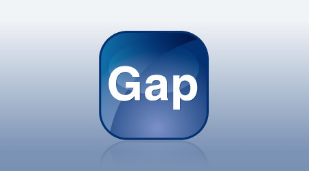
The boldest idea that a group can accept is the boldest idea the least bold member can accept.
And there it is!
posted by cccorlew at 8:13 PM on October 6, 2010 [1 favorite]
And there it is!
posted by cccorlew at 8:13 PM on October 6, 2010 [1 favorite]
That's what I mean by your logic not scaling. It's faulty.
I don't think scaling means what you think it means.
posted by jayder at 9:29 PM on October 6, 2010
I don't think scaling means what you think it means.
posted by jayder at 9:29 PM on October 6, 2010
I'm white and boring and not that edgy (purple hair notwithstanding) and I buy Gap jeans and sweaters and boxers for Mr. immlass. As a member of the target audience, I think this logo sucks. The old logo wasn't great, but this one is actively weak.
The next time I get asked to fill out one of their store surveys, I'm telling them so, too.
posted by immlass at 10:11 PM on October 6, 2010
The next time I get asked to fill out one of their store surveys, I'm telling them so, too.
posted by immlass at 10:11 PM on October 6, 2010
Is this something I'd have to wear pants to understand?
posted by IvoShandor at 10:39 PM on October 6, 2010
posted by IvoShandor at 10:39 PM on October 6, 2010
Heh. Sounds like they're about to pull a Tropicana after all.
posted by katillathehun at 12:04 AM on October 7, 2010
posted by katillathehun at 12:04 AM on October 7, 2010
Is this where we start being offered a choice between New Gap and Gap Classic?
posted by Miko at 6:07 AM on October 7, 2010
posted by Miko at 6:07 AM on October 7, 2010
But Your Majesty, she's a commoner. Her Gap will taste foul.
posted by Gator at 6:10 AM on October 7, 2010
posted by Gator at 6:10 AM on October 7, 2010
*Al Gore sigh*
1. It doesn't HAVE to make sense to other brands - we're talking about the direction one particular brand has taken, and I see some justification for the direction they've taken. What makes sense for Gap, a clothing retailer with a legacy as a store that sold jeans cheaper than Levi's, does not necessarily make a whit of sense for other brands.
2. I still don't know what you're on about with the other logos. There are scads of boring corporate logos out there, and this Gap logo is one of them.
posted by Mister_A at 6:51 AM on October 7, 2010
I don't understand why companies like Gap and AT&T feel the need to change their logos to look more "modern". Can't their marketing people understand that having an iconic logo is a huge boon?
posted by reenum at 8:00 AM on October 7, 2010
posted by reenum at 8:00 AM on October 7, 2010
So their new plan is to get someone to design a new logo for them in exchange for...a print.
posted by mippy at 8:24 AM on October 7, 2010
posted by mippy at 8:24 AM on October 7, 2010
The official Facebook page still has the old logo. As does the official (verified, cough cough) Twitter page.
posted by Gator at 8:34 AM on October 7, 2010
posted by Gator at 8:34 AM on October 7, 2010
So their new plan is to get someone to design a new logo for them in exchange for...a print.
I think the print contest is being held for fun by a blog that isn't affiliated with Gap. Gap's plan is to get someone to redesign their logo for nothing.
posted by katillathehun at 9:15 AM on October 7, 2010
I think the print contest is being held for fun by a blog that isn't affiliated with Gap. Gap's plan is to get someone to redesign their logo for nothing.
posted by katillathehun at 9:15 AM on October 7, 2010
Gap's looking for free work? Hell why didn't they just ask!
Here's my entry.
This site was VERY helpful!
posted by mazola at 9:38 AM on October 7, 2010 [1 favorite]
Here's my entry.
This site was VERY helpful!
posted by mazola at 9:38 AM on October 7, 2010 [1 favorite]
Wait, this one is better.
Notice how the space between the G and the A screams 'gap'? Clever, eh?
posted by mazola at 9:49 AM on October 7, 2010 [1 favorite]
Notice how the space between the G and the A screams 'gap'? Clever, eh?
posted by mazola at 9:49 AM on October 7, 2010 [1 favorite]
Before I read this thread I predict it's going to be full of a lot of font nerdery, logo obsession, and people making sweeping unfounded generalizations about everything.
posted by tehloki at 10:55 AM on October 7, 2010
posted by tehloki at 10:55 AM on October 7, 2010
Before I read this thread I predict it's going to be full of a lot of font nerdery, logo obsession, and people making sweeping unfounded generalizations about everything.
Your own sweeping generalization isn't that much of a stretch considering this is a post about the font on a logo.
posted by katillathehun at 10:59 AM on October 7, 2010
Your own sweeping generalization isn't that much of a stretch considering this is a post about the font on a logo.
posted by katillathehun at 10:59 AM on October 7, 2010
It's time for a new Metafilter logo.
posted by howling fantods at 1:47 PM on October 7, 2010 [1 favorite]
posted by howling fantods at 1:47 PM on October 7, 2010 [1 favorite]
Does the gap's agency not understand dot gain? Logos need to be reproducible as 1 color, and they need to function in real-world media. This thing will objectively stink at 1 inch, in black, on newsprint, and at 2 inches in white, on the back of a t-shirt.
posted by Devils Rancher at 8:07 AM on October 10, 2010
posted by Devils Rancher at 8:07 AM on October 10, 2010
Gap to Scrap New Logo, Return to Old Design
posted by brundlefly at 4:43 PM on October 11, 2010 [1 favorite]
posted by brundlefly at 4:43 PM on October 11, 2010 [1 favorite]
Paging Nelson Muntz, Nelson Muntz to the white courtesy phone.
posted by Gator at 4:49 PM on October 11, 2010 [3 favorites]
posted by Gator at 4:49 PM on October 11, 2010 [3 favorites]
A slightly more amusing take: New Gap Logo, Despised Symbol of Corporate Banality, Dead at One Week
posted by zarq at 9:27 AM on October 12, 2010 [1 favorite]
posted by zarq at 9:27 AM on October 12, 2010 [1 favorite]
« Older "Oh God you guys. This better be pretty freakin'... | I Love to Ride Elevators Newer »
This thread has been archived and is closed to new comments
posted by setanor at 8:52 AM on October 6, 2010 [2 favorites]